TPW: Technical & Professional Writing
Institution: MIT
62 study materials · 14 sections
Technical & Professional Writing (TPW) is an introductory open education resource designed to prepare students for the diverse communication demands of the professional world. The course focuses on a reader-centered approach, teaching students how to convey complex information clearly, accurately, and ethically to achieve specific workplace goals. Key areas of study include rhetorical analysis, document design, intercultural sensitivity, and the creation of common professional documents such as reports, proposals, and employment materials.
Course Sections
Introduction to Technical Communication
Key concepts: Technical vs. Academic writing · Reader-centered communication · P.A.L.E.S. Criteria · STC definition
Defines technical communication and distinguishes it from academic writing, focusing on its role as a reader-centered, action-oriented tool.
Introduction to Technical Communication
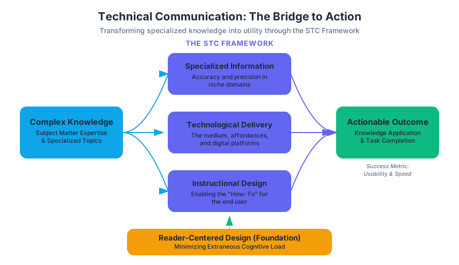
Technical communication is the bridge between complex, specialized knowledge and the individuals who must apply that knowledge to achieve a specific goal. It is an interdisciplinary field that combines linguistics, cognitive psychology, information design, and subject-matter expertise. In a professional context, technical communication is not merely the act of "writing about technology"; rather, it is the strategic delivery of information in a way that facilitates action, reduces error, and optimizes human-system interaction.
The STC Definition and the Scope of the Field
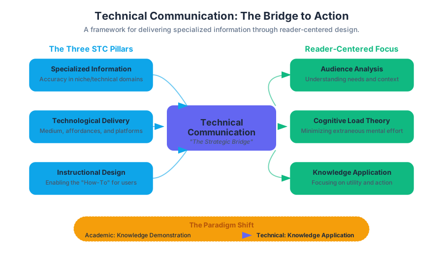
To understand technical communication, we must look to the Society for Technical Communication (STC), the world’s largest professional association for the field. The STC defines technical communication through three primary characteristics. If a piece of communication meets any of these criteria, it falls under the umbrella of the discipline:
- Communicating about specialized or technical topics, such as computer applications, medical procedures, or environmental regulations.
- Communicating by using technology, such as web pages, help files, or social media sites.
- Providing instructions about how to do something, regardless of how technical the task is or even if technology is used to create or distribute that communication.
Key Insight: The modern definition of technical communication has shifted from a focus on the subject matter (the "technical") to the utility of the information (the "communication"). This is why a recipe for a cake and a manual for a nuclear reactor share the same fundamental rhetorical DNA: they are both designed to guide a user through a process to a successful outcome.
Table 1: The Three Pillars of Technical Communication (STC Framework)
| Pillar | Focus | Examples |
|---|---|---|
| Specialized Information | Accuracy and precision in niche domains. | White papers on blockchain; medical journals; legal briefs. |
| Technological Delivery | The medium and its affordances. | API documentation; interactive UI tooltips; wikis. |
| Instructional Design | Enabling the "How-To" for the user. | Assembly guides; troubleshooting flowcharts; SOPs. |
Technical vs. Academic Writing: The Paradigm Shift
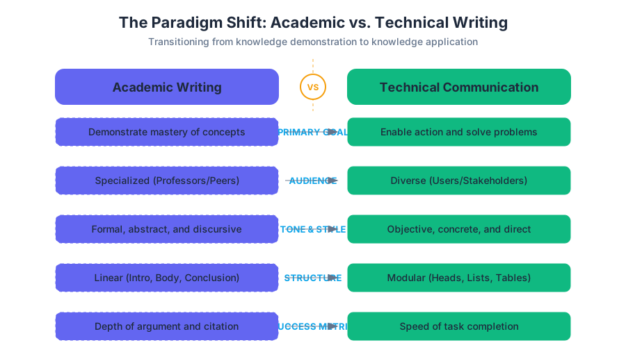
For many entering the professional world, the transition from academic writing to technical writing requires a fundamental "unlearning" of stylistic habits. In the academy, writing is often a tool for knowledge demonstration—showing a professor that you have synthesized complex ideas. In the workplace, writing is a tool for knowledge application.
The primary difference lies in the Rhetorical Situation. In academic writing, the audience (the instructor) usually knows more about the topic than the writer. In technical writing, the writer is the expert, and the audience (the user) is looking for a specific answer to a specific problem.
Table 2: Comparative Analysis of Writing Paradigms
| Feature | Academic Writing | Technical Writing |
|---|---|---|
| Primary Goal | To persuade or demonstrate mastery. | To inform or enable action. |
| Audience | Specialized (Professors/Peers). | Diverse (Users/Stakeholders/Clients). |
| Tone | Formal, often abstract, and discursive. | Objective, concrete, and direct. |
| Structure | Linear (Intro, Body, Conclusion). | Modular (Headed sections, Lists, Tables). |
| Success Metric | Depth of argument and citation. | Speed of task completion (Usability). |
Implementation Example: Documenting a System Function
Consider the difference in how a low-level system function is documented for a developer (Technical) versus how its theory might be discussed in a computer science paper (Academic).
/**
 * @file memory_manager.c
 * @brief Implements a thread-safe heap allocator.
 *
 * @section DESCRIPTION
 * This function utilizes a boundary-tag buddy system to minimize
 * external fragmentation. It is O(log N) for both allocation
 * and deallocation.
 *
 * @param size The number of bytes to allocate.
 * @return void* Pointer to the allocated block, or NULL if failed.
 *
 * @note Ensure that memory_init() is called before this function.
 */
void* secure_malloc(size_t size) {
    if (size == 0) return NULL;

    pthread_mutex_lock(&global_malloc_lock);
    void* ptr = internal_allocate(size);
    pthread_mutex_unlock(&global_malloc_lock);

    return ptr;
}
Reader-Centered Communication
The cornerstone of technical communication is Reader-Centered Design. This philosophy posits that the writer is not the center of the universe; the reader's needs, limitations, and context are the primary drivers of every word, image, and layout choice.
To achieve reader-centered communication, a writer must perform a rigorous Audience Analysis. This involves moving beyond demographics to understand the reader's psychographics and cognitive load.
The Cognitive Load Theory (CLT) in Writing
Technical writers aim to minimize Extraneous Cognitive Load (effort spent processing the document's format) so that the reader can focus entirely on Germane Cognitive Load (the effort required to learn the task).
Table 3: Audience Analysis Matrix
| Variable | Definition | Impact on Document Design |
|---|---|---|
| Knowledge Level | What the reader already knows. | Determines the use of jargon vs. plain language. |
| Role/Persona | The reader's job function. | Determines which sections are prioritized (e.g., Executive Summary vs. Appendices). |
| Context of Use | Where and how the doc is read. | Determines medium (mobile-friendly vs. printed manual). |
| Attitude | The reader's emotional state. | Influences tone (e.g., empathetic in troubleshooting). |
Mathematical Derivation of Readability
One way technical communicators measure the "accessibility" of their text is through the Flesch-Kincaid Grade Level formula. This provides a quantitative metric for how difficult a text is to parse.
\text{Grade Level} = 0.39 \left( \frac{\text{total words}}{\text{total sentences}} \right) + 11.8 \left( \frac{\text{total syllables}}{\text{total words}} \right) - 15.59
By calculating this, a writer can objectively determine if their "Technical Writing" is actually accessible to their target audience. For instance, a manual for a general consumer product should ideally target an 8th-grade reading level.
The P.A.L.E.S. Criteria
To evaluate the effectiveness of a technical document, we use the P.A.L.E.S. Criteria. This framework serves as a heuristic for both the creation and the peer review of professional communication.
1. Purposeful
Every technical document exists to solve a problem or fulfill a need (Exigence). If you cannot define exactly what the reader should be able to do after reading the document, the document lacks purpose.
- Primary Purpose: The main goal (e.g., "Install the software").
- Secondary Purpose: Subsidiary goals (e.g., "Build brand trust").
2. Audience-centered
As discussed, the document must be tailored to the specific user. This includes the use of Persona-based writing.
{
  "persona": "DevOps_Engineer_Junior",
  "technical_proficiency": 3,
  "primary_goal": "Automate container deployment",
  "pain_points": [
    "Complex YAML syntax",
    "Vague error messages"
  ],
  "preferred_format": "CLI examples and copy-pasteable snippets"
}
3. Logical
Information must be organized in a way that mirrors the user's mental model. Common logical structures include:
- Chronological: For instructions and procedures.
- General-to-Specific: For technical descriptions.
- Cause-and-Effect: For troubleshooting and diagnostic reports.
4. Ethical
Technical communication has real-world consequences. Ethical writing involves:
- Accuracy: Ensuring data is correct.
- Honesty: Not hiding product flaws or safety risks.
- Accessibility: Ensuring the document is usable by people with disabilities (WCAG compliance).
5. Standardized
Professional writing relies on consistency. This includes following Style Guides (like Microsoft, Google, or IEEE) and using standardized templates. Standardization reduces the user's learning curve.
Document Design and Visual Rhetoric
In technical communication, design is not decoration. It is a functional component of the message. Effective document design uses visual cues to guide the reader's eye and emphasize important information.
Key Principles of Technical Design:
- Contrast: Using bolding, color, or size to distinguish headings from body text.
- Alignment: Creating a clean "grid" to help the reader scan the page.
- Proximity: Grouping related items together (e.g., a figure and its caption).
- Repetition: Using the same format for all "Warning" boxes to build a visual pattern.
Table 4: Visual Elements and Their Functions
| Element | Purpose | Best Practice |
|---|---|---|
| Headings | Navigation and Chunking. | Use "Talking Headings" (Gerunds/Verbs). |
| Bullet Lists | Breaking down complex items. | Keep items parallel in grammatical structure. |
| Callouts | Highlighting safety or tips. | Use standard icons (e.g., ⚠️ for Warning). |
| Tables | Comparing data points. | Keep headers visible and data aligned. |
The Workflow of a Technical Communicator
Technical writing is rarely a solo endeavor. It involves a "Documentation Lifecycle" that mirrors the Software Development Life Cycle (SDLC) or Product Development Life Cycle.
The Documentation Pipeline:
- Planning: Defining the P.A.L.E.S. criteria and project scope.
- Information Gathering: Interviewing Subject Matter Experts (SMEs) and using the product.
- Drafting: Creating the content using a "minimalist" approach (only what the user needs).
- Review/Testing: Conducting Usability Testing to see if real users can follow the instructions.
- Publishing/Maintenance: Releasing the doc and updating it as the product evolves.
Real-World Usage: Documentation as Code
Modern technical communicators often use "Docs-as-Code" workflows, treating documentation like software.
# Example of a documentation build pipeline using Pandoc and Git
# 1. Pull latest changes from the repo
git pull origin main

# 2. Convert Markdown source to PDF using a custom LaTeX template
pandoc source/manual.md \
    -o build/user_manual_v2.pdf \
    --template=templates/corporate_style.tex \
    --toc --number-sections

# 3. Deploy the build to the web server
scp build/user_manual_v2.pdf web-admin@docs-server:/var/www/html/guides/
Common Pitfalls in Technical Communication
Even experienced writers can fall into traps that hinder communication. Recognizing these is the first step toward professional-grade writing.
- The Curse of Knowledge: Assuming the reader knows as much as the writer. This leads to missing steps in instructions.
- Buried Instructions: Placing critical actions in the middle of long paragraphs. Instructions should always be in numbered lists.
- Passive Voice: "The button should be pressed" is weaker and more ambiguous than "Press the button." Technical writing favors the Imperative Mood.
- Ambiguous Pronouns: Using "this" or "it" without a clear antecedent.
- Bad: "Connect the cable to the port. It will glow blue." (The cable or the port?)
- Good: "Connect the cable to the port. The port LED will glow blue."
Theorem of Technical Clarity: The probability of a user error ($P_e$) is inversely proportional to the clarity of the instruction ($C$) and directly proportional to the complexity of the task ($K$).
$$P_e \propto \frac{K}{C}$$
To reduce error, we must either simplify the task or increase the clarity of the communication.
Professionalism and Workplace Success
Key concepts: Professionalism and Self-Concept · Employer-Desired Skills · Active Listening and Reading · Problem-Solving Activity
Explores how mastering communication skills enhances professional image, self-concept, and overall employability.
Professionalism and Workplace Success
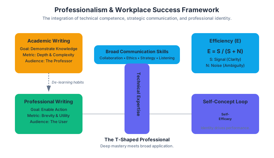
In the modern knowledge economy, professionalism is often mischaracterized as a mere adherence to dress codes or punctuality. In the context of technical and professional writing (TPW), professionalism is more accurately defined as the consistent application of high-level communication standards, ethical responsibility, and the strategic management of one's Self-Concept. It is the bridge between raw technical competence and organizational impact.
Professionalism and Self-Concept
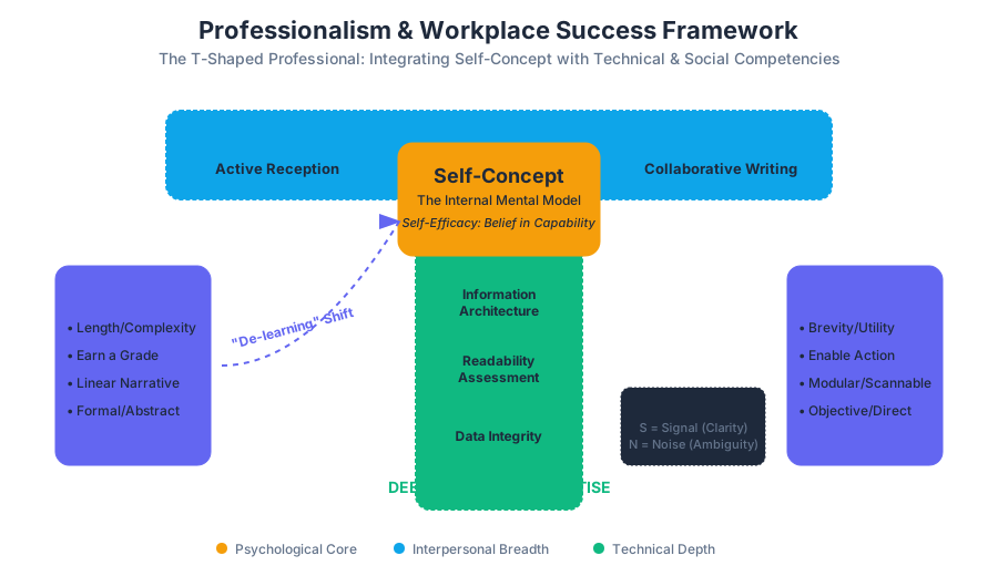
At the core of professional success lies the Self-Concept: the internal mental model an individual holds regarding their own abilities, identity, and value within a professional ecosystem. In technical communication, your self-concept dictates how you approach complex documentation tasks and how you interact with subject matter experts (SMEs).
The Psychology of Professional Identity
A writer’s self-concept is not static; it is a dynamic feedback loop between their perceived competence and the external validation of their work. High Self-Efficacy—a subset of self-concept—is the belief in one’s capability to organize and execute the courses of action required to manage prospective situations.
Definition: Self-Efficacy in TPW The measure of a communicator's belief in their ability to translate high-entropy technical data into low-entropy, actionable information for a specific audience.
The Academic-to-Professional Transition
One of the primary challenges in developing a professional self-concept is the "de-learning" of academic habits. Academic writing often rewards length and complexity (to prove the writer's knowledge), whereas professional writing rewards brevity and utility (to respect the reader's time).
| Feature | Academic Writing | Professional/Technical Writing |
|---|---|---|
| Primary Goal | Demonstrate knowledge/earn a grade | Enable action/solve a problem |
| Audience | The Professor (Subject Expert) | The User (Varied expertise) |
| Structure | Linear, narrative-driven | Modular, non-linear, scannable |
| Tone | Formal, often abstract | Objective, concrete, and direct |
| Success Metric | Depth of analysis | Speed of information retrieval |
Employer-Desired Skills: The Competency Matrix
Employers in technical fields do not just hire for "coding" or "engineering" skills; they hire for the ability to integrate those skills into a social and organizational framework. This is often visualized as the T-Shaped Professional, where the vertical bar represents deep technical expertise and the horizontal bar represents broad communication and collaboration skills.
The Hierarchy of Workplace Competencies
To quantify "employability," we can look at the intersection of hard technical skills and "soft" communicative skills. In a 2023 survey of Fortune 500 hiring managers, "Communication Clarity" and "Problem-Solving" consistently outranked specific software proficiencies.
| Skill Category | Specific Competency | Workplace Application |
|---|---|---|
| Cognitive | Critical Thinking | Evaluating the validity of data sources before inclusion in a report. |
| Interpersonal | Collaborative Writing | Using version control (Git) to co-author documentation with engineers. |
| Technical | Information Architecture | Designing a documentation hierarchy that minimizes "click-depth." |
| Ethical | Data Integrity | Ensuring visual representations (charts) do not mislead the audience. |
Implementation: Automated Readability Assessment
A professional communicator uses tools to validate their output. Below is a Python implementation of the Flesch-Kincaid Grade Level algorithm, a standard metric used by professionals to ensure their writing matches the target audience's reading level.
import re

def calculate_readability(text):
    """
    Calculates the Flesch-Kincaid Grade Level.
    Formula: 0.39 * (total_words / total_sentences) + 11.8 * (total_syllables / total_words) - 15.59
    """
    sentences = len(re.findall(r'[.!?]+', text))
    words = len(re.findall(r'\w+', text))

    # Simplified syllable count (vowel groups)
    syllables = len(re.findall(r'[aeiouy]+', text.lower()))

    if sentences == 0 or words == 0:
        return 0

    grade_level = (0.39 * (words / sentences)) + (11.8 * (syllables / words)) - 15.59
    return round(grade_level, 2)

# Example Usage: A complex technical paragraph
sample_doc = (
    "The implementation of the asynchronous microservices architecture "
    "facilitates a decoupled environment where horizontal scaling is "
    "achieved through container orchestration. This ensures high availability."
)

print(f"Target Grade Level: {calculate_readability(sample_doc)}")
Active Listening and Reading
Professionalism is as much about reception as it is about production. In a technical environment, the cost of a "misread" or a "misheard" instruction can be measured in lost revenue or compromised safety.
The Mechanics of Active Reception
Active listening and reading involve a conscious effort to perceive not just the words, but the intent and context (the rhetorical situation). This is modeled by the Shannon-Weaver Model of Communication, which accounts for "noise"—anything that interferes with the message.
Mathematical Representation of Information Transfer
We can model the effectiveness of communication ($E$) as a function of the Signal ($S$) and the Noise ($N$):
E = \lim_{N \to 0} \frac{S}{S + N}
Where:
- $S$ = The clarity and relevance of the technical content.
- $N$ = Semantic ambiguity, poor formatting, or psychological bias in the reader.
Strategies for Active Reading (SQ3R)
Professional readers do not read documents like novels. They use the SQ3R method:
- Survey: Scan headings and visuals.
- Question: Turn headings into questions (e.g., "How do I reset the API?").
- Read: Search specifically for the answers to those questions.
- Recite: Summarize the answer in your own words.
- Review: Re-read to confirm accuracy.
| Active Listening Technique | Professional Purpose |
|---|---|
| Paraphrasing | "So, if I understand correctly, the main bottleneck is the SQL query latency?" |
| Non-Verbal Cues | Maintaining eye contact and nodding to signal engagement during a sprint planning. |
| Clarifying Questions | "Could you define what 'high load' means in terms of requests per second?" |
| Summarizing | "To recap, our action items are X, Y, and Z by Friday." |
Problem-Solving Activity
Technical communication is fundamentally a problem-solving activity. A document exists because there is a "gap" between what a user knows and what they need to know to achieve a goal.
The P.A.L.E.S. Criteria for Problem Solving
When approaching a workplace communication task, professionals use the P.A.L.E.S. framework to analyze the problem:
- Purpose: What is the specific "Exigence" (the urgent need) for this document?
- Audience: Who are the stakeholders? What is their "Knowledge Delta"?
- Layout: Which design pattern (Grid, F-Pattern, Z-Pattern) best serves the goal?
- Ethics: Are there legal requirements or safety warnings (e.g., OSHA standards) to consider?
- Style: Does the tone match the organizational culture and the urgency of the task?
Case Study: The "Broken Build" Notification
Imagine a CI/CD pipeline fails. The "problem" is the broken build. The "communication solution" is the notification sent to the engineering team.
Ineffective Communication (Passive): "The build failed. Please check the logs when you have time. It might be the database."
Professional Communication (Problem-Solving Oriented):
"CRITICAL: Build #402 failed on main branch. Error: NullPointerException in AuthService.java:42. Impact: Deployment blocked. Assigned to: @DevTeam."
Configuration as Documentation
In modern DevOps, "Professionalism" includes how we configure our tools to prevent errors. Below is a .vale.ini configuration file. Vale is a "linter for prose" used by professional technical writers to enforce style guides automatically.
# Vale configuration file (.vale.ini)
StylesPath = styles
MinAlertLevel = suggestion

[*.md]
BasedOnStyles = Microsoft, Google, Write-good

# Enforce specific professional standards
Microsoft.Passive = error
Microsoft.FirstPerson = warning
Google.WordList = error
Common Pitfalls and Professional Recovery
Even the most seasoned professionals encounter friction. The hallmark of workplace success is not the absence of errors, but the systematic recovery from them.
- The Expert's Blind Spot: Assuming the reader knows as much as the writer.
- Fix: Use "User Personas" to map out the audience's actual skill level.
- Scope Creep: Trying to solve every problem in one document.
- Fix: Use a "Modular Documentation" approach where each page solves exactly one user goal.
- Tone Mismatch: Being too informal in a high-stakes report or too rigid in a collaborative Slack channel.
- Fix: Conduct a "Rhetorical Analysis" of the medium before hitting send.
Professional Correspondence: The CLI Approach
Sometimes, professionalism means using the right tool for the right job. For a senior engineer, "writing" might happen in the terminal to communicate system states to the rest of the team.
# A professional "Status Report" generated via CLI for a team update
echo "--- SYSTEM STATUS REPORT ---"
uptime | awk '{print "System Uptime: " $3 " " $4}'
df -h | grep '^/dev/' | awk '{print "Disk Usage: " $5 " on " $1}'
git log -1 --pretty=format:"Last Commit: %s (%an)"
echo -e "\n--- END REPORT ---"
Conclusion
Professionalism in the workplace is a multifaceted discipline that integrates Self-Concept, Active Reception, and Analytical Problem-Solving. By viewing every document, email, and meeting as a technical challenge to be optimized, you transition from a "writer" to a "strategic communicator." Success is not measured by the number of words produced, but by the efficiency with which those words move an organization toward its goals.
Ethics and Legal Obligations
Key concepts: Ethical Responsibility · Plagiarism and Intellectual Property · Misrepresentation of Data · Persuasive Manipulation
Covers the ethical responsibilities of technical writers, including honesty, data integrity, and intellectual property.
Ethics and Legal Obligations
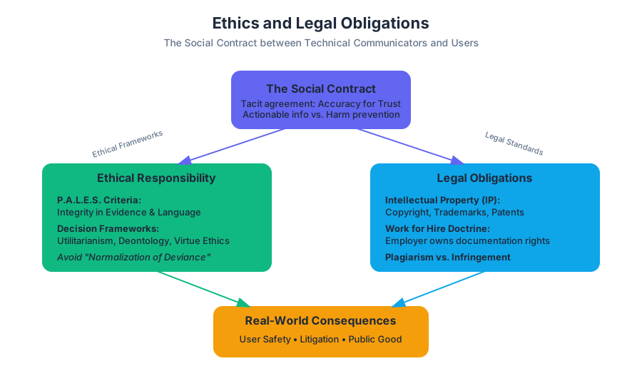
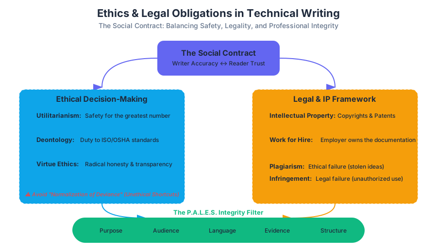
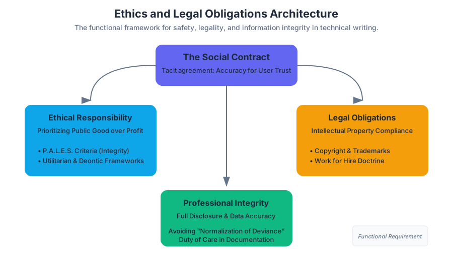
In the realm of technical and professional writing, ethics is not merely a philosophical abstraction; it is a functional requirement for the safety, legality, and efficacy of information systems. While academic writing often focuses on the pursuit of truth or the expression of an argument, technical communication operates within a Social Contract between the creator and the user. The user relies on the documentation to operate machinery, administer medicine, or manage financial assets. Consequently, any breach in ethical standards—whether through omission, obfuscation, or outright deception—carries real-world consequences ranging from litigation to the loss of human life.
Ethical Responsibility: The Professional Ethos
Ethical Responsibility in technical communication is defined as the obligation to prioritize the user's safety and the public good over organizational convenience or profit motives. This concept is rooted in the P.A.L.E.S. Criteria (Purpose, Audience, Language, Evidence, and Structure), where the "Evidence" and "Language" components must be handled with extreme integrity.
The Mechanics of Ethical Decision-Making
Technical writers often face the "Normalization of Deviance"—a term coined by sociologist Diane Vaughan—where small, unethical shortcuts become standard practice until a catastrophe occurs. To combat this, professionals use structured ethical frameworks to evaluate their work.
Definition: The Social Contract of Technical Writing A tacit agreement where the writer provides accurate, accessible, and actionable information, and the reader provides their trust and time, assuming that following the instructions will not result in harm.
| Framework | Core Principle | Application in Technical Writing |
|---|---|---|
| Utilitarianism | The greatest good for the greatest number. | Prioritizing clear safety warnings that protect the majority of users. |
| Deontology | Duty-based ethics; follow the rules regardless of outcome. | Adhering strictly to ISO or OSHA documentation standards. |
| Virtue Ethics | Focus on the character of the writer. | Cultivating a reputation for honesty and "radical transparency" in reporting. |
| Contractarianism | Ethics based on social agreements. | Fulfilling the specific requirements of a Service Level Agreement (SLA). |
Worked Example: The "Silence as Deception" Case
Consider a software engineer writing documentation for a new API. They discover a race condition that occurs in 0.1% of cases. The marketing department asks them to omit this from the "Known Issues" section to ensure a "clean launch."
Ethical Analysis:
- Exigence: The need for a stable launch.
- Audience: Developers who will build critical infrastructure on this API.
- Outcome: If the 0.1% failure occurs in a medical device, the omission is a violation of the "Duty of Care."
- Action: The writer must include the race condition and provide a "Workaround" block, fulfilling the ethical obligation of Full Disclosure.
Plagiarism and Intellectual Property
In a professional context, Intellectual Property (IP) refers to creations of the mind—inventions, literary and artistic works, designs, and symbols—used in commerce. For the technical writer, IP is a legal minefield involving Copyright, Trademarks, and Patents.
Plagiarism vs. Copyright Infringement
While often used interchangeably, they are distinct:
- Plagiarism is an ethical failure: claiming someone else's ideas or words as your own.
- Copyright Infringement is a legal failure: using someone else's protected work without permission, regardless of whether you give them credit.
The "Work for Hire" Doctrine
Under the U.S. Copyright Act, if a professional writer creates a document as part of their employment, the employer is considered the legal author. This is the Work for Hire doctrine. The writer cannot take that documentation to a new company without violating IP laws.
Implementation: Automated Plagiarism Detection
To ensure document integrity, organizations often use hashing algorithms to detect "fuzzy" matches between internal documents and external sources.
# A simplified MinHash implementation for detecting document similarity
# This represents how enterprise-level documentation audits are performed.

import binascii

def get_shingles(text, k=5):
    """Break text into overlapping sets of k characters."""
    return set([text[i:i+k] for i in range(len(text) - k + 1)])

def minhash_signature(shingles, num_hashes=100):
    """Generate a unique signature for a document based on its content."""
    signature = []
    for i in range(num_hashes):
        min_hash = float('inf')
        for s in shingles:
            # Create a unique hash for each shingle
            h = binascii.crc32(s.encode('utf-8') + str(i).encode('utf-8')) & 0xffffffff
            if h < min_hash:
                min_hash = h
        signature.append(min_hash)
    return signature

def jaccard_similarity(sig1, sig2):
    """Calculate the similarity between two document signatures."""
    assert len(sig1) == len(sig2)
    matches = sum(1 for i, j in zip(sig1, sig2) if i == j)
    return matches / len(sig1)

# Example Usage
doc_a = "The system must be rebooted after every kernel update to ensure stability."
doc_b = "The system should be restarted following each kernel patch for stability."

sig_a = minhash_signature(get_shingles(doc_a))
sig_b = minhash_signature(get_shingles(doc_b))

print(f"Similarity Score: {jaccard_similarity(sig_a, sig_b):.2f}")
# A high score (e.g., > 0.7) suggests potential plagiarism or unauthorized derivation.
Misrepresentation of Data
Data Integrity is the cornerstone of technical communication. Misrepresentation occurs when a writer manipulates data—either through visual distortion or statistical cherry-picking—to lead the reader to a false conclusion.
The "Lie Factor" in Visuals
Edward Tufte, a pioneer in data visualization, defined the Lie Factor as a way to quantify how much a graphic misrepresents the underlying numbers.
The Lie Factor Formula $$LF = \frac{\text{Size of effect shown in graphic}}{\text{Size of effect in data}}$$
- If $LF = 1$, the graphic is accurate.
- If $LF > 1.05$ or $LF < 0.95$, the graphic is considered misleading.
Common Data Fallacies in Technical Reports
| Fallacy | Description | Impact |
|---|---|---|
| Truncated Y-Axis | Starting the vertical axis at a non-zero value. | Exaggerates small differences between data points. |
| Cherry-Picking | Selecting only data that supports a specific claim. | Hides systemic failures or negative trends. |
| Correlation as Causation | Implying a causal link because two variables move together. | Leads to incorrect engineering or policy decisions. |
| The "Omitted Variable" | Failing to mention a factor that significantly impacts the data. | Provides an incomplete and dangerous picture of reality. |
Mathematical Derivation of Skewness via Omission
If a writer omits "outliers" (e.g., system crashes) from a performance report to show a better "average" uptime, they are manipulating the Mean ($\mu$) and Standard Deviation ($\sigma$).
Let $X$ be the set of all data points. If the writer removes the subset $O$ (outliers), the new mean $\mu'$ is: $$\mu' = \frac{\sum X - \sum O}{N - |O|}$$
If $\sum O$ contains values significantly lower than $\mu$ (crashes), then $\mu' > \mu$, creating a false impression of higher performance. This is a direct violation of the Ethical Responsibility to provide accurate evidence.
Persuasive Manipulation
Technical writing is inherently persuasive—it seeks to persuade the reader to follow a process or adopt a solution. However, there is a sharp line between Persuasion (using logic and evidence to guide a user) and Manipulation (using psychological triggers to deceive or coerce).
Dark Patterns in Documentation and UI
In modern technical communication, manipulation often takes the form of Dark Patterns. These are user interface designs or instructional flows intended to trick users into doing something they didn't intend to do (e.g., signing up for a recurring subscription while trying to download a manual).
Rhetorical Analysis of Manipulative Language
Technical writers must avoid "weasel words" and "loaded language" that obscure the truth.
| Manipulative Technique | Example | Ethical Alternative |
|---|---|---|
| Passive Voice Obfuscation | "Mistakes were made in the calculation." | "The engineering team used an incorrect variable in the calculation." |
| Euphemisms | "Rapid unscheduled disassembly" | "The rocket exploded." |
| False Urgency | "Update now or your data is at risk!" (when it isn't). | "This update contains security patches for known vulnerabilities." |
| The "Wall of Text" | Hiding a critical warning inside a 50-page EULA. | Using a DANGER or WARNING callout box. |
Implementation: Auditing for Bias and Manipulation
In a professional CI/CD (Continuous Integration/Continuous Deployment) pipeline, documentation can be audited for tone and bias using CLI tools.
# Example: Using a linter to check for biased or non-inclusive language
# 'alex' is a tool that catches insensitive, inconsiderate writing.

# Install the tool
npm install -g alex

# Run a check on the technical manual
alex manual_v2.md

# Output example:
# manual_v2.md
#  12:45-12:51  warning  `master` may be insensitive, use `primary` instead  master-slave
#  45:10-45:15  warning  `he` may be insensitive, use `they` instead        he-she

# Using 'grep' to find "weasel words" that weaken technical accuracy
grep -Ei "clearly|obviously|easy|simple|just|actually" documentation/*.md
Legal Obligations and Liability
Beyond ethics, technical writers operate under specific legal frameworks. Failure to adhere to these can result in Professional Negligence or Strict Liability.
- Failure to Warn: If a product is dangerous and the manual does not provide a clear, prominent warning, the manufacturer (and by extension, the writer) can be held liable for damages.
- Breach of Warranty: If the documentation claims a product can perform a specific task and it fails, the documentation serves as a legal "Express Warranty."
- Accessibility (Section 508): In many jurisdictions, technical documentation for government or public use must be accessible to people with disabilities (e.g., providing Alt-text for images, screen-reader compatibility).
The "Clear and Conspicuous" Standard
Courts often use the "Clear and Conspicuous" standard to judge warnings. A warning is not legally sufficient if it is:
- Printed in a tiny font.
- Placed in an illogical location.
- Written in overly technical jargon that the target audience cannot understand.
Summary of Ethical and Legal Integration
The professional writer must act as a bridge between the technical reality of a product and the human reality of the user. This requires a constant balancing act:
- Accuracy vs. Simplicity
- Company Loyalty vs. User Safety
- Persuasion vs. Transparency
By adhering to the principles of intellectual property, data integrity, and ethical language, the technical communicator ensures that their work is not only useful but also honorable.
Case Studies: Lion Air and Space Shuttle Challenger
Key concepts: MCAS Software Gap · O-ring Failure · Clarity vs. Ambiguity · Organizational Hierarchies · Bad News Transmission
Analyzes real-world disasters caused by communication breakdowns and ethical lapses in technical reporting.
Case Studies: Lion Air and Space Shuttle Challenger
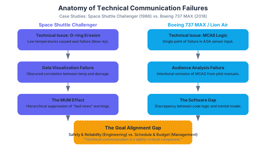
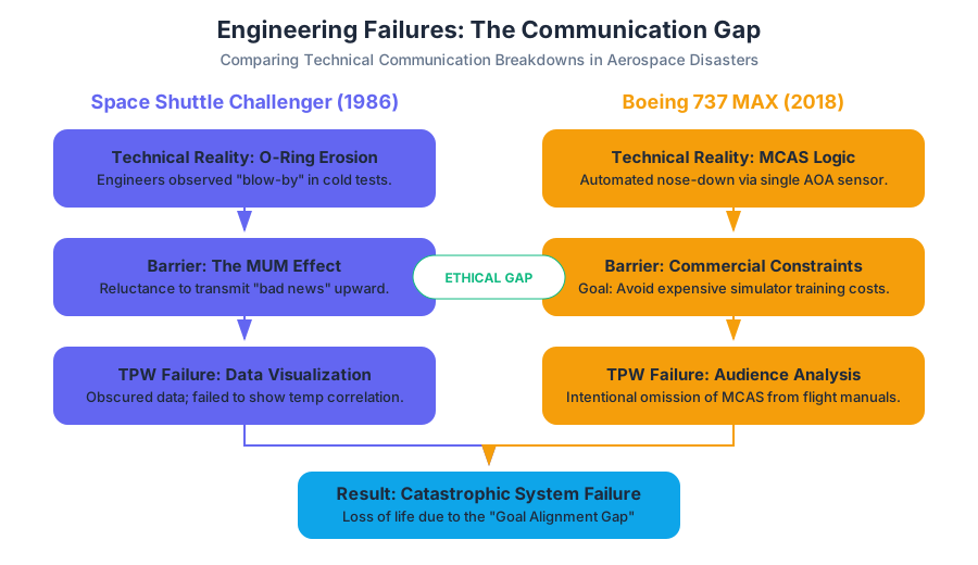
Technical communication is often perceived as the "soft" side of engineering—a matter of formatting manuals or polishing prose. However, the history of aerospace engineering proves that communication is a safety-critical component, as vital as a redundant hydraulic system or a heat shield. When technical information is suppressed, obscured by ambiguity, or lost in organizational hierarchies, the result is often catastrophic.
This section performs a deep-dive into two of the most significant engineering failures in history: the Space Shuttle Challenger (1986) and the Boeing 737 MAX / Lion Air Flight 610 (2018). By analyzing these events through the lens of technical and professional writing (TPW), we can identify how specific failures in data visualization, ethical reporting, and audience analysis led directly to the loss of life.
The Space Shuttle Challenger: A Failure of Interpretation
On January 28, 1986, the Space Shuttle Challenger disintegrated 73 seconds into its flight. The physical cause was the failure of the O-ring seals in the right Solid Rocket Booster (SRB). Due to record-low temperatures at the launch site, the rubber O-rings lost their resiliency, failing to seal the joints and allowing hot gases to escape.
However, the Rogers Commission, tasked with investigating the accident, famously concluded that the disaster was as much a "failure in communication" as it was a technical one.
The O-ring Anomaly and the "MUM" Effect
Engineers at Morton Thiokol, the contractor responsible for the SRBs, had known about O-ring erosion for years. They had observed "blow-by" (soot behind the rings) in previous flights. However, this data was transmitted through an organizational hierarchy that suffered from the MUM Effect (Minimizing Unpleasant Messages).
Definition: The MUM Effect A phenomenon in organizational communication where individuals are reluctant to transmit "bad news" upward due to fear of being blamed or the desire to maintain a positive relationship with superiors.
In the case of the Challenger, the technical data regarding O-ring resiliency was presented in a way that lacked rhetorical force. Instead of a clear warning, engineers provided complex charts that failed to correlate temperature with erosion clearly.
Engineering vs. Management Perspectives
The night before the launch, a teleconference took place between Morton Thiokol and NASA. The engineers recommended a delay, citing the cold weather. However, NASA managers, facing pressure to maintain the launch schedule, challenged the engineers to "prove" the shuttle was unsafe. This shifted the burden of proof from "prove it is safe" to "prove it will fail."
| Perspective | Primary Goal | View of Data | Communication Style |
|---|---|---|---|
| Engineering | Safety and Reliability | Probabilistic; focuses on anomalies. | Detailed, cautious, technical. |
| Management | Schedule and Budget | Binary (Go/No-Go); focuses on "flight history." | Action-oriented, persuasive, bottom-line. |
| The Conflict | Goal Alignment Gap | Engineers saw a risk; Managers saw a lack of definitive proof. | Hierarchical suppression of dissent. |
The Technical Writing Failure: Data Visualization
Edward Tufte, a pioneer in data visualization, later argued that the Challenger disaster could have been prevented if the data had been presented more clearly. The engineers provided 13 charts, but none of them simply plotted the relationship between temperature and O-ring damage across all previous flights. By burying the "bad news" in a sea of irrelevant data, the engineers failed to achieve Clarity.
The Boeing 737 MAX: The MCAS Software Gap
Three decades after the Challenger, the crash of Lion Air Flight 610 (and later Ethiopian Airlines Flight 302) revealed a new era of technical communication failure: the intentional omission of critical information to satisfy commercial goals.
The MCAS System
The Boeing 737 MAX featured larger, more fuel-efficient engines. Because these engines were placed further forward and higher on the wing, they changed the plane's aerodynamics, creating a tendency for the nose to pitch up under certain conditions. To compensate, Boeing developed the Maneuvering Characteristics Augmentation System (MCAS).
MCAS was designed to automatically push the nose down if it sensed the plane was approaching a stall. However, the system relied on a single point of failure: a single Angle of Attack (AOA) sensor.
The Rhetorical Situation: Audience Analysis Failure
In technical writing, Audience Analysis is the process of determining what the reader needs to know to perform a task. Boeing’s audience analysis was driven by a commercial constraint: they wanted to ensure the 737 MAX did not require expensive "Level B" simulator training for pilots transitioning from the 737 NG.
To achieve this, Boeing made a fateful decision in their technical documentation: they omitted MCAS from the flight manuals.
Key Concept: The Software Gap The discrepancy between the actual logic of a system (the code) and the user's mental model of that system (the manual). When the MCAS activated on Lion Air 610 due to a faulty sensor, the pilots had no mental model of the system fighting them, leading to a fatal struggle for control.
Code Logic vs. Documentation
The following pseudocode represents the simplified logic of the MCAS system. Note how the "Single Point of Failure" is hardcoded into the logic, yet this logic was never explained to the end-users (the pilots).
\text{If } (AOA_{sensor} > \theta_{threshold}) \text{ AND } (Flaps == UP) \text{ AND } (Autopilot == OFF):
    \text{Apply } \Delta_{nose\_down} \text{ for } 10 \text{ seconds}
    \text{Wait } 5 \text{ seconds}
    \text{Repeat until } AOA_{sensor} \leq \theta_{threshold}
In the Lion Air case, the AOA sensor was providing a false reading. The system repeatedly pushed the nose down. Because the manual contained no mention of MCAS, the pilots performed standard troubleshooting for "Runaway Stabilizer," which was insufficient to counter the specific behavior of the MCAS logic.
Comparative Analysis: Challenger vs. Lion Air
While the technologies differed (solid rocket boosters vs. flight control software), the communication failures follow a strikingly similar pattern.
| Feature | Space Shuttle Challenger (1986) | Boeing 737 MAX (Lion Air, 2018) |
|---|---|---|
| Technical Trigger | O-ring thermal degradation. | Faulty AOA sensor triggering MCAS. |
| Communication Gap | Ambiguous data visualization; MUM effect. | Intentional omission of system info in manuals. |
| Organizational Pressure | Launch schedule/Political pressure. | Avoiding simulator training costs/Competition. |
| Audience Failure | Managers failed to understand engineering risk. | Pilots were unaware of automated system logic. |
| Ethical Breach | Suppression of dissenting engineering voices. | Prioritizing "marketability" over "informed operation." |
Professional Responsibility and Ethical Reporting
Technical writers and engineers operate under a Professional Responsibility to ensure that "bad news" is not just transmitted, but understood. This requires navigating the Organizational Hierarchy effectively.
Strategies for Transmitting Bad News
- Clarity over Ambiguity: Avoid "weasel words" like appears to, might, or could potentially. Use direct language: "The system will fail at temperatures below 53°F."
- Visual Hierarchy: Place the most critical warnings at the beginning of the document (the "Front Matter") and use standardized safety icons (DANGER, WARNING, CAUTION).
- The P.A.L.E.S. Criteria: Evaluate every document based on Purpose, Audience, Language, Ethics, and Structure.
Example: The "Management Hat" Problem
During the Challenger teleconference, a senior executive told the lead engineer to "take off your engineering hat and put on your management hat." This is a classic example of an ethical boundary violation. In technical communication, the "Engineering Hat" represents Data Integrity, while the "Management Hat" represents Organizational Expediency.
/*
 * SIMULATION: The Ethical Decision Loop
 * This C snippet demonstrates the logic-gate failure in
 * organizational reporting when "Management Hat" overrides "Engineering Hat".
 */

#include <stdio.h>
#include <stdbool.h>

typedef struct {
    float temperature;
    bool o_ring_integrity;
    bool schedule_pressure;
} LaunchContext;

char* evaluate_launch_status(LaunchContext ctx) {
    // Engineering Logic
    if (ctx.temperature < 53.0) {
        ctx.o_ring_integrity = false;
    }

    // The Communication Failure Point
    if (ctx.schedule_pressure) {
        // "Management Hat" logic: ignore the integrity flag
        // unless proof is 100% certain (which it rarely is in engineering)
        return "GO FOR LAUNCH (Ambiguous Warning Buried)";
    } else {
        if (!ctx.o_ring_integrity) {
            return "SCRUB LAUNCH (Clear Technical Warning)";
        }
    }
    return "GO FOR LAUNCH";
}

int main() {
    LaunchContext challenger = {31.0, true, true};
    printf("Decision: %s\n", evaluate_launch_status(challenger));
    return 0;
}
Common Pitfalls in Technical Reporting
In professional exams and real-world scenarios, these patterns of failure recur. Recognizing them is the first step toward prevention.
1. The "Single Point of Failure" in Documentation
Just as a system shouldn't rely on one sensor, a safety critical process shouldn't rely on a single mention in a 500-page manual.
- Correction: Use redundancy in communication. Mention critical risks in the "Safety Summary," the "Operation" section, and the "Troubleshooting" appendix.
2. Ambiguous Criticality Ratings
Using vague terms to describe risk levels can lead to misinterpretation by management.
| Rating | Ambiguous Definition (Bad) | Precise Definition (Good) |
|---|---|---|
| Criticality 1 | "Very important." | "Loss of life or vehicle if component fails." |
| Criticality 2 | "Needs attention." | "Loss of mission objectives if component fails." |
| Criticality 3 | "Minor issue." | "Redundant system available; no mission impact." |
3. Passive Voice in Warnings
"It was discovered that the sensor may fail" is weaker than "The sensor fails when moisture exceeds 80%." Passive voice hides the agent and the certainty of the event.
Worked Example: Redesigning a Warning
Original (Similar to Boeing's internal memos):
"The MCAS function is capable of commanding significant stabilizer nose-down movement. In certain flight conditions, this may be perceived by the crew as a runaway stabilizer. Pilots should be aware of the existing cutout switches."
Critique:
- Audience: Pilots don't know what "MCAS" is because it's not in the manual.
- Language: "May be perceived" is ambiguous.
- Clarity: It doesn't explain why the plane is doing this.
Redesign (Ethical Technical Communication):
WARNING: UNCOMMANDED NOSE-DOWN TRIM (MCAS) The aircraft is equipped with MCAS, an automated system that adjusts pitch to prevent stalls. If an AOA sensor fails, MCAS will repeatedly push the nose down. ACTION REQUIRED: If uncommanded nose-down trim occurs, immediately move STAB TRIM CUTOUT switches to CUTOUT. Failure to do so will result in loss of aircraft control.
Conclusion: The Technical Writer as Ethical Gatekeeper
The Lion Air and Challenger cases prove that technical writing is not a neutral act. Every choice—whether to include a system in a manual, how to plot a data point, or whether to use the passive voice—carries ethical weight.
As a technical communicator, your role is to bridge the gap between complex engineering reality and the user’s need for actionable, clear information. When organizational hierarchies pressure you to "soften" the message or "bury" the data, remember that the document you are writing is often the last line of defense against disaster.
- MUM Effect: The tendency to withhold or soften bad news when communicating upward in a hierarchy.
- MCAS: Maneuvering Characteristics Augmentation System; the automated trim system on the 737 MAX.
- O-ring: The rubber seal that failed on the Challenger due to cold-induced loss of resiliency.
- Rhetorical Situation: The combination of Purpose, Audience, and Context that shapes a document.
- Normalization of Deviance: The dangerous tendency to accept technical anomalies as "normal" because they haven't caused a failure yet.
- Criticality 1: A NASA designation for a component whose failure results in loss of life or vehicle.
- Audience Analysis: The process of identifying the reader's knowledge level, needs, and environment.
-
Why did Edward Tufte criticize the Morton Thiokol engineers' charts?
- A) They used the wrong colors.
- B) They failed to show the correlation between temperature and O-ring damage.
- C) They were too short.
- D) They used digital instead of hand-drawn graphics. (Correct: B)
-
What was the primary commercial motivation for Boeing omitting MCAS from pilot manuals?
- A) To keep the technology secret from competitors.
- B) To reduce the file size of the digital manuals.
- C) To avoid the requirement for expensive simulator training.
- D) Because the software was not yet finished. (Correct: C)
-
In the context of the Challenger, what does "taking off the engineering hat" signify?
- A) Retiring from the profession.
- B) Prioritizing management/schedule concerns over technical safety data.
- C) Putting on safety gear for the launchpad.
- D) Switching from C programming to project management software. (Correct: B)
-
Which TPW concept describes the gap between how a pilot thinks the plane works and how the software actually works?
- A) Visual Hierarchy.
- B) The Software Gap / Mental Model Mismatch.
- C) Passive Voice.
- D) P.A.L.E.S. Criteria. (Correct: B)
Summary of Key Lessons
- Clarity is Safety: Ambiguous language in technical reports can be fatal.
- Data Visualization Matters: How you present data is as important as the data itself.
- Know Your Audience: If pilots are the audience, they must know about every system that can take control of the aircraft.
- Ethical Courage: Technical professionals must resist organizational pressure to suppress "bad news."
- Single Points of Failure: Both in engineering (one sensor) and communication (one mention in a manual), single points of failure must be avoided through redundancy and clear warnings.
Exam Preparation Tips
- Be ready to analyze a "Bad Warning" and rewrite it using the P.A.L.E.S. criteria.
- Understand the difference between the Engineering Perspective (data-driven, cautious) and the Management Perspective (schedule-driven, bottom-line).
- Practice identifying the MUM Effect in case study descriptions.
- Remember the definition of Technical Communication from the STC: "Information that helps users perform a task or interact with a product."
Digital Communication and Netiquette
Key concepts: Netiquette · Digital Permanence · Acceptable Use Policy (AUP) · User Authentication · Conflict Resolution
Guidelines for professional online behavior, including email etiquette, platform security, and acceptable use policies.
Digital Communication and Netiquette
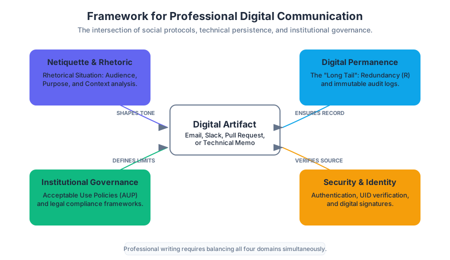
In the contemporary professional landscape, the distinction between "writing" and "digital communication" has effectively evaporated. Every memorandum, report, and proposal is mediated through digital layers, making an understanding of the technical and social protocols of these layers essential for any technical communicator. This section explores the intersection of human behavior (Netiquette), technical reality (Digital Permanence), institutional governance (Acceptable Use Policies), and security (Authentication), providing a comprehensive framework for professional conduct in the digital age.
Netiquette: The Rhetoric of Digital Interaction
Netiquette, a portmanteau of "network" and "etiquette," refers to the social and professional code of conduct governing online interaction. In technical and professional writing (TPW), netiquette is not merely about "politeness"; it is a specialized application of Rhetorical Analysis. A professional must evaluate the Audience, Purpose, and Context of every digital artifact—whether it is a Slack message, an email, or a pull request comment.
The Core Pillars of Professional Netiquette
- Human-Centricity (The Empathy Gap): Digital interfaces often mask the humanity of the recipient. The "Online Disinhibition Effect" suggests that users are more likely to be blunt or aggressive when shielded by a screen. Professional netiquette requires a conscious effort to bridge this gap.
- Efficiency and Clarity: Respecting the recipient's "cognitive load" is a primary netiquette rule. This aligns with the P.A.L.E.S. Criteria (Purpose, Audience, Layout, Ethics, and Style) found in technical communication.
- Cultural and Contextual Awareness: Digital communication is global. Symbols, idioms, and even time zones must be accounted for to maintain professional synergy.
| Feature | Academic Digital Tone | Professional Digital Tone |
|---|---|---|
| Primary Goal | Demonstrate knowledge/learning | Facilitate action/decision-making |
| Structure | Narrative/Argumentative | Scannable (Headings, Bullets) |
| Response Time | Flexible (Days) | Expected (Hours/Business Day) |
| Formatting | Standardized (APA/MLA) | Functional (AUP compliant, accessible) |
Definition: The Rhetorical Situation in Netiquette The rhetorical situation consists of the Exigence (the need that sparks the communication), the Audience (the individuals who can act on the information), and the Constraints (the digital platform's limitations and the organization's policies).
Technical Implementation of Communication Structures
To understand how netiquette is enforced at a systemic level, consider the low-level structure of a digital message. Even a simple "Professional Email" is a data structure that carries metadata defining its context.
/*
 * A low-level representation of a Professional Communication Packet
 * demonstrating the separation of Metadata (Context) and Payload (Content).
 */

#include <stdio.h>
#include <time.h>

typedef enum { EMAIL, SLACK, MEMO, SYSTEM_ALERT } ChannelType;

struct DigitalMessage {
    unsigned long message_id;
    char sender_uid[64];
    char recipient_uid[64];
    ChannelType channel;
    time_t timestamp;
    int priority_level; // 1 (Low) to 5 (Urgent)
    char* subject_line;
    char* body_content;
    char* digital_signature; // For Authentication
};

void validate_netiquette_metadata(struct DigitalMessage msg) {
    if (msg.subject_line == NULL || strlen(msg.subject_line) == 0) {
        printf("Violation: Professional messages require a descriptive subject line.\n");
    }
    if (msg.priority_level > 4 && msg.channel == SLACK) {
        printf("Warning: High-priority alerts should use formal channels per AUP.\n");
    }
}
Digital Permanence: The "Long Tail" of Professional Writing
Digital Permanence is the technical reality that digital data, once created and transmitted, is nearly impossible to fully "delete." For the professional writer, this means that every draft, every "private" message, and every archived email is a permanent record of their professional identity.
The Mechanics of Persistence
Digital information persists through three primary mechanisms:
- Redundancy (Backups): Enterprise systems automatically replicate data across multiple servers and geographic regions to prevent data loss.
- Caching and Indexing: Search engines and internal corporate databases index content, creating "snapshots" that remain even if the original source is modified.
- The "Streisand Effect": In a social context, attempting to remove information often leads to its further replication.
The Probability of Data Persistence
We can model the probability of a digital artifact $A$ remaining accessible over time $t$ as a function of its replication factor $R$ and the decay rate of the storage medium $\lambda$.
$$P(A_{exists}) = 1 - (1 - e^{-\lambda t})^R$$
As $R$ (the number of servers/backups) increases, the probability of the information disappearing approaches zero, even as time $t$ increases. This is why professional writers must assume a Public-Permanent status for all workplace communication.
% Pseudocode for a Distributed Persistence Logic
% Explaining why "Deleting" a message often fails in professional environments.

Algorithm: DeleteMessage(message_id, user_auth)
    1. Check user_auth.permissions
    2. Mark message_id as "HIDDEN" in Primary_Database
    3. Send "PURGE" request to CDN_Nodes
    4. IF (Backup_Interval_Reached) THEN
           Message remains in Cold_Storage_Archive (Immutable)
    5. RETURN "Message hidden from UI, but retained in audit logs."
Acceptable Use Policy (AUP): The Legal Framework
An Acceptable Use Policy (AUP) is a document outlining the constraints and practices that a user must agree to for access to a corporate or institutional network. It serves as a legal and ethical contract between the organization (e.g., Central Oregon Community College) and the user.
Key Components of a Standard AUP
Organizations use AUPs to mitigate risk, protect intellectual property, and ensure that resources are used for their intended purpose.
| AUP Clause | Technical Implication | Professional Rationale |
|---|---|---|
| Prohibited Content | Content filtering/Firewalls | Prevents hostile work environments and legal liability. |
| Resource Allocation | Bandwidth throttling | Ensures critical business systems remain operational. |
| Privacy Expectation | SSL Decryption/Log Monitoring | Establishes that "private" use of company gear is not private. |
| Intellectual Property | Data Loss Prevention (DLP) | Protects the organization's proprietary research and data. |
Example: AUP Enforcement via Configuration
In a modern enterprise, AUPs are not just "read"; they are enforced via code. Below is a conceptual configuration for an Identity and Access Management (IAM) policy that enforces AUP-related restrictions.
# IAM Policy: AUP_Enforcement_Standard
Version: "2023-10-01"
Statement:
  - Effect: Allow
    Action:
      - "tpw_platform:ReadContent"
      - "tpw_platform:SubmitReport"
    Resource: "*"
    Condition:
      Bool:
        "user:AgreedToAUP": true
  - Effect: Deny
    Action: "tpw_platform:ExportBulkData"
    Resource: "arn:tpw:database/sensitive_records/*"
    Condition:
      StringNotEquals:
        "aws:SourceVpc": "vpc-corporate-secure-01"
User Authentication and Security
In the context of TPW, User Authentication is the process of verifying the identity of a user attempting to access a system. This is the first line of defense in maintaining the integrity of professional documents.
The Three Factors of Authentication
- Knowledge: Something you know (Password, PIN).
- Possession: Something you have (Smartphone, Security Key, Token).
- Inherence: Something you are (Fingerprint, Facial Recognition).
Theorem: The Strength of Multi-Factor Authentication (MFA) The security of an authentication system increases exponentially with the addition of independent factors. If the probability of compromising a password is $P_p$ and a physical token is $P_t$, the probability of a total breach $P_b$ is $P_p \times P_t$, assuming the factors are uncorrelated.
Account Recovery and Localization
A professional login interface (as seen in the TPW platform) must account for human error and diversity.
- Account Recovery: Uses "Out-of-Band" (OOB) communication (email/SMS) to reset credentials, maintaining the chain of trust.
- Language Localization: Professionalism requires accessibility. Providing interfaces in English (US, UK, Canada) or Français is not just a courtesy; it is a requirement for global technical communication.
Real-World Usage: Authenticating via API
Technical writers often interact with systems via CLI or API. Understanding the underlying authentication flow (like OAuth2 or JWT) is critical.
# Example: Authenticating with a Professional Writing Platform API
# 1. Request a JSON Web Token (JWT) using credentials
curl -X POST https://api.tpw-platform.edu/v1/login \
     -H "Content-Type: application/json" \
     -d '{"username": "w_fleming", "password": "secure_password_123"}' \
     -o token.json

# 2. Use the token to access protected documentation
TOKEN=$(jq -r '.access_token' token.json)
curl -H "Authorization: Bearer $TOKEN" \
     https://api.tpw-platform.edu/v1/documents/aup_handbook.pdf
Conflict Resolution in Digital Spaces
Digital communication lacks the non-verbal cues (tone of voice, body language) that facilitate understanding in person. This often leads to "Team Friction." Effective Conflict Resolution in a digital environment requires a structured, evidence-based approach.
Strategies for Digital De-escalation
- The 24-Hour Rule: If a digital interaction triggers an emotional response, wait 24 hours before responding. This allows the "Exigence" to settle and the "Purpose" to remain professional.
- Medium Switching: If a text-based conflict persists, move to a high-bandwidth medium (Video call or Face-to-Face).
- Goal Alignment: Re-center the conversation on the shared project goals rather than personal grievances.
| Strategy | When to Use | Digital Implementation |
|---|---|---|
| Competing | Urgent issues where a "right" answer is critical. | Explicit "Admin" override in project management software. |
| Collaborating | When both sets of concerns are too important to be compromised. | Shared "Living Documents" (Google Docs, Notion) with comments. |
| Compromising | When goals are important but not worth the effort of potential disruption. | Version control branching and merging (Git). |
| Avoiding | When an issue is trivial or symptomatic of a larger problem. | Muting notifications or "parking" a thread for later. |
Common Pitfalls in Digital Professionalism
- The "Reply All" Trap: Failing to analyze the audience before hitting send, leading to information overload for uninvolved parties.
- Informality Creep: Treating professional emails like text messages (e.g., using emojis, lack of capitalization). While some cultures allow this, it is safer to maintain a formal baseline.
- Ignoring Metadata: Forgetting that document properties (Author name, Edit time, Comments) are often preserved in the final PDF or Word file sent to a client.
- AUP Complacency: Assuming that because "everyone does it" (e.g., checking personal social media on a work laptop), it is not a violation of policy.
The Rhetorical Situation: Purpose and Audience
Key concepts: Rhetorical Situation · Exigence · General vs. Specific Purpose · Communicating vs. Convincing
Introduces the framework for analyzing the interplay between writer, audience, purpose, and context.
The Rhetorical Situation: Purpose and Audience
In the field of technical and professional writing (TPW), a document never exists in a vacuum. Every piece of communication—from a high-level architectural decision record (ADR) to a simple "Reset Password" email—is born from a specific set of circumstances known as the Rhetorical Situation.
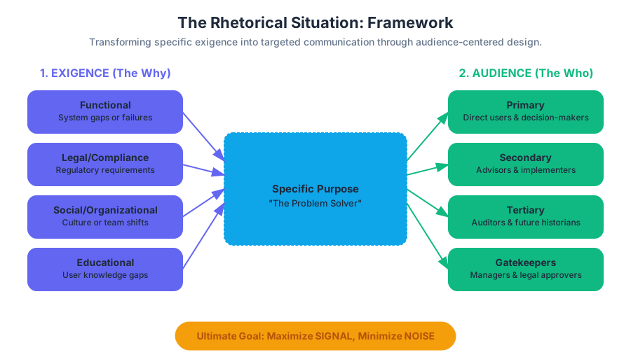
The rhetorical situation is the ecosystem in which a message is created, transmitted, and received. It is the fundamental framework that dictates the "shape" of the content. Without a rigorous analysis of this situation, a writer risks producing "noise" rather than "signal." In technical domains, where the cost of misunderstanding can range from minor user frustration to catastrophic system failure, mastering the rhetorical situation is not a soft skill; it is a core engineering requirement.
The Genesis of Communication: Exigence
The first component of any rhetorical situation is Exigence. Coined by rhetorical theorist Lloyd Bitzer, exigence is defined as "an imperfection marked by urgency; it is a defect, an obstacle, something waiting to be done, a thing which is other than it should be."
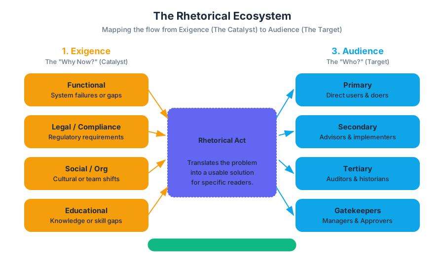
In technical writing, exigence is the "Why now?" of a document. It is the catalyst that transforms a silent state into a communicative act. If there is no exigence, there is no need for the document.
Categorizing Exigence
Exigence can be broadly categorized into two types: Natural and Rhetorical. A natural exigence (like a hurricane) cannot be modified by talk. A rhetorical exigence is one that can be positively modified through the intervention of a message.
| Exigence Type | Source | Example in Technical Context | Resolution Strategy |
|---|---|---|---|
| Functional | System failure or gap | A critical API endpoint is deprecated. | Update documentation and issue a migration guide. |
| Legal/Compliance | Regulatory requirements | GDPR or CCPA mandates new data handling disclosures. | Draft a Privacy Impact Assessment or updated Terms of Service. |
| Social/Organizational | Cultural or team shifts | A team is moving from Waterfall to Agile. | Create a "Ways of Working" handbook or Wiki. |
| Educational | Knowledge gap | Users are consistently failing to complete a specific onboarding step. | Design a troubleshooting FAQ or an interactive tutorial. |
The Imperative of "The Problem"
To identify the exigence, the writer must ask: What is the problem that this document is intended to solve? If the writer cannot name the problem, the document will lack focus. For example, the exigence for a README.md file isn't "I need to describe my code"; it is "Users cannot run this software without knowing the dependencies and build commands."
The Target: Audience Analysis
The Audience is the most critical variable in the rhetorical equation. In technical communication, we move away from the "general public" and toward specific personas with varying levels of expertise, interest, and authority.
Definition: Audience-Centered Design A methodology where the writer prioritizes the reader's needs, background, and environment over the writer's own preferences. The goal is to minimize the cognitive load required for the reader to extract and use information.
The Audience Hierarchy
Most technical documents serve multiple audiences simultaneously. We categorize them based on their proximity to the information and their role in the decision-making process.
| Audience Tier | Description | Typical Knowledge Level | Goal |
|---|---|---|---|
| Primary | The direct users or decision-makers. | High (Technical) or Low (End-user) | To perform a task or make a choice. |
| Secondary | Advisors or implementers (e.g., Legal, HR, Finance). | Specialized but non-domain | To verify compliance or feasibility. |
| Tertiary | External observers, auditors, or future historians. | Variable | To ensure long-term record-keeping or safety. |
| Gatekeepers | Managers or editors who must approve the text. | High (Managerial) | To ensure the document meets brand/safety standards. |
Quantifying Audience Knowledge: The Readability Implementation
To objectively assess if a document matches its audience, we often use readability metrics. Below is a low-level implementation of the Flesch-Kincaid Grade Level algorithm, which estimates the years of education required to understand a text based on sentence length and syllable count.
import re

def calculate_flesch_kincaid(text):
    """
    Calculates the Flesch-Kincaid Grade Level.
    Formula: 0.39 * (total_words / total_sentences) + 11.8 * (total_syllables / total_words) - 15.59
    """
    sentences = len(re.split(r'[.!?]+', text)) - 1
    words = len(text.split())

    # Simple syllable counter (heuristic-based)
    def count_syllables(word):
        word = word.lower()
        count = 0
        vowels = "aeiouy"
        if word[0] in vowels:
            count += 1
        for index in range(1, len(word)):
            if word[index] in vowels and word[index - 1] not in vowels:
                count += 1
        if word.endswith("e"):
            count -= 1
        if count == 0:
            count = 1
        return count

    syllables = sum(count_syllables(word) for word in text.split())

    if sentences == 0 or words == 0:
        return 0

    grade_level = 0.39 * (words / sentences) + 11.8 * (syllables / words) - 15.59
    return round(grade_level, 2)

# Example usage for a technical audience vs. a lay audience
tech_doc = "The asynchronous execution of the callback ensures non-blocking I/O operations."
lay_doc = "The computer will keep working while it waits for your file to save."

print(f"Tech Doc Grade Level: {calculate_flesch_kincaid(tech_doc)}")
print(f"Lay Doc Grade Level: {calculate_flesch_kincaid(lay_doc)}")
The Objective: General vs. Specific Purpose
Every document has a Purpose, but technical writers distinguish between the broad intent and the granular outcome.
General Purpose
The general purpose is the high-level rhetorical mode. In TPW, we rarely "entertain" or "express" ourselves. We primarily:
- Inform: Provide facts and data (e.g., a status report).
- Instruct: Guide a user through a process (e.g., a user manual).
- Persuade: Convince a reader to take a specific action (e.g., a proposal).
Specific Purpose
The specific purpose is a concrete statement of what the document should achieve for both the writer and the reader. It is often written as a "Purpose Statement" at the beginning of a project.
The Purpose Formula: "The purpose of this [Document Type] is to [Action Verb] [Target Audience] so that they can [Result/Outcome]."
Mathematical Representation of Purpose Alignment
We can model the "Purpose Gap" ($\Delta P$) as the difference between the Information Provided ($I_p$) and the Information Required ($I_r$) by the audience to achieve the specific goal.
\Delta P = \int_{t_0}^{t_f} |I_r(t) - I_p(t)| dt
Where:
- $I_r(t)$ is the information the user needs at time $t$ to complete a task.
- $I_p(t)$ is the information provided by the document.
- The goal of the technical writer is to minimize $\Delta P$ such that $\Delta P \to 0$.
Communicating vs. Convincing: The Spectrum of Rhetoric
A common misconception in technical writing is that it is "objective" and therefore non-persuasive. In reality, all communication involves a degree of persuasion.
Communicating (Information Transfer)
The primary goal here is fidelity. The writer acts as a conduit, moving data from a source to a receiver with minimal distortion. This is the "What" and the "How."
Convincing (Persuasion)
The goal here is adherence. The writer must convince the reader that:
- The information is credible (Ethos).
- The logic is sound (Logos).
- The recommended action is urgent (Pathos/Exigence).
Comparison of Informative vs. Persuasive Rhetoric
| Feature | Informative (Communicating) | Persuasive (Convincing) |
|---|---|---|
| Primary Goal | Understanding | Agreement/Action |
| Tone | Neutral, detached | Professional, authoritative |
| Structure | Sequential or hierarchical | Problem-Solution or Comparative |
| Evidence | Raw data, specifications | Benefits, ROI, case studies |
| Example | API Reference Library | Project Proposal for a new API |
Real-World Usage: Structuring for Audience and Purpose
In modern documentation systems, we use structured formats like YAML to define the rhetorical metadata of a document. This ensures that the purpose and audience are explicitly tracked.
# document_metadata.yaml
document_id: "ARCH-2023-004"
title: "Migration to Microservices Architecture"
rhetorical_situation:
  exigence: "Current monolithic system has reached 95% CPU utilization; scaling is no longer cost-effective."
  general_purpose: "Persuade"
  specific_purpose: "To convince the CTO to approve a $200k budget for microservices migration by Q3."

audience_analysis:
  primary:
    role: "CTO / VP of Engineering"
    knowledge_level: "High (Architectural), Low (Implementation details)"
    primary_concern: "Cost, Risk, Timeline"
  secondary:
    role: "DevOps Team"
    knowledge_level: "Expert"
    primary_concern: "Maintainability, Deployment Pipeline"

constraints:
  format: "PDF for Board Presentation"
  length_limit: "10 pages"
  legal_review_required: true
The Rhetorical Triangle and Constraints
To synthesize these concepts, we look at the Rhetorical Triangle (Writer, Audience, Message) situated within a Context.
- The Writer (Ethos): What is your relationship to the audience? Are you an expert, a peer, or a subordinate? Your persona dictates the tone.
- The Message (Logos): Is the information accurate, complete, and logically organized?
- The Audience (Pathos): What are their biases, fears, or motivations?
- The Context: This includes the Constraints. Constraints are the "rules of the game"—deadlines, page limits, software requirements, or cultural norms.
Worked Example: The "Server Down" Incident Report
- Exigence: The production server crashed for 4 hours on a Tuesday.
- Audience:
- Primary: The Client (Angry, non-technical).
- Secondary: The Engineering Manager (Needs to know the root cause).
- Purpose: To inform the manager of the technical fix and to persuade the client that the company is still reliable.
- Constraint: Must be delivered within 24 hours of the incident.
Common Pitfalls in Rhetorical Analysis
- The "Expert Blindness" Trap: Writing for yourself rather than the audience. Using jargon that the primary audience doesn't understand.
- Misidentifying Exigence: Writing a 50-page manual when the user just needs a 1-page "Quick Start" guide.
- Vague Purpose: Using "To inform" as a specific purpose. (Correct: "To inform the user how to calibrate the sensor.")
- Ignoring Constraints: Writing a long, beautiful report that is ignored because the manager only reads emails on their phone.
Summary of the Rhetorical Workflow
To implement this in a professional setting, follow this pipeline:
- Identify Exigence: What triggered this? What is the "imperfection"?
- Define Purpose: Draft the "Purpose Formula" statement.
- Profile Audience: Map out primary and secondary readers. Use a table to list their knowledge levels and concerns.
- Assess Constraints: What are the hard limits (time, format, tools)?
- Select Strategy: Based on the above, choose a tone (Communicating vs. Convincing) and a structure.
Advanced Audience Analysis
Key concepts: Audience Profile Sheet · Needs Assessment Template · Primary vs. Secondary Readers · Skimmers and Skeptics · Intended vs. Unintended Audience
Practical tools and strategies for profiling readers, including the Needs Assessment Template and the Audience Profile Sheet.
Advanced Audience Analysis
In the realm of technical communication, the audience is not a passive recipient of information; it is a dynamic system of constraints, expectations, and cognitive biases. Advanced Audience Analysis is the rigorous process of mapping these variables to ensure that a document achieves its intended rhetorical effect. While academic writing often targets a generalized "educated reader," technical writing targets specific stakeholders with distinct operational needs.
To master this, one must move beyond demographic surface-level data and into the psychographics and situational contexts of the readers. This involves quantifying knowledge gaps, anticipating resistance, and designing for varied reading modalities.
The Audience Profile Sheet (APS)
The Audience Profile Sheet (APS) is a diagnostic instrument used to formalize the attributes of the target reader. It serves as the "requirements document" for the writing process. In professional environments, an APS prevents "scope creep" in content by pinning down exactly who the information is for and, equally importantly, who it is not for.
What it is
An APS is a structured data set—often a table or a formal document—that categorizes the reader’s technical expertise, professional role, cultural background, and attitude toward the subject matter.
Why it matters
Without a formalized APS, writers often default to "writing for themselves" or for an imaginary version of the reader that possesses the same context as the author. This leads to the Curse of Knowledge, where the writer assumes the reader understands jargon or logic leaps that are actually opaque.
How it works: The Parameters of Analysis
The APS typically evaluates four primary dimensions:
| Dimension | Parameters | Metric/Value |
|---|---|---|
| Technical Depth | Vocabulary, conceptual familiarity, tool-chain knowledge | Expert, Informed, Layperson |
| Operational Context | Physical environment, time constraints, device usage | Mobile/Field, Office, High-Stress |
| Attitudinal State | Receptivity to message, existing biases, urgency | Positive, Neutral, Skeptical, Hostile |
| Demographics | Language proficiency, education level, cultural norms | Variable |
Implementation: Readability Scoring
To ensure the document matches the APS, we can use automated tools to calculate the linguistic complexity. Below is a Python implementation of a readability analyzer that checks if a text block aligns with a specific audience profile.
import re
import math

def calculate_flesch_kincaid(text):
    """
    Calculates the Flesch-Kincaid Grade Level.
    Formula: 0.39 * (total_words / total_sentences) + 11.8 * (total_syllables / total_words) - 15.59
    """
    sentences = len(re.findall(r'[.!?]+', text))
    words = len(re.findall(r'\w+', text))

    # Simple syllable counter (approximation)
    def count_syllables(word):
        word = word.lower()
        count = 0
        vowels = "aeiouy"
        if word[0] in vowels:
            count += 1
        for index in range(1, len(word)):
            if word[index] in vowels and word[index - 1] not in vowels:
                count += 1
        if word.endswith("e"):
            count -= 1
        if count == 0:
            count = 1
        return count

    syllables = sum(count_syllables(w) for w in re.findall(r'\w+', text))

    if sentences == 0 or words == 0:
        return 0

    grade_level = 0.39 * (words / sentences) + 11.8 * (syllables / words) - 15.59
    return round(grade_level, 2)

# Example Usage for an 'Informed Layperson' profile (Target Grade: 8-10)
sample_doc = """The implementation of the new API requires a secure handshake protocol.
Users must authenticate via the OAuth2 gateway before accessing the database."""

print(f"Document Grade Level: {calculate_flesch_kincaid(sample_doc)}")
Needs Assessment Template
While the APS focuses on who the reader is, the Needs Assessment focuses on what the reader must accomplish. It is an exigence-based analysis that identifies the gap between the reader's current state and their desired goal.
The Logic of Needs Assessment
We can formalize the "Need" ($N$) as the difference between the Required Knowledge ($K_r$) for a task and the Current Knowledge ($K_c$) of the audience, mediated by the Situational Urgency ($U$).
N = (K_r - K_c) \times U
If $K_c \geq K_r$, the document may be redundant. If $K_r \gg K_c$, the document requires significant scaffolding (glossaries, tutorials).
Components of the Template
A robust Needs Assessment covers the following:
- Task Analysis: What specific actions will the reader take?
- Information Gaps: What specific data points are currently missing?
- Constraint Identification: What limits the reader’s ability to use the info (e.g., "Must be readable in low-light conditions")?
Primary vs. Secondary Readers
In complex organizational ecosystems, a single document rarely has one reader. We categorize these into a hierarchy of influence.
Primary Audience: The person or group who will act upon the information or for whom the document is directly intended (e.g., the technician following a manual).
Secondary Audience: Individuals who may advise the primary reader or who are affected by the actions taken (e.g., the legal department reviewing the manual for liability).
Comparison of Audience Roles
| Feature | Primary Audience | Secondary Audience |
|---|---|---|
| Action Level | Direct implementation | Oversight, validation, or support |
| Knowledge Focus | How-to, procedural, technical specs | Legal, financial, or strategic impact |
| Reading Style | Intensive, sequential | Selective, reference-based |
| Example | Software Developer | Project Manager / CTO |
Worked Example: The Security Audit Report
Consider a report on a data breach:
- Primary Audience: The IT Security Team. They need the raw logs, the exploit vector, and the patch requirements.
- Secondary Audience: The Legal Team. They need to know if PII (Personally Identifiable Information) was leaked to determine if they must notify the state.
- Tertiary Audience: The Board of Directors. They need a high-level summary of the financial risk and the "bottom line" on brand reputation.
Skimmers and Skeptics
Readers do not consume technical content like they consume a novel. They adopt specific cognitive postures based on their goals.
The Skimmer
Skimmers are high-velocity readers. They are often "Primary" readers in a hurry or "Tertiary" readers looking for the "so-what." They look for headings, bolded text, and bulleted lists.
- Strategy: Use the Inverted Pyramid style. Put the most important information (the conclusion or the "ask") at the very top. Use high-contrast document design.
The Skeptic
Skeptics are readers who are looking for reasons to disagree with your findings or to find flaws in your logic. These are often peer reviewers, auditors, or competing stakeholders.
- Strategy: Provide "Proof Burdens." Use extensive citations, data appendices, and transparent methodology sections. Anticipate counter-arguments and address them in a "Limitations" or "FAQ" section.
Design Strategies for Mixed Modalities
| Design Element | Benefit to Skimmer | Benefit to Skeptic |
|---|---|---|
| Executive Summary | Provides the answer in 30 seconds. | Sets the scope of the argument. |
| Data Tables | Allows for quick value-checking. | Provides the raw evidence for verification. |
| Internal Hyperlinks | Allows for non-linear navigation. | Allows for deep-diving into sources. |
| Appendices | Can be safely ignored. | Essential for validating the "how." |
Intended vs. Unintended Audience
One of the most dangerous pitfalls in technical writing is the Unintended Audience. In the digital age, documents are rarely "deleted"; they are leaked, archived, or subpoenaed.
Intended Audience
These are the people you want to read the document. You have analyzed them, used the APS, and tailored your tone to them.
Unintended Audience
These are readers you did not design the document for, but who may gain access to it.
- The Public/Media: A leaked internal memo about product flaws.
- Legal/Courts: Internal Slack logs or emails used as evidence in a lawsuit.
- Competitors: Proprietary processes revealed in a poorly secured white paper.
Risk Mitigation: The "Front Page" Rule
A common heuristic in professional writing is: Never write anything in a technical document that you would be ashamed to see on the front page of a national newspaper.
Configuration Example: Audience Metadata
In modern documentation-as-code (DaC), we can use YAML front-matter to explicitly define audience parameters, which can then be used by static site generators to show/hide content.
# document_metadata.yml
title: "Cloud Infrastructure Migration Guide"
version: 2.4.1
audience:
  primary: "DevOps Engineers"
  secondary: ["Project Managers", "Security Auditors"]
  expertise_level: "Advanced"
  security_clearance: "Internal-Only"
access_control:
  unintended_audience_risk: "High"
  redaction_required: true
Common Pitfalls in Audience Analysis
- The "Average User" Fallacy: Designing for an "average" user often results in a document that is too simple for experts and too complex for beginners. Instead, design for the Complex Audience by layering information (e.g., a "Quick Start" guide followed by "Deep Dive" chapters).
- Tone Mismatch: Using overly formal language for a field technician or overly casual language for a C-suite executive.
- Ignoring the "Physical" Audience: Forgetting that the reader might be wearing gloves (requiring larger buttons/pages) or using a screen reader (requiring Alt-text).
Comparison of Tone and Context
| Context | Recommended Tone | Pitfall to Avoid |
|---|---|---|
| Emergency Procedures | Imperative, direct, brief | Politeness markers ("Please consider...") |
| Research Proposal | Persuasive, evidence-based | Over-confidence or lack of citations |
| Internal Memo | Professional, collaborative | Jargon that excludes new hires |
Summary of the Analytical Pipeline
To perform an advanced audience analysis, follow this algorithmic approach:
- Identify the Exigence: Why is this document being written now?
- Map the Stakeholders: List all Primary, Secondary, and potential Unintended readers.
- Execute the APS: Fill out the profile sheet for the Primary reader.
- Conduct Needs Assessment: Identify the specific delta between what they know and what they need to do.
- Select the Modality: Choose a document design that satisfies both Skimmers (via layout) and Skeptics (via evidence).
- Review for Unintended Exposure: Sanitize the document for "worst-case" readers.
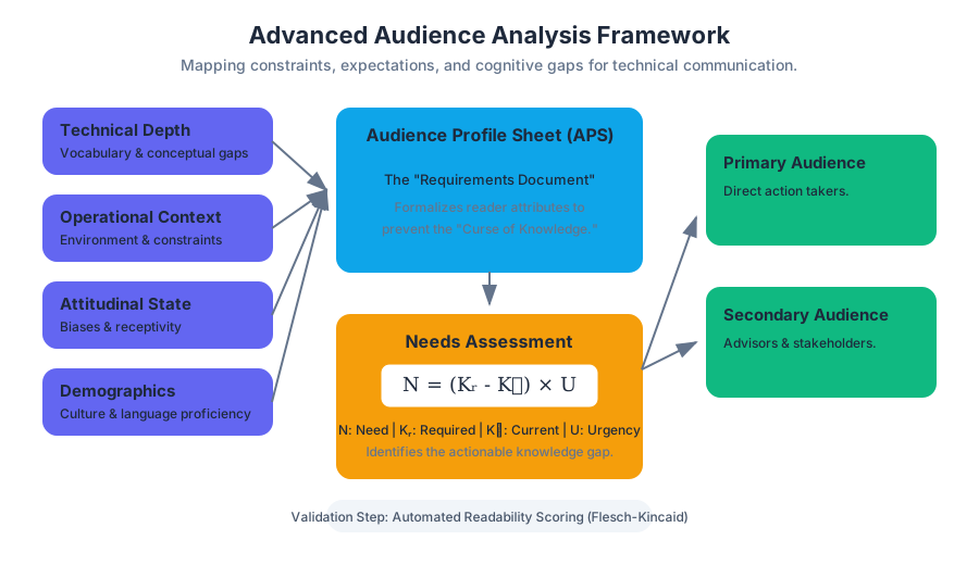
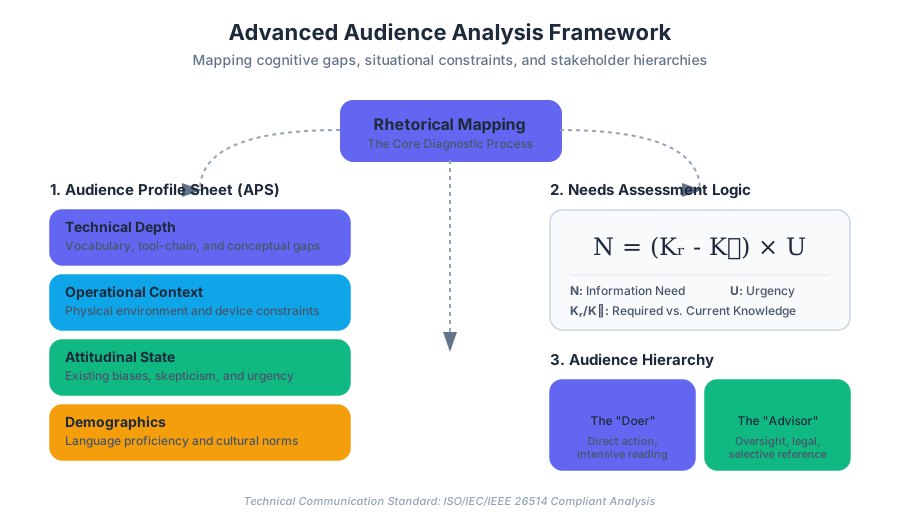
Intercultural Communication and Sensitivity
Key concepts: Ethnocentrism vs. Ethnorelativism · High-context vs. Low-context Cultures · Developmental Model of Intercultural Sensitivity (DMIS) · Gender-neutral and Inclusive Language
Explores how cultural dimensions influence communication and provides guidelines for inclusive, global writing.
Intercultural Communication and Sensitivity
In the contemporary landscape of technical and professional writing (TPW), the "audience" is rarely a monolithic entity residing within a single geographic or linguistic border. As digital infrastructure collapses physical distances, the technical communicator must operate as a cultural mediator. Intercultural communication is the study and practice of how individuals from different cultural backgrounds interact, perceive information, and negotiate meaning. For the technical writer, this is not merely a matter of "politeness" but a critical requirement for usability, safety, and rhetorical effectiveness.
Sensitivity in this context refers to the ability to decode the cultural variables that influence how a document is received. When we ignore these variables, we risk ethnocentrism—the assumption that our own cultural norms are the "correct" or "default" way of communicating. Moving toward ethnorelativism allows a writer to design information that respects the cognitive load and cultural expectations of a global user base.
Ethnocentrism vs. Ethnorelativism
The transition from an ethnocentric mindset to an ethnorelative one is the foundational journey of a professional communicator. These are not binary states but poles on a developmental spectrum.
The Ethnocentric Phase
Ethnocentrism is the tendency to view the world through the lens of one’s own culture, often leading to the belief that one's own group is centrally important and all others are measured in relation to it. In technical writing, this manifests as:
- Using localized metaphors (e.g., "hit a home run" in a software manual).
- Assuming a specific reading direction (Left-to-Right) is universal.
- Defaulting to Western-centric naming conventions (First Name, Last Name) in database schemas.
The Ethnorelative Phase
Ethnorelativism is the acquired ability to see many values and behaviors as cultural rather than universal. An ethnorelative writer understands that "clarity" is a culturally defined concept. For example, while a North American audience might find a direct, "bottom-line-up-front" (BLUF) approach clear, a high-context audience might find it abrasive or even confusing.
| Feature | Ethnocentrism | Ethnorelativism |
|---|---|---|
| Perspective | My culture is the standard. | My culture is one of many equally valid systems. |
| Communication Goal | Efficiency based on local norms. | Effectiveness based on audience norms. |
| Handling Difference | Difference is a problem to be corrected. | Difference is a variable to be integrated. |
| Design Approach | One-size-fits-all. | Localization and culturalization. |
The Developmental Model of Intercultural Sensitivity (DMIS)
Developed by Milton Bennett, the Developmental Model of Intercultural Sensitivity (DMIS) provides a framework for understanding how people experience and engage with cultural difference. For technical writers, the DMIS serves as a diagnostic tool to assess both their own biases and the potential "cultural friction" of their documents.
The Six Stages of DMIS
The model moves from three "ethnocentric" stages to three "ethnorelative" stages:
- Denial: The individual does not recognize cultural differences or views them in very broad, simplistic terms.
- Defense: Cultural difference is perceived as a threat. The individual may believe their culture is superior ("Us vs. Them").
- Minimization: Differences are acknowledged but trivialized. The focus is on "human universality" (e.g., "Deep down, we're all the same"), which often masks the writer's own cultural dominance.
- Acceptance: The individual recognizes and respects that other cultures have different ways of organizing human existence.
- Adaptation: The individual can consciously shift their perspective and behavior to communicate more effectively in a different cultural context.
- Integration: The individual’s identity includes multiple cultural frames of reference.
Key Insight: Most professional writers operate at the Minimization stage by default. They believe that by using "plain English," they are being universal. However, true intercultural competence requires moving into Adaptation, where the document's structure, tone, and visual cues are modified for the specific target culture.
Implementation in Technical Logic
To implement intercultural sensitivity at a technical level, we must move beyond prose into the logic of our systems. Consider the following Python implementation of a locale-aware formatting engine that handles cultural differences in data representation.
import locale
from datetime import datetime

class CulturalFormatter:
    """
    A low-level implementation for ensuring data representation
    respects ethnorelative design principles.
    """
    def __init__(self, target_locale: str):
        self.target_locale = target_locale
        try:
            locale.setlocale(locale.LC_ALL, target_locale)
        except locale.Error:
            print(f"Locale {target_locale} not supported. Defaulting to C.")
            locale.setlocale(locale.LC_ALL, 'C')

    def format_currency(self, amount: float) -> str:
        return locale.currency(amount, grouping=True)

    def format_date(self, dt: datetime) -> str:
        # Avoids the MM/DD/YYYY vs DD/MM/YYYY ambiguity by using
        # locale-specific long formats or ISO-8601
        return dt.strftime(locale.nl_langinfo(locale.D_T_FMT))

    def get_reading_direction(self) -> str:
        # Logic to determine UI layout (LTR vs RTL)
        rtl_locales = ['ar', 'he', 'fa', 'ur']
        return "RTL" if any(self.target_locale.startswith(l) for l in rtl_locales) else "LTR"

# Usage
formatter = CulturalFormatter('ja_JP.UTF-8')
print(formatter.format_currency(1250.50)) # Output: ¥1,251
High-Context vs. Low-Context Cultures
Anthropologist Edward T. Hall introduced the concept of Context to describe how information is exchanged. This is perhaps the most critical concept for technical writers to master, as it dictates the required "density" of a manual or report.
Low-Context Communication
In Low-Context cultures (e.g., Germany, USA, Scandinavia), the mass of the information is vested in the explicit code (the words).
- Characteristics: Directness, transparency, specificity.
- Writing Style: "Say what you mean." Use of imperatives, numbered lists, and explicit transitions.
- Assumption: The reader knows nothing unless it is written on the page.
High-Context Communication
In High-Context cultures (e.g., Japan, China, Arab nations, France), much of the information is either in the physical context or internalized in the person.
- Characteristics: Indirectness, emphasis on relationship, reading "between the lines."
- Writing Style: Nuanced, formal, often prioritizing the "why" or the "who" before the "how."
- Assumption: The reader shares a common understanding; over-explaining can be seen as insulting or patronizing.
| Parameter | Low-Context (Explicit) | High-Context (Implicit) |
|---|---|---|
| Message Focus | Task-oriented | Relationship-oriented |
| Information Flow | Linear, structured | Circular, holistic |
| Role of Silence | Uncomfortable; needs filling | Meaningful; indicates reflection |
| Conflict Resolution | Direct confrontation | Face-saving; indirect |
| Technical Manuals | Step-by-step, exhaustive | Conceptual, visual, contextual |
Mathematical Derivation of Contextual Entropy
We can model the "Context" of a culture as a function of information entropy. In a low-context system, the probability $P$ of understanding a message $M$ depends almost entirely on the signal $S$. In a high-context system, it depends on the signal $S$ plus the shared environmental knowledge $E$.
$$P(M) = f(S, E)$$
In Low-Context: $$\frac{\partial P}{\partial S} \gg \frac{\partial P}{\partial E}$$ (The message is highly sensitive to changes in the text/signal).
In High-Context: $$\frac{\partial P}{\partial S} \approx \frac{\partial P}{\partial E}$$ (The message is equally dependent on the text and the surrounding cultural environment).
Gender-Neutral and Inclusive Language
Inclusive language is the practice of using vocabulary that avoids exclusion or stereotyping. In technical writing, this is not a matter of "political correctness" but of precision. If a user manual says, "The administrator should use his password," it is factually incorrect if the administrator is not male.
Core Principles of Inclusive TPW
- Gender Neutrality: Use "they/them" as a singular pronoun or restructure sentences to avoid gendered pronouns entirely.
- Disability-First vs. Identity-First: Use "person with a disability" (person-first) or "disabled person" (identity-first) based on the community's preference, but generally avoid "handicapped" or "crippled."
- Cultural Sensitivity: Avoid terms with colonial or violent histories (e.g., "master/slave" in database architecture, "whitelist/blacklist").
Transformation Table: Exclusive to Inclusive
| Exclusive/Biased Term | Inclusive Alternative | Reasoning |
|---|---|---|
Man-hours |
Person-hours / Work-hours |
Gender-neutral; focuses on the task. |
Master/Slave |
Primary/Secondary / Main/Replica |
Removes racially charged metaphors. |
Guys (to a group) |
Team / Everyone / Folks |
Avoids gendered assumptions. |
Normal user |
Typical user / Standard user |
"Normal" implies others are "abnormal." |
Sanity check |
Confidence check / Quick check |
Avoids ableist language regarding mental health. |
Automated Linting for Inclusivity
Technical teams often use linters to enforce inclusive language. Below is a configuration for Vale, a popular prose linter, to catch non-inclusive terms in Markdown documentation.
# .vale.ini configuration snippet
StylesPath = styles
MinAlertLevel = suggestion

[*.md]
BasedOnStyles = Vale, Microsoft, Inclusivity

# Custom rule to flag "master/slave"
Inclusivity.Terminology = YES
Inclusivity.GenderBias = YES

# Example of a custom rule definition (styles/Inclusivity/Terminology.yml)
extends: substitution
message: "Use '%s' instead of '%s'."
level: error
ignorecase: true
patterns:
  - master/slave: primary/secondary
  - whitelist: allowlist
  - blacklist: denylist
  - manpower: workforce
Managing Idioms and Metaphors
Idioms are the "landmines" of intercultural communication. An idiom is a phrase where the meaning cannot be derived from the individual words (e.g., "under the weather").
The Problem with Idioms in TPW
Technical writing aims for a 1:1 mapping between signifier and signified. Idioms break this mapping.
- Translation Failure: Machine translation (like Google Translate) often translates idioms literally, resulting in nonsense.
- Cognitive Load: Non-native speakers must spend extra cycles decoding the metaphor rather than the technical instruction.
Worked Example: De-Idiomizing a Technical Memo
- Original: "We need to hit the ground running on this project. If we cut corners now, we’ll end up in the weeds during the QA phase."
- Analysis:
- "Hit the ground running": Cultural metaphor for starting quickly.
- "Cut corners": Metaphor for skipping steps.
- "In the weeds": Metaphor for being overwhelmed by detail.
- Revised for Global Audience: "We must begin this project immediately. If we skip the initial safety protocols, we will face complex errors during the Quality Assurance (QA) phase."
Practical Application: The Localization (L10n) Pipeline
Professional technical communication involves a pipeline that moves from Internationalization (i18n) to Localization (L10n).
- Internationalization (i18n): Designing the document or software so it can be adapted to various languages and regions without engineering changes.
- Localization (L10n): The actual process of adapting the i18n-ready document for a specific locale (translating text, changing date formats, adjusting colors).
Real-World Usage: JSON Translation Files
In modern web documentation, text is often abstracted into JSON files to allow for easy localization.
{
  "en-US": {
    "welcome_message": "Welcome, Administrator!",
    "error_access_denied": "You do not have permission to view this page.",
    "date_format": "MM/DD/YYYY"
  },
  "fr-FR": {
    "welcome_message": "Bienvenue, Administrateur !",
    "error_access_denied": "Vous n'avez pas l'autorisation de consulter cette page.",
    "date_format": "DD/MM/YYYY"
  },
  "ar-SA": {
    "welcome_message": "مرحباً، المدير!",
    "error_access_denied": "ليس لديك إذن لعرض هذه الصفحة.",
    "date_format": "YYYY/MM/DD"
  }
}
Common Pitfalls and Edge Cases
The "Universal Icon" Myth
Writers often assume icons are universal. However, a "mailbox" icon for email looks different in different countries. A "thumbs up" is an affirmative in the US but offensive in parts of the Middle East.
- Solution: Always pair icons with text labels.
Over-Simplification
In an attempt to be "sensitive," writers sometimes "dumb down" the content. This is a form of Defense in the DMIS model.
- Solution: Maintain technical rigor while simplifying the linguistic structure. Use Simplified Technical English (STE), which limits the vocabulary and restricts sentence length without losing technical depth.
The "False Friend" in Translation
Words that look the same in two languages but have different meanings (e.g., "Actual" in English means "current" in Spanish/Portuguese/German).
- Solution: Use a glossary of terms for translators to ensure "Actual" is translated as "Current" rather than "Real."
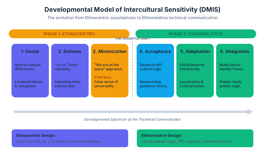
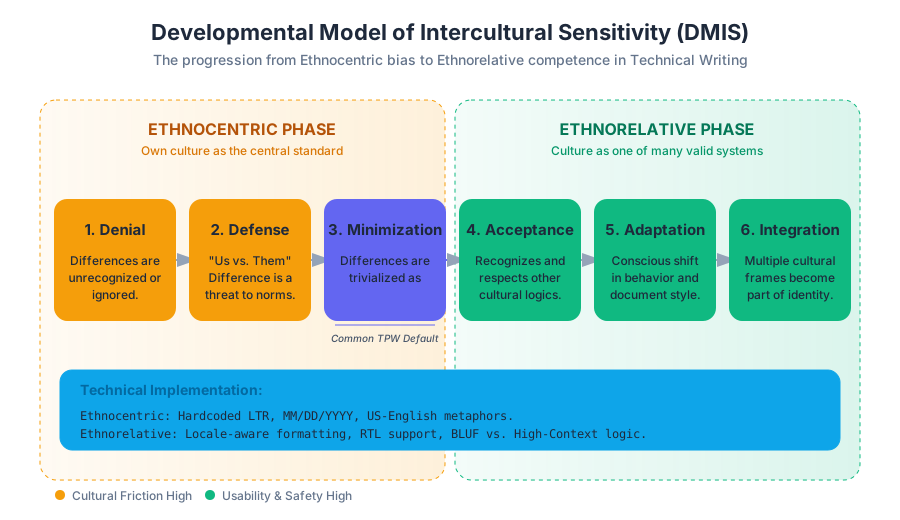
Document Design and Accessibility
Key concepts: Reader-Centered Design · White Space · Heading Hierarchy · Accessibility Principles · Page Layout Elements
Principles of page layout, typography, and white space to enhance readability and usability.
Document Design and Accessibility
In the realm of technical and professional writing, a document is more than a carrier of linguistic meaning; it is a functional interface between a human user and a complex system. Document design is the strategic process of arranging visual and textual elements to optimize the document’s usability, readability, and accessibility.
While amateur writers often view design as "beautification" or "formatting," the technical communicator views design as an extension of the information architecture. If a reader cannot find a specific instruction within five seconds, or if a visually impaired user cannot parse the document with a screen reader, the document has failed its primary mission, regardless of the quality of its prose. This article explores the engineering principles behind reader-centered design, the mathematics of visual hierarchy, and the ethical and technical imperatives of accessibility.
Reader-Centered Design (RCD)
Reader-Centered Design (RCD) is a rhetorical framework that prioritizes the needs, goals, and cognitive constraints of the audience over the preferences of the author. In academic writing, the goal is often to demonstrate the author’s knowledge; in technical writing, the goal is to enable the reader’s action.
The Rhetorical Situation
To design effectively, one must first perform a Rhetorical Analysis. This involves mapping the Exigence (the problem that requires the document), the Audience (their prior knowledge and emotional state), and the Context (the physical or digital environment where the document will be used).
Definition: The P.A.L.E.S. Criteria Effective document design is evaluated against five core criteria:
- Purpose: Does the design facilitate the document's primary goal?
- Audience: Is the visual complexity appropriate for the user's expertise?
- Language: Does the layout support the linguistic register?
- Evidence: Are data visualizations integrated logically with the text?
- Structure: Is the hierarchy intuitive and navigable?
Audience Knowledge Tiers
Design choices must shift based on the audience's technical proficiency.
| Audience Tier | Primary Design Goal | Key Elements |
|---|---|---|
| Laypeople | Accessibility & Clarity | High white space, glossaries, simplified diagrams. |
| Technicians | Efficiency & Action | Bulleted lists, schematics, quick-reference tables. |
| Experts | Precision & Depth | Dense data tables, formal notation, complex appendices. |
| Managers | Decision Support | Executive summaries, high-level charts, key takeaways. |
The Architecture of White Space
White Space (or negative space) is the portion of a page left unmarked. In high-performance document design, white space is not "empty" space; it is a functional tool used to manage Cognitive Load—the total amount of mental effort being used in the working memory.
Active vs. Passive White Space
- Passive White Space: The margins and gutters that define the boundaries of the page. It prevents the text from feeling "crowded" and provides a place for the reader to rest their eyes.
- Active White Space: Space intentionally placed within the content to separate distinct ideas, group related items, or draw attention to specific elements (e.g., a call-out box or a formula).
Gestalt Principles in Layout
Document design relies heavily on Gestalt Psychology, which describes how humans naturally group visual elements:
- Proximity: Elements close to each other are perceived as a single unit. (e.g., a figure and its caption).
- Similarity: Elements that look alike (same font, same color) are perceived as having the same function.
- Continuity: The eye follows paths; aligned text creates a "line" that guides the reader downward.
Mathematical Leading and Margins
In typography, Leading (line spacing) is calculated relative to the font size. For optimal readability, the standard ratio is often $1.2$ to $1.5$ times the font size.
L = f \times r
Where:
- $L$ is the leading (line height).
- $f$ is the font size in points.
- $r$ is the ratio (typically $1.4$ for technical body text).
Heading Hierarchy and Information Scaffolding
Heading Hierarchy is the use of visual levels to signal the organization of content. It creates a Mental Map for the reader, allowing for "skimming and scanning"—the primary way professional documents are consumed.
Semantic Structuralism
A document should be viewed as a tree structure. Each heading level ($H_1, H_2, H_3$) represents a node in that tree. If a reader skips from an $H_1$ to an $H_3$ without an intervening $H_2$, the "logical scent" is lost, and the reader's cognitive processing speed drops.
| Level | Visual Indicator | Logical Function |
|---|---|---|
| H1 | Largest, Bold, Centered/Left | The "Title": Defines the entire scope. |
| H2 | Large, Bold, Left-aligned | The "Chapter": Major conceptual blocks. |
| H3 | Medium, Bold/Italic | The "Section": Specific sub-topics or steps. |
| H4 | Body size, Bold | The "Subsection": Granular details or edge cases. |
Implementation in Web Standards
In HTML/CSS, heading hierarchy is not just visual; it is semantic. Screen readers rely on the <h1> through <h6> tags to generate a Table of Contents for non-visual users.
// Example of a React component enforcing semantic heading hierarchy
interface SectionProps {
  level: 1 | 2 | 3 | 4 | 5 | 6;
  title: string;
  children: React.ReactNode;
}

const DocumentSection: React.FC<SectionProps> = ({ level, title, children }) => {
  const HeadingTag = `h${level}` as keyof JSX.IntrinsicElements;

  return (
    <section className={`section-level-${level}`}>
      <HeadingTag className="heading-style">
        {title}
      </HeadingTag>
      <div className="content-body">
        {children}
      </div>
    </section>
  );
};
Accessibility Principles (WCAG)
Accessibility is the practice of ensuring that documents are usable by everyone, including people with visual, auditory, motor, or cognitive disabilities. In many jurisdictions, accessibility is a legal requirement (e.g., Section 508 in the US, EN 301 549 in the EU).
The Web Content Accessibility Guidelines (WCAG) are organized around four principles, known by the acronym POUR:
- Perceivable: Information and interface components must be presentable to users in ways they can perceive (e.g., Alt-text for images).
- Operable: User interface components and navigation must be operable (e.g., keyboard navigation).
- Understandable: Information and the operation of the user interface must be understandable (e.g., clear headings, predictable behavior).
- Robust: Content must be robust enough that it can be interpreted reliably by a wide variety of user agents, including assistive technologies.
Color Contrast and Luminance
One of the most common accessibility failures is insufficient color contrast. WCAG 2.1 Level AA requires a contrast ratio of at least 4.5:1 for normal text and 3:1 for large text.
The contrast ratio is calculated using the Relative Luminance ($L$) of the colors:
Contrast Ratio = \frac{L_1 + 0.05}{L_2 + 0.05}
Where $L_1$ is the relative luminance of the lighter color and $L_2$ is the relative luminance of the darker color.
Relative Luminance Derivation
Relative luminance is calculated based on the sRGB color space: For each channel (R, G, B), calculate the linear value $C$: If $C_{sRGB} \le 0.03928$, then $C = C_{sRGB} / 12.92$. Else, $C = ((C_{sRGB} + 0.055) / 1.055)^{2.4}$.
Then:
L = 0.2126R + 0.7152G + 0.0722B
Accessibility Checklist for Technical Documents
- Alt-Text: Every functional image must have a text description.
- Table Headers: Tables must use
<th>tags (or equivalent) to associate data cells with their headers. - Descriptive Links: Avoid "Click Here." Use "Download the 2023 Security Audit (PDF)."
- Color Independence: Never use color as the only way to convey meaning (e.g., "Required fields are in red"). Use symbols or text labels as well.
Page Layout Elements and Visual Grammar
The arrangement of elements on a page follows a "visual grammar" that dictates how the eye moves.
The Grid System
Professional layouts use a Grid System to maintain alignment and consistency. Grids divide the page into columns and rows, providing a skeleton for placing text blocks, images, and sidebars.
| Element | Function | Typical Usage |
|---|---|---|
| Margin | Boundary | Provides "breathing room" and binding space. |
| Gutter | Separation | The space between columns; prevents text overlap. |
| Module | Container | Individual "cells" in the grid where content lives. |
| Flowline | Alignment | Horizontal lines that guide the eye across columns. |
Eye-Tracking Patterns
- F-Pattern: Common for text-heavy web pages. Users read the top horizontally, then a second horizontal movement lower down, then a vertical scan of the left side.
- Z-Pattern: Common for landing pages or visual documents. The eye moves from top-left to top-right, then diagonally to bottom-left, then across to bottom-right.
Typography: Serif vs. Sans-Serif
The choice of typeface is a functional decision, not just an aesthetic one.
| Typeface Category | Characteristics | Best Use Case |
|---|---|---|
| Serif (e.g., Times New Roman) | Small "feet" on letters. | Long-form printed text; facilitates horizontal flow. |
| Sans-Serif (e.g., Arial, Helvetica) | Clean, no feet. | Digital screens; remains legible at lower resolutions. |
| Monospaced (e.g., Courier) | Every letter has equal width. | Code blocks, data tables, alignment-sensitive text. |
Implementation and Automation
In modern workflows, document design is often automated through Style Sheets (CSS), LaTeX Templates, or Markdown Processors. This ensures consistency across thousands of pages.
Automated Accessibility Testing
Writers should integrate accessibility checks into their CI/CD (Continuous Integration/Continuous Deployment) pipelines.
# Example GitHub Action for automated accessibility linting
name: Accessibility Audit
on: [push]

jobs:
  pa11y-check:
    runs-on: ubuntu-latest
    steps:
      - uses: actions/checkout@v2
      - name: Install Pa11y
        run: npm install -g pa11y-ci
      - name: Run Accessibility Audit
        run: pa11y-ci --sitemap http://localhost:3000/sitemap.xml --threshold 0
      - name: Report Failures
        if: failure()
        run: echo "Accessibility standards not met. Please check contrast ratios and alt-text."
Common Pitfalls in Document Design
- The "Wall of Text": Failing to use white space or headings, leading to reader fatigue and information abandonment.
- Over-Designing: Using too many fonts, colors, or decorative elements that distract from the core message.
- Inconsistent Hierarchy: Using an $H_3$ style for a major section and an $H_2$ for a minor one, confusing the reader's mental map.
- Ignoring Mobile Users: Designing for a standard 8.5x11 page when 50% of readers may be viewing the document on a smartphone.
- PDF-Only Distribution: PDFs are often difficult for screen readers to parse if not properly "tagged." HTML is generally the more accessible format.
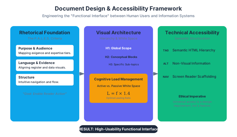
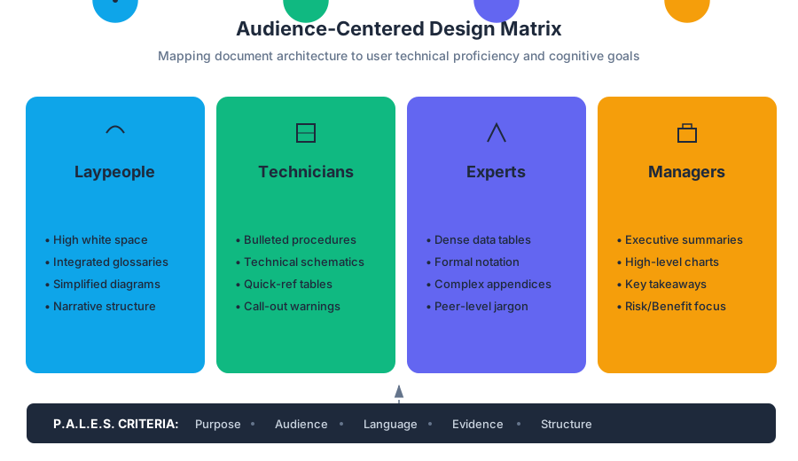
Visual Communication and Infographics
Key concepts: Visual Storytelling · Information Synthesis · KISS Principle · Integration Rules (Captions/Sourcing) · Infographics vs. Data Visualization
Guidelines for integrating visuals and using infographics to synthesize complex data.
Visual Communication and Infographics
Visual communication in technical and professional writing (TPW) is the strategic integration of non-textual elements—charts, diagrams, photographs, and infographics—to enhance the transfer of information. Far from being mere "decoration," visuals in a technical context serve as cognitive scaffolds. They allow a reader to synthesize complex data, recognize patterns, and navigate dense information architectures with significantly lower cognitive load than text alone.
In the professional world, the rhetorical situation (the intersection of audience, purpose, and context) dictates the form and function of every visual. A senior engineer might require a high-fidelity schematic to understand a system's failure point, while a stakeholder might require a high-level infographic to grasp the project's ROI. This article explores the mechanics of visual storytelling, the principles of synthesis, and the rigorous rules of integration that transform a simple image into a powerful tool of technical communication.
Visual Storytelling and Information Synthesis
Visual storytelling is the practice of using a sequence of visual cues to guide a reader through a narrative or a logical process. In TPW, this "story" is rarely fictional; it is the story of how a machine works, how a budget is allocated, or how a user should navigate a software interface.
The Mechanics of Synthesis
Information synthesis is the process of distilling vast amounts of raw data into a coherent, actionable visual. This requires the writer to identify the Exigence—the specific problem or "gap" that the visual is meant to fill.
Definition: Information Synthesis The cognitive and technical process of aggregating disparate data points, identifying underlying patterns, and representing them through a unified visual hierarchy to facilitate rapid comprehension.
When synthesizing information, the writer must balance two competing forces: Complexity (the depth of information) and Clarity (the ease of understanding).
| Feature | Raw Data | Synthesized Visual |
|---|---|---|
| Cognitive Load | High (Requires active decoding) | Low (Leverages pre-attentive attributes) |
| Focus | Exhaustive (Includes all variables) | Selective (Highlights key insights) |
| Goal | Documentation | Communication/Persuasion |
| Structure | Linear/Tabular | Spatial/Hierarchical |
The Dual Coding Theory
The effectiveness of visual storytelling is rooted in Dual Coding Theory, which suggests that the human brain processes verbal and visual information through two distinct channels. When a technical document provides both a textual description and a corresponding diagram, the brain creates two separate mental representations, which reinforces memory and understanding.
The KISS Principle and the Data-Ink Ratio
The KISS Principle ("Keep It Simple, Stupid") is the foundational philosophy of technical document design. In the context of visuals, simplicity is not about the absence of detail, but the absence of clutter.
The Data-Ink Ratio
Coined by Edward Tufte, the Data-Ink Ratio is a mathematical approach to visual clarity. It argues that a large share of the ink (or pixels) used in a graphic should represent "data-information."
$$R_{di} = \frac{\text{Data-Ink}}{\text{Total ink used to print the graphic}}$$
To maximize the ratio, a designer must:
- Erase non-data-ink (decorations, heavy borders, redundant grids).
- Erase redundant data-ink (repeated labels, unnecessary 3D effects).
Implementation: Drawing a Minimalist Bar Chart
In the following example, we implement a basic bar chart using low-level JavaScript and the HTML5 Canvas API. Note how the logic focuses purely on the data points, leaving out unnecessary "chart junk."
/**
 * Low-level implementation of a minimalist bar chart.
 * Focuses on high data-ink ratio by removing unnecessary axes and borders.
 */
function drawMinimalChart(canvasId, data) {
    const canvas = document.getElementById(canvasId);
    const ctx = canvas.getContext('2d');
    const margin = 40;
    const width = canvas.width - (margin * 2);
    const height = canvas.height - (margin * 2);

    // Calculate scaling factor
    const maxVal = Math.max(...data.values);
    const barWidth = width / data.values.length;

    ctx.clearRect(0, 0, canvas.width, canvas.height);

    data.values.forEach((val, i) => {
        const barHeight = (val / maxVal) * height;
        const x = margin + (i * barWidth);
        const y = canvas.height - margin - barHeight;

        // Draw Bar - Using a single neutral color to avoid distraction
        ctx.fillStyle = '#2c3e50';
        ctx.fillRect(x + 5, y, barWidth - 10, barHeight);

        // Minimalist Labeling - Only showing the value at the top
        ctx.fillStyle = '#000';
        ctx.font = '12px sans-serif';
        ctx.textAlign = 'center';
        ctx.fillText(val, x + (barWidth / 2), y - 5);
    });
}
Infographics vs. Data Visualization
While often used interchangeably, Infographics and Data Visualizations serve different rhetorical purposes. Understanding the distinction is vital for a technical writer when selecting the appropriate medium for their audience.
Comparative Analysis
| Attribute | Data Visualization | Infographic |
|---|---|---|
| Primary Purpose | Exploration and Analysis | Explanation and Narrative |
| Data Volume | High (Often dynamic/real-time) | Low to Medium (Curated) |
| User Interaction | High (Filtering, zooming, querying) | Low (Usually static or linear) |
| Design Style | Algorithmic/Standardized | Illustrative/Customized |
| Context | Standalone tool | Integrated into a report or story |
Declarative Visualization Logic
In modern technical documentation, data visualizations are often defined using declarative schemas like Vega-Lite. This separates the data from the presentation, allowing for more precise control over the visual output.
{
  "$schema": "https://vega.github.io/schema/vega-lite/v5.json",
  "description": "A minimalist scatterplot showing the relationship between document length and reading time.",
  "data": {
    "values": [
      {"length": 500, "time": 2}, {"length": 1500, "time": 7},
      {"length": 3000, "time": 14}, {"length": 5000, "time": 25}
    ]
  },
  "mark": "point",
  "encoding": {
    "x": {"field": "length", "type": "quantitative", "title": "Word Count"},
    "y": {"field": "time", "type": "quantitative", "title": "Reading Time (min)"},
    "color": {"value": "#e67e22"}
  },
  "config": {
    "view": {"stroke": "transparent"},
    "axis": {"grid": false}
  }
}
Integration Rules: Captions, Sourcing, and Referencing
A visual in a technical document is never "self-explanatory." It must be tethered to the text through a rigorous set of integration rules. Failure to do so results in "floating visuals" that confuse the reader and undermine the document's authority.
The Three-Point Rule of Integration
- Mention: Refer to the visual in the body text before it appears (e.g., "As shown in Figure 1...").
- Place: Position the visual as close to the relevant text as possible.
- Explain: Provide a caption that describes the visual's significance, not just its contents.
Anatomy of a Technical Figure
A professional figure consists of four mandatory components:
- The Graphic: The visual itself.
- The Figure Number and Title: Located below the graphic (e.g., Figure 4: Thermal Conductivity of Alloys).
- The Caption/Legend: A brief explanation of what the reader should notice.
- The Source Note: Attribution for the data or the image creator.
Accessibility and Alt-Text
In digital technical communication, visuals must be accessible to users with visual impairments. This involves providing alt text and, for complex charts, a longdesc or a link to the raw data.
<!-- Real-world implementation of an accessible figure in a technical report -->
<figure aria-labelledby="fig1-title">
  <img src="system-architecture.svg"
       alt="Flowchart showing the 4-step authentication process: Request, Challenge, Response, and Token Issue."
       width="600">
  <figcaption id="fig1-title">
    <strong>Figure 1:</strong> The OAuth 2.0 Authorization Code Flow.
    <em>Note the separation between the Resource Owner and the Client.</em>
    <br>
    <small>Source: Adapted from RFC 6749, IETF.</small>
  </figcaption>
</figure>
Common Pitfalls in Visual Communication
Even with high-quality data, a visual can fail if it violates the principles of technical communication.
1. The "Lie Factor"
The Lie Factor occurs when the size of the effect shown in the graphic is not proportional to the size of the effect in the data. This often happens when the Y-axis does not start at zero, exaggerating small differences.
$$\text{Lie Factor} = \frac{\text{Size of effect shown in graphic}}{\text{Size of effect in data}}$$
2. Visual Noise (Chart Junk)
Excessive use of color, 3D effects, and decorative icons can obscure the data. In professional writing, color should be used functionally (to categorize or highlight) rather than aesthetically.
3. Lack of Context
A chart showing a "50% increase" is meaningless without knowing the baseline. Technical writers must ensure that the scale and units are clearly labeled and that the context (sample size, time period) is provided.
| Pitfall | Consequence | Solution |
|---|---|---|
| Truncated Y-Axis | Misleading trends | Always start axes at zero unless justified. |
| Color Overload | High cognitive load | Use a limited, high-contrast palette. |
| Missing Captions | Loss of narrative control | Follow the Three-Point Rule. |
| Low Resolution | Reduced credibility | Use vector formats (SVG, PDF) for diagrams. |
Conclusion: The Rhetorical Power of the Visual
Visual communication is the bridge between raw information and human understanding. By applying the KISS principle, maximizing the data-ink ratio, and adhering to strict integration rules, technical writers can transform complex datasets into clear, persuasive narratives. Whether through a minimalist bar chart or a comprehensive infographic, the goal remains the same: to help the reader act upon the information with speed and accuracy.
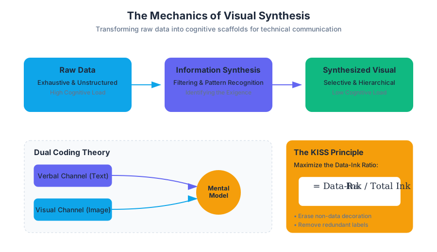
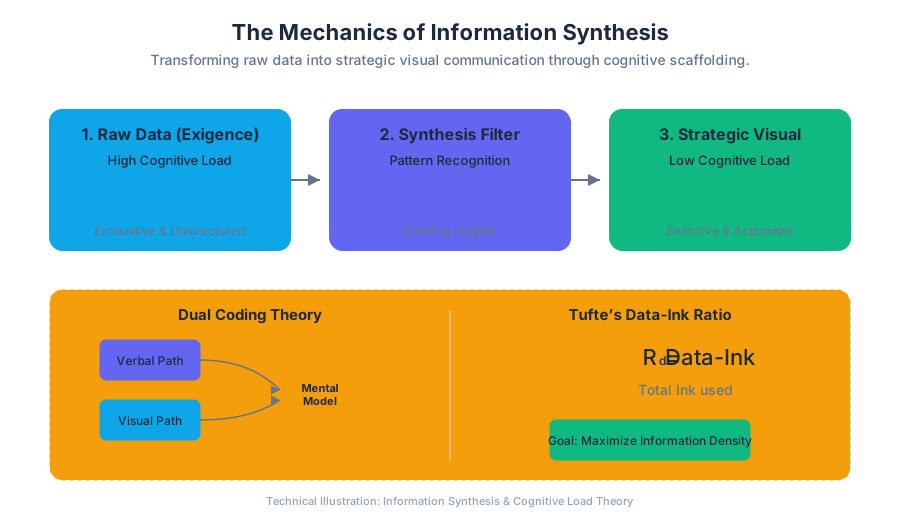
Tables, Charts, and Graphs
Key concepts: Numerical vs. Categorical Data · Table Components · Axis Labels and Keys · Data Simplification · Cross-referencing
Detailed techniques for presenting numerical and categorical data effectively.
Tables, Charts, and Graphs: The Architecture of Quantitative Communication
In technical and professional writing, the transition from prose to visual data representation marks a shift from narrative explanation to structural evidence. While text is ideal for establishing context, nuance, and causal logic, visuals—specifically tables, charts, and graphs—are the primary vehicles for transmitting high-density information with precision and speed.
The goal of data visualization in a technical context is not "decoration" but functional efficiency. A well-constructed graphic allows a reader to perform rapid comparisons, identify trends, and extract specific values without the cognitive load of parsing dense paragraphs. This section explores the rhetorical, mathematical, and design principles required to transform raw data into actionable professional intelligence.
Numerical vs. Categorical Data: The Foundation of Selection
Before a writer can select a visual format, they must categorize the underlying data. The mathematical nature of the data dictates the permissible operations and, consequently, the appropriate visual metaphor.
Categorical Data (Qualitative)
Categorical data represents groups or labels. It is further divided into:
- Nominal: Data with no inherent order (e.g., programming languages, department names, error types).
- Ordinal: Data with a logical sequence but no fixed "distance" between points (e.g., Likert scales: "Satisfied," "Neutral," "Dissatisfied").
Numerical Data (Quantitative)
Numerical data represents measurable quantities. It is divided into:
- Discrete: Countable values (e.g., number of server nodes, total tickets resolved).
- Continuous: Measurements that can take any value within a range (e.g., CPU temperature, latency in milliseconds, signal-to-noise ratio).
| Data Level | Description | Mathematical Operations | Best Visuals |
|---|---|---|---|
| Nominal | Unordered labels | Counting, Mode | Bar Charts, Pie Charts (limited) |
| Ordinal | Ordered labels | Median, Rank Correlation | Grouped Bar Charts, Stacked Bars |
| Interval | Ordered, known distance, no true zero | Addition, Subtraction, Mean | Line Graphs, Histograms |
| Ratio | Ordered, known distance, true zero | Multiplication, Division, Coeff. of Variation | Scatter Plots, Regression Lines |
The Principle of Mapping: The effectiveness of a graphic depends on how accurately it maps the mathematical properties of the data to visual properties (length, position, color, or area).
Table Components and Anatomy
While graphs show "shapes" of data, tables provide "exactitude." Tables are the preferred choice when the audience needs to look up specific values or compare precise metrics across multiple categories.
The Structural Elements
A professional table consists of five mandatory components:
- Table Number and Title: Placed above the table, providing a clear, descriptive label (e.g., "Table 1: Latency Metrics by Region").
- Stub (Column 1): The leftmost column containing the row headings/categories.
- Column Headers (Boxhead): The top row identifying the data in each column, including units of measurement (e.g., "Throughput (Gbps)").
- The Body: The central grid of data cells.
- Footnotes/Source Note: Placed below the table to explain abbreviations or cite data origins.
Alignment and Formatting Rules
Technical precision requires strict adherence to alignment conventions to facilitate scanning:
- Numerical data should be right-aligned (or decimal-aligned) so that the magnitude of numbers is visually apparent (e.g., 1,000 should sit above 100).
- Textual data should be left-aligned.
- Headers should align with the data they describe.
- White space should be used instead of heavy vertical grid lines (the "Tufte" approach) to reduce visual noise.
Axis Labels, Keys, and Scaling
Graphs translate numbers into spatial coordinates. This translation is governed by the Coordinate System (usually Cartesian) and the Scale.
The Mechanics of the Axis
Every graph must have a clearly defined X-axis (Independent Variable) and Y-axis (Dependent Variable).
- Labels: Must include the variable name and the unit in parentheses:
Time (s)orVoltage (mV). - Tick Marks: Should be placed at logical, even intervals (2s, 5s, 10s) rather than arbitrary data points.
- The Zero Baseline: For bar charts, the Y-axis must start at zero to avoid "visual lying," where small differences are exaggerated. For line graphs showing fluctuations (e.g., stock prices), a truncated axis is permissible if clearly marked.
The Legend (Key)
A Key or Legend is required whenever a graph contains more than one data series. In high-level technical writing, it is often more effective to use direct labeling (placing the label next to the line) rather than a separate key, as it reduces the "split-attention effect" where the reader must look back and forth between the data and the legend.
Data Simplification and the "Signal-to-Noise" Ratio
A common pitfall in professional writing is the "data dump"—presenting every available data point regardless of its relevance to the argument. Technical writers must apply Data-Ink Ratio optimization, a concept popularized by Edward Tufte.
Data-Ink Ratio: The proportion of "ink" (or pixels) used to present actual information compared to the total ink used in the graphic. A high ratio is preferred.
Strategies for Simplification:
- Aggregation: Instead of plotting 1,000 individual data points, plot the mean with error bars (Standard Deviation or Confidence Intervals).
- Highlighting: Use color or bold lines to emphasize the specific trend the text discusses, while graying out secondary data.
- Eliminating Chartjunk: Remove 3D effects, unnecessary shadows, and distracting background textures.
Cross-referencing and Textual Integration
A graphic should never "stand alone." In a professional document, the text and the visual must function as a single unit. This is achieved through a three-step integration pattern:
- Lead-in: Mention the graphic before it appears.
- Example: "As illustrated in Figure 4, the failure rate increases exponentially after 5,000 hours of operation."
- The Graphic: Place the visual as close to the lead-in as possible.
- Lead-out (Interpretation): Explain the significance of the data. Don't just say what the data is; say what it means.
- Example: "This correlation suggests that the current cooling protocol is insufficient for long-term deployments."
The Rule of Self-Sufficiency
While the text interprets the graphic, the graphic should be self-sufficient. A reader should be able to understand the core message of a table or chart by reading only its title, labels, and key, without referring to the body text.
Implementation: Generating Professional Visuals
In modern technical workflows, visuals are often generated via code to ensure reproducibility and precision. Below is a professional implementation using Python's matplotlib and pandas libraries, demonstrating proper labeling, scaling, and styling.
import matplotlib.pyplot as plt
import pandas as pd
import numpy as np

# 1. Data Preparation (Numerical and Categorical)
data = {
    'Timestamp': pd.date_range(start='2023-01-01', periods=10, freq='D'),
    'System_A_Latency': [120, 132, 125, 145, 150, 155, 148, 160, 165, 170],
    'System_B_Latency': [95, 98, 105, 110, 108, 115, 120, 125, 130, 135]
}
df = pd.DataFrame(data)

# 2. Plotting Configuration
plt.style.use('seaborn-v0_8-whitegrid')
fig, ax = plt.subplots(figsize=(10, 6))

# 3. Generating the Visual
ax.plot(df['Timestamp'], df['System_A_Latency'],
        label='Legacy System (A)', color='#d95f02', linewidth=2, marker='o')
ax.plot(df['Timestamp'], df['System_B_Latency'],
        label='Optimized System (B)', color='#1b9e77', linewidth=2, marker='s')

# 4. Professional Labeling and Scaling
ax.set_title('Comparative System Latency (Q1 Analysis)', fontsize=14, fontweight='bold', loc='left')
ax.set_xlabel('Observation Date', fontsize=12)
ax.set_ylabel('Latency (ms)', fontsize=12)
ax.set_ylim(0, 200) # Ensuring zero-baseline for context
ax.legend(loc='upper left', frameon=True)

# 5. Data Simplification: Removing unnecessary spines
ax.spines['top'].set_visible(False)
ax.spines['right'].set_visible(False)

plt.tight_layout()
plt.show()
Mathematical Derivation: Normalization for Comparison
When comparing two data sets with different scales (e.g., CPU usage in % vs. Memory usage in GB), writers must often normalize the data to a common range (0 to 1) to visualize them on the same graph without distorting the relationship.
The standard formula for Min-Max Normalization is:
X_{norm} = \frac{X - X_{min}}{X_{max} - X_{min}}
Where:
- $X$ is the original value.
- $X_{min}$ is the minimum value in the dataset.
- $X_{max}$ is the maximum value in the dataset.
- $X_{norm}$ is the resulting value between 0 and 1.
This allows for the creation of Dual-Axis Charts or Normalized Line Graphs, which are essential for showing correlation between disparate metrics.
Declarative Visualization with Vega-Lite
For web-based technical documentation, declarative formats like Vega-Lite (JSON) are preferred over static images. This allows the data to remain searchable and accessible.
{
  "$schema": "https://vega.github.io/schema/vega-lite/v5.json",
  "description": "A simple bar chart with embedded data.",
  "data": {
    "values": [
      {"category": "Node JS", "performance": 85},
      {"category": "Python", "performance": 65},
      {"category": "Go", "performance": 92},
      {"category": "Rust", "performance": 98}
    ]
  },
  "mark": {"type": "bar", "cornerRadiusEnd": 4, "color": "#4682b4"},
  "encoding": {
    "x": {"field": "category", "type": "nominal", "axis": {"labelAngle": 0}},
    "y": {"field": "performance", "type": "quantitative", "title": "Efficiency Score (%)"},
    "tooltip": [{"field": "category"}, {"field": "performance"}]
  }
}
Common Pitfalls in Data Visualization
Even technically accurate data can be presented in ways that mislead or confuse the reader.
1. The "Lie Factor"
Coined by Tufte, the Lie Factor is the ratio of the size of the effect shown in the graphic to the size of the effect in the data.
- Pitfall: Using 3D cylinders where the volume increases much faster than the height, making a 2x increase look like an 8x increase.
2. Over-plotting
- Pitfall: Putting too many lines on a single graph (the "spaghetti chart").
- Solution: Use Small Multiples—a series of small, similar graphs arranged in a grid, each showing one category.
3. Color Blindness and Accessibility
- Pitfall: Relying solely on Red and Green to distinguish between "Fail" and "Pass."
- Solution: Use redundant encoding—different line styles (dashed vs. solid) and color-blind friendly palettes (e.g., Viridis or ColorBrewer).
| Visual Error | Consequence | Professional Correction |
|---|---|---|
| Truncated Y-Axis | Exaggerates minor differences | Start axis at zero for bar charts |
| Missing Units | Data becomes meaningless | Always include units in headers/labels |
| Pie Charts > 3 slices | Difficult to compare angles | Use Horizontal Bar Charts |
| Inconsistent Scaling | Misrepresents trends across graphs | Use uniform axes for comparative figures |
Summary of Best Practices
To ensure your tables, charts, and graphs meet professional standards:
- Choose the right tool for the job: Tables for precision, Graphs for patterns.
- Label everything: No axis or column should be anonymous.
- Simplify: If a data point doesn't support your specific point, move it to an appendix.
- Integrate: Use the text to guide the reader through the visual evidence.
- Verify: Check that the visual representation accurately reflects the mathematical reality of the data.
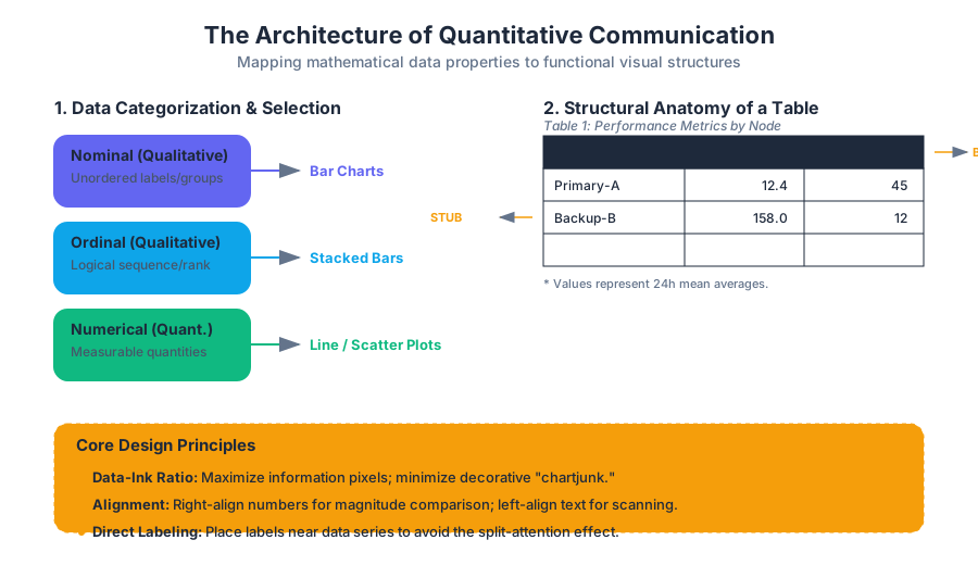
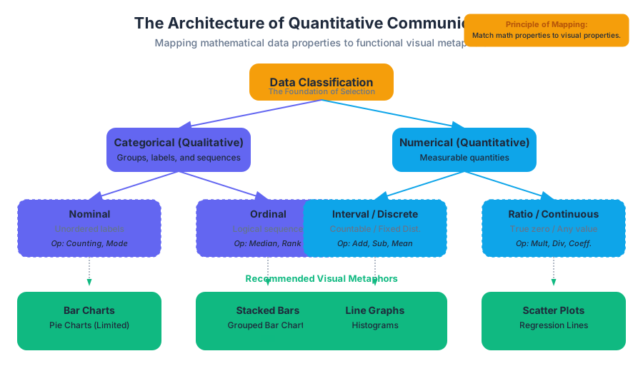
Lists and Formatting for Readability
Key concepts: Parallel Construction · Bulleted vs. Numbered Lists · In-sentence Lists · Nested Lists · Readability
Using lists and parallel construction to highlight key points and improve document flow.
Lists and Formatting for Readability
In the architecture of technical communication, lists serve as the primary structural element for decomposing complex information into digestible, "scannable" units. While prose is designed for narrative flow, lists are designed for utility. They function as a cognitive shortcut, allowing a reader to bypass the linear constraints of a paragraph to find specific data points, instructions, or requirements.
Effective list design is not merely a matter of aesthetics; it is a fundamental application of Information Mapping and Cognitive Load Theory. By utilizing white space and vertical alignment, a writer signals to the reader that the information contained within the list is distinct, categorized, and high-priority.
The Cognitive Science of Readability
To understand why lists are effective, we must examine how the human eye processes a page. Eye-tracking studies, such as those conducted by the Nielsen Norman Group, consistently demonstrate that users read in an F-Pattern. They scan the top horizontally, move down the page, and scan again, eventually focusing primarily on the left margin.
The Scannability Theorem: The time required to locate a specific datum $D$ in a block of text $T$ is inversely proportional to the amount of white space $W$ surrounding $D$ and the degree of syntactic isolation $S$ applied to $D$.
Lists maximize both $W$ and $S$. By breaking the "wall of text," lists provide visual anchors that prevent "reader fatigue"—a state where the cognitive cost of processing dense prose exceeds the reader's motivation to continue.
| Feature | Prose Paragraph | Formatted List |
|---|---|---|
| Cognitive Load | High (requires linear parsing) | Low (allows non-linear scanning) |
| Visual Emphasis | Low (uniform density) | High (distinct margins and bullets) |
| Information Density | High (context-heavy) | Moderate (fact-heavy) |
| Primary Use Case | Explanation, Nuance, Narrative | Instructions, Features, Requirements |
Parallel Construction: The Logic of Symmetry
Parallel Construction (or parallelism) is the most critical grammatical requirement for professional lists. It dictates that every item in a list must follow the same grammatical pattern. If the first item begins with a present-tense imperative verb, every subsequent item must also begin with a present-tense imperative verb.
Why Parallelism Matters
Parallelism functions like a mathematical proof for the reader's brain. When the syntax is consistent, the reader can "predict" the structure of the next item, allowing them to focus entirely on the content rather than the phrasing. When a list is non-parallel, the reader must mentally "reset" their linguistic expectations for each bullet point, which creates friction and reduces comprehension.
The Formal Logic of Parallelism
Let $L$ be a list such that $L = {i_1, i_2, i_3, \dots, i_n}$. Let $G(x)$ be a function that returns the grammatical structure of item $x$. For $L$ to be parallel, the condition $G(i_1) = G(i_2) = \dots = G(i_n)$ must hold true.
Worked Example: Correcting Non-Parallelism
Consider a list describing the features of a new software module:
-
Non-Parallel:
- Fast data processing. (Noun phrase)
- It encrypts files. (Clause)
- User-friendly interface. (Adjective-noun)
- To improve security. (Infinitive phrase)
-
Parallel (Noun-focused):
- High-speed data processing.
- Advanced file encryption.
- Intuitive user interface.
- Enhanced security protocols.
Taxonomy of List Types
Technical writers must choose the appropriate list type based on the Rhetorical Situation (the relationship between the audience, purpose, and context).
| List Type | Primary Purpose | Visual Cue |
|---|---|---|
| Bulleted | Items of equal weight; no specific order. | Dots, squares, or custom glyphs. |
| Numbered | Sequential steps, priorities, or counts. | Arabic numerals or letters. |
| In-sentence | Short lists (3 or fewer items) within a paragraph. | Commas or semicolons. |
| Nested | Hierarchical relationships or sub-steps. | Indentation and varying markers. |
Bulleted Lists (Unordered)
Bulleted lists are used when the order of items is arbitrary. They are ideal for listing features, parts of a system, or membership requirements.
- Best Practice: Use a "lead-in" sentence (a stem) followed by a colon.
- Punctuation: If the items are fragments, no terminal punctuation is needed. If they are full sentences, use periods.
Numbered Lists (Ordered)
Numbered lists imply a hierarchy or a temporal sequence. They are the standard for Standard Operating Procedures (SOPs) and troubleshooting guides.
- Best Practice: If a step contains multiple sub-actions, use a nested list rather than a long, complex sentence.
In-sentence Lists (Run-in)
These are used for brevity. They do not provide the same "scannability" as vertical lists but maintain the flow of a paragraph.
- Example: "The system requires three components: (1) a stable power supply, (2) an active internet connection, and (3) a registered user account."
Technical Implementation: Lists in Digital Environments
In modern documentation, lists are often generated via Markdown or rendered through CSS. Understanding the underlying structure is vital for ensuring accessibility (WCAG compliance).
Implementation 1: Semantic HTML and CSS
For web-based documentation, lists must be semantically tagged so screen readers can announce the number of items to visually impaired users.
<!-- Semantic Implementation of an Ordered List -->
<style>
  .tech-list {
    counter-reset: step-counter;
    list-style-type: none;
    padding-left: 20px;
  }
  .tech-list li {
    counter-increment: step-counter;
    margin-bottom: 12px;
    position: relative;
  }
  .tech-list li::before {
    content: counter(step-counter);
    background-color: #004a99;
    color: white;
    font-weight: bold;
    padding: 2px 8px;
    border-radius: 50%;
    margin-right: 10px;
  }
</style>

<ol class="tech-list">
  <li>Initialize the environment variables using the <code>.env</code> file.</li>
  <li>Execute the <code>npm install</code> command to fetch dependencies.</li>
  <li>Run the build script via <code>npm run build</code>.</li>
</ol>
Implementation 2: Regular Expressions for Parallelism Detection
Automating the check for parallelism can be difficult, but we can use Regex to identify if list items start with inconsistent parts of speech (e.g., mixing "Ing-verbs" with "Imperative-verbs").
import re

# A simple heuristic check for list item consistency
def check_parallelism(list_items):
    # Pattern for Gerunds (e.g., Running, Loading)
    gerund_pattern = re.compile(r'^[A-Z][a-z]+ing\b')
    # Pattern for Imperative Verbs (e.g., Run, Load)
    imperative_pattern = re.compile(r'^[A-Z][a-z]+\b(?<!ing)')

    gerund_count = sum(1 for item in list_items if gerund_pattern.match(item))
    imperative_count = sum(1 for item in list_items if imperative_pattern.match(item))

    if gerund_count > 0 and imperative_count > 0:
        return "Warning: Inconsistent list structure detected (Mixed Gerunds and Imperatives)."
    return "Consistency check passed."

items = ["Loading the data", "Processing the request", "Save the file"]
print(check_parallelism(items))
Nested Lists and Information Hierarchy
Nested lists are used to show subordination. In technical manuals, a high-level step may require several sub-steps.
The "Rule of Three" for Depth
While lists improve readability, excessive nesting (more than three levels deep) can have the opposite effect. As the indentation increases, the line length decreases, and the reader's "mental stack" becomes overloaded.
- Primary Step
- Sub-action A
- Detail i
- Detail ii
- Sub-action B
- Sub-action A
- Primary Step 2
Complexity Analysis of Nested Lists
The cognitive load $C$ of a nested list can be modeled by the depth $d$ and the number of items $n$ at each level.
$$C = \sum_{i=1}^{d} (n_i \cdot w_i)$$
Where $w_i$ is a weighting factor that increases with depth. As $d > 3$, $w_i$ grows exponentially, leading to a breakdown in comprehension.
| Depth Level | Cognitive Weight ($w$) | Recommended Usage |
|---|---|---|
| Level 1 (Root) | 1.0 | Main concepts or primary steps. |
| Level 2 | 1.5 | Supporting details or sub-tasks. |
| Level 3 | 3.0 | Specific technical parameters or exceptions. |
| Level 4+ | 8.0+ | Avoid. Use a separate table or subsection instead. |
Formatting Mechanics: Punctuation and Capitalization
Standardizing the "look and feel" of lists is essential for professional branding. Most organizations follow a specific style guide (e.g., Microsoft, IEEE, or Chicago).
Capitalization
- Sentence Case: Capitalize the first word of every list item. This is the standard for technical writing as it treats each item as a distinct unit of thought.
- Lowercase: Only used for very short, fragmented lists that complete a sentence stem (rare in modern professional contexts).
Punctuation (The "All or Nothing" Rule)
- No Punctuation: Use for lists consisting entirely of short phrases or fragments.
- Full Stops: Use if any single item in the list is a complete sentence. For consistency, if one item has a period, all items should have a period.
- Semicolons: Historically used for complex lists where items contain internal commas. This is increasingly rare in digital documentation, as nested lists are preferred for clarity.
Lead-in Sentences
The lead-in sentence (the "stem") should clearly define the relationship of the items.
- Complete Lead-in: "The following tools are required for the installation:" (Use a colon).
- Partial Lead-in: "To complete the installation, you must:" (Use a colon; items should complete the sentence).
Common Pitfalls and Anti-Patterns
Even experienced writers fall into traps that undermine the effectiveness of their lists.
- The "Kitchen Sink" List: Including too many items (usually more than 7–9) in a single list. This violates Miller's Law (the magic number $7 \pm 2$).
- Solution: Group related items into sub-categories with their own headings.
- Over-Listing: Using lists for narrative content that requires nuance or transition.
- Solution: If you find yourself writing "bulleted paragraphs," revert to standard prose.
- Mismatched Numbers: Using a numbered list for items that have no chronological order.
- Solution: Switch to bullets to avoid implying a false sense of priority.
- Inconsistent Lead-ins: Mixing complete sentences and fragments after the same stem.
Example of a "Kitchen Sink" Anti-Pattern
A list of 15 disparate server settings is impossible to memorize or scan.
- Refactored: Break the list into "Network Settings," "Security Settings," and "Hardware Specs."
Real-World Usage: Configuration and Data Lists
In DevOps and Systems Engineering, lists are often represented in YAML or JSON. While these are machine-readable, they are also read by humans and must follow the same principles of grouping and logic.
# YAML Configuration illustrating nested lists and logical grouping
server_configuration:
  environment: production
  allowed_protocols: # Bulleted list equivalent
    - https
    - ssh
    - sftp
  deployment_steps: # Numbered list equivalent
    1: pull_repo
    2: run_unit_tests
    3: migrate_database
    4: restart_service
  security_layers:
    - firewall:
        rules:
          - permit_80
          - permit_443
    - encryption: AES-256
Summary of Best Practices
To ensure your lists achieve maximum readability:
- Audit for Parallelism: Check the first word of every item.
- Evaluate the Stem: Ensure the lead-in clearly introduces the list.
- Check for White Space: Ensure there is adequate padding between the list and the surrounding text.
- Limit Depth: Never exceed three levels of nesting.
- Choose the Right Marker: Numbers for sequence, bullets for sets.
Further Reading
- The Elements of Style by Strunk and White (for parallelism).
- Don't Make Me Think by Steve Krug (for scannability and web usability).
- The Chicago Manual of Style (for formal punctuation rules).
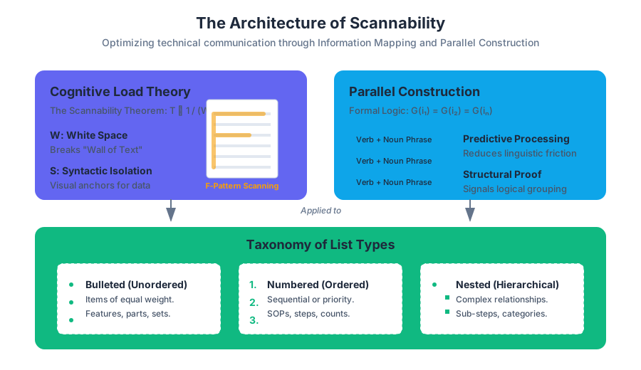
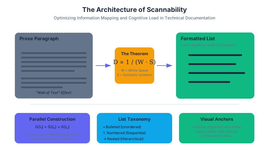
Professional Correspondence and Employment Documents
Key concepts: Block Style Business Letter · Bad News Letter · Tailoring Employment Documents · Resume Objectives · Modern Resume Tips
Practical application of technical writing skills to memos, business letters, resumes, and cover letters.
Professional Correspondence and Employment Documents
In the ecosystem of technical communication, professional correspondence and employment documents serve as the primary interfaces between individuals and organizational structures. Unlike creative writing, which may prioritize self-expression, these documents are problem-oriented and audience-centered. They function as high-stakes protocols for the exchange of value, whether that value is a business decision, a refusal of a claim, or the procurement of a professional role.
The Architecture of Professional Correspondence
Professional correspondence is governed by the principle of Contextual Awareness. Every letter or memo is a "stateless" document; it must contain all necessary metadata to be understood by a reader who may not have seen previous communications. This is particularly critical in legal and technical environments where documents are archived and retrieved years later.
Block Style Business Letter
The Block Style Business Letter is the industry standard for external communication. Its primary characteristic is efficiency: all text is left-aligned, and paragraphs are separated by double spaces rather than indents. This "block" format reduces the cognitive load on the reader and simplifies the mechanical production of the document.
Definition: Block Style A formatting convention where all elements of the letter—sender’s address, date, recipient’s address, salutation, body, and closing—begin at the left margin. It is designed for maximum readability and a clean, professional aesthetic.
| Element | Description | Formatting Rule |
|---|---|---|
| Sender's Address | The source of the communication. | Top of the page; omit if using letterhead. |
| Dateline | The date the letter was completed. | Two to three lines below the sender's address. |
| Inside Address | The recipient's full name, title, and address. | Two lines below the date. |
| Salutation | The formal greeting (e.g., "Dear Mr. Smith:"). | Use a colon, not a comma, in business. |
| Body Paragraphs | The core message. | Single-spaced within, double-spaced between. |
| Complimentary Close | The sign-off (e.g., "Sincerely,"). | Two lines below the last body paragraph. |
| Signature Block | The writer's typed name and title. | Four lines below the close to allow for a signature. |
The Indirect Method: Delivering "Bad News"
In professional settings, the "Bad News Letter" is a specialized rhetorical structure used to maintain relationships while delivering negative information (e.g., denying a promotion, rejecting a proposal, or announcing a layoff). This relies on the Indirect Method, which prioritizes the "Reason" before the "Refusal" to ensure the reader understands the logic before the emotional impact of the news.
| Strategy | Goal | Components |
|---|---|---|
| Buffer | Establish common ground. | Neutral statement, appreciation, or agreement. |
| Reasoning | Provide logical justification. | Objective data, policy explanations, or constraints. |
| The News | State the refusal clearly. | De-emphasized but unambiguous; avoid "I regret to inform you." |
| Alternative | Offer a "pivot" or solution. | Other options, future possibilities, or helpful resources. |
| Positive Close | Maintain the relationship. | Forward-looking, professional, and warm. |
Implementation: Document Generation and Validation
In modern technical environments, professional correspondence is often automated or templated to ensure consistency. Below is a low-level implementation of a document generator that enforces Block Style constraints.
import datetime

class BusinessLetter:
    """
    A class to generate a standard Block Style Business Letter.
    Enforces structural integrity and left-alignment.
    """
    def __init__(self, sender, recipient, subject, body):
        self.sender = sender
        self.recipient = recipient
        self.date = datetime.date.today().strftime("%B %d, %Y")
        self.subject = subject
        self.body = body
        self.margin = 0  # Left-aligned

    def format_address(self, address_dict):
        return "\n".join([
            address_dict.get('name', ''),
            address_dict.get('title', ''),
            address_dict.get('org', ''),
            address_dict.get('street', ''),
            f"{address_dict.get('city', '')}, {address_dict.get('state', '')} {address_dict.get('zip', '')}"
        ])

    def compile(self):
        letter = []
        letter.append(self.format_address(self.sender))
        letter.append(f"\n{self.date}\n")
        letter.append(self.format_address(self.recipient))
        letter.append(f"\nSubject: {self.subject.upper()}\n")
        letter.append(f"Dear {self.recipient.get('name', 'Sir/Madam')}:\n")

        # Split body into paragraphs and join with double spacing
        paragraphs = self.body.split('\n\n')
        letter.append("\n\n".join(paragraphs))

        letter.append("\nSincerely,\n\n\n")
        letter.append(f"{self.sender.get('name')}\n{self.sender.get('title')}")

        return "\n".join(letter)

# Usage
sender_info = {"name": "Jane Doe", "title": "Lead Engineer", "org": "TechCorp", "street": "123 Logic Way", "city": "Austin", "state": "TX", "zip": "78701"}
recipient_info = {"name": "John Smith", "title": "Director", "org": "BuildIt Inc", "street": "456 Construction Rd", "city": "Denver", "state": "CO", "zip": "80202"}
msg = "Thank you for the proposal. After review, we have decided to move forward with another vendor due to budget constraints.\n\nWe appreciate your time and hope to collaborate in the future."

letter = BusinessLetter(sender_info, recipient_info, "Vendor Selection", msg)
print(letter.compile())
Tailoring Employment Documents
The transition from a student or generalist to a professional requires a shift from Writer-Centered to Reader-Centered writing. In the context of resumes and cover letters, this is known as Tailoring.
Audience Analysis: Skimmers vs. Skeptics
Employment documents must satisfy two distinct reading styles simultaneously:
- Skimmers: Recruiters or automated Applicant Tracking Systems (ATS) that spend 6–10 seconds looking for keywords and visual cues.
- Skeptics: Hiring managers or technical leads who read deeply to find evidence of claims and evaluate the "Unity of Purpose" in the candidate's narrative.
| Reader Type | Focus | Document Requirement |
|---|---|---|
| Skimmer | Keywords, Layout, Titles | Bold headers, bulleted lists, standard fonts, white space. |
| Skeptic | Evidence, Logic, Impact | Quantifiable metrics, specific technologies, professional tone. |
The Modern Resume: Architecture and Evolution
The modern resume has moved away from the "Objective Statement" toward the "Professional Summary." While an Objective tells the employer what you want, a Summary tells the employer what you can do for them.
Resume Components and Strategy
- Contact Information: Professional email (no nicknames), LinkedIn URL, and portfolio/GitHub link.
- Professional Summary: A 3–5 line "elevator pitch" that uses keywords from the job description.
- Skills Matrix: A categorized list of technical proficiencies (e.g., "Languages: C++, Rust, Python").
- Experience: Reverse-chronological order. Use the STAR Method (Situation, Task, Action, Result) to describe achievements.
- Education: For early-career professionals, this is prominent; for late-career, it moves to the bottom.
% A LaTeX snippet demonstrating the structural precision of a modern resume header
\documentclass[11pt,a4paper]{article}
\usepackage[utf8]{inputenc}
\usepackage{geometry}
\geometry{margin=0.75in}

\begin{document}

\begin{center}
    {\huge \textbf{ALEX R. DEVELOPER}} \\
    \vspace{2mm}
    San Francisco, CA | (555) 010-9999 | alex.dev@email.com \\
    \textbf{LinkedIn:} linkedin.com/in/alexdev | \textbf{GitHub:} github.com/alexdev
\end{center}

\hrule
\vspace{4mm}

\section*{Professional Summary}
Results-oriented Software Engineer with 5+ years of experience in full-stack development. Proven track record of optimizing database queries by 40\% and leading cross-functional teams in Agile environments. Expert in React, Node.js, and AWS architecture.

\end{section*}
\end{document}
The Ethics of Professional Communication
The stakes of professional correspondence extend beyond personal career success. As seen in the Lion Air Crash case study, the failure to communicate technical changes (the MCAS system) to the primary audience (pilots) resulted in catastrophe.
Ethical Obligations
- Clarity and Accuracy: Misrepresenting data or omitting critical "bad news" (like a system's failure mode) is a breach of professional ethics.
- Intellectual Property: Proper attribution of sources and respecting copyright (as outlined in Acceptable Use Policies).
- Accessibility: Ensuring documents are readable by diverse audiences, including those using assistive technologies.
Key Insight: The MCAS Failure The Boeing 737 Max disaster was fundamentally a failure of technical communication. By prioritizing "minimizing retraining costs" over "audience awareness," Boeing failed to include information about the Maneuvering Characteristics Augmentation System (MCAS) in the pilot manuals. This created a fatal gap between the system's logic and the pilot's mental model.
Advanced Tailoring: The Cover Letter as a Bridge
The cover letter is not a summary of the resume; it is a persuasive document that bridges the gap between the employer's problem and your solution.
The Three-Paragraph Strategy
- The Hook: Identify the specific position and state your "Unity of Purpose"—why you are the unique fit for this specific company culture.
- The Evidence: Select one or two "hero stories" from your resume and expand on them. Don't just say you are a "problem solver"; describe a specific problem you solved using the skills they are looking for.
- The Call to Action: Reiterate your interest and propose the next step (e.g., an interview), maintaining a tone of professional confidence.
# A YAML representation of a tailored resume data structure
# This format is often used by static site generators or ATS-friendly builders
candidate:
  name: "Jordan Casey"
  target_role: "Senior Systems Architect"
  tailoring_keywords:
    - "Distributed Systems"
    - "Kubernetes"
    - "Scalability"
  experience:
    - company: "CloudScale Inc"
      role: "Systems Engineer"
      duration: "2019-Present"
      achievements:
        - "Reduced latency by 150ms through implementation of Redis caching"
        - "Managed a cluster of 500+ nodes using Terraform and Ansible"
  education:
    degree: "B.S. Computer Science"
    institution: "Oregon State University"
Common Pitfalls in Professional Writing
- The "Wall of Text": Failing to use white space and headers, which alienates "Skimmers."
- Vague Objectives: Using generic phrases like "Seeking a challenging position in a growth-oriented company."
- Tone Mismatch: Being too informal in a Block Style letter or too stiff in a modern tech startup cover letter.
- Failure to Proofread: In technical writing, a typo is not just a spelling error; it is a signal of a lack of attention to detail—a critical trait for engineers and professionals.
- Block Style: A left-aligned business letter format used for professional external communication.
- Indirect Method: A rhetorical strategy for delivering bad news by providing reasons before the refusal.
- Tailoring: The process of adjusting employment documents to match the specific needs and keywords of a job description.
- Skimmers vs. Skeptics: The two primary audience types for resumes; one looks for speed, the other for depth.
- Unity of Purpose: The consistent professional narrative across all documents (resume, cover letter, LinkedIn).
- STAR Method: A framework (Situation, Task, Action, Result) for writing impactful bullet points.
- MCAS: Maneuvering Characteristics Augmentation System; a case study in the ethical consequences of poor technical documentation.
- ATS: Applicant Tracking System; software used by employers to filter resumes based on keywords.
-
Why is the "Reason" placed before the "News" in an indirect bad-news letter?
- A) To hide the bad news from the reader.
- B) To ensure the reader understands the logic and remains receptive to the explanation.
- C) To make the letter longer and more formal.
- D) Because it is a legal requirement in most states. Answer: B
-
Which of the following is a characteristic of a "Skimmer" audience?
- A) They read every word of the cover letter to check for grammar.
- B) They look for specific keywords and bolded headers to quickly assess fit.
- C) They are primarily interested in the candidate's hobbies and personal life.
- D) They only read the "Education" section of a resume. Answer: B
-
What was the primary communication failure in the Boeing 737 Max (MCAS) case?
- A) The software was written in an outdated programming language.
- B) The pilots were not given enough vacation time.
- C) Critical technical information was omitted from manuals to avoid retraining costs.
- D) The flight manuals were too long and contained too much jargon. Answer: C
-
In Block Style formatting, where does the sender's address go?
- A) Right-aligned at the bottom.
- B) Centered at the top.
- C) Left-aligned at the top.
- D) It is never included. Answer: C
-
What does the 'R' in the STAR method stand for?
- A) Responsibility
- B) Review
- C) Result
- D) Reason Answer: C
Core Competencies
- Master the Block Style: Be able to draft a perfectly formatted business letter from scratch without templates.
- Rhetorical Flexibility: Switch between direct (routine) and indirect (bad news) patterns based on the audience's likely emotional response.
- Audience Analysis: Use the "Skimmers and Skeptics" framework to audit your own resume for both keyword density and evidentiary depth.
- Ethical Vigilance: Recognize that in technical fields, "clear communication" is a safety requirement, not just a soft skill.
Critical Thinking Questions
- How does the "stateless" nature of a business letter protect an organization in a legal dispute?
- If you are applying for a "Creative Director" role vs. a "Systems Engineer" role, how would your document design (white space, font choice, layout) change to meet audience expectations?
- In the age of AI-generated cover letters, how can a candidate demonstrate "Unity of Purpose" and "Authenticity" to a Skeptic reader?
- Reflecting on the Lion Air crash, what are the specific "Red Flags" in a technical document that suggest a writer is prioritizing business goals over user safety?
Collaborative Writing and Editing
Key concepts: Collaboration Imperative · Collaborative Editing · Executive Strategies · Organizational Potential
Strategies for working in teams to produce and edit technical documents.
Collaborative Writing and Editing
In the professional landscape, the myth of the "lone genius" author has been largely superseded by the reality of the Collaborative Writing model. Technical communication is rarely a solitary endeavor; it is a distributed cognitive process where subject matter experts (SMEs), technical writers, editors, and stakeholders converge to produce a single, cohesive artifact. This section explores the theoretical frameworks and practical methodologies required to manage the complexities of group authorship, ensuring that the final output maintains a "single voice" despite its multi-source origin.
The Collaboration Imperative
The Collaboration Imperative posits that the complexity of modern technical systems exceeds the cognitive capacity of any single individual. Therefore, high-quality documentation is a product of Team Intelligence—the collective ability of a group to solve problems and create content that is more accurate, comprehensive, and user-centric than what could be produced in isolation.
Organizations rely on collaboration not merely for labor division, but to unlock Organizational Potential. This is the synergistic effect where the diversity of perspectives (engineering, legal, marketing, and UX) ensures that the document addresses the full Rhetorical Situation: the purpose, audience, and context of the communication.
The Synergy Equation
In a collaborative environment, the value $V$ of a document can be modeled as a function of individual contributions $c$ plus the synergistic interaction factor $s$:
$$V = \sum_{i=1}^{n} c_i + \int f(s) , dt$$ Where $n$ is the number of collaborators and $s$ represents the emergent insights generated through peer review and cross-functional dialogue.
Models of Collaboration
Different projects require different structural approaches to writing. The following table compares the primary models used in professional environments:
| Model | Description | Best Use Case | Risk Factor |
|---|---|---|---|
| Sequential | Author A writes a draft, then passes it to Author B for additions. | Linear workflows with clear hand-offs. | "Telephone game" distortion of original intent. |
| Parallel (Stratified) | The document is split into sections; each author writes their part simultaneously. | Large manuals or reports with distinct chapters. | Inconsistent tone and redundant content. |
| Reciprocal | All authors work on all parts of the document at the same time, often via live tools. | High-stakes, short-deadline projects requiring consensus. | High potential for interpersonal conflict. |
| Lead-Author | One person writes the bulk; others provide data, feedback, and minor edits. | Research papers or specialized technical briefs. | Bottlenecks at the lead author level. |
Executive Strategies for Team Management
Successful collaboration does not happen by accident; it requires Executive Strategies—high-level management techniques that align individual efforts with organizational goals. Without these strategies, teams often fall into "groupthink" or suffer from "social loafing," where individual accountability diminishes.
Role Clarity and the RACI Matrix
To prevent overlap and confusion, teams must define roles early in the project lifecycle. In technical writing, roles typically include:
- Project Manager: Oversees the timeline and resource allocation.
- Subject Matter Expert (SME): Provides the raw technical data and verifies accuracy.
- Lead Writer: Synthesizes information into a coherent narrative.
- Editor: Ensures stylistic consistency and grammatical precision.
- Reviewer/Stakeholder: Approves the document based on business requirements.
Task Timing and the Critical Path
Collaborative writing projects must account for the Critical Path—the sequence of stages that determines the minimum time needed for completion. If the SME is late providing the technical specifications, the writer cannot draft, and the editor cannot polish.
# A simple Python script to calculate the 'Contribution Density' of a
# collaborative document based on git-style commit logs.
# This helps Project Managers identify 'Social Loafing' or bottlenecks.

import collections

def analyze_contribution_density(commit_logs):
    """
    Analyzes which authors are contributing the most 'delta' (changes).
    commit_logs: List of dicts {'author': str, 'lines_added': int, 'lines_removed': int}
    """
    stats = collections.defaultdict(lambda: {'added': 0, 'removed': 0, 'impact': 0})

    for log in commit_logs:
        author = log['author']
        stats[author]['added'] += log['lines_added']
        stats[author]['removed'] += log['lines_removed']
        # Impact is a weighted metric of total churn
        stats[author]['impact'] = stats[author]['added'] + (stats[author]['removed'] * 0.5)

    # Sort authors by impact
    sorted_authors = sorted(stats.items(), key=lambda x: x[1]['impact'], reverse=True)

    print(f"{'Author':<15} | {'Added':<10} | {'Removed':<10} | {'Impact Score'}")
    print("-" * 55)
    for author, data in sorted_authors:
        print(f"{author:<15} | {data['added']:<10} | {data['removed']:<10} | {data['impact']:.2f}")

# Example usage
logs = [
    {'author': 'Alice_SME', 'lines_added': 450, 'lines_removed': 20},
    {'author': 'Bob_Writer', 'lines_added': 1200, 'lines_removed': 300},
    {'author': 'Charlie_Ed', 'lines_added': 50, 'lines_removed': 400},
]
analyze_contribution_density(logs)
Collaborative Editing: The Mechanics of Refinement
Collaborative Editing is the process of reviewing and improving a document through multiple lenses. It is distinct from solo editing because it requires a high degree of Rhetorical Sensitivity—the ability to provide feedback that improves the document without damaging the working relationship.
Levels of Edit
In a collaborative environment, editing is categorized into levels to ensure the right feedback is given at the right time.
- Substantive/Structural Edit: Focuses on the high-level organization. Does the document follow the P.A.L.E.S. criteria (Purpose, Audience, Layout, Evidence, Style)?
- Technical Edit: Performed by an SME to ensure the facts, formulas, and procedures are correct.
- Copyedit: Focuses on the "mechanics"—grammar, punctuation, and adherence to the organization's style guide.
- Proofreading: The final pass to catch literal errors (typos, page numbering) before publication.
The Feedback Loop and Conflict Management
Conflict is an inherent part of collaboration, particularly during the "Storming" phase of team development. Effective teams use Evidence-Based Writing to resolve disputes. Instead of saying "I don't like this sentence," a professional editor says, "This sentence has a high cognitive load for our primary audience (novice users); I suggest breaking it into two."
The Consensus Theorem: In a collaborative writing environment, the probability of document success $P(S)$ is inversely proportional to the number of unresolved "blocking" comments $C_b$ and directly proportional to the clarity of the shared goal $G$. $$P(S) \propto \frac{G}{C_b + 1}$$
Tooling and Infrastructure
Modern collaboration relies on a sophisticated Tech Stack to manage versioning and real-time contributions. The choice of tool often dictates the writing workflow.
Version Control Systems (VCS)
For technical documentation, especially in software environments, "Docs-as-Code" is the prevailing paradigm. Tools like Git allow multiple writers to work on the same files, merge their changes, and maintain a complete history of the document's evolution.
# Documentation Workflow using Git (CLI)
# 1. Create a feature branch for a new chapter
git checkout -b feature/api-authentication-guide

# 2. Stage changes after writing
git add chapters/auth_guide.md

# 3. Commit with a descriptive message for the team
git commit -m "docs: add initial draft for OAuth2 flow and error codes"

# 4. Push to the remote repository for peer review
git push origin feature/api-authentication-guide

# 5. Open a Pull Request (PR) where the Editor and SME will leave comments.
Comparison of Collaborative Platforms
The following table outlines the trade-offs between common collaborative writing platforms:
| Feature | Cloud Suites (Google Docs/O365) | Git-Based (GitHub/GitLab) | Component CMS (Paligo/MadCap) |
|---|---|---|---|
| Real-time Editing | Excellent (Synchronous) | Poor (Asynchronous) | Moderate |
| Version Control | Basic (History) | Advanced (Branching/Merging) | Advanced (Reusability) |
| Formatting | WYSIWYG | Markdown/Asciidoc (Code-like) | XML/Structured |
| Audience | General Business | Developers/Tech Writers | Enterprise Tech Writers |
| Conflict Resolution | Last-write wins / Suggesting | Manual Merge Conflict resolution | Check-in/Check-out locks |
Common Pitfalls in Collaborative Writing
Even with the best tools, teams often encounter systemic failures. Recognizing these early is crucial for the Project Manager.
- The "Frankenstein" Document: Occurs in parallel writing when authors do not coordinate on tone, terminology, or formatting. The result is a jarring experience for the reader.
- Solution: Establish a Style Guide and a Glossary of Terms before writing begins.
- Scope Creep: When the collaborative process invites too many stakeholders, leading to an ever-expanding list of requirements.
- Solution: Strictly define the Exigence (the specific need the document addresses) and the Purpose Statement.
- Bystander Effect: In large groups, individuals may assume someone else is checking the technical accuracy or fixing the grammar.
- Solution: Use a RACI Matrix to assign explicit accountability for specific sections or types of edits.
Automated Quality Enforcement
To mitigate human error, professional teams often use automated pipelines to enforce standards.
# Example: GitHub Actions Workflow for Documentation Quality
# This 'config' ensures no document is merged without passing basic checks.

name: Documentation Linting
on: [pull_request]

jobs:
  lint:
    runs-on: ubuntu-latest
    steps:
      - name: Checkout code
        uses: actions/checkout@v3

      - name: Check for Broken Links
        uses: lycheeverse/lychee-action@v1.8.0
        with:
          args: --verbose ./docs/**/*.md

      - name: Enforce Style Guide (Vale)
        uses: errata-ai/vale-action@v2
        with:
          styles: |
            https://github.com/errata-ai/Microsoft/releases/latest/download/Microsoft.zip
          files: docs/
Conclusion: The Future of Collaborative Writing
As AI-assisted writing tools (LLMs) become integrated into the workflow, the definition of "collaborator" is expanding to include non-human agents. However, the core principles of Technical Communication—audience analysis, rhetorical purpose, and document design—remain the responsibility of the human team. The ability to navigate the interpersonal and technical challenges of collaborative writing is not just a "soft skill"; it is a core technical competency that determines the usability and success of professional documentation.
Source Materials
- download?type=pdf
- TPW: Technical & Professional Writing
- TPW: Technical & Professional Writing
- TPW: Technical & Professional Writing
- TPW: Technical & Professional Writing
- TPW: Technical & Professional Writing
- TPW: Technical & Professional Writing
- TPW: Technical & Professional Writing
- Log In
- Communication Failures – Shuttle Challenger
- Behind the Lion Air Crash
- TPW: Technical & Professional Writing
Study TPW: Technical & Professional Writing with AI — Free on Lykke
Sign up for free to generate personalized flashcards, quizzes, and study guides from this course. Chat with an AI tutor that knows the material.
Get Started FreeView this course wiki on Lykke · Browse all public course wikis