From the free course Art on Lykke
Studio Arts and Applied Design
Key concepts: 2D Design · Linear Perspective · Professional Illustration · User-Centered Innovation · Graphic Narrative
An overview of professional art fields, including 2D design, drawing techniques, and the integration of creativity with utility in design.
Studio Arts and Applied Design
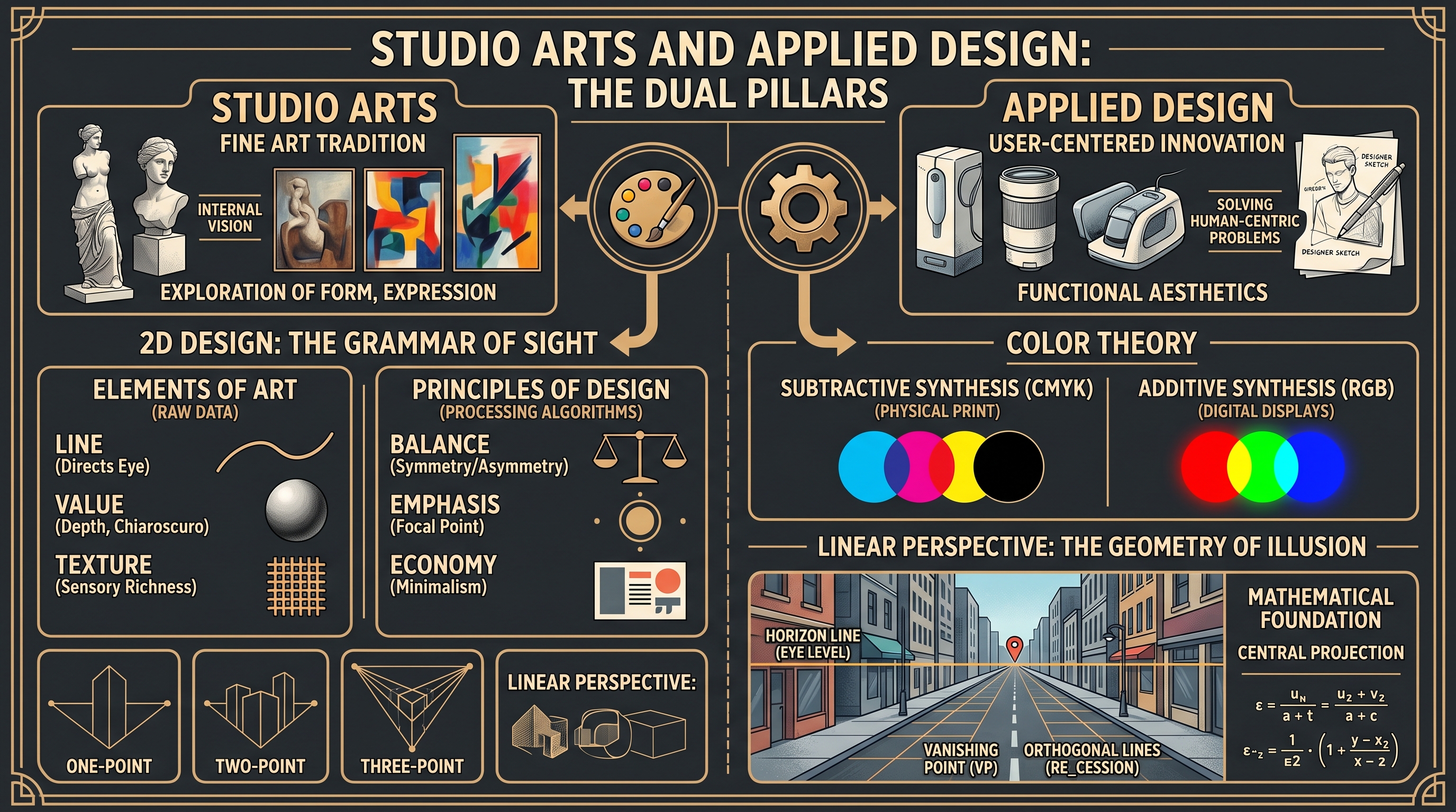
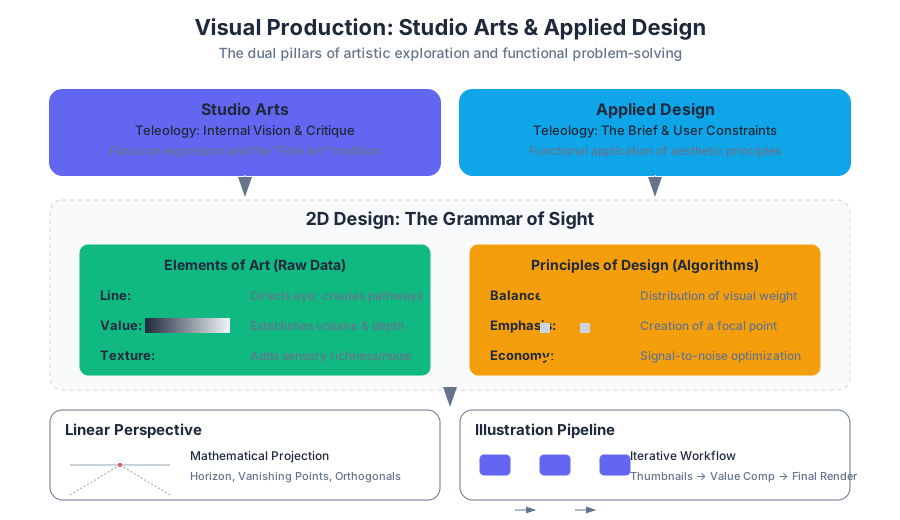
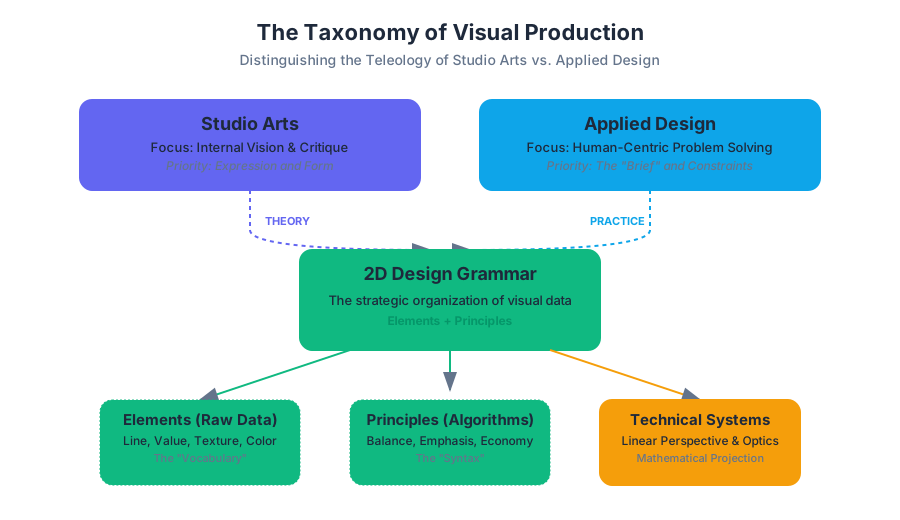
Studio Arts and Applied Design represent the dual pillars of visual production: the former focused on the exploration of form, expression, and the "fine art" tradition, and the latter on the functional application of aesthetic principles to solve human-centric problems. This section explores the transition from the theoretical "Elements and Principles of Design" to the rigorous technical implementations found in linear perspective, professional illustration, and user-centered innovation.
In the contemporary landscape, the boundary between the "artist" and the "designer" is increasingly fluid. However, the distinction remains in the teleology of the work—the purpose for which it is created. While studio art may prioritize the artist's internal vision or socio-political critique, applied design is governed by the "brief," the user, and the constraints of the medium.
2D Design: The Grammar of Sight
2D Design is the study of organizing visual elements on a flat plane (the "picture plane") to communicate specific ideas or evoke particular emotional responses. It is often described as the "grammar" of visual language. Just as a sentence requires syntax to be intelligible, a visual composition requires the strategic arrangement of elements according to established principles.
The Elements vs. The Principles
To understand 2D design, one must distinguish between the Elements of Art (the raw data) and the Principles of Design (the algorithms used to process that data).
| Category | Component | Definition | Technical Function |
|---|---|---|---|
| Element | Line | A point in motion or the edge of a shape. | Directs the viewer's eye; creates "pathways." |
| Element | Value | The relative lightness or darkness of a surface. | Establishes volume, depth, and "chiaroscuro." |
| Element | Texture | The surface quality (tactile or implied). | Adds sensory richness and "noise" to a surface. |
| Principle | Balance | The distribution of visual weight (Symmetrical/Asymmetrical). | Establishes stability or tension within the frame. |
| Principle | Emphasis | The creation of a focal point. | Manages the hierarchy of information. |
| Principle | Economy | The removal of non-essential elements. | Maximizes the "signal-to-noise" ratio in communication. |
Color Theory and Subtractive Synthesis
In 2D design, color is not merely aesthetic but functional. Professional design typically utilizes the CMYK (Subtractive) model for physical media and RGB (Additive) for digital.
The Weber-Fechner Law in Design: The perceived change in a visual stimulus (like the brightness of a color or the weight of a line) is proportional to the initial intensity of the stimulus. In practice, this means that to make a "dark" area look significantly darker, the artist must decrease the value exponentially, not linearly.
Linear Perspective: The Geometry of Illusion
Linear Perspective is a mathematical system for representing three-dimensional objects and spatial relationships on a two-dimensional surface. It relies on the optical illusion that parallel lines appear to converge as they recede into the distance.
The Mathematical Foundation
The core of linear perspective is the Central Projection. If we treat the eye as a single point (the "station point"), every point in 3D space ($P$) is projected onto a 2D plane ($I$) along a ray passing through the station point.
The fundamental variables are:
- Horizon Line: The viewer's eye level.
- Vanishing Point (VP): The point on the horizon where parallel lines appear to meet.
- Orthogonals: The lines drawn from the edges of objects to the vanishing point.
The Perspective Projection Matrix
In computer graphics and advanced technical illustration, we use a 4x4 matrix to transform 3D coordinates into 2D screen space. This simulates the way the human eye perceives depth.
Variations of Perspective
- One-Point: Used when the front plane of an object is parallel to the picture plane.
- Two-Point: Used when the object is viewed at an angle; two vanishing points sit on the horizon.
- Three-Point (Bird's/Worm's Eye): Adds a third vanishing point above or below the horizon to simulate extreme height or depth.
- Atmospheric Perspective: A non-linear method where depth is signaled by decreasing contrast and shifting colors toward the blue end of the spectrum (due to Rayleigh scattering in the atmosphere).
Professional Illustration and Graphic Narrative
Professional Illustration differs from fine art primarily in its Intent and Context. While a painting in a gallery exists for its own sake, an illustration is commissioned to clarify, decorate, or interpret a text or concept.
The Illustration Pipeline
A senior illustrator follows a rigorous "Double Diamond" or iterative workflow:
- Thumbnailing: Rapid, low-fidelity sketches to explore composition and "readability."
- Value Comp: Establishing the light and dark structure before color is applied.
- Final Render: The application of texture, color, and "finish."
Graphic Narrative and Sequential Art
The Graphic Narrative (comics, storyboards, instructional manuals) introduces the element of Time. In sequential art, the "unit of meaning" is not the single image, but the transition between images.
Closure: The phenomenon of observing the parts but perceiving the whole. In a graphic narrative, the reader performs "closure" in the gutter (the space between panels), mentally connecting two static images into a continuous action.
| Transition Type | Description | Cognitive Load |
|---|---|---|
| Moment-to-Moment | Requires very little closure (e.g., a blinking eye). | Low |
| Action-to-Action | Shows a single subject progressing through a motion. | Medium |
| Aspect-to-Aspect | Bypasses time to set a mood or place (shifting focus across a scene). | High |
| Non-Sequitur | No logical relationship between panels. | Infinite (Surrealism) |
User-Centered Innovation (UCI)
User-Centered Innovation is the application of design principles to the creation of products, systems, and interfaces that prioritize the end-user's needs, limitations, and behaviors. It is the "Applied Design" of the modern era, spanning Industrial Design (ID) and User Experience (UX).
The Mechanics of UCI
UCI is governed by Heuristics—rules of thumb that ensure a design is functional and accessible.
- Affordance: A property of an object that suggests how it should be used (e.g., a handle "affords" pulling).
- Signifiers: Visual cues that point to affordances (e.g., the word "PULL" on the handle).
- Mapping: The relationship between controls and their effects (e.g., the layout of stove knobs matching the layout of burners).
Derivation of the "Golden Ratio" in Layout
In applied design, the Golden Ratio ($\phi \approx 1.618$) is often used to create "natural" feeling layouts. It is derived from the limit of the ratio of consecutive Fibonacci numbers.
$$ \phi = \frac{1 + \sqrt{5}}{2} $$
In a layout, if the total width is $W$, the primary content area $w_1$ and the sidebar $w_2$ should satisfy: $$ \frac{W}{w_1} = \frac{w_1}{w_2} = \phi $$
Material Significance and Ethics
In both Studio Arts and Applied Design, the choice of material is never neutral. As noted in the Introduction to Art: Design, Context, and Meaning, materials carry Intrinsic, Monetary, and Cultural value.
The Value Triad
- Intrinsic Value: The physical properties of the material (e.g., the durability of granite vs. the fragility of glass).
- Monetary Value: The market cost of the raw material (e.g., Gold leaf vs. Yellow ochre).
- Cultural Value: The symbolic meaning assigned by society (e.g., the use of "Spolia"—repurposed stone from ancient monuments—to signal power and continuity).
Ethical Considerations in Applied Design
Designers today must navigate the Ecological Impact of their material choices. The "Cradle-to-Cradle" philosophy suggests that every material used in a design should either be a "biological nutrient" (biodegradable) or a "technical nutrient" (infinitely recyclable).
The Ethics of the Interface: In digital design, "Dark Patterns" are user interfaces designed to trick users into doing things they didn't intend to do (e.g., hidden costs in a checkout flow). User-Centered Innovation rejects these patterns in favor of transparency and user agency.
Common Pitfalls in Studio and Applied Arts
- The "Uncanny Valley" in Perspective: Over-reliance on strict mathematical perspective can sometimes make a drawing feel "dead" or distorted at the edges. Professional illustrators often "cheat" perspective to match human peripheral vision.
- Form Following Fashion, Not Function: In applied design, prioritizing aesthetic trends over usability leads to "over-designed" products that fail the end-user.
- Ignoring the Gutter: In graphic narratives, failing to provide enough information for the reader to perform "closure" results in a disjointed and confusing story.
Source Materials
Study Art on Lykke
This course page is free to open: signed out, you can read its first two sections, and signing in, on any plan, opens the rest. The free Lykke Chrome extension syncs your own Canvas courses, so ChatGPT, Claude and Muse can answer from your classes and deadlines. It only reads Canvas.
Add the free extensionSign in to open every section