Statistics and Probability
Institution: MIT
42 study materials · 13 sections
The Client Challenge course is a comprehensive curriculum in Statistics and Probability, designed to take learners from foundational data analysis to advanced statistical inference. The course covers the visualization and summarization of categorical and quantitative data, the principles of experimental design, and the laws of probability. Students will master complex topics including sampling distributions, hypothesis testing, chi-square analysis, and Analysis of Variance (ANOVA) to make data-driven decisions.
Course Sections
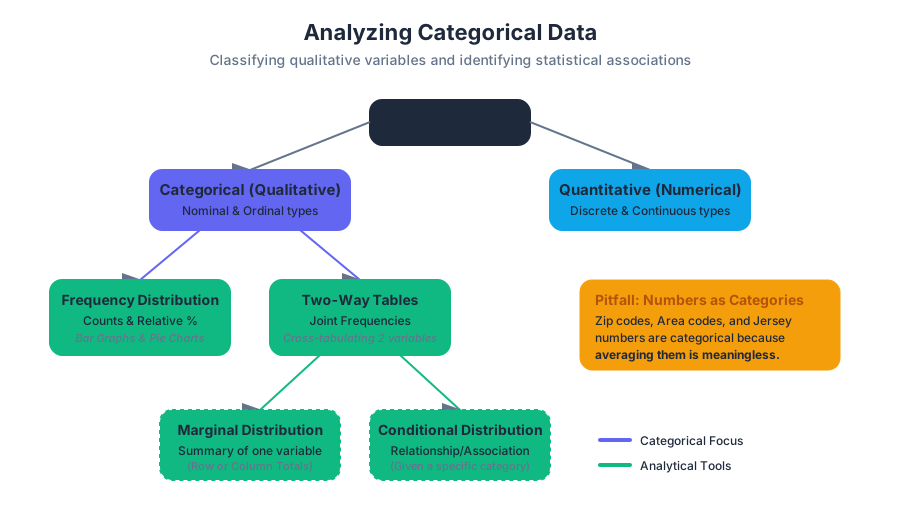
Analyzing Categorical Data
Key concepts: Categorical vs. Quantitative Variables · Two-Way Frequency Tables · Marginal and Conditional Distributions · Data Visualization (Bar Graphs, Pie Charts)
Introduction to identifying variables and visualizing categorical data using frequency tables and charts.
Analyzing Categorical Data
In the rigorous study of statistics, data is the raw material from which we forge insight. However, not all data is created equal. Before we can apply the machinery of hypothesis testing or predictive modeling, we must first understand the fundamental nature of the variables we are observing. The analysis of categorical data—information that sorts individuals into distinct groups or categories—serves as the gateway to understanding qualitative relationships, social structures, and logical associations.
While quantitative data deals with "how much" or "how many," categorical data addresses "what kind." This section explores the taxonomies of data, the mechanics of frequency distributions, and the mathematical frameworks used to identify associations between non-numerical variables.
Categorical vs. Quantitative Variables
The first step in any data analysis pipeline is variable classification. A variable is any characteristic, number, or quantity that can be measured or counted.
Categorical Variables
A categorical variable (also known as a qualitative variable) places an individual into one of several groups or categories. These categories may have a natural order (ordinal), such as "low, medium, high," or they may be purely nominal, such as "hair color" or "zip code."
Note on Numbers as Categories: It is a common pitfall to assume that any numerical value is quantitative. Zip codes, area codes, and jersey numbers are categorical because performing arithmetic on them (e.g., calculating the "average" zip code) yields a meaningless result.
Quantitative Variables
A quantitative variable takes numerical values for which it makes sense to find an average. These are further divided into discrete (countable values, like the number of children) and continuous (values that can take any real number within an interval, like height or time).
| Feature | Categorical (Qualitative) | Quantitative (Numerical) |
|---|---|---|
| Data Type | Labels, Names, Categories | Counts, Measurements |
| Operations | Counting, Proportions, Mode | Mean, Median, Standard Deviation |
| Sub-types | Nominal, Ordinal | Discrete, Continuous |
| Example | Species, Blood Type, Rating (1-5) | Weight, Temperature, Population |
| Visualization | Bar Graphs, Pie Charts | Histograms, Box Plots, Scatter Plots |
Frequency and Relative Frequency
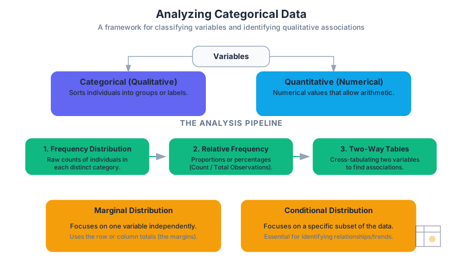
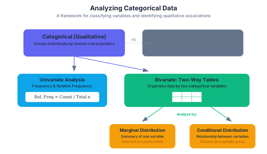
To analyze a single categorical variable, we begin by counting how many individuals fall into each category. This is known as a frequency distribution. However, raw counts can be misleading when comparing groups of different sizes. To normalize the data, we use relative frequency, which expresses the count as a proportion or percentage of the total.
$$\text{Relative Frequency} = \frac{\text{Count in Category}}{\text{Total Number of Observations}}$$
Visualization: Bar Graphs and Pie Charts
- Bar Graphs: These represent each category as a bar whose height corresponds to the frequency or relative frequency. They are superior to pie charts because the human eye is better at comparing linear lengths than angular areas.
- Pie Charts: These show the distribution of a categorical variable as "slices" of a circle. They are only appropriate when you want to emphasize a category's relation to the whole (100%).
Two-Way Frequency Tables
When we wish to examine the relationship between two categorical variables, we employ a two-way table (also called a contingency table or cross-tabulation). This structure allows us to summarize data for the same group of individuals across two different characteristics.
Structure of a Two-Way Table
Consider a study examining the relationship between "Exercise Habit" (Regular, Occasional, Never) and "Sleep Quality" (Good, Poor).
| Good Sleep | Poor Sleep | Total (Marginal) | |
|---|---|---|---|
| Regular Exercise | 45 | 15 | 60 |
| Occasional Exercise | 30 | 35 | 65 |
| Never Exercise | 10 | 65 | 75 |
| Total (Marginal) | 85 | 115 | 200 |
In this table:
- The cells in the interior contain the joint frequencies.
- The row totals and column totals represent the marginal distributions.
Marginal Distributions
The marginal distribution of one of the categorical variables in a two-way table is the distribution of values of that variable among all individuals described by the table. We call it "marginal" because the totals typically appear in the right or bottom margins of the table.
To calculate the marginal distribution for "Exercise Habit" from the table above:
- Identify the row totals for each exercise category.
- Divide each row total by the grand total (200).
| Exercise Habit | Frequency | Relative Frequency |
|---|---|---|
| Regular | 60 | $60/200 = 0.30$ (30%) |
| Occasional | 65 | $65/200 = 0.325$ (32.5%) |
| Never | 75 | $75/200 = 0.375$ (37.5%) |
Key Insight: Marginal distributions tell us nothing about the relationship between the two variables. They only summarize each variable independently.
Conditional Distributions
To understand the association between variables, we must look at conditional distributions. A conditional distribution describes the values of one variable among individuals who have a specific value of another variable.
Mathematically, the conditional distribution of variable $Y$ given $X = x$ is: $$P(Y | X=x) = \frac{\text{Frequency of } (X=x \text{ and } Y)}{\text{Total Frequency of } X=x}$$
Worked Example: Sleep Quality Given Exercise
Let’s find the conditional distribution of Sleep Quality for those who "Regularly Exercise."
- Total Regular Exercisers: 60
- Regular Exercisers with Good Sleep: 45 ($45/60 = 75%$)
- Regular Exercisers with Poor Sleep: 15 ($15/60 = 25%$)
Now, compare this to those who "Never Exercise":
- Total Never Exercisers: 75
- Never Exercisers with Good Sleep: 10 ($10/75 \approx 13.3%$)
- Never Exercisers with Poor Sleep: 65 ($65/75 \approx 86.7%$)
Identifying Independence and Association
The primary goal of analyzing two-way tables is to determine if there is an association between two variables.
Definition of Independence: Two categorical variables are independent if the conditional distributions of one variable are the same for all categories of the other variable.
If the conditional distribution of "Good Sleep" is significantly higher for "Regular Exercisers" (75%) than for those who "Never Exercise" (13.3%), we conclude there is a strong association between exercise and sleep quality. If the percentages were nearly identical (e.g., 40% for both), the variables would be considered independent.
Visualizing Association: Segmented Bar Graphs
A segmented bar graph (or stacked bar graph) is the gold standard for visualizing associations. Each bar represents a category of the explanatory variable, and the bar is divided into segments representing the proportions of the response variable. If the segments vary in height across the bars, an association is present.
Implementation and Computation
In modern data science, we rarely calculate these distributions by hand. We use computational libraries to generate contingency tables and perform statistical tests like the Chi-Square test for independence.
1. Low-Level Implementation (Python/Pandas)
Using Python's pandas library is the industry standard for manipulating categorical data frames.
import pandas as pd

# Sample Data: Survey of 200 individuals
data = {
    'Exercise': ['Regular']*60 + ['Occasional']*65 + ['Never']*75,
    'Sleep': ['Good']*45 + ['Poor']*15 + ['Good']*30 + ['Poor']*35 + ['Good']*10 + ['Poor']*65
}
df = pd.DataFrame(data)

# Create a Two-Way Frequency Table (Contingency Table)
contingency_table = pd.crosstab(df['Exercise'], df['Sleep'], margins=True)

# Calculate Marginal Distribution for Exercise
marginal_exercise = contingency_table['All'] / contingency_table.loc['All', 'All']

# Calculate Conditional Distribution of Sleep given Exercise
# We divide each row by the row total (axis=0)
conditional_sleep = pd.crosstab(df['Exercise'], df['Sleep'], normalize='index')

print("Conditional Distribution (Proportions):")
print(conditional_sleep)
2. Mathematical Derivation (LaTeX)
The logic of categorical analysis is rooted in probability theory. We define the relationship between joint, marginal, and conditional probabilities as follows:
\begin{aligned}
&\text{Let } A \text{ and } B \text{ be two categorical variables.} \\
&\text{Joint Probability: } P(A_i \cap B_j) = \frac{n_{ij}}{N} \\
&\text{Marginal Probability: } P(A_i) = \sum_{j} P(A_i \cap B_j) = \frac{n_{i \cdot}}{N} \\
&\text{Conditional Probability: } P(B_j | A_i) = \frac{P(A_i \cap B_j)}{P(A_i)} = \frac{n_{ij}}{n_{i \cdot}} \\
&\text{Independence Condition: } P(B_j | A_i) = P(B_j) \text{ for all } i, j
\end{aligned}
3. Real-World Usage (SQL)
In a production database environment, categorical analysis often happens at the query level to generate reports.
-- Calculating a Two-Way Table of User Status vs Subscription Tier
SELECT
    subscription_tier,
    status,
    COUNT(*) AS frequency,
    ROUND(100.0 * COUNT(*) / SUM(COUNT(*)) OVER (PARTITION BY subscription_tier), 2) AS conditional_pct
FROM
    users
GROUP BY
    subscription_tier,
    status
ORDER BY
    subscription_tier;
Advanced Nuance: Simpson's Paradox
An expert-level analysis of categorical data must account for Simpson's Paradox. This occurs when an association between two variables reverses or disappears when a third "lurking" or "confounding" variable is introduced.
The Classic Example: University Admissions
Imagine a university where:
- Men have a higher overall acceptance rate than women.
- However, when looking at individual departments, women have a higher acceptance rate in every single department.
How is this possible? It happens if women apply in large numbers to highly competitive departments with low acceptance rates, while men apply to less competitive departments.
| Department | Men Admitted | Women Admitted |
|---|---|---|
| Engineering (Easy) | 80/100 (80%) | 10/10 (100%) |
| Medicine (Hard) | 10/100 (10%) | 20/100 (20%) |
| Total | 90/200 (45%) | 30/110 (27%) |
In the table above, women outperform men in both departments, yet their aggregate rate is lower. This highlights the danger of aggregating categorical data without considering the underlying structure.
Common Pitfalls in Categorical Analysis
- Confusing Frequency with Relative Frequency: When comparing groups of different sizes, always use percentages. A group of 100 people might have 10 "Successes," while a group of 1000 has 50. The second group has more successes in raw numbers, but a much lower success rate (5% vs 10%).
- Ignoring the "Other" Category: Incomplete categories can skew marginal distributions. Ensure the categories are mutually exclusive and collectively exhaustive.
- Misinterpreting Correlation as Causation: Just because "Regular Exercise" is associated with "Good Sleep" doesn't mean exercise causes sleep. A third variable, like "Lower Stress Levels," might be causing both.
- Over-reliance on Pie Charts: Pie charts become unreadable with more than 3-4 categories. Use bar graphs for clarity.
Summary of Analysis Pipeline
To analyze categorical data effectively, follow this systematic workflow:
- Identify Individuals and Variables: Determine what constitutes a single observation.
- Classify Variables: Confirm the data is categorical (nominal or ordinal).
- Summarize Single Variables: Create frequency and relative frequency tables.
- Visualize: Use Bar Graphs for single variables.
- Cross-Tabulate: Create a two-way table for bivariate analysis.
- Calculate Distributions: Determine marginal distributions for the "big picture" and conditional distributions for specific comparisons.
- Check for Association: Compare conditional distributions. Look for significant differences that suggest a relationship.
- Check for Confounders: Be wary of Simpson's Paradox; consider if a third variable is influencing the results.
Displaying and Summarizing Quantitative Data
Key concepts: Histograms and Dot Plots · Mean and Median · Standard Deviation · Interquartile Range (IQR) · Box Plots and Outliers
Methods for representing numerical data graphically and summarizing it using measures of center and spread.
Displaying and Summarizing Quantitative Data
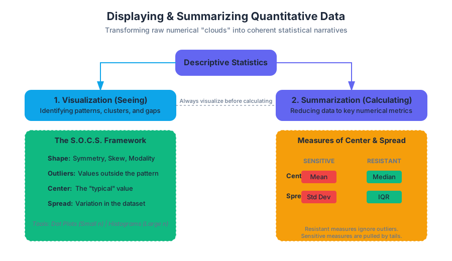
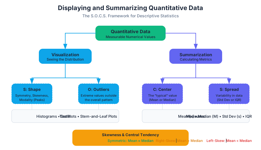
In the realm of statistical analysis, data is generally bifurcated into two categories: categorical (qualitative) and numerical (quantitative). While categorical data deals with labels and attributes, quantitative data represents measurable quantities where arithmetic operations provide meaningful insights. The challenge for the statistician is to transform a raw "cloud" of numbers into a coherent narrative. This process, known as Descriptive Statistics, relies on two primary pillars: Visualization (seeing the data) and Summarization (calculating the data).
To understand a quantitative distribution, we must examine its S.O.C.S.:
- Shape: Is it symmetric, skewed, unimodal, or bimodal?
- Outliers: Are there individual values that fall outside the overall pattern?
- Center: What is a "typical" value?
- Spread: How much variation exists in the data?
Visualizing Quantitative Distributions
Before calculating a single average, a researcher must look at the data. Graphical displays reveal patterns—clusters, gaps, and skewness—that numerical summaries often hide.
Dot Plots and Stem-and-Leaf Plots
For small datasets, Dot Plots provide the most granular view. Each data point is represented by a dot above a number line. This allows for an immediate assessment of the frequency and the exact location of every value. Similarly, Stem-and-Leaf Plots (or stemplots) preserve the individual data values while grouping them. The "stem" represents the leading digit(s), and the "leaf" represents the final digit.
Histograms
As datasets grow into the thousands or millions, individual dots become illegible. Histograms solve this by grouping adjacent values into bins (or intervals). The height of each bar represents the frequency (count) or relative frequency (percentage) of values falling within that bin.
The Binning Rule: The choice of bin width is critical. Bins that are too wide will "oversmooth" the data, hiding important features like bimodality. Bins that are too narrow will create a "noisy" plot where the overall shape is lost in local fluctuations.
| Feature | Dot Plot | Stem-and-Leaf | Histogram |
|---|---|---|---|
| Data Size | Small ($n < 50$) | Small to Medium | Large ($n > 100$) |
| Granularity | High (shows every point) | High (shows every point) | Low (aggregates into bins) |
| Ease of Construction | Manual/Simple | Manual/Simple | Computational |
| Best Use Case | Initial data inspection | Classroom settings | Professional reporting/Big Data |
Measures of Center: Mean vs. Median
The "center" of a distribution is the value that represents the typical observation. However, "typical" can be defined in multiple ways, leading to the two most common measures: the Arithmetic Mean and the Median.
The Arithmetic Mean ($\bar{x}$)
The mean is the "balance point" of the distribution. Mathematically, it is the sum of all observations divided by the number of observations.
$$\bar{x} = \frac{\sum_{i=1}^{n} x_i}{n}$$
The mean is highly sensitive to outliers. A single extreme value (like a billionaire entering a room of middle-class earners) will pull the mean toward it, often resulting in a value that does not accurately represent the majority of the group.
The Median ($M$)
The median is the "middle" value when the data is arranged in ascending order. If $n$ is odd, the median is the center observation. If $n$ is even, the median is the average of the two center observations.
Unlike the mean, the median is resistant (or robust). It ignores the actual magnitude of extreme values, focusing only on their position.
Shape and Central Tendency
The relationship between the mean and median reveals the skewness of the data:
- Symmetric: Mean $\approx$ Median.
- Right-Skewed (Positive): Mean > Median (the tail pulls the mean to the right).
- Left-Skewed (Negative): Mean < Median (the tail pulls the mean to the left).
# Low-level implementation of Central Tendency Algorithms
def calculate_stats(data):
    """
    Calculates mean and median without high-level library dependencies.
    Demonstrates the algorithmic logic of sorting and summation.
    """
    n = len(data)
    if n == 0:
        return None

    # Calculate Mean
    total_sum = 0
    for x in data:
        total_sum += x
    mean = total_sum / n

    # Calculate Median
    sorted_data = sorted(data)
    mid = n // 2

    if n % 2 == 0:
        # Average of two middle elements
        median = (sorted_data[mid - 1] + sorted_data[mid]) / 2
    else:
        # Single middle element
        median = sorted_data[mid]

    return {
        "mean": round(mean, 2),
        "median": round(median, 2),
        "is_skewed_right": mean > median
    }

# Example usage:
dataset = [12, 15, 12, 18, 20, 100] # 100 is an outlier
print(calculate_stats(dataset))
Measures of Variability: Standard Deviation and IQR
Knowing the center is insufficient. Two datasets can have the same mean but look entirely different. Spread (or variability) describes how much the data deviates from the center.
Standard Deviation ($s$)
The standard deviation measures the "typical" distance of the observations from the mean. To calculate it, we first find the Variance ($s^2$), which is the average of the squared deviations.
Bessel's Correction: When calculating the sample variance, we divide by $n-1$ rather than $n$. This corrects the bias in the estimation of the population variance, as sample observations tend to be less spread out than the entire population.
\text{Sample Variance: } s^2 = \frac{\sum (x_i - \bar{x})^2}{n - 1}
\text{Standard Deviation: } s = \sqrt{\frac{\sum (x_i - \bar{x})^2}{n - 1}}
The Interquartile Range (IQR)
While the standard deviation is paired with the mean, the IQR is paired with the median. The IQR measures the spread of the middle 50% of the data.
- Q1 (First Quartile): The median of the lower half of the data (25th percentile).
- Q3 (Third Quartile): The median of the upper half of the data (75th percentile).
- IQR = $Q_3 - Q_1$.
Like the median, the IQR is resistant to outliers.
| Metric | Formula/Logic | Sensitivity to Outliers | Best for... |
|---|---|---|---|
| Range | Max - Min | Extremely Sensitive | Quick, rough estimate |
| Standard Deviation | $\sqrt{Var}$ | Sensitive | Symmetric distributions |
| IQR | $Q_3 - Q_1$ | Resistant | Skewed distributions |
| MAD | $\frac{\sum \vert x_i - \bar{x}\vert }{n}$ | Moderate | Intuitive "average error" |
Identifying Outliers: The 1.5xIQR Rule
An outlier is not just a "large number"; it is a point that is mathematically distant from the rest of the data. The most common standard for identifying outliers is the 1.5xIQR Rule, established by John Tukey.
The Algorithm
- Calculate the IQR ($Q_3 - Q_1$).
- Multiply the IQR by 1.5.
- Determine the Lower Bound: $Q_1 - (1.5 \times IQR)$.
- Determine the Upper Bound: $Q_3 + (1.5 \times IQR)$.
- Any data point falling below the Lower Bound or above the Upper Bound is considered a formal outlier.
Why 1.5?
The multiplier 1.5 is a heuristic. In a perfectly Normal (bell-shaped) distribution, the 1.5xIQR rule identifies approximately 0.7% of the data as outliers (points roughly 2.7 standard deviations away from the mean). It provides a balance between being too sensitive (labeling normal variation as outliers) and too restrictive (missing genuine anomalies).
# Real-world usage: Statistical Analysis in R
# Analyzing the 'mtcars' dataset for outliers in horsepower (hp)

data(mtcars)
hp_data <- mtcars$hp

# Calculate Quartiles
q1 <- quantile(hp_data, 0.25)
q3 <- quantile(hp_data, 0.75)
iqr_val <- q3 - q1

# Define Bounds
lower_bound <- q1 - (1.5 * iqr_val)
upper_bound <- q3 + (1.5 * iqr_val)

# Identify Outliers
outliers <- hp_data[hp_data < lower_bound | hp_data > upper_bound]

cat("Lower Bound:", lower_bound, "\n")
cat("Upper Bound:", upper_bound, "\n")
cat("Detected Outliers:", outliers, "\n")

# Visualizing with a Boxplot
boxplot(hp_data, main="Horsepower Distribution", horizontal=TRUE, col="lightblue")
Box and Whisker Plots
The Box Plot is a visual representation of the Five-Number Summary:
- Minimum (non-outlier)
- $Q_1$
- Median
- $Q_3$
- Maximum (non-outlier)
Construction Mechanics
- The Box spans from $Q_1$ to $Q_3$, representing the IQR.
- A Line is drawn inside the box at the Median.
- The Whiskers extend from the box to the smallest and largest values that are not outliers.
- Outliers are typically plotted as individual points (dots or asterisks) beyond the whiskers.
Box plots are exceptionally useful for comparing groups. By placing box plots side-by-side, a researcher can instantly compare the centers (medians), spreads (IQR/Whiskers), and the presence of outliers across different categories.
Linear Transformations and Data Scaling
In many engineering and data science contexts, we must transform data—for example, converting temperatures from Celsius to Fahrenheit or normalizing scores. These transformations have predictable effects on our summary statistics.
Shifting (Addition/Subtraction)
Adding a constant $a$ to every value in a dataset:
- Center: Increases by $a$ (Mean${new}$ = Mean${old} + a$).
- Spread: Remains unchanged (SD and IQR stay the same).
Scaling (Multiplication/Division)
Multiplying every value by a constant $b$:
- Center: Multiplied by $b$.
- Spread: Multiplied by $|b|$.
| Transformation | Mean | Median | Std Dev | IQR | Range |
|---|---|---|---|---|---|
| Add $a$ | $+ a$ | $+ a$ | No Change | No Change | No Change |
| Multiply by $b$ | $\times b$ | $\times b$ | $\times \Vert b\Vert $ | $\times \Vert b\Vert $ | $\times \Vert b\Vert $ |
-- Calculating Summary Statistics at Scale
-- Using SQL to summarize a 'sales' table with 1M+ rows

SELECT
    COUNT(price) AS n,
    AVG(price) AS mean_price,
    PERCENTILE_CONT(0.5) WITHIN GROUP (ORDER BY price) AS median_price,
    STDDEV_SAMP(price) AS std_dev,
    PERCENTILE_CONT(0.75) WITHIN GROUP (ORDER BY price) -
    PERCENTILE_CONT(0.25) WITHIN GROUP (ORDER BY price) AS iqr,
    MIN(price) AS min_val,
    MAX(price) AS max_val
FROM ecommerce.transactions
WHERE transaction_date >= '2023-01-01';
Common Pitfalls in Summarizing Data
- The "Average" Trap: Reporting only the mean for highly skewed data (like income or house prices). This often misleads the audience by presenting a "typical" value that is much higher than what most people experience.
- Ignoring the Shape: Two distributions can have the same mean and standard deviation but different shapes (e.g., one unimodal and one bimodal). Always visualize before summarizing.
- Standard Deviation on Skewed Data: Using $s$ to describe spread in a heavily skewed distribution is technically possible but often unhelpful, as $s$ is not resistant. The IQR is the preferred metric here.
- Bin Width Bias: In histograms, choosing an arbitrary bin width can hide gaps in the data. If the data represents ages, bins of 10 years might hide a "missing generation" that bins of 1 year would reveal.
- Confusing Sample vs. Population: Forgetting to use $n-1$ for sample standard deviation leads to an underestimation of the true population variability.
Summary of Best Practices
When tasked with displaying and summarizing quantitative data, follow this pipeline:
- Visualize: Create a histogram or dot plot to determine the shape.
- Check for Outliers: Use the 1.5xIQR rule to identify and investigate anomalies. Decide if they are data entry errors or genuine (and interesting) extreme cases.
- Choose Metrics:
- If Symmetric: Use Mean and Standard Deviation.
- If Skewed: Use Median and IQR.
- Compare: If comparing multiple groups, use side-by-side box plots to highlight differences in center and variability.
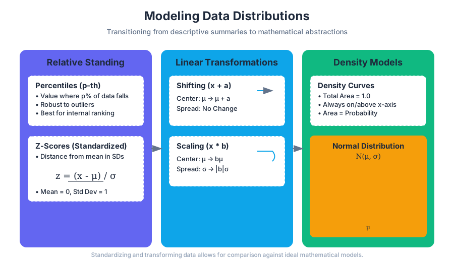
Modeling Data Distributions
Key concepts: Z-scores · Percentiles · Linear Transformations · Normal Distribution · Empirical Rule (68-95-99.7)
Exploring the position of data points within a distribution and the properties of Normal distributions.
Modeling Data Distributions
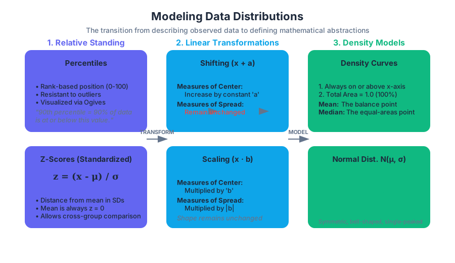
In the preceding chapters, we focused on descriptive statistics—the art of summarizing and visualizing the data we have actually observed. However, the true power of statistics lies in modeling: the transition from describing a finite set of data points to defining a mathematical abstraction that represents the underlying process. Modeling allows us to make predictions, compare disparate datasets, and understand the probability of future occurrences.
This section explores how we locate individual values within a distribution, how we transform entire datasets to fit specific scales, and how we utilize the Normal Distribution—the "bell curve"—as a foundational tool for statistical inference.
Measuring Relative Standing: Percentiles and Z-Scores
When we look at a single data point, its raw value often tells us very little. If a student scores 85 on a test, we cannot determine if they performed well without knowing the distribution of the rest of the class. To provide context, we use measures of relative standing.
Percentiles
The $p$-th percentile of a distribution is the value such that $p$ percent of the observations fall at or below it.
Definition: If a value $x$ is at the 90th percentile, it means 90% of the data points in the set are less than or equal to $x$.
Percentiles are particularly useful for non-symmetric distributions because they are resistant to outliers. A common visualization for percentiles is the Cumulative Relative Frequency Graph (or Ogive), which plots the percentile rank on the y-axis against the data values on the x-axis.
Z-Scores (Standardized Scores)
While percentiles tell us about rank, Z-scores tell us about distance. A Z-score measures how many standard deviations a value is from the mean.
The formula for calculating a Z-score is: $$z = \frac{x - \mu}{\sigma}$$
Where:
- $x$ is the raw value.
- $\mu$ is the population mean.
- $\sigma$ is the population standard deviation.
| Feature | Percentiles | Z-Scores |
|---|---|---|
| Unit of Measure | Percentage (0-100) | Standard Deviations |
| Center | Median is the 50th percentile | Mean is always $z = 0$ |
| Sensitivity | Robust to outliers | Sensitive to outliers (via $\mu$ and $\sigma$) |
| Comparison | Best for ranking within one group | Best for comparing across different groups |
Implementation: Calculating Standardized Scores
In high-performance data environments, standardizing features is a prerequisite for many machine learning algorithms (like SVM or K-Means). Below is a robust implementation using Python and NumPy.
import numpy as np

def standardize_data(data):
    """
    Standardizes a dataset (Z-score normalization).
    Handles edge cases like zero variance to prevent division by zero.
    """
    data = np.array(data)
    mean = np.mean(data)
    std_dev = np.std(data)

    if std_dev == 0:
        return np.zeros_like(data)

    z_scores = (data - mean) / std_dev
    return z_scores

# Example usage with a sample dataset
observations = [12, 15, 12, 18, 20, 25, 14, 16]
standardized_obs = standardize_data(observations)

print(f"Mean: {np.mean(observations):.2f}")
print(f"Std Dev: {np.std(observations):.2f}")
print(f"Z-Scores: {standardized_obs}")
Linear Transformations
Often, we need to convert data from one scale to another—for example, converting Celsius to Fahrenheit or adding a curve to exam scores. These are linear transformations. A linear transformation follows the form $x_{new} = a + bx$.
The Effect of Shifting (Adding/Subtracting $a$)
When we add a constant $a$ to every value in a dataset:
- Measures of Center and Location (mean, median, quartiles, percentiles) increase by $a$.
- Measures of Spread (range, IQR, standard deviation) remain unchanged.
- The shape of the distribution remains unchanged.
The Effect of Scaling (Multiplying/Dividing by $b$)
When we multiply every value in a dataset by a constant $b$:
- Measures of Center and Location are multiplied by $b$.
- Measures of Spread are multiplied by $|b|$.
- The shape of the distribution remains unchanged.
Mathematical Derivation of Linear Transformation Effects
Let X be a random variable with mean E[X] and variance Var(X).
Define a transformed variable Y = a + bX.

1. Expectation (Mean):
   E[Y] = E[a + bX]
   E[Y] = E[a] + E[bX]
   E[Y] = a + b * E[X]

2. Variance:
   Var(Y) = Var(a + bX)
   Var(Y) = Var(bX)  (Adding a constant 'a' does not change spread)
   Var(Y) = b^2 * Var(X)

3. Standard Deviation:
   SD(Y) = sqrt(b^2 * Var(X)) = |b| * SD(X)
Density Curves
As we move from discrete data points to continuous models, we use density curves. A density curve is a mathematical model that describes the overall pattern of a distribution.
The Two Rules of Density Curves:
- The curve is always on or above the horizontal axis.
- The total area under the curve is exactly 1.
The area under the curve between two points represents the proportion of all observations that fall within that range. While the mean of a density curve is its "balance point," the median is the "equal-areas point" (the point that divides the area under the curve in half).
| Distribution Shape | Mean vs. Median |
|---|---|
| Symmetric | Mean = Median |
| Skewed Right | Mean > Median (mean is pulled toward the tail) |
| Skewed Left | Mean < Median (mean is pulled toward the tail) |
The Normal Distribution
The most important density curve in statistics is the Normal Distribution. It is symmetric, single-peaked, and bell-shaped. Any Normal distribution is completely described by two parameters: its mean ($\mu$) and its standard deviation ($\sigma$). We denote this as $N(\mu, \sigma)$.
Why the Normal Distribution Matters
The Normal distribution appears everywhere in nature and industry—heights, blood pressure, errors in measurement, and standardized test scores. Its ubiquity is largely explained by the Central Limit Theorem, which states that the sum (or mean) of many independent random variables tends toward a Normal distribution, regardless of the original distribution's shape.
The Probability Density Function (PDF)
The height of the Normal curve at any point $x$ is given by the Gaussian function: $$f(x) = \frac{1}{\sigma\sqrt{2\pi}} e^{-\frac{1}{2}\left(\frac{x-\mu}{\sigma}\right)^2}$$
The Empirical Rule (68-95-99.7)
For any Normal distribution, the Empirical Rule provides a quick way to estimate the proportion of data within certain distances of the mean.
The 68-95-99.7 Rule:
- Approximately 68% of the observations fall within $1\sigma$ of the mean $\mu$.
- Approximately 95% of the observations fall within $2\sigma$ of the mean $\mu$.
- Approximately 99.7% of the observations fall within $3\sigma$ of the mean $\mu$.
Worked Example: Industrial Quality Control
Suppose a factory produces steel rods with a mean diameter of 50mm and a standard deviation of 0.02mm. The distribution of diameters is Normal.
- What range contains 95% of the rods? According to the Empirical Rule, 95% fall within $2\sigma$. Range = $50 \pm 2(0.02) = [49.96mm, 50.04mm]$.
- What percent of rods are thicker than 50.04mm? Since 95% are between 49.96 and 50.04, the remaining 5% are outside that range. Because the curve is symmetric, half of that 5% (which is 2.5%) will be above 50.04mm.
| Distance from Mean | Area Under Curve (Cumulative) | Tail Area (Outside) |
|---|---|---|
| $\pm 1\sigma$ | 0.6827 | 0.3173 |
| $\pm 2\sigma$ | 0.9545 | 0.0455 |
| $\pm 3\sigma$ | 0.9973 | 0.0027 |
The Standard Normal Distribution
To simplify calculations, we often transform any $N(\mu, \sigma)$ distribution into the Standard Normal Distribution, denoted as $N(0, 1)$. This is achieved by converting every $x$ value into its Z-score.
Once standardized, we can use a Standard Normal Table (Z-table) or software to find the area under the curve for any Z-value.
Practical Usage: Finding Probabilities with Scipy
In modern engineering, we rarely use Z-tables. We use libraries that implement the Cumulative Distribution Function (CDF).
from scipy.stats import norm

# Parameters for a distribution of IQ scores: Mean=100, SD=15
mu = 100
sigma = 15

# 1. What is the probability of an IQ score being less than 115?
# This is exactly 1 standard deviation above the mean.
prob_less_115 = norm.cdf(115, mu, sigma)
print(f"P(X < 115): {prob_less_115:.4f}") # Expected ~0.8413

# 2. What is the IQ score at the 99th percentile?
iq_99th = norm.ppf(0.99, mu, sigma)
print(f"99th Percentile Score: {iq_99th:.2f}")

# 3. What is the probability of a score between 85 and 115?
prob_between = norm.cdf(115, mu, sigma) - norm.cdf(85, mu, sigma)
print(f"P(85 < X < 115): {prob_between:.4f}") # Expected ~0.6827
Assessing Normality
Not every bell-shaped curve is Normal. Before applying the Empirical Rule or Z-score probabilities, we must verify the "Normality" of the data.
- Visual Inspection: Plot a histogram or stemplot. Look for symmetry and a single peak.
- Check the Empirical Rule: Calculate $\bar{x}$ and $s$. See if approximately 68%, 95%, and 99.7% of the data points fall within 1, 2, and 3 standard deviations.
- Normal Probability Plot (Q-Q Plot): This is the most reliable method. A Q-Q plot graphs the observed data against the "theoretical" quantiles of a Normal distribution.
- If the points on a Normal probability plot lie close to a straight line, the data is approximately Normal.
- Systematic deviations from a straight line indicate non-Normality (e.g., a curve indicates skewness).
Common Pitfalls and Misconceptions
- Confusing Z-scores and Percentiles: A Z-score of 1.0 does not mean the 1st percentile; it means the value is 1 standard deviation above the mean (which corresponds to roughly the 84th percentile).
- Assuming Normality: Many students apply the 68-95-99.7 rule to distributions that are heavily skewed. This leads to massive errors in probability estimation. Always check a Q-Q plot first.
- Standardizing Shape: Standardizing (Z-scores) changes the scale and center of a distribution, but it never changes the shape. If the original data was skewed, the Z-scores will be equally skewed.
- The "0.5" Error: In a Normal distribution, the probability of a single exact point (e.g., $P(X = 100)$) is technically zero because the area of a line is zero. We always calculate probabilities for intervals.
Large-Scale Standardization in SQL
When working with databases, you might need to standardize a column across millions of rows.
-- Standardizing 'sales_amount' in a table 'transactions'
WITH Stats AS (
    SELECT
        AVG(sales_amount) AS mu,
        STDDEV(sales_amount) AS sigma
    FROM transactions
)
SELECT
    t.transaction_id,
    t.sales_amount,
    (t.sales_amount - s.mu) / NULLIF(s.sigma, 0) AS z_score
FROM transactions t, Stats s;
Bivariate Numerical Data and Regression
Key concepts: Scatter Plots · Correlation Coefficient (r) · Least-Squares Regression Line · Residuals · Coefficient of Determination (r²)
Analyzing the relationship between two quantitative variables using scatter plots and linear models.
Bivariate Numerical Data and Regression
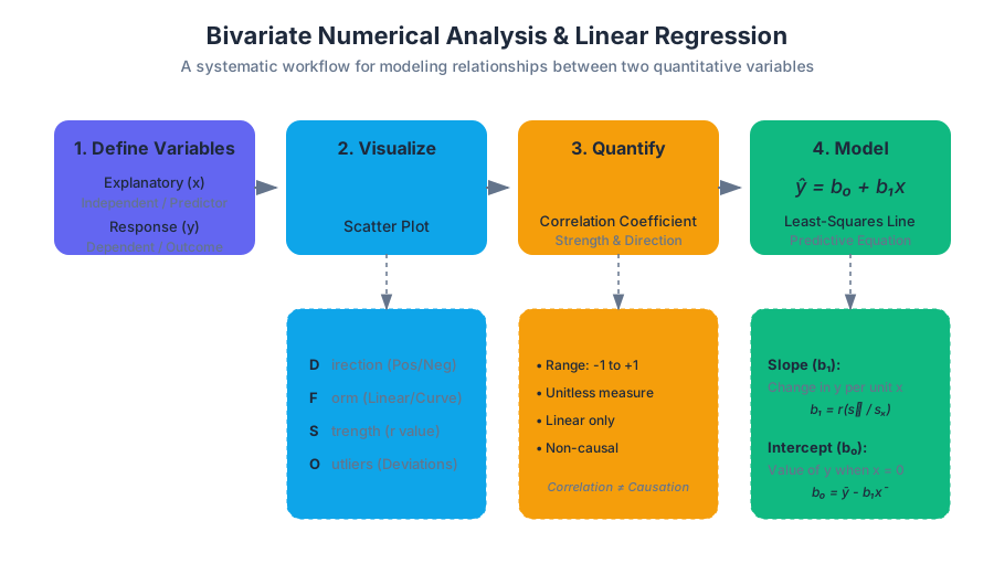
In the realm of statistical modeling, bivariate numerical data represents the first step toward predictive power. While univariate analysis allows us to understand the distribution and central tendency of a single variable, bivariate analysis explores the dynamic relationship between two quantitative variables. We seek to determine if a change in an explanatory variable ($x$)—also known as the independent variable—is associated with a predictable change in a response variable ($y$), or the dependent variable.
This relationship is the foundation of linear regression, a method that allows us to move beyond simple observation into the territory of estimation and forecasting. By quantifying the "link" between variables, we can construct mathematical models that serve as the backbone for everything from algorithmic trading and medical diagnostics to social science research.
1. Scatter Plots: The Visual Foundation
Before performing any calculation, a statistician must visualize the data. The scatter plot is the primary tool for this task. It maps each pair of observations $(x_i, y_i)$ as a point in a two-dimensional Cartesian plane.
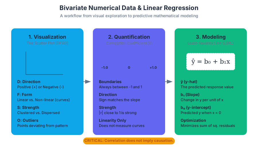
When interpreting a scatter plot, we look for four specific characteristics, often remembered by the acronym DFSO:
- Direction: Is the trend positive (as $x$ increases, $y$ increases) or negative (as $x$ increases, $y$ decreases)?
- Form: Is the relationship linear, or does it follow a curve (quadratic, exponential, logarithmic)?
- Strength: How closely do the points follow the form? Tight clusters indicate a strong relationship; high dispersion indicates a weak one.
- Outliers: Are there individual points that deviate significantly from the overall pattern?
Interpreting Scatter Plot Characteristics
| Characteristic | Description | Visual Indicator |
|---|---|---|
| Positive Association | Both variables move in the same direction. | Points trend from bottom-left to top-right. |
| Negative Association | Variables move in opposite directions. | Points trend from top-left to bottom-right. |
| Linear Form | The rate of change is constant. | Points roughly follow a straight line. |
| Non-linear Form | The rate of change varies. | Points follow a curve, "U" shape, or "S" shape. |
| Strong Strength | High predictive reliability. | Points are very close to the imaginary trend line. |
| Weak Strength | Low predictive reliability. | Points appear as a "cloud" with a vague trend. |
2. The Correlation Coefficient (r)
While scatter plots provide a qualitative "feel" for the data, the Correlation Coefficient ($r$), specifically the Pearson Product-Moment Correlation, provides a quantitative measure of the strength and direction of a linear relationship.
Mathematically, $r$ is the average product of the $z$-scores of the $x$ and $y$ pairs:
$$r = \frac{1}{n-1} \sum \left( \frac{x_i - \bar{x}}{s_x} \right) \left( \frac{y_i - \bar{y}}{s_y} \right)$$
Properties of $r$
- Boundaries: $r$ is always between $-1$ and $1$.
- Direction: $r > 0$ indicates a positive slope; $r < 0$ indicates a negative slope.
- Strength: $|r| = 1$ is a perfect linear relationship; $r = 0$ indicates no linear relationship.
- Unitless: Because it uses $z$-scores, $r$ is not affected by changes in units (e.g., converting inches to centimeters).
- Symmetry: The correlation of $(x, y)$ is the same as the correlation of $(y, x)$.
Critical Insight: Correlation does not imply causation. A high $r$ value simply means the two variables move together; it does not prove that $x$ causes $y$. "Lurking variables" or confounding factors may be the actual drivers of the observed relationship.
Implementation: Calculating Pearson's $r$ from Scratch
The following Python implementation demonstrates the low-level calculation of the correlation coefficient using NumPy, adhering to the $z$-score summation logic.
import numpy as np

def calculate_correlation(x, y):
    """
    Calculates the Pearson Correlation Coefficient (r) using the
    standardized z-score product method.
    """
    n = len(x)
    if n != len(y):
        raise ValueError("Arrays must be of equal length.")

    # Calculate means and standard deviations (sample)
    mu_x, mu_y = np.mean(x), np.mean(y)
    std_x, std_y = np.std(x, ddof=1), np.std(y, ddof=1)

    # Calculate z-scores
    z_x = (x - mu_x) / std_x
    z_y = (y - mu_y) / std_y

    # Sum of products of z-scores
    r = np.sum(z_x * z_y) / (n - 1)

    return r

# Example Data: Study Hours vs. Exam Score
hours = np.array([2, 3, 5, 7, 9])
scores = np.array([65, 70, 80, 85, 92])

r_value = calculate_correlation(hours, scores)
print(f"Correlation Coefficient (r): {r_value:.4f}")
3. The Least-Squares Regression Line (LSRL)
If the scatter plot reveals a linear form, we can model the relationship using the Least-Squares Regression Line (LSRL). This is the "line of best fit" that minimizes the sum of the squared vertical distances between the observed data points and the line itself.
The equation for the LSRL is typically written as: $$\hat{y} = b_0 + b_1x$$
Where:
- $\hat{y}$ (y-hat) is the predicted value of $y$ for a given $x$.
- $b_1$ is the slope, representing the predicted change in $y$ for every 1-unit increase in $x$.
- $b_0$ is the y-intercept, representing the predicted value of $y$ when $x = 0$.
Calculating the Parameters
The slope and intercept are derived from the means ($\bar{x}, \bar{y}$), standard deviations ($s_x, s_y$), and the correlation coefficient ($r$):
- Slope ($b_1$): $b_1 = r \left( \frac{s_y}{s_x} \right)$
- Intercept ($b_0$): $b_0 = \bar{y} - b_1\bar{x}$
Mathematical Derivation: The Normal Equations
The goal is to minimize the Loss Function $L = \sum (y_i - (b_0 + b_1x_i))^2$. By taking partial derivatives with respect to $b_0$ and $b_1$ and setting them to zero, we arrive at the "Normal Equations."
\begin{aligned}
\text{1. Partial wrt } b_0: & \quad \frac{\partial}{\partial b_0} \sum (y_i - b_0 - b_1x_i)^2 = -2 \sum (y_i - b_0 - b_1x_i) = 0 \\
\text{2. Partial wrt } b_1: & \quad \frac{\partial}{\partial b_1} \sum (y_i - b_0 - b_1x_i)^2 = -2 \sum x_i(y_i - b_0 - b_1x_i) = 0 \\
\\
\text{Resulting in:} & \\
n b_0 + b_1 \sum x_i &= \sum y_i \\
b_0 \sum x_i + b_1 \sum x_i^2 &= \sum x_i y_i
\end{aligned}
4. Residuals and Residual Plots
No model is perfect. The difference between an observed value ($y$) and the predicted value ($\hat{y}$) is called a residual.
$$\text{Residual} = y - \hat{y}$$
- A positive residual means the observed value was higher than predicted (the model underestimated).
- A negative residual means the observed value was lower than predicted (the model overestimated).
The Residual Plot
To validate a linear model, we plot the residuals on the vertical axis against the explanatory variable ($x$) on the horizontal axis.
- If the residual plot shows a random scatter of points around the horizontal line at 0, the linear model is appropriate.
- If the residual plot shows a clear pattern (like a curve), a non-linear model may be better suited for the data.
- If the "spread" of residuals increases or decreases as $x$ increases (heteroscedasticity), the reliability of our predictions varies across the range of $x$.
| Residual Plot Appearance | Interpretation |
|---|---|
| Uniform Random Scatter | Linear model is appropriate; constant variance. |
| Curved Pattern (U-shape) | Relationship is likely non-linear; use transformation. |
| Fan/Funnel Shape | Heteroscedasticity; prediction error grows with $x$. |
| Isolated Outliers | Specific data points exert undue influence or are errors. |
5. The Coefficient of Determination ($r^2$)
While $r$ tells us about direction and strength, $r^2$ (r-squared) tells us about the proportion of variability. It is formally defined as the percentage of the variation in the response variable ($y$) that can be explained by the linear relationship with the explanatory variable ($x$).
$$r^2 = \frac{\text{SST} - \text{SSE}}{\text{SST}} = \frac{\text{SSR}}{\text{SST}}$$
Where:
- SST (Total Sum of Squares): Total variation in $y$.
- SSE (Sum of Squared Errors): Variation not explained by the line (sum of squared residuals).
- SSR (Regression Sum of Squares): Variation explained by the line.
Example Interpretation: If $r^2 = 0.85$ for a model relating "Study Hours" to "Exam Scores," we say: "85% of the variation in exam scores can be explained by the linear relationship with study hours. The remaining 15% is due to other factors or inherent variability."
Real-World Usage: Regression in R
In professional statistical environments, we rarely calculate these by hand. We use high-level libraries that provide comprehensive summaries.
# Load dataset
data(mtcars)

# Fit a linear model: Miles per Gallon (mpg) explained by Weight (wt)
model <- lm(mpg ~ wt, data = mtcars)

# Output the summary
summary(model)

# The output provides:
# 1. Residual statistics (Min, 1Q, Median, 3Q, Max)
# 2. Coefficients (Intercept and Slope) with p-values
# 3. R-squared and Adjusted R-squared
# 4. F-statistic for overall model significance
6. Influential Points and Outliers
Not all data points are created equal. In bivariate data, we distinguish between different types of unusual observations:
- Outliers: Points with large residuals (they don't fit the $y$-pattern).
- High Leverage Points: Points with $x$-values that are far from the mean of $x$. They have the potential to "pull" the regression line toward themselves.
- Influential Points: A point is influential if removing it significantly changes the slope, intercept, or $r$ value of the regression. Most influential points have high leverage.
Comparison of Point Types
| Point Type | Location | Effect on Residual | Effect on LSRL |
|---|---|---|---|
| Vertical Outlier | Far from the line in $y$-direction. | Large residual. | Usually minimal effect on slope. |
| High Leverage | Far from the mean in $x$-direction. | Can be small or large. | Acts as a "pivot" for the line. |
| Influential | High leverage + Outlier. | Variable. | Drastically changes the slope ($b_1$). |
7. Pitfalls: Extrapolation and Lurking Variables
Even a perfect model has limits. Two major traps await the unwary analyst:
Extrapolation
Extrapolation is the practice of using a regression line to predict values outside the range of the observed $x$-data. Example: If you track a child's growth from ages 2 to 10, the linear model might predict they will be 12 feet tall by age 30. Linear trends rarely continue indefinitely; the relationship may change or level off outside the observed domain.
Lurking Variables and Confounding
A lurking variable is a variable that is not included in the study but has an effect on the variables of interest. Example: There is a strong positive correlation between ice cream sales and drowning incidents. However, ice cream does not cause drowning. The lurking variable is Temperature—hot weather increases both ice cream consumption and the number of people swimming.
8. Database Implementation: SQL for Statistics
In modern data engineering, it is often more efficient to calculate these statistics directly within the database using SQL aggregates.
-- Calculating Slope (b1) and Intercept (b0) for a dataset
-- Formula: b1 = Cov(x,y) / Var(x)
-- Formula: b0 = Avg(y) - b1 * Avg(x)

WITH Stats AS (
    SELECT
        AVG(hours_studied) AS avg_x,
        AVG(test_score) AS avg_y,
        VAR_SAMP(hours_studied) AS var_x,
        COVAR_SAMP(hours_studied, test_score) AS cov_xy
    FROM student_performance
)
SELECT
    cov_xy / var_x AS slope_b1,
    avg_y - (cov_xy / var_x) * avg_x AS intercept_b0,
    CORR(hours_studied, test_score) AS correlation_r,
    POWER(CORR(hours_studied, test_score), 2) AS r_squared
FROM student_performance, Stats
GROUP BY avg_x, avg_y, var_x, cov_xy;
Statistical Investigations and Study Design
Key concepts: Random Sampling · Observational Studies vs. Experiments · Sources of Bias · Experimental Design Principles · Random Assignment
Learning how to collect data through sampling and experiments while avoiding bias.
Statistical Investigations and Study Design
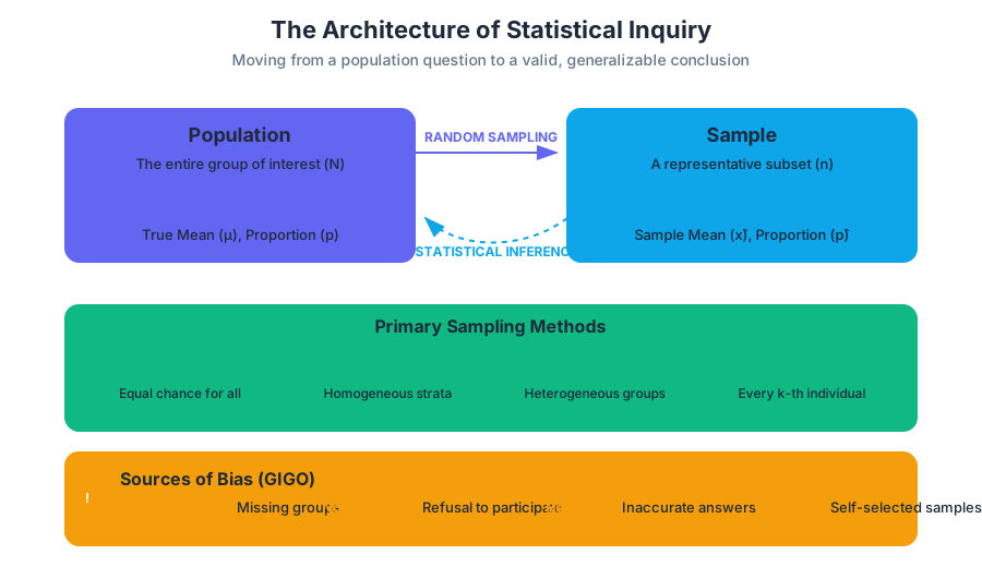
The integrity of any statistical conclusion rests entirely upon the quality of the data collection process. In the field of data science and statistics, we often say "Garbage In, Garbage Out" (GIGO). No amount of sophisticated machine learning or high-level calculus can rescue a study built on a biased sample or a poorly designed experiment. This article explores the rigorous frameworks required to move from a simple question to a valid, generalizable conclusion.
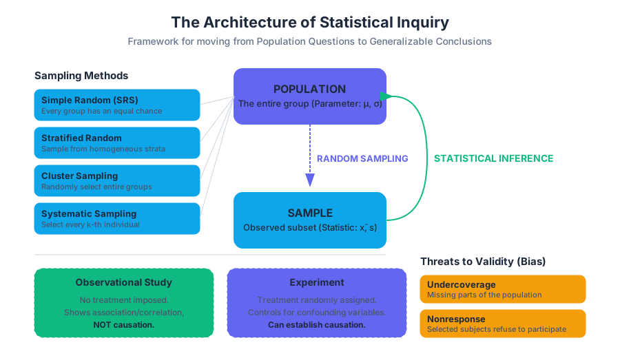
The Architecture of Statistical Inquiry
Before a single data point is collected, a researcher must distinguish between a statistical question and a non-statistical question. A statistical question is one that anticipates variability in the data. For example, "How much does a typical laptop weigh?" is a statistical question because weights vary. "How much does this specific MacBook Pro weigh?" is not; it has a single, deterministic answer.
The Population vs. The Sample
In statistical investigations, we seek to understand a population—the entire group of individuals we are interested in. Because it is usually impossible or impractical to measure every member of a population (a census), we instead collect a sample.
Definition: Parameter vs. Statistic A parameter is a numerical summary of a population (e.g., the true mean height of all humans, $\mu$). A statistic is a numerical summary of a sample (e.g., the mean height of 100 people in a study, $\bar{x}$). We use statistics to estimate parameters.
Random Sampling: The Science of Selection
The goal of sampling is to obtain a representative subset of the population. To achieve this, we must use randomization. If every individual in the population has an equal chance of being selected, we minimize the risk of systematic error.
Primary Sampling Methods
| Method | Description | Best For... |
|---|---|---|
| Simple Random Sample (SRS) | Every group of size $n$ has an equal chance of selection. | General populations with no distinct sub-groups. |
| Stratified Random Sample | Population is divided into strata (homogeneous groups); an SRS is taken from each. | Ensuring representation of specific demographics (e.g., age, gender). |
| Cluster Sample | Population is divided into clusters (heterogeneous groups); entire clusters are randomly selected. | Reducing costs/logistics when the population is geographically spread. |
| Systematic Sample | Selecting every $k$-th individual from a list after a random starting point. | Quality control on assembly lines or large databases. |
Implementation: Sampling Algorithms
In modern practice, we rely on algorithmic randomness to ensure unbiased selection. Below is a Python implementation demonstrating the difference between a Simple Random Sample and a Stratified Random Sample.
import pandas as pd
import numpy as np

def generate_sample_data(n_rows=1000):
    """Generates a synthetic population with a 'Strata' column."""
    data = {
        'id': range(n_rows),
        'strata': np.random.choice(['A', 'B', 'C'], size=n_rows, p=[0.5, 0.3, 0.2]),
        'value': np.random.normal(loc=50, scale=10, size=n_rows)
    }
    return pd.DataFrame(data)

def get_samples(df, n=100):
    # 1. Simple Random Sample (SRS)
    srs_sample = df.sample(n=n, random_state=42)

    # 2. Stratified Random Sample
    # We ensure the sample proportions match the population proportions
    stratified_sample = df.groupby('strata', group_keys=False).apply(
        lambda x: x.sample(int(np.rint(n * len(x) / len(df))))
    )

    return srs_sample, stratified_sample

# Execution
population = generate_sample_data()
srs, strat = get_samples(population)

print(f"SRS Mean: {srs['value'].mean():.2f}")
print(f"Stratified Mean: {strat['value'].mean():.2f}")
Why it Matters: Variance Reduction
Stratified sampling is not just about "fairness." Mathematically, it reduces the sampling variability (standard error) of our estimate if the strata are significantly different from one another. By ensuring we capture the variation between groups, we only have to worry about the variation within groups.
Sources of Bias: The Silent Killers of Validity
Bias is a systematic error that results in an estimate that is consistently higher or lower than the true population parameter. It is distinct from sampling error, which is the natural variation that occurs because we are looking at a sample rather than a population.
Common Types of Bias
| Bias Type | Mechanism | Example |
|---|---|---|
| Undercoverage | Some members of the population are left out of the sampling frame. | Conducting a "national" survey via landline phones (missing cell-only users). |
| Nonresponse | Selected individuals cannot be contacted or refuse to participate. | A long email survey where only people with strong opinions reply. |
| Response Bias | Inaccurate responses due to wording, interviewer behavior, or social desirability. | Asking "Do you support the illegal use of drugs?" (People lie). |
| Voluntary Response | Participants choose themselves to be part of the sample. | Online polls on news websites; usually attracts extremists. |
The Mathematical Perspective on Bias
If we let $\theta$ be the true parameter and $\hat{\theta}$ be our estimator, the bias is defined as: $$ \text{Bias}(\hat{\theta}) = E[\hat{\theta}] - \theta $$ An unbiased estimator is one where $E[\hat{\theta}] = \theta$. Random sampling is the primary tool used to drive this bias toward zero.
Observational Studies vs. Experiments
The most critical distinction in study design is the level of control the researcher exerts over the subjects.
- Observational Study: The researcher observes individuals and measures variables of interest but does not attempt to influence the responses. We can identify associations or correlations, but we cannot establish causation.
- Experiment: The researcher deliberately imposes a treatment on individuals to measure their responses. This is the "gold standard" for establishing causation.
The Confounding Variable
The reason observational studies cannot prove causation is the presence of confounding variables. A confounding variable is an "extra" variable that is associated with both the explanatory variable and the response variable, making it impossible to tell which is causing the effect.
Example: Data shows that ice cream sales are positively correlated with drowning incidents. Does ice cream cause drowning? No. The confounding variable is temperature. Hot weather increases both ice cream consumption and swimming activity.
Experimental Design Principles
To conduct a valid experiment that can prove causation, researchers must adhere to four fundamental principles.
1. Comparison
You must compare at least two treatments. This often involves a control group that receives a placebo (a dummy treatment) or the current standard of care. This allows us to isolate the effect of the specific treatment being tested.
2. Randomization (Random Assignment)
This is the most important step. Subjects must be assigned to treatment groups using a chance process.
- Random Sampling allows us to generalize to the population.
- Random Assignment allows us to determine causation.
3. Control
Researchers must keep other variables constant for all groups to prevent confounding. For example, in a plant growth experiment, all plants should receive the same amount of water and sunlight, regardless of the fertilizer (treatment) they receive.
4. Replication
The experiment must be applied to enough experimental units so that any observed effects can be distinguished from chance variation.
The Logic of Causal Inference (Counterfactuals)
In a perfect world, we would observe the same person both taking a drug and not taking a drug at the same time. This is the "Counterfactual." Since we cannot do this, we use random assignment to create two groups that are, on average, identical.
Potential Outcomes Framework (Rubin Causal Model):
Let Y_i(1) be the outcome for individual i if treated.
Let Y_i(0) be the outcome for individual i if not treated.

Causal Effect = Y_i(1) - Y_i(0)

Problem: We only observe ONE of these for any individual.
Solution: E[Y(1) | Treatment] - E[Y(0) | Control]
If assignment is RANDOM, then:
E[Y(1) | Treatment] = E[Y(1)] and E[Y(0) | Control] = E[Y(0)]
Therefore, Average Treatment Effect (ATE) = E[Y(1)] - E[Y(0)]
Advanced Experimental Structures
Not all experiments are "Completely Randomized Designs." Sometimes, we need more nuance to handle known variability.
Randomized Block Design
If we know a specific variable (like gender or age) will affect the response, we can group subjects into blocks based on that variable and then randomly assign treatments within each block. This is the experimental equivalent of stratified sampling.
Matched Pairs Design
A special case of blocking where we compare two very similar units (e.g., identical twins) or measure the same unit before and after a treatment. This significantly reduces "noise" in the data.
Blinding and the Placebo Effect
- Single-Blind: The subject does not know which treatment they are receiving.
- Double-Blind: Neither the subject nor the researcher interacting with them knows which treatment is being administered. This prevents the researcher from subconsciously influencing the results.
Real-World Usage: A/B Testing Configuration
In software engineering, experiments are often deployed as A/B tests. Below is a conceptual YAML configuration for an experiment in a feature-flagging system.
experiment_id: "ui_redesign_2023_v1"
description: "Test if the new checkout button color increases conversion."
target_population: "all_logged_in_users"
traffic_allocation: 0.10  # 10% of users enter the experiment

variants:
  - id: "control"
    weight: 0.5
    payload: { "button_color": "#0000FF", "label": "Buy Now" }
  - id: "treatment_a"
    weight: 0.5
    payload: { "button_color": "#FF0000", "label": "Checkout" }

metrics:
  primary: "conversion_rate"
  secondary: ["average_order_value", "session_duration"]

randomization_unit: "user_id" # Ensures a user sees the same variant every time
Common Pitfalls in Study Design
- Confusing Random Sampling with Random Assignment:
- Sampling is about how you get your subjects (affects generalizability).
- Assignment is about what you do with them (affects causality).
- Ignoring the Placebo Effect: Humans often improve simply because they believe they are being treated. Without a control group, you cannot tell if the drug works or if the "idea" of the drug works.
- Over-generalizing: If you conduct an experiment on college students, your results might not apply to 70-year-olds. The scope of inference is limited to the population from which you sampled.
- Data Dredging (P-hacking): Running dozens of observational comparisons and only reporting the one that looks "significant" by chance.
Summary Table: Scope of Inference
| Randomly Selected? (Yes) | Randomly Selected? (No) | |
|---|---|---|
| Randomly Assigned? (Yes) | Can infer causation; can generalize to population. | Can infer causation; cannot generalize to population. |
| Randomly Assigned? (No) | Cannot infer causation; can generalize to population. | Cannot infer causation; cannot generalize to population. |
Probability and Combinatorics
Key concepts: Theoretical vs. Experimental Probability · Addition and Multiplication Rules · Conditional Probability · Permutations and Combinations · Independent Events
The mathematical foundations of chance, including counting rules and probability laws.
Probability and Combinatorics
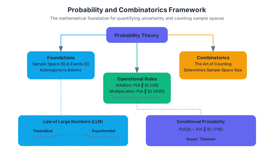
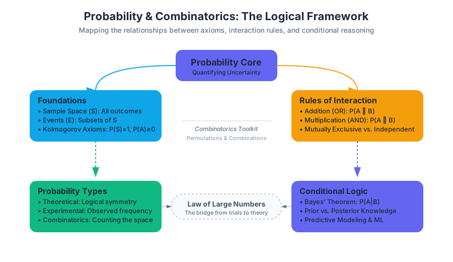
Probability is the mathematical framework for quantifying uncertainty, providing the rigorous foundation upon which all of modern statistics, machine learning, and risk management are built. While descriptive statistics allow us to summarize the past, probability allows us to model the future. Combinatorics, the "art of counting," serves as the essential toolkit for determining the size of sample spaces that are often too vast to enumerate by hand.
Foundations of Probability
At its core, probability is the study of Random Phenomena—processes where the individual outcome is uncertain, but there is nonetheless a regular distribution of outcomes over a large number of repetitions. We define the Sample Space (S) as the set of all possible outcomes. An Event (E) is a subset of the sample space.
Kolmogorov’s Axioms:
- For any event $A$, $P(A) \geq 0$.
- The probability of the entire sample space is $P(S) = 1$.
- For any sequence of mutually exclusive events, the probability of their union is the sum of their individual probabilities.
Theoretical vs. Experimental Probability
The distinction between theoretical and experimental probability lies in the source of the data. Theoretical Probability is based on physical properties or logical reasoning (e.g., the symmetry of a fair die), while Experimental Probability (or Empirical Probability) is derived from observed data.
| Feature | Theoretical Probability | Experimental Probability |
|---|---|---|
| Basis | Logical reasoning, symmetry, and mathematical models. | Observed frequency from trials or historical data. |
| Calculation | $P(E) = \frac{\text{favorable outcomes}}{\text{total possible outcomes}}$ | $P(E) \approx \frac{\text{number of times } E \text{ occurred}}{\text{total trials}}$ |
| Context | Games of chance, idealized physics, pure math. | Quality control, insurance, clinical trials, ML. |
| Accuracy | Exact within the model's assumptions. | Subject to sampling error; improves with $n$. |
The bridge between these two is the Law of Large Numbers (LLN). The LLN states that as the number of trials $n$ increases, the experimental probability converges to the theoretical probability.
The Rules of Probability
To navigate complex systems, we rely on a set of foundational rules that govern how probabilities interact. These rules allow us to decompose complex "compound events" into simpler components.
The Addition Rule (The "OR" Logic)
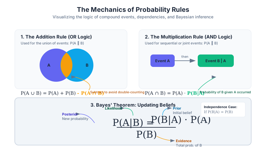
The Addition Rule is used when we want to find the probability that either Event A or Event B (or both) occurs. The primary challenge here is avoiding "double-counting" the intersection where both events happen simultaneously.
General Addition Rule: $P(A \cup B) = P(A) + P(B) - P(A \cap B)$
If events are Mutually Exclusive (disjoint), meaning they cannot happen at the same time ($P(A \cap B) = 0$), the formula simplifies to $P(A) + P(B)$.
The Multiplication Rule (The "AND" Logic)
The Multiplication Rule determines the probability of two events occurring in sequence or simultaneously. It is intrinsically linked to the concept of Conditional Probability.
General Multiplication Rule: $P(A \cap B) = P(A) \cdot P(B|A)$
If the events are Independent, the occurrence of $A$ does not change the probability of $B$. In this specific case, $P(B|A) = P(B)$, and the rule simplifies to $P(A) \cdot P(B)$.
import random

def monte_carlo_birthday_paradox(num_people, trials=100000):
    """
    Simulates the Birthday Paradox to demonstrate experimental probability.
    Calculates the probability that at least two people in a room share a birthday.
    """
    successes = 0

    for _ in range(trials):
        # Generate random birthdays for 'num_people' (1 to 365)
        birthdays = [random.randint(1, 365) for _ in range(num_people)]

        # Check for duplicates using a set
        if len(birthdays) != len(set(birthdays)):
            successes += 1

    experimental_prob = successes / trials
    return experimental_prob

# Example: In a room of 23 people, the theoretical probability is ~0.507
room_size = 23
result = monte_carlo_birthday_paradox(room_size)
print(f"Experimental Probability for {room_size} people: {result:.4f}")
Conditional Probability and Independence
Conditional Probability is the probability of an event occurring given that another event has already occurred. This is the cornerstone of Bayesian statistics and modern predictive modeling. It effectively "shrinks" the sample space to only those outcomes where the given condition is met.
Formal Definition and Bayes' Theorem
The notation $P(A|B)$ is read as "the probability of A given B." It is calculated as: $$P(A|B) = \frac{P(A \cap B)}{P(B)}$$
This leads directly to Bayes' Theorem, which allows us to reverse the condition—finding $P(A|B)$ if we know $P(B|A)$. This is vital in medical testing, where we want to know the probability of having a disease given a positive test result.
\begin{aligned}
&\text{Bayes' Theorem Derivation:} \\
&1. P(A \cap B) = P(A|B)P(B) \\
&2. P(B \cap A) = P(B|A)P(A) \\
&\text{Since } P(A \cap B) = P(B \cap A): \\
&P(A|B)P(B) = P(B|A)P(A) \\
&\implies P(A|B) = \frac{P(B|A)P(A)}{P(B)}
\end{aligned}
Testing for Independence
Two events are Independent if and only if the knowledge that one has occurred does not affect the probability of the other. Mathematically, $A$ and $B$ are independent if any of the following hold:
- $P(A|B) = P(A)$
- $P(B|A) = P(B)$
- $P(A \cap B) = P(A) \cdot P(B)$
| Concept | Definition | Mathematical Condition |
|---|---|---|
| Independent | One event's outcome provides no info about the other. | $P(A \cap B) = P(A)P(B)$ |
| Dependent | The outcome of one event changes the likelihood of the other. | $P(A \cap B) \neq P(A)P(B)$ |
| Mutually Exclusive | The events cannot happen at the same time. | $P(A \cap B) = 0$ |
Common Pitfall: Many students confuse "Independent" with "Mutually Exclusive." In fact, if two events with non-zero probabilities are mutually exclusive, they cannot be independent. If you know $A$ happened, the probability of $B$ happening becomes zero—a massive change in information.
Combinatorics: The Mathematics of Counting
In many probability problems, the sample space is too large to list. Combinatorics provides the formulas to calculate the number of outcomes in the sample space ($|S|$) and the number of favorable outcomes ($|E|$).
The Fundamental Counting Principle
If one task can be performed in $n$ ways and a second task in $m$ ways, then the sequence of two tasks can be performed in $n \times m$ ways. This generalizes to any number of tasks.
Permutations: Order Matters
A Permutation is an arrangement of items where the order is significant. For example, the sequence (A, B, C) is different from (C, B, A).
- Permutations of $n$ items: $n!$ (n factorial)
- Permutations of $n$ items taken $r$ at a time: $$P(n, r) = \frac{n!}{(n-r)!}$$
Combinations: Order Does Not Matter
A Combination is a selection of items where the order is irrelevant. For example, a committee of (Alice, Bob) is the same as (Bob, Alice).
- Combinations of $n$ items taken $r$ at a time: $$C(n, r) = \binom{n}{r} = \frac{n!}{r!(n-r)!}$$
| Scenario | Order Matters? | Formula | Example |
|---|---|---|---|
| Permutation | Yes | $\frac{n!}{(n-r)!}$ | Race finishes (1st, 2nd, 3rd) |
| Combination | No | $\frac{n!}{r!(n-r)!}$ | Choosing a pizza topping combo |
| Permutation (with repetition) | Yes | $n^r$ | Combination lock digits |
| Combination (with repetition) | No | $\frac{(n+r-1)!}{r!(n-1)!}$ | Buying 5 sodas from 3 brands |
-- Example: Calculating Joint and Conditional Probabilities from a Database
-- Scenario: Analyzing user behavior (Clicked vs. Purchased)

WITH TotalCounts AS (
    SELECT COUNT(*) as total_users FROM user_activity
),
EventCounts AS (
    SELECT
        SUM(CASE WHEN clicked = 1 THEN 1 ELSE 0 END) as count_clicked,
        SUM(CASE WHEN purchased = 1 THEN 1 ELSE 0 END) as count_purchased,
        SUM(CASE WHEN clicked = 1 AND purchased = 1 THEN 1 ELSE 0 END) as count_both
    FROM user_activity
)
SELECT
    CAST(count_clicked AS FLOAT) / total_users AS prob_click,
    CAST(count_purchased AS FLOAT) / total_users AS prob_purchase,
    -- Conditional Probability: P(Purchase | Click)
    CAST(count_both AS FLOAT) / count_clicked AS prob_purchase_given_click
FROM EventCounts, TotalCounts;
Advanced Combinatorial Applications
Combinatorics extends beyond simple dice and cards into the realm of Binomial Distributions and Stochastic Processes.
The Binomial Coefficient in Probability
The formula for combinations, $\binom{n}{k}$, is also known as the Binomial Coefficient. It appears in the expansion of $(x+y)^n$ and is used to calculate the probability of exactly $k$ successes in $n$ independent Bernoulli trials (trials with only two outcomes: success or failure).
The probability of $k$ successes is given by: $$P(X=k) = \binom{n}{k} p^k (1-p)^{n-k}$$ where $p$ is the probability of success on a single trial.
Combinatorial Explosion
In systems design, we must be wary of Combinatorial Explosion. As the number of variables $n$ increases, the number of possible states or paths often grows factorially ($n!$) or exponentially ($2^n$). This is why brute-force testing is impossible for complex software; we must use probabilistic sampling instead.
/// A high-performance Rust implementation for calculating large combinations.
/// Uses the multiplicative formula to prevent early integer overflow.
fn combinations(n: u64, mut k: u64) -> u64 {
    if k > n { return 0; }
    if k > n / 2 { k = n - k; } // Symmetry property: C(n, k) = C(n, n-k)

    let mut res = 1;
    for i in 1..=k {
        res = res * (n - i + 1) / i;
    }
    res
}

fn main() {
    let n = 52;
    let k = 5;
    let ways_to_draw_poker_hand = combinations(n, k);
    println!("Number of distinct 5-card poker hands: {}", ways_to_draw_poker_hand);
    // Output: 2,598,960
}
Common Pitfalls and Paradoxes
Probability is notoriously counter-intuitive. Even experts frequently fall into these traps:
- The Gambler's Fallacy: The belief that if an event happened more frequently than normal in the past, it is less likely to happen in the future (or vice versa). If a coin lands heads 10 times in a row, the probability of tails on the 11th flip is still exactly 0.5 (assuming the coin is fair).
- The Prosecutor's Fallacy: Confusing $P(Evidence|Innocent)$ with $P(Innocent|Evidence)$. Just because a DNA match is rare ($1$ in $1,000,000$) doesn't mean there is only a $1$ in $1,000,000$ chance the defendant is innocent.
- Ignoring the Base Rate: When calculating conditional probability, people often focus on the "hit rate" of a test and ignore how rare the condition is in the general population.
- Overestimating Small Sample Strengths: Humans tend to believe that small samples should be highly representative of the population, leading to the "Law of Small Numbers" bias.
Summary of Key Formulas
To master this section, one must be fluent in the following relationships:
| Name | Formula |
|---|---|
| Complement Rule | $P(A^c) = 1 - P(A)$ |
| General Addition | $P(A \cup B) = P(A) + P(B) - P(A \cap B)$ |
| Conditional Prob | $P(A|B) = \frac{P(A \cap B)}{P(B)}$ |
| Independence Test | $P(A \cap B) = P(A) \cdot P(B)$ |
| Permutation | $P(n, r) = \frac{n!}{(n-r)!}$ |
| Combination | $C(n, r) = \frac{n!}{r!(n-r)!}$ |
Random Variables and Distributions
Key concepts: Discrete vs. Continuous Random Variables · Expected Value (Mean) · Binomial Distributions · Geometric Distributions · Variance of Random Variables
Studying discrete and continuous random variables and their expected values.
Random Variables and Distributions
In the rigorous study of probability, a Random Variable (RV) is the formal mechanism that bridges the gap between qualitative outcomes and quantitative analysis. While a sample space might contain outcomes like "Heads" or "Failure," a random variable maps these outcomes to a measurable numerical value, $X: S \to \mathbb{R}$. This mapping allows us to apply the full power of calculus and algebra to uncertain events.
Discrete vs. Continuous Random Variables
The classification of a random variable depends entirely on the nature of its Support—the set of all possible values it can take. Understanding this distinction is critical because the mathematical tools used for each (summation vs. integration) are fundamentally different.
Discrete Random Variables
A Discrete Random Variable has a countable number of possible values. These values are often integers, representing counts (e.g., the number of packets dropped in a network or the number of customers arriving at a bank).
The probability structure of a discrete RV is defined by its Probability Mass Function (PMF), denoted as $P(X = x)$. The PMF must satisfy two primary conditions:
- $0 \le P(X = x) \le 1$ for all $x$.
- $\sum P(X = x) = 1$, where the sum is taken over all possible values of $x$.
Continuous Random Variables
A Continuous Random Variable takes on any value within an interval or collection of intervals. Because there are infinitely many values in any interval, the probability of a continuous RV taking on a specific exact value is zero: $P(X = 1.000...) = 0$.
Instead of a PMF, we use a Probability Density Function (PDF), denoted $f(x)$. Probability is represented by the area under the curve of the PDF over an interval $[a, b]$.
| Feature | Discrete Random Variables | Continuous Random Variables |
|---|---|---|
| Values | Countable (finite or infinite) | Uncountable (intervals) |
| Probability Function | Probability Mass Function (PMF) | Probability Density Function (PDF) |
| $P(X = x)$ | Can be $> 0$ | Always $0$ |
| Total Measure | $\sum P(x) = 1$ | $\int_{-\infty}^{\infty} f(x) dx = 1$ |
| Visualization | Histograms / Bar charts | Smooth density curves |
Expected Value (The Mean of a Distribution)
The Expected Value, denoted $E[X]$ or $\mu$, is the long-run theoretical average of a random variable. It is not necessarily a value the variable will ever actually take; rather, it is the center of gravity of the probability distribution.
Mathematical Definition
For a discrete random variable $X$ with values $x_i$ and probabilities $p_i$, the expected value is the weighted average: $$E[X] = \sum_{i} x_i \cdot P(X = x_i)$$
For a continuous random variable: $$E[X] = \int_{-\infty}^{\infty} x \cdot f(x) dx$$
Linearity of Expectation
One of the most powerful properties in probability is the Linearity of Expectation. For any two random variables $X$ and $Y$ (regardless of whether they are independent), and constants $a$ and $b$: $$E[aX + bY] = aE[X] + bE[Y]$$
Theorem: The Law of the Unconscious Statistician (LOTUS) To find the expected value of a function of a random variable, $g(X)$, you do not need to find the distribution of $g(X)$ first. You can calculate it directly: $E[g(X)] = \sum g(x) P(X=x)$
import numpy as np

def calculate_discrete_expected_value(values, probabilities):
    """
    Low-level implementation of E[X] calculation.
    Validates the distribution before computing the weighted sum.
    """
    values = np.array(values)
    probs = np.array(probabilities)

    # Validation: Probabilities must sum to 1 (within floating point error)
    if not np.isclose(np.sum(probs), 1.0):
        raise ValueError("Probabilities must sum to 1.0")

    # E[X] = sum(x * P(X=x))
    expected_value = np.dot(values, probs)

    # Variance: E[X^2] - (E[X])^2
    expected_x_squared = np.dot(values**2, probs)
    variance = expected_x_squared - (expected_value**2)

    return {
        "mean": expected_value,
        "variance": variance,
        "std_dev": np.sqrt(variance)
    }

# Example: A biased 4-sided die
outcomes = [1, 2, 3, 4]
weights = [0.1, 0.2, 0.3, 0.4]
print(calculate_discrete_expected_value(outcomes, weights))
Variance and Standard Deviation
While the expected value identifies the center, Variance ($Var(X)$ or $\sigma^2$) measures the "spread" or dispersion of the values around that center. It is defined as the expected squared deviation from the mean:
$$Var(X) = E[(X - \mu)^2]$$
The Computational Formula
In practice, we rarely use the definition to calculate variance. Instead, we use the computationally efficient identity: $$Var(X) = E[X^2] - (E[X])^2$$
Properties of Variance
Unlike expectation, variance is not linear. For a constant $a$ and $b$:
- $Var(aX + b) = a^2 Var(X)$ (Adding a constant doesn't change spread; scaling does so quadratically).
- If $X$ and $Y$ are independent: $Var(X + Y) = Var(X) + Var(Y)$.
Binomial Distributions
The Binomial Distribution is the discrete probability distribution of the number of successes in a sequence of $n$ independent experiments.
The BINS Criteria
To use the Binomial model, four conditions must be met:
- Binary: Outcomes must be classified as "Success" or "Failure."
- Independent: The outcome of one trial must not affect the next.
- Number: There is a fixed number of trials ($n$).
- Success: The probability of success ($p$) is constant for each trial.
The Probability Mass Function
The probability of getting exactly $k$ successes in $n$ trials is: $$P(X = k) = \binom{n}{k} p^k (1-p)^{n-k}$$ Where $\binom{n}{k} = \frac{n!}{k!(n-k)!}$ is the binomial coefficient, representing the number of ways to arrange $k$ successes.
Parameters and Moments
- Mean: $E[X] = np$
- Variance: $Var(X) = np(1-p)$
\text{Derivation of Binomial Mean } E[X]:
\text{Let } X = X_1 + X_2 + ... + X_n \text{ where } X_i \text{ is a Bernoulli trial.}
E[X_i] = (1 \cdot p) + (0 \cdot (1-p)) = p
\text{By Linearity of Expectation:}
E[X] = E[X_1] + E[X_2] + ... + E[X_n]
E[X] = p + p + ... + p = np
Geometric Distributions
The Geometric Distribution models the number of trials required to achieve the first success. Unlike the Binomial distribution, the number of trials is not fixed; it is the random variable itself.
Characteristics
- The trials are independent Bernoulli trials.
- The variable $X$ is the trial number of the first success.
- The support is $x \in {1, 2, 3, ...}$.
The Probability Mass Function
To have the first success on trial $k$, you must have $k-1$ failures followed by exactly one success: $$P(X = k) = (1-p)^{k-1} p$$
The Memoryless Property
The Geometric distribution is unique among discrete distributions for being memoryless. This means that the probability of needing $s$ additional trials, given that $t$ trials have already failed, is the same as the initial probability of needing $s$ trials. $$P(X > t + s | X > t) = P(X > s)$$
| Distribution | Random Variable ($X$) | Parameters | Mean ($E[X]$) | Variance ($Var(X)$) |
|---|---|---|---|---|
| Binomial | # of successes in $n$ trials | $n, p$ | $np$ | $np(1-p)$ |
| Geometric | # of trials until 1st success | $p$ | $1/p$ | $(1-p)/p^2$ |
Transforming and Combining Random Variables
In engineering and data science, we rarely look at a single variable in isolation. We often combine them (e.g., the total weight of 10 components or the difference in latency between two servers).
Linear Transformations
If $Y = aX + b$, then:
- $\mu_Y = a\mu_X + b$
- $\sigma_Y = |a|\sigma_X$
- $\sigma^2_Y = a^2\sigma^2_X$
Sums of Independent Random Variables
If $X$ and $Y$ are independent random variables:
- Mean: $\mu_{X+Y} = \mu_X + \mu_Y$
- Variance: $\sigma^2_{X+Y} = \sigma^2_X + \sigma^2_Y$
- Standard Deviation: $\sigma_{X+Y} = \sqrt{\sigma^2_X + \sigma^2_Y}$
Crucial Pitfall: Standard deviations do not add. You must always add variances and then take the square root. This is essentially the Pythagorean Theorem of Statistics.
-- Real-world usage: Calculating Expected Revenue from a Sales Table
-- Schema: sales_leads (lead_id, expected_value, conversion_probability)

SELECT
    SUM(expected_value * conversion_probability) AS total_expected_revenue,
    SQRT(SUM(POWER(expected_value, 2) * conversion_probability * (1 - conversion_probability))) AS revenue_standard_deviation
FROM
    sales_pipeline
WHERE
    status = 'open';

/*
   Note: This treats each lead as an independent Bernoulli trial (Binomial-like)
   to estimate the variance of the total pipeline value.
*/
Common Pitfalls in Distribution Analysis
- Confusing Binomial and Geometric: Always ask: "Is the number of trials fixed?" If yes, it's Binomial. If we are "waiting" for an event, it's Geometric.
- Independence Assumption: Applying $Var(X+Y) = Var(X) + Var(Y)$ to dependent variables. If variables are correlated, you must include the covariance term: $Var(X+Y) = Var(X) + Var(Y) + 2Cov(X,Y)$.
- Continuous Probability Paradox: Forgetting that $P(X=x) = 0$ for continuous variables. This often leads to confusion when calculating the CDF vs. the PDF.
- Scaling Variance: Forgetting to square the constant when moving it out of the variance operator ($Var(3X) = 9Var(X)$, not $3Var(X)$).
Summary of Key Formulas
General Random Variables
- Expected Value: $E[X] = \sum x P(x)$
- Variance: $Var(X) = E[X^2] - (E[X])^2$
- Standard Deviation: $\sigma = \sqrt{Var(X)}$
Binomial Distribution ($X \sim B(n, p)$)
- PMF: $P(X=k) = \binom{n}{k} p^k (1-p)^{n-k}$
- Mean: $np$
- Variance: $np(1-p)$
Geometric Distribution ($X \sim G(p)$)
- PMF: $P(X=k) = (1-p)^{k-1} p$
- Mean: $1/p$
- Variance: $(1-p)/p^2$
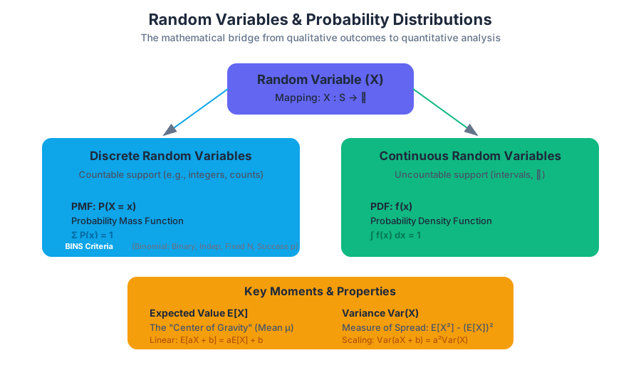
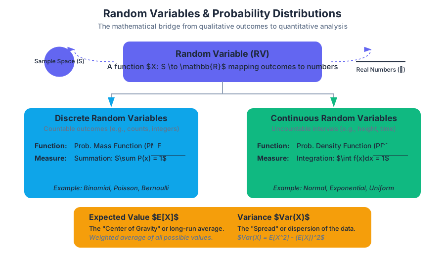
Sampling Distributions and the CLT
Key concepts: Parameters vs. Statistics · Sampling Distribution of a Proportion · Sampling Distribution of a Mean · Central Limit Theorem (CLT) · Unbiased Estimators
Understanding how sample statistics vary and the power of the Central Limit Theorem.
Sampling Distributions and the CLT
In the realm of statistical inference, we are often tasked with a seemingly impossible challenge: making definitive statements about a vast, unreachable population using only a tiny, finite sliver of data. This bridge between the sample and the population is built upon the theory of Sampling Distributions.
If descriptive statistics is the art of summarizing what we see, then sampling distributions are the science of quantifying the uncertainty in what we don't see. They represent a "meta-level" of probability—instead of asking about the probability of a single individual having a certain trait, we ask about the probability of an entire sample's average falling within a specific range.
Parameters vs. Statistics
Before we can model the behavior of samples, we must establish a rigorous vocabulary to distinguish between the "truth" of the population and the "estimate" provided by our data. This is the distinction between parameters and statistics.
Definition: A Parameter is a fixed (usually unknown) numerical value that describes an entire population. A Statistic is a numerical value calculated from a sample, which varies from sample to sample.
We use specific notation to keep these concepts distinct. In the professor’s shorthand: Greek letters usually denote the "God’s eye view" (parameters), while Latin letters or "hats" denote the "Researcher’s view" (statistics).
| Concept | Population Parameter (Fixed) | Sample Statistic (Random Variable) |
|---|---|---|
| Mean | $\mu$ (mu) | $\bar{x}$ (x-bar) |
| Standard Deviation | $\sigma$ (sigma) | $s$ |
| Proportion | $p$ | $\hat{p}$ (p-hat) |
| Variance | $\sigma^2$ | $s^2$ |
| Correlation | $\rho$ (rho) | $r$ |
The Nature of Sampling Variability
If you take a random sample of 100 students and find an average height of 170cm, and I take a different random sample of 100 students and find 172cm, neither of us is "wrong." This fluctuation is called sampling variability. The sampling distribution is the probability distribution of all possible values of a statistic if we were to repeat the sampling process an infinite number of times.
Unbiased Estimators
A central goal in statistics is to find a sample statistic that serves as a "good" guess for the population parameter. We define "goodness" primarily through the lens of bias and variability.
Accuracy: The Unbiased Property
A statistic is an unbiased estimator of a population parameter if the mean of its sampling distribution is equal to the true value of the parameter being estimated. Mathematically, $\hat{\theta}$ is unbiased for $\theta$ if: $$E[\hat{\theta}] = \theta$$
Precision: Minimum Variance
Even if an estimator is unbiased, it might be "noisy" (high variance). We prefer estimators that are both unbiased and have the smallest possible standard deviation. This is why we use $(n-1)$ in the denominator of the sample variance $s^2$; using $n$ would consistently underestimate the population variance $\sigma^2$, making it a biased estimator.
Sampling Distribution of a Proportion
When dealing with categorical data (e.g., "Yes/No" or "Success/Failure"), we are interested in the proportion $p$ of the population that possesses a certain characteristic. The sample proportion $\hat{p}$ is calculated as $X/n$, where $X$ is the count of successes.
The Mean and Standard Deviation
The sampling distribution of $\hat{p}$ has the following properties:
- Center: $\mu_{\hat{p}} = p$ (The sample proportion is an unbiased estimator).
- Spread: $\sigma_{\hat{p}} = \sqrt{\frac{p(1-p)}{n}}$ (This is often called the Standard Error of the proportion).
Conditions for Normality
We cannot always assume the sampling distribution of $\hat{p}$ is Normal. For the distribution to be approximately Normal, three conditions must be met:
| Condition | Requirement | Purpose |
|---|---|---|
| Randomness | Data must come from a well-designed random sample or randomized experiment. | Ensures the sample is representative and avoids bias. |
| Independence (10% Rule) | When sampling without replacement, $n \le 0.10N$. | Ensures that the probability of success doesn't change significantly between draws. |
| Large Counts | $np \ge 10$ and $n(1-p) \ge 10$. | Ensures the distribution has enough "room" to be symmetric and not "bunched" against 0 or 1. |
Worked Example: Political Polling
Imagine a city where 60% ($p = 0.60$) of voters support a new tax. You survey 400 voters.
- $\mu_{\hat{p}} = 0.60$
- $\sigma_{\hat{p}} = \sqrt{\frac{0.6 \times 0.4}{400}} = \sqrt{0.0006} \approx 0.0245$
- Large Counts check: $400(0.6) = 240$ and $400(0.4) = 160$. Both are $\ge 10$.
- Conclusion: The distribution of your sample proportion is $N(0.60, 0.0245)$.
Sampling Distribution of a Mean
When dealing with quantitative data, we focus on the sample mean $\bar{x}$. This is perhaps the most important concept in all of statistics because it allows us to quantify the precision of scientific measurements.
The Mean and Standard Deviation
- Center: $\mu_{\bar{x}} = \mu$ (The sample mean is an unbiased estimator of the population mean).
- Spread: $\sigma_{\bar{x}} = \frac{\sigma}{\sqrt{n}}$
Key Insight: Notice the $\sqrt{n}$ in the denominator. This is the Square Root Law. To cut your uncertainty (standard error) in half, you must quadruple your sample size. This is why large-scale clinical trials are so expensive; the "returns" on sample size diminish as $n$ grows.
Derivation of the Variance of the Mean
Why is the standard deviation divided by $\sqrt{n}$? We can derive this using the properties of variance for independent random variables $X_1, X_2, ..., X_n$:
\begin{aligned}
Var(\bar{X}) &= Var\left(\frac{\sum X_i}{n}\right) \\
&= \frac{1}{n^2} Var\left(\sum X_i\right) \\
&= \frac{1}{n^2} \sum Var(X_i) \quad \text{(assuming independence)} \\
&= \frac{1}{n^2} (n\sigma^2) = \frac{\sigma^2}{n} \\
\sigma_{\bar{x}} &= \sqrt{\frac{\sigma^2}{n}} = \frac{\sigma}{\sqrt{n}}
\end{aligned}
The Central Limit Theorem (CLT)
The Central Limit Theorem is often called the "Fundamental Theorem of Statistics." It describes the shape of the sampling distribution of the mean.
The Central Limit Theorem: Regardless of the shape of the underlying population distribution, the sampling distribution of the sample mean $\bar{x}$ becomes approximately Normal as the sample size $n$ increases.
Why is this "Magic"?
Most things in the real world are not Normally distributed. Income is skewed right; survival times are exponential; dice rolls are uniform. However, the average of these values will always trend toward a bell curve. This allows us to use Normal probability calculations (Z-scores) even when we don't know the population's shape.
The "Rule of 30"
How large must $n$ be?
- If the population is already Normal, the sampling distribution is Normal for any sample size $n$.
- If the population is skewed or has outliers, we generally need $n \ge 30$ for the CLT to "kick in" and provide a reasonable Normal approximation.
| Population Shape | Sample Size ($n$) | Sampling Distribution Shape |
|---|---|---|
| Normal | $n=2$ | Perfectly Normal |
| Symmetric/Uniform | $n=10$ | Approximately Normal |
| Heavily Skewed | $n=30$ | Approximately Normal |
| Extreme Outliers | $n=100+$ | Approximately Normal |
Implementation: Simulating the CLT
To truly understand the CLT, one must see it in action. Below is a Python implementation using NumPy and Matplotlib that draws samples from a highly non-normal distribution (an Exponential distribution) and plots the resulting distribution of means.
import numpy as np
import matplotlib.pyplot as plt

def simulate_clt(population_dist, sample_size, iterations=10000):
    """
    Simulates the Central Limit Theorem.
    Takes 'sample_size' samples from 'population_dist' repeatedly.
    """
    sample_means = []

    for _ in range(iterations):
        # Draw a random sample from the population
        sample = np.random.choice(population_dist, size=sample_size)
        # Calculate the mean of that specific sample
        sample_means.append(np.mean(sample))

    return sample_means

# 1. Create a non-normal population (Exponential distribution)
# This represents something like 'time between phone calls'
population = np.random.exponential(scale=2.0, size=100000)

# 2. Simulate sampling distributions with different n
means_n2 = simulate_clt(population, sample_size=2)
means_n30 = simulate_clt(population, sample_size=30)

# 3. Visualization
fig, axes = plt.subplots(1, 3, figsize=(15, 5))

axes[0].hist(population, bins=50, color='gray', alpha=0.7)
axes[0].set_title("Population (Exponential)")

axes[1].hist(means_n2, bins=50, color='blue', alpha=0.7)
axes[1].set_title("Sampling Dist (n=2)")

axes[2].hist(means_n30, bins=50, color='green', alpha=0.7)
axes[2].set_title("Sampling Dist (n=30)")

plt.tight_layout()
plt.show()
Practical Usage: Probability Calculations
Once we know that $\bar{x} \sim N(\mu, \frac{\sigma}{\sqrt{n}})$, we can calculate the probability of obtaining a specific sample mean using Z-scores.
The Z-score for a Sample Mean
The formula for a single individual is $z = \frac{x - \mu}{\sigma}$. The formula for a sample mean is: $$z = \frac{\bar{x} - \mu}{\sigma / \sqrt{n}}$$
Worked Example: Industrial Quality Control
A factory produces bolts with a mean diameter of 10mm and a standard deviation of 0.2mm. A quality control inspector takes a random sample of 25 bolts. What is the probability that the sample mean diameter is greater than 10.05mm?
- Identify Parameters: $\mu = 10$, $\sigma = 0.2$, $n = 25$.
- Check Conditions: $n=25$ is close to 30; if the population is roughly symmetric, CLT applies.
- Calculate Standard Error: $\sigma_{\bar{x}} = \frac{0.2}{\sqrt{25}} = \frac{0.2}{5} = 0.04$.
- Calculate Z-score: $$z = \frac{10.05 - 10}{0.04} = \frac{0.05}{0.04} = 1.25$$
- Find Probability: Using a standard Normal table, $P(Z > 1.25) \approx 0.1056$. There is a 10.56% chance the inspector finds a sample mean this high purely by random chance.
Comparison of Distributions
It is vital to distinguish between three distinct types of distributions that students often conflate.
| Distribution | What it describes | Mean | Standard Deviation |
|---|---|---|---|
| Population Distribution | Every individual in the entire group. | $\mu$ | $\sigma$ |
| Sample Distribution | The individuals in a single specific sample. | $\bar{x}$ | $s$ |
| Sampling Distribution | The behavior of a statistic over many samples. | $\mu_{\bar{x}} = \mu$ | $\sigma_{\bar{x}} = \sigma / \sqrt{n}$ |
Common Pitfalls and Misconceptions
1. The "Law of Averages" Fallacy
Many people believe that if a sample mean is currently "too high," the next few data points must be "low" to balance it out. This is false. The CLT works through swamping, not compensation. As $n$ increases, the existing "error" is divided by a larger and larger number, making its impact on the average negligible.
2. Confusing $n$ with $N$
The standard error formula $\sigma/\sqrt{n}$ depends on the sample size ($n$), not the population size ($N$). A sample of 1,000 people provides the same level of precision whether the population is 100,000 or 100,000,000 (provided the 10% rule is met).
3. Standard Deviation vs. Standard Error
- Standard Deviation measures the dispersion of individual data points.
- Standard Error measures the dispersion of a sample statistic. As $n$ increases, the standard deviation of the sample ($s$) stays roughly the same (it estimates $\sigma$), but the standard error ($\sigma/\sqrt{n}$) decreases.
4. The Normality Assumption
The CLT says the sampling distribution is Normal, not the population. You can have a perfectly Normal sampling distribution even if your population looks like a "U" shape or a uniform block.
Final Summary for the Practitioner
The power of the Central Limit Theorem lies in its universality. It is the reason we can conduct medical trials, perform exit polls during elections, and maintain quality control in manufacturing. By understanding that the mean of a sample is itself a random variable with a predictable shape, center, and spread, we transform "guessing" into "inference."
When you look at a sample mean, do not see a single point. See a single draw from a beautiful, bell-shaped distribution centered at the truth, with a width determined by the square root of your effort ($n$).
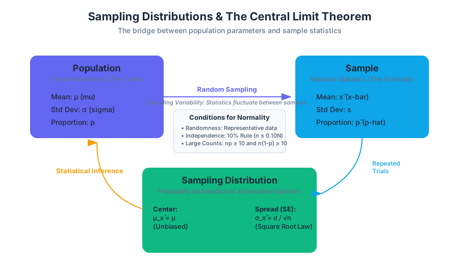
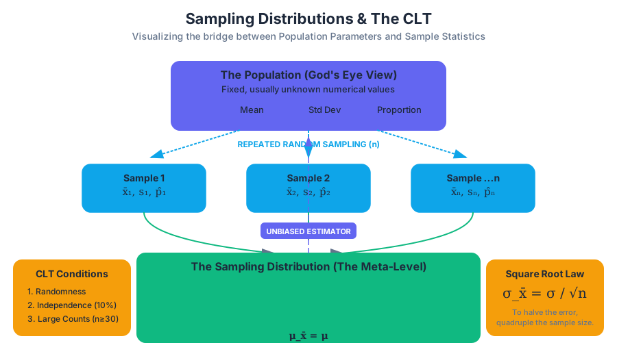
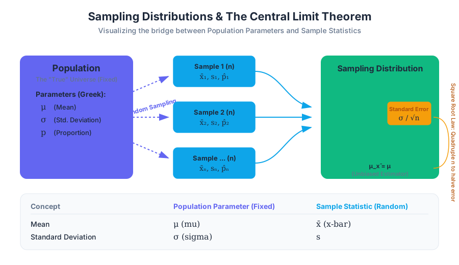
Estimating with Confidence Intervals
Key concepts: Point Estimates · Margin of Error · Critical Values (z* and t*) · Confidence Level · T-distributions
Constructing intervals to estimate population parameters with a specific level of confidence.
Estimating with Confidence Intervals
In the realm of statistical inference, we are often tasked with a fundamental challenge: how do we describe a vast population using only a tiny, imperfect slice of data? While descriptive statistics allow us to summarize the data we have, Inferential Statistics allows us to make claims about the data we don't have.
The most basic form of inference is the Point Estimate, a single value (like a sample mean $\bar{x}$) used to estimate a population parameter (like the population mean $\mu$). However, point estimates are almost certainly "wrong" in the sense that they rarely equal the exact population parameter. To account for this inherent sampling variability, we use Confidence Intervals (CI). A confidence interval provides a range of plausible values for the parameter, accompanied by a specific level of confidence that the range actually captures the truth.
The Anatomy of a Confidence Interval
Every confidence interval follows a consistent logical structure. It is built by taking a point estimate and adding or subtracting a Margin of Error (MoE).
Definition: Confidence Interval A confidence interval is an interval of the form: $$\text{Point Estimate} \pm \text{Margin of Error}$$ Where the Margin of Error is calculated as: $$\text{Margin of Error} = (\text{Critical Value}) \times (\text{Standard Error of the Estimate})$$
The Critical Value ($z^$ or $t^$) is determined by the desired confidence level, while the Standard Error represents the standard deviation of the sampling distribution—essentially, how much we expect the point estimate to fluctuate from sample to sample.
| Component | Symbol | Description |
|---|---|---|
| Point Estimate | $\hat{\theta}$ | The best "single guess" (e.g., $\bar{x}$ or $\hat{p}$) derived from sample data. |
| Confidence Level | $C$ | The success rate of the method (e.g., 95%, 99%). |
| Critical Value | $z^$ or $t^$ | A multiplier that scales the interval based on the confidence level and distribution shape. |
| Standard Error | $SE$ | The estimated standard deviation of the point estimate's sampling distribution. |
| Margin of Error | $ME$ | The maximum expected distance between the point estimate and the true parameter. |
The Philosophy of Confidence Levels
A common misconception is that a "95% confidence interval" means there is a 95% probability that the population parameter lies within that specific interval. In frequentist statistics, the population parameter is a fixed (though unknown) constant. It does not "move." Instead, the interval is what varies from sample to sample.
When we say we are "95% confident," we are describing the reliability of the process. If we were to take 100 different random samples and construct 100 different intervals using the same methodology, approximately 95 of those intervals would successfully capture the true population parameter, and 5 would miss it.
Critical Values: $z^$ vs. $t^$
The choice of the critical value depends on what we know about the population and the type of data we are analyzing.
The Z-Distribution ($z^*$)
We use the Standard Normal Distribution ($z$-scores) when constructing intervals for proportions or when the population standard deviation ($\sigma$) is known (which is rare in practice). The critical value $z^*$ represents the number of standard deviations you must move away from the mean to capture the central $C%$ of the distribution.
| Confidence Level | Alpha ($\alpha$) | Tail Area ($\alpha/2$) | Critical Value ($z^*$) |
|---|---|---|---|
| 90% | 0.10 | 0.05 | 1.645 |
| 95% | 0.05 | 0.025 | 1.960 |
| 99% | 0.01 | 0.005 | 2.576 |
The T-Distribution ($t^*$)
In most real-world scenarios involving means, we do not know the population standard deviation $\sigma$. Instead, we must use the sample standard deviation $s$. Because $s$ is itself an estimate, it introduces extra uncertainty. To compensate, we use the Student’s T-distribution.
The T-distribution is "fatter" in the tails than the Z-distribution. As the sample size $n$ increases, the T-distribution approaches the Normal distribution. The specific shape of the T-distribution is determined by its Degrees of Freedom (df), calculated as $df = n - 1$.
Implementation: Calculating Intervals for Means
To calculate a confidence interval for a population mean $\mu$ when $\sigma$ is unknown, we follow these steps:
- Verify Conditions: Ensure the sample is random, independent ($n < 10%$ of population), and the population is nearly normal (or $n \ge 30$ per the Central Limit Theorem).
- Calculate Point Estimate: Find the sample mean $\bar{x}$.
- Find Standard Error: $SE_{\bar{x}} = \frac{s}{\sqrt{n}}$.
- Identify Critical Value: Find $t^*$ for $df = n-1$ and the desired confidence level.
- Compute Interval: $\bar{x} \pm t^* \left( \frac{s}{\sqrt{n}} \right)$.
Python Implementation (Scientific Stack)
The following code demonstrates how to calculate a 95% confidence interval for a mean using scipy.stats.
import numpy as np
from scipy import stats

def calculate_mean_ci(data, confidence=0.95):
    """
    Calculates the T-based confidence interval for a 1D array of data.
    """
    n = len(data)
    mean = np.mean(data)
    # ddof=1 provides the unbiased sample standard deviation (s)
    std_err = stats.sem(data)

    # Calculate degrees of freedom
    df = n - 1

    # Calculate the t-critical value
    # ppf (Percent Point Function) is the inverse of the CDF
    t_star = stats.t.ppf((1 + confidence) / 2, df)

    margin_of_error = t_star * std_err

    return (mean - margin_of_error, mean + margin_of_error)

# Example Usage: Heights of 15 randomly selected plants (in cm)
plant_heights = [12.5, 13.2, 11.8, 14.1, 12.9, 13.5, 12.2, 13.8, 14.5, 11.9, 12.7, 13.1, 14.0, 12.3, 13.4]
lower, upper = calculate_mean_ci(plant_heights)

print(f"Sample Mean: {np.mean(plant_heights):.2f}")
print(f"95% Confidence Interval: ({lower:.2f}, {upper:.2f})")
Mathematical Derivation: Sample Size Determination
A common engineering and research question is: "How large must my sample be to ensure my estimate is within a certain margin of error?" We can derive the required sample size $n$ by rearranging the Margin of Error formula.
Derivation for Proportions
For a population proportion $p$, the Margin of Error is: $$ME = z^* \sqrt{\frac{\hat{p}(1-\hat{p})}{n}}$$
To solve for $n$:
- Square both sides: $ME^2 = (z^*)^2 \frac{\hat{p}(1-\hat{p})}{n}$
- Multiply by $n$: $n \cdot ME^2 = (z^*)^2 \hat{p}(1-\hat{p})$
- Divide by $ME^2$: $n = \frac{(z^*)^2 \hat{p}(1-\hat{p})}{ME^2}$
Note: If we don't have a preliminary estimate for $\hat{p}$, we use $\hat{p} = 0.5$ as a "worst-case scenario" because it maximizes the required sample size, ensuring the study is sufficiently powered regardless of the actual proportion.
\begin{aligned}
&\text{Sample Size Formula (Mean):} \\
&n = \left( \frac{z^* \cdot \sigma}{ME} \right)^2 \\
\\
&\text{Sample Size Formula (Proportion):} \\
&n = \frac{(z^*)^2 \cdot \hat{p}(1-\hat{p})}{ME^2}
\end{aligned}
Estimating Proportions: The Z-Interval
When dealing with categorical data (e.g., "Yes/No" surveys), we estimate the population proportion $p$ using the sample proportion $\hat{p} = \frac{x}{n}$.
Conditions for the Z-Interval
For the sampling distribution of $\hat{p}$ to be approximately normal, we must satisfy the Large Counts Condition:
- $n\hat{p} \ge 10$ (Expected successes)
- $n(1-\hat{p}) \ge 10$ (Expected failures)
If these conditions are met, the interval is: $$\hat{p} \pm z^* \sqrt{\frac{\hat{p}(1-\hat{p})}{n}}$$
Real-World Usage: R Statistical Language
R is the industry standard for statistical modeling. Here is how a researcher would perform a one-sample proportion test to generate a confidence interval.
# Scenario: In a survey of 1000 voters, 530 support a specific policy.
# Calculate a 99% confidence interval for the true population proportion.

successes <- 530
total_n <- 1000
conf_level <- 0.99

# prop.test performs the calculation and handles the null hypothesis test
result <- prop.test(x = successes, n = total_n, conf.level = conf_level, correct = FALSE)

# Extract the confidence interval
cat("Point Estimate (p-hat):", result$estimate, "\n")
cat("99% Confidence Interval:", result$conf.int[1], "to", result$conf.int[2], "\n")

# Output Interpretation:
# We are 99% confident that the true proportion of voters supporting
# the policy is between 48.9% and 57.1%.
The T-Distribution: A Historical Necessity
The T-distribution was developed by William Sealy Gosset in 1908. Working for the Guinness Brewery in Dublin, Gosset needed a way to monitor the quality of stout using small samples. He realized that using $z$-scores with small samples resulted in intervals that were too narrow, failing to capture the true mean as often as promised.
Because Guinness prohibited employees from publishing proprietary research, Gosset published his findings under the pseudonym "Student."
Why $n-1$?
The use of $n-1$ in the denominator of the sample variance ($s^2 = \frac{\sum(x_i - \bar{x})^2}{n-1}$) is known as Bessel's Correction. When we calculate the sample mean $\bar{x}$, we "use up" one degree of freedom. If we used $n$ in the denominator, our estimate of the variance would be biased—it would consistently underestimate the true population variance. Using $n-1$ makes the sample variance an unbiased estimator.
Common Pitfalls and Misinterpretations
Even seasoned data scientists occasionally misinterpret confidence intervals. Here are the most frequent errors:
- The Probability Trap: Saying "There is a 95% chance the mean is in this interval." Correction: The mean is either in the interval or it isn't (Probability 0 or 1). The 95% refers to the process across many samples.
- The Individual Trap: Saying "95% of the data points fall within this interval." Correction: The confidence interval estimates the mean of the population, not the distribution of individual values. (A Prediction Interval is used for individuals).
- Ignoring Bias: A confidence interval only accounts for sampling error (random chance). It cannot fix non-sampling errors like selection bias, non-response bias, or poorly worded survey questions. If your sampling method is biased, your interval will be precisely centered around the wrong value.
- Sample Size vs. Confidence: Increasing the confidence level (e.g., from 95% to 99%) makes the interval wider. Increasing the sample size $n$ makes the interval narrower.
Summary Table: Choosing the Right Interval
| Scenario | Parameter | Critical Value | Standard Error ($SE$) |
|---|---|---|---|
| Means ($\sigma$ known) | $\mu$ | $z^*$ | $\sigma / \sqrt{n}$ |
| Means ($\sigma$ unknown) | $\mu$ | $t^*$ ($df=n-1$) | $s / \sqrt{n}$ |
| Proportions | $p$ | $z^*$ | $\sqrt{\frac{\hat{p}(1-\hat{p})}{n}}$ |
| Diff. in Means | $\mu_1 - \mu_2$ | $t^*$ | $\sqrt{\frac{s_1^2}{n_1} + \frac{s_2^2}{n_2}}$ |
Practical CLI Example: Quick Estimation
For DevOps or Systems Engineers, sometimes a quick shell calculation is needed to check if a latency spike is statistically significant.
# A simple bash alias/function to calculate a 95% Z-interval for a proportion
# Usage: ci_prop [successes] [total_n]
ci_prop() {
    local x=$1
    local n=$2
    local p=$(echo "scale=4; $x / $n" | bc)
    local z=1.96

    # Calculate Standard Error: sqrt(p*(1-p)/n)
    local se=$(python3 -c "import math; print(math.sqrt($p * (1 - $p) / $n))")

    # Calculate Margin of Error
    local moe=$(python3 -c "print($z * $se)")

    local lower=$(python3 -c "print($p - $moe)")
    local upper=$(python3 -c "print($p + $moe)")

    echo "Point Estimate: $p"
    echo "95% CI: [$lower, $upper]"
}

# Example: 45 errors out of 1000 requests
# ci_prop 45 1000
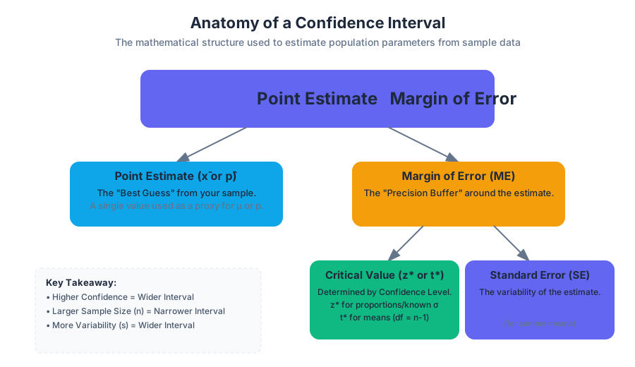
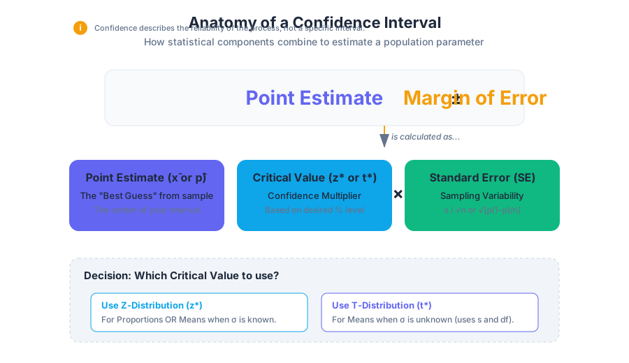
Significance Testing
Key concepts: Null and Alternative Hypotheses · P-values · Significance Level (Alpha) · Type I and Type II Errors · Statistical Power
The formal process of hypothesis testing to evaluate claims about a population.
Significance Testing
Significance testing, often referred to as Null Hypothesis Statistical Testing (NHST), is the formal mathematical framework used to determine whether an observed effect in a dataset is likely a result of true underlying patterns or merely a product of random sampling error. In the rigorous world of empirical research, we rarely "prove" a theory; instead, we evaluate the strength of the evidence against a default state of "no effect."
At its core, significance testing is a decision-making tool. It allows researchers to quantify uncertainty and set a threshold for when an observation becomes "interesting" enough to warrant rejecting the status quo. Whether you are validating a new pharmaceutical compound, optimizing a machine learning model, or analyzing A/B test results for a web application, significance testing provides the guardrails against seeing patterns in noise.
The Hypothesis Framework: H₀ vs. Hₐ
The foundation of any significance test is the formulation of two mutually exclusive hypotheses. This binary structure is designed to mimic the logic of "proof by contradiction" found in mathematics.
The Null Hypothesis (H₀)
The Null Hypothesis represents the baseline assumption: that there is no relationship, no difference, or no effect. It is the "innocent until proven guilty" stance of the statistical world. We assume $H_0$ is true until the data provides overwhelming evidence to the contrary.
The Alternative Hypothesis (Hₐ)
The Alternative Hypothesis (sometimes denoted as $H_1$) is the claim the researcher hopes to support. It posits that an effect, difference, or relationship actually exists.
| Feature | Null Hypothesis ($H_0$) | Alternative Hypothesis ($H_a$) |
|---|---|---|
| Core Assumption | Status quo, no change, no effect. | There is an effect or change. |
| Mathematical Sign | Usually contains equality ($=, \leq, \geq$). | Usually contains inequality ($\neq, <, >$). |
| Burden of Proof | Assumed true by default. | Must be supported by evidence. |
| Goal of Test | To be rejected or "failed to be rejected." | To be supported via the rejection of $H_0$. |
The Principle of Falsification: In significance testing, we never "accept" the null hypothesis. We either reject it or fail to reject it. Failing to reject $H_0$ does not mean $H_0$ is true; it simply means the evidence was insufficient to prove it false.
The P-value: Quantifying Surprise
The P-value is perhaps the most critical—and most frequently misunderstood—metric in statistics. Formally, the P-value is the probability of obtaining a test statistic at least as extreme as the one observed, assuming that the null hypothesis is true.
Mathematically, if $T$ is the test statistic and $t_{obs}$ is the value calculated from our sample: $$P\text{-value} = P(|T| \geq |t_{obs}| \mid H_0)$$
A low P-value indicates that the observed data is highly unlikely under the assumption of the null hypothesis. It is a measure of the "strength of evidence" against $H_0$.
Common Misconceptions
- Misconception 1: A P-value of 0.05 means there is a 5% chance the null hypothesis is true. (False: The P-value describes the data, not the hypothesis).
- Misconception 2: A P-value of 0.05 means there is a 95% chance the alternative hypothesis is true. (False: This ignores prior probabilities).
- Misconception 3: A small P-value means the effect is large or important. (False: A tiny effect can have a tiny P-value if the sample size is large enough).
Implementation: Calculating Significance in Python
In modern data science, we rarely calculate these by hand. We use libraries like scipy.stats to perform the underlying integration of probability density functions.
import numpy as np
from scipy import stats

def perform_t_test(sample_a, sample_b):
    """
    Performs an independent two-sample t-test.
    H0: The means of sample_a and sample_b are equal.
    Ha: The means are different.
    """
    # Calculate means and standard deviations
    mean_a, mean_b = np.mean(sample_a), np.mean(sample_b)

    # Perform Welch's t-test (does not assume equal variance)
    t_stat, p_val = stats.ttest_ind(sample_a, sample_b, equal_var=False)

    results = {
        "t_statistic": round(t_stat, 4),
        "p_value": round(p_val, 6),
        "mean_diff": round(mean_a - mean_b, 4),
        "significant": p_val < 0.05
    }

    return results

# Example: Testing a new UI layout (Time on Page in seconds)
control_group = np.random.normal(loc=120, scale=30, size=100)
treatment_group = np.random.normal(loc=135, scale=35, size=100)

print(perform_t_test(control_group, treatment_group))
Significance Level (Alpha)
The Significance Level, denoted by $\alpha$, is the pre-determined threshold for rejecting the null hypothesis. It represents the maximum risk a researcher is willing to take of committing a Type I Error (rejecting $H_0$ when it is actually true).
The most common value for $\alpha$ is 0.05, meaning we require the evidence to be so strong that it would occur by chance only 5% of the time. However, $\alpha$ should be chosen based on the consequences of being wrong.
| Field | Typical $\alpha$ | Reasoning |
|---|---|---|
| Social Sciences | 0.05 | Standard balance of risk and discovery. |
| Manufacturing (Six Sigma) | 0.0027 | High cost of false alarms in production lines. |
| Genomics | $10^{-8}$ | Correcting for millions of simultaneous tests. |
| Particle Physics | $3 \times 10^{-7}$ | The "5-sigma" rule required to claim a discovery (e.g., Higgs Boson). |
Type I and Type II Errors
In a world of uncertainty, our decisions can be wrong in two distinct ways. Understanding the trade-off between these errors is the essence of experimental design.
Type I Error (False Positive)
A Type I Error occurs when we reject a null hypothesis that is actually true. We "find" an effect that isn't there. The probability of this error is exactly $\alpha$.
Type II Error (False Negative)
A Type II Error occurs when we fail to reject a null hypothesis that is actually false. We "miss" a real effect. The probability of this error is denoted by $\beta$.
The Decision Matrix
| $H_0$ is True | $H_0$ is False | |
|---|---|---|
| Fail to Reject $H_0$ | Correct Decision (Confidence: $1-\alpha$) | Type II Error ($\beta$) |
| Reject $H_0$ | Type I Error ($\alpha$) | Correct Decision (Power: $1-\beta$) |
Statistical Power (1 - Beta)
Statistical Power is the probability that a test will correctly reject a false null hypothesis. In simpler terms, it is the sensitivity of the test—its ability to detect an effect if one truly exists.
A high-power test is one where the probability of a Type II error ($\beta$) is low. Most researchers aim for a power of at least 0.80 (80%).
Factors Influencing Power
- Sample Size ($n$): Larger samples reduce standard error, making it easier to detect effects.
- Effect Size ($\delta$): Large differences are easier to detect than subtle ones.
- Significance Level ($\alpha$): If you make $\alpha$ stricter (e.g., 0.01), power decreases because you require more evidence to reject $H_0$.
- Variance ($\sigma^2$): High noise in the data obscures the signal, reducing power.
Mathematical Derivation of the Z-Test Statistic
To understand how these variables interact, we look at the derivation of the Z-score for a sample mean:
\begin{aligned}
& \text{Standard Error (SE)} = \frac{\sigma}{\sqrt{n}} \\
& Z = \frac{\bar{x} - \mu_0}{SE} = \frac{\bar{x} - \mu_0}{\sigma / \sqrt{n}} \\
& \text{To reject } H_0 \text{ at } \alpha=0.05, \text{ we need: } |Z| > 1.96 \\
& \text{Power } (1-\beta) = P\left(Z > 1.96 - \frac{|\mu_a - \mu_0|}{\sigma / \sqrt{n}}\right)
\end{aligned}
This derivation shows that as $n$ increases, the denominator of the fraction decreases, which increases the overall value, thereby increasing the probability of exceeding the critical threshold (Power).
Worked Example: A/B Testing for Conversion Rates
Imagine an e-commerce company testing a new checkout button color. They want to know if the new color (Treatment) increases the conversion rate compared to the current color (Control).
Step 1: State Hypotheses
- $H_0: p_{new} = p_{old}$ (The conversion rates are the same)
- $H_a: p_{new} > p_{old}$ (The new color is better - One-tailed test)
Step 2: Choose Alpha We set $\alpha = 0.05$.
Step 3: Collect Data
- Control: $n=1000$, Conversions=100 ($10%$)
- Treatment: $n=1000$, Conversions=130 ($13%$)
Step 4: Calculate the Test Statistic (Z-test for proportions) Using the pooled proportion $p$: $$p = \frac{100+130}{1000+1000} = 0.115$$ $$SE = \sqrt{0.115 \times (1-0.115) \times (\frac{1}{1000} + \frac{1}{1000})} \approx 0.0143$$ $$Z = \frac{0.13 - 0.10}{0.0143} \approx 2.097$$
Step 5: Determine P-value and Decision A Z-score of 2.097 corresponds to a P-value of approximately 0.018. Since $0.018 < 0.05$, we reject the null hypothesis. The evidence suggests the new button color significantly improves conversion.
Advanced Usage: R and Statistical Modeling
While Python is excellent for general-purpose data science, R remains the gold standard for statistical reporting due to its expressive formula syntax and comprehensive test outputs.
# Load a built-in dataset
data("mtcars")

# Question: Does transmission type (am: 0=auto, 1=manual)
# affect fuel efficiency (mpg)?

# Step 1: Visual Check
boxplot(mpg ~ am, data=mtcars,
        main="MPG by Transmission Type",
        xlab="Transmission (0=Auto, 1=Manual)",
        ylab="Miles Per Gallon")

# Step 2: T-Test
# We use the formula notation: dependent_var ~ independent_var
test_results <- t.test(mpg ~ am, data=mtcars, var.equal=FALSE)

# Step 3: Print detailed output
print(test_results)

# Interpretation:
# If p-value < 0.05, we conclude transmission type has a
# statistically significant impact on fuel efficiency.
Common Pitfalls and the Replicability Crisis
Significance testing is a powerful tool, but it is often abused. The "Replicability Crisis" in science is largely attributed to the misuse of P-values.
1. P-Hacking (Data Dredging)
This involves running multiple tests on the same dataset and only reporting the ones that come up significant. If you run 20 different tests on random data, by definition, one of them is likely to have a P-value $< 0.05$ purely by chance.
2. Ignoring Effect Size
A result can be "statistically significant" but "practically useless." For example, a drug that lowers blood pressure by 0.1 mmHg might have a P-value of 0.0001 in a study of 1 million people, but it doesn't actually help the patient.
3. Confusing Correlation with Causation
Significance tests tell you if a relationship exists, not why it exists. Observational data can yield highly significant P-values for relationships driven by confounding variables.
4. The "File Drawer" Problem
Journals are more likely to publish studies with "significant" results. This leads to a biased body of literature where the 19 failed experiments are hidden in the file drawer, and only the 1 lucky "significant" result is published.
Summary of Test Selection
Choosing the right test is as important as interpreting the P-value. The choice depends on the data type and the number of groups.
| Data Type | Comparison | Statistical Test |
|---|---|---|
| Quantitative | 1 Group vs. Known Mean | One-sample T-test |
| Quantitative | 2 Independent Groups | Independent Samples T-test |
| Quantitative | 2 Related Groups (Before/After) | Paired T-test |
| Quantitative | 3+ Groups | ANOVA (Analysis of Variance) |
| Categorical | Observed vs. Expected Frequencies | Chi-Square Goodness of Fit |
| Categorical | Relationship between 2 variables | Chi-Square Test of Independence |
Significance Testing in the CLI
For quick checks during data processing pipelines, one might use a command-line tool or a simple script to validate assumptions about log files or stream data.
# Example: Using a hypothetical 'stats-tool' to check if
# error rates in two log files are significantly different.
# Usage: stats-tool compare --file1 control.log --file2 experiment.log --metric error_rate

curl -s "http://api.stats-engine.internal/v1/compare" \
  -H "Content-Type: application/json" \
  -d '{
    "control": [0.01, 0.02, 0.015, 0.01],
    "test": [0.05, 0.04, 0.06, 0.045],
    "alpha": 0.01
  }' | jq '.is_significant, .p_value'

# Output:
# true
# 0.00042
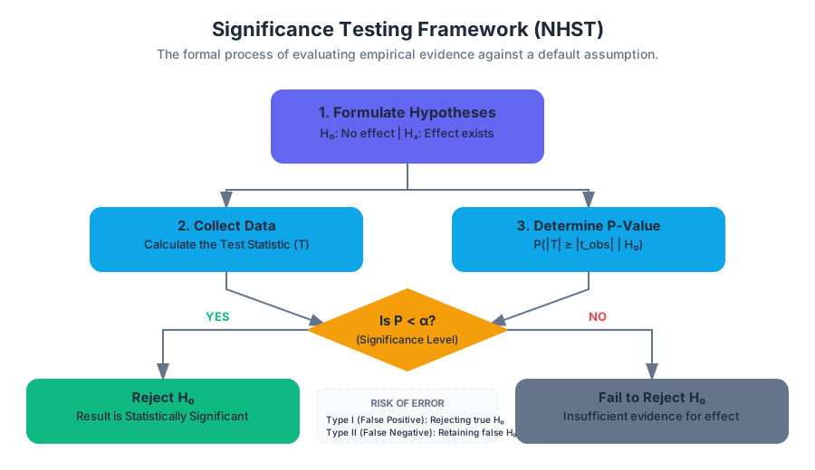
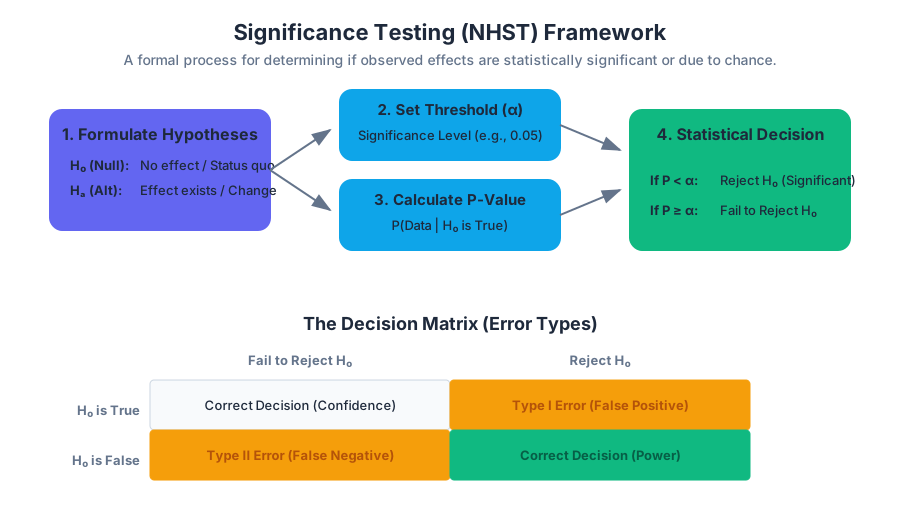
Two-Sample Inference
Key concepts: Difference of Means · Difference of Proportions · Pooled Proportions · Independent Samples · Matched Pairs
Comparing two different populations or treatment groups using means and proportions.
Two-Sample Inference
In the realm of statistical analysis, moving from one-sample inference to Two-Sample Inference represents a shift from simple estimation to comparative science. While one-sample tests ask, "Is the population mean equal to a specific value?", two-sample tests ask, "Is there a fundamental difference between these two populations?" This is the bedrock of the scientific method, enabling us to evaluate the efficacy of medical treatments, the impact of policy changes, or the performance of competing algorithms.
The Fundamental Logic of Comparison
Two-sample inference is built upon the distribution of the difference between statistics. Whether we are comparing means ($\bar{x}_1 - \bar{x}_2$) or proportions ($\hat{p}_1 - \hat{p}_2$), we are essentially creating a new random variable representing the gap between two groups.
The core challenge lies in the propagation of uncertainty. Because both samples are subject to sampling error, the variance of their difference is the sum of their individual variances (assuming independence). This is derived from the property of variance: $Var(X - Y) = Var(X) + Var(Y)$ for independent variables.
The Principle of Independent Variance: When subtracting two independent random variables, their uncertainties do not cancel out; they accumulate. This is why the standard error of a difference is always larger than the standard error of the individual components.
Independent Samples vs. Matched Pairs
Before selecting a test, the researcher must identify the relationship between the two groups. This distinction dictates the entire mathematical approach.
| Feature | Independent Samples | Matched Pairs (Dependent) |
|---|---|---|
| Data Source | Two distinct, unrelated groups (e.g., Men vs. Women). | The same subjects measured twice, or twins/matched subjects. |
| Sample Sizes | Can be different ($n_1 \neq n_2$). | Must be identical ($n_1 = n_2$). |
| Statistical Goal | Compare the centers of two distributions. | Compare the mean of the differences ($ \mu_d $). |
| Primary Benefit | Simplicity in experimental design. | Controls for subject-to-subject variability; higher power. |
Matched Pairs: The "Hidden" One-Sample Test
In a Matched Pairs design, we do not actually perform a two-sample test. Instead, we calculate the difference $d_i = x_{1,i} - x_{2,i}$ for each pair. We then perform a one-sample t-test on these differences. This effectively eliminates the "noise" caused by individual differences between subjects, focusing solely on the effect of the treatment.
Difference of Means: Independent Samples
When comparing the means of two independent populations, we typically employ the Two-Sample T-Test. This is used when the population standard deviations ($\sigma_1, \sigma_2$) are unknown, which is the case in almost all real-world scenarios.
The Welch’s T-Test vs. Pooled T-Test
There are two primary ways to calculate the t-statistic for independent means:
- Welch’s T-Test (Unpooled): Does not assume equal variances. This is the modern default in software like R and Python (SciPy).
- Pooled T-Test: Assumes $\sigma_1^2 = \sigma_2^2$. While slightly more powerful if the assumption holds, it is risky and often discouraged unless the experimental design guarantees equal variance.
Mathematical Derivation of the T-Statistic
The t-statistic for the difference of means is defined as:
$$t = \frac{(\bar{x}_1 - \bar{x}2) - (\mu_1 - \mu_2)}{SE{\bar{x}_1 - \bar{x}_2}}$$
Where the Standard Error ($SE$) for the unpooled version is:
$$SE = \sqrt{\frac{s_1^2}{n_1} + \frac{s_2^2}{n_2}}$$
Degrees of Freedom (Satterthwaite Approximation)
In a one-sample test, $df = n-1$. In a two-sample test where variances are not assumed equal, the degrees of freedom calculation is notoriously complex. Most students use the "conservative" $df = \min(n_1-1, n_2-1)$, but professional software uses the Satterthwaite-Welch formula:
df \approx \frac{\left( \frac{s_1^2}{n_1} + \frac{s_2^2}{n_2} \right)^2}{\frac{1}{n_1-1}\left(\frac{s_1^2}{n_1}\right)^2 + \frac{1}{n_2-1}\left(\frac{s_2^2}{n_2}\right)^2}
Implementation in Python
The following implementation demonstrates how to perform a two-sample t-test from scratch using NumPy to understand the underlying mechanics, then compares it to the SciPy library.
import numpy as np
from scipy import stats

def manual_two_sample_t_test(group1, group2):
    # Calculate basic statistics
    n1, n2 = len(group1), len(group2)
    m1, m2 = np.mean(group1), np.mean(group2)
    v1, v2 = np.var(group1, ddof=1), np.var(group2, ddof=1)

    # Standard Error calculation (Unpooled/Welch)
    se = np.sqrt(v1/n1 + v2/n2)

    # T-statistic
    t_stat = (m1 - m2) / se

    # Satterthwaite-Welch Degrees of Freedom
    df_numerator = (v1/n1 + v2/n2)**2
    df_denominator = ( (v1/n1)**2 / (n1-1) ) + ( (v2/n2)**2 / (n2-1) )
    df = df_numerator / df_denominator

    # Two-tailed p-value
    p_val = 2 * (1 - stats.t.cdf(np.abs(t_stat), df))

    return t_stat, df, p_val

# Example Data: Test scores for two different teaching methods
method_a = [85, 88, 90, 78, 92, 84]
method_b = [72, 75, 68, 80, 74, 71]

t, df, p = manual_two_sample_t_test(method_a, method_b)
print(f"Manual T: {t:.4f}, DF: {df:.4f}, P-value: {p:.4f}")

# Verification with SciPy
res = stats.ttest_ind(method_a, method_b, equal_var=False)
print(f"SciPy T: {res.statistic:.4f}, P-value: {res.pvalue:.4f}")
Difference of Proportions
Comparing proportions (e.g., conversion rates in an A/B test) requires a Two-Sample Z-Test. Unlike means, which use the T-distribution to account for estimated standard deviation, proportions use the Normal (Z) distribution because the standard deviation of a proportion is directly tied to the proportion itself ($\sigma_p = \sqrt{p(1-p)/n}$).
The Concept of Pooled Proportions
There is a critical distinction in how we calculate standard error for proportions depending on whether we are building a Confidence Interval or performing a Hypothesis Test.
- Confidence Intervals: We use the individual sample proportions ($\hat{p}_1$ and $\hat{p}_2$) because we are estimating the actual difference.
- Hypothesis Testing: Under the null hypothesis ($H_0: p_1 = p_2$), we assume both samples come from a population with the same proportion. Therefore, we "pool" the data to get the best possible estimate of this common proportion ($p_c$).
Pooled Proportion Formula: $$\hat{p}_c = \frac{X_1 + X_2}{n_1 + n_2}$$ Where $X$ is the number of successes.
Standard Error Comparison
| Context | Standard Error Formula |
|---|---|
| Confidence Interval | $SE = \sqrt{\frac{\hat{p}_1(1-\hat{p}_1)}{n_1} + \frac{\hat{p}_2(1-\hat{p}_2)}{n_2}}$ |
| Hypothesis Test | $SE_{pooled} = \sqrt{\hat{p}_c(1-\hat{p}_c) \left( \frac{1}{n_1} + \frac{1}{n_2} \right)}$ |
Real-World Usage: SQL A/B Testing
In a data engineering or product analytics context, two-sample inference for proportions is the standard for A/B testing. We often calculate the raw components in SQL before passing them to a statistical engine.
-- Calculating raw components for a Two-Sample Z-Test for Proportions
-- Comparing conversion rates between Control and Treatment groups
WITH group_stats AS (
    SELECT
        test_group,
        COUNT(*) AS n,
        SUM(converted) AS successes,
        CAST(SUM(converted) AS FLOAT) / COUNT(*) AS p_hat
    FROM user_events
    WHERE experiment_id = 'EXP_2023_04'
    GROUP BY test_group
),
pooled_stats AS (
    SELECT
        SUM(successes) / SUM(n) AS p_pooled,
        SUM(n) AS total_n
    FROM group_stats
)
SELECT
    a.p_hat AS p_control,
    b.p_hat AS p_treatment,
    (b.p_hat - a.p_hat) AS lift,
    -- Standard Error for Hypothesis Testing (using pooled proportion)
    SQRT(p_pooled * (1 - p_pooled) * (1.0/a.n + 1.0/b.n)) AS se_pooled
FROM group_stats a, group_stats b, pooled_stats
WHERE a.test_group = 'control' AND b.test_group = 'treatment';
Conditions for Valid Inference
For the results of these tests to be valid, several assumptions must be met. Failure to verify these can lead to Type I errors (false positives) or Type II errors (false negatives).
- Independence:
- Within groups: Observations in each sample must be independent (usually satisfied by random sampling or the 10% rule).
- Between groups: The two samples must be independent of each other (unless using a Matched Pairs design).
- Normality / Large Counts:
- For Means: Each population should be Normal, or sample sizes should be large enough ($n > 30$) for the Central Limit Theorem to apply.
- For Proportions: The "Success/Failure" condition must be met for both groups: $np \geq 10$ and $n(1-p) \geq 10$.
- Randomization: Data must come from a random sample or a randomized experiment to generalize results.
Common Pitfalls and Misconceptions
1. Confusing Independent Samples with Matched Pairs
This is the most common error in undergraduate statistics. If you measure the weight of 50 people before a diet and the same 50 people after, you have one sample of 50 differences, not two independent samples of 50. Using an independent t-test here ignores the correlation between the "before" and "after" measurements, drastically reducing the power of the test.
2. The "Equality of Variance" Trap
Many older textbooks emphasize checking for equal variance using an F-test or Levene's test before choosing between a Pooled or Welch's t-test. However, modern statistical theory suggests that Welch's T-test is almost always preferable. It performs nearly as well as the pooled test when variances are equal and far outperforms it when they are not.
3. Over-reliance on P-values
A statistically significant difference (small p-value) does not necessarily mean the difference is practically significant. With large enough sample sizes (e.g., $n=1,000,000$), even a trivial difference in means will produce a significant p-value. Always report the Effect Size (like Cohen's d) alongside the p-value.
4. Pooling Proportions for Confidence Intervals
As noted earlier, you should only pool proportions for hypothesis tests. For confidence intervals, pooling is mathematically inconsistent because the interval is meant to capture the uncertainty of the actual proportions, not a hypothetical shared proportion.
Summary of Inference Procedures
| Scenario | Parameter | Test Statistic | Standard Error |
|---|---|---|---|
| Means (Independent) | $\mu_1 - \mu_2$ | T-score | $\sqrt{\frac{s_1^2}{n_1} + \frac{s_2^2}{n_2}}$ |
| Means (Matched Pairs) | $\mu_d$ | T-score | $\frac{s_d}{\sqrt{n}}$ |
| Proportions (CI) | $p_1 - p_2$ | Z-score | $\sqrt{\frac{\hat{p}_1(1-\hat{p}_1)}{n_1} + \frac{\hat{p}_2(1-\hat{p}_2)}{n_2}}$ |
| Proportions (Test) | $p_1 - p_2$ | Z-score | $\sqrt{\hat{p}_c(1-\hat{p}_c) (\frac{1}{n_1} + \frac{1}{n_2})}$ |
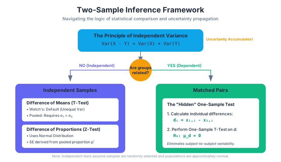
Chi-Square Tests
Key concepts: Goodness-of-Fit Test · Test for Independence · Test for Homogeneity · Expected Counts · Degrees of Freedom
Using Chi-Square distributions to analyze categorical data in two-way tables.
Chi-Square Tests
The Chi-Square ($\chi^2$) test family represents a cornerstone of non-parametric statistics, providing a robust framework for analyzing categorical data. While the t-test and ANOVA dominate the landscape of quantitative variables (means and variances), the Chi-Square test allows us to rigorously evaluate frequencies, proportions, and associations. Developed primarily by Karl Pearson at the turn of the 20th century, these tests bridge the gap between observed reality and theoretical expectation.
The Mathematical Foundation: The $\chi^2$ Distribution
Before diving into specific tests, we must understand the distribution itself. The Chi-Square distribution with $k$ degrees of freedom is the distribution of a sum of the squares of $k$ independent standard normal random variables. Mathematically, if $Z_1, Z_2, \dots, Z_k$ are independent $N(0, 1)$ variables, then:
$$Q = \sum_{i=1}^{k} Z_i^2 \sim \chi^2(k)$$
The distribution is characterized by its Degrees of Freedom (df), which dictates its shape. Unlike the symmetric Normal distribution, the $\chi^2$ distribution is skewed to the right, though it approaches normality as $df$ increases.
The Fundamental Statistic
Regardless of the specific test type, the core mechanic involves calculating the Chi-Square Statistic, denoted as $\chi^2$. This value quantifies the "distance" between what we actually saw (Observed counts) and what we would expect to see if the null hypothesis were true (Expected counts).
$$\chi^2 = \sum \frac{(O - E)^2}{E}$$
Where:
- $O$: The observed frequency in a category.
- $E$: The expected frequency in a category under $H_0$.
The Intuition of the Formula: We square the difference $(O-E)$ to ensure that positive and negative deviations don't cancel each other out. We divide by $E$ to normalize the deviation; a difference of 10 is massive if you expected 5, but negligible if you expected 5,000.
1. Chi-Square Goodness-of-Fit (GoF) Test
The Goodness-of-Fit Test is used to determine if a sample of categorical data matches a specific population distribution. It is a "one-variable" test.
When to Use It
- To check if a die is fair (uniform distribution).
- To see if the ethnic breakdown of a jury matches the census data of a city.
- To verify if Mendelian genetics (e.g., a 3:1 ratio) holds for a cross-breeding experiment.
Mechanics and Degrees of Freedom
In a GoF test, the degrees of freedom are calculated as: $$df = k - 1$$ where $k$ is the number of categories. We lose one degree of freedom because the total count is fixed; if you know the counts of $k-1$ categories, the last one is determined.
Implementation Example (Python/SciPy)
The following code demonstrates a Goodness-of-Fit test to determine if a 6-sided die is biased.
import numpy as np
from scipy import stats

def chi_square_gof_example():
    # Observed frequencies of a die rolled 60 times
    # Categories: [1, 2, 3, 4, 5, 6]
    observed = np.array([8, 12, 15, 9, 10, 6])

    # Under the Null Hypothesis (Fair Die), each side has 1/6 probability
    total_rolls = np.sum(observed)
    expected = np.array([total_rolls / 6] * 6)

    # Calculate Chi-Square Statistic and P-value
    chi_stat, p_val = stats.chisquare(f_obs=observed, f_exp=expected)

    print(f"Chi-Square Statistic: {chi_stat:.4f}")
    print(f"P-value: {p_val:.4f}")

    alpha = 0.05
    if p_val < alpha:
        print("Result: Reject H0. The die is likely biased.")
    else:
        print("Result: Fail to reject H0. No evidence of bias.")

chi_square_gof_example()
2. Chi-Square Test for Independence
The Test for Independence evaluates whether there is a significant association between two categorical variables in a single population. It asks: "Does the value of Variable A depend on the value of Variable B?"
The Contingency Table
Data for this test is organized into a $r \times c$ contingency table (or two-way table), where $r$ is the number of rows and $c$ is the number of columns.
| Variable A \ Variable B | Category B1 | Category B2 | Row Totals |
|---|---|---|---|
| Category A1 | $O_{11}$ | $O_{12}$ | $R_1$ |
| Category A2 | $O_{21}$ | $O_{22}$ | $R_2$ |
| Column Totals | $C_1$ | $C_2$ | N |
Calculating Expected Counts
Under the assumption of independence, the probability of an observation falling into cell $(i, j)$ is the product of the marginal probabilities. Therefore, the expected count for any cell is:
$$E_{i,j} = \frac{(\text{Row } i \text{ Total}) \times (\text{Column } j \text{ Total})}{\text{Grand Total (N)}}$$
Mathematical Derivation of Expected Values
The derivation relies on the definition of independent events: $P(A \cap B) = P(A) \times P(B)$.
% Logic for Expected Value in Independence Test
P(Row_i) = Row_i_Total / N
P(Col_j) = Col_j_Total / N

Assuming Independence:
P(Row_i AND Col_j) = (Row_i_Total / N) * (Col_j_Total / N)

Expected Count (E_ij):
E_ij = N * P(Row_i AND Col_j)
E_ij = N * (Row_i_Total / N) * (Col_j_Total / N)
E_ij = (Row_i_Total * Col_j_Total) / N
3. Chi-Square Test for Homogeneity
While the Test for Independence looks at two variables in one population, the Test for Homogeneity looks at one variable across multiple populations (or treatment groups).
Key Distinction
- Independence: One sample, two variables. (e.g., Sample 500 voters; ask their party and their gender).
- Homogeneity: Multiple samples, one variable. (e.g., Sample 200 men and 200 women separately; ask if they support a specific policy).
Mathematically, the calculation for the $\chi^2$ statistic and the degrees of freedom are identical to the test for independence. The difference lies entirely in the sampling design and the null hypothesis statement.
| Feature | Test for Independence | Test for Homogeneity |
|---|---|---|
| Goal | See if Variable X and Y are related. | See if Group A and B have the same distribution. |
| Sampling | Single random sample. | Multiple independent random samples. |
| Null Hypothesis | Variable A and B are independent. | The distribution of Variable X is the same across populations. |
| Degrees of Freedom | $(r-1)(c-1)$ | $(r-1)(c-1)$ |
4. Degrees of Freedom and Critical Values
The Degrees of Freedom (df) represent the number of values in the final calculation of a statistic that are free to vary.
Summary of df Calculations
| Test Type | Formula | Explanation |
|---|---|---|
| Goodness-of-Fit | $k - 1$ | $k$ is the number of levels/categories. |
| Independence | $(r-1)(c-1)$ | $r$ = rows, $c$ = columns in the table. |
| Homogeneity | $(r-1)(c-1)$ | $r$ = number of populations, $c$ = category levels. |
Real-World Usage: Analyzing Survey Data (R)
In professional statistical environments, R is often the tool of choice for contingency table analysis due to its concise syntax.
# Create a contingency table: Smoking status vs. Exercise level
# Rows: Non-smoker, Occasional, Heavy
# Cols: Low Exercise, High Exercise
survey_data <- matrix(c(50, 70, 20, 30, 10, 20), nrow=3, byrow=TRUE)
rownames(survey_data) <- c("Non-Smoker", "Occasional", "Heavy")
colnames(survey_data) <- c("Low_Ex", "High_Ex")

# Perform Chi-Square Test for Independence
result <- chisq.test(survey_data)

# Output results
print(result)

# Accessing Expected Counts specifically
print("Expected Counts:")
print(result$expected)
5. Assumptions and Conditions
The Chi-Square test is powerful, but it is not "distribution-free" in the sense that it requires specific conditions to be valid. If these are violated, the $\chi^2$ approximation to the sampling distribution of the test statistic fails.
- Randomness: The data must come from a random sample or a randomized experiment.
- Independence: Each observation must be independent of others. This means the sample size $n$ should be less than 10% of the population if sampling without replacement.
- Large Sample Size (Cochran's Rule):
- All Expected Counts must be at least 1.
- At least 80% of Expected Counts must be at least 5.
- Note: If these are not met, use Fisher's Exact Test (for $2 \times 2$ tables) or collapse categories.
6. Worked Example: Independence Test
Scenario: A tech company wants to know if the choice of Operating System (OS) is independent of the user's job role. They survey 200 employees.
Step 1: State Hypotheses
- $H_0$: OS choice and Job Role are independent.
- $H_a$: OS choice and Job Role are dependent.
Step 2: Observed Data (Contingency Table)
| MacOS | Windows | Linux | Total | |
|---|---|---|---|---|
| Devs | 40 | 20 | 40 | 100 |
| Designers | 70 | 20 | 10 | 100 |
| Total | 110 | 40 | 50 | 200 |
Step 3: Calculate Expected Counts
For Devs/MacOS: $E = (100 \times 110) / 200 = 55$ For Designers/Linux: $E = (100 \times 50) / 200 = 25$ (And so on for all 6 cells)
Step 4: Compute $\chi^2$
$$\chi^2 = \frac{(40-55)^2}{55} + \frac{(20-20)^2}{20} + \dots$$ After calculation, suppose $\chi^2 = 32.7$.
Step 5: Determine P-value
With $df = (2-1)(3-1) = 2$, a $\chi^2$ of 32.7 yields a p-value $< 0.0001$. Conclusion: Reject $H_0$. There is a significant association between job role and OS preference.
7. Common Pitfalls and Misconceptions
Pitfall 1: Using Percentages instead of Counts
The Chi-Square formula $\sum \frac{(O-E)^2}{E}$ is strictly defined for frequencies (counts). Using percentages or proportions will result in an incorrect (usually much smaller) $\chi^2$ value, leading to Type II errors (failing to reject a false null).
Pitfall 2: Confusing Independence and Homogeneity
While the math is the same, the interpretation differs. If you sampled 100 people and asked two questions, it's Independence. If you sampled 50 men and 50 women and asked one question, it's Homogeneity.
Pitfall 3: Ignoring the "Small Cell" Problem
When expected counts are too low, the $\chi^2$ statistic becomes unstable. In a $2 \times 2$ table, some researchers use the Yates' Continuity Correction, though modern statisticians often prefer Fisher's Exact Test.
Pitfall 4: Correlation vs. Causation
A significant Chi-Square result for independence shows an association, not causality. Just because "Ice Cream Flavor" and "Sunburn Severity" might be dependent doesn't mean mint chocolate chip causes skin damage; both are likely dependent on a third variable (Temperature/Season).
Summary of Chi-Square Variants
| Test Name | Number of Variables | Number of Populations | Null Hypothesis ($H_0$) |
|---|---|---|---|
| Goodness-of-Fit | 1 | 1 | The sample follows the specified distribution. |
| Independence | 2 | 1 | The two variables are not related. |
| Homogeneity | 1 | 2+ | The distribution is the same across all populations. |
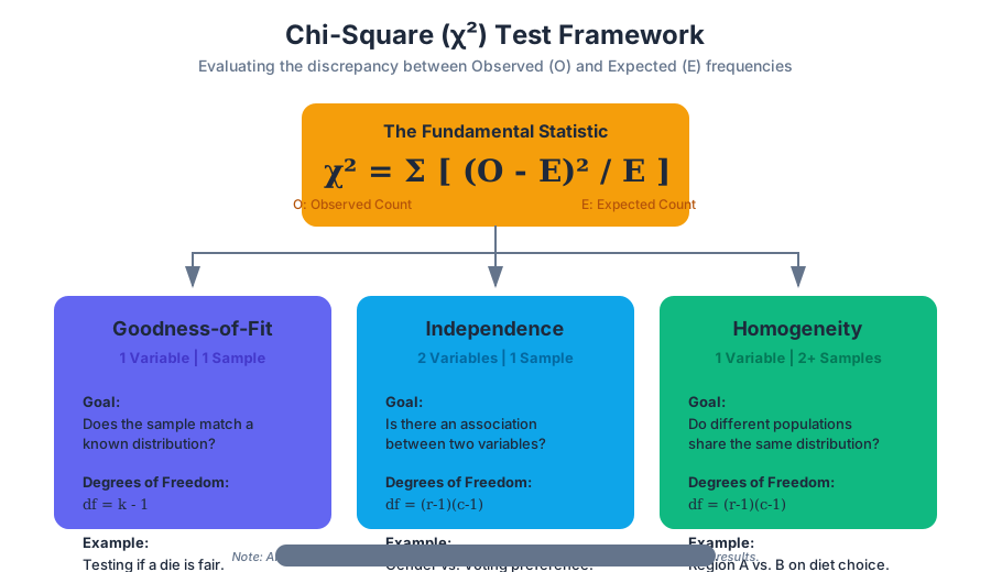
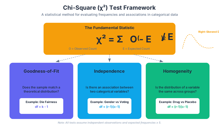
Advanced Regression and ANOVA
Key concepts: Inference for Slope · T-test for Regression · Nonlinear Transformations · Analysis of Variance (ANOVA) · F-statistic
Inference for regression slopes and comparing means across more than two groups.
Advanced Regression and ANOVA
In the preceding stages of statistical analysis, we focused on descriptive bivariate relationships—calculating the correlation coefficient $r$ and fitting a least-squares regression line (LSRL) to a sample. However, in the professional and academic spheres, we are rarely interested in the sample for its own sake. Instead, we seek to make inferences about the underlying population.
Advanced Regression and ANOVA (Analysis of Variance) represent the transition from mere data fitting to rigorous hypothesis testing. This section explores how we determine if a relationship is statistically significant, how we handle complex non-linear trends through mathematical transformations, and how we compare the means of multiple groups simultaneously without inflating our risk of false positives.
Inference for Slope
When we calculate a sample slope $b_1$, we are providing a point estimate for the true population slope $\beta_1$. Because of sampling variability, a different sample from the same population would yield a different $b_1$. To determine if the observed relationship between $x$ and $y$ is "real" or merely a product of chance, we perform Inference for Slope.
What it is
Inference for slope involves constructing confidence intervals and performing hypothesis tests for the parameter $\beta_1$. The most common test is the T-test for Regression, which evaluates the null hypothesis that there is no linear relationship between the variables in the population.
The Regression Model: $y_i = \beta_0 + \beta_1 x_i + \epsilon_i$ Where $\epsilon_i$ is the random error term, assumed to be normally distributed with mean 0 and constant variance $\sigma^2$.
The LINE Assumptions
Before proceeding with inference, four critical conditions must be met, often remembered by the acronym LINE:
- Linearity: The relationship between $x$ and $y$ is linear.
- Independence: The observations are independent of one another.
- Normality: For any fixed $x$, the responses $y$ vary according to a Normal distribution.
- Equal Variance (Homoscedasticity): The variance of $y$ (the spread of residuals) is the same for all values of $x$.
The T-Statistic for Slope
The test statistic for the slope is calculated as: $$t = \frac{b_1 - \beta_{1, \text{null}}}{SE_{b_1}}$$ Where $SE_{b_1}$ is the Standard Error of the Slope, defined as: $$SE_{b_1} = \frac{s_e}{s_x \sqrt{n-1}}$$ Here, $s_e$ is the standard deviation of the residuals (the "typical" error), and $s_x$ is the standard deviation of the $x$ values.
| Parameter | Symbol | Purpose |
|---|---|---|
| Population Slope | $\beta_1$ | The true rate of change in the population. |
| Sample Slope | $b_1$ | The estimated rate of change from the data. |
| Standard Error ($SE_{b_1}$) | $SE_{b_1}$ | Measures how much $b_1$ varies across samples. |
| Degrees of Freedom | $df = n - 2$ | Used to find the critical value $t^*$ or p-value. |
Implementation in Python
The following implementation uses statsmodels to perform a full ordinary least squares (OLS) regression, providing the t-statistics and p-values necessary for inference.
import numpy as np
import pandas as pd
import statsmodels.api as sm

def perform_regression_inference(x, y):
    """
    Performs OLS regression and returns inference statistics for the slope.
    """
    # Add a constant to the predictor (intercept term)
    X = sm.add_constant(x)

    # Fit the model
    model = sm.OLS(y, X).fit()

    # Extracting key inference metrics
    slope = model.params[1]
    t_stat = model.tvalues[1]
    p_val = model.pvalues[1]
    conf_int = model.conf_int().iloc[1]

    print(f"--- Regression Results ---")
    print(f"Estimated Slope (b1): {slope:.4f}")
    print(f"T-statistic: {t_stat:.4f}")
    print(f"P-value: {p_val:.4e}")
    print(f"95% Conf. Interval: [{conf_int[0]:.4f}, {conf_int[1]:.4f}]")

    return model.summary()

# Example usage with synthetic data
np.random.seed(42)
x_data = np.linspace(0, 10, 30)
y_data = 2.5 * x_data + np.random.normal(0, 2, 30)
perform_regression_inference(x_data, y_data)
Nonlinear Transformations
In many real-world scenarios, the relationship between variables is not linear. For instance, the growth of bacteria over time is exponential, and the relationship between a car's speed and its braking distance is quadratic. To apply linear regression techniques to these datasets, we must perform Nonlinear Transformations.
Why it matters
Linear models are mathematically "well-behaved" and easy to interpret. By transforming the data (applying a function to $x$, $y$, or both), we can "straighten" a scatterplot. This allows us to use the standard OLS machinery on data that would otherwise violate the linearity assumption.
Common Transformation Strategies
The "Ladder of Powers" provides a systematic way to choose a transformation. If a scatterplot shows a "bowed" shape, we typically look at logarithms or power functions.
| Transformation Type | Model Equation | Interpretation of $b_1$ |
|---|---|---|
| Exponential | $\ln(y) = a + bx$ | A 1-unit increase in $x$ multiplies $y$ by $e^b$. |
| Power | $\ln(y) = a + b \ln(x)$ | A 1% increase in $x$ results in a $b$% increase in $y$. |
| Logarithmic | $y = a + b \ln(x)$ | A 1% increase in $x$ results in a $b/100$ unit increase in $y$. |
| Quadratic | $y = a + bx + cx^2$ | Relationship depends on the level of $x$ (curvilinear). |
Mathematical Derivation: The Power Model
Suppose we suspect a power relationship of the form $y = \alpha x^\beta$. We can linearize this by taking the natural logarithm of both sides:
\begin{aligned}
y &= \alpha x^\beta \\
\ln(y) &= \ln(\alpha x^\beta) \\
\ln(y) &= \ln(\alpha) + \beta \ln(x)
\end{aligned}
By substituting $Y' = \ln(y)$, $X' = \ln(x)$, and $A = \ln(\alpha)$, we arrive at the linear form: $$Y' = A + \beta X'$$ Now, a standard linear regression on the logged variables will yield an estimate for $\beta$ (the power) and $A$ (the intercept).
Common Pitfall: Back-Transforming Residuals
A common mistake is calculating the $R^2$ or residuals on the transformed data and assuming they apply directly to the original units. When you transform $y$, the distance between points changes non-linearly. Always back-transform your predictions to the original scale before reporting the final "typical error" in context.
Analysis of Variance (ANOVA)
While regression looks at the relationship between quantitative variables, Analysis of Variance (ANOVA) is used when the predictor is categorical. Specifically, One-Way ANOVA tests whether the means of three or more independent groups are significantly different.
Why not multiple T-tests?
If you have four groups (A, B, C, D) and you want to see if any of their means differ, you could perform six separate t-tests (A vs B, A vs C, etc.). However, if each test has a significance level of $\alpha = 0.05$, the probability of making at least one Type I error (finding a difference where none exists) across six tests is approximately $1 - (0.95)^6 \approx 0.26$. This is known as alpha inflation. ANOVA solves this by performing a single "omnibus" test at the $\alpha = 0.05$ level.
How it works: The F-Statistic
ANOVA works by partitioning the total variation in the data into two components:
- Variation Between Groups (SSB): How much the group means differ from the overall "grand mean."
- Variation Within Groups (SSW): How much individual observations differ from their own group mean (error).
The F-statistic is the ratio of these variances, adjusted for degrees of freedom: $$F = \frac{MS_{\text{Between}}}{MS_{\text{Within}}} = \frac{SSB / (k-1)}{SSW / (n-k)}$$ Where $k$ is the number of groups and $n$ is the total number of observations.
Key Insight: If the null hypothesis is true (all means are equal), the variation between groups should be roughly the same as the variation within groups, resulting in an F-statistic near 1. If the group means are significantly different, the "Between" variation will dwarf the "Within" variation, resulting in a large F-statistic and a small p-value.
The ANOVA Source Table
The results of an ANOVA are traditionally organized into a standard table:
| Source of Variation | Sum of Squares (SS) | df | Mean Square (MS) | F |
|---|---|---|---|---|
| Between (Groups) | $SSB$ | $k - 1$ | $MSB = SSB / df_B$ | $MSB / MSW$ |
| Within (Error) | $SSW$ | $n - k$ | $MSW = SSW / df_W$ | |
| Total | $SST$ | $n - 1$ |
Real-World Usage: R Implementation
In research environments, ANOVA is frequently performed using R due to its robust formula syntax and post-hoc testing capabilities.
# Example: Comparing crop yields across three different fertilizers
fertilizer_data <- data.frame(
  yield = c(20, 22, 19, 24, 18, 28, 30, 27, 29, 31, 15, 16, 14, 17, 15),
  type = factor(rep(c("Type_A", "Type_B", "Type_C"), each = 5))
)

# Perform One-Way ANOVA
anova_model <- aov(yield ~ type, data = fertilizer_data)

# Display the ANOVA table
summary(anova_model)

# If significant, perform Tukey's Honestly Significant Difference (HSD)
# to see WHICH groups differ
TukeyHSD(anova_model)
The F-Distribution and Post-hoc Analysis
The F-statistic follows an F-distribution, which is right-skewed and defined by two separate degrees of freedom: $df_{numerator}$ (groups - 1) and $df_{denominator}$ (observations - groups).
Assumptions for ANOVA
ANOVA is a parametric test and requires:
- Independence: Observations are independent within and between groups.
- Normality: The data in each group are approximately normally distributed.
- Homogeneity of Variance: The populations have the same variance ($\sigma^2$). This is often checked using Levene's Test.
Post-hoc Testing
A significant ANOVA result only tells you that at least one group mean is different. It does not tell you which one. To find the specific differences, we use post-hoc tests like Tukey’s HSD or Bonferroni Correction. These tests adjust the p-values to maintain the family-wise error rate at the desired $\alpha$.
Comparison: Regression vs. ANOVA
While they seem different, Regression and ANOVA are both part of the General Linear Model (GLM). In fact, an ANOVA can be computed using a regression model with "dummy variables" (0/1 coding) for the categories.
| Feature | Linear Regression | One-Way ANOVA |
|---|---|---|
| Predictor (X) | Quantitative (Continuous) | Categorical (Discrete) |
| Response (Y) | Quantitative | Quantitative |
| Test Statistic | T-statistic (for slope) | F-statistic (for group variance) |
| Goal | Predict $y$ and find rate of change. | Compare group means. |
Summary of Advanced Modeling Workflow
- Visualize: Start with a scatterplot (Regression) or Boxplot (ANOVA).
- Check Assumptions: Look at residual plots for linearity and constant variance.
- Transform (if needed): If residuals show a curve, apply $\ln(y)$ or $\ln(x)$.
- Execute Test: Calculate the T-statistic for slope or the F-statistic for means.
- Interpret P-value: If $p < \alpha$, reject the null hypothesis.
- Post-hoc/Effect Size: For ANOVA, run Tukey HSD. For Regression, calculate $r^2$ to determine the proportion of explained variance.
Source Materials
Study Statistics and Probability with AI — Free on Lykke
Sign up for free to generate personalized flashcards, quizzes, and study guides from this course. Chat with an AI tutor that knows the material.
Get Started FreeView this course wiki on Lykke · Browse all public course wikis