AP Statistics
Institution: MIT
90 study materials · 73 sections
A full AP Statistics course built to the Fall 2026 Course and Exam Description, covering all five official units — exploring one-variable data and collecting data; probability, random variables, and probability distributions; inference for proportions; inference for means; and regression analysis — plus a closing AP Practice unit with guided multiple-choice and free-response questions, timed sets, and a full practice exam. Every topic is taught question-first with real data, simulations, and worked examples, so you build the statistical reasoning and the precise writing the exam rewards.
Course Sections
Unit 1: Exploring One-Variable Data and Collecting Data
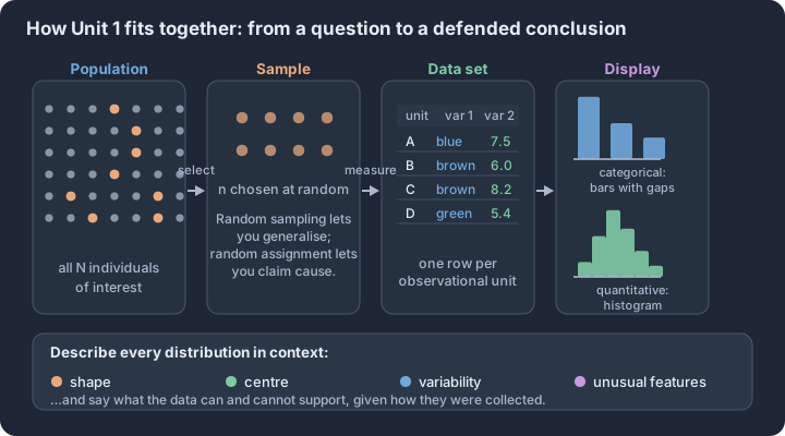
Key concepts: Statistical study — sample data used to answer a question about a population · Variable types — categorical, discrete quantitative, continuous quantitative · Distribution described by shape, centre, variability and unusual features · Summary statistics — mean, median, quartiles, IQR, standard deviation · Resistant vs non-resistant summaries when data are skewed · Random sampling supports generalisation; random assignment supports cause
Integrate the official Unit 1 topics through the AP statistical practices and apply them to contextual problems. Follow the unit roadmap to connect every topic, practice statistical reasoning in context, and prepare for cumulative AP-style questions.
Unit 1: Exploring One-Variable Data and Collecting Data is organized around one recurring question: what evidence would justify the conclusion we want to make? This overview connects the unit's topics before you work through them one at a time.
What you will learn
Integrate the official Unit 1 topics through the AP statistical practices and apply them to contextual problems.
Topic sequence
- 1.1 Introducing Statistics: What Can We Learn from Data? — Formulate an investigative question and identify the data needed to answer it.
- 1.2 Variables — Classify variables and explain how their types affect appropriate analysis.
- 1.3 Tabular Representation and Summary Statistics for One Categorical Variable — Construct and interpret frequency and relative-frequency tables for one categorical variable.
- 1.4 Graphical Representations for One Categorical Variable — Construct, describe, and justify conclusions from graphs of one categorical variable.
- 1.5 Graphical Representations for One Quantitative Variable — Choose and construct appropriate displays for one quantitative variable.
- 1.6 Descriptions for One Quantitative Variable Distributions — Describe a quantitative distribution in context using shape, center, variability, and unusual features.
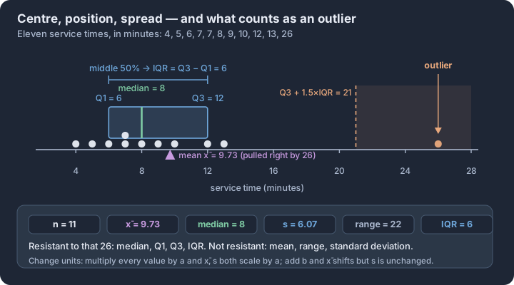
- 1.7 Summary Statistics for One Quantitative Variable — Calculate and interpret measures of center, position, and variability for one quantitative variable.
- 1.8 Graphical Representations of Summary Statistics for One Quantitative Variable — Construct and interpret graphical displays of quantitative summary statistics.
- 1.9 Comparisons of the Distributions for One Quantitative Variable — Compare quantitative distributions using aligned graphical and numerical evidence in context.
- 1.10 The Investigative Question Revisited and Data Collection — Connect an investigative question to a defensible data-collection plan.
- 1.11 Random Sampling — Explain and simulate random sampling methods and the scope of conclusions they support.
- 1.12 Potential Problems with Sampling — Identify sampling bias and other threats to representative data.
- 1.13 Experimental Design — Design and evaluate experiments using comparison, random assignment, replication, and control.
The reasoning routine
- Start by naming the statistical question and the population or process in context.
- Choose a representation or procedure because its conditions match the situation.
- Show the numerical or graphical evidence clearly.
- Interpret the result using the variables, groups, and units from the original context.
Before you move on
Use the roadmap above to select the first topic. Keep a running error log with four labels—concept, procedure, calculation, and context—so the practice unit can point you back to the exact kind of repair you need.
1.1 Introducing Statistics: What Can We Learn from Data?
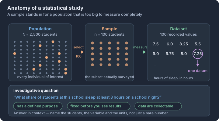
Key concepts: Statistical study — sample data answer a question about a larger population · Population of size N versus sample of size n · Datum versus data set — one recorded value against the whole collection · Why sample at all — measuring every individual is usually impractical · Valid investigative question — defined purpose, fixed before the analysis · Working in context — every number tied to its individuals and units
Identify the components of a statistical study and construct a purposeful investigative question whose required data can be collected and analyzed.
A high school principal notices that students in the hallway seem increasingly tired and wonders if the student body is getting the recommended eight hours of sleep per night. To investigate, the principal could attempt to interview all 2,500 students, but the time and resources required make this nearly impossible. Instead, the principal selects 100 students to survey. This scenario captures the fundamental engine of statistics: the process of collecting data from a manageable subset to answer a specific question about a much larger group.
The Architecture of a Statistical Study
A statistical study is a formal investigation where data are collected from a sample to answer an investigative question about a larger population. These studies become essential when a population—the entire collection of individuals or items of interest—is too vast or difficult to measure in its entirety.
To navigate these studies, we use precise notation and terminology to distinguish between the "whole" and the "part":
- Population ($N$): The complete set of all items or individuals under consideration. The total count of these individuals is represented by the uppercase symbol $N$.
- Sample ($n$): A subset of the population from which we actually obtain information. The number of individuals in this subset is the sample size, represented by the lowercase symbol $n$.
- Datum: A single piece of information (the singular form of data) regarding one individual or item.
- Data Set: The full collection of all individual pieces of information (data) gathered during the study.
The Investigative Question
Every statistical journey begins with a valid investigative question. Unlike a casual inquiry, a statistical investigative question must meet three strict criteria to ensure the integrity of the results.
Criteria for a Valid Investigative Question:
- Defined Purpose: The question must have a clear objective that directs the focus of the study.
- Fixed Before Analysis: The question must be established before any data analysis or results are seen. Changing the question to match what the data "seems to show" later on means it no longer satisfies the fixed-in-advance criterion.
- Collectable and Analyzable: The question must be posed in a way that allows for the collection of specific data that can be processed and interpreted.
Working in Context
In statistics, numbers are never just numbers; they are "in context." This means every component of a study—from the initial question to the final calculation—must be explicitly linked back to the real-world situation. If a study calculates an average of 7.2, that number is meaningless until it is identified as "an average of 7.2 hours of sleep per night for students at North High School."
Worked Example: The Urban Park Project
A city planner wants to know the average number of hours residents of a city use a specific downtown park during the summer. The city has 500,000 residents ($N = 500,000$). The planner conducts a survey of 400 residents ($n = 400$).
- Investigative Question: "What is the average number of hours per week that city residents spend in the downtown park during the months of June, July, and August?" (This is valid: it has a purpose, is set before the survey, and the data—hours—is collectable).
- The Datum: A single resident's response (e.g., "5 hours").
- The Data Set: The list of all 400 responses collected.
- The Population: All 500,000 residents of the city.
- The Sample: The 400 residents who participated in the survey.
Misconception Clinic
The "N vs. n" Confusion
- Misconception: Students often use $N$ and $n$ interchangeably or assume $N$ refers to the sample because it is the "New" data.
- Correction: Always remember that $N$ (uppercase) is for the "BIG" group (Population) and $n$ (lowercase) is for the "small" group (sample).
The "Data" vs. "Datum" Distinction
- Misconception: Treating "data" as a singular noun (e.g., "The data is...") or confusing a single response with the whole set.
- Correction: "Data" is plural. If you have one response, you have a datum. If you have a collection, you have a data set.
The "Moving Target" Question
- Misconception: Thinking it is okay to look at the data first and then decide what question to ask.
- Correction: Changing the question after seeing results does not meet the fixed-in-advance criterion.
Question Builder
Short Response: A wildlife biologist is studying the weight of salmon in a specific river system. There are approximately 12,000 salmon in the river. The biologist catches, weighs, and releases 150 salmon.
- Identify the population size ($N$) and the sample size ($n$).
- Propose a valid investigative question for this study.
Check Your Work:
- $N = 12,000$; $n = 150$.
- A valid question would be: "What is the average weight, in pounds, of the salmon currently living in this river system?"
Exit Check
- Can you distinguish between a population ($N$) and a sample ($n$) in a given scenario?
- Do you know the difference between a single datum and a full data set?
- Can you explain why an investigative question must be fixed before data analysis begins?
- Can you define what it means for a statistical result to be "in context"?
1.2 Variables
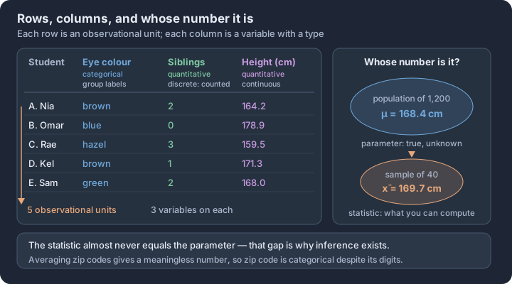
Key concepts: Observational unit — the individual a datum is collected from · Variable — a characteristic that changes from one observational unit to another · Categorical vs quantitative variables — group labels versus measured amounts · Discrete vs continuous — countable values versus any value in an interval · Parameter vs statistic — population truth versus sample estimate · Numerals are not automatically quantitative — zip codes are labels
Statistical analysis begins not with a calculation, but with a classification. Before a single mean is computed or a bar chart is drawn, a researcher must determine the nature of the information being recorded from each individual in a study.
Statistical analysis begins not with a calculation, but with a classification. Before a single mean is computed or a bar chart is drawn, a researcher must determine the nature of the information being recorded from each individual in a study. This classification—identifying the type of variable—is the foundational step of Skill 2.A, as it dictates every subsequent choice in the statistical problem-solving process, from the graphical display used to the summary statistics calculated.
The Taxonomy of Data
A variable is any characteristic that varies from one individual to another in a population or sample. In the AP Statistics framework (VAR-1.B), these characteristics are divided into two primary domains based on the type of information they provide: categorical and quantitative.
| Variable Type | Definition | Examples |
|---|---|---|
| Categorical | Values that place an individual into one of several groups or categories. These are often labels or names. | Eye color, Grade level (Freshman, etc.), Type of dwelling, Zip code. |
| Quantitative | Values that take on numerical measurements for which it makes sense to find an average or perform arithmetic. | Height in cm, Annual income, Number of siblings, Time spent sleeping. |
The Arithmetic Test: To distinguish between types, ask: "Does calculating an average of these values provide meaningful information?" If you average two zip codes (90210 and 10001), the resulting number (50105.5) is geographically meaningless. Therefore, zip codes are categorical, even though they consist of digits.
Quantitative Sub-types: Discrete vs. Continuous
When a variable is quantitative, we further classify it based on the "set" of possible values it can take. This distinction is critical for choosing between specific types of probability distributions later in the course.
Discrete Variables
A discrete variable (VAR-1.B.2) results from a counting process. It can take on a countable number of values, usually integers, with "gaps" between them.
- Example: The number of cars in a parking lot. You can have 14 or 15 cars, but never 14.62 cars.
- Key Indicator: "How many?"
Continuous Variables
A continuous variable (VAR-1.B.2) results from a measurement process. It can take on any value within a given interval on the number line. The precision of a continuous variable is limited only by the measuring instrument used.
- Example: The weight of a golden retriever. While a scale might show 30.2 kg, the actual weight could be 30.214... kg if measured with infinite precision.
- Key Indicator: "How much?"
Contextual Application: The "Smartwatch" Study
Consider a study tracking 500 athletes using wearable technology. To practice Skill 2.A, we must identify the variables and their types within this data collection plan:
- Brand of Watch: (Apple, Garmin, Fitbit). This is categorical; it sorts athletes into groups.
- Daily Step Count: (e.g., 10,432 steps). This is quantitative and discrete; you cannot take half a step.
- Blood Oxygen Level: (e.g., 98.2%). This is quantitative and continuous; it is a measurement that can take any value in a range.
- User ID Number: (e.g., #88291). This is categorical; it is a numerical label used for identification, not for math.
Misconception Clinic: The "Number" Trap
A common error is assuming that any variable containing numbers is quantitative. This leads to "nonsense" statistics, such as calculating the "average phone area code" in a classroom.
- Incorrect: "The variable 'Jersey Number' is quantitative because it uses numbers."
- Correct: "The variable 'Jersey Number' is categorical."
- Reasoning: A player wearing #10 and a player wearing #20 do not "average out" to a player wearing #15. The numbers are simply identifiers, equivalent to names like "Smith" or "Jones."
Why Classification Matters
The type of variable determines the "legal" operations in data analysis. If you misidentify a categorical variable as quantitative, you might attempt to create a histogram (Topic 1.5) when a bar chart (Topic 1.4) is required, or report a standard deviation for data that has no inherent numerical scale.
Retrieval Check
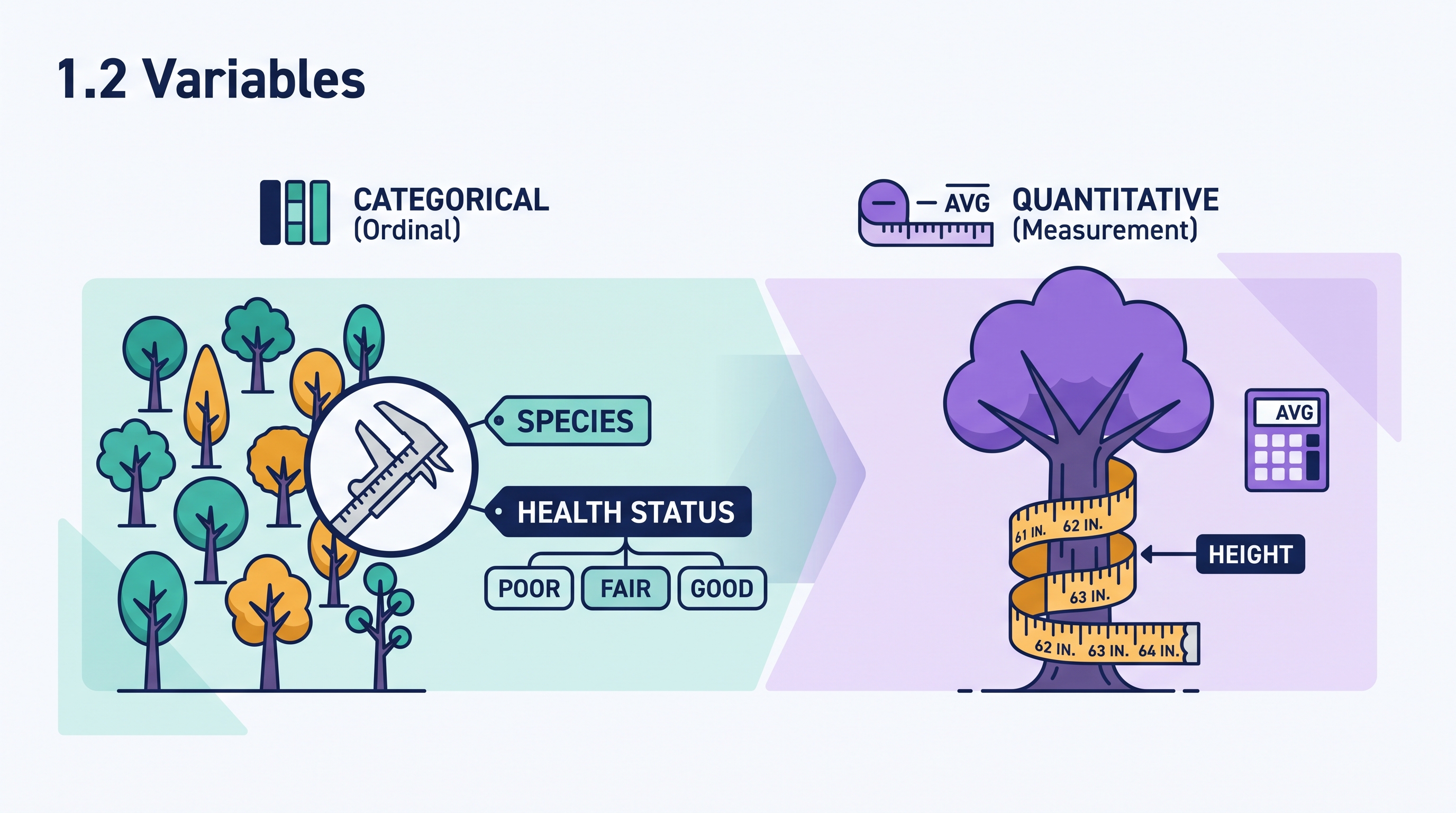
A researcher records the following for each tree in a local park: Species, Height (to the nearest inch), and Health Status (Poor, Fair, Good).
Identify the variable type for "Health Status" and explain why "Height" is considered quantitative even if it is rounded to the nearest whole inch.
Interpretation: Health Status is categorical (ordinal) because it places trees into descriptive groups. Height is quantitative because it is a measurement where arithmetic (like finding the average height of the park's trees) is meaningful. Even if rounded to the nearest inch, the underlying characteristic remains a measurement on a continuous scale.
1.3 Tabular Representation and Summary Statistics for One Categorical Variable
Key concepts: Frequency table — the count of observational units in each category · Relative frequency table — the proportion of units in each category · Proportion, percentage and ratio all carry the same information · Relative frequencies of all categories add to 1, or 100% · Comparing unequal-sized groups needs proportions, not raw counts · Justifying a claim about a categorical variable in context
Raw data is often a chaotic stream of labels—"Red," "Blue," "Red," "Green"—that offers little insight until it is structured. For a categorical variable, the primary goal of analysis is to determine how often each category occurs within a data set.
Raw data is often a chaotic stream of labels—"Red," "Blue," "Red," "Green"—that offers little insight until it is structured. For a categorical variable, the primary goal of analysis is to determine how often each category occurs within a data set. By condensing individual observations into a frequency table, we transform a list of names into a distribution that reveals the "shape" of the categorical data: which outcomes are common, which are rare, and how they relate to the whole.
Organizing Counts: The Frequency Table (UNC-1.B)
The most fundamental summary of a categorical variable is the frequency, which is simply the count of individuals that fall into a specific category. When we list every possible category alongside its corresponding count, we have constructed a frequency table (Skill 3.A). This table serves as the bedrock for all subsequent categorical analysis, ensuring that no individual datum is lost while making the overall pattern visible.
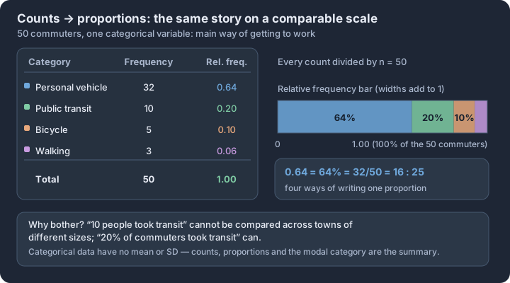
Consider a study of 50 commuters and their primary mode of transportation. The raw data might be a messy spreadsheet, but a frequency table provides immediate clarity:
| Transportation Mode | Frequency (Count) |
|---|---|
| Personal Vehicle | 32 |
| Public Transit | 10 |
| Bicycle | 5 |
| Walking | 3 |
| Total | 50 |
Proportions and Percentages: Relative Frequency (UNC-1.B)
While counts are useful for understanding a single group, they are difficult to compare across groups of different sizes. To solve this, we use relative frequency, which is the proportion or percentage of the total observations that fall into a category. To calculate a relative frequency, you divide the frequency of a category by the total number of individuals in the data set ($n$).
Relative frequencies allow us to make "apples-to-apples" comparisons. Saying "10 people used public transit" is less informative than saying "20% of commuters used public transit." The latter provides a sense of scale and importance relative to the entire population being studied.
Summary Statistics for Categorical Data (UNC-1.C)
Unlike quantitative data, where we calculate means and standard deviations, the summary statistics for categorical variables are limited to frequencies and relative frequencies (Skill 4.A). We describe the distribution by identifying the mode—the category with the highest frequency—and by noting the relative "weight" of each group.
When interpreting these statistics, precision in language is vital. A statistical description should always include:
- The category name (e.g., "Personal Vehicle").
- The numerical value (e.g., "32" or "64%").
- The context (e.g., "of the 50 commuters surveyed").
Misconception Check: The "Average" Category
A common error is attempting to calculate a "mean" for categorical data that uses numbers as labels. For example, if you are analyzing a data set of Zip Codes (e.g., 90210, 60601), calculating the average Zip Code is mathematically possible but statistically meaningless. A Zip Code is a categorical variable; the "average" location does not exist in the way a mean height or weight does. For these variables, you must stick to frequencies and the mode.
Contextual Application: App Usage
Imagine a developer tracks which feature 200 users click first when opening a fitness app. They find that 120 users click "Start Workout," 50 click "View Progress," and 30 click "Settings."
To describe this distribution (Skill 4.A), the developer would report that the mode is "Start Workout," which accounts for a relative frequency of 0.60 (or 60%). They might observe that "Settings" is the least frequent initial action, representing only 15% of the users. This tabular summary directly informs the developer that the majority of their audience uses the app for its primary functional purpose immediately upon launch.
In-Flow Interpretation Check A survey of 80 students identifies their favorite lunch option: 40 choose Pizza, 20 choose Tacos, 15 choose Salad, and 5 choose "Other."
- What is the relative frequency of students who prefer Tacos?
- Identify the mode of this distribution.
Response Check:
- $20 / 80 = 0.25$ (or 25%).
- The mode is Pizza (the category with the highest frequency of 40).

1.4 Graphical Representations for One Categorical Variable
Key concepts: Bar chart — bar height gives the frequency or relative frequency of a category · Gaps between bars — categories are separate, not a continuous scale · Pie chart — each slice's area is that category's share of the whole · Area principle — height and area stay proportional to frequency · Frequency scale versus relative frequency scale for fair comparison · Comparing two or more data sets on the same categorical variable
While a frequency table organizes data into a readable list, a graphical representation transforms those numbers into a visual landscape. For a single categorical variable, the primary goal of a graph is to display the distribution—the categories and the frequency (or relative frequency)…
While a frequency table organizes data into a readable list, a graphical representation transforms those numbers into a visual landscape. For a single categorical variable, the primary goal of a graph is to display the distribution—the categories and the frequency (or relative frequency) of individuals falling into each. In the context of the AP Statistics framework, moving from a table to a graph is not merely an aesthetic choice; it is a shift toward identifying patterns, comparing the prevalence of categories, and justifying claims with visual evidence.
The Workhorse: Bar Charts
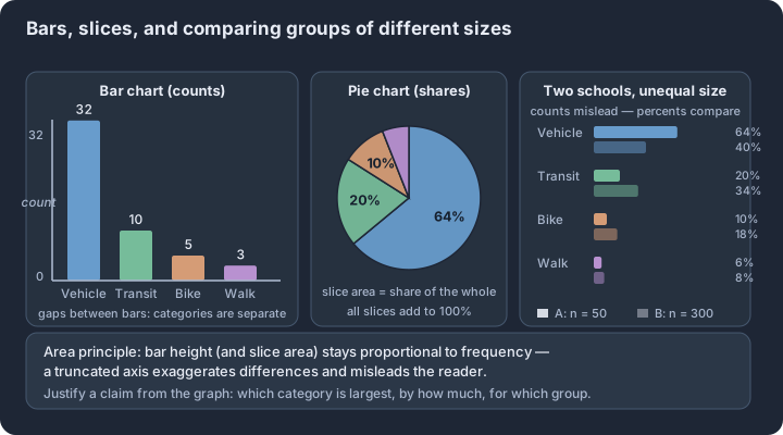
The bar chart is the most versatile tool for representing categorical data. It displays the possible values of the variable on one axis (usually the horizontal axis) and the frequency or relative frequency on the other. Because categorical variables represent distinct groups rather than a continuous numerical range, the bars in a bar chart must be drawn with spaces between them. This visual separation reinforces the idea that "Red" and "Blue" are separate categories, unlike the touching bars of a histogram used for quantitative data.
When constructing or interpreting bar charts (Skill 3.A), precision in scaling is paramount. A frequency bar chart uses raw counts, making it ideal for understanding the exact size of a sample. A relative frequency bar chart uses proportions or percentages, which is essential when the goal is to describe the "part-of-the-whole" relationship or when comparing two different-sized groups. Regardless of the scale, the area principle must be respected: the area of the bar must be proportional to the frequency it represents.
Alternatives: Pie Charts and Segmented Bars
While bar charts are excellent for comparison, pie charts and segmented bar charts emphasize how a single categorical variable is distributed as parts of a single whole. A pie chart divides a circle into slices, where the area of each slice is proportional to the relative frequency of the category. While visually intuitive for showing "majority" vs. "minority," pie charts are often criticized in professional statistics because the human eye is less adept at comparing angles and areas than it is at comparing the linear heights of bars.
A segmented bar chart (sometimes called a stacked bar chart) provides a middle ground. It represents the entire sample as a single bar, with segments stacked on top of each other. The height of each segment corresponds to the relative frequency of that category. This format is particularly useful when space is limited or when preparing to analyze the relationship between two categorical variables in later units.
Describing and Justifying with Data (Skills 4.A & 4.B)
In the AP Statistics environment, "describing" a distribution (Skill 4.A) requires more than just listing numbers. It requires contextualizing the visual evidence. Consider a study of primary "Commute Method" for employees at a tech firm. A bar chart shows the "Bicycle" bar reaching 0.45 on the relative frequency axis, while "Drive Alone" reaches 0.20.
To justify a conclusion (Skill 4.B), a student must explicitly link the claim to the graphical evidence.
- Claim: "The majority of employees use eco-friendly transportation."
- Justification: "Based on the relative frequency bar chart, the 'Bicycle' and 'Walking' categories combined account for a relative frequency of 0.65 (45% + 20%), which is greater than 0.50."
The Area Principle: A statistical rule stating that the area occupied by a part of a graph must be proportional to the magnitude of the value it represents. Violating this—such as by using 3D effects or varying bar widths—misleads the viewer.
Misconception Check: The Truncated Axis
A common error in media and student work is the "truncated" or "broken" vertical axis. If a bar chart comparing two categories (e.g., 48% vs. 52%) starts the y-axis at 45% instead of 0%, the 52% bar will appear multiple times taller than the 48% bar. This violates the area principle and creates a visual lie. Always check that the vertical axis starts at zero to ensure the relative heights accurately reflect the data.
Contextual Example: Streaming Service Preferences
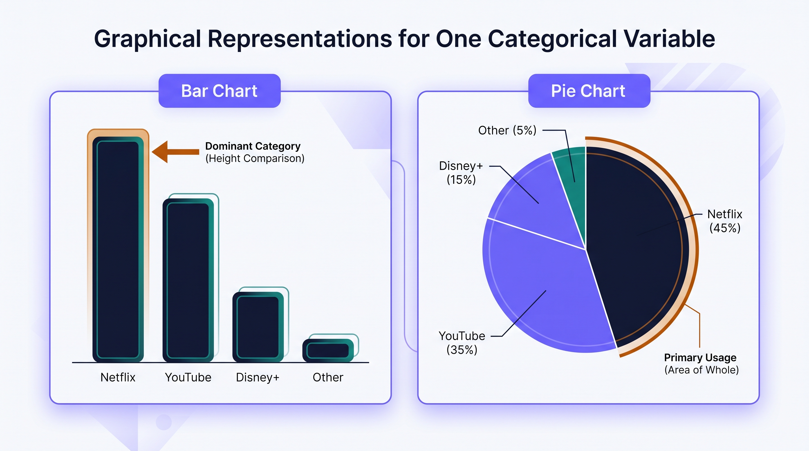
A survey asks 200 teenagers which streaming service they use most often. The data shows: Netflix (90), YouTube (70), Disney+ (30), and Other (10).
- Construction (3.A): To create a relative frequency bar chart, we calculate the proportions: Netflix (0.45), YouTube (0.35), Disney+ (0.15), and Other (0.05).
- Description (4.A): The distribution is dominated by Netflix and YouTube, which together account for 80% of the primary usage.
- Justification (4.B): We can conclude that Netflix is the most popular service because its bar height (0.45) is the greatest among all categories.
Interpretation Check: You are presented with a segmented bar chart showing the favorite pizza toppings of a class. The "Pepperoni" segment spans from the 0% mark to the 40% mark. The "Mushroom" segment spans from the 40% mark to the 55% mark.
- Which topping is more popular?
- What is the relative frequency of the "Mushroom" preference?
(Answer: Pepperoni is more popular because its segment height is 40%, while the Mushroom segment height is only 15% [55% - 40%].)
1.5 Graphical Representations for One Quantitative Variable
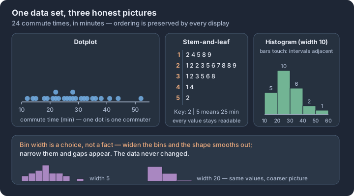
Key concepts: Dotplot — one dot per observation, stacked at repeated values · Stem-and-leaf plot — stem and leaf keep every original value readable · Histogram — ordered bins, bar height gives the count in each interval · Bin width is a choice that changes the picture, not the data · Bars touch for quantitative intervals, unlike a categorical bar chart · All three displays preserve the natural ordering of the values
Raw data is often a chaotic list of values that obscures the underlying story. To uncover the "shape" of a dataset—where values cluster, how far they stretch, and whether they are symmetric or lopsided—we must translate numbers into space.
Raw data is often a chaotic list of values that obscures the underlying story. To uncover the "shape" of a dataset—where values cluster, how far they stretch, and whether they are symmetric or lopsided—we must translate numbers into space. For a single quantitative variable, three primary displays serve as the standard toolkit: dotplots, stemplots, and histograms. Each offers a different balance between precision and bird's-eye perspective.
The Dotplot: Precision in Simplicity
A dotplot is the most direct way to visualize a small quantitative dataset. It consists of a horizontal number line with a single dot placed above the corresponding value for every observation in the data. When multiple observations share the same value, the dots are stacked vertically.
Definition: A dotplot represents each data point as a dot positioned along a scaled axis. It is ideal for small datasets where maintaining the identity of every individual value is important.
| Feature | Requirement |
|---|---|
| Axis | Must be a single, consistently scaled horizontal number line. |
| Labels | The axis must be labeled with the variable name and units. |
| Dots | Each dot represents one observation; stacks show frequency. |
The Stemplot: Preserving the Raw Data
A stemplot (or stem-and-leaf plot) organizes data by splitting each value into two parts: a stem (the leading digit or digits) and a leaf (the final significant digit). This display is unique because it creates a visual "bar" of data while still allowing the reader to see every original numerical value.
Construction Rules for Stemplots
- Separate the digits: Usually, the leaf is the very last digit (e.g., in the number 42, the stem is 4 and the leaf is 2).
- Vertical Stem: Write the stems in a vertical column from smallest to largest, drawing a vertical line to their right.
- Leaves: Write each leaf to the right of its corresponding stem in increasing order.
- The Key: You must include a key that explains what the stem and leaf represent (e.g.,
4 | 2 represents 42 minutes).
Misconception Check: A common error is skipping "empty" stems. If your data has values in the 20s and 40s but none in the 30s, you must still include the stem 3 to show the gap in the distribution.
The Histogram: Grouping for Scale
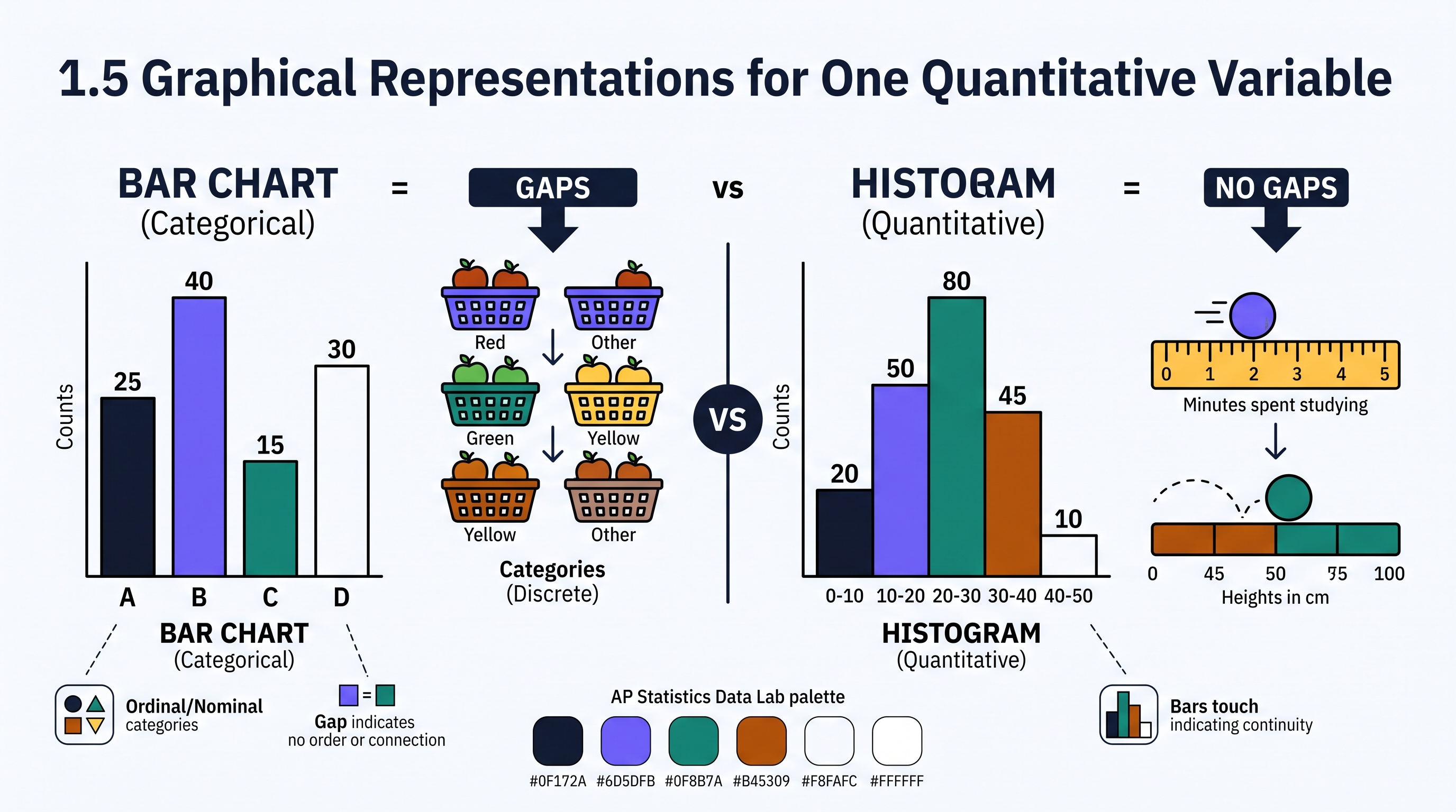
When datasets grow large, individual dots or leaves become overwhelming. A histogram solves this by grouping values into adjacent intervals of equal width, called bins or classes. The height of each bar represents the frequency (count) or relative frequency (proportion) of observations falling within that interval.
Unlike a bar chart, the horizontal axis of a histogram is a continuous number line. Therefore, the bars in a histogram must touch, signaling that the variable is quantitative and continuous.
Choosing the Right Representation (Skill 3.A)
Selecting a display is a strategic decision based on the size of the dataset and the level of detail required.
| Display Type | Best Used When... | Advantage | Disadvantage |
|---|---|---|---|
| Dotplot | $n < 25$ | Extremely easy to construct and read. | Becomes cluttered with large $n$. |
| Stemplot | $25 < n < 100$ | Preserves actual data values. | Hard to manage with very large $n$ or high precision. |
| Histogram | $n > 100$ | Excellent for seeing "shape" in large data. | Hides individual data values; shape can change with bin width. |
Contextual Example: Commute Times
Imagine an HR manager at a tech startup collects the commute times (in minutes) for 15 employees: 12, 15, 15, 18, 22, 25, 25, 25, 30, 32, 35, 40, 45, 50, 60.
- Dotplot: 15 dots would be placed on a line from 10 to 60. You would see a stack of three dots at the 25-minute mark.
- Stemplot:
1 | 2 5 5 82 | 2 5 5 53 | 0 2 54 | 0 55 | 06 | 0- Key: 1 | 2 = 12 minutes
- Histogram: If we used bin widths of 10 (0-10, 10-20, etc.), the first bar (10 to <20) would have a height of 4.
Misconception: Histograms vs. Bar Charts
A bar chart represents categorical data; the bars have gaps between them because the categories (like "Red" or "Blue") have no inherent numerical order. A histogram represents quantitative data; the bars touch because they represent a continuous range of values. If you leave gaps between bars in a histogram, you are incorrectly implying that those intermediate values are impossible.
Interpretation Check: A researcher is studying the number of hours of sleep 200 college students got last night. Which graphical display would be most appropriate to quickly identify the overall shape of the distribution without cluttering the page with 200 individual marks?
Select one: Dotplot, Stemplot, or Histogram? (Answer: Histogram. With $n=200$, a dotplot or stemplot would be too dense to interpret quickly, whereas a histogram efficiently aggregates the data into readable bins.)
1.6 Descriptions for One Quantitative Variable Distributions
Key concepts: Four-part description — shape, centre, variability, unusual features, in context · Skewed right, skewed left, or approximately symmetric · Unimodal, bimodal, or approximately uniform · Outliers — values unusually small or large relative to the rest · Gaps and clusters — empty stretches and concentrations of values · Skew drags the mean towards the long tail, away from the median
A raw data set is a collection of numbers, but a distribution is a narrative. When we transition from simply constructing a graph to describing it, we move from data visualization to statistical communication.
A raw data set is a collection of numbers, but a distribution is a narrative. When we transition from simply constructing a graph to describing it, we move from data visualization to statistical communication. To describe a distribution completely, a statistician must address four specific pillars: shape, center, variability, and unusual features. In the context of the AP Statistics framework, these descriptions are never abstract; they must always be tethered to the variable and units provided in the scenario (Skill 4.A).
The Four Pillars of Distribution Description
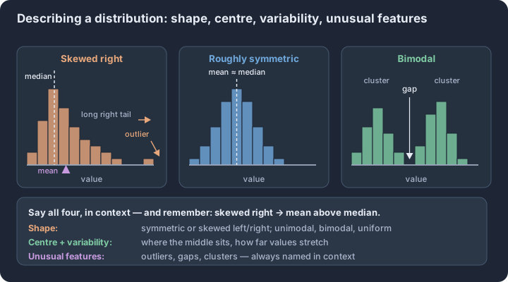
The essential knowledge for Topic 1.6 requires that any description of a quantitative variable’s distribution includes context and addresses the following components (1.6.A.1):
- Shape: The overall "silhouette" of the data. Is it symmetric? Is it pushed to one side? How many peaks does it have?
- Center: The "typical" value of the data set. While Topic 1.7 dives into the arithmetic of mean and median, Topic 1.6 focuses on identifying the approximate location of the center on a graph.
- Variability (Spread): A description of how much the data values vary. This can be described generally (e.g., "The values range from 10 to 50 units") or specifically using range or interquartile range.
- Unusual Features: Points or patterns that deviate from the overall trend. This includes outliers (observations that fall far from the rest of the data), gaps (regions with no observations), and clusters (concentrations of values separated by gaps) (1.6.A.2).
Decoding Shape: Symmetry, Skewness, and Modality
The shape of a distribution is often the first thing a statistician notices. It provides immediate insight into the nature of the variable being studied.
- Symmetry: A distribution is roughly symmetric if the right and left sides are approximately mirror images of each other. In perfectly symmetric distributions, the center acts as a fold line.
- Skewness: This describes a lack of symmetry. A distribution is skewed right (positively skewed) if the "tail" of the data extends further to the right, toward larger values. Conversely, it is skewed left (negatively skewed) if the tail extends further to the left, toward smaller values.
- Modality: This refers to the number of prominent peaks (modes) in the distribution. A unimodal distribution has one clear peak; bimodal has two; multimodal has more than two. A uniform distribution has no clear peaks, appearing roughly flat across its range.
The Skewness Misconception: Many students mistakenly identify skewness based on where the "bulk" of the data is located. Correct Reasoning: Skewness is defined by the tail, not the peak. If the thin tail points toward the high numbers (the right), the distribution is skewed right.
Identifying Unusual Features
Unusual features are often the most scientifically interesting parts of a data set. A gap indicates a range of values where no data was observed, which might suggest that the population consists of two distinct subgroups. Clusters are the concentrations of data on either side of those gaps. When describing these, you must be specific: "There is a cluster of commute times between 5 and 15 minutes, and another between 45 and 60 minutes, separated by a 30-minute gap."
Outliers require careful handling. While we will later learn formal rules (like the $1.5 \times \text{IQR}$ rule) to identify them, at this stage, an outlier is any value that appears to be an obvious departure from the rest of the distribution.
Justifying Claims in Context (Skill 4.B)
Statistical description is the foundation for justification. Graphical representations reveal information that can support or refute a claim about a real-world phenomenon (1.6.B.1). For example, if a company claims that most of its employees have short commutes, but a histogram of commute times is heavily skewed to the right with a center at 45 minutes, the distribution provides the evidence needed to challenge that claim.
Contextual Example: Battery Life
Imagine a dotplot representing the lifespan (in hours) of 30 "LongLast" brand batteries.
- Description: The distribution of battery lifespans is unimodal and roughly symmetric, centered at approximately 105 hours. The lifespans vary from a minimum of 92 hours to a maximum of 118 hours. There are no apparent outliers or significant gaps in the data.
- Justification: If a consumer claims these batteries are "unreliable" because they vary too much, you could justify a counter-claim by pointing out the symmetry and relatively tight spread (variability) around the 105-hour center.
Interpretation Check
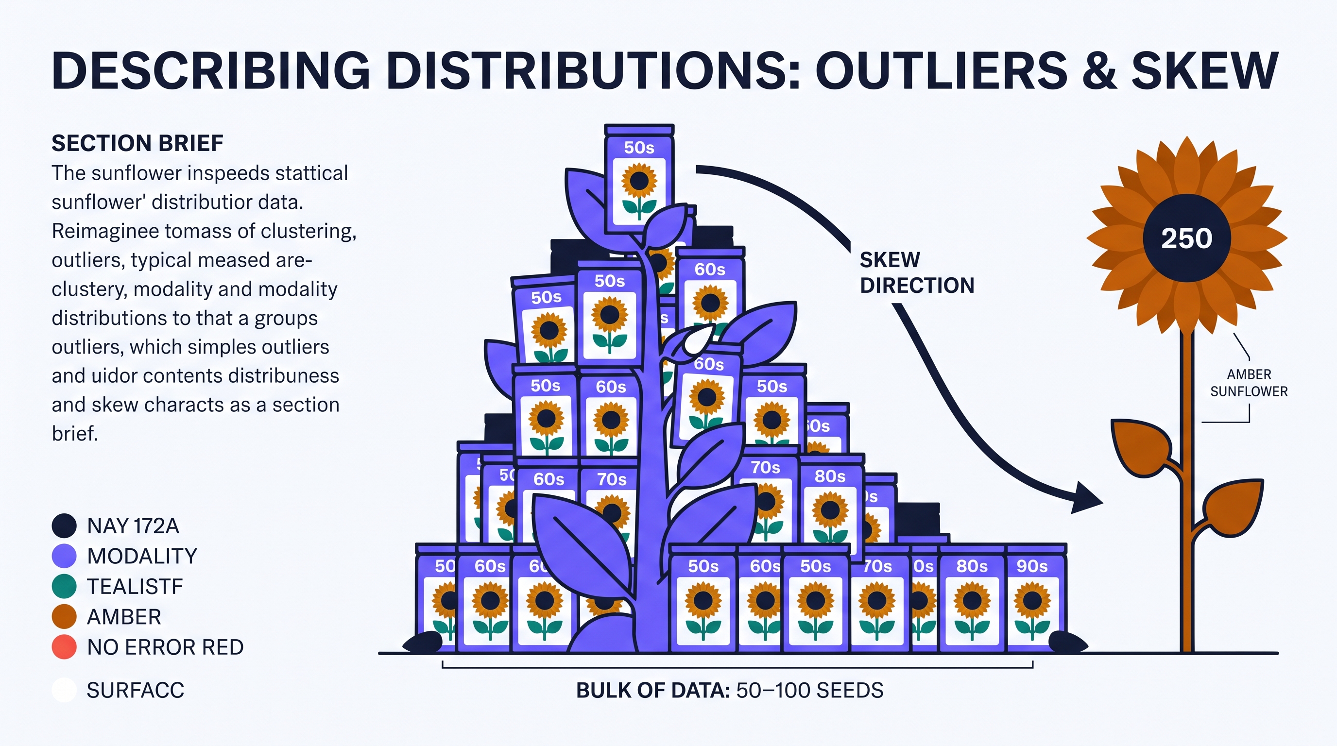
A researcher collects data on the number of seeds in a specific species of sunflower and creates a stem-and-leaf plot. The plot shows a large cluster of sunflowers with 50–100 seeds, a wide gap, and then a single sunflower with 250 seeds.
- How would you describe the "250 seeds" observation in the context of this distribution?
- If the bulk of the data is between 50 and 100, but the "tail" of the distribution extends out to 250, is this distribution skewed left or skewed right?
- How would you describe the modality of a distribution that has two distinct clusters separated by a gap?
1.7 Summary Statistics for One Quantitative Variable
Key concepts: Mean and median — the balance point versus the middle value · Quartiles, percentiles and the five-number summary · Range, interquartile range and standard deviation as measures of variability · Standard deviation — typical distance from the mean, computed with n − 1 · The 1.5 × IQR rule for flagging potential outliers · Resistant summaries vs non-resistant ones, and how unit changes rescale them
The arithmetic mean ($\bar{x}$) serves as the balance point of a distribution, representing the sum of all individual observations divided by the total number of observations $n$.
The arithmetic mean ($\bar{x}$) serves as the balance point of a distribution, representing the sum of all individual observations divided by the total number of observations $n$. While the mean accounts for the specific value of every data point in a set, the median identifies the physical midpoint, dividing an ordered data set into two equal halves where 50% of the observations fall at or below that value and 50% fall at or above it (UNC-1.K, Skill 3.B).
Measures of Center and the Influence of Data Points
The choice between mean and median depends heavily on the presence of extreme values or skewness. Because the mean incorporates the magnitude of every value, it is pulled toward the tail of a skewed distribution or toward outliers, making it a non-resistant statistic. In contrast, the median is resistant; it remains largely unaffected by extreme observations because it only tracks the center position of the ordered list (UNC-1.M, Skill 4.A).
| Statistic | Calculation Logic | Sensitivity to Outliers |
|---|---|---|
| Mean ($\bar{x}$) | $\frac{\sum x_i}{n}$ | High (Non-resistant) |
| Median | Middle value of ordered data | Low (Resistant) |
Key Insight: In a perfectly symmetric distribution, the mean and median are equal. In a right-skewed distribution, the mean is typically greater than the median. In a left-skewed distribution, the mean is typically less than the median (UNC-1.M).
Measures of Variability
Variability describes the "spread" or "dispersion" of the data, quantifying how much the observations differ from one another or from the center. A distribution with low variability has data points clustered tightly together, while high variability indicates data points spread over a wider range of values (UNC-1.L, Skill 3.B).
1. Range
The range is the simplest measure of variability, calculated as the difference between the maximum and minimum values ($\text{Range} = \text{Max} - \text{Min}$). It is highly non-resistant because it relies entirely on the two most extreme values in the data set.
2. Standard Deviation ($s_x$)
The standard deviation measures the typical distance of the observations from their mean. It is calculated by taking the square root of the variance ($s_x^2$), which is the average of the squared deviations from the mean.
- Interpretation: "The [variable] typically varies by about [$s_x$] from the mean of [$\bar{x}$]."
- Like the mean, $s_x$ is non-resistant and increases significantly with the addition of outliers (UNC-1.L, Skill 4.B).
3. Interquartile Range (IQR)
The IQR measures the variability of the middle 50% of the data. It is the distance between the first quartile ($Q_1$) and the third quartile ($Q_3$): $\text{IQR} = Q_3 - Q_1$. Because it ignores the top and bottom 25% of the data, the IQR is a resistant measure of spread (UNC-1.L).
Measures of Relative Position
To understand where a single observation stands within the larger group, we use measures of position such as percentiles and quartiles (UNC-1.N, Skill 4.A).
- Percentiles: The $p^{th}$ percentile of a distribution is the value such that $p$ percent of the observations fall at or below it.
- Quartiles: These specific percentiles divide the data into four equal-sized groups.
- First Quartile ($Q_1$): The 25th percentile (median of the lower half).
- Second Quartile: The 50th percentile (the Median).
- Third Quartile ($Q_3$): The 75th percentile (median of the upper half).
The Five-Number Summary
The five-number summary provides a comprehensive numerical snapshot of a distribution’s center and spread. It consists of:
- Minimum
- First Quartile ($Q_1$)
- Median
- Third Quartile ($Q_3$)
- Maximum
Contextual Example: Smartphone App Usage
Imagine a study recording the number of apps installed on the phones of 10 students:
12, 15, 18, 20, 22, 25, 28, 30, 35, 110
- Mean: $\approx 31.5$ apps.
- Median: $23.5$ apps.
- Analysis: The student with 110 apps is an outlier. This extreme value pulls the mean (31.5) well above the median (23.5). If we want to describe the "typical" student, the median is a more accurate representation because it is resistant to that outlier (Skill 4.B).
- IQR: $Q_1$ (3rd value) is 18; $Q_3$ (8th value) is 30. $\text{IQR} = 30 - 18 = 12$. The middle 50% of students have an app count spread of 12 apps.
Misconception Check
The Error: Reporting the Range as an interval (e.g., "The range is 12 to 110"). The Correction: In statistics, the range is a single non-negative number representing the distance (e.g., "The range is 98"). If you want to describe the boundaries, you are describing the "minimum and maximum," not the range itself.
Interpretation Check
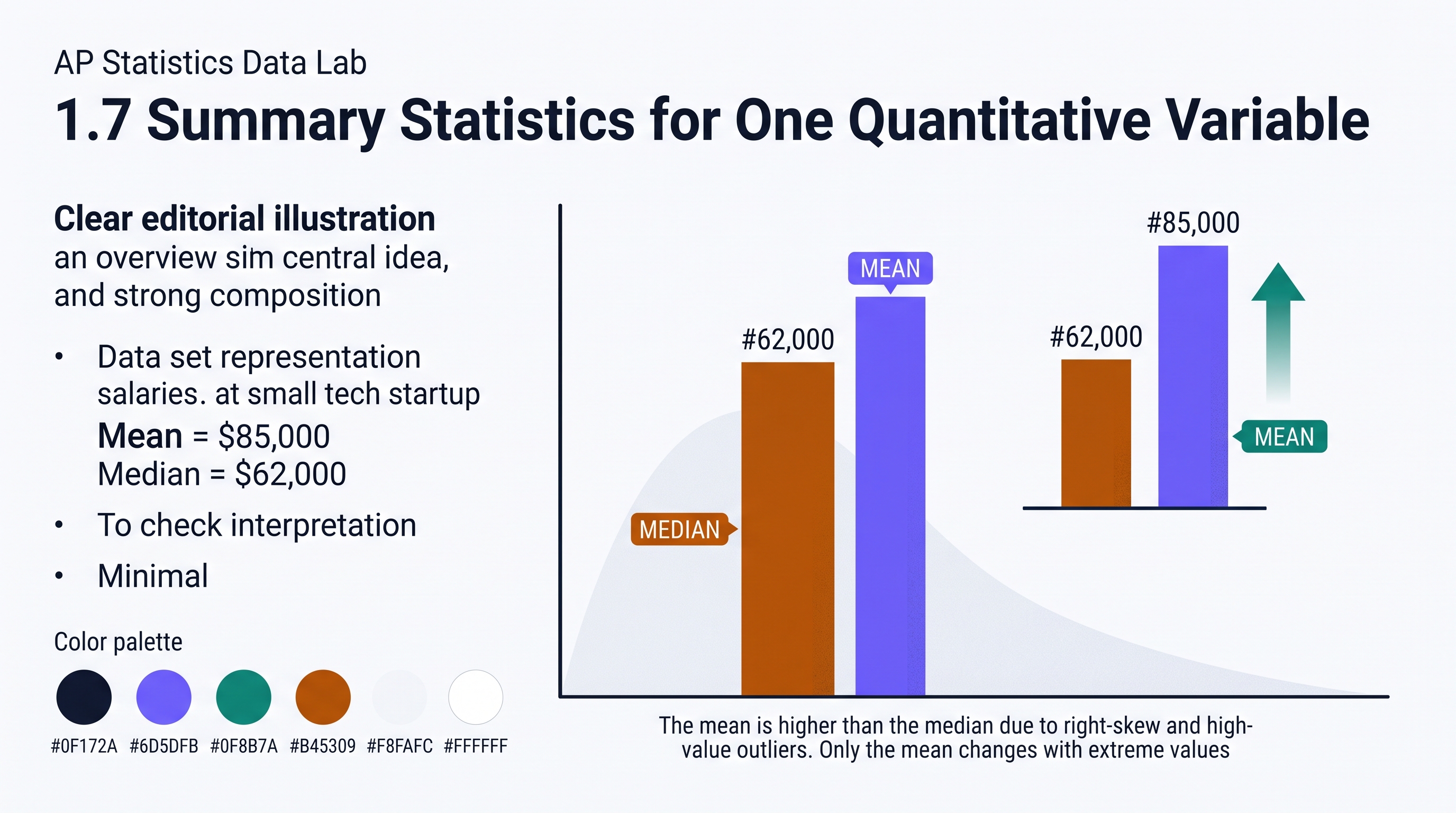
A data set representing the salaries of employees at a small tech startup has a mean of $85,000 and a median of $62,000.
- What does the discrepancy between the mean and median suggest about the distribution of salaries?
- If the CEO (the highest earner) receives a $50,000 raise, which of these two statistics will change, and why?
Check your reasoning: 1. The mean is much higher than the median, suggesting the distribution is right-skewed with high-value outliers. 2. Only the mean will change; it is non-resistant and will increase as the sum of salaries increases. The median remains the middle position and is resistant to changes in extreme values.
1.8 Graphical Representations of Summary Statistics for One Quantitative Variable
Key concepts: Five-number summary — minimum, Q1, median, Q3, maximum · Boxplot — the five-number summary to scale, whiskers stopping at the last non-outlier · Quartiles cut the data into four groups of about 25% · IQR = Q3 − Q1, the spread of the middle 50% · The 1.5 × IQR fences, the rule that flags an outlier · Mean above, below, or near the median signals skew
A boxplot (or box-and-whisker plot) acts as a structural X-ray for a quantitative distribution. While histograms and dotplots show every bump and gap in the data, the boxplot strips away the "noise" to highlight five specific landmarks: the five-number summary.
A boxplot (or box-and-whisker plot) acts as a structural X-ray for a quantitative distribution. While histograms and dotplots show every bump and gap in the data, the boxplot strips away the "noise" to highlight five specific landmarks: the five-number summary. This representation allows statisticians to evaluate the center, spread, and potential outliers of a dataset at a single glance, making it one of the most efficient tools for analyzing the distribution of a single quantitative variable (Skill 3.A).
The Five-Number Summary and the Box
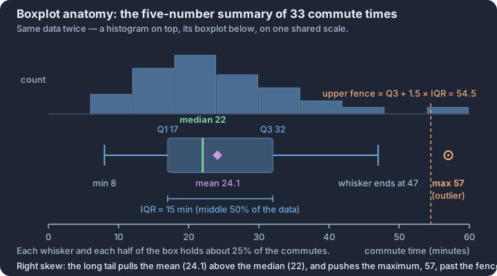
The foundation of every boxplot is the five-number summary, which divides the data into four equal-sized groups, each containing approximately 25% of the observations.
| Statistic | Role in the Boxplot | Data Coverage |
|---|---|---|
| Minimum | The smallest data value. The left whisker stops at the smallest value inside the fence. | Bottom 0% |
| First Quartile (Q1) | The left edge of the "box." | 25th Percentile |
| Median | The vertical line inside the box. | 50th Percentile |
| Third Quartile (Q3) | The right edge of the "box." | 75th Percentile |
| Maximum | The largest data value. The right whisker stops at the largest value inside the fence. | Top 100% |
The "box" itself represents the Interquartile Range (IQR), spanning from $Q1$ to $Q3$. This middle 50% of the data provides a robust measure of variability that is not influenced by extreme values.
Identifying Outliers: The 1.5 × IQR Rule
In a standard modified boxplot, outliers are not just "unusual" points; they are mathematically defined. To identify them, we calculate "fences" that act as the boundaries for typical data. Any value falling outside these fences is plotted individually as a point or asterisk.
The Outlier Fences:
- Lower Fence: $Q1 - 1.5 \times \text{IQR}$
- Upper Fence: $Q3 + 1.5 \times \text{IQR}$
The whiskers of the boxplot do not necessarily extend to these fences. Instead, they extend to the most extreme data points that are still inside the fences. This is a critical distinction for accurate construction (Skill 3.A).
Interpreting Shape and Variability
A boxplot provides immediate visual evidence of a distribution’s shape and variability (Skill 4.A). Because each section of the plot (each whisker and each half of the box) represents 25% of the data, the length of these sections tells us about the density of the observations.
- Symmetry: If the median is roughly in the middle of the box and the whiskers are of equal length, the distribution is likely symmetric.
- Right Skew: If the right whisker is significantly longer than the left, or if the median is pulled toward the left side of the box, the distribution is skewed to the right.
- Left Skew: If the left whisker is significantly longer than the right, or if the median is pulled toward the right side of the box, the distribution is skewed to the left.
Contextual Example: Smartphone Battery Life
Suppose a researcher tests the battery life (in hours) of 20 identical smartphones. The data yields: $Min=6, Q1=12, Med=15, Q3=17, Max=22$.
- IQR: $17 - 12 = 5$ hours.
- Upper Fence: $17 + 1.5(5) = 24.5$. Since the $Max (22)$ is less than $24.5$, there is no upper outlier.
- Lower Fence: $12 - 1.5(5) = 4.5$. Since the $Min (6)$ is greater than $4.5$, there is no lower outlier. Interpretation: The boxplot would show a slightly left-skewed distribution, as the distance from $Min$ to $Med$ ($9$ hours) is greater than the distance from $Med$ to $Max$ ($7$ hours).
Misconception Clinic: The "More Data" Trap
The Misconception: Students often look at a long whisker or a wide box and assume it contains "more data points" than a shorter section.
The Correction: Every one of the four sections of a boxplot (lower whisker, lower box, upper box, upper whisker) contains approximately 25% of the data. A longer section does not mean more data; it means the data in that quartile is more spread out (less dense). A short, cramped section means the data points are tightly packed together.
Interpretation Check
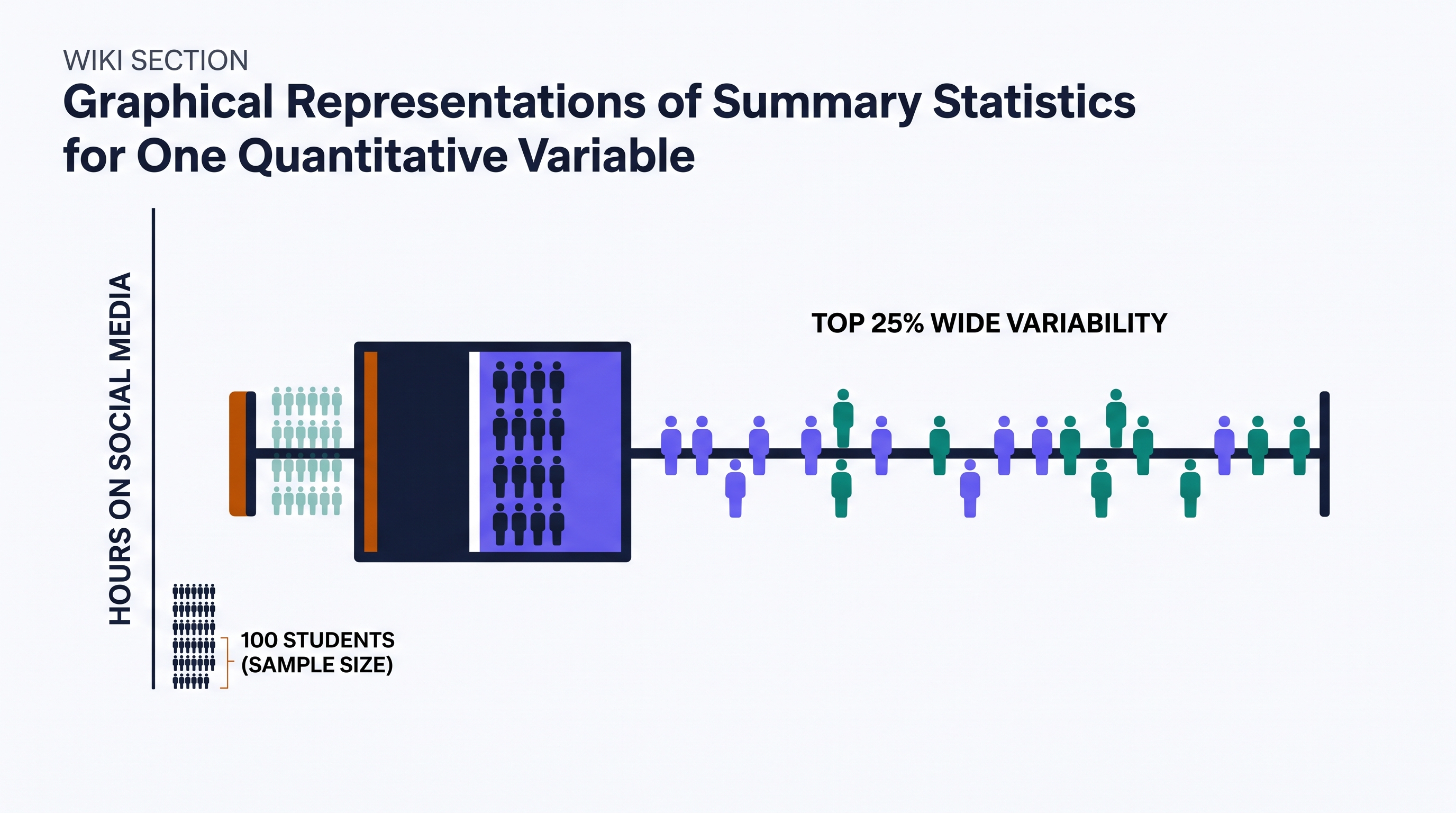
A boxplot for the number of hours students spend on social media shows a very short left whisker and a very long right whisker. If there are 100 students in the sample, approximately how many students are represented by the long right whisker, and what does its length tell you about their habits?
Answer: Approximately 25 students are represented by that whisker. Its length indicates that while these students all fall in the top 25% of usage, their actual hours vary widely compared to the bottom 25% of students, who have very similar (tightly packed) usage times.
1.9 Comparisons of the Distributions for One Quantitative Variable
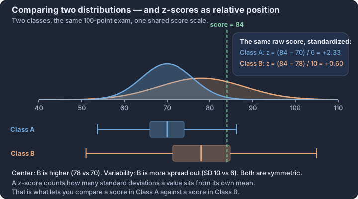
Key concepts: Shape, center, variability, unusual features — the four comparisons · Comparative language, not two separate descriptions · Parallel boxplots and back-to-back stemplots for comparing groups · One shared scale for every graph being compared · z-score — standard deviations a value sits from its own mean · z-scores compare positions across two different distributions
Comparing the distributions of a quantitative variable across different groups reveals whether a specific factor—such as a medical treatment, a geographic location, or a manufacturing process—is associated with a change in the data's center, spread, or shape.
Comparing the distributions of a quantitative variable across different groups reveals whether a specific factor—such as a medical treatment, a geographic location, or a manufacturing process—is associated with a change in the data's center, spread, or shape. While describing a single distribution provides a snapshot of one group, a formal comparison requires an integrated analysis that uses explicit comparative language to link two or more datasets. This process is fundamental to the statistical goal of identifying patterns and justifying claims about differences between populations.
The Four Pillars of Comparison
To provide a complete comparison of quantitative distributions, you must address four specific characteristics: shape, center, variability, and unusual features. A common error is to simply list these values for each group separately; however, a statistical comparison is only valid when it uses comparative words (e.g., "greater than," "smaller than," "more symmetric") to directly relate the groups in context.
| Feature | Comparative Focus | Statistical Evidence (Skill 3.B) |
|---|---|---|
| Shape | Are the skewness or modality patterns similar? | Skewed left/right, symmetric, unimodal, bimodal. |
| Center | Which group has a typically higher value? | Compare medians or means. |
| Variability | Which group's data is more spread out? | Compare Range, IQR, or Standard Deviation. |
| Unusual | Do the groups share or differ in outliers? | Identify specific outliers, gaps, or clusters. |
Graphical Tools for Comparison
Effective comparisons rely on visual alignments that allow the eye to immediately detect differences in position and spread. The most common tools for this are parallel boxplots and back-to-back stemplots.
- Parallel Boxplots: These are ideal for comparing centers (medians) and variability (IQR and Range) simultaneously. Because they are plotted on the same numerical scale, the relative positions of the "boxes" immediately indicate which group has a higher typical value.
- Back-to-Back Stemplots: These share a single central "stem," with "leaves" for one group extending to the left and leaves for the other extending to the right. This is particularly useful for comparing the granular shapes and identifying gaps or clusters in smaller datasets.
- Side-by-Side Histograms: When using histograms to compare groups, they must be constructed using the same scale on the horizontal axis. If the scales differ, a visual comparison of spread or center will be fundamentally misleading.
Justifying Claims with Evidence (Skill 4.B & 4.C)
In AP Statistics, a comparison is incomplete without a justification. If you claim that "Brand A batteries are more reliable than Brand B," you must back that claim with specific summary statistics. For example, "Brand A is more reliable because it has a smaller interquartile range (10 hours) compared to Brand B (25 hours), indicating less variability in battery life."
The Golden Rule of Comparison: Always use comparative adverbs. Saying "Group A has a median of 50 and Group B has a median of 30" is a description. Saying "The median of Group A (50) is higher than the median of Group B (30)" is a comparison.
Contextual Example: Urban vs. Rural Commute Times
Imagine comparing the commute times (in minutes) for workers in a dense urban center versus a rural town.
- Shape: The urban distribution might be strongly skewed to the right due to traffic delays, while the rural distribution is more symmetric.
- Center: The median commute time for urban workers (45 mins) is significantly higher than for rural workers (20 mins).
- Variability: The urban commute times show much greater variability (Range = 80 mins) compared to the rural times (Range = 15 mins).
- Unusual Features: The urban data contains several high-end outliers representing extreme delays, whereas the rural data has no outliers.
Misconception Check: The "List Trap"
A frequent mistake is writing two separate paragraphs—one for Group A and one for Group B—without ever actually comparing them. To avoid this, use "linking" sentences. Instead of finishing Group A and starting Group B, use phrases like:
- "While both distributions are skewed right, Group A is more heavily skewed..."
- "The variability in Group B, as measured by the IQR, is roughly double that of Group A..."
- "Unlike Group A, which has no outliers, Group B has two distinct outliers at the upper end..."
Interpretation Check
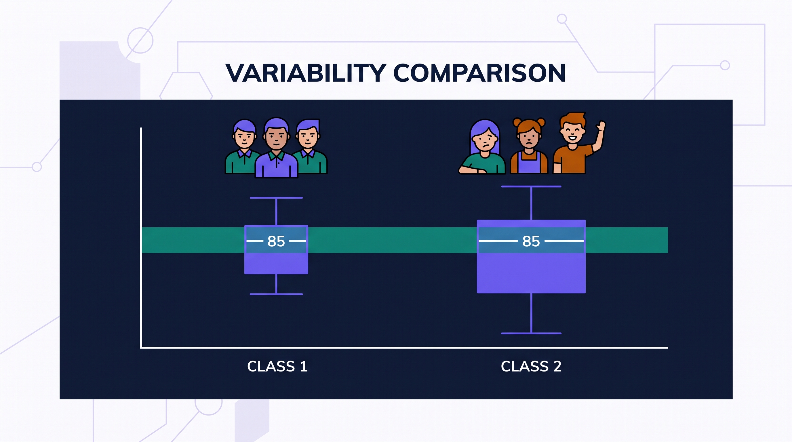
A researcher compares the test scores of two classes. Class 1 has a median of 85 and an IQR of 5. Class 2 has a median of 85 and an IQR of 15. Both distributions are symmetric with no outliers.
Question: Which class performed "better," and what does the difference in variability tell us about the students' scores?
Model Answer: While both classes have the same typical performance (median = 85), Class 1 was more consistent. The variability in Class 2 is much higher (IQR of 15 vs. 5), meaning Class 2 had a wider range of scores among the middle 50% of students, whereas Class 1 students scored very similarly to one another.
Would you like a summary of the next section, which covers Topic 1.10 and the connection between investigative questions and data collection?
1.10 The Investigative Question Revisited and Data Collection
Key concepts: Statistical investigative question — population, variable, and conclusion · Census — recording data from every individual in the population · Observational study — variables measured, nothing imposed · Experiment — treatments deliberately assigned to experimental units · Random selection is what licenses generalizing to the population · Confounding variable — a rival explanation for an association
A statistical investigative question is a purposeful inquiry that identifies a specific population and a measurable characteristic to be analyzed through data that exhibit variability.
A statistical investigative question is a purposeful inquiry that identifies a specific population and a measurable characteristic to be analyzed through data that exhibit variability. Unlike a simple factual question (e.g., "How many students are in this room?"), a statistical question anticipates a range of responses and seeks to uncover patterns, differences, or relationships within a defined group.
Learning Objective T1.10-LO01: Formulate a statistical investigative question and identify the data needed to answer it. (Skill 1.A)
The integrity of a statistical study relies on the Fixed-Question Principle. To ensure the validity of the results, the investigative question must be finalized before any data are collected or analyzed. Formulating a question after viewing the data—a practice sometimes called "data snooping"—can lead to biased conclusions that do not reflect true population characteristics.
Components of a Defensible Plan
To move from an abstract curiosity to a rigorous data collection plan, a researcher must align three critical components: the population of interest, the variables to be measured, and the method of collection.
- The Population: The entire group about which the researcher wants to draw a conclusion.
- The Variables (Skill 2.A): The specific characteristics (categorical or quantitative) that will be recorded for each individual in the sample.
- The Collection Method (Skill 2.B): The strategy used to obtain the data, typically categorized as either an observational study or an experimental design.
Observational Studies vs. Experiments
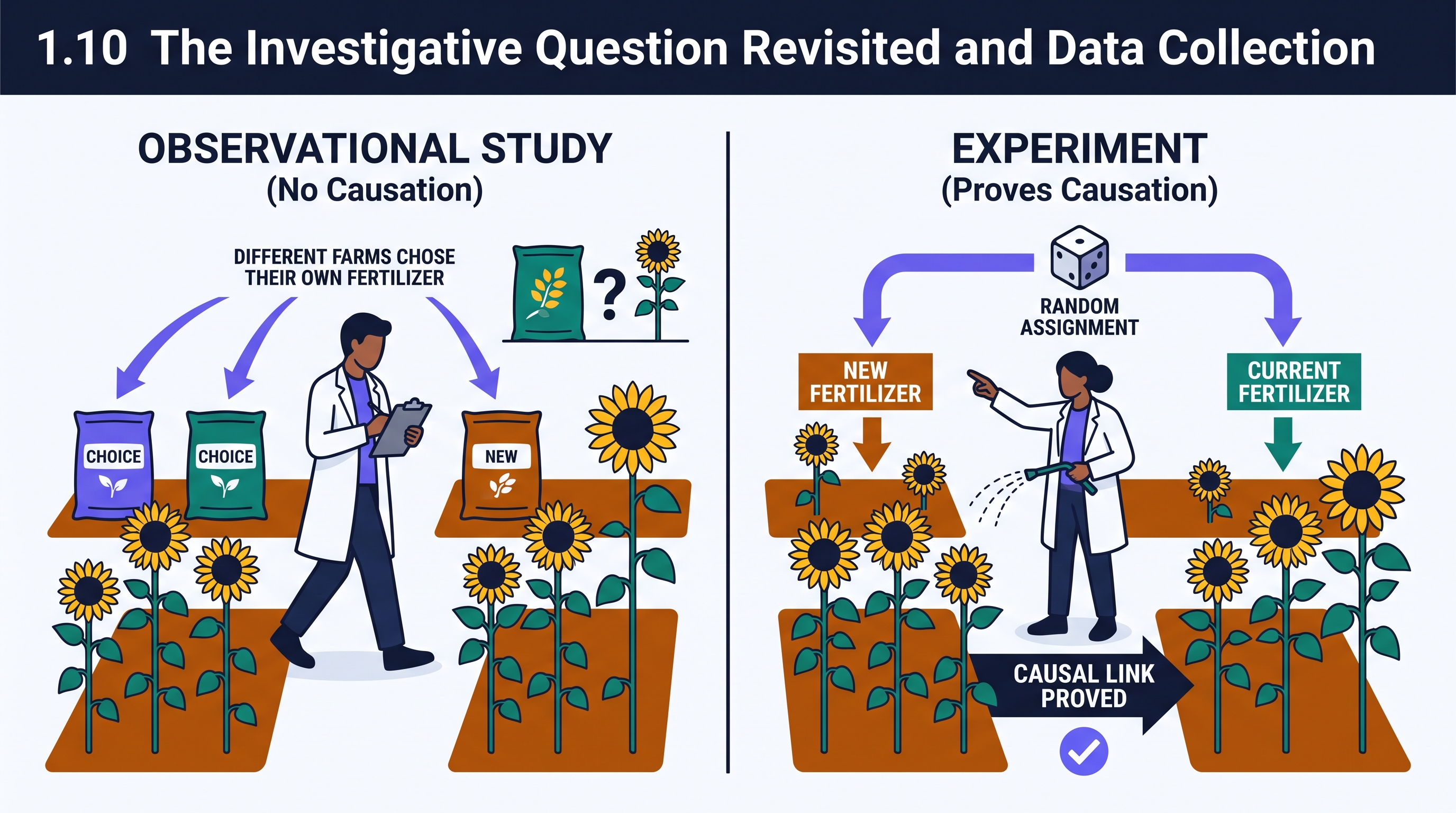
The choice of data collection method determines the scope of the conclusion. In an observational study, researchers measure variables of interest but do not attempt to influence the responses. These studies are ideal for identifying associations or describing populations as they naturally exist.
In contrast, an experiment involves the deliberate imposition of some treatment on individuals to observe their responses. By controlling the environment and randomly assigning treatments, researchers can investigate potential cause-and-forth relationships. Identifying the correct method is a core requirement of Skill 2.B, as it justifies whether a claim of "association" or "causation" is defensible.
Contextual Example: The Sleep and GPA Study
| Component | Implementation |
|---|---|
| Investigative Question | Is there a relationship between the average hours of sleep per night and the cumulative GPA of seniors at West High School? |
| Population | All seniors at West High School. |
| Variables | Sleep (Quantitative, hours); GPA (Quantitative, 0.0–4.0 scale). |
| Method | Observational Study. The researcher would record existing habits rather than forcing students to sleep specific amounts. |
| Scope | Can show an association between sleep and GPA, but cannot prove that more sleep causes a higher GPA. |
Misconception Clinic: The "Post-Hoc" Question
| The Error | Why It Fails | The Repair |
|---|---|---|
| The "Discovery" Question: A researcher collects data on 50 variables, finds a weird spike in one, and then writes the investigative question to target that spike. | This violates the requirement that the question be fixed before analysis (T1.10-EK02). It increases the risk of finding "patterns" that are actually just random noise. | Define the purpose and the specific variables of interest before the first data point is ever recorded. |
Data Collection and the Scope of Inference
The data collection plan must be "defensible," meaning the method chosen must actually be capable of answering the question asked. If the question asks about a "cause," but the plan describes an observational study, the plan is not defensible. Similarly, if the question targets "all teenagers" but the data collection plan only involves "teenagers at one local mall," the scope of the conclusion will be limited by the sampling method.
Interpretation Check
A researcher wants to know if a new fertilizer leads to taller sunflowers compared to the current brand. They plan to visit 20 different farms and measure the height of sunflowers, noting which fertilizer each farm chose to use.
Question: Is this a defensible plan to prove the new fertilizer causes sunflowers to grow taller?
- Answer: No. This is an observational study because the researcher did not impose the treatment (the farms chose their own fertilizer). To prove causation, the researcher would need an experiment where they randomly assign the fertilizer types to different plots of sunflowers.
1.11 Random Sampling
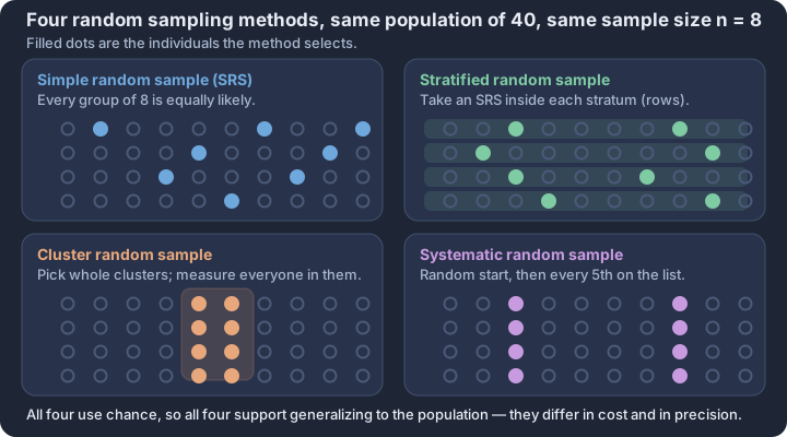
Key concepts: Simple random sample — every group of size n equally likely · Stratified random sample — an SRS taken inside each stratum · Cluster random sample — whole randomly chosen groups measured · Systematic random sample — random start, then every kth unit · Sampling with replacement versus without replacement · Strata are internally similar; clusters should mirror the population
A statistical study is only as strong as the bridge between its sample and the population it intends to describe. If you were to taste a massive pot of soup, you wouldn't need to drink the entire gallon to know if it is too salty; you would simply stir it thoroughly and take a single spoonful.
A statistical study is only as strong as the bridge between its sample and the population it intends to describe. If you were to taste a massive pot of soup, you wouldn't need to drink the entire gallon to know if it is too salty; you would simply stir it thoroughly and take a single spoonful. In statistics, random sampling is the "stirring"—a process that ensures every individual in the population has a known, non-zero chance of being selected, thereby creating a representative "spoonful" of data.
The Power of Generalization (DAT-2.D)
The primary goal of random sampling is to allow for generalization. When a sample is selected using a truly random process, the characteristics observed in that sample can be used to make inferences about the entire population (DAT-2.D). Without randomness, a sample is likely to suffer from bias, meaning it systematically favors certain outcomes and fails to reflect the true population parameters.
Essential Knowledge (DAT-2.D.1): Random sampling allows results from a sample to be generalized to the population from which the sample was selected.
Methods of Random Selection (DAT-2.C)
Statistical Practice 2.B requires researchers to not only identify a sampling method but to justify why it is appropriate for a specific context. The four primary methods recognized in the 2026 CED offer different balance points between precision, cost, and ease of implementation.
1. Simple Random Sample (SRS)
A Simple Random Sample (SRS) of size $n$ is a method where every possible group of $n$ individuals in the population has an equal chance of being chosen as the sample (DAT-2.C). This is often achieved by labeling every member of the population with a unique number and using a random number generator to pick the winners.
2. Stratified Random Sampling
In stratified random sampling, the population is divided into non-overlapping groups called strata based on a shared characteristic (like grade level or geographic region). A separate SRS is then performed within every stratum. This method is justified when the characteristic used to define the strata is expected to influence the variable being measured. It ensures that every subgroup is represented, which often reduces the variability of the sample estimates.
3. Cluster Sampling
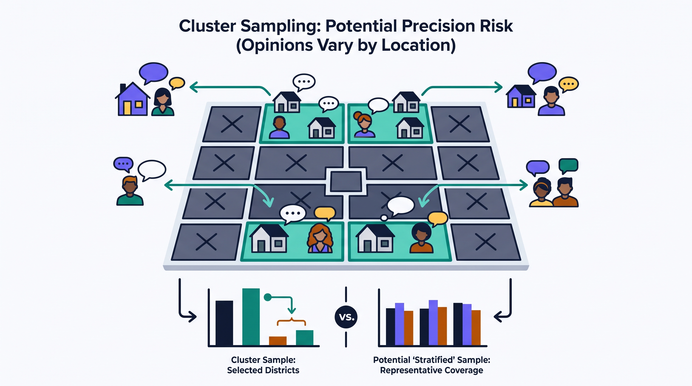
Cluster sampling involves dividing the population into groups that are "mini-versions" of the population, called clusters. Instead of picking individuals from every group, the researcher randomly selects a few entire clusters and surveys everyone inside them. This is justified when the population is widely dispersed, making it more efficient to visit a few specific locations (like specific city blocks) rather than traveling to individuals scattered across a whole state.
4. Systematic Random Sampling
In systematic random sampling, researchers select a random starting point and then pick every $k^{th}$ individual from a list (e.g., every 10th person entering a stadium). This is often easier to execute in the field than an SRS but requires that the list itself does not have a hidden pattern that aligns with the sampling interval.
Comparing Stratified and Cluster Sampling
Learners often confuse these two "group-based" methods. The key difference lies in what happens within the groups and which groups are selected.
| Feature | Stratified Sampling | Cluster Sampling |
|---|---|---|
| Group Composition | Homogeneous: Individuals within a stratum are similar (e.g., all freshmen). | Heterogeneous: Each cluster is a "microcosm" of the population. |
| Selection Rule | Some from all: Take an SRS from every group. | All from some: Take everyone from a few randomly picked groups. |
| Primary Goal | Precision: Reduce variability by accounting for known differences. | Efficiency: Save time/money when the population is spread out. |
Modeling Selection via Simulation (DAT-2.E)
To understand the behavior of these methods, statisticians use simulation (DAT-2.E). By repeatedly drawing samples from a known "population" of data using a computer, we can see how much the sample statistics (like the sample mean $\bar{x}$) vary from one sample to the next. This variability is known as sampling error, and it is a natural, predictable part of the process—not a mistake in measurement.
Contextual Example: The Quality Control Lab
A factory produces 5,000 smartphone screens a day in 50 batches of 100.
- SRS: Assign numbers 1–5,000 to all screens; use a generator to pick 50. (Difficult to find specific screens on the floor).
- Stratified: Pick 1 screen at random from each of the 50 batches. (Ensures every batch is checked).
- Cluster: Randomly pick 2 entire batches and test all 200 screens in them. (Very fast, but risky if one batch is uniquely bad).
Misconception Check: Random Sampling vs. Random Assignment
The Error: Thinking that "random" always means you can generalize to the whole world.
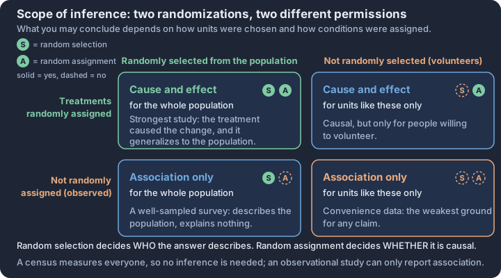
The Correction: Random sampling (picking people from a population) allows you to generalize to that population. Random assignment (putting people into "Treatment A" or "Placebo" groups) allows you to determine cause-and-effect. You can have one without the other. If you randomly sample 100 students but don't randomly assign them to a study method, you can describe the population, but you cannot claim the study method caused their grades to change.
Interpretation Check
A city council wants to know how residents feel about a new park. They divide the city into 20 voting districts. They randomly select 4 districts and interview every household in those 4 districts.
- Identify the sampling method used.
- Justify why this might be less precise than a stratified sample of the same size if residents' opinions vary significantly between the north and south sides of the city.
Check your reasoning: 1. This is cluster sampling because entire groups (districts) were selected. 2. If opinions vary by location, cluster sampling risks missing the views of the 16 districts not chosen. A stratified sample would have guaranteed that residents from both the north and south sides were included in the data set, thereby providing a more representative view of the entire city's population as a whole.
1.12 Potential Problems with Sampling
Key concepts: Bias — systematic error that pushes a statistic consistently one way · Bias versus sampling variability — a larger n fixes only the second · Voluntary response bias — the sample is made of volunteers · Undercoverage — part of the population can never be selected · Nonresponse bias — selected individuals who do not answer · Response bias — leading wording or self-report distorts answers
A bathroom scale that consistently adds five pounds to every measurement provides a perfect physical model for bias in statistics. No matter how many times you step on the scale, the result will be wrong in the same direction.
A bathroom scale that consistently adds five pounds to every measurement provides a perfect physical model for bias in statistics. No matter how many times you step on the scale, the result will be wrong in the same direction. In statistical study design, bias is not a synonym for "prejudice" or "unfairness" in the colloquial sense; rather, it is a systematic error in the sampling procedure that results in a statistic being consistently larger or consistently smaller than the population parameter it is used to estimate.
The Mechanics of Bias
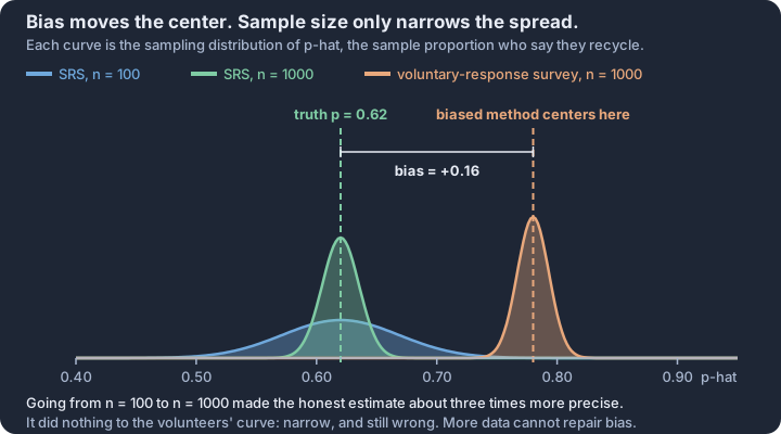
When a sampling method is biased, the error is baked into the process itself. This distinguishes bias from sampling variability, which is the natural, expected difference between a sample statistic and a population parameter due to the luck of the draw. While increasing sample size ($n$) reduces sampling variability, it does not reduce bias. A biased method applied to a million people will simply produce a very large, very precisely incorrect estimate.
Bias (T1.12.A.1): A systematic error in the sampling procedure that results in a statistic being consistently larger or consistently smaller than the parameter the statistic is used to estimate.
Selection Bias: How the Sample is Built
The most fundamental problems often occur before a single question is asked. If the "net" used to catch the sample is broken or poorly placed, the resulting data cannot represent the whole population.
- Nonrandom Sampling (T1.12.A.6): Methods such as convenience sampling (sampling those easiest to reach) or voluntary response sampling introduce bias because they do not use random chance to select individuals. Without randomization, there is no mathematical guarantee that the sample's characteristics will mirror the population's.
- Undercoverage (T1.12.A.3): This occurs when the sampling method fails to include part of the population or makes a specific group less likely to be selected. For example, a survey conducted via landline telephones will suffer from undercoverage of younger adults who exclusively use mobile phones. If age is related to the variable being studied, the results will be systematically skewed.
Participation Bias: Who Chooses to Speak
Even if a researcher selects a perfect random sample, the human element can introduce significant errors based on who actually provides data.
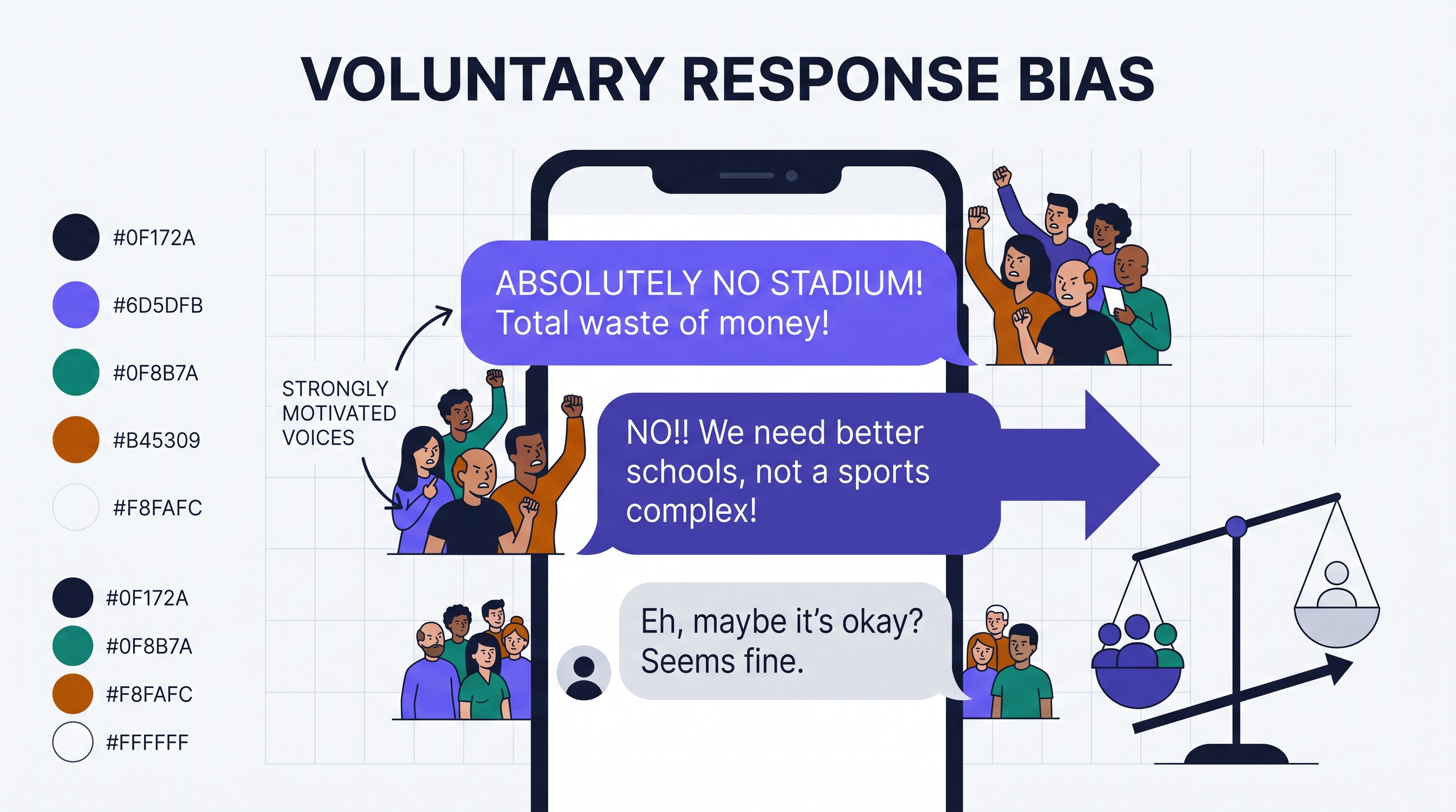
- Voluntary Response Bias (T1.12.A.2): This occurs when a sample consists entirely of volunteers who respond to a general appeal (like an internet poll or a call-in radio show). People with strong, often negative, opinions are more likely to take the time to respond, leading to a sample that over-represents extreme views.
- Nonresponse Bias (T1.12.A.4): This occurs when individuals chosen for a sample cannot be reached or refuse to participate. This becomes a "bias" only if the people who don't respond differ significantly from those who do in ways that matter to the study. For instance, a survey on "how busy are you?" will likely suffer from nonresponse bias because the busiest people are the least likely to answer the phone.
Measurement Bias: The Accuracy of the Data
Response bias (T1.12.A.5) occurs when the actual responses or measurements differ from the "true" value in a systematic direction. This is often a result of the survey environment or the instrument itself.
- Question Wording Bias: Leading or confusing questions can nudge respondents toward a specific answer. Consider the difference between "Do you support the city's plan to improve our crumbling infrastructure?" and "Do you support the city's plan to increase your taxes for road construction?"
- Self-Reported Responses: When asked about sensitive or illegal behavior (e.g., "Have you ever cheated on your taxes?"), respondents may lie to appear more favorable. This "social desirability bias" results in a statistic that consistently underestimates the true prevalence of the behavior.
Misconception Check: Undercoverage vs. Nonresponse
A common error is confusing undercoverage with nonresponse.
- Undercoverage happens before the sample is contacted; the individuals were never on the list to begin with.
- Nonresponse happens after the sample is contacted; the individuals were on the list and were selected, but they chose not to (or could not) provide data.
Contextual Example: The Library Bond
A town is considering a bond to fund a new library. To gauge public support, a researcher stands outside the current library at 2:00 PM on a Tuesday and asks the first 50 people they see if they support the bond.
- Identify the Sampling Method: This is a convenience sample (nonrandom).
- Identify the Bias: This method suffers from undercoverage. It excludes anyone not currently at the library and anyone working a standard 9-to-5 job.
- Predict the Direction: Because people at a library are more likely to value library services, the sample proportion of "Yes" votes will likely be a systematic overestimate of the true population proportion of support.
Interpretation Check
A local news station asks viewers to text "YES" or "NO" to a poll regarding a proposed new sports stadium. Out of 2,000 texts, 85% say "NO." Identify the primary source of bias and explain how it likely affects the result.
Answer Hint: This is voluntary response bias. Because the sample consists of people who feel strongly enough to text a news station, and people with negative opinions are typically more motivated to act, the 85% figure is likely a systematic overestimate of the opposition to the stadium project.
1.13 Experimental Design
Key concepts: Comparison — at least two treatments, one often a control group · Random assignment balances extraneous variables across groups · Replication — more than one experimental unit per treatment · Direct control — holding other conditions the same for every unit · Blinding, the placebo effect, and confounding variables · Completely randomized, randomized block, and matched-pairs designs
Establishing that one thing causes another is the "holy grail" of statistical inquiry. While observational studies can reveal fascinating correlations, only a well-designed experiment allows us to assert a causal link.
Establishing that one thing causes another is the "holy grail" of statistical inquiry. While observational studies can reveal fascinating correlations, only a well-designed experiment allows us to assert a causal link. In an experiment, researchers deliberately impose treatments on experimental units (the smallest collection of individuals to which treatments are applied) to observe how a response variable changes. This active intervention is what separates experimental data from mere observation.
The Four Pillars of Experimental Design
A well-designed experiment is not a casual trial; it is a rigorous structure built on four essential principles. According to LO 1.13.A and EK 1.13.A.1, these elements must work in concert to ensure that any observed difference in the response variable is actually due to the treatment and not some other factor.
| Principle | Definition | Statistical Purpose |
|---|---|---|
| Comparison | Using at least two treatment groups, one of which may be a control group. | To provide a baseline and account for variables that change over time (like weather or natural healing). |
| Random Assignment | Using a chance process to assign experimental units to treatment groups. | To create roughly equivalent groups at the start by balancing the effects of variables we cannot control or see. |
| Replication | Applying each treatment to many experimental units. | To ensure the observed effect is consistent and not just a "fluke" result from one or two unusual units. |
| Control | Keeping other variables constant for all experimental groups. | To prevent extraneous variables from becoming confounding variables that cloud the results. |
The Logic of Random Assignment
Random assignment is the "great equalizer" of statistics (Skill 2.B). Imagine testing a new energy drink on runners. If we let the fastest runners choose the new drink, we won't know if their fast times were caused by the drink or their natural ability. By using random assignment—such as a random number generator or drawing names from a hat—we ensure that "natural ability" is spread roughly equally across the new drink group and the water group. This allows us to attribute differences in performance to the treatment itself.
Identifying Design Elements in Context
To evaluate or design a study, you must be able to pull apart its components (Skill 2.A). Consider a researcher testing whether a specific blue-light filter improves sleep quality.
- Experimental Units: The 50 volunteers participating in the study.
- Explanatory Variable: The type of light filter used.
- Treatments: Blue-light filtering glasses (Treatment A) and clear "placebo" glasses (Control B).
- Response Variable: Hours of REM sleep recorded by a wearable device.
Essential Knowledge 1.13.B & 1.13.C: A completely randomized design occurs when every experimental unit is assigned to a treatment purely by chance. This design is justified when the units are relatively homogeneous or when we want the simplest possible structure to test for a treatment effect.
Misconception Clinic: Random Sampling vs. Random Assignment
One of the most frequent errors in statistical reasoning is confusing how we get our subjects with what we do with them.
- The Error: Assuming that because a study used "randomization," it can prove causation for the whole world.
- The Correction:
- Random Sampling (Topic 1.11) allows us to generalize results to a larger population.
- Random Assignment (Topic 1.13) allows us to determine causation between variables.
- The Reality: Many medical experiments use volunteers (not a random sample), so they can prove a drug works (causation), but they must be cautious about saying it works for everyone (generalization).
Interpretation Check
A botanist wants to know if a new organic mulch increases tomato yield. She has 20 identical plots of land. She flips a coin for each plot: "Heads" gets the organic mulch, "Tails" gets standard wood chips. At the end of the season, she weighs the total kilograms of tomatoes from each plot.
- Identify the experimental units.
- Which of the four pillars is represented by the coin flip?
- If she only used one plot for mulch and one for wood chips, which pillar would she be violating?
Check your reasoning: (1) The 20 plots of land. (2) Random assignment. (3) Replication—one unit per treatment is not enough to distinguish a treatment effect from natural plot-to-plot variation.
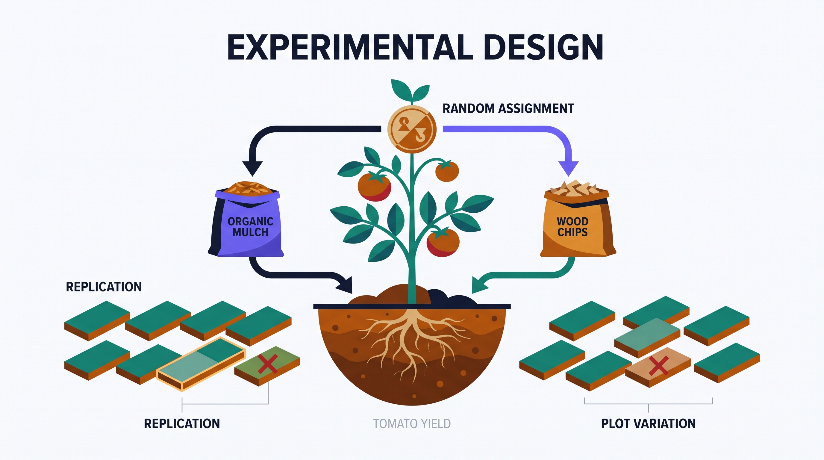
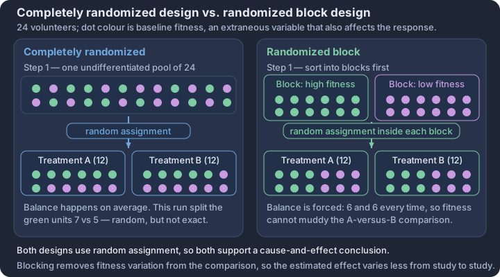
Unit 1 Practice: AP Exam Questions
Key concepts: Released free-response questions · Describing distributions · Comparing distributions · Sampling design · Experimental design
The three kinds of Unit 1 practice kept apart: this course's own question bank, multiple choice written in the exam's style, and the five official College Board free-response questions from 2023-2025 that fall inside Unit 1.
Everything below is tied back to the thirteen topics of Unit 1. There are three sets, and they are deliberately not interchangeable: one is written for this course, one is written in the style of the exam, and one is the exam.
Set 1 — The practice bank in this course
Unit 1 carries 83 practice questions and 114 flashcards, each attached to the topic it tests. Work them topic by topic while you are learning; use the mixed set at the foot of this page once the whole unit is behind you.
| Topic | Questions | Flashcards |
|---|---|---|
| 1.1 Introducing Statistics: What Can We Learn from Data? | 5 | 8 |
| 1.2 Variables | 7 | 9 |
| 1.3 Tabular Representation and Summary Statistics for One Categorical Variable | 6 | 8 |
| 1.4 Graphical Representations for One Categorical Variable | 6 | 8 |
| 1.5 Graphical Representations for One Quantitative Variable | 7 | 8 |
| 1.6 Descriptions for One Quantitative Variable Distributions | 7 | 9 |
| 1.7 Summary Statistics for One Quantitative Variable | 7 | 10 |
| 1.8 Graphical Representations of Summary Statistics for One Quantitative Variable | 6 | 8 |
| 1.9 Comparisons of the Distributions for One Quantitative Variable | 6 | 9 |
| 1.10 The Investigative Question Revisited and Data Collection | 6 | 9 |
| 1.11 Random Sampling | 8 | 9 |
| 1.12 Potential Problems with Sampling | 6 | 9 |
| 1.13 Experimental Design | 6 | 10 |
| Unit 1 total | 83 | 114 |
Set 2 — Multiple choice, in the style of the exam
One thing to be clear about, because it shapes how you should practise: the College Board does not release the multiple-choice section of the AP Statistics exam. Only the free-response questions are published each year. Any set of "past-paper multiple choice" you find online is somebody's reconstruction, not the real thing.
So the multiple-choice practice in this course is written to the exam's style and difficulty rather than copied from a past paper. In Unit 1 that means questions that ask you to read a distribution rather than compute from it, to choose between sampling designs on the basis of bias rather than convenience, and to say what a statistic would do if a value moved — the three habits the released free-response questions below keep testing.
The mixed set at the foot of this page draws from all 13 topics.
Set 3 — Official free-response questions
These are the real questions, released by the College Board after each exam. Five of them fall inside Unit 1, drawn from the three most recent papers. The other questions on those papers belong to Units 2 through 5.
Two of the five need nothing but this page. The rest depend on a figure that lives in the official paper — each one says so, and links to it.
Describing and comparing distributions
2023 Question 1 — Dissolved oxygen in Alaskan streams
As part of a study on the chemistry of Alaskan streams, researchers took water samples from many streams with temperatures colder than 8°C and from many streams with temperatures warmer than 8°C. For each sample, the researchers measured the dissolved oxygen concentration, in milligrams per liter (mg/l).
(a) The researchers constructed the histogram shown for the dissolved oxygen concentration in streams from the sample with water temperatures colder than 8°C. Based on the histogram, describe the distribution of dissolved oxygen concentration in streams with water temperatures colder than 8°C.
(b) The researchers computed the summary statistics shown in the table for the dissolved oxygen concentration in streams from the sample with water temperatures warmer than 8°C. Use the summary statistics to construct a box plot for the dissolved oxygen concentration in streams with water temperatures warmer than 8°C. Do not indicate outliers.
Min Q1 Median Q3 Max Mean Std. Dev. 2.10 4.39 5.43 6.12 13.45 5.54 1.64 (c) The researchers believe that streams with higher dissolved oxygen concentration are generally healthier for wildlife. Which streams are generally healthier for wildlife, those with water temperature colder than 8°C or those with water temperature warmer than 8°C? Using characteristics of the distribution of dissolved oxygen concentration for each temperature group, justify your answer.
Part (b) is fully answerable from this page — the summary statistics are all there. Part (a) needs the histogram, on page 4 of the 2023 paper.
Tests: 1.6 (describing a distribution), 1.8 (building a boxplot from summary statistics), 1.9 (comparing two distributions). Notice that the max of 13.45 sits far above Q3 of 6.12 — that gap is the whole of part (c).
Check yourself: 2023 scoring guidelines, question 1.
2024 Question 6, parts (b) and (c) — Whistle prices
Julio, a statistician, wants to estimate the mean price of a type of whistle at all stores that sell it. He called the managers of 20 randomly selected stores and recorded the price at each. The summary statistics for Julio's data are shown in the following table.
Sample Size Mean Std. Dev. Minimum Q1 Median Q3 Maximum 20 5.12 0.743 4.25 4.51 4.885 5.475 6.58 (b) Julio wants to examine some characteristics of the distribution of the sample of whistle prices. (i) Describe the shape of the distribution of the sample of whistle prices. Justify your response using appropriate values from the summary statistics table. (ii) Using the $1.5 \times IQR$ rule, determine whether there are any outliers in the sample of whistle prices. Justify your response.
(c) It can be difficult to tell whether a distribution is skewed from a graph, particularly when the sample size is small, so statisticians sometimes measure how skewed a data set is. One such measure is Pearson's coefficient of skewness:
$$\text{Pearson's Coefficient of Skewness} = \frac{3(\bar{x} - m)}{s}$$
where $\bar{x}$ is the sample mean, $m$ is the sample median, and $s$ is the sample standard deviation. (i) Calculate Pearson's coefficient of skewness for Julio's sample of 20 whistle prices. Show your work.
Fully answerable from this page. Every number you need is in the table.
Tests: 1.6 (shape), 1.7 (summary statistics and the $1.5 \times IQR$ outlier rule). Part (c) is a nice bridge — it turns the informal "mean above median means right-skew" reasoning of 1.6 into a number.
(Part (a) of this question, and part (c-ii), concern inference and a supplied graph; they belong to Unit 4. The full question is on page 13 of the 2024 paper.)
Check yourself: 2024 scoring guidelines, question 6.
2025 Question 1 — Gas mileage in two countries
The manager of an automotive company is interested in comparing the gas mileages for cars manufactured in Country A and cars manufactured in Country B. The manager selected a random sample of 100 cars manufactured in Country A and a random sample of 100 cars manufactured in Country B. The gas mileages for each sample, in miles per gallon (mpg), are summarized in the boxplots.
A. Compare the distributions of gas mileage for the sample of cars manufactured in Country A and the sample of cars manufactured in Country B.
B. For the distribution of gas mileage for the sample of cars manufactured in Country A, would you expect the mean to be greater than 18 mpg, less than 18 mpg, or equal to 18 mpg? Justify your answer.
C. The manager will create a new boxplot with the combined data from the sample of cars manufactured in Country A and the sample of cars manufactured in Country B. i. What is the range of the combined data set? Justify your answer. ii. What is a possible value of the median of the combined data set? Justify your answer by referencing the boxplots shown.
Needs the figure — the two boxplots, on page 3 of the 2025 paper. Every part depends on it.
Tests: 1.6, 1.8, 1.9. Part B is 1.6 in disguise: it asks which way skew pulls the mean away from the median.
Check yourself: 2025 scoring guidelines, question 1.
Collecting data: sampling and experiments
2023 Question 2 — Fibers in concrete
A developer wants to know whether adding fibers to concrete used in paving driveways will reduce the severity of cracking, because any driveway with severe cracks will have to be repaired by the developer. The developer conducts a completely randomized experiment with 60 new homes that need driveways. Thirty of the driveways will be randomly assigned to receive concrete that contains fibers, and the other 30 driveways will receive concrete that does not contain fibers. After one year, the developer will record the severity of cracks in each driveway on a scale of 0 to 10, with 0 representing not cracked at all and 10 representing severely cracked.
(a) Based on the information provided about the developer's experiment, identify each of the following: experimental units; treatments; response variable.
(b) Describe an appropriate method the developer could use to randomly assign concrete that contains fibers and concrete that does not contain fibers to the 60 driveways.
(c) Suppose the developer finds that there is a statistically significant reduction in the mean severity of cracks in driveways using the concrete that contains fibers. In terms of the developer's conclusion, what is the benefit of randomly assigning the driveways to either the concrete that contains fibers or the concrete that does not contain fibers?
Fully answerable from this page — no figure at all. This is the cleanest Unit 1 free-response question of the three years, and the best one to attempt first.
Tests: 1.13 end to end. Part (c) is the one students lose marks on: the benefit of random assignment is that it permits a causal conclusion, not merely that it "removes bias".
Check yourself: 2023 scoring guidelines, question 2.
2025 Question 2 — Aphids in a cabbage field
Aphids are tiny insects that feed on plants such as cabbage plants. A farmer wants to reduce the number of aphids in a cabbage field. A river is located 100 meters south of the cabbage field. The farmer divides the field into 25 regions of equal size, as shown in the diagram. Each region has approximately the same number of cabbage plants.
The farmer would like to estimate the proportion of cabbage plants in the field that are affected by aphids and believes that the extent of aphid damage is greater for the regions in the cabbage field closer to the river. To obtain the estimate, the farmer is considering three sampling methods.
- Sampling method I: Select region 3, which is closest to the farmer's house and farthest from the river. Examine every cabbage plant in the region for aphid damage.
- Sampling method II: Randomly select one row (A, B, C, D, or E). For every region in the selected row, examine every cabbage plant for aphid damage.
- Sampling method III: Randomly select one region from each of rows A, B, C, D, and E. For each selected region, examine every cabbage plant for aphid damage.
A. Explain whether sampling method I is an appropriate sampling method for the farmer to use to estimate the proportion of cabbage plants in the field that are damaged by aphids.
B. Using sampling method II, the farmer randomly selected row E and examined every cabbage plant in row E. If the farmer's belief is correct, determine whether the selection of row E is likely to provide an overestimate or an underestimate of the proportion of cabbage plants in the field that are damaged by aphids. Justify your answer.
C. Using the information provided in the diagram of the cabbage field, describe how to implement sampling method III, which requires a random selection of one region from each of rows A, B, C, D, and E.
Needs the figure — the 25-region field diagram, on page 4 of the 2025 paper. Part B cannot be answered without it, because the answer turns on where row E lies relative to the river.
Tests: 1.10 (data collection for an investigative question), 1.11 (method III is a stratified design), 1.12 (method I is convenience; method II is a cluster design that can go badly wrong).
Check yourself: 2025 scoring guidelines, question 2.
Free-response questions and scoring guidelines are © 2023, 2024, 2025 College Board, reproduced from the public AP Central releases for classroom use; the figures remain in the source papers. AP® is a registered trademark of the College Board, which was not involved in the production of, and does not endorse, this resource.
Unit 2: Probability, Random Variables, and Probability Distributions
Key concepts: Two-way tables and conditional distributions for two categorical variables · Probability as the long-run relative frequency of an outcome · Conditional probability, independence, and mutually exclusive events · Random variable — a distribution of outcomes with a mean and SD · Binomial and normal models, and the conditions each requires · Sampling distributions and the Central Limit Theorem
Integrate the official Unit 2 topics through the AP statistical practices and apply them to contextual problems. Follow the unit roadmap to connect every topic, practice statistical reasoning in context, and prepare for cumulative AP-style questions.
Unit 2: Probability, Random Variables, and Probability Distributions is organized around one recurring question: what evidence would justify the conclusion we want to make? This overview connects the unit's topics before you work through them one at a time.
What you will learn
Integrate the official Unit 2 topics through the AP statistical practices and apply them to contextual problems.
Topic sequence
- 2.1 Tabular and Graphical Representations for the Distributions of Two Categorical Variables — Compare two categorical variables using two-way tables and appropriate graphs.
- 2.2 Summary Statistics for Two Categorical Variables — Calculate and interpret joint, marginal, and conditional relative frequencies.
- 2.3 Estimating Probabilities Using Simulation — Design and use simulations to estimate probabilities.
- 2.4 Introduction to Probability — Calculate probabilities using probability rules and representations.
- 2.5 Mutually Exclusive Events — Determine whether events are mutually exclusive and justify probability claims.
- 2.6 Conditional Probability — Calculate and interpret conditional probabilities in context.
- 2.7 Independent Events and Unions of Events — Use independence and addition or multiplication rules to calculate probabilities.
- 2.8 Introduction to Random Variables and Probability Distributions — Construct and interpret probability distributions for discrete random variables.
- 2.9 Parameters of Random Variables — Calculate and interpret parameters of random variables.
- 2.10 The Binomial Distribution — Verify binomial conditions and calculate and interpret binomial probabilities and parameters.
- 2.11 The Normal Distribution — Calculate probabilities and compare relative positions using normal distributions.
- 2.12 Sampling Distributions and the Central Limit Theorem — Describe sampling distributions and use the Central Limit Theorem to reason about their shape.
The reasoning routine
- Start by naming the statistical question and the population or process in context.
- Choose a representation or procedure because its conditions match the situation.
- Show the numerical or graphical evidence clearly.
- Interpret the result using the variables, groups, and units from the original context.
Before you move on
Use the roadmap above to select the first topic. Keep a running error log with four labels—concept, procedure, calculation, and context—so the practice unit can point you back to the exact kind of repair you need.
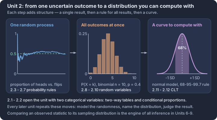
2.1 Tabular and Graphical Representations for the Distributions of Two Categorical Variables
Key concepts: Two-way (contingency) table of counts or relative frequencies · Conditional distribution — the breakdown within one row or column · Side-by-side bar chart — compares counts across the groups · Segmented bar chart — every bar stands for 100% of its group · Mosaic plot — bar width also shows how big each group is · Association — the conditional distributions differ across groups
Bivariate categorical analysis shifts the focus from describing a single characteristic to investigating the relationship between two qualitative variables. When we collect data on two categorical variables for each observational unit—such as a person's vaccination status and their health…
Bivariate categorical analysis shifts the focus from describing a single characteristic to investigating the relationship between two qualitative variables. When we collect data on two categorical variables for each observational unit—such as a person's vaccination status and their health outcome—we seek to determine if the distribution of one variable depends on the level of the other. This relationship is the foundation of statistical association.
The Two-Way Table (Contingency Table)
The primary tool for organizing bivariate categorical data is the two-way table, also known as a contingency table (CED 2.1.A.1). This table summarizes the relationship by displaying the frequencies (counts) or relative frequencies (proportions) of the intersections between the categories of two variables. One variable defines the rows, while the other defines the columns.
Definition: A two-way table is a tabular representation where the rows represent the levels of one categorical variable and the columns represent the levels of another. Each "cell" in the table contains the count or proportion of individuals who fall into that specific combination of categories.
Comparing Graphical Representations
To visualize the relationship between two categorical variables, we use specialized charts that allow for direct comparison across groups (CED 2.1.A.2). While a simple bar chart handles one variable, bivariate data requires displays that "stack" or "group" the data to reveal patterns.
1. Side-by-Side Bar Charts
In a side-by-side bar chart, bars for the categories of one variable are placed next to each other for every level of the second variable. This is highly effective for comparing raw counts (frequencies) across groups. However, if the group sizes are vastly different, comparing counts can be misleading, making relative frequencies a safer choice for comparison (Skill 4.A).
2. Segmented Bar Charts
A segmented bar chart (or stacked bar chart) treats each level of the "explanatory" variable as a single bar representing 100%. This bar is then divided into segments proportional to the relative frequencies of the "response" variable. This format makes it easy to see if the "makeup" of one group differs from another.
3. Mosaic Plots
A mosaic plot is a more advanced version of the segmented bar chart. While the heights of the segments still represent the relative frequency of the response variable, the widths of the bars are adjusted to represent the relative frequency of the categories on the horizontal axis (CED 2.1.A.2). This allows the viewer to see both the relationship between variables and the relative sizes of the groups being compared simultaneously.
Identifying Association (Skill 4.B)
The ultimate goal of these representations is to determine if an association exists between the two variables (CED 2.1.A.3). Two categorical variables are associated if knowing the value of one variable helps predict the value of the other.
- No Association: If the segmented bar charts or mosaic plots look identical across all groups (the segments are the same height), the variables are not associated.
- Association Present: If the distribution of the segments changes significantly from one bar to the next, we have evidence of an association (CED 2.1.B.1).
Contextual Example: Subscription Tiers and Device Type
Imagine a streaming service analyzing whether the type of device used (Mobile vs. TV) is associated with the subscription tier (Basic vs. Premium).
| Device | Basic | Premium | Total |
|---|---|---|---|
| Mobile | 400 | 100 | 500 |
| TV | 150 | 350 | 500 |
In a segmented bar chart, the "Mobile" bar would be 80% Basic and 20% Premium. The "TV" bar would be 30% Basic and 70% Premium. Because these distributions are different, we justify the claim that an association exists: TV users are more likely to choose Premium subscriptions than Mobile users (Skill 4.B).
Misconception Check: Frequency vs. Relative Frequency
A common error is concluding an association exists based solely on raw counts when group sizes are unequal. For example, if 100 people in Group A like a product and only 50 people in Group B like it, you cannot claim Group A is "more likely" to like it without knowing the total number of people in each group. Always use relative frequencies (percentages or proportions) when comparing groups of different sizes to avoid this "size bias."
Interpretation Check
A researcher creates a mosaic plot comparing "Exercise Habit" (Regular vs. Occasional) and "Sleep Quality" (Good vs. Poor). The bar for "Regular Exercise" is much wider than the bar for "Occasional Exercise," and the "Good Sleep" segment in the "Regular" bar is significantly taller than the "Good Sleep" segment in the "Occasional" bar.
- What does the wider bar for "Regular Exercise" tell you about the sample?
- Does this plot suggest an association between exercise and sleep quality? Justify your answer.
Check your reasoning:
- The wider bar indicates that there were more "Regular Exercisers" in the study's sample than "Occasional Exercisers."
- Yes, an association is suggested. Because the height of the "Good Sleep" segment changes (it is taller for regular exercisers), the distribution of sleep quality depends on exercise habits.
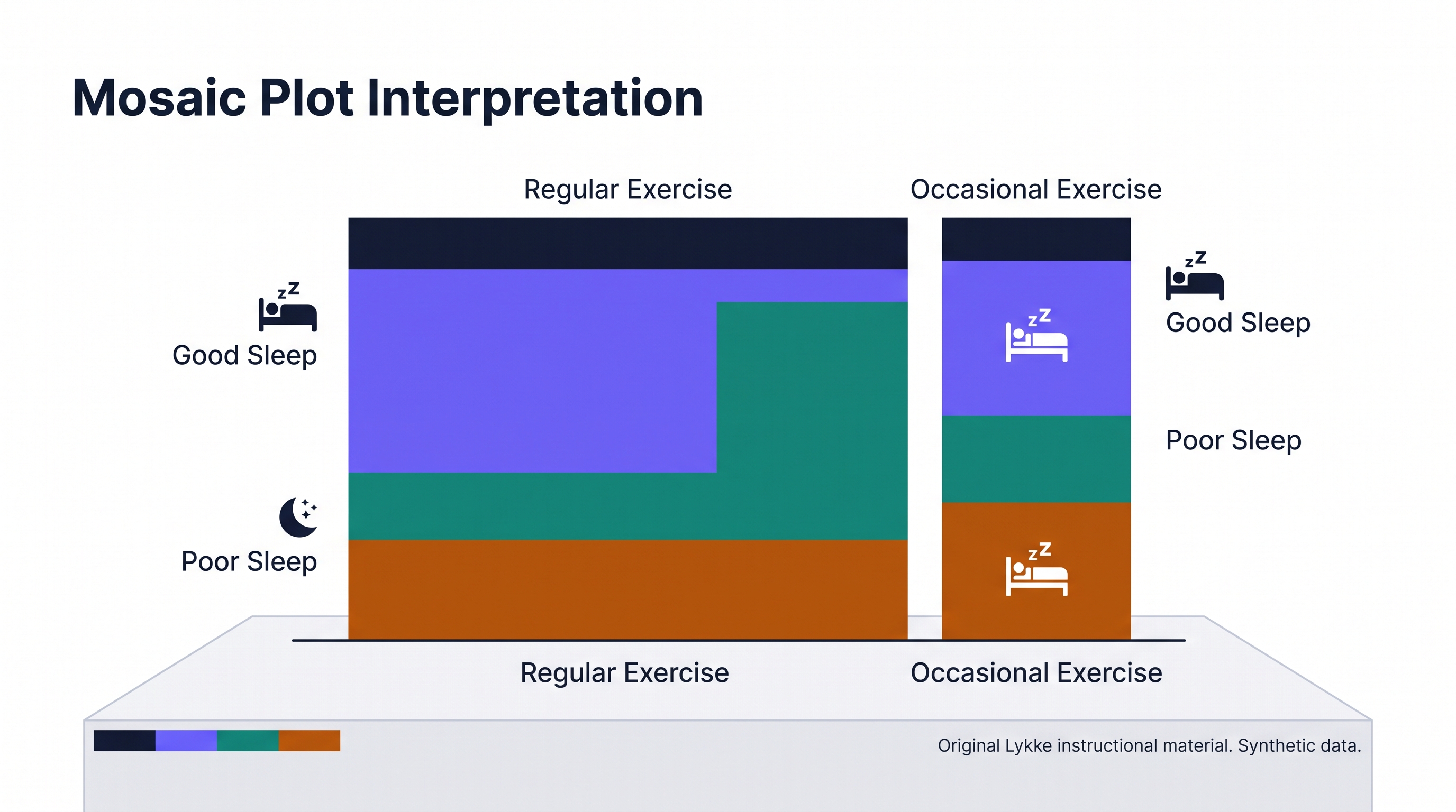
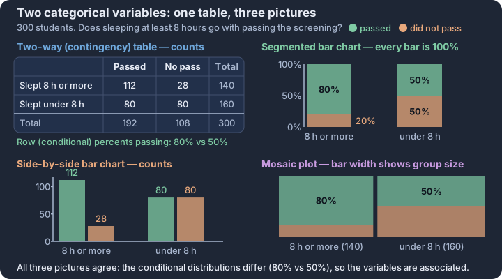
2.2 Summary Statistics for Two Categorical Variables
Key concepts: Two-way table — counts cross-classified by two categorical variables · Joint relative frequency — one cell divided by the grand total · Marginal relative frequency — row or column total over the grand total · Conditional relative frequency — a cell over its own row total · Association — conditional distributions that differ across groups · Segmented bar comparison — reading association from equal-height bars
A raw count of 80 students passing an exam tells us very little about the effectiveness of a study method until we know the context of the entire group.
A raw count of 80 students passing an exam tells us very little about the effectiveness of a study method until we know the context of the entire group. To move from simple counting to statistical reasoning, we must transform counts into relative frequencies—proportions that allow us to compare groups of different sizes and identify associations between variables.
The Three Frequencies of Association
When analyzing two categorical variables, we use three distinct types of summary statistics to describe the distribution: joint, marginal, and conditional relative frequencies. Each answers a different question by changing the "base" or denominator of our calculation.
Joint Relative Frequency (LO 2.2.A, EK 2.2.A.1): The proportion of the total number of observations that fall into a specific category for both variables.
Marginal Relative Frequency (LO 2.2.A, EK 2.2.A.2): The proportion of the total number of observations that fall into a specific category for one of the variables, regardless of the other variable.
Conditional Relative Frequency (LO 2.2.A, EK 2.2.A.3): The proportion of a specific category of one variable given that an observation falls into a specific category of the other variable.
Worked Problem: The Study Habit Study
Consider a study of 200 students investigating the relationship between their primary Study Location (Library or Home) and their Exam Result (Pass or Fail). This scenario allows us to practice calculating and interpreting these statistics (Skill 3.B, 4.A).
The Data (Two-Way Table)
| Pass | Fail | Total | |
|---|---|---|---|
| Library | 80 | 20 | 100 |
| Home | 60 | 40 | 100 |
| Total | 140 | 60 | 200 |
1. Calculating Joint Relative Frequency (Skill 3.B)
Question: What proportion of all students studied in the library and passed?
- Calculation: $\frac{\text{Cell Count}}{\text{Grand Total}} = \frac{80}{200} = 0.40$
- Interpretation (Skill 4.A): 40% of the students in this study both used the library and passed the exam.
2. Calculating Marginal Relative Frequency (Skill 3.B)
Question: What proportion of all students passed the exam?
- Calculation: $\frac{\text{Column Total}}{\text{Grand Total}} = \frac{140}{200} = 0.70$
- Interpretation (Skill 4.A): Overall, 70% of the students in the study passed the exam, regardless of where they studied.
3. Calculating Conditional Relative Frequency (Skill 3.B)
Question: Of the students who studied in the library, what proportion passed?
- Calculation: $\frac{\text{Cell Count}}{\text{Row Total}} = \frac{80}{100} = 0.80$
- Interpretation (Skill 4.A): Among students who studied in the library, 80% passed the exam.
Interpreting Results: Identifying Association (Skill 4.B)
The ultimate goal of these summary statistics is to determine if an association exists between the two variables. Two categorical variables are associated if the conditional relative frequencies of one variable change depending on the category of the other variable.
In our study habit example, we compare the conditional passing rates:
- Pass rate given Library: 80%
- Pass rate given Home: $\frac{60}{100} = 60%$
Because the proportion of students who passed is different for those who studied in the library (0.80) compared to those who studied at home (0.60), we conclude that there is an association between study location and exam result (Skill 4.B). If these proportions were equal, we would say the variables are independent.
Misconception Clinic: The Denominator Trap
A common error is confusing the direction of a conditional relative frequency. The phrase "the proportion of passers who studied in the library" is not the same as "the proportion of library-studiers who passed."
- Proportion of passers in the library: Denominator is the total number of passers (140). Result: $80/140 \approx 0.57$.
- Proportion of library-studiers who passed: Denominator is the total number of library-studiers (100). Result: $80/100 = 0.80$.
Always identify the group being described first (the "given" condition) to set your denominator correctly.
Interpretation Check
Using the table above, calculate the conditional relative frequency of students who failed, given that they studied at home.
- A. $40/200 = 0.20$
- B. $40/60 = 0.67$
- C. $40/100 = 0.40$
- D. $60/200 = 0.30$
Correct Answer: C. The condition is "studied at home," so the denominator is the row total for Home (100). The numerator is the count of those who failed in that row (40).
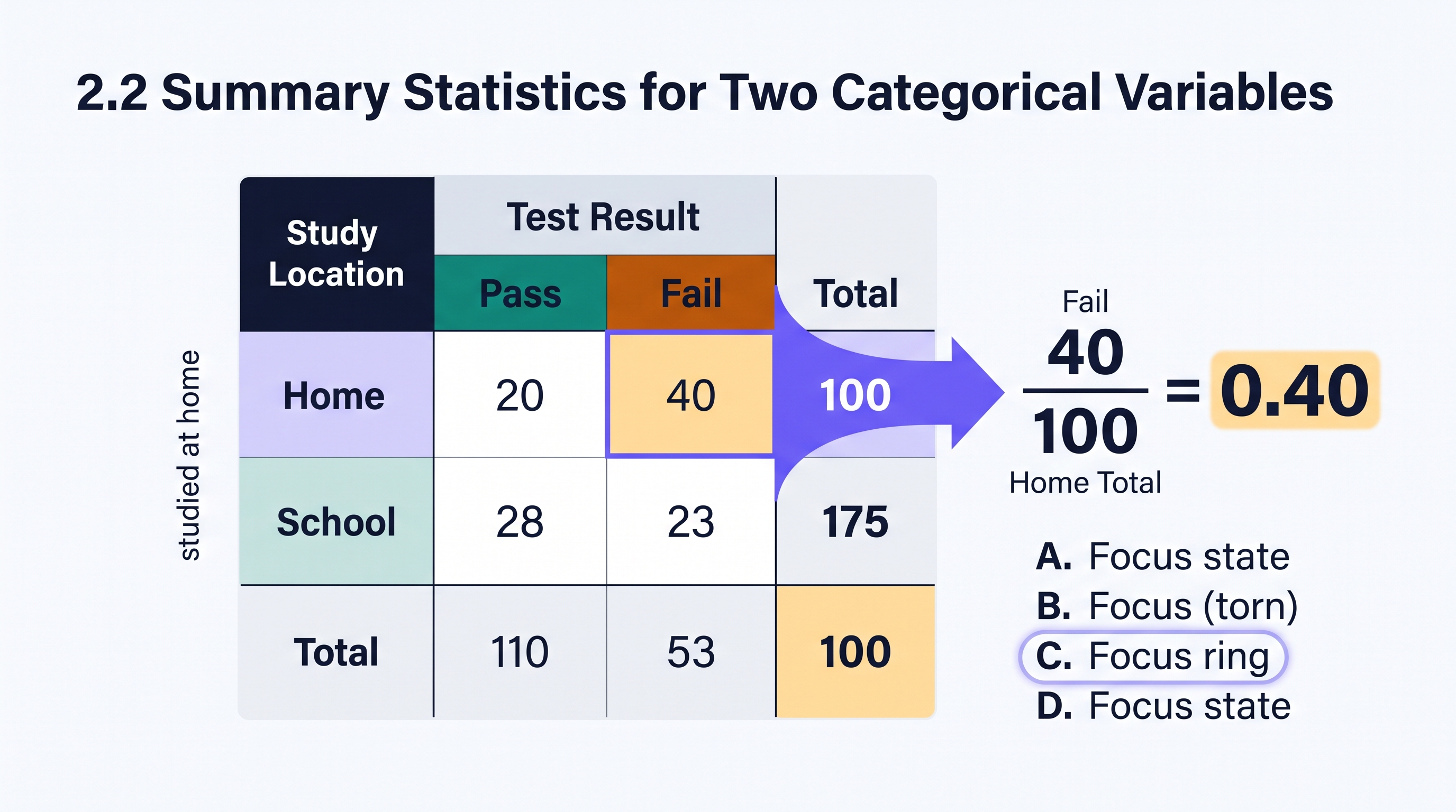
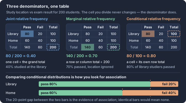
2.3 Estimating Probabilities Using Simulation
Key concepts: Random process — outcomes fixed by chance, not by rule · Trial, outcome, event — one repetition, its result, a set of results · Simulation — a chance model whose outcomes mimic the real process · Long-run relative frequency — the meaning of a probability · Empirical estimate — simulated relative frequency approximates true probability · Law of large numbers — more trials, tighter agreement with the truth
A random process generates results that are determined entirely by chance, where individual outcomes are unpredictable in the short term but exhibit a predictable pattern over many repetitions.
A random process generates results that are determined entirely by chance, where individual outcomes are unpredictable in the short term but exhibit a predictable pattern over many repetitions. While we cannot say for certain whether a single coin flip will land on heads, we can estimate with high confidence that approximately 50% of 10,000 flips will be heads. This bridge between short-term uncertainty and long-term predictability is the foundation of probability.
2.3.1 The Anatomy of Randomness
To analyze a random process, we must distinguish between the individual results and the broader goals of our investigation. In the language of the AP Statistics framework, we categorize these as trials, outcomes, and events.
| Term | Definition | Example (Rolling a Die) |
|---|---|---|
| Trial | A single performance of a random process. | One roll of the die. |
| Outcome | The specific result of a single trial (2.3.A.2). | Rolling a "4". |
| Event | A collection of one or more outcomes (2.3.A.3). | Rolling an even number {2, 4, 6}. |
Essential Knowledge 2.3.A.1–3: A random process generates results determined by chance. An outcome is the result of one trial, while an event is a collection of those outcomes.
2.3.2 The Logic of Simulation
Simulation is a method used to model random events so that the simulated outcomes closely match real-world behavior (2.3.A.4). We use simulations when the theoretical probability is too complex to calculate easily or when we want to visualize the variability of a process. To perform a valid simulation, every possible real-world outcome must be associated with a value determined by chance (such as a random number), and we must record the counts of these outcomes over many trials.
Contextual Example: The "Perfect Attendance" Prize
A school gives out a "Mystery Swag Bag" to students with perfect attendance. There are four different stickers possible in each bag (A, B, C, and D), each with an equal 25% chance of appearing. How many bags, on average, must a student collect to get all four stickers?
Instead of buying hundreds of bags, we can simulate this:
- Assign Digits: Let 1 = Sticker A, 2 = B, 3 = C, and 4 = D. Ignore digits 0 and 5–9.
- Define a Trial: Generate random digits until all four stickers (1, 2, 3, and 4) have appeared. Record the number of "bags" (digits) it took.
- Repeat: Perform this trial 50 times.
- Calculate: Find the average number of bags across all 50 trials to estimate the true expected value.
2.3.3 Probability as Long-Run Relative Frequency
The probability of an outcome is defined as its long-run relative frequency (2.3.A.5). This means that if we repeat a trial a very large number of times, the proportion of times a specific outcome occurs will settle toward a single, constant value.
The Law of Large Numbers (LLN)
The Law of Large Numbers states that for independent trials, as the number of trials increases, the relative frequency of an event gets closer and closer to its actual, or true, probability (2.3.A.7). This is why empirical data—data collected through observation or simulation—is a powerful tool for estimation (2.3.A.6). A simulation of 10 trials might give a relative frequency of 0.70 for a fair coin, but a simulation of 10,000 trials will almost certainly be very close to 0.50.
2.3.4 Misconception Clinic: The "Law of Averages"
A common error is confusing the Law of Large Numbers with the non-existent "Law of Averages."
- The Misconception: "I've flipped five heads in a row; the next one has to be tails because it's 'due' to even out."
- The Reality: The coin has no memory. The probability of tails remains 0.50 for the next flip.
- The Statistical Truth: The Law of Large Numbers doesn't work by "compensating" for past outcomes with different future outcomes. Instead, it works by swamping the early results. If you have 5 heads and 0 tails, the relative frequency is 100%. If you then flip 1,000 more times and get roughly 500 heads and 500 tails, your total becomes 505 heads out of 1,005 flips—a relative frequency of 50.2%. The early "streak" didn't disappear; it just became insignificant.
2.3.5 Discrete Probability Distributions via Simulation
A random variable is a variable whose numerical outcomes result from a random phenomenon (2.8.A.1). We can use simulations to estimate the probability distribution of a discrete random variable—a display of every possible value and its associated probability (2.8.A.2, 2.8.A.3). By recording the results of thousands of simulated trials, we can construct a table or histogram that approximates the true distribution of the variable.
Interpretation Check
A researcher simulates a medical procedure that has a known 20% success rate. They run 500 trials, where each trial consists of 10 procedures, and they record the number of successes in each trial.
- What is the random process in this scenario?
- If the event "exactly 2 successes" occurred in 150 of the 500 trials, what is the estimated probability of that event?
- According to the Law of Large Numbers, what would happen to that estimate if the researcher increased the simulation to 50,000 trials?
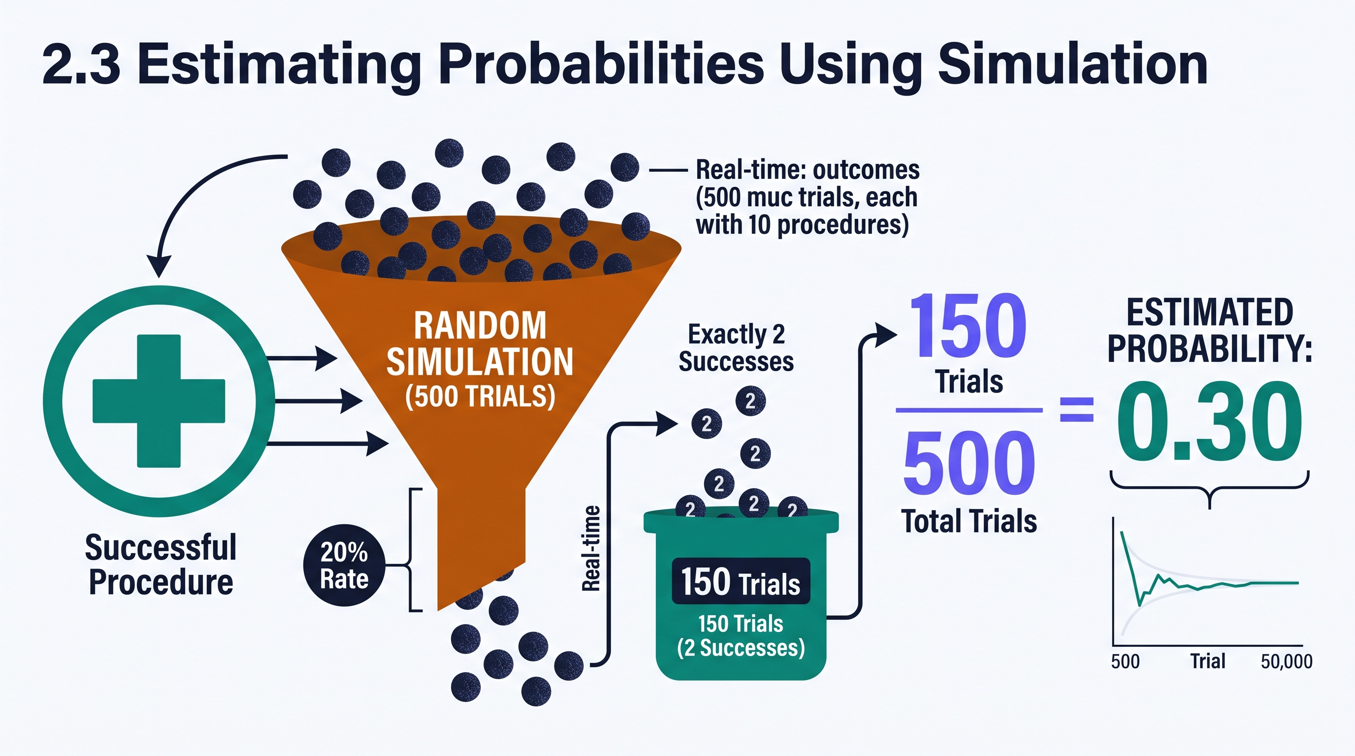
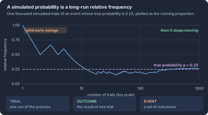
2.4 Introduction to Probability
Key concepts: Sample space — the set of all non-overlapping possible outcomes · Event — any subset of the sample space · Equally likely outcomes — P(E) is a ratio of counts · Probability scale — every probability lies between 0 and 1 · Complement — P(not E) = 1 − P(E) · Complement shortcut — count the easier side, then subtract
Probability quantifies the long-run regularity of random phenomena that appear chaotic in the short term. While the outcome of a single trial—such as a coin flip or a sensor reading—is unpredictable, a distinct pattern emerges across thousands of repetitions.
Probability quantifies the long-run regularity of random phenomena that appear chaotic in the short term. While the outcome of a single trial—such as a coin flip or a sensor reading—is unpredictable, a distinct pattern emerges across thousands of repetitions. This predictable behavior in the aggregate allows statisticians to calculate the likelihood of specific events with mathematical precision.
The Law of Large Numbers (LLN)
The foundation of probability is the Law of Large Numbers, which states that the proportion of times a specific outcome occurs in many independent trials will approach a single, stable value (EK 2.4.A.2). This stable value is the probability of that outcome. Probability is always expressed as a number between 0 and 1, where 0 indicates an impossible event and 1 indicates an event that is certain to occur (EK 2.4.A.1).
As demonstrated in the simulation below, the relative frequency of an outcome may fluctuate wildly during the first few trials. However, as the number of trials ($n$) increases, the cumulative proportion settles toward the theoretical probability. This long-run stability is what makes statistical inference possible.
Sample Spaces and Equally Likely Outcomes
To calculate a probability, we must first define the sample space ($S$), which is the set of all possible outcomes of a random process. An event is a subset of the sample space, consisting of one or more outcomes. When all outcomes in a sample space are equally likely, the probability of an event $E$ is the ratio of the number of outcomes in $E$ to the total number of outcomes in $S$ (EK 2.4.A.3).
The Probability Formula (Equally Likely Outcomes): $$P(E) = \frac{\text{Number of outcomes in event } E}{\text{Total number of outcomes in sample space } S}$$
The Complement Rule
The complement of an event $E$, denoted as $E^c$, consists of all outcomes in the sample space that are not in $E$. Because an event must either occur or not occur, the sum of the probabilities of an event and its complement must equal 1. This relationship allows us to calculate the probability of an event by subtracting the probability of its complement from 1 (EK 2.4.A.4).
$$P(E^c) = 1 - P(E)$$
The complement rule is particularly useful when calculating the probability that an event does not happen, or when the complement is easier to count than the event itself.
Worked Problem: Quality Control Analysis
A manufacturing plant inspects a batch of 1,200 microchips. The inspection results are recorded in the table below. If one microchip is selected at random, what is the probability that the selected chip is not defective? (Skill 3.C)
| Inspection Result | Count |
|---|---|
| Functional (No Defects) | 1,158 |
| Minor Defect | 30 |
| Major Defect | 12 |
| Total | 1,200 |
Step 1: Identify the Sample Space. The sample space $S$ consists of all 1,200 microchips in the batch. Therefore, the total number of outcomes is 1,200.
Step 2: Identify the Event. The event $E$ is "selecting a microchip that is not defective." This corresponds to the "Functional" category.
Step 3: Apply the Probability Definition. $$P(\text{Functional}) = \frac{1,158}{1,200} = 0.965$$
Step 4: Verify using the Complement Rule (EK 2.4.A.4). The complement of "not defective" is "defective." The total number of defective chips is $30 + 12 = 42$. $$P(\text{Defective}) = \frac{42}{1,200} = 0.035$$ $$P(\text{Not Defective}) = 1 - P(\text{Defective}) = 1 - 0.035 = 0.965$$
Interpretation: If we were to repeatedly select one chip from batches with this exact composition, we would expect to select a functional chip approximately 96.5% of the time in the long run.
Interpretation Check: A weather station reports that the probability of precipitation tomorrow is 0.20. Which of the following is the most accurate interpretation of this probability? A. It will rain for exactly 20% of the day tomorrow. B. In a long series of days with these same meteorological conditions, it will rain on approximately 20% of those days. C. There is a 20% chance that it will rain in the morning and an 80% chance it will rain in the afternoon. D. If it did not rain today, the probability of rain tomorrow increases to compensate for the "missing" rain.
Check your reasoning: Choice B correctly applies the Law of Large Numbers (EK 2.4.A.2) by defining probability as a long-run relative frequency rather than a short-term prediction or a distribution of time.
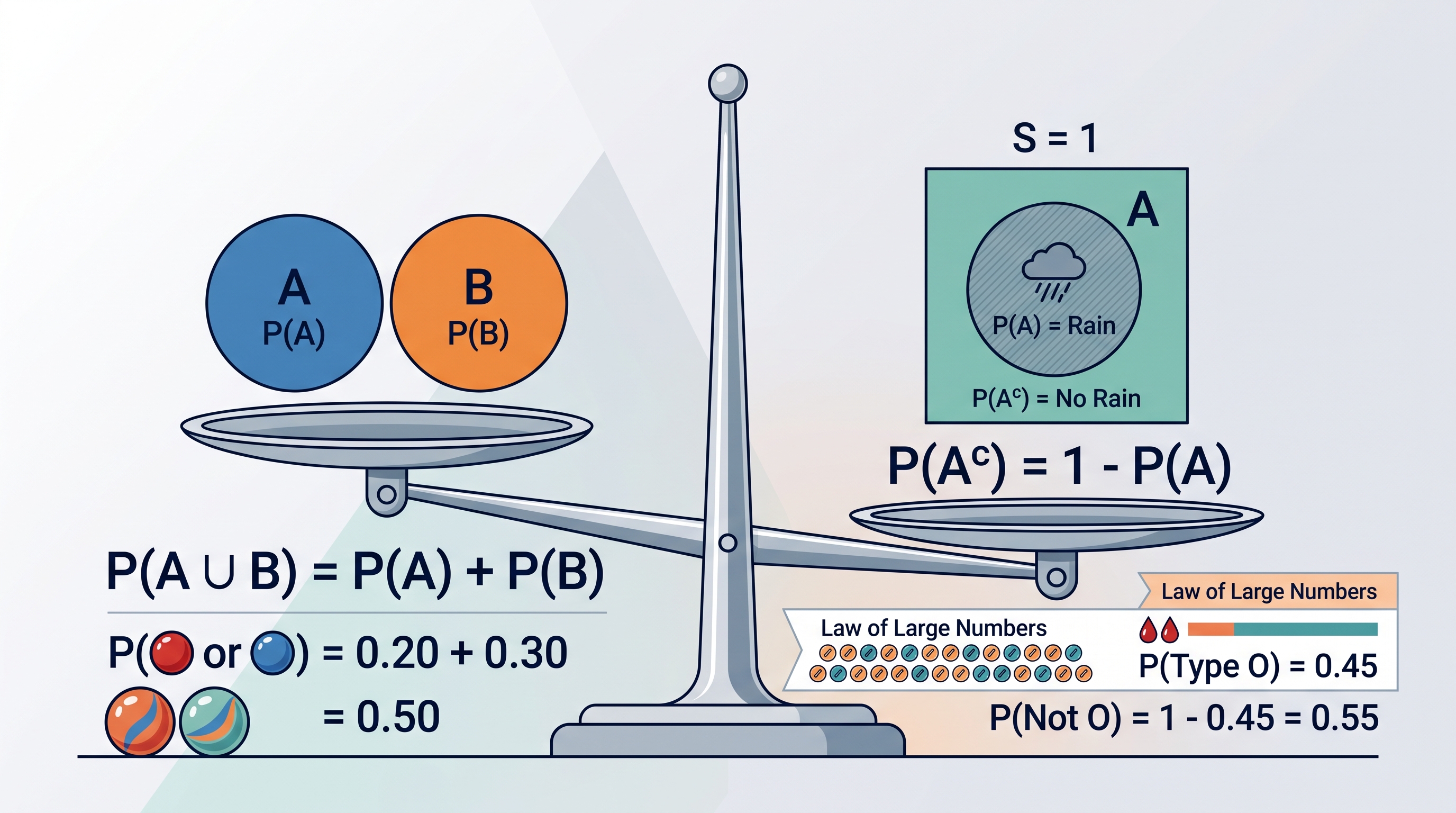
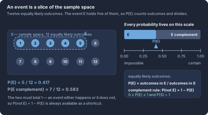
2.5 Mutually Exclusive Events
Key concepts: Joint probability — P(A ∩ B), both events on the same trial · Mutually exclusive (disjoint) events — P(A ∩ B) = 0 · Addition rule for disjoint events — the probabilities simply add · Exhaustive disjoint categories — probabilities that total 1 · Disjoint is not independent — A occurring rules B out · Justifying disjointness — argue from the joint probability, not from wording
Events that cannot occur at the same time define the boundary of logical possibility in probability. In statistics, these are formally known as mutually exclusive (or disjoint) events.
Events that cannot occur at the same time define the boundary of logical possibility in probability. In statistics, these are formally known as mutually exclusive (or disjoint) events. If one event occurs, the other is strictly prohibited from occurring during that same trial. This structural "gap" between events simplifies the math of the addition rule and provides a foundational check for the validity of probability models.
The Logic of Disjoint Sets
Two events, $A$ and $B$, are mutually exclusive if they have no outcomes in common. In the language of set theory, their intersection is the empty set ($A \cap B = \emptyset$). Because there is no overlap, the probability of both events occurring simultaneously is exactly zero.
Definition: Mutually Exclusive (Disjoint) Two events are mutually exclusive if the occurrence of one event excludes the possibility of the occurrence of the other. Formally: $$P(A \cap B) = 0$$
The Simplified Addition Rule
When events are mutually exclusive, the general addition rule—$P(A \cup B) = P(A) + P(B) - P(A \cap B)$—collapses into a simpler form. Since the "overlap" term is zero, we do not need to worry about double-counting outcomes.
Formula: Addition Rule for Mutually Exclusive Events
For any two mutually exclusive events $A$ and $B$: $$P(A \text{ or } B) = P(A) + P(B)$$ This principle extends to any number of mutually exclusive events. If a set of events is mutually exclusive and exhaustive, meaning they cover every possible outcome in the sample space without overlapping, their probabilities must sum to exactly 1.
Contextual Example: Emergency Room Triage
Consider a hospital's triage system where every incoming patient is assigned exactly one priority level: Immediate, Urgent, or Non-urgent. Because a single patient cannot be classified as both "Immediate" and "Non-urgent" at the same moment, these categories are mutually exclusive.
If $P(\text{Immediate}) = 0.08$ and $P(\text{Urgent}) = 0.32$, we can use the simplified addition rule to find the probability that a randomly selected patient requires significant resources (either Immediate or Urgent): $$P(\text{Immediate} \cup \text{Urgent}) = 0.08 + 0.32 = 0.40$$ Assigning meaning to this finding (Skill 4.B), a hospital administrator can claim that 40% of the incoming patient flow requires prioritized medical intervention.
The "Independence" Trap
The most frequent error in introductory statistics is confusing mutually exclusive events with independent events. While the terms sound similar in everyday English, they are mathematically opposites in the world of probability.
- Independence means the occurrence of one event provides no information about the likelihood of the other.
- Mutual Exclusivity means the occurrence of one event provides perfect information about the other—it tells you the other event definitely did not happen.
If $A$ and $B$ are mutually exclusive and $P(A) > 0$, then $A$ and $B$ cannot be independent. Why? Because if you know $A$ happened, the probability of $B$ immediately drops to zero. Since the probability of $B$ changed, the events are dependent.
Misconception Clinic: Mutual Exclusivity vs. Independence
| Feature | Mutually Exclusive (Disjoint) | Independent |
|---|---|---|
| Definition | Cannot happen at the same time. | One happening doesn't change the other's probability. |
| Intersection | $P(A \cap B) = 0$ | $P(A \cap B) = P(A) \cdot P(B)$ |
| Visual | Non-overlapping circles in a Venn diagram. | Overlapping circles (usually) where the ratio of overlap is consistent. |
| Relationship | Knowing $A$ happened means $B$ is impossible. | Knowing $A$ happened tells you nothing new about $B$. |
Identifying Disjoint Events in Data
To determine if two events are mutually exclusive in a real-world data set, such as a two-way table, look at the joint frequency (the "cell" where the row and column meet). If the count in that cell is 0, the events are mutually exclusive for that data set. If the count is greater than 0, they are not mutually exclusive.
Essential Knowledge (T2.5-C01): Two events are mutually exclusive if they cannot occur simultaneously. This is verified if $P(A \cap B) = 0$. Learning Objective (T2.5-L01): Determine whether events are mutually exclusive (disjoint).
Interpretation Check
A standard deck of cards is shuffled. Event $H$ is drawing a Heart. Event $F$ is drawing a Face card (Jack, Queen, King).
- Are events $H$ and $F$ mutually exclusive?
- Justify your answer using $P(H \cap F)$.
Check your reasoning: No, they are not mutually exclusive. There are 3 cards (the Jack, Queen, and King of Hearts) that belong to both sets. Therefore, $P(H \cap F) = 3/52 \neq 0$. Because the intersection is not zero, the events can occur simultaneously.

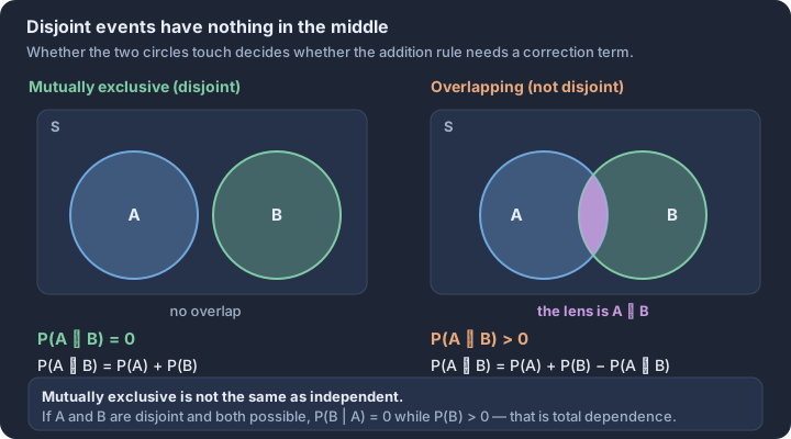
2.6 Conditional Probability
Key concepts: Conditional probability P(A | B) — the chance of A within B · Restricted sample space — the condition becomes the new denominator · Conditional formula — P(A ∩ B) divided by P(B) · General multiplication rule — multiply P(B) by P(A | B) · Conditional frequencies in a two-way table — divide by the row total · Inverted conditionals — P(A | B) is not P(B | A)
Probability is rarely a static calculation based on a total population; it is a dynamic tool that updates as we gain new information.
Probability is rarely a static calculation based on a total population; it is a dynamic tool that updates as we gain new information. When we ask for the probability of an event "given" that another event has already occurred, we are performing a conditional probability calculation. This process effectively "shrinks" the sample space from the entire set of possible outcomes to only those outcomes that satisfy the given condition.
The Logic of the Restricted Sample Space
Definition: Conditional Probability (EK 2.6.A.1) The conditional probability of event $A$ given that event $B$ has occurred is denoted by $P(A|B)$. The vertical bar $|$ is read as "given," and it indicates that $B$ is the new universe we are considering.
To calculate this probability, we look only at the outcomes where $B$ is true. Within that subset, we determine how often $A$ also occurs. Mathematically, this is expressed as the ratio of the intersection of both events to the probability of the condition itself.
The Conditional Formula (EK 2.6.A.2) $$P(A|B) = \frac{P(A \cap B)}{P(B)}, \text{ provided } P(B) > 0$$
Calculating from Two-Way Tables
In practice, especially on the AP Exam, conditional probabilities are often derived from two-way tables (EK 2.6.A.3). When a condition is "given," you ignore every row or column in the table except for the one specified by the condition. The total of that specific row or column becomes your new denominator.
Contextual Example: Tech Support and Device Type
Consider a survey of 200 customers who contacted tech support. We want to find the probability that a customer was using a Tablet, given that their issue was Resolved.
| Issue Status | Smartphone | Tablet | Total |
|---|---|---|---|
| Resolved | 95 | 45 | 140 |
| Unresolved | 20 | 40 | 60 |
| Total | 115 | 85 | 200 |
- Identify the Condition: The condition is "Resolved." We look only at the "Resolved" row.
- Identify the Denominator: The total number of resolved cases is 140.
- Identify the Numerator: Within the "Resolved" row, how many were tablets? 45.
- Calculate (Skill 3.C): $P(\text{Tablet} | \text{Resolved}) = \frac{45}{140} \approx 0.321$.
Interpreting the Result in Context
Interpretation is a critical component of Statistical Practice 4. A complete interpretation must include the condition and the resulting likelihood in non-definitive language.
Model Interpretation: "Given that a tech support issue was resolved, there is approximately a 0.321 probability that the customer was using a tablet."
Misconception Check: The Confusion of Inverse
A common error is assuming that $P(A|B)$ is equal to $P(B|A)$. This is known as the "Prosecutor's Fallacy."
- Incorrect Reasoning: "The probability that a person is a professional athlete given they are tall is high, so the probability that a person is tall given they are a professional athlete must also be high."
- Correct Reasoning: While $P(\text{Tall} | \text{Pro Athlete})$ is nearly 1.0, $P(\text{Pro Athlete} | \text{Tall})$ is extremely low because there are millions of tall people but very few professional athletes. Always identify which event is the "given" (the denominator) and which is the "target" (the numerator).
Tree Diagrams and the General Multiplication Rule
When events happen in stages, tree diagrams help visualize conditional probabilities. Each branch represents a conditional probability. For example, if the first branch is $P(B)$, the second branch stemming from it is $P(A|B)$. Multiplying along the branches gives the joint probability $P(A \cap B)$.
$$P(A \cap B) = P(B) \cdot P(A|B)$$
This relationship shows that the "and" probability is simply the probability of the first event happening, multiplied by the probability that the second event happens assuming the first one did.
Interpretation Check
A medical study reports that $P(\text{Positive Test} | \text{Disease}) = 0.99$ and $P(\text{Disease}) = 0.001$. In a sentence, what does the value 0.99 represent?
Check your reasoning: The value 0.99 represents the probability that a patient will test positive, given that they actually have the disease. It does not represent the probability that a person who tests positive actually has the disease—that would be $P(\text{Disease} | \text{Positive Test})$, which requires more information to calculate.
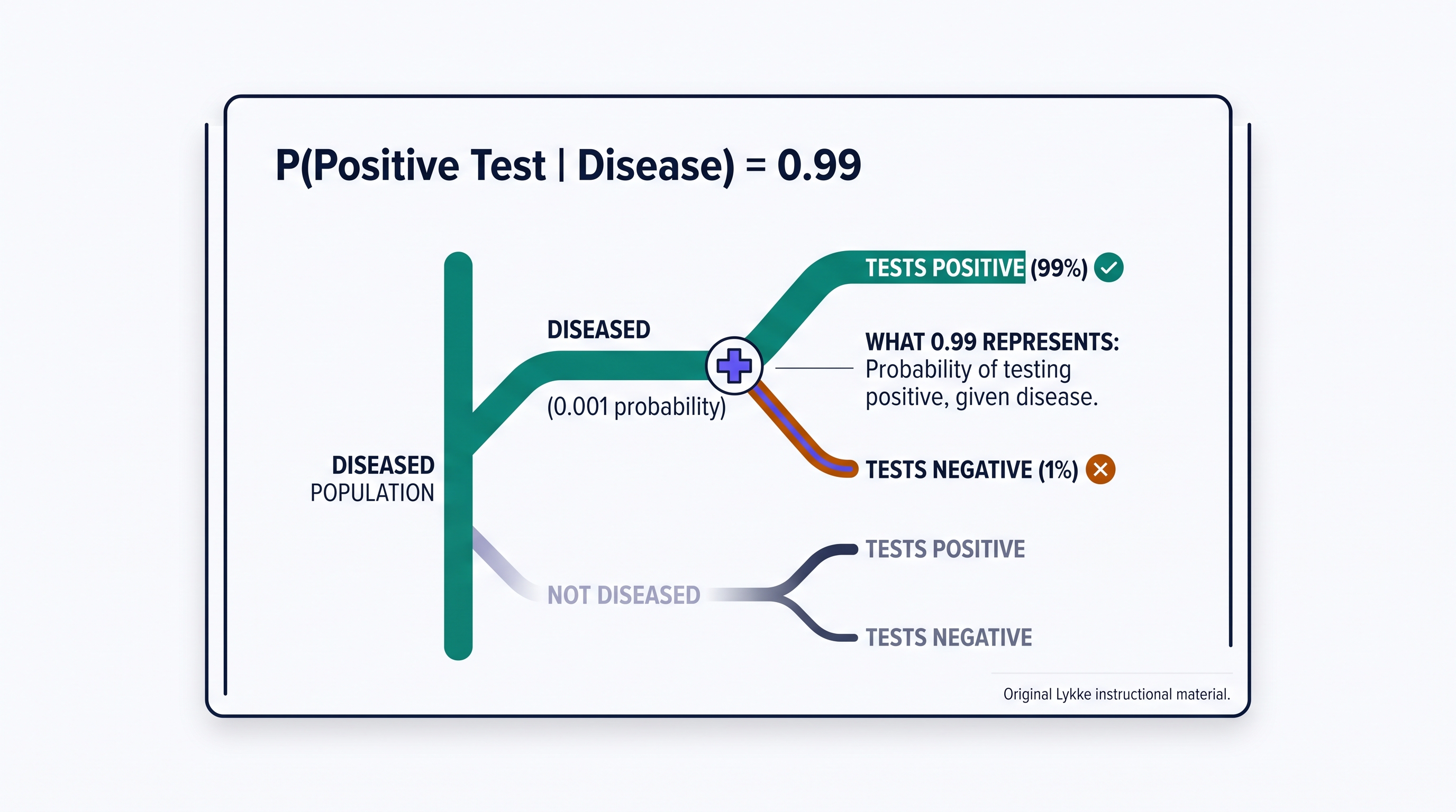
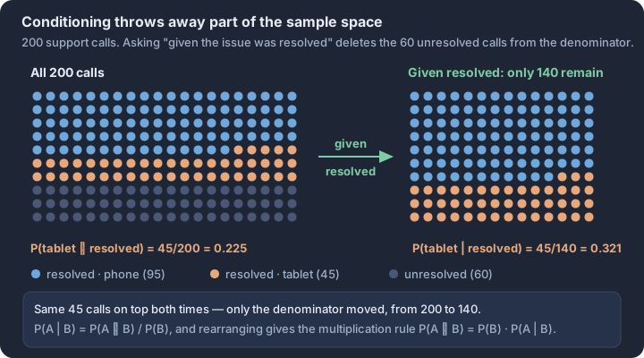
2.7 Independent Events and Unions of Events
Key concepts: Independent events — conditioning on one leaves the other unchanged · Multiplication rule for independent events — multiply the two probabilities · Union of events — A occurs, B occurs, or both · General addition rule — add both, subtract the overlap once · Checking independence numerically — compare P(A ∩ B) with P(A) · P(B) · Sampling without replacement — independence only approximate under the 10% guideline
Independence is the statistical equivalent of a "clean slate." In a world of dependent variables, independent events are those rare occurrences where the past has no shadow and the present provides no clues about the future.
Independence is the statistical equivalent of a "clean slate." In a world of dependent variables, independent events are those rare occurrences where the past has no shadow and the present provides no clues about the future. If you flip a fair coin and it lands on heads ten times in a row, the probability of it landing on heads the eleventh time remains exactly 0.5. The coin has no memory, and the trials are independent. Understanding how to calculate the probability of these events occurring together (intersections) or at least one of them occurring (unions) is the foundation of risk assessment and predictive modeling (Skill 3.C).
2.7.A Defining Independence
Two events, $A$ and $B$, are independent if the occurrence of one event does not change the probability that the other event will occur. Formally, we use conditional probability to define this relationship. Events $A$ and $B$ are independent if and only if: $$P(A|B) = P(A)$$ $$P(B|A) = P(B)$$ If knowing that $B$ has happened gives you exactly zero new information about the likelihood of $A$, then $A$ is independent of $B$. This is a strict mathematical requirement (LO 2.7.A). In practice, independence is often assumed in experimental designs where subjects are randomly assigned or in sampling with replacement. However, when sampling without replacement from a finite population, independence is technically lost, though we often use the "10% Rule" to treat observations as independent if the sample size is small relative to the population (EK 2.7.A.1).
2.7.B The Multiplication Rule for Independent Events
When events are independent, calculating the probability of their intersection—the "And" probability—becomes a simple matter of multiplication. This is the Multiplication Rule for Independent Events (LO 2.7.B): $$P(A \cap B) = P(A) \cdot P(B)$$ This rule extends to any number of independent events. For example, the probability that three independent components in a series all function correctly is the product of their individual reliability probabilities. If any one event has a low probability, the probability of the entire chain succeeding (the intersection) drops rapidly (EK 2.7.B.1).
2.7.C Unions and the General Addition Rule
The union of two events ($A \cup B$) represents the probability that event $A$ occurs, event $B$ occurs, or both occur. To find this "Or" probability, we use the General Addition Rule (LO 2.7.C): $$P(A \cup B) = P(A) + P(B) - P(A \cap B)$$ We subtract the intersection $P(A \cap B)$ because those outcomes are included in both $P(A)$ and $P(B)$. If we didn't subtract it, we would be "double-counting" the overlap. If the events are independent, we can substitute the multiplication rule into this formula: $$P(A \cup B) = P(A) + P(B) - [P(A) \cdot P(B)]$$ This formula is essential for calculating "at least one" probabilities. A common strategy for finding the probability that at least one of several independent events occurs is to use the complement: $1 - P(\text{none occur})$.
2.7.D Worked Example: The Redundancy Principle
In aerospace engineering, critical systems often have a backup to ensure safety. Suppose a jet engine has a primary igniter with a 0.99 probability of functioning correctly. To increase safety, engineers add a secondary, independent backup igniter with the same 0.99 probability. What is the probability that the engine ignites (i.e., at least one igniter works)?
Step 1: Define the events. Let $A$ be the event the primary igniter works ($P(A) = 0.99$). Let $B$ be the event the backup igniter works ($P(B) = 0.99$).
Step 2: Calculate the intersection. Since they are independent, $P(A \cap B) = 0.99 \times 0.99 = 0.9801$.
Step 3: Apply the General Addition Rule. $P(A \cup B) = P(A) + P(B) - P(A \cap B)$ $P(A \cup B) = 0.99 + 0.99 - 0.9801 = 0.9999$.
The probability of failure has dropped from 1 in 100 to 1 in 10,000 through the power of independent redundancy.
2.7.E Misconception Clinic: Independent vs. Mutually Exclusive
The most common error in probability is confusing independent events with mutually exclusive (disjoint) events. They are actually opposites in terms of information.
- Mutually Exclusive: If $A$ happens, $B$ cannot happen. Knowing $A$ occurred gives you perfect information about $B$ ($P(B|A) = 0$). Therefore, mutually exclusive events (with non-zero probabilities) can never be independent.
- Independent: If $A$ happens, it has no effect on the probability of $B$. Knowing $A$ occurred gives you zero information about $B$.
The Rule of Thumb: If two events are disjoint, they are highly dependent. If they are independent, they must have an overlap (intersection) equal to the product of their probabilities.
Check for Understanding: A specific genetic trait appears in 20% of a population. If two people are selected at random (independently) from this large population, what is the probability that at least one of them has the trait?
(Answer: $0.20 + 0.20 - (0.20 \times 0.20) = 0.36$, or $1 - (0.80 \times 0.80) = 0.36$.)
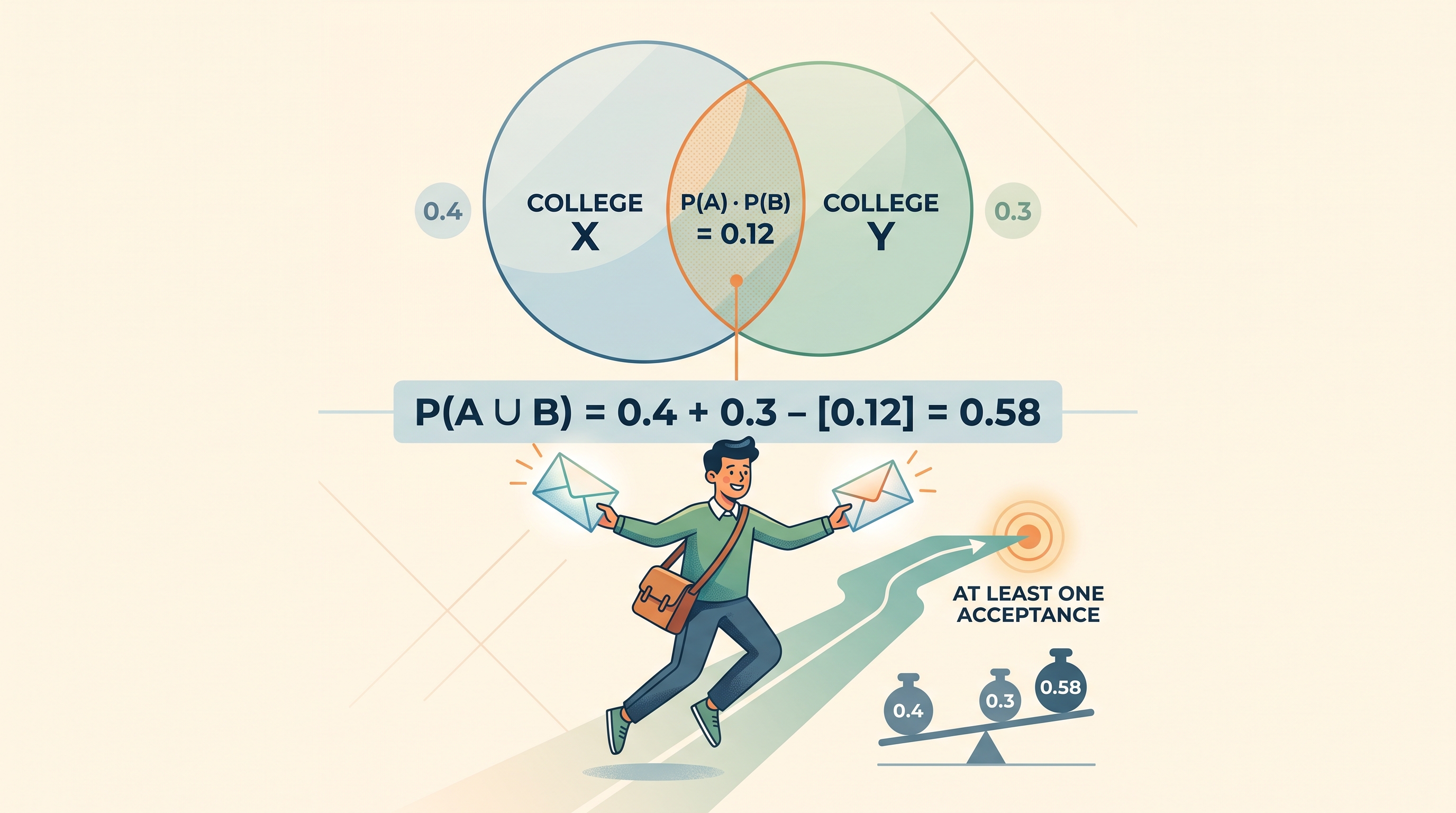
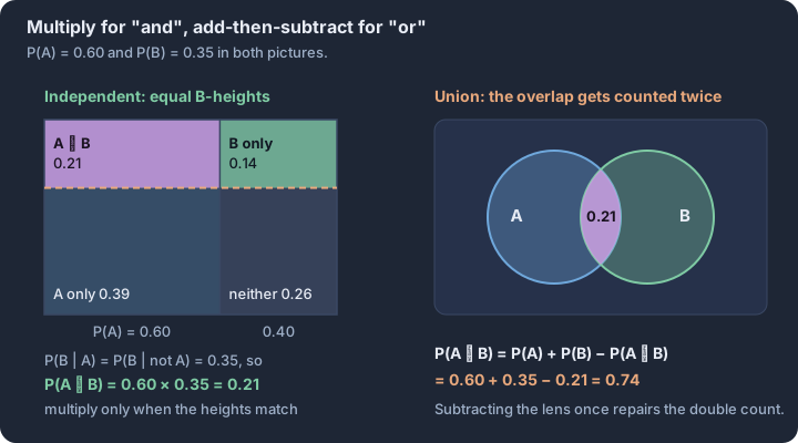
2.8 Introduction to Random Variables and Probability Distributions
Key concepts: Random variable — a numerical outcome of a chance process · Discrete random variable — countable list of possible values · Probability distribution — a probability attached to each value of X · Total probability — the probabilities of a distribution sum to 1 · Three representations — table, graph, or function for the same distribution · Cumulative distribution — P(X ≤ x) accumulated up each value
A random variable is a numerical description of the outcome of a random phenomenon, effectively acting as a bridge between the qualitative world of "what happened" and the quantitative world of "how much." Unlike a variable in algebra, which represents a fixed but unknown value, a random…
A random variable is a numerical description of the outcome of a random phenomenon, effectively acting as a bridge between the qualitative world of "what happened" and the quantitative world of "how much." Unlike a variable in algebra, which represents a fixed but unknown value, a random variable takes on different values based on chance. We typically denote the random variable itself with an uppercase letter, like $X$, and its specific possible values with lowercase letters, like $x$.
Learning Objective 2.8.A (VAR-5.A): Construct a probability distribution for a discrete random variable. Essential Knowledge 2.8.A.1 (VAR-5.A.1): A random variable is a variable whose values have numerical outcomes that result from a random phenomenon.
The Discrete Random Variable
A discrete random variable has a collection of possible values that can be listed or counted. These often arise from counting processes—such as the number of heads in three coin flips, the number of defective bulbs in a shipment, or the number of goals scored in a match. Because the outcomes are distinct and "jump" from one value to the next (e.g., you cannot score 1.5 goals), we can assign a specific probability to every individual value the variable can take.
Constructing the Probability Distribution
A probability distribution is a complete map of a random variable's behavior. To satisfy the requirements of a valid distribution, two conditions must be met:
- Every probability $P(X = x)$ must be between 0 and 1, inclusive.
- The sum of all probabilities for all possible values must equal exactly 1.
Consider the random phenomenon of flipping a fair coin three times. Let $X$ be the number of heads. The sample space consists of 8 equally likely outcomes: {HHH, HHT, HTH, THH, HTT, THT, TTH, TTT}. To construct the distribution, we map these outcomes to their numerical values:
- $X = 0$: {TTT} $\rightarrow P(X=0) = 1/8$
- $X = 1$: {HTT, THT, TTH} $\rightarrow P(X=1) = 3/8$
- $X = 2$: {HHT, HTH, THH} $\rightarrow P(X=2) = 3/8$
- $X = 3$: {HHH} $\rightarrow P(X=3) = 1/8$
Visualizing Distributions
While a table is the most precise way to represent a discrete distribution, a probability histogram provides the visual intuition necessary for Skill 3.A. In these graphs, the horizontal axis represents the possible values of the random variable, and the vertical axis represents the probability (relative frequency) of those values. Unlike a standard frequency histogram of sample data, a probability histogram represents the theoretical "long-run" behavior of the population or process.
When interpreting these graphs, we look for the same features we used in Unit 1: shape, center, and variability. A symmetric probability histogram suggests that outcomes equidistant from the center are equally likely, while a skewed histogram indicates that the random process is more likely to produce values at one end of the spectrum.
{ "questions": [ { "question": "A random variable Y represents the number of broken eggs in a carton of 12. The probability distribution is partially given: P(Y=0)=0.85, P(Y=1)=0.10, P(Y=2)=0.03. If Y cannot take values greater than 3, what is P(Y=3)?", "options": [ "0.01", "0.02", "0.05", "0.98" ], "answer": "0.02", "explanation": "The sum of all probabilities in a valid distribution must equal 1. Here, 0.85 + 0.10 + 0.03 = 0.98. Therefore, P(Y=3) must be 1 - 0.98 = 0.02 to complete the distribution." }, { "question": "Which of the following is a required characteristic for a discrete probability distribution?", "options": [ "The values of the random variable must be positive.", "The probabilities must be equal for all values of x.", "The sum of the probabilities P(X=x) must equal 1.", "The distribution must be bell-shaped and symmetric." ], "answer": "The sum of the probabilities P(X=x) must equal 1.", "explanation": "By definition (VAR-5.A.1), a probability distribution must account for the entire sample space, meaning the sum of probabilities must be exactly 1. Values can be negative (e.g., profit/loss), probabilities do not have to be equal, and shape can vary widely." } ] }
Interpretation Check: Suppose a random variable $K$ has the values {10, 20, 30} with probabilities {0.2, 0.5, 0.3}. If you were to conduct this random process 1,000 times, roughly how many times would you expect to see the outcome $K=20$? (Answer: approximately 500 times, as $1000 \times 0.5 = 500$).
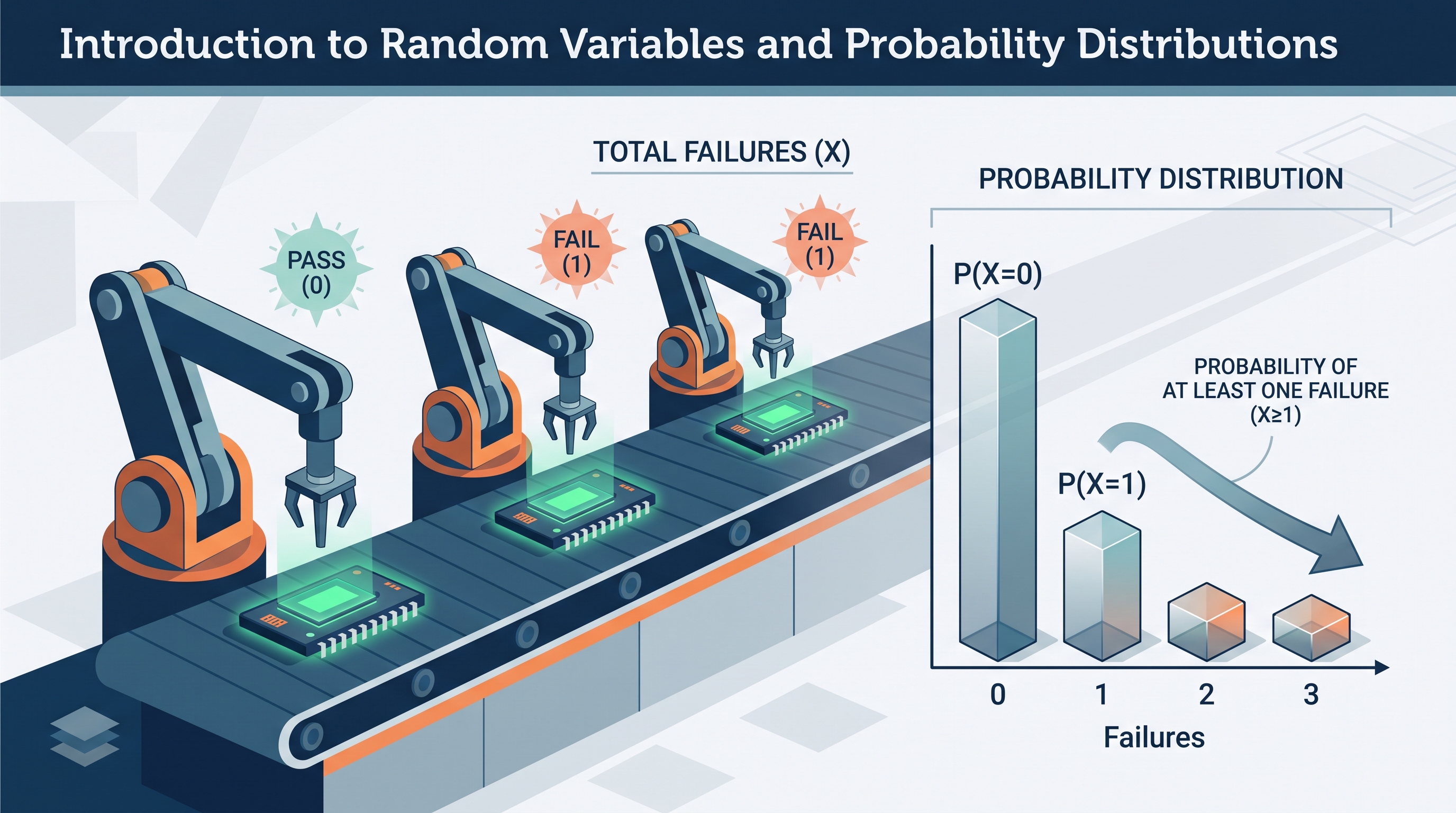
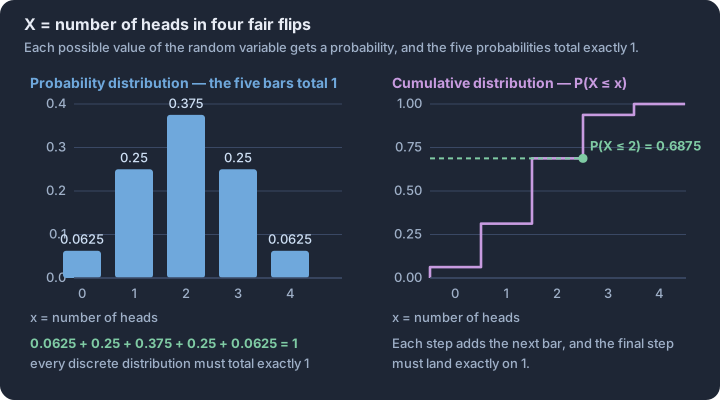
2.9 Parameters of Random Variables
Key concepts: Parameter — a fixed numerical feature of a distribution or population · Expected value μ_X = Σ x·P(x) — the long-run average outcome · Balance point — μ need not be an attainable value · Variance σ² — probability-weighted average squared distance from μ · Standard deviation σ_X — typical distance of X from its mean · Contextual interpretation — report μ and σ in real units
The long-run behavior of a random variable is not a matter of guesswork, but a predictable balance point known as a parameter.
The long-run behavior of a random variable is not a matter of guesswork, but a predictable balance point known as a parameter. While an individual trial of a random process is uncertain, the average result over thousands of repetitions settles into a constant value. In the study of discrete random variables, we quantify this stability using two primary parameters: the mean (expected value) and the standard deviation. These values provide a "summary" of the entire probability distribution, allowing us to predict costs, risks, and outcomes in fields ranging from insurance underwriting to game design.
The Mean: The "Long-Run" Balance Point
The mean of a random variable $X$, denoted as $\mu_X$ or $E(X)$, represents the theoretical average outcome if the random process were repeated an infinite number of times. It is not necessarily the "most likely" outcome, nor must it be a value that the variable can actually take (for instance, the expected number of heads in three coin flips is 1.5, even though you cannot flip half a head). Mathematically, the mean is the weighted average of all possible outcomes, where each outcome is weighted by its probability of occurrence.
Definition: Expected Value (Mean) For a discrete random variable $X$ with outcomes $x_i$ and probabilities $P(x_i)$: $$\mu_X = E(X) = \sum [x_i \cdot P(x_i)]$$
The Standard Deviation: Quantifying Variability
The standard deviation of a random variable, denoted as $\sigma_X$, measures the "typical" distance between the outcomes and the mean in the long run. A small standard deviation indicates that the outcomes are tightly clustered around the mean, while a large standard deviation suggests a high degree of uncertainty and spread. Before calculating the standard deviation, we must find the variance ($\sigma_X^2$), which is the average of the squared deviations from the mean.
Definition: Standard Deviation The standard deviation is the square root of the variance: $$\sigma_X = \sqrt{\sum [(x_i - \mu_X)^2 \cdot P(x_i)]}$$
Interpretation Templates (Skill 4.D)
Precise communication is essential for AP Statistics. Use these structures to interpret results in context:
- Mean ($\mu_X$): "If we were to [repeat the random process] many, many times, the average [outcome] would be about [value]."
- Standard Deviation ($\sigma_X$): "The [outcome] typically varies from the mean of [value] by about [SD value]."
Worked Problem: The "Free-to-Play" Economy
A mobile game developer offers a "Mystery Chest" for 100 gems. The chest contains a variable number of "Power-Ups." Based on the game's code, the probability distribution for the number of Power-Ups ($X$) is as follows:
| Power-Ups ($x_i$) | 0 | 1 | 5 | 10 |
|---|---|---|---|---|
| $P(X = x_i)$ | 0.50 | 0.30 | 0.15 | 0.05 |
Step 1: Calculate the Mean (Skill 3.B)
To find the expected number of Power-Ups, multiply each outcome by its probability and sum the products: $\mu_X = (0 \cdot 0.50) + (1 \cdot 0.30) + (5 \cdot 0.15) + (10 \cdot 0.05)$ $\mu_X = 0 + 0.30 + 0.75 + 0.50 = \mathbf{1.55}$ Power-Ups
Step 2: Calculate the Standard Deviation (Skill 3.B)
First, find the variance by calculating the squared deviation of each outcome from the mean (1.55): $\sigma_X^2 = (0 - 1.55)^2(0.50) + (1 - 1.55)^2(0.30) + (5 - 1.55)^2(0.15) + (10 - 1.55)^2(0.05)$ $\sigma_X^2 = (2.4025)(0.50) + (0.3025)(0.30) + (11.9025)(0.15) + (71.4025)(0.05)$ $\sigma_X^2 = 1.20125 + 0.09075 + 1.785375 + 3.570125 = \mathbf{6.6475}$ $\sigma_X = \sqrt{6.6475} \approx \mathbf{2.58}$ Power-Ups
Step 3: Interpret the Results (Skill 4.D)
- Mean: If many, many players buy this Mystery Chest, the average number of Power-Ups per chest will be about 1.55.
- Standard Deviation: The number of Power-Ups obtained from a chest typically varies by about 2.58 from the mean of 1.55.
Misconception Check: The "Next Trial" Fallacy
A common error is assuming the expected value tells you what will happen in the next trial. If $\mu_X = 1.55$, a player might be frustrated that they can never actually receive exactly 1.55 Power-Ups.
- The Reality: The mean is a parameter of the population of all possible trials. It is a measure of center for the distribution, not a prediction for a single data point. It describes the "long-run" average, not the "short-run" reality.
Interpretation Check
A local car wash offers a "Surprise Detail" package. The random variable $Y$ represents the number of extra services (wax, vacuum, tire shine) a customer receives. The mean is $\mu_Y = 2.1$ services and the standard deviation is $\sigma_Y = 0.8$ services.
Which of the following is the most accurate interpretation of the mean? A) Most customers will receive exactly 2.1 extra services. B) If we look at a large number of customers, the average number of extra services per customer will be about 2.1. C) A customer is guaranteed to receive at least 2 extra services. D) The number of services for the next customer will typically be 2.1.
Check your reasoning: The correct answer is B. The mean describes the long-run average over many trials, not a single outcome or a guarantee.
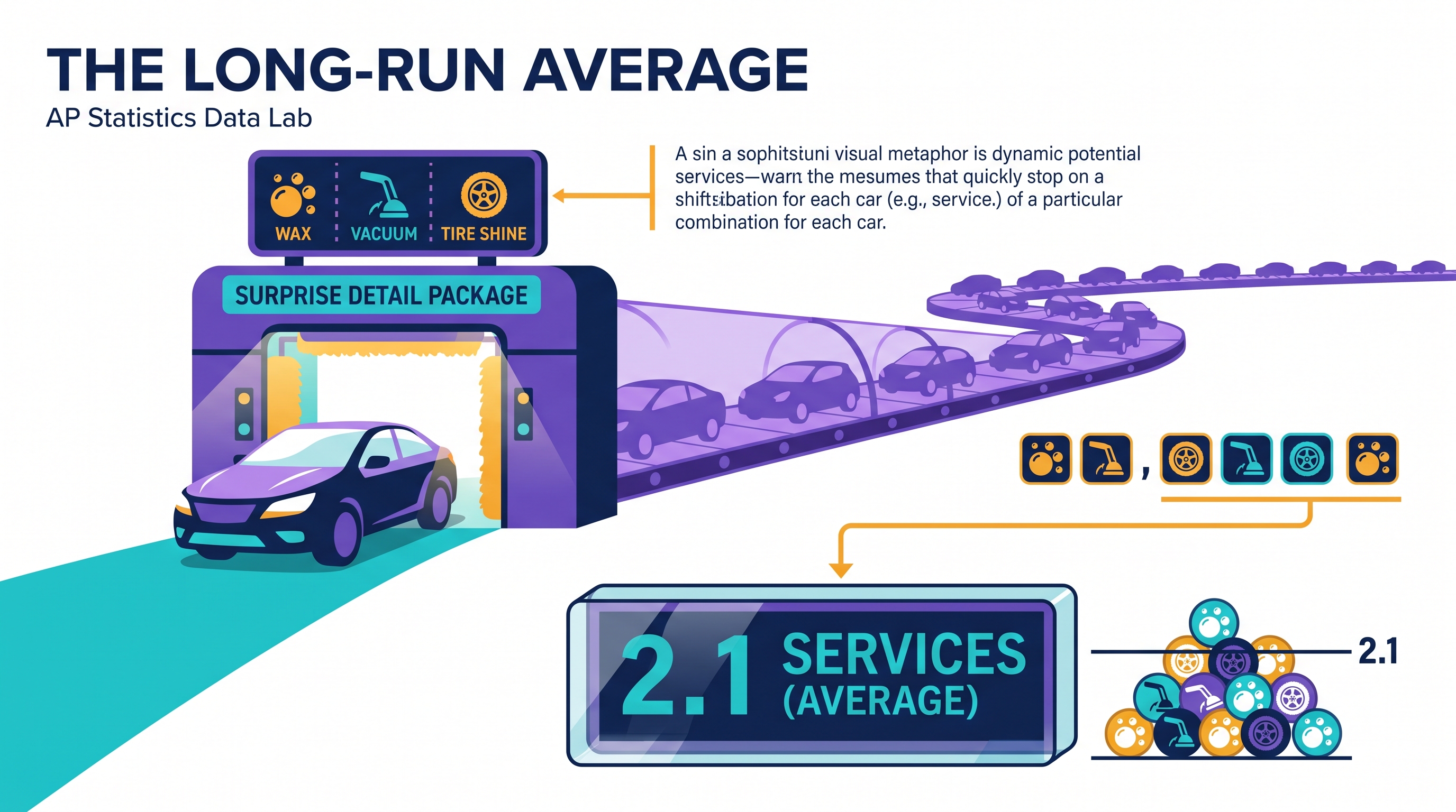
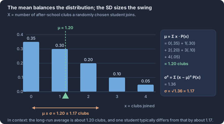
2.10 The Binomial Distribution
Key concepts: Binomial random variable — counts successes in n fixed independent trials · BINS check — binary outcome, independent trials, fixed n, constant p · Binomial probability P(X = x) = C(n,x)p^x(1−p)^(n−x) · Mean of a binomial distribution: μ = np · Standard deviation of a binomial distribution: σ = √(np(1−p)) · Simulation estimate — relative frequency approximates a binomial probability
A binomial random variable $X$ serves as the mathematical bridge between individual binary trials and the aggregate behavior of a fixed-size sample.
A binomial random variable $X$ serves as the mathematical bridge between individual binary trials and the aggregate behavior of a fixed-size sample. It quantifies the number of "successes" in a sequence of independent events where only two outcomes are possible—such as a medical treatment succeeding or failing, a component passing or failing inspection, or a voter supporting or opposing a measure.
The Binomial Setting (BINS)
Definition: Binomial Random Variable (LO 2.10.A) A discrete random variable $X$ is considered binomial if it counts the number of successes in $n$ repeated trials. To justify this classification, the scenario must satisfy the four BINS conditions:
- Binary: Each trial has exactly two possible outcomes (Success/Failure).
- Independent: The outcome of one trial does not affect the probability of another.
- Number: The number of trials $n$ is fixed in advance.
- Success: The probability of success $p$ remains constant for every trial.
Misconception Check: The Independence Trap
In real-world sampling without replacement, trials are technically dependent because the population composition changes. However, statisticians apply the 10% Rule: if the sample size $n$ is less than 10% of the population size $N$, the trials are treated as independent enough to use the binomial model without significant error.
Calculating Binomial Probabilities
To find the probability of exactly $k$ successes in $n$ trials (LO 2.10.B), we use the binomial probability formula (Skill 3.C). This formula accounts for both the probability of a specific sequence occurring and the total number of ways that sequence can be arranged.
$$P(X = k) = \binom{n}{k} p^k (1-p)^{n-k}$$
| Component | Statistical Meaning |
|---|---|
| $\binom{n}{k}$ | The binomial coefficient (n choose k), representing the number of ways to arrange $k$ successes in $n$ trials. |
| $p^k$ | The probability of getting exactly $k$ successes. |
| $(1-p)^{n-k}$ | The probability of getting the remaining $n-k$ failures. |
Worked Example: Quality Control
A factory produces lightbulbs with a 3% defect rate ($p = 0.03$). If a random sample of 10 bulbs is selected ($n = 10$), what is the probability that exactly 1 bulb is defective?
- Check BINS: Binary (Defective/Not), Independent (10 bulbs < 10% of total production), Fixed $n=10$, Constant $p=0.03$.
- Calculate: $P(X=1) = \binom{10}{1} (0.03)^1 (0.97)^9$
- Result: $10 \cdot 0.03 \cdot 0.7602 \approx 0.2281$. There is a 22.81% chance of finding exactly one defective bulb.
Parameters: Mean and Standard Deviation
The binomial distribution is defined by two parameters: $n$ and $p$. From these, we derive the long-run average and the expected variability of the distribution (LO 2.10.C, Skill 3.D).
- Mean (Expected Value): $\mu_X = np$
- Standard Deviation: $\sigma_X = \sqrt{np(1-p)}$
Interpreting Binomial Results
Calculation is only the first step; statistical reasoning requires interpreting these values in the context of the population (LO 2.10.D, Skill 4.D).
Interpreting the Mean (Skill 4.B)
The mean $\mu_X$ is the expected number of successes if the $n$-trial process were repeated many, many times. It is not a guarantee for a single sample, but a long-run average.
- Contextual Example: If a basketball player with an 80% free-throw rate ($p=0.80$) takes 10 shots ($n=10$), $\mu_X = 8$. We interpret this as: "If the player takes many sets of 10 shots, the average number of shots made per set will be 8."
Interpreting the Standard Deviation (Skill 4.B)
The standard deviation $\sigma_X$ measures how much the number of successes typically varies from the mean.
- Contextual Example: For the shooter above, $\sigma_X = \sqrt{10(0.8)(0.2)} \approx 1.26$. "In many sets of 10 shots, the number of shots made will typically vary by about 1.26 from the mean of 8."
Estimating via Simulation
When theoretical calculations are complex, we can estimate binomial probabilities by simulating thousands of trials (LO 2.10.D). By recording the frequency of $k$ successes across these simulations, the long-run relative frequency converges to the theoretical probability defined by the binomial formula. This simulation-based approach reinforces the concept that probability is a measure of long-term regularity in random processes.
Retrieval Check A pharmaceutical company claims a drug has a 90% success rate. In a sample of 100 patients, the standard deviation of the number of successful treatments is 3. Interpret this value in context.
Answer: In many random samples of 100 patients, the number of successful treatments will typically vary by about 3 from the mean of 90.
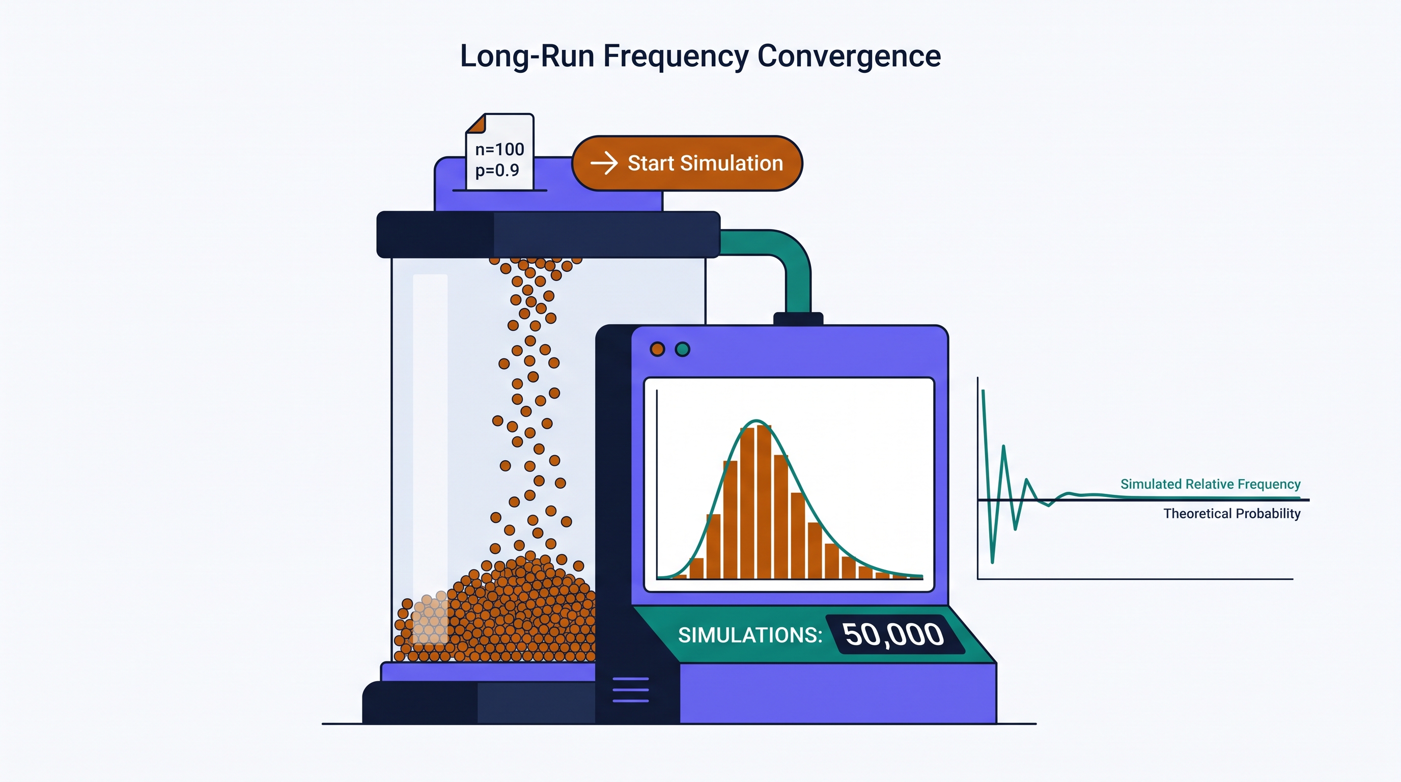
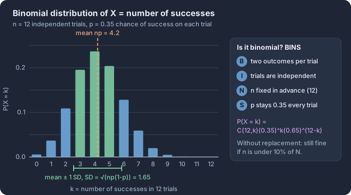
2.11 The Normal Distribution
Key concepts: Continuous random variable — probability is area over an interval · Normal curve — unimodal, symmetric and bell-shaped · Two parameters μ and σ fix the curve's center and spread · Standard normal distribution — the normal model with μ = 0, σ = 1 · z-score — standardized position used to compare values across distributions · Empirical rule — about 68%, 95%, 99.7% within 1, 2, 3 SD
A Normal distribution is a continuous probability distribution defined entirely by two parameters: its mean ($\mu$) and its standard deviation ($\sigma$). Often called the "bell curve," this model is central to statistical inference because it describes the behavior of many random…
A Normal distribution is a continuous probability distribution defined entirely by two parameters: its mean ($\mu$) and its standard deviation ($\sigma$). Often called the "bell curve," this model is central to statistical inference because it describes the behavior of many random variables where data clusters around a central average with decreasing frequency as values move further away.
Anatomy of the Normal Curve
The geometric properties of the Normal distribution are rigid and predictable. Every Normal curve, regardless of its specific $\mu$ or $\sigma$, shares the same fundamental structure (LO 2.11.A).
Essential Knowledge 2.11.A.1: The Normal distribution is symmetric and bell-shaped. The mean, median, and mode are all located at the center of the distribution.
Essential Knowledge 2.11.A.2: The total area under the Normal curve is exactly 1. This represents the total probability (100%) of all possible outcomes for the continuous random variable.
Key Characteristics
- Symmetry: The left half is a mirror image of the right half.
- Asymptotic: The "tails" of the curve extend infinitely in both directions, approaching but never touching the horizontal axis.
- The Empirical Rule: Approximately 68% of the data falls within $1\sigma$ of the mean, 95% within $2\sigma$, and 99.7% within $3\sigma$.
Standardization and the z-Score
To compare values from different Normal distributions or to calculate specific probabilities, we use standardization. This process converts any value $x$ into a z-score, which measures how many standard deviations the value sits above or below the mean.
$$z = \frac{x - \mu}{\sigma}$$
Essential Knowledge 2.11.A.3: The Standard Normal distribution is a specific Normal distribution with a mean of 0 and a standard deviation of 1 ($N(0, 1)$).
Calculating Probabilities (Skill 3.C)
Because the Normal distribution is continuous, the probability of a variable taking on an exact single value is 0. Instead, we calculate the probability that a variable falls within an interval by finding the area under the curve over that interval.
Worked Example: Smartphone Battery Life
Suppose the battery life of a specific smartphone model follows a Normal distribution with a mean $\mu = 22$ hours and a standard deviation $\sigma = 3.5$ hours. What is the probability that a randomly selected phone lasts more than 25 hours?
- Standardize the value (Skill 3.C): $$z = \frac{25 - 22}{3.5} \approx 0.86$$
- Find the Area: Using technology (like
normalcdfon a calculator) or a standard Normal table, the area to the left of $z = 0.86$ is approximately 0.8051. - Calculate the Complement: Since we want the probability of lasting more than 25 hours, we look at the right tail: $1 - 0.8051 = 0.1949$.
- Interpret the Result (Skill 3.D): There is a 0.1949 probability that a randomly selected smartphone of this model will have a battery life exceeding 25 hours. This implies that approximately 19.49% of all such phones are expected to last longer than 25 hours under these conditions.
Comparing Relative Positions (Skill 4.C)
Standardization allows for "apples-to-oranges" comparisons. By converting raw scores from different distributions into $z$-scores, we can determine which value is more extreme relative to its own population.
| Metric | Student A (SAT) | Student B (ACT) |
|---|---|---|
| Score ($x$) | 1350 | 30 |
| Mean ($\mu$) | 1060 | 21 |
| Std Dev ($\sigma$) | 210 | 5 |
| z-score calculation | $(1350-1060)/210 = \mathbf{1.38}$ | $(30-21)/5 = \mathbf{1.80}$ |
Conclusion (Skill 4.C): Although both students scored well above their respective means, Student B’s performance is more impressive in a relative sense. Student B is 1.80 standard deviations above the mean, while Student A is only 1.38 standard deviations above the mean.
Misconception Check: The "Normal" Label
The Misconception: Students often assume that "Normal" means "typical" or "common," or that any symmetric distribution is automatically Normal. The Correction: "Normal" refers to a specific mathematical density function. A distribution can be symmetric and unimodal (like a uniform distribution or a t-distribution) without being Normal. Furthermore, data is rarely perfectly Normal; we use the Normal distribution as a model to approximate real-world data that fits the bell-shaped criteria.
Interpretation Check
A company finds that its lightbulb lifespans are $N(1200, 150)$ hours. A specific bulb has a $z$-score of $-2.1$. Without calculating the exact hours, interpret what this $z$-score tells you about the bulb's lifespan and its relative position in the distribution.
(Answer: The bulb lasted 2.1 standard deviations less than the average lifespan. Because the score is more than 2 standard deviations below the mean, this bulb is an outlier/unusual, lasting significantly less time than approximately 97.7% of other bulbs.)
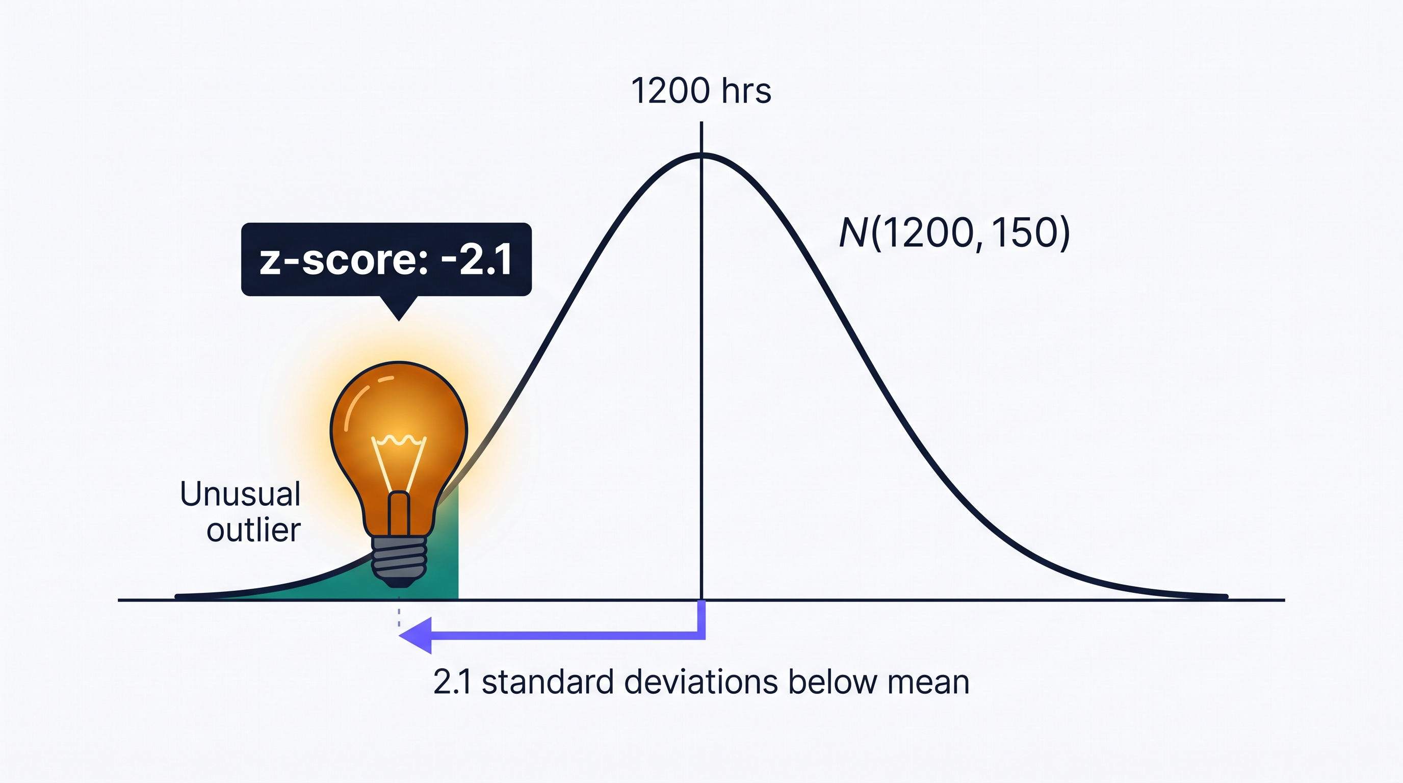
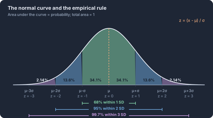
2.12 Sampling Distributions and the Central Limit Theorem
Key concepts: Sampling distribution — values of a statistic over all samples of size n · Three levels — population, one sample, sampling distribution · Simulation — many random samples approximate the sampling distribution · Randomization distribution — statistic values from reshuffling treatment groups · Central limit theorem — x̄ is approximately normal for large n · Spread of x̄ shrinks like σ/√n as sample size grows
A sampling distribution is the theoretical probability distribution of a statistic—such as a sample mean ($\bar{x}$) or a sample proportion ($\hat{p}$)—calculated from all possible samples of a fixed size $n$ from a specific population.
A sampling distribution is the theoretical probability distribution of a statistic—such as a sample mean ($\bar{x}$) or a sample proportion ($\hat{p}$)—calculated from all possible samples of a fixed size $n$ from a specific population. While a single sample tells us about a specific group, the sampling distribution tells us how that sample statistic behaves across the "long run" of repeated sampling. It is the essential bridge between the data we have and the population parameters we wish to estimate.
The Three Levels of Distribution
To master this concept, you must distinguish between three distinct layers of data. Confusing these is the most common barrier to success in statistical inference.
| Distribution Type | What it describes | Typical Notation |
|---|---|---|
| Population Distribution | Every individual in the entire group. | $\mu, \sigma, p$ |
| Sample Distribution | The individuals in one specific collection of size $n$. | $\bar{x}, s, \hat{p}$ |
| Sampling Distribution | The values of a statistic for all possible samples of size $n$. | $\mu_{\bar{x}}, \sigma_{\bar{x}}$ |
Simulating the Unreachable
In practice, we rarely have the resources to take every possible sample from a population. Instead, we use simulations to approximate the sampling distribution (EK 2.12.A.2). By repeatedly generating a large number of random samples (e.g., 10,000 trials) from a known population model, we can observe the pattern of the resulting statistics.
The Randomization Distribution
A specialized form of simulation is the randomization distribution (EK 2.12.A.3). Used primarily in experimental contexts, this distribution is generated by repeatedly reallocating response values to different treatment groups by chance. This allows statisticians to see what differences in means or proportions might occur purely by "the luck of the draw," providing a baseline for determining if an experimental result is statistically significant.
The Central Limit Theorem (CLT) and Shape
The Central Limit Theorem is often called the "Fundamental Theorem of Statistics" because of its remarkable claim about shape. It states that for a large enough sample size (typically $n \ge 30$), the sampling distribution of the sample mean will be approximately Normal, regardless of the shape of the underlying population distribution.
The Power of n:
- Center: The mean of the sampling distribution ($\mu_{\bar{x}}$) is equal to the population mean ($\mu$).
- Spread: As the sample size $n$ increases, the variability (standard deviation) of the sampling distribution decreases. Larger samples provide more precise estimates.
- Shape: As $n$ increases, the sampling distribution becomes more symmetric and bell-shaped, even if the population is heavily skewed.
Contextual Example: Commute Times
Imagine a city where the population distribution of commute times is heavily right-skewed; most people live close to work (10 mins), but a few "super-commuters" travel 120 minutes.
- If you take a sample of $n=2$, your sample mean might be highly volatile.
- If you take a sample of $n=100$, the "super-commuters" are balanced out by the majority, and the distribution of those 100-person averages will cluster tightly and normally around the true city average.
Misconception Clinic: "More Trials" vs. "Larger n"
The Error: Thinking that running a simulation for more trials (e.g., 50,000 instead of 1,000) makes the sampling distribution narrower or more Normal. The Correction: Increasing the number of trials only makes our approximation of the sampling distribution more accurate. It does not change the distribution itself. Only increasing the sample size ($n$) within each trial reduces the spread and pushes the shape toward Normality.
Skill 4.C: Describing and Comparing
When asked to describe a sampling distribution (Skill 4.C), you must address its Shape, Center, and Variability.
- Shape: Is it approximately Normal? (Check if $n \ge 30$ for means or the Large Counts Condition for proportions).
- Center: Identify the mean of the statistics.
- Variability: Describe the spread using the standard deviation of the statistic.
Interpretation Check: A researcher simulates the sampling distribution of $\bar{x}$ for $n=40$ from a skewed population. The simulation results in a mean of 100 and a standard deviation of 5. If a single random sample yields $\bar{x} = 112$, how would you describe its position relative to the sampling distribution? (Answer: The value 112 is 2.4 standard deviations above the mean of the sampling distribution, making it a relatively unusual or extreme result.)
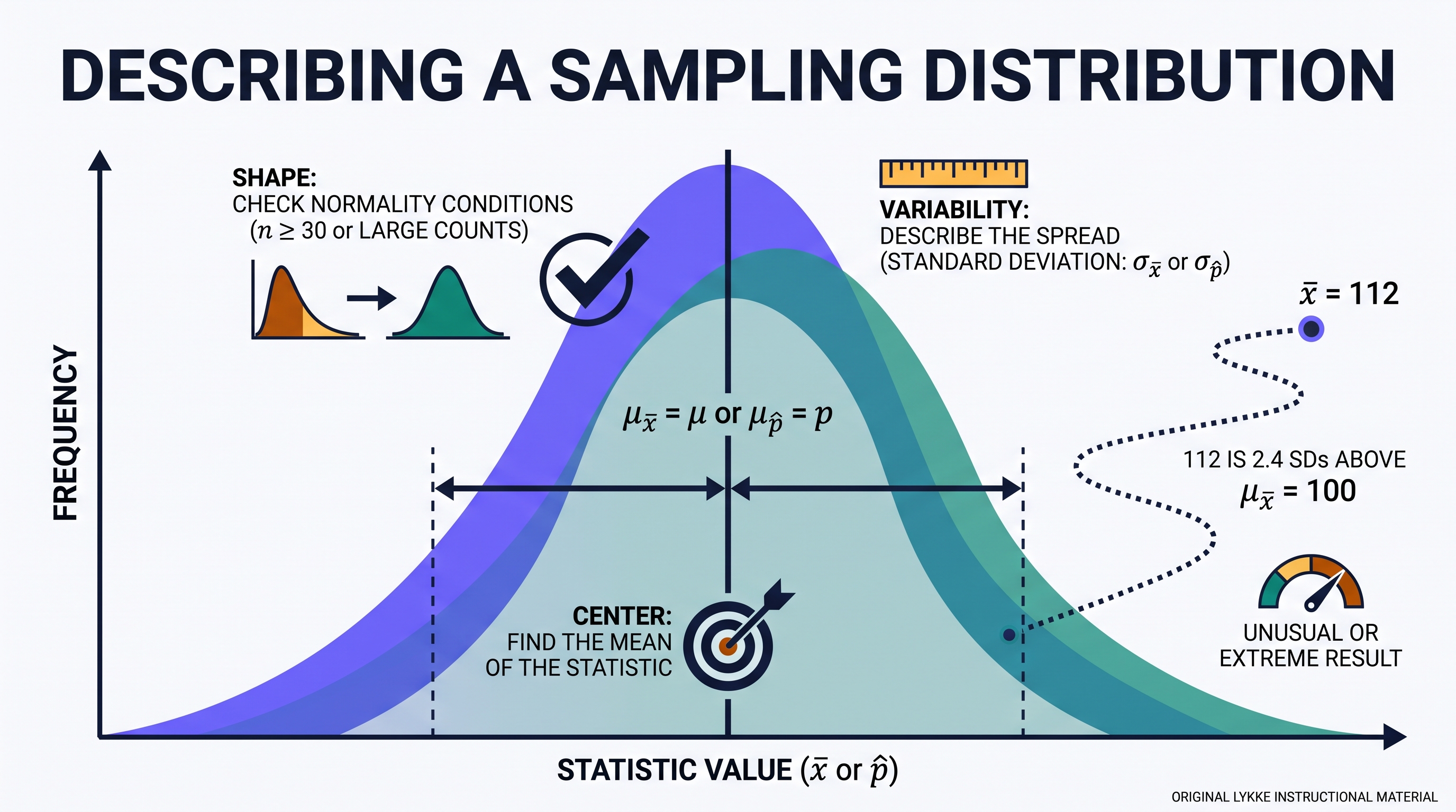
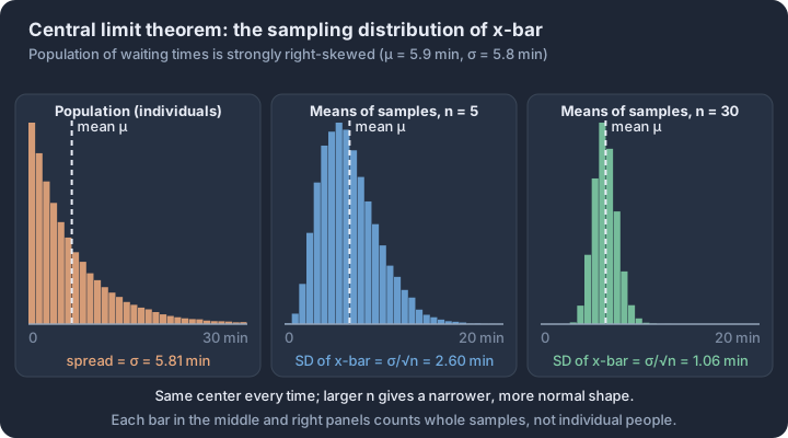
Unit 3: Inference for Categorical Data: Proportions
Key concepts: Parameter p vs statistic p̂ — unknown truth vs sample estimate · Sampling distribution of p̂ — center p, spread √(p(1−p)/n) · Conditions — random sample, 10% rule, at least 10 successes and failures · Confidence interval — p̂ ± z*·SE gives plausible values for p · Significance test — p-value against α, with Type I and Type II error risks · Two-proportion inference — the same logic applied to p₁ − p₂
Integrate the official Unit 3 topics through the AP statistical practices and apply them to contextual problems. Follow the unit roadmap to connect every topic, practice statistical reasoning in context, and prepare for cumulative AP-style questions.
Unit 3: Inference for Categorical Data: Proportions is organized around one recurring question: what evidence would justify the conclusion we want to make? This overview connects the unit's topics before you work through them one at a time.
What you will learn
Integrate the official Unit 3 topics through the AP statistical practices and apply them to contextual problems.
Topic sequence
- 3.1 Estimators — Calculate point estimates and justify whether an estimator is unbiased.
- 3.2 Sampling Distributions for Sample Proportions — Calculate, verify conditions for, and interpret sampling distributions of sample proportions.
- 3.3 Constructing a Confidence Interval for a Population Proportion — Select, justify, and construct a confidence interval for one population proportion.
- 3.4 Justifying a Claim Based on a Confidence Interval for a Population Proportion — Interpret a confidence interval and use it to justify a claim about a population proportion.
- 3.5 Setting Up a Test for a Population Proportion — Select and set up a valid significance test for one population proportion.
- 3.6 p-Values — Interpret a p-value in the context of a statistical test.
- 3.7 Carrying Out a Test for a Population Proportion — Calculate a test result and justify a conclusion for one population proportion.
- 3.8 Potential Errors When Performing Tests — Analyze Type I and Type II errors, significance, and power in context.
- 3.9 Sampling Distributions for the Difference Between Sample Proportions — Calculate, verify conditions for, and interpret sampling distributions of differences in sample proportions.
- 3.10 Constructing a Confidence Interval for the Difference Between Two Population Proportions — Select, justify, and construct a confidence interval for a difference in population proportions.
- 3.11 Justifying a Claim Based on a Confidence Interval for the Difference Between Two Population Proportions — Interpret a two-proportion confidence interval and justify a contextual claim.
- 3.12 Setting Up a Test for the Difference Between Two Population Proportions — Select and set up a valid significance test for a difference in population proportions.
- 3.13 Carrying Out a Test for the Difference Between Two Population Proportions — Calculate and interpret a two-proportion test and justify its conclusion.
- 3.14 Setting Up a Chi-Square Test for Homogeneity or Independence — Choose, state hypotheses for, and verify conditions for a chi-square test of homogeneity or independence.
- 3.15 Carrying Out a Chi-Square Test for Homogeneity or Independence — Calculate expected counts and chi-square results, then interpret and justify the conclusion.
The reasoning routine
- Start by naming the statistical question and the population or process in context.
- Choose a representation or procedure because its conditions match the situation.
- Show the numerical or graphical evidence clearly.
- Interpret the result using the variables, groups, and units from the original context.
Before you move on
Use the roadmap above to select the first topic. Keep a running error log with four labels—concept, procedure, calculation, and context—so the practice unit can point you back to the exact kind of repair you need.
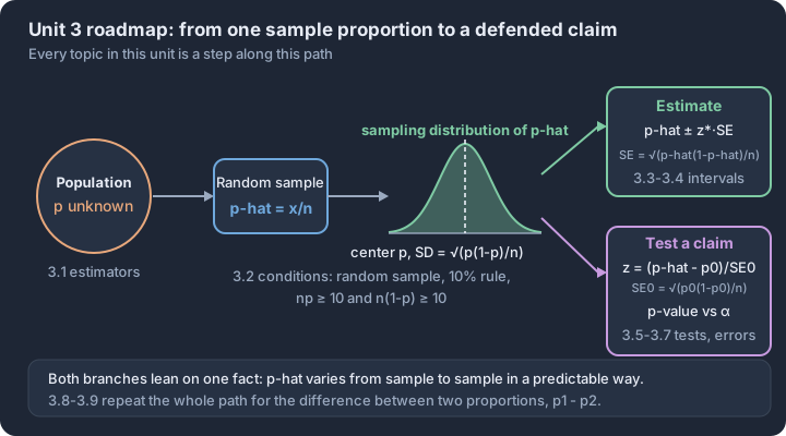
3.1 Estimators
Key concepts: Point estimate — one number from a sample standing in for a parameter · Point estimator — the rule that produces the estimate, such as p̂ = x/n · Unbiased estimator — centers on the parameter over many samples · Bias — a systematic gap between an estimator's center and the parameter · Variability — how widely estimates scatter from sample to sample · Matching pairs — p̂ estimates p, x̄ estimates μ
Statistical inference begins with a single, calculated value that serves as our best guess for a hidden truth about a population. This "best guess" is known as a point estimate, and the rule or formula we use to produce it is the point estimator.
Statistical inference begins with a single, calculated value that serves as our best guess for a hidden truth about a population. This "best guess" is known as a point estimate, and the rule or formula we use to produce it is the point estimator. In the world of categorical data, we often use the sample proportion ($\hat{p}$) to estimate the true population proportion ($p$).
The Inference Gap: Parameters vs. Statistics
To understand estimators, we must distinguish between the fixed reality of the population and the varying results of our samples. A parameter is a numerical summary of a population; it is usually unknown and fixed. A statistic is a numerical summary of a sample; it is known once we collect data, but it varies from sample to sample.
| Feature | Population Parameter | Sample Statistic (Estimator) |
|---|---|---|
| Definition | A fixed value describing the whole group. | A variable value describing a subset. |
| Notation (Proportions) | $p$ | $\hat{p}$ (read as "p-hat") |
| Notation (Means) | $\mu$ (mu) | $\bar{x}$ (x-bar) |
| Availability | Usually unknown. | Calculated from data. |
Essential Knowledge 3.1.B.1: A sample statistic is a point estimator of the corresponding population parameter and can be thought of as the estimate of the population parameter. For example, the sample proportion $\hat{p}$ is a point estimator for the population proportion $p$.
Unbiased Estimators: The "On Average" Standard
An estimator is not judged by a single result, but by its behavior over many, many repetitions. We call an estimator unbiased if, on average, the value of the estimator does not underestimate or overestimate the population parameter.
Imagine an archer (the estimator) shooting at a target (the parameter). An unbiased archer might not hit the bullseye every time—in fact, they might never hit it exactly—but their arrows are centered around the bullseye. They aren't consistently aiming too high or too far to the left.
Learning Objective 3.1.A: Justify why an estimator is or is not unbiased. [Skill 4.B] Essential Knowledge 3.1.A.1: When estimating a population parameter, an estimator is unbiased if, on average, the value of the estimator does not underestimate or overestimate the population parameter.
Worked Example: Estimating Student Preferences
Suppose a large university (the population) wants to know the proportion $p$ of students who prefer digital textbooks over print. A researcher takes a random sample of $n = 100$ students and finds that 62 prefer digital.
- Calculate the Estimate (Skill 3.D): The point estimate is the sample proportion: $$\hat{p} = \frac{\text{count of successes}}{\text{sample size}} = \frac{62}{100} = 0.62$$
- Justify the Estimator (Skill 4.B): If the researcher used a random sampling method, $\hat{p}$ is an unbiased estimator of $p$. This means that if we took thousands of random samples of 100 students, the average of all those different $\hat{p}$ values would equal the true population proportion $p$.
Misconception Clinic
The Misconception: "An unbiased estimator always gives an accurate result." The Reality: "Unbiased" refers to the process, not a single outcome. A single sample proportion ($\hat{p} = 0.62$) might be quite far from the truth due to sampling variability. However, because the estimator is unbiased, we know the method isn't systematically "rigged" to favor high or low values.
The Misconception: "Increasing the sample size ($n$) makes an estimator unbiased." The Reality: Bias is usually a result of poor study design (like convenience sampling). If your method is biased (e.g., only asking students in the computer lab about digital books), taking a larger sample just gives you a more "precisely wrong" estimate. Bias and variability are two different problems.
Accuracy vs. Precision
In statistical practice, we want estimators that are both unbiased (accurate) and have low variability (precise).
- Bias is a measure of center: Is the sampling distribution centered at the parameter?
- Variability is a measure of spread: How much do the statistics fluctuate from sample to sample?
Interpretation Check
A quality control manager at a lightbulb factory tests a random sample of 50 bulbs and finds that 2 are defective.
- Identify the point estimator being used.
- Calculate the point estimate.
- If the manager used a biased sampling method (e.g., only testing bulbs from the "reject" bin), will the average of many such samples likely equal the true factory-wide defect rate?
Check your reasoning: 1. The sample proportion ($\hat{p}$). 2. $\hat{p} = 2/50 = 0.04$. 3. No; the average would likely overestimate the true parameter because the sampling method systematically favors defective bulbs.
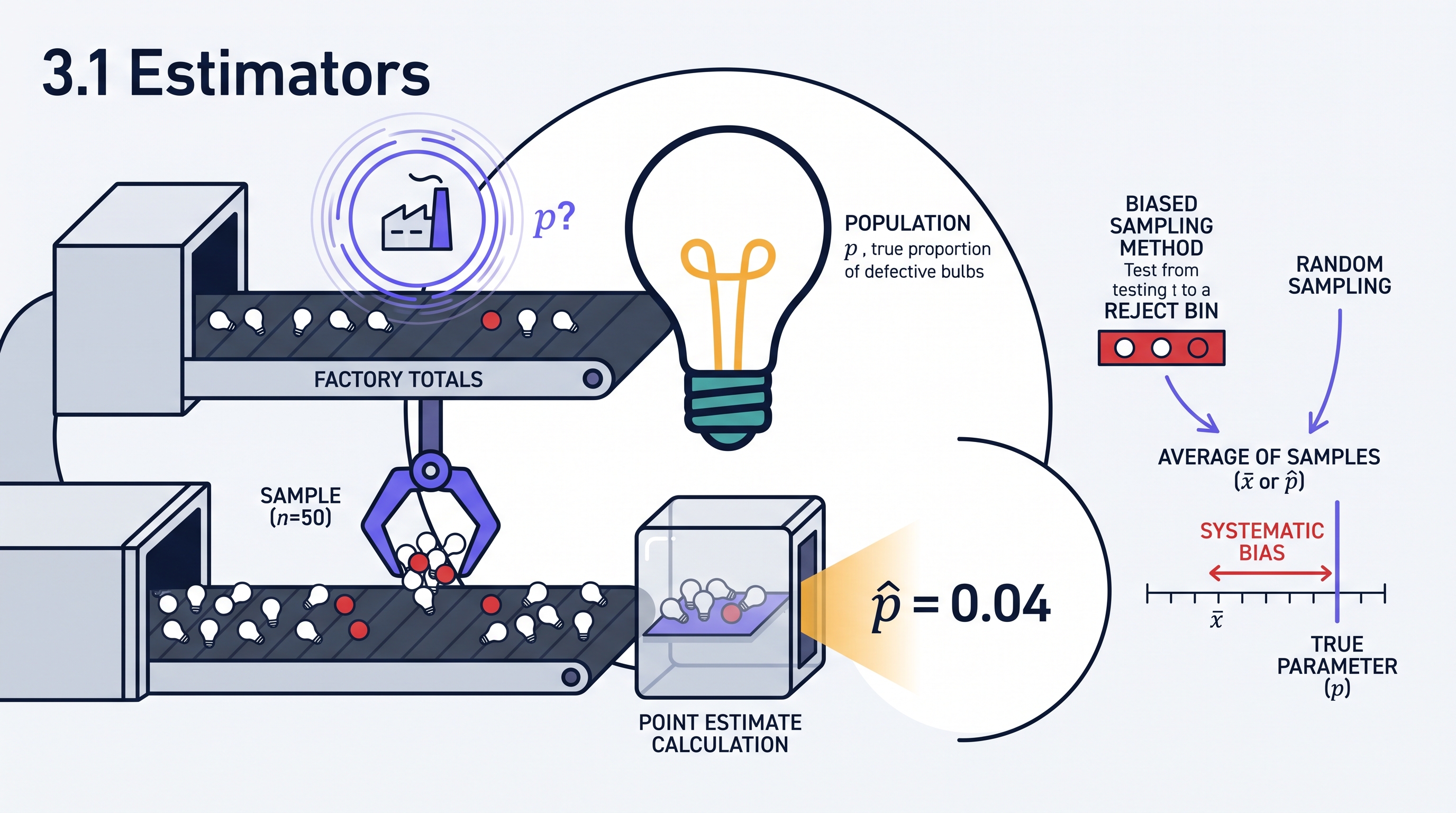
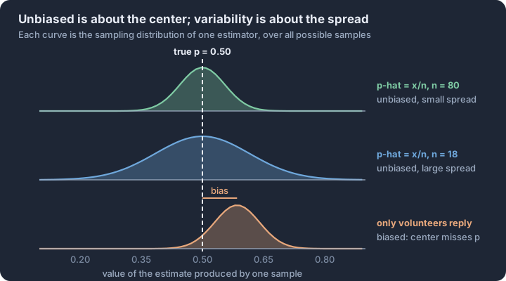
3.2 Sampling Distributions for Sample Proportions
Key concepts: Mean of the sampling distribution: μ of p̂ equals p · Standard deviation of p̂: √(p(1−p)/n) · Randomization condition — the data come from a random sample · 10% condition — sample no more than a tenth of the population · Large-counts condition — np ≥ 10 and n(1−p) ≥ 10 · Interpreting p̂ probabilities — how unusual a sample result would be
When we take a random sample from a population, the sample proportion $\hat{p}$ is rarely identical to the true population proportion $p$.
When we take a random sample from a population, the sample proportion $\hat{p}$ is rarely identical to the true population proportion $p$. If we were to take thousands of samples of the same size, the resulting collection of $\hat{p}$ values would form a predictable pattern known as the sampling distribution of a sample proportion. This distribution allows us to quantify how much a sample statistic is likely to vary from the population parameter, providing the mathematical foundation for all categorical inference.
3.2.A Parameters of the Sampling Distribution (Skill 3.D, EK 3.2.A.1)
The sampling distribution of $\hat{p}$ is characterized by two primary parameters: its center (mean) and its spread (standard deviation). These parameters are determined by the population proportion $p$ and the sample size $n$.
Mean of the Sampling Distribution ($\mu_{\hat{p}}$): The mean of all possible sample proportions is equal to the population proportion. $$\mu_{\hat{p}} = p$$ This confirms that $\hat{p}$ is an unbiased estimator of $p$.
Standard Deviation of the Sampling Distribution ($\sigma_{\hat{p}}$): The standard deviation measures the "typical" distance between a sample proportion $\hat{p}$ and the population proportion $p$. $$\sigma_{\hat{p}} = \sqrt{\frac{p(1-p)}{n}}$$ As the sample size $n$ increases, the standard deviation decreases, meaning larger samples provide more precise estimates of the population parameter.
3.2.B Justifying Conditions for Inference (Skill 4.E, EK 3.2.B.1)
To use the Normal distribution as a model for the sampling distribution of $\hat{p}$, we must justify that specific conditions are met. These conditions ensure that our calculations for standard deviation are valid and that the shape of the distribution is approximately Normal.
| Condition | Requirement | Statistical Justification |
|---|---|---|
| Random | Data must come from a random sample or randomized experiment. | Allows us to generalize results to the population and reduces bias. |
| Independent / 10% Rule | If sampling without replacement, $n \le 0.10N$. | Ensures that the probabilities of success remain approximately constant between trials, justifying the use of the $\sigma_{\hat{p}}$ formula. |
| Large Counts | $np \ge 10$ and $n(1-p) \ge 10$. | Ensures the sample size is large enough that the sampling distribution of $\hat{p}$ is approximately Normal. |
Misconception: The "Large Population" Fallacy
A common error is believing that a sample must be a large percentage of the population to be accurate. In reality, the variability of a sample statistic depends almost entirely on the sample size $n$, not the population size $N$, provided the 10% condition is met. A sample of 1,000 voters in a city of 50,000 provides nearly the same precision as a sample of 1,000 voters in a country of 300 million.
3.2.C Interpreting Results and Probabilities (Skill 4.D)
Interpreting the sampling distribution requires moving beyond calculation to contextual meaning. When we calculate $\sigma_{\hat{p}}$, we are describing the sampling variability.
Interpretation Template for $\sigma_{\hat{p}}$: "In repeated random samples of size $n$ from this population, the sample proportion of [context] will typically vary by about [value of $\sigma_{\hat{p}}$] from the true population proportion $p$."
Worked Example: Customer Satisfaction
A large airline claims that 80% ($p = 0.80$) of its customers are satisfied with their flight experience. A consumer advocacy group takes a random sample of 100 customers ($n = 100$).
-
Check Conditions:
- Random: The problem states a random sample was taken.
- 10% Rule: It is reasonable to assume there are more than $10(100) = 1,000$ customers in the airline's population.
- Large Counts: $100(0.80) = 80 \ge 10$ and $100(0.20) = 20 \ge 10$. The distribution of $\hat{p}$ is approximately Normal.
-
Calculate Parameters:
- $\mu_{\hat{p}} = 0.80$
- $\sigma_{\hat{p}} = \sqrt{\frac{0.80(0.20)}{100}} = 0.04$
-
Analyze a Result: Suppose the sample resulted in $\hat{p} = 0.70$. This value is 2.5 standard deviations below the mean ($z = \frac{0.70 - 0.80}{0.04} = -2.5$). Using Normal calculations, the probability of obtaining a sample proportion of 0.70 or less is approximately 0.0062. Because this probability is so low, it provides strong evidence that the airline's claim of 80% satisfaction may be an overestimate.
Interpretation Check
A local health department believes that 25% of residents in a large city are smokers ($p = 0.25$). A researcher takes a random sample of 30 residents ($n = 30$).
Question: Can the researcher use a Normal distribution to calculate the probability that more than 30% of the sample are smokers? Justify your answer.
Analysis: To use the Normal distribution, the Large Counts condition must be satisfied.
- $np = 30(0.25) = 7.5$
- $n(1-p) = 30(0.75) = 22.5$
Conclusion: No. Since $np = 7.5$, which is less than 10, the Large Counts condition is not met. The sampling distribution of the sample proportion will be skewed to the right and cannot be accurately modeled by a Normal distribution.
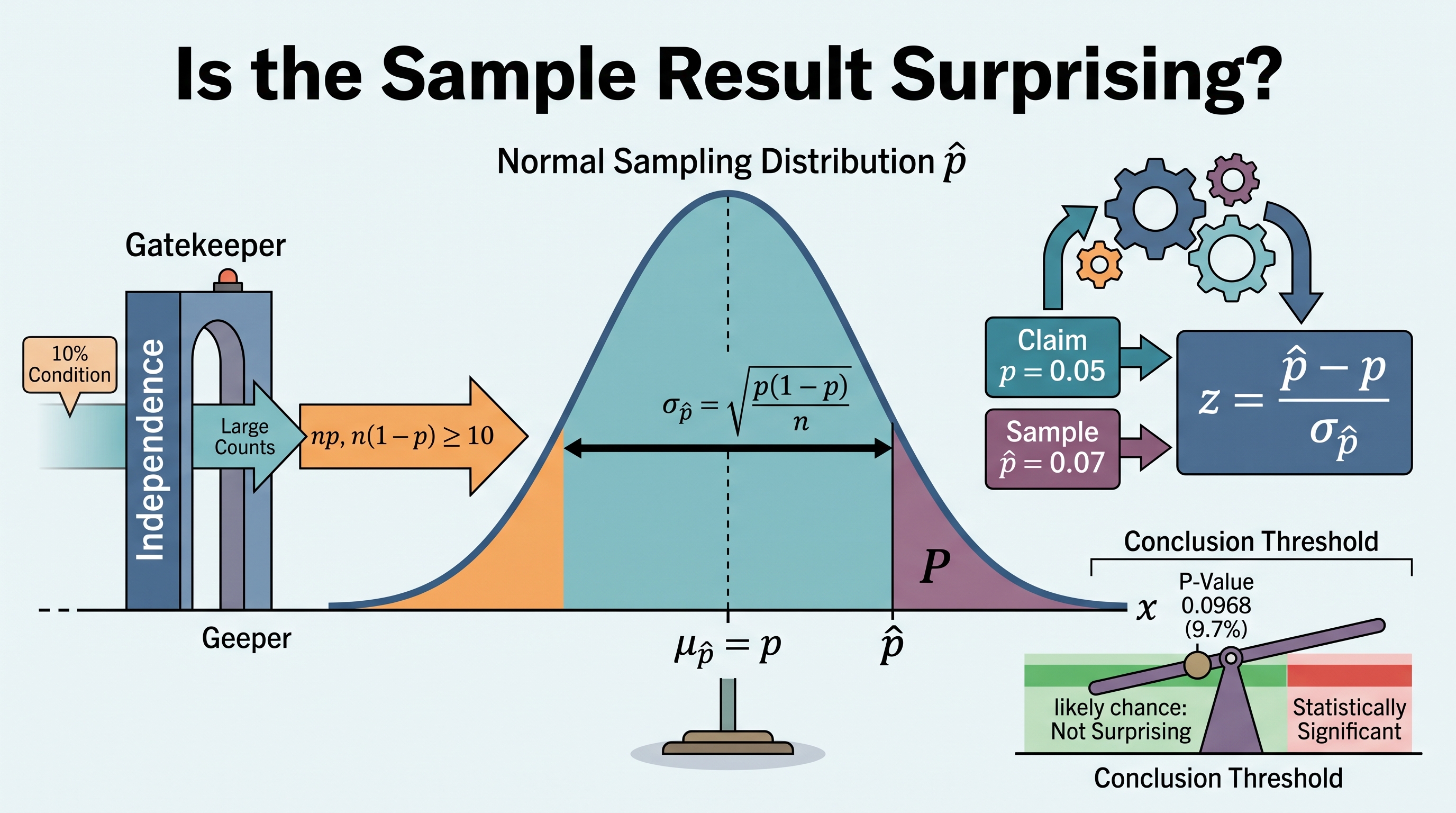
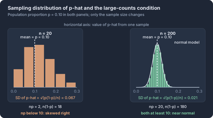
3.3 Constructing a Confidence Interval for a Population Proportion
Key concepts: One-sample z-interval — the procedure for a single population proportion · Parameter in context — proportion, response variable and population named · Conditions — random sample, 10% rule, at least 10 successes and failures · Standard error — SE = √(p̂(1−p̂)/n), the estimated spread of p̂ · Critical value z* — cuts off the middle C% of the standard normal · Margin of error z*·SE, and n ≈ (z*/MOE)²p̂(1−p̂) for a target margin
A point estimate, such as a sample proportion ($\hat{p}$), provides a single "best guess" for a population parameter. However, because of sampling variability, we know this single value is almost certainly not exactly equal to the true population proportion ($p$).
A point estimate, such as a sample proportion ($\hat{p}$), provides a single "best guess" for a population parameter. However, because of sampling variability, we know this single value is almost certainly not exactly equal to the true population proportion ($p$). To account for this uncertainty, we construct a confidence interval: an interval of plausible values for the parameter, calculated from sample data. For a single population proportion, the standard procedure is the one-sample $z$-interval for a population proportion.
The Anatomy of an Interval
The construction of a confidence interval follows a consistent logic: take the point estimate and add/subtract a margin of error (MOE). This margin of error represents the maximum expected difference between the sample statistic and the population parameter at a specific confidence level.
The General Formula: $$\text{Point Estimate} \pm \text{Margin of Error}$$ $$\hat{p} \pm (z^*)(\text{SE}_{\hat{p}})$$
Components of the Calculation
- Point Estimate ($\hat{p}$): The proportion of successes observed in the sample.
- Critical Value ($z^*$): A multiplier based on the desired confidence level. It represents how many standard deviations you must move away from the mean of a standard Normal distribution to capture the central $C%$ of the area. For a $95%$ confidence level, $z^* \approx 1.96$.
- Standard Error ($\text{SE}_{\hat{p}}$): Since the true population proportion $p$ is unknown, we cannot calculate the true standard deviation of the sampling distribution. Instead, we use the sample proportion to estimate it: $\text{SE}_{\hat{p}} = \sqrt{\frac{\hat{p}(1 - \hat{p})}{n}}$.
Justifying the Method: Verifying Conditions
Before calculating, we must justify the use of the $z$-interval by verifying three critical conditions. If these are not met, the resulting interval may be misleading or mathematically invalid.
| Condition | Requirement | Statistical Purpose |
|---|---|---|
| Random | Data must come from a random sample or a randomized experiment. | Ensures the sample is representative and the estimator is unbiased. |
| Independent | When sampling without replacement, the sample size $n$ should be $\le 10%$ of the population $N$. | Allows us to use the standard error formula as if observations were independent. |
| Normal (Large Counts) | Both $n\hat{p} \ge 10$ and $n(1 - \hat{p}) \ge 10$. | Ensures the sampling distribution of $\hat{p}$ is approximately Normal, justifying the use of $z^*$. |
Worked Example: The Urban Transit Study
Suppose a city planner wants to estimate the proportion of residents who support a new bike lane. A random sample of $200$ residents finds that $114$ support the proposal. Construct a $95%$ confidence interval for the true proportion of all residents who support the lane.
- Identify Procedure: One-sample $z$-interval for $p$.
- Verify Conditions:
- Random: Stated as a random sample.
- Independent: $200$ is likely less than $10%$ of all city residents.
- Normal: $n\hat{p} = 114 \ge 10$ and $n(1-\hat{p}) = 86 \ge 10$. Conditions met.
- Calculate:
- $\hat{p} = 114/200 = 0.57$
- $\text{SE}_{\hat{p}} = \sqrt{\frac{0.57(0.43)}{200}} \approx 0.035$
- $\text{Interval} = 0.57 \pm 1.96(0.035) = 0.57 \pm 0.0686$
- Result: $(0.5014, 0.6386)$
Determining Sample Size
Often, researchers want to ensure their margin of error does not exceed a specific value. We can rearrange the MOE formula to solve for the required sample size $n$: $$n = \frac{(z^*)^2 \hat{p}(1 - \hat{p})}{(MOE)^2}$$
The Conservative Approach
If you are planning a study and do not yet have a sample proportion ($\hat{p}$), you should use $\hat{p} = 0.5$. This value provides the largest possible product for $\hat{p}(1-\hat{p})$, ensuring the calculated $n$ is large enough to meet the MOE requirement regardless of what the actual proportion turns out to be.
Misconception Check: The "Probability" Trap
A common error is to claim there is a "$95%$ probability" that the true proportion $p$ falls within a specific calculated interval (e.g., $0.50$ to $0.64$). This is incorrect. Once the interval is calculated, the true $p$ is either in it or it isn't—there is no longer any "probability" involved for that specific set of numbers. The $95%$ refers to the process: if we took many random samples and built many intervals, approximately $95%$ of them would successfully capture the true population proportion.
Interpretation Check
A researcher calculates a $90%$ confidence interval for a proportion to be $(0.22, 0.30)$. If the researcher wanted to reduce the margin of error to half its current size while keeping the same confidence level, by what factor would they need to increase the sample size?
Check your reasoning: Since the width of the interval is approximately proportional to $1/\sqrt{n}$, reducing the MOE by half requires increasing the sample size by a factor of $4$ (because $\sqrt{4} = 2$).

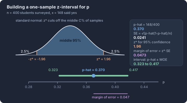
3.4 Justifying a Claim Based on a Confidence Interval for a Population Proportion
Key concepts: Interpreting an interval — C% confident it captures the population proportion · Confidence level describes the method — C% of intervals capture p · Any one interval either contains p or does not · Plausible values — a claim inside the interval is not contradicted · Raising the confidence level raises z*, widening the interval · Larger samples narrow the interval, roughly like 1/√n
A confidence interval is more than a mathematical result; it is a boundary of plausibility that allows us to evaluate claims about a population.
A confidence interval is more than a mathematical result; it is a boundary of plausibility that allows us to evaluate claims about a population. While a point estimate provides a single "best guess" for a population proportion ($p$), the interval provides a range of values that are consistent with the observed data. This allows statisticians to move beyond simple estimation and begin the process of statistical inference—using sample data to make defensible statements about the truth of a population.
Interpreting the Confidence Interval (Skill 4.F)
When we report a confidence interval, we are communicating the precision of our estimate and our level of certainty. A standard interpretation must include three components: the confidence level, the numerical boundaries, and the parameter in context. The formal phrasing is: "We are $C%$ confident that the interval from $a$ to $b$ captures the true population proportion of [context]."
The term "confident" in this context does not refer to a probability that the specific calculated interval contains the parameter. Because the population proportion $p$ is a fixed (though unknown) value, and the interval $(a, b)$ is also fixed once calculated, the parameter is either inside the interval or it is not. There is no "chance" involved after the data is collected. Instead, our confidence stems from the reliability of the statistical process used to generate the interval.
Interpreting the Confidence Level (Skill 2.D)
The confidence level ($C%$) describes the long-run success rate of the method. If we were to take many random samples of the same size from the same population and construct a $C%$ confidence interval from each sample, approximately $C%$ of those intervals would successfully capture the true population proportion $p$.
It is a critical distinction: the confidence interval tells us about the parameter, while the confidence level tells us about the performance of the estimator over time. A $95%$ confidence level implies that in the long run, the process will "miss" the true proportion $5%$ of the time. This inherent risk of error is a fundamental aspect of statistical inference (Skill 2.D), as any single interval may or may not contain the true value.
Justifying a Claim (Skill 4.G)
Statistical claims often take the form of a specific value, such as "more than half of voters support the measure" ($p > 0.5$) or "the defect rate is exactly $2%$" ($p = 0.02$). We can use a confidence interval to evaluate these claims by checking if the claimed value falls within our calculated range.
- Plausible Values: Any value inside the confidence interval is considered a plausible value for the population proportion based on the sample data.
- Evidence Against a Claim: If a claimed value falls entirely outside the confidence interval, we have statistically significant evidence to reject or doubt that claim at the corresponding alpha level.
Contextual Example: The School Cafeteria Claim
A student government leader claims that exactly $75%$ of students are satisfied with the new cafeteria menu. A random sample of students is surveyed, and a $95%$ confidence interval for the proportion of satisfied students is calculated to be $(0.62, 0.71)$.
To justify a conclusion (Skill 4.G), we observe that the claimed value of $0.75$ is not contained within the interval $(0.62, 0.71)$. Therefore, the interval provides evidence that the true proportion of satisfied students is likely lower than $75%$. We are $95%$ confident that the true proportion is between $62%$ and $71%$, making the claim of $75%$ implausible.
Misconception Check: The "Probability" Trap
A common error is stating that there is a "$95%$ probability that the true proportion is between $0.62$ and $0.71$." This is incorrect. The true proportion $p$ is a constant. Once the interval is set, the probability of it containing $p$ is either $1$ (it does) or $0$ (it doesn't). The $95%$ refers to our confidence in the procedure, not the specific interval's probability.
Interpretation Check
A local environmental group constructs a $90%$ confidence interval for the proportion of households that recycle, resulting in $(0.44, 0.52)$. A city official claims that a majority of households recycle. Does the interval support this claim?
Interpretation: No. A "majority" requires the proportion to be greater than $0.50$. While the interval includes some values above $0.50$ (like $0.51$), it also includes many values that are not a majority (like $0.45$). Because the interval contains values both above and below $0.50$, we do not have convincing evidence that a majority of households recycle. We are $90%$ confident that the true proportion of households that recycle is between $44%$ and $52%$.
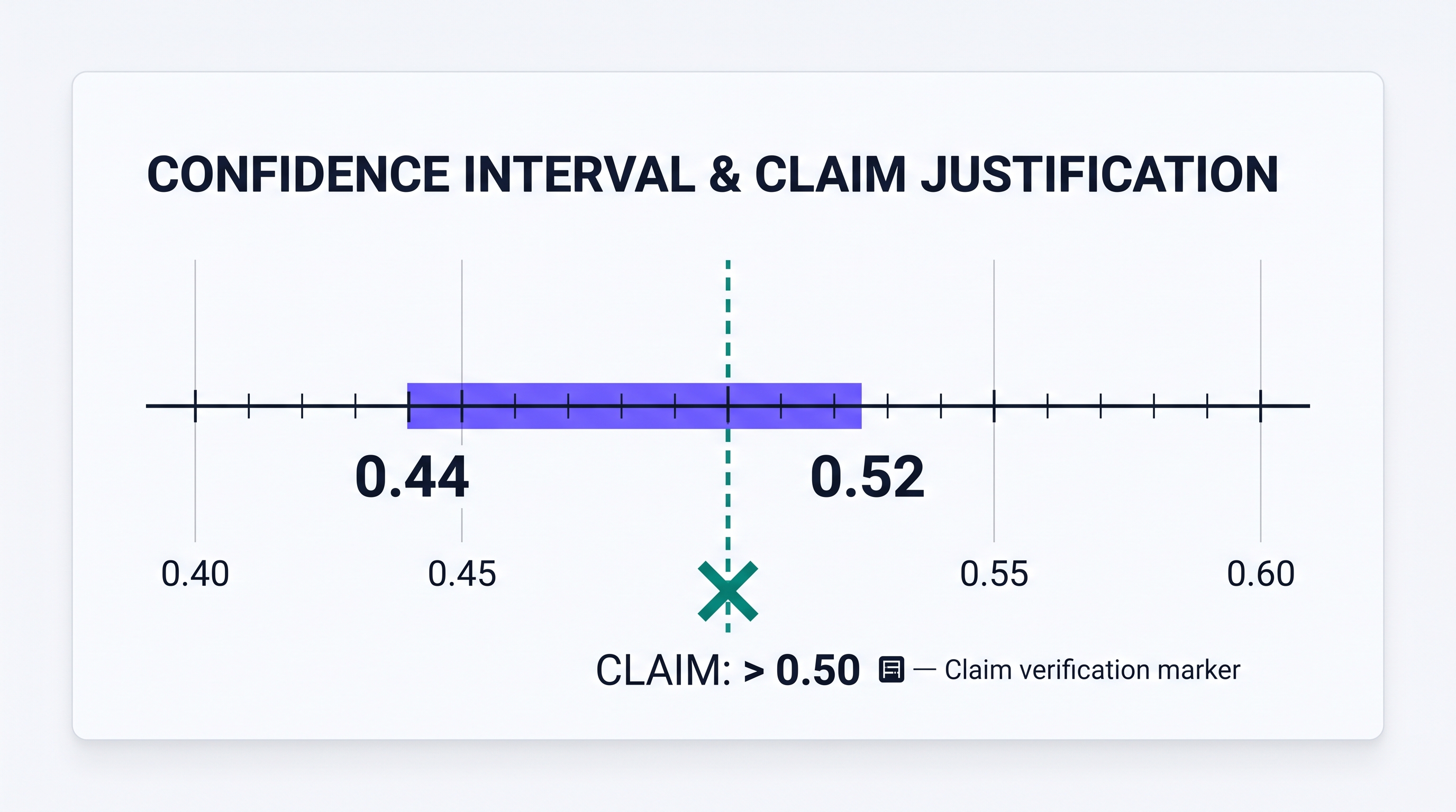
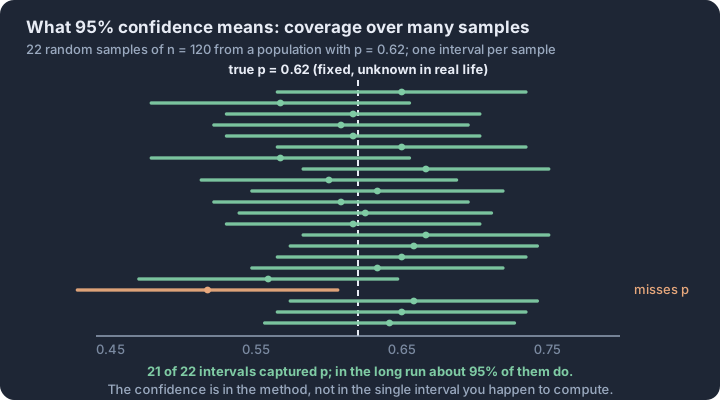
3.5 Setting Up a Test for a Population Proportion
Key concepts: One-sample z-test for p — deciding about a single population proportion · Parameter statement — the population, the response variable, and p in context · Null hypothesis H₀: p = p₀ — the status-quo value assumed true · Alternative hypothesis — one-sided (< or >) versus two-sided (≠) · Hypotheses are claims about the parameter p, never about p̂ · Conditions — random sample, 10% rule, both expected counts ≥ 10
A statistical claim is only as strong as the evidence required to overturn it. When a manufacturer asserts that 95% of their components are defect-free, or a pollster claims that a majority of voters support a new policy, they are setting a baseline for the truth.
A statistical claim is only as strong as the evidence required to overturn it. When a manufacturer asserts that 95% of their components are defect-free, or a pollster claims that a majority of voters support a new policy, they are setting a baseline for the truth. In statistics, we don't simply "check" if these numbers are right; we mount a formal challenge using a one-sample z-test for a population proportion. This procedure allows us to determine if an observed sample result is so unlikely—under the assumption that the claim is true—that we must reject the claim entirely.
The Inference Framework: One-Sample z-test
The one-sample z-test for a population proportion is the standard inference method used to make a decision about the value of a single population parameter $p$. This method (Skill 2.C) is appropriate when the data consists of a single categorical variable (success/failure) from one population. The goal is to move from a specific sample statistic ($\hat{p}$) to a generalized conclusion about the entire population.
To set up this test correctly, we must first precisely define the parameter of interest. A well-defined parameter (EK 3.5.A.2) must reference three things:
- The Population: Who or what are we studying? (e.g., "all registered voters in Ohio")
- The Response Variable: What characteristic are we measuring? (e.g., "support for the school bond")
- The Parameter Type: Since we are dealing with categorical data, this is the proportion ($p$).
Defining the Challenge: Null and Alternative Hypotheses
Every significance test is built on a pair of competing statements known as hypotheses (Skill 2.E). These statements are always about the population parameter ($p$), never about the sample statistic ($\hat{p}$). We act as a "statistical jury," assuming the defendant (the null hypothesis) is innocent until proven guilty by the evidence.
- Null Hypothesis ($H_0$): This is the "no change" or "status quo" claim. it asserts that the population proportion is equal to a specific claimed value, denoted as $p_0$.
- Notation: $H_0: p = p_0$
- Alternative Hypothesis ($H_a$): This is the claim we are looking for evidence to support. It represents a departure from the null in a specific direction.
- One-sided (Greater than): $H_a: p > p_0$ (The true proportion is higher than claimed).
- One-sided (Less than): $H_a: p < p_0$ (The true proportion is lower than claimed).
- Two-sided (Not equal to): $H_a: p \neq p_0$ (The true proportion is simply different than claimed).
Justifying the Method: Verifying Conditions
Before we can calculate a test statistic or a p-value, we must justify the use of the z-test by verifying three critical conditions (Skill 4.E). If these conditions are not met, the resulting probabilities may be misleading.
- Random: The data must come from a well-designed random sample or a randomized experiment. This allows us to generalize our findings to the population and ensures that the sample is not systematically biased.
- 10% Rule (Independence): When sampling without replacement from a finite population, the sample size $n$ should be no more than 10% of the population size $N$ ($n \leq 0.10N$). This allows us to treat individual observations as independent.
- Large Counts (Normality): To use the Normal distribution for our calculations, the expected number of successes and failures must both be at least 10. Crucially, we use the hypothesized proportion ($p_0$) for this check:
- $np_0 \geq 10$
- $n(1 - p_0) \geq 10$
Misconception Check: $p$ vs. $\hat{p}$ A common error is using the sample proportion ($\hat{p}$) in the hypotheses or the Large Counts condition. Remember: We already know $\hat{p}$—it’s a fact from our data. We don't need to test it. We test the unknown population parameter $p$. In the Large Counts check, we use $p_0$ because we are calculating the probability of our result assuming the null hypothesis is true.
Contextual Example: The Cafeteria Claim
A high school cafeteria manager claims that 70% of students are satisfied with the new "Meatless Monday" menu. A student leader suspects the actual satisfaction rate is lower. They survey a random sample of 150 students and find that 90 are satisfied.
1. Identify Parameter: Let $p$ = the true proportion of all students at this school who are satisfied with the new menu. 2. State Hypotheses:
- $H_0: p = 0.70$
- $H_a: p < 0.70$ 3. Verify Conditions:
- Random: The scenario states a "random sample" was used.
- 10%: It is reasonable to assume there are more than 1,500 students at a large high school ($150 \leq 0.10N$).
- Large Counts: $150(0.70) = 105 \geq 10$ and $150(0.30) = 45 \geq 10$. The condition is met.
Retrieval Check: Suppose a researcher wants to test if a new medication has a different success rate than the current standard of 40%. They sample 100 patients.
- What is the appropriate null hypothesis?
- What is the appropriate alternative hypothesis?
- In the Large Counts condition, what value of $p$ should be multiplied by $n$?
(Answer: 1. $H_0: p = 0.40$; 2. $H_a: p \neq 0.40$; 3. The hypothesized value $p_0 = 0.40$.)
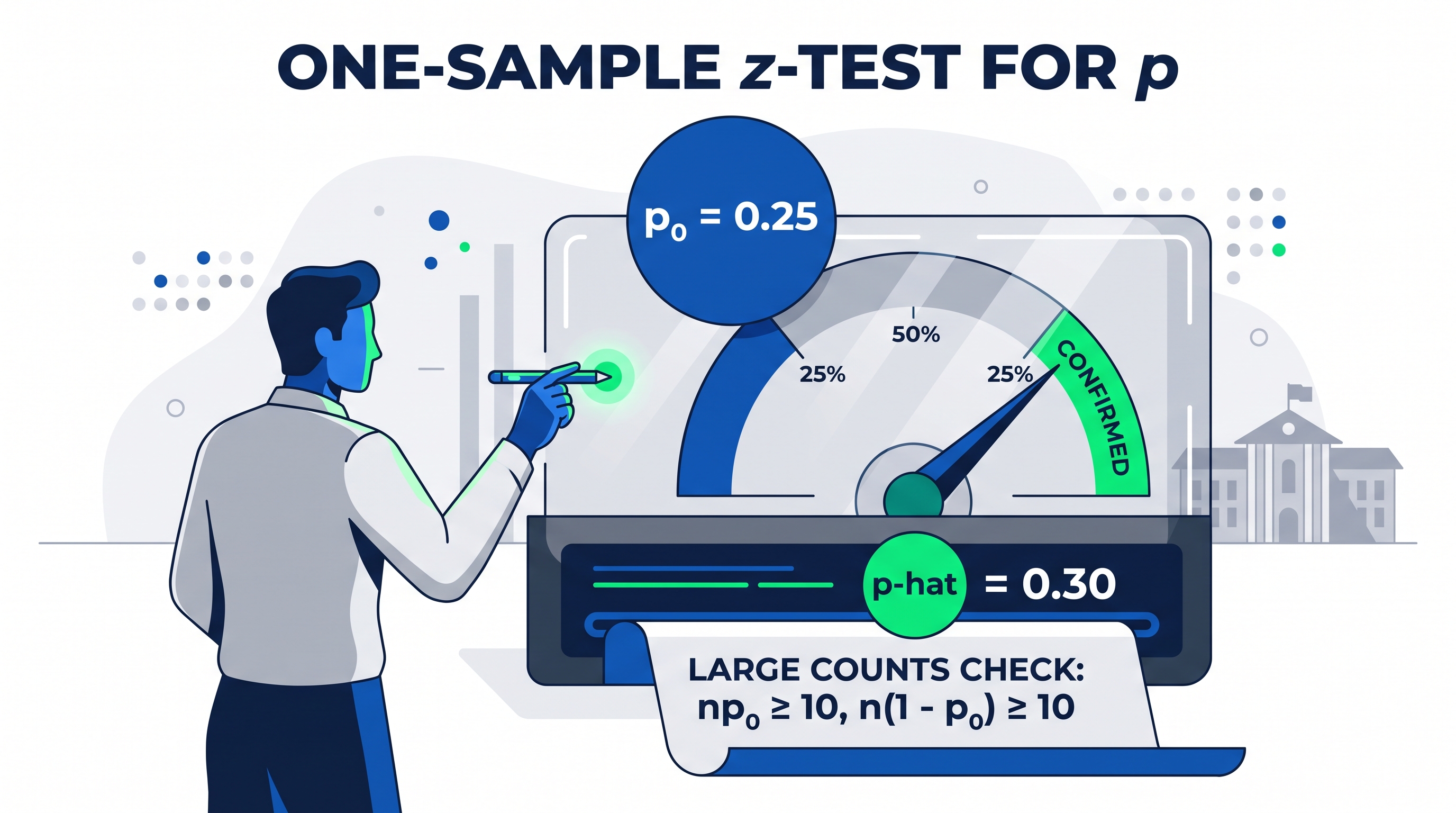
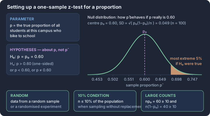
3.6 p-Values
Key concepts: p-value — chance of a result this extreme if H₀ is true · Null distribution — how the test statistic behaves if H₀ holds · Direction of “more extreme” is set by the alternative hypothesis · Two-sided p-value — twice the tail area beyond |z| · Simulated p-value — proportion of null trials at least as extreme · Small p-value is evidence for Hₐ; a large one never confirms H₀
A p-value measures the strength of evidence against a null hypothesis by quantifying how unusual the observed sample data would be if that null hypothesis were actually true.
A p-value measures the strength of evidence against a null hypothesis by quantifying how unusual the observed sample data would be if that null hypothesis were actually true. It acts as a bridge between the raw data (the test statistic) and the final conclusion, providing a standardized probability that allows statisticians to assess whether a result is likely due to the specific claim being tested or simply the result of random sampling variability.
Definition (VAR-6.D): The p-value is the probability of observing a test statistic as extreme as, or more extreme than, the value actually observed, provided that the null hypothesis ($H_0$) is true.
The Conditional Nature of p-Values
The most critical aspect of a p-value is that it is a conditional probability (VAR-6.D.1). It does not measure the probability that a hypothesis is "correct" in an absolute sense. Instead, it operates entirely within a hypothetical world where the null hypothesis is a perfect reflection of reality. We calculate the p-value by looking at the sampling distribution centered at the null parameter and determining how much of that distribution lies at or beyond our sample statistic.
Directionality and "More Extreme"
The definition of "more extreme" is not universal; it is dictated entirely by the alternative hypothesis ($H_a$) (VAR-6.D.2). The p-value represents the area in the tail(s) of the null distribution, and the direction of those tails must align with the claim we are testing:
- Right-Tailed Test ($H_a: p > p_0$): The p-value is the probability of getting a sample proportion $\hat{p}$ equal to or greater than the observed value.
- Left-Tailed Test ($H_a: p < p_0$): The p-value is the probability of getting a sample proportion $\hat{p}$ equal to or less than the observed value.
- Two-Tailed Test ($H_a: p \neq p_0$): The p-value is the probability of getting a sample proportion $\hat{p}$ that is at least as far from the null parameter $p_0$ in either direction. This is typically calculated by finding the area in one tail and doubling it.
Interpreting in Context (Skill 4.F)
To satisfy AP Skill 4.F, an interpretation must include four specific components: the condition (assuming $H_0$ is true), the probability (the p-value itself), the statistic (the observed sample result), and the direction (as extreme or more extreme).
Contextual Example: The "Lucky" Coin
Suppose a magician claims a coin is "lucky" and lands on heads more than 50% of the time. You test the null hypothesis $H_0: p = 0.50$ against the alternative $H_a: p > 0.50$. You flip the coin 50 times and observe 32 heads ($\hat{p} = 0.64$). After calculating the test statistic, you find a p-value of 0.023.
Correct Interpretation: "Assuming the coin is fair (heads 50% of the time), there is a 0.023 probability of getting a sample proportion of heads of 0.64 or greater purely by chance."
Misconception Clinic
- Incorrect: "The p-value is the probability that the null hypothesis is true."
- Correction: The p-value is calculated assuming the null is true; it cannot tell you the probability of the assumption itself.
- Incorrect: "A p-value of 0.03 means there is a 3% chance the results are due to luck."
- Correction: This implies we know the "chance of luck." The p-value only tells us how often this specific result would happen in the long run if the null model were the only thing at work.
- Incorrect: "A p-value of 0.80 proves the null hypothesis is true."
- Correction: A high p-value only means the data is consistent with the null hypothesis. It does not prove the null is the only possible explanation.
Interpretation Check
A researcher is testing whether a new medication reduces the proportion of patients who experience side effects compared to the current rate of 0.15. The hypotheses are $H_0: p = 0.15$ and $H_a: p < 0.15$. The resulting p-value is 0.042.
Which of the following is the most accurate interpretation of this p-value? A) There is a 4.2% chance that the medication does not work. B) Assuming the true side-effect rate is still 0.15, the probability of observing a sample proportion as low as or lower than the one found in this study is 0.042. C) The probability that the side-effect rate is less than 0.15 is 0.958. D) There is a 4.2% chance that the null hypothesis is false.
Check: B is correct. It maintains the conditional "assuming $H_0$ is true" and correctly identifies the direction of the alternative hypothesis ("as low as or lower").
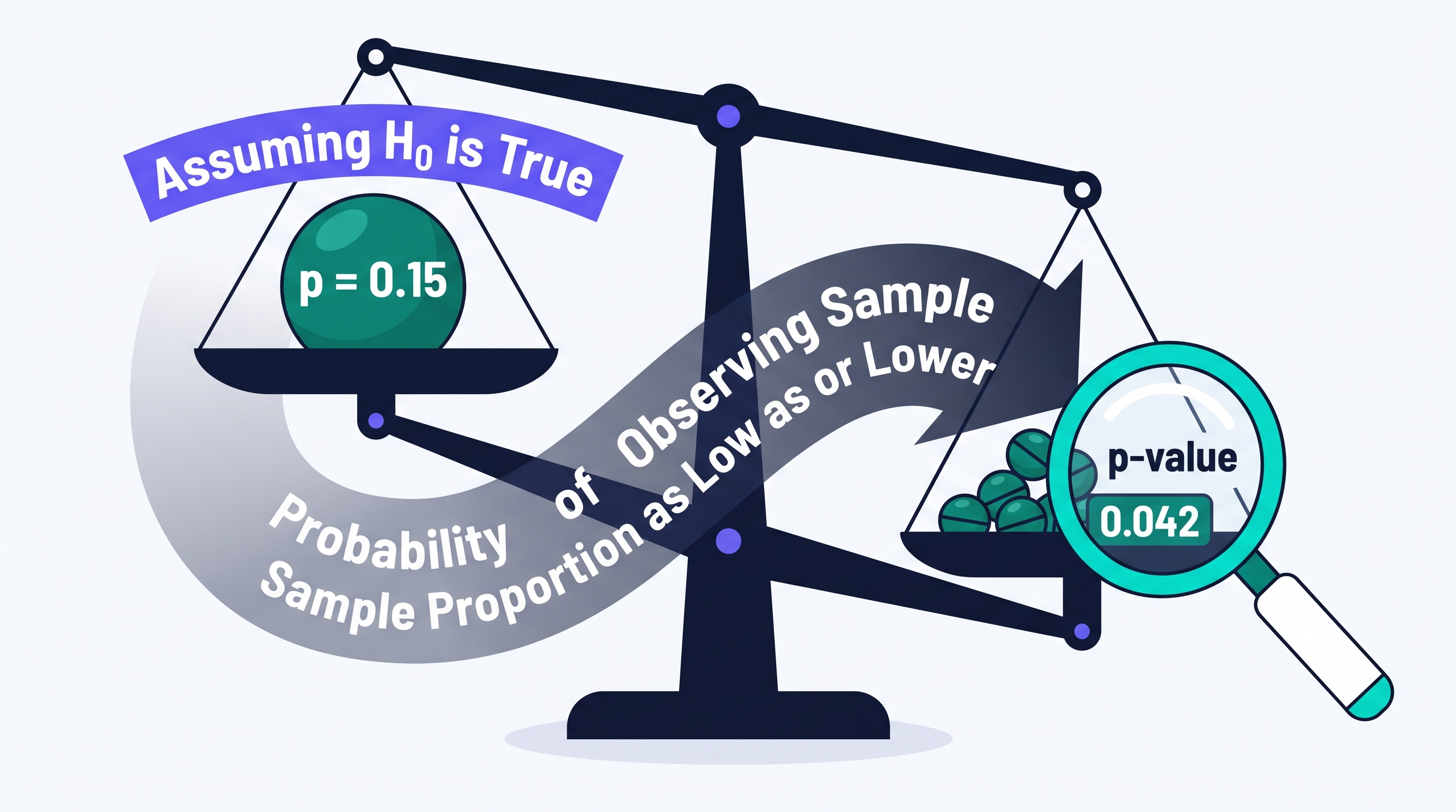
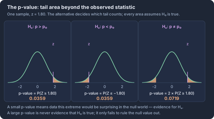
3.7 Carrying Out a Test for a Population Proportion
Key concepts: Test statistic z — how many standard errors p̂ lies from p₀ · Standard error under H₀ uses p₀, not the sample proportion · p-value read from the standard normal null distribution · Significance level α — the rejection threshold fixed before the data · Decision rule — reject H₀ when the p-value is below α · Conclusion stated in context, in terms of Hₐ, with non-definitive language
The transition from setting up a hypothesis to reaching a statistical conclusion requires a precise execution of the one-sample z-test for a population proportion.
The transition from setting up a hypothesis to reaching a statistical conclusion requires a precise execution of the one-sample z-test for a population proportion. This procedure transforms raw sample data into a standardized test statistic and a corresponding p-value, providing the mathematical weight necessary to support or refute a claim about a population. By assuming the null hypothesis ($H_0$) is true, we create a benchmark to determine if our observed sample proportion ($\hat{p}$) is a common occurrence or a rare anomaly.
The Mechanics of the Test Statistic (Skill 3.E)
To quantify how far our observed data deviates from the null hypothesis, we calculate the z-test statistic. This value represents the number of standard deviations the sample proportion ($\hat{p}$) lies from the hypothesized proportion ($p_0$). Because we perform this calculation under the assumption that $H_0$ is true, we use the null proportion, $p_0$, to calculate the standard deviation of the sampling distribution (Learning Objective 3.7.A).
The One-Sample z-Statistic for Proportions: $$z = \frac{\hat{p} - p_0}{\sqrt{\frac{p_0(1 - p_0)}{n}}}$$ Where:
- $\hat{p}$ is the sample proportion.
- $p_0$ is the hypothesized population proportion from $H_0$.
- $n$ is the sample size.
A positive $z$-score indicates the sample proportion is higher than hypothesized, while a negative $z$-score indicates it is lower. The magnitude of $z$ directly influences the p-value: the further $z$ is from zero, the smaller the p-value becomes, and the stronger the evidence against the null hypothesis (Essential Knowledge 3.6.A.4).
Determining the p-Value
The p-value is the probability of obtaining a test statistic at least as extreme as the one observed, given that the null hypothesis is true. For a population proportion, this probability is found using the standard normal distribution ($N(0, 1)$). The direction of the "extreme" values depends entirely on the alternative hypothesis ($H_a$):
| Alternative Hypothesis ($H_a$) | Direction of p-Value Calculation |
|---|---|
| $p > p_0$ (Upper-tailed) | $P(Z \ge z)$ |
| $p < p_0$ (Lower-tailed) | $P(Z \le z)$ |
| $p \neq p_0$ (Two-tailed) | $2 \times P(Z \ge |
Worked Example: Urban Green Initiatives
A city council claims that 70% of residents support a new bike lane project ($p_0 = 0.70$). A random sample of 150 residents finds that 93 support the project ($\hat{p} = 0.62$). Does this provide evidence that support is actually lower than 70%? Use $\alpha = 0.05$.
- Calculate $z$: $$z = \frac{0.62 - 0.70}{\sqrt{\frac{0.70(0.30)}{150}}} = \frac{-0.08}{0.0374} \approx -2.14$$
- Find p-value: Since $H_a: p < 0.70$, we find $P(Z \le -2.14) \approx 0.0162$.
- Compare to $\alpha$: $0.0162 \le 0.05$.
Justifying the Conclusion (Skill 4.G)
The final stage of the test is the formal conclusion. This is not merely a "yes" or "no" answer but a reasoned justification based on the comparison between the p-value and the significance level ($\alpha$). If the p-value is less than or equal to $\alpha$, we reject the null hypothesis. If the p-value is greater than $\alpha$, we fail to reject the null hypothesis.
A valid conclusion must always be stated in context, referring to the specific parameter and population being studied (Essential Knowledge 3.7.B.6). It should use non-definitive language—statistics allows us to support claims with evidence, but it does not "prove" them with absolute certainty.
Conclusion Template: "Because the p-value ([value]) is [less than/greater than] $\alpha = [value]$, we [reject/fail to reject] the null hypothesis. There is [sufficient/insufficient] evidence to suggest that the true proportion of [population] who [context] is [direction of $H_a$] [hypothesized value]."
Misconception Check: The "Acceptance" Trap
A common error is stating that we "accept the null hypothesis" or that the data "proves the null hypothesis is true." In statistical inference, failing to find convincing evidence against $H_0$ is not the same as proving $H_0$ is correct. It simply means the observed result is plausible under the null assumption (Essential Knowledge 3.6.A.5). Always use the phrase "fail to reject."
Retrieval Check
In a test where $H_0: p = 0.5$ and $H_a: p \neq 0.5$, a researcher calculates a test statistic of $z = 2.05$.
- Is the p-value for this two-tailed test approximately 0.02 or 0.04?
- If $\alpha = 0.05$, what is the formal decision regarding the null hypothesis?
(Check: 1. Approximately 0.04, because $2 \times P(Z \ge 2.05) \approx 2 \times 0.0202$. 2. Reject the null hypothesis, as $0.04 < 0.05$.)
Would you like a summary of the next topic, which covers the potential errors (Type I and Type II) that can occur during this decision-making process?
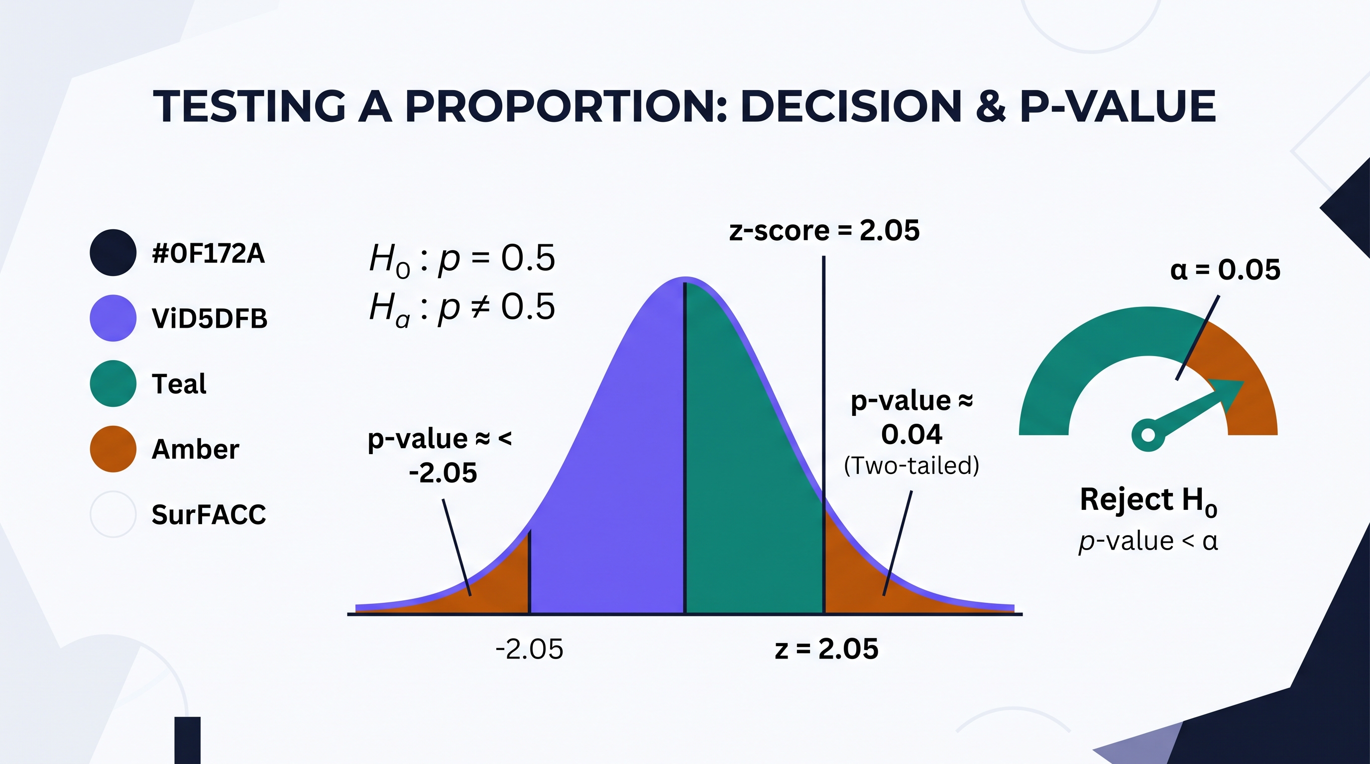
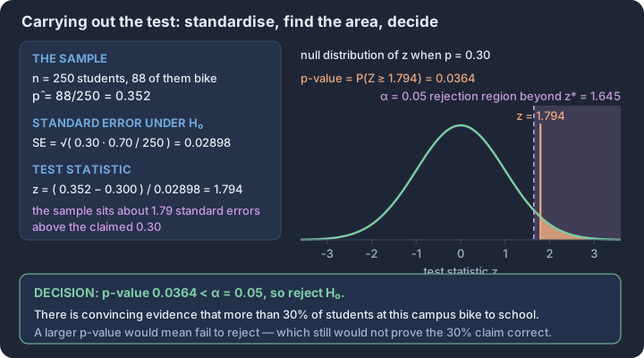
3.8 Potential Errors When Performing Tests
Key concepts: Type I error — rejecting a null hypothesis that is actually true · Type II error — missing an alternative hypothesis that is actually true · P(Type I error) = α, fixed before any data are collected · Power = 1 − β — correctly rejecting a false null hypothesis · Power rises with larger n, smaller SE, or larger α · Which error costs more drives the choice of α and n
In the theater of statistical inference, a p-value is not a verdict of absolute truth; it is a measure of evidence. Because we rely on random samples to draw conclusions about entire populations, there is always a non-zero probability that our sample is an outlier—a "fluke" that leads us…
In the theater of statistical inference, a p-value is not a verdict of absolute truth; it is a measure of evidence. Because we rely on random samples to draw conclusions about entire populations, there is always a non-zero probability that our sample is an outlier—a "fluke" that leads us to the wrong conclusion. Understanding the architecture of these mistakes is the difference between blindly following a calculator and performing rigorous science.
The Two Faces of Error
When we perform a significance test, we choose between two competing hypotheses: the null ($H_0$) and the alternative ($H_a$). This creates four possible outcomes based on the reality of the population versus the decision we make. Two of these outcomes are correct, and two are errors.
Type I Error [3.8.A.1]: Occurs when we find convincing statistical evidence for the alternative hypothesis (a small p-value), but the null hypothesis is actually true. This is often called a "false positive."
Type II Error [3.8.A.2]: Occurs when we do not find convincing statistical evidence for the alternative hypothesis (a large p-value), but the alternative hypothesis is actually true. This is often called a "false negative."
Contextual Mechanics: The Vaccine Trial
To develop Skill 3.C, let’s examine a clinical trial for a new shingles vaccine. Suppose the current standard vaccine has a success rate of $p = 0.80$. Researchers want to know if their new formula is more effective ($H_a: p > 0.80$). They administer the vaccine to a random sample of $n = 200$ patients and find that 174 recovered without symptoms ($\hat{p} = 0.87$).
To assess the evidence, we calculate the test statistic and p-value:
- Standard Error: $SE = \sqrt{\frac{0.80(1-0.80)}{200}} \approx 0.0283$
- Test Statistic ($z$): $z = \frac{0.87 - 0.80}{0.0283} \approx 2.47$
- p-value: $P(Z > 2.47) \approx 0.0068$
At a significance level of $\alpha = 0.05$, since $0.0068 < 0.05$, the researchers reject $H_0$. They conclude there is convincing evidence the new vaccine is better. However, they must consider the potential for error (Skill 2.D):
- If this is a Type I Error: The new vaccine is actually no better than the old one ($p = 0.80$), but this specific sample of 200 people happened to be unusually healthy or responsive. The consequence is wasting resources on a vaccine that doesn't actually improve outcomes.
- If this is a Type II Error: The researchers would have failed to reject $H_0$ (if, for instance, $\hat{p}$ had been lower). If the vaccine truly was better, a Type II error would mean a superior medical treatment is abandoned, and patients miss out on better protection.
Statistical Power and Its Drivers [3.8.C]
While $\alpha$ (the significance level) represents the probability of a Type I error, we use $\beta$ to represent the probability of a Type II error. This leads to one of the most vital concepts in research design: Power.
Power [3.8.C.1]: The probability that a test will correctly reject a false null hypothesis. Mathematically, $\text{Power} = 1 - \beta$. It is the "sensitivity" of your test—its ability to detect an effect that actually exists.
To assess a claim or meaning (Skill 4.D), we must understand what makes power go up or down. If a study has low power, it is "blind" to the truth; even if the alternative hypothesis is true, the test is unlikely to produce a significant result.
| Factor | Change | Effect on Power | Why? |
|---|---|---|---|
| Sample Size ($n$) | Increase | Increase | Larger samples reduce variability ($SE$), making the sampling distribution narrower and easier to distinguish from the null. |
| Significance Level ($\alpha$) | Increase | Increase | A larger $\alpha$ (e.g., 0.10 instead of 0.01) makes it easier to reject $H_0$, which catches more true effects but increases Type I error risk. |
| Effect Size | Increase | Increase | If the true population parameter is very far from the null value, the "truth" is easier to see. |
The Inverse Relationship
There is a fundamental trade-off in inference. If you decrease the probability of a Type I error (by lowering $\alpha$), you automatically increase the probability of a Type II error ($\beta$), which decreases power. You cannot decrease both simultaneously without increasing the sample size.
Misconception Check: "Proving" the Null
A common error in interpretation is claiming that a large p-value "proves" the null hypothesis is true. This is incorrect. A large p-value simply means we lacked "convincing evidence" to reject the status quo. In the context of errors, a large p-value might just be a Type II error—the effect was there, but our test wasn't powerful enough to catch it. Always use non-definitive language: "We fail to reject the null" rather than "The null is true."
Interpretation Check A researcher is testing a new "eco-friendly" lightbulb that claims to last longer than the current 1,000-hour average ($H_a: \mu > 1000$). After testing a sample, they obtain a p-value of 0.12 and fail to reject $H_0$ at the $\alpha = 0.05$ level.
- If the new bulbs actually do last 1,200 hours on average, what type of error did the researcher commit?
- How would increasing the number of bulbs tested (sample size) have changed the probability of this error?
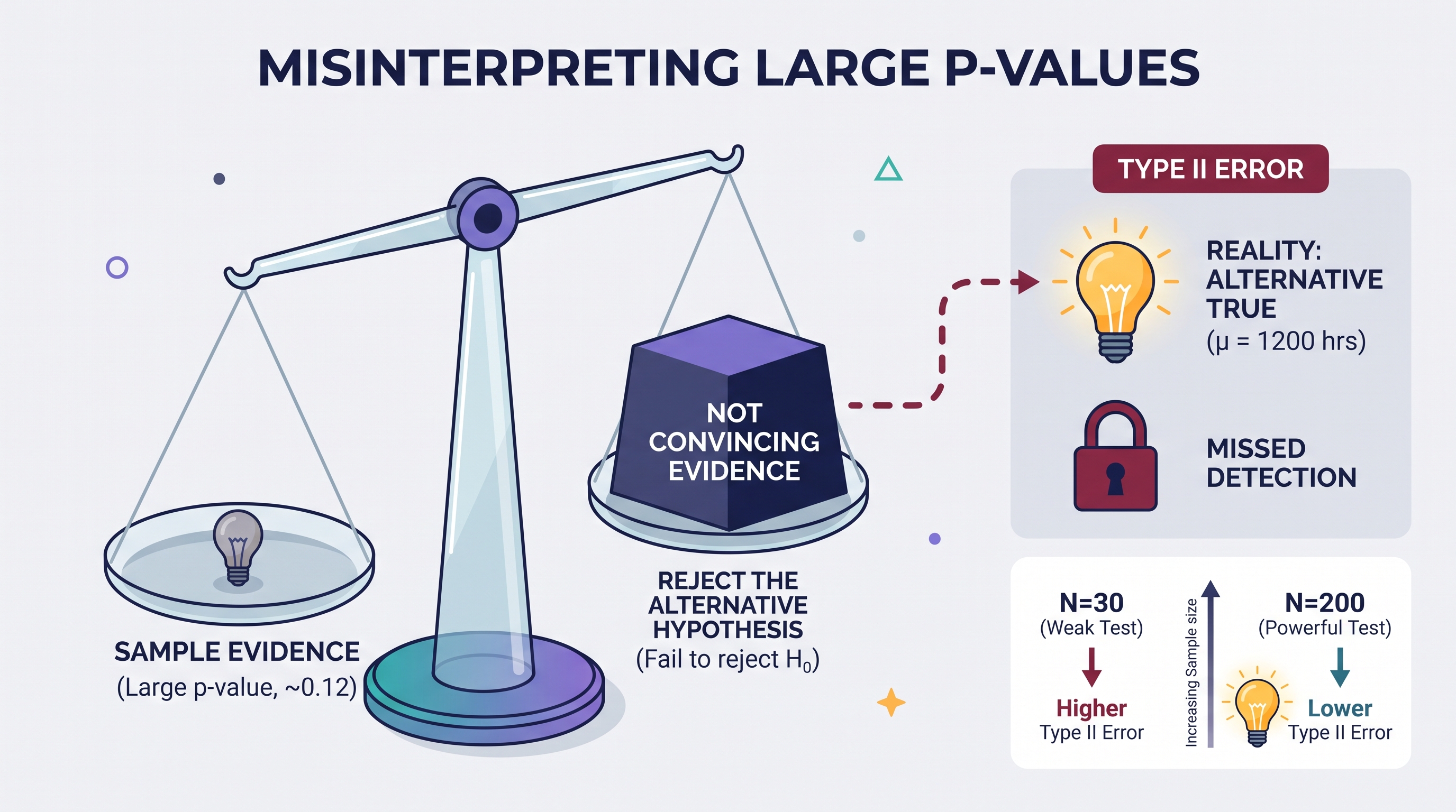
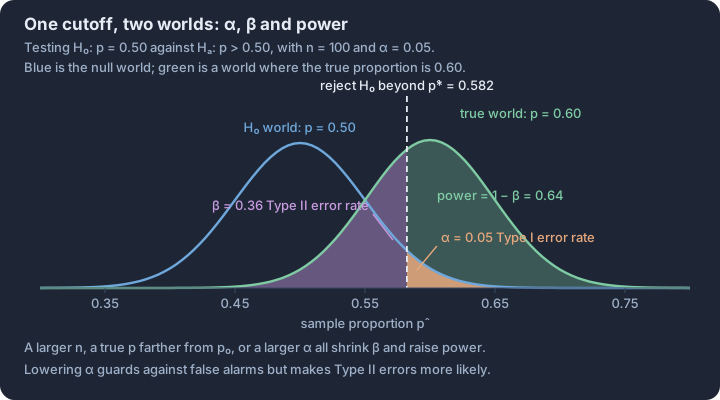
3.9 Sampling Distributions for the Difference Between Sample Proportions
Key concepts: Sampling distribution of p̂₁ − p̂₂ over repeated independent sampling · Mean of the difference equals the true difference p₁ − p₂ · Standard deviation √(p₁q₁/n₁ + p₂q₂/n₂) — add variances, never standard deviations · Independence — two random samples, each ≤ 10% of its population · Normality — all four expected success and failure counts ≥ 10 · Distance of 0 from the centre, measured in standard deviations
Comparing the success rates of two medical treatments or the voting preferences of two distinct cities requires a statistical model that describes how the difference between two sample proportions behaves across repeated trials.
Comparing the success rates of two medical treatments or the voting preferences of two distinct cities requires a statistical model that describes how the difference between two sample proportions behaves across repeated trials. When we draw independent random samples from two separate populations, the resulting statistic—the difference in sample proportions ($\hat{p}_1 - \hat{p}_2$)—follows its own predictable distribution. This sampling distribution allows us to quantify how much the observed difference between two groups might vary simply due to the luck of the draw.
The Parameters of the Difference
To analyze the difference between two groups, we first define the characteristics of the individual populations. Let $p_1$ and $p_2$ represent the true population proportions for Group 1 and Group 2, respectively. When we take independent samples of sizes $n_1$ and $n_2$, the sampling distribution of the statistic $\hat{p}_1 - \hat{p}_2$ is defined by its center and its spread (Skill 3.D).
Essential Knowledge 3.9.A.1: Parameters of the Distribution For two independent populations with proportions $p_1$ and $p_2$, the sampling distribution for the difference in sample proportions $\hat{p}_1 - \hat{p}_2$ has:
- Mean: $\mu_{\hat{p}_1 - \hat{p}_2} = p_1 - p_2$
- Standard Deviation: $\sigma_{\hat{p}_1 - \hat{p}_2} = \sqrt{\frac{p_1(1-p_1)}{n_1} + \frac{p_2(1-p_2)}{n_2}}$
Justifying the Model: Conditions for Inference
Before using the Normal approximation to calculate probabilities or justify claims (Skill 4.E), we must verify that the sampling distribution is modeled accurately. These conditions ensure that our samples are representative and that the sample sizes are large enough to produce a bell-shaped distribution (Essential Knowledge 3.9.B.1).
| Condition | Requirement | Statistical Justification |
|---|---|---|
| Independence | Samples must be independent of each other. If sampling without replacement, each sample size must be $\le 10%$ of its respective population. | Allows us to use the standard deviation formula without adjustment for finite populations. |
| Randomness | Data must come from two independent random samples or a randomized experiment. | Ensures the sample statistics are unbiased estimators of the population parameters. |
| Large Counts | $n_1p_1 \ge 10$, $n_1(1-p_1) \ge 10$, $n_2p_2 \ge 10$, and $n_2(1-p_2) \ge 10$. | Ensures the sampling distribution of $\hat{p}_1 - \hat{p}_2$ is approximately Normal. |
Worked Example: Comparing Commute Methods
Suppose $60%$ of students at North High ($p_1 = 0.60$) walk to school, while only $40%$ of students at South High ($p_2 = 0.40$) walk to school. We take an independent random sample of $n_1 = 50$ students from North High and $n_2 = 50$ students from South High.
1. Calculate the Mean: $\mu_{\hat{p}_1 - \hat{p}_2} = 0.60 - 0.40 = 0.20$. On average, the proportion of walkers at North High will be $0.20$ higher than at South High.
2. Calculate the Standard Deviation: $\sigma_{\hat{p}_1 - \hat{p}_2} = \sqrt{\frac{0.6(0.4)}{50} + \frac{0.4(0.6)}{50}} = \sqrt{0.0048 + 0.0048} = \sqrt{0.0096} \approx 0.098$.
3. Interpret the Result (Skill 4.D): In many repeated random samples of 50 students from each school, the difference in the sample proportions of walkers will typically vary by about $0.098$ from the true difference of $0.20$.
4. Check the Normal Condition: $50(0.6) = 30$, $50(0.4) = 20$, $50(0.4) = 20$, $50(0.6) = 30$. Since all expected counts are $\ge 10$, the sampling distribution of $\hat{p}_1 - \hat{p}_2$ is approximately Normal.
Misconception Check: Adding Variances A common error is attempting to subtract the standard deviations of the two groups. Remember: Variances add; standard deviations do not. Even though we are looking for the difference between proportions, the variability of that difference is greater than the variability of a single proportion because the errors from both samples can compound. Always add the terms under the square root.
Scenario: A researcher compares the proportion of adults who exercise daily in City A ($p_1 = 0.3$) and City B ($p_2 = 0.2$). They take independent random samples of $n_1 = 100$ and $n_2 = 100$.
Question 1: What is the standard deviation of the sampling distribution of the difference in sample proportions ($\hat{p}_1 - \hat{p}_2$)? A) $\sqrt{\frac{0.3(0.7)}{100} - \frac{0.2(0.8)}{100}}$ B) $\sqrt{\frac{0.3(0.7)}{100} + \frac{0.2(0.8)}{100}}$ C) $\frac{0.3(0.7)}{100} + \frac{0.2(0.8)}{100}$ D) $\sqrt{0.3 - 0.2}$
Question 2: Which of the following is the best interpretation of the mean of this sampling distribution? A) The difference between the two sample proportions will always be $0.1$. B) In one specific sample, the difference $\hat{p}_1 - \hat{p}_2$ is expected to be $0.5$. C) Over many repeated samples of these sizes, the average difference between the sample proportions will be $0.1$. D) The probability that the two sample proportions are equal is $0.1$.
Question 3: Is the Normal condition met for this sampling distribution? A) No, because the total sample size ($n_1 + n_2$) is only 200. B) No, because $p_1$ and $p_2$ are different. C) Yes, because the samples were selected randomly. D) Yes, because $n_1p_1, n_1(1-p_1), n_2p_2,$ and $n_2(1-p_2)$ are all at least 10.
Answers:
- B (Variances must be added under the radical).
- C (The mean of the sampling distribution describes the long-run average of the statistic).
- D (The Large Counts condition is satisfied: $30, 70, 20, 80$ are all $\ge 10$).
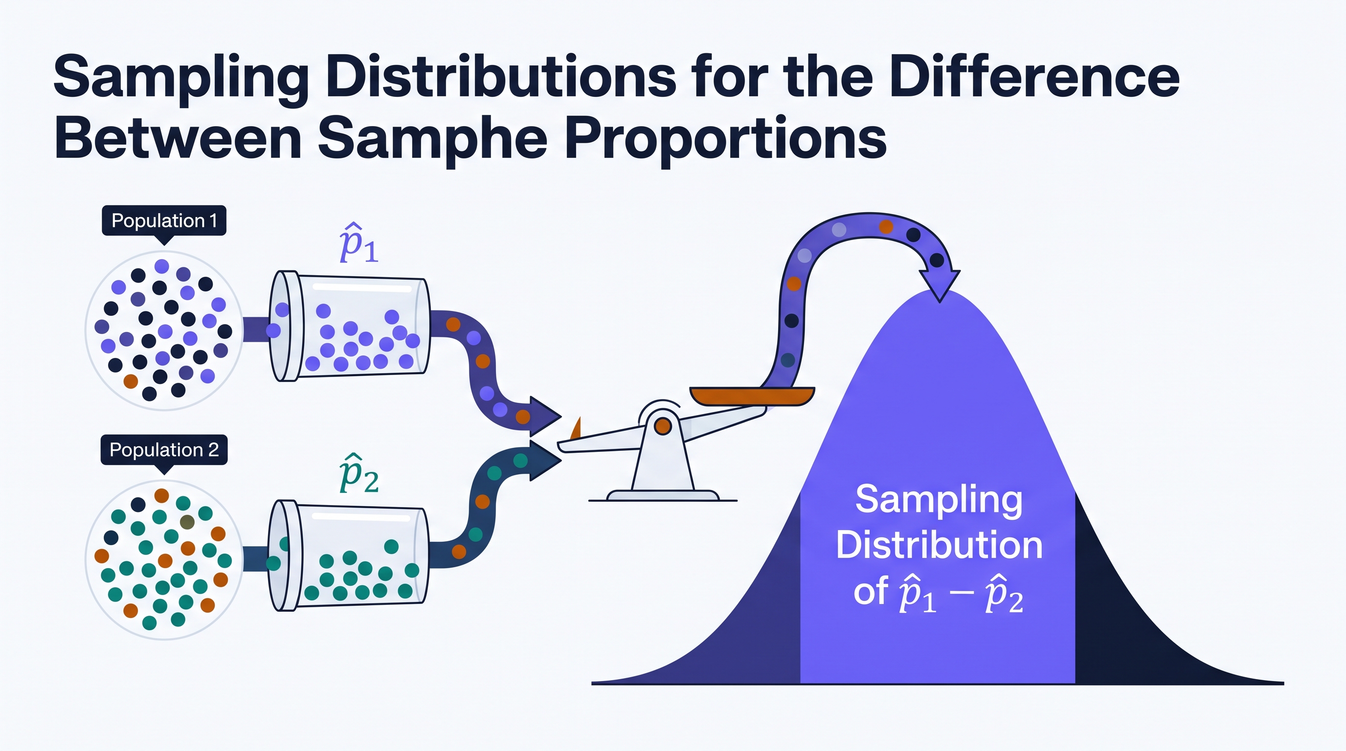
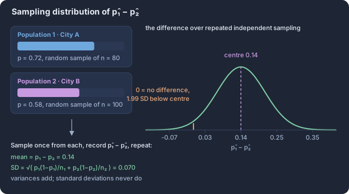
3.10 Constructing a Confidence Interval for the Difference Between Two Population Proportions
Key concepts: Two-sample z-interval — estimating the gap between two proportions · Point estimate p̂₁ − p̂₂ plus or minus a margin of error · Unpooled standard error √(p̂₁q̂₁/n₁ + p̂₂q̂₂/n₂) — intervals never pool · Critical value z* determined by the confidence level · Margin of error = z* × SE, shrinking as sample sizes grow · Conditions — independent random samples or randomisation, all four counts ≥ 10
Estimating the magnitude of the difference between two population parameters allows researchers to move beyond simply asking "is there a difference?" to asking "how large is the difference?" When the data are categorical, we use a two-sample $z$-interval for $p_1 - p_2$ to estimate the…
Estimating the magnitude of the difference between two population parameters allows researchers to move beyond simply asking "is there a difference?" to asking "how large is the difference?" When the data are categorical, we use a two-sample $z$-interval for $p_1 - p_2$ to estimate the difference between two population proportions, $p_1$ and $p_2$, based on the difference between two independent sample proportions, $\hat{p}_1$ and $\hat{p}_2$. This procedure (UNC-4.D, Skill 2.C) provides a range of plausible values for the true difference in proportions at a specified confidence level.
The Anatomy of the Two-Sample $z$-Interval
The construction of this interval follows the universal point estimate ± margin of error structure. However, because we are dealing with two independent samples, the variability of our estimate increases. The standard error of the difference reflects the combined sampling variability of both independent proportions.
The critical value, $z^*$, is determined by the desired confidence level (e.g., 1.96 for 95% confidence) and is based on the standard normal distribution. The standard error (UNC-4.F.1) is calculated using the individual sample proportions: $$SE_{\hat{p}_1 - \hat{p}_2} = \sqrt{\frac{\hat{p}_1(1-\hat{p}_1)}{n_1} + \frac{\hat{p}_2(1-\hat{p}_2)}{n_2}}$$ Note that unlike significance tests for the difference in proportions, we do not use a "pooled" proportion for confidence intervals because we are not assuming the null hypothesis ($p_1 = p_2$) is true.
Justifying the Analysis: Verification of Conditions
Before calculating the interval, we must justify that the sampling distribution of $\hat{p}_1 - \hat{p}_2$ is approximately normal and that our samples are representative (UNC-4.E, Skill 4.E). These conditions must be verified for both groups independently.
- Random: Data must come from two independent random samples or from a randomized experiment. This allows us to generalize results to the populations or make causal inferences about the treatments.
- Independent (10% Rule): When sampling without replacement from finite populations, each sample size must be less than 10% of its respective population ($n_1 < 0.10N_1$ and $n_2 < 0.10N_2$). This ensures the observations within each sample are essentially independent.
- Large Counts: The number of successes and failures in each sample must be at least 10 ($n_1\hat{p}_1 \ge 10$, $n_1(1-\hat{p}_1) \ge 10$, $n_2\hat{p}_2 \ge 10$, and $n_2(1-\hat{p}_2) \ge 10$). This condition justifies using the normal approximation for the sampling distribution (UNC-4.E.1).
Contextual Application: Public Health Study
Suppose a researcher wants to estimate the difference in the proportion of adults who exercise daily in two different cities. In City A, a random sample of 150 adults found 60 who exercise daily ($\hat{p}_A = 0.40$). In City B, a random sample of 200 adults found 100 who exercise daily ($\hat{p}_B = 0.50$).
- Identify Procedure: Two-sample $z$-interval for $p_B - p_A$.
- Verify Conditions: Both samples are random. 150 and 200 are likely less than 10% of all adults in their respective cities. Successes/Failures: City A (60, 90) and City B (100, 100) are all $\ge 10$.
- Calculate (Skill 3.E):
- Point Estimate: $0.50 - 0.40 = 0.10$
- Standard Error: $\sqrt{\frac{0.4(0.6)}{150} + \frac{0.5(0.5)}{200}} \approx 0.0534$
- Margin of Error (95%): $1.96 \times 0.0534 \approx 0.1047$
- Interval: $0.10 \pm 0.1047 \rightarrow (-0.0047, 0.2047)$
Misconception Check: The "Pooled" Trap
A common error is using a pooled proportion ($\hat{p}_c = \frac{X_1 + X_2}{n_1 + n_2}$) when constructing a confidence interval. Correction: Pooling is only appropriate for hypothesis tests where we assume $p_1 = p_2$. For confidence intervals, we are trying to estimate the difference, so we use the best available individual estimates ($\hat{p}_1$ and $\hat{p}_2$) to calculate the standard error.
Interpretation Check
A 90% confidence interval for the difference in the proportion of teenagers who use App X versus App Y ($p_X - p_Y$) is calculated to be $(0.02, 0.12)$. If the Large Counts condition was not met for App X (e.g., only 5 teenagers used it), how would this affect the validity of the interval?
Answer Hint: If the Large Counts condition is violated, the sampling distribution of the difference in proportions may not be approximately normal. Consequently, the actual capture rate of the interval-making process might not be 90%, rendering the $z^$ critical value and the resulting interval unreliable.*
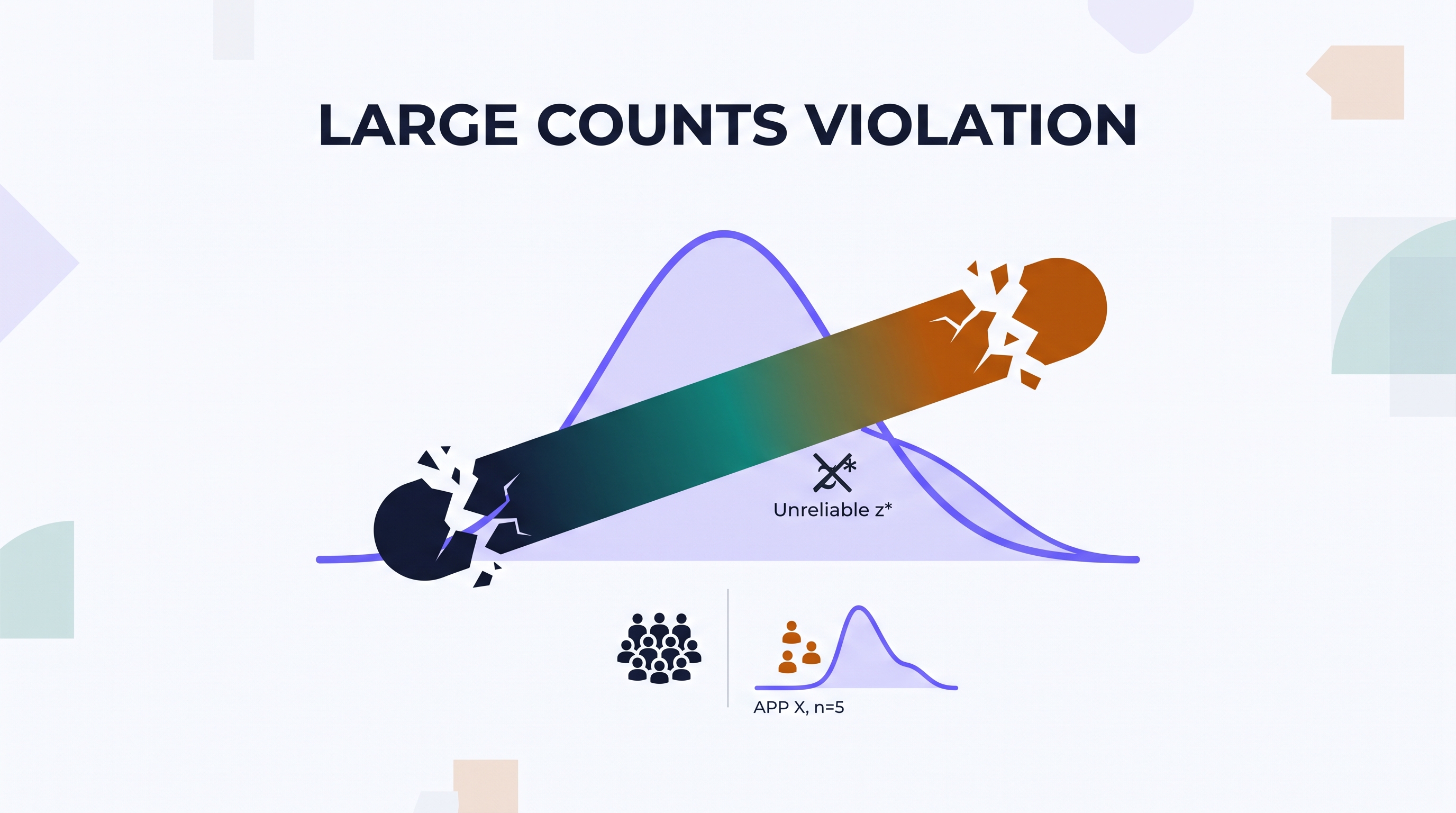
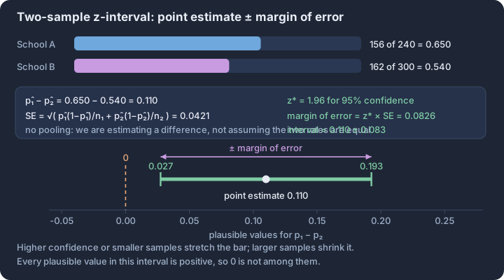
3.11 Justifying a Claim Based on a Confidence Interval for the Difference Between Two Population Proportions
Key concepts: Interpretation — C% confident the interval captures the true p₁ − p₂ · Confidence level describes the method across repeated sampling, not one interval · Zero rule — an interval containing 0 shows no convincing difference · Entirely positive interval — evidence that p₁ exceeds p₂ · Entirely negative interval — evidence that p₂ exceeds p₁ · Claims name both populations and the response variable in context
A confidence interval for the difference between two population proportions ($p_1 - p_2$) transforms raw sample data into a range of plausible values for the true, unknown gap between two groups.
A confidence interval for the difference between two population proportions ($p_1 - p_2$) transforms raw sample data into a range of plausible values for the true, unknown gap between two groups. While a point estimate provides a single "best guess," the interval accounts for sampling variability, allowing statisticians to determine if a perceived difference is likely a real population characteristic or merely a result of the "luck of the draw" during sampling.
The Logic of the "Zero-Capture"
The most critical value in any confidence interval for a difference is zero. Because the interval represents plausible values for $p_1 - p_2$, the inclusion or exclusion of zero dictates the strength of evidence for a claim about group differences.
- If the interval contains 0: The data do not provide convincing evidence of a difference between the two population proportions. Zero is a plausible value for the difference ($p_1 - p_2 = 0$), meaning it is possible the proportions are identical.
- If the interval does not contain 0: The data provide convincing evidence of a difference. If the entire interval is positive, we have evidence that $p_1 > p_2$. If the entire interval is negative, we have evidence that $p_1 < p_2$.
Interpreting the Confidence Interval (Skill 4.F)
Interpreting the result requires a precise statement that links the calculated bounds to the population parameters in context. A standard interpretation follows this template: "We are $C%$ confident that the interval from $L$ to $U$ captures the true difference in the proportion of [Population 1] who [Response] and the proportion of [Population 2] who [Response]."
Contextual Example: App Interface Testing A developer wants to know if a "Dark Mode" interface leads to higher user retention than a "Light Mode" interface. A 95% confidence interval for the difference in retention proportions ($p_{Dark} - p_{Light}$) is calculated as $(0.03, 0.11)$.
Interpretation: We are 95% confident that the interval from 0.03 to 0.11 captures the true difference in the proportion of all users who stay active using Dark Mode versus Light Mode. Because the entire interval is positive (above zero), this provides convincing evidence that the retention proportion is higher for Dark Mode.
Interpreting the Confidence Level
It is a common error to confuse the interval with the level. The confidence level ($C%$) describes the reliability of the statistical method itself, not the specific numbers in one calculated interval. The computed interval may or may not contain the true value for the difference between the two population proportions.
The interpretation of the confidence level is: In repeated random sampling using the same sample sizes from the same populations, approximately $C%$ of the confidence intervals created will successfully capture the true difference between the two population proportions.
Misconception Check: Probability vs. Confidence
One of the most frequent errors in statistical writing is claiming there is a "$95%$ probability" that the true difference is between two specific numbers.
| Incorrect Reasoning | Correct Reasoning |
|---|---|
| "There is a 95% chance the true difference is between 0.03 and 0.11." | "We are 95% confident the true difference is between 0.03 and 0.11." |
| Why it fails: Once the interval is calculated, the true difference is either in it (100% probability) or it isn't (0% probability). The probability refers to the process before the data are collected. | Why it works: "Confidence" describes our trust in the procedure that produced the interval, acknowledging that 5% of such intervals will fail to capture the truth. |
Justifying Claims (Skill 4.G)
When asked to justify a claim, you must explicitly mention whether the value of interest (usually zero) is contained within the interval. Your justification should follow a clear "Evidence $\rightarrow$ Conclusion" path.
- State the interval.
- Note the position of zero relative to that interval.
- Conclude in context regarding the claim.
If a researcher claims that a new fertilizer ($p_1$) is more effective than the standard ($p_2$), but the 90% confidence interval for $p_1 - p_2$ is $(-0.02, 0.15)$, the researcher cannot justify the claim. Because zero is included in the interval, it is plausible that there is no difference in effectiveness, or even that the standard fertilizer is slightly better.
Retrieval Check A school district calculates a 99% confidence interval for the difference in the proportion of students who pass a math exam using a new curriculum ($p_{new}$) versus the old curriculum ($p_{old}$). The resulting interval is $(-0.08, -0.01)$.
- Does this interval provide convincing evidence of a difference in passing proportions?
- Which curriculum appears to have a higher passing proportion?
Check your reasoning:
- Yes. Because the interval does not contain 0, there is convincing evidence of a difference.
- The old curriculum ($p_{old}$). Since the entire interval for $p_{new} - p_{old}$ is negative, the data suggest that $p_{old}$ is greater than $p_{new}$ by between 1 and 8 percentage points.
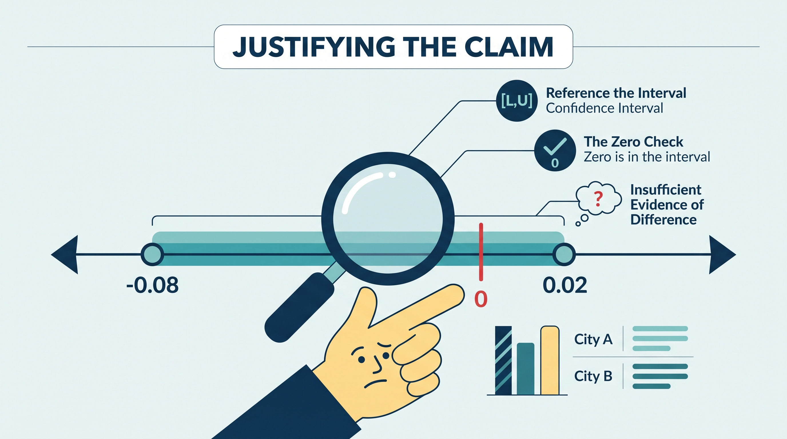
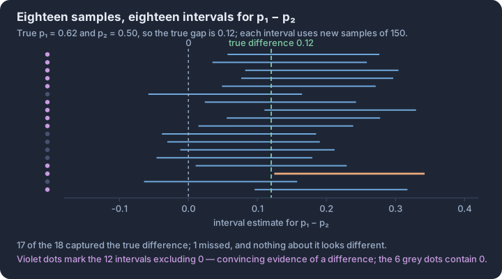
3.12 Setting Up a Test for the Difference Between Two Population Proportions
Key concepts: Two-sample z-test for p₁ − p₂ — testing whether two rates differ · Null hypothesis H₀: p₁ = p₂, a difference of exactly zero · Alternative — p₁ > p₂, p₁ < p₂, or p₁ ≠ p₂ · Pooled proportion p̂c — combined successes over combined sample sizes · Pooled standard error — used only because H₀ assumes one common rate · Conditions — randomisation, 10% rule, and four pooled counts ≥ 10
When we observe a difference between two sample proportions—such as a 5% higher recovery rate in a treatment group compared to a control group—we face a fundamental inferential dilemma: is this gap a reflection of a true difference between the populations, or is it merely the result of…
When we observe a difference between two sample proportions—such as a 5% higher recovery rate in a treatment group compared to a control group—we face a fundamental inferential dilemma: is this gap a reflection of a true difference between the populations, or is it merely the result of "the luck of the draw" in random sampling? Setting up a formal significance test allows us to quantify the probability of seeing such a difference by chance alone. This process transforms a vague observation into a rigorous statistical claim by defining the parameters, stating the hypotheses, and verifying that the mathematical model for the sampling distribution is valid.
Defining the Parameters and Hypotheses
The first step in any inference procedure is to clearly define the population parameters of interest. In a two-proportion test, we define $p_1$ as the true proportion of successes in Population 1 and $p_2$ as the true proportion of successes in Population 2. It is essential to use the parameter $p$ (the population value) in the hypotheses, rather than the statistic $\hat{p}$ (the sample value), because we already know the sample values; the test is designed to probe the unknown truth of the populations.
The null hypothesis ($H_0$) typically assumes a "boring" world where there is no difference between the groups. We represent this as $H_0: p_1 - p_2 = 0$ (or $H_0: p_1 = p_2$). The alternative hypothesis ($H_a$) reflects the researcher's suspicion or the investigative question. Depending on the direction of the inquiry, the alternative can take three forms:
- Two-sided: $H_a: p_1 - p_2 \neq 0$ (There is some difference).
- One-sided (Greater than): $H_a: p_1 - p_2 > 0$ (Population 1 has a higher proportion).
- One-sided (Less than): $H_a: p_1 - p_2 < 0$ (Population 1 has a lower proportion).
The Logic of Pooling
A unique feature of setting up a test for $p_1 - p_2$ is the use of the combined (pooled) sample proportion, denoted as $\hat{p}_c$. Because the null hypothesis assumes $p_1 = p_2$, we act as if both samples came from a single population with a common proportion. To get the best estimate of this common proportion, we "pool" the data from both samples: $$\hat{p}_c = \frac{\text{Successes}_1 + \text{Successes}_2}{n_1 + n_2}$$ This pooled proportion is used specifically for the Large Counts condition and for calculating the standard error during the test phase. This differs from confidence intervals, where we do not assume the proportions are equal and therefore do not pool.
Verifying Necessary Conditions (Skill 4.E)
Before proceeding to calculations, we must justify the use of the Normal approximation for the sampling distribution of $\hat{p}_1 - \hat{p}_2$. If these conditions are not met, the resulting $p$-value may be misleading.
- Random: The data must come from two independent random samples or from a randomized experiment with two treatment groups. This ensures the results can be generalized or that a cause-and-effect relationship can be investigated (Skill 2.C).
- 10% Condition: If sampling without replacement, the sample sizes $n_1$ and $n_2$ must be less than 10% of their respective population sizes ($N_1$ and $N_2$). This allows us to treat the observations as independent. (Note: This condition is generally not required for randomized experiments).
- Large Counts: We must expect at least 10 successes and 10 failures in each group. However, because we assume $H_0$ is true, we use the pooled proportion $\hat{p}_c$ to check this:
- $n_1\hat{p}_c \ge 10$ and $n_1(1-\hat{p}_c) \ge 10$
- $n_2\hat{p}_c \ge 10$ and $n_2(1-\hat{p}_c) \ge 10$
Contextual Example: Digital Literacy Initiatives
Suppose a non-profit wants to know if a new workshop increases the proportion of seniors who feel "confident" using online banking. They randomly assign 100 seniors to the workshop (Group 1) and 100 to a control group (Group 2). After the program, 62 in the workshop group and 48 in the control group report feeling confident.
- Parameters: $p_1 =$ true proportion of all seniors who would feel confident after the workshop; $p_2 =$ true proportion of all seniors who would feel confident without the workshop.
- Hypotheses: $H_0: p_1 - p_2 = 0$ vs. $H_a: p_1 - p_2 > 0$.
- Pooling: $\hat{p}_c = (62 + 48) / (100 + 100) = 110 / 200 = 0.55$.
- Large Counts Check: $100(0.55) = 55$ and $100(0.45) = 45$. Both are $\ge 10$ for both groups. Conditions are met for a two-sample $z$-test for $p_1 - p_2$.
Misconception Check: A common error is writing hypotheses using sample statistics, such as $H_0: \hat{p}_1 = \hat{p}_2$. Remember: we use the test to make an inference about the unknown population parameters ($p$), not the observed sample statistics ($\hat{p}$). We already know $\hat{p}_1$ and $\hat{p}_2$ are different! The question is whether that difference is statistically significant.
Interpretation Check
A researcher is studying whether the proportion of electric vehicles (EVs) is different in City A compared to City B. They take independent random samples of 500 cars in each city. In City A, 45 cars are EVs; in City B, 55 cars are EVs.
- State the null and alternative hypotheses in symbols.
- Calculate the pooled proportion $\hat{p}_c$ that would be used to check the Large Counts condition.
(Think through your answer before reading on: $H_0: p_A - p_B = 0$ and $H_a: p_A - p_B \neq 0$. The pooled proportion is $\hat{p}_c = (45+55)/(500+500) = 100/1000 = 0.10$.)
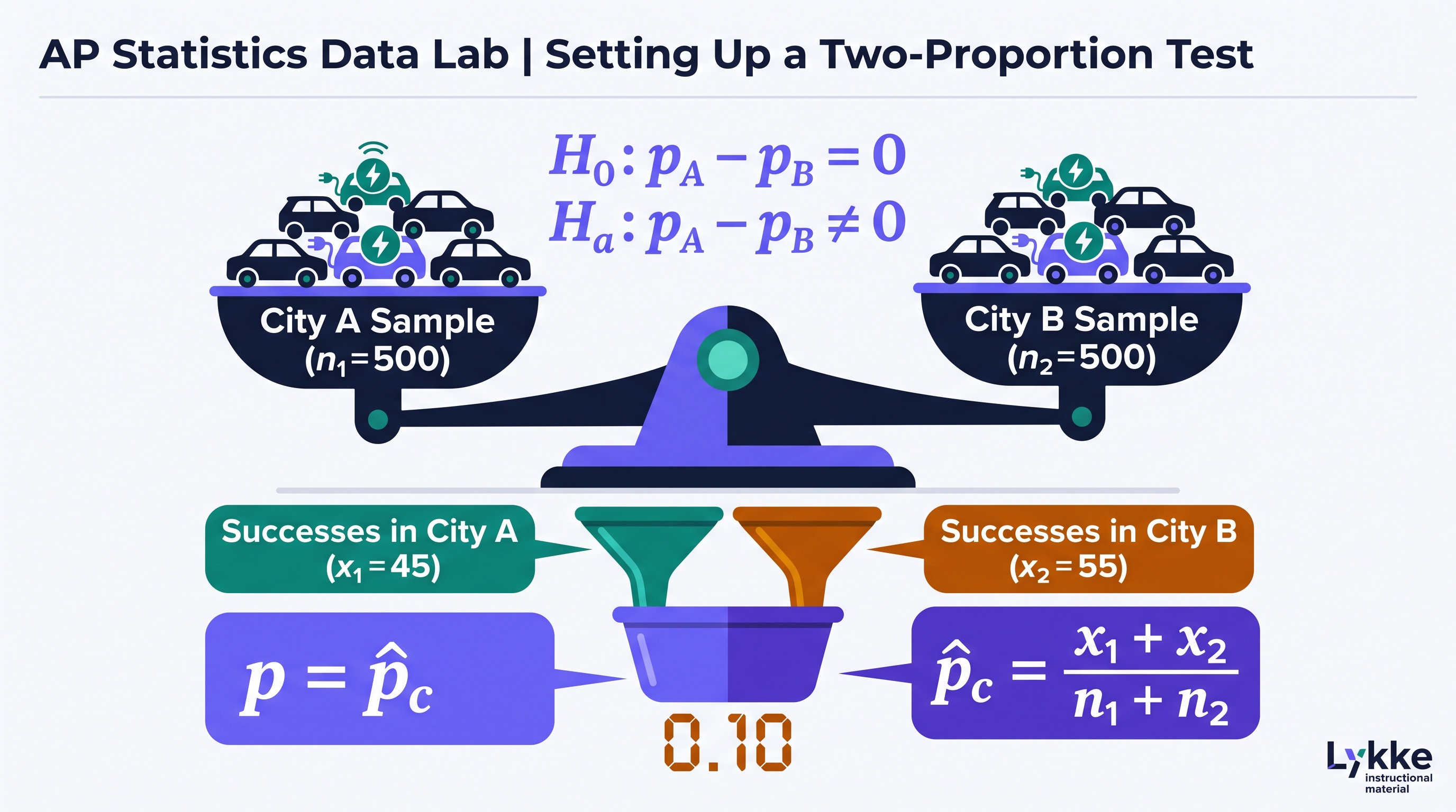
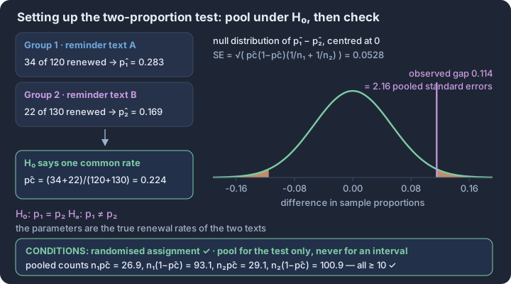
3.13 Carrying Out a Test for the Difference Between Two Population Proportions
Key concepts: Pooled proportion p̂c — all successes over all observations · Pooling is justified only by H₀: p₁ = p₂ · Standard error √(p̂c(1−p̂c)(1/n₁ + 1/n₂)) for the test · z statistic — observed difference measured in standard errors · p-value — chance of a gap this extreme if the proportions were equal · Decision at α — reject or fail to reject, never accept H₀
When we test whether two populations have the same proportion of a specific characteristic, we operate under the foundational assumption of the null hypothesis: $H_0: p_1 = p_2$.
When we test whether two populations have the same proportion of a specific characteristic, we operate under the foundational assumption of the null hypothesis: $H_0: p_1 = p_2$. If this assumption is true, the two samples are effectively drawn from populations with a single, shared proportion. To reflect this in our mathematics, we combine the data from both samples to create a single combined (pooled) sample proportion, denoted as $\hat{p}_c$. This pooled estimate provides a more precise calculation of the standard deviation of the sampling distribution than using the two sample proportions separately.
The pooled proportion is the total number of "successes" from both groups divided by the total number of observations. Mathematically, it is expressed as $\hat{p}_c = \frac{X_1 + X_2}{n_1 + n_2}$. This value is then used to calculate the standard error of the difference for the test statistic. Unlike confidence intervals for the difference between two proportions—where we do not assume the proportions are equal and thus do not pool—the significance test requires this pooling to remain consistent with the null hypothesis.
The Test Statistic and the Z-Curve
The z-test statistic measures how many standard deviations the observed difference in sample proportions ($\hat{p}_1 - \hat{p}_2$) falls from the hypothesized difference (usually zero). Because the sampling distribution of the difference between two independent proportions is approximately Normal (provided the Large Counts condition is met), we can use the standard Normal distribution to determine the likelihood of our results.
The formula for the test statistic is: $$z = \frac{(\hat{p}_1 - \hat{p}_2) - 0}{\sqrt{\hat{p}_c(1 - \hat{p}_c) \left( \frac{1}{n_1} + \frac{1}{n_2} \right)}}$$ A large absolute value for $z$ indicates that the observed difference is unlikely to have occurred by random sampling error alone if the null hypothesis were true.
Interpreting the p-Value
The p-value is the probability of obtaining a test statistic as extreme as, or more extreme than, the one actually observed, assuming the null hypothesis is correct. In a two-proportion test, the "extremity" depends on the alternative hypothesis ($H_a$):
- Greater than ($p_1 > p_2$): The area under the standard Normal curve to the right of the calculated $z$.
- Less than ($p_1 < p_2$): The area under the standard Normal curve to the left of the calculated $z$.
- Not equal to ($p_1 \neq p_2$): The combined area in both tails (double the area of the single tail).
Definition: p-Value for Two Proportions The probability, computed assuming $p_1 = p_2$, that the difference in sample proportions would be as far or farther from zero than the difference actually observed.
Justifying the Conclusion
A statistical conclusion is never just a "yes" or "no" answer; it is a formal judgment based on the weight of evidence. To justify a conclusion (Skill 4.G), you must compare the $p$-value to a pre-determined significance level ($\alpha$).
- Compare: Explicitly state whether the $p$-value is less than or greater than $\alpha$.
- Decide: State whether you reject or fail to reject the null hypothesis ($H_0$).
- Conclude in Context: State whether there is sufficient or insufficient evidence to support the alternative hypothesis ($H_a$) using the specific variables from the study.
Misconception Check: The "Equal Proportions" Trap
A common error is concluding that $p_1 = p_2$ when the $p$-value is large. We never "accept" the null hypothesis. A large $p$-value simply means our data is consistent with the null hypothesis; it does not prove the proportions are identical. We simply "fail to find evidence of a difference."
Worked Example: Green Packaging
A company wants to know if "Green" eco-friendly packaging increases the proportion of customers who would recommend a product. They show Group A ($n_1 = 100$) the green box and Group B ($n_2 = 100$) the standard box.
- Results: $\hat{p}_1 = 0.55$, $\hat{p}_2 = 0.40$.
- Pooled Proportion: $\hat{p}_c = \frac{55 + 40}{100 + 100} = 0.475$.
- Test Statistic: $z = \frac{0.55 - 0.40}{\sqrt{0.475(0.525)(\frac{1}{100} + \frac{1}{100})}} \approx 2.12$.
- p-value: For $H_a: p_1 > p_2$, the $p$-value is $P(Z > 2.12) \approx 0.017$.
Retrieval Check: Using the Green Packaging example above and a significance level of $\alpha = 0.05$, write the final three-part conclusion for this test. Ensure you include the comparison, the decision regarding $H_0$, and the contextual claim regarding customer recommendations.
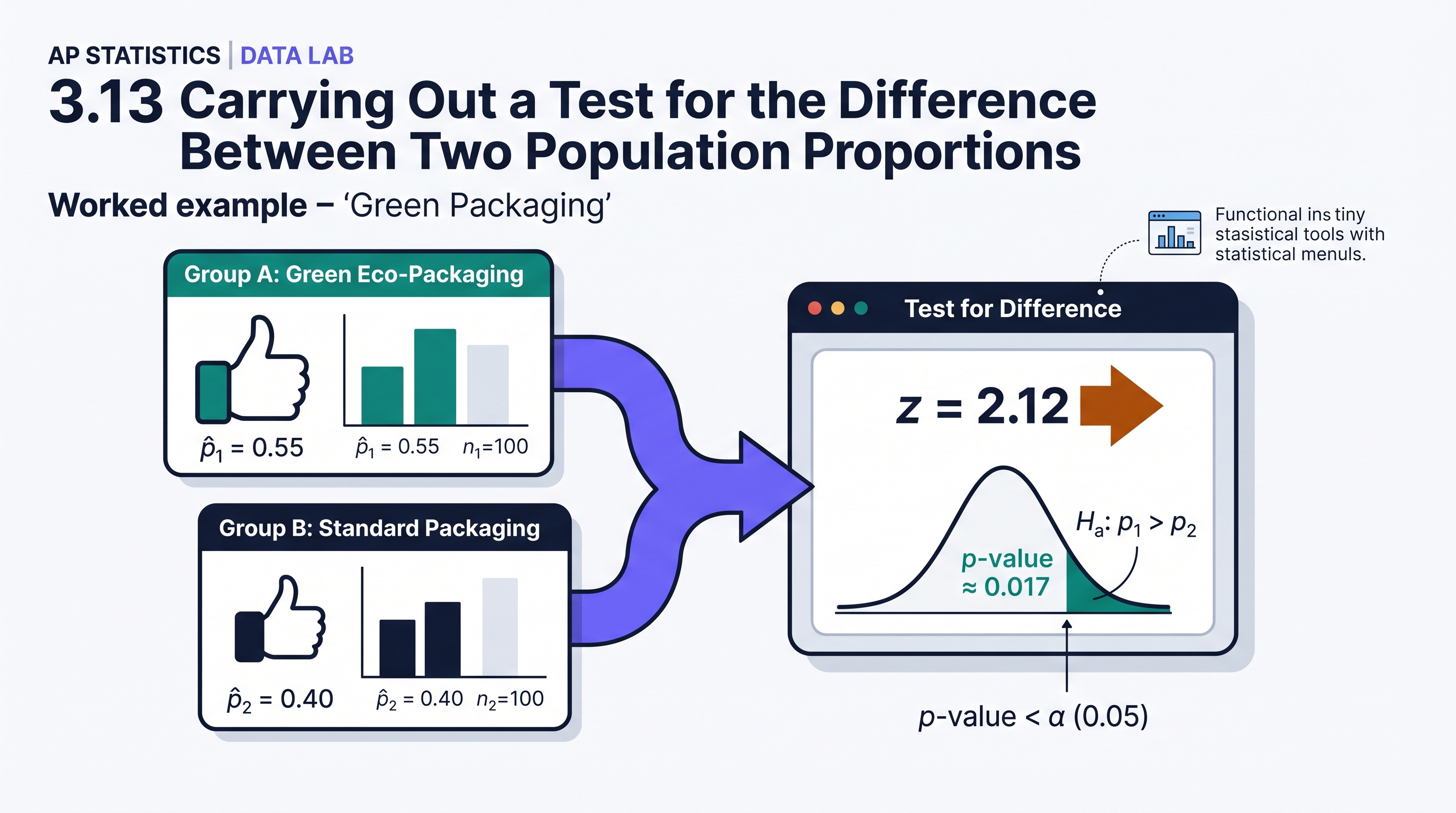
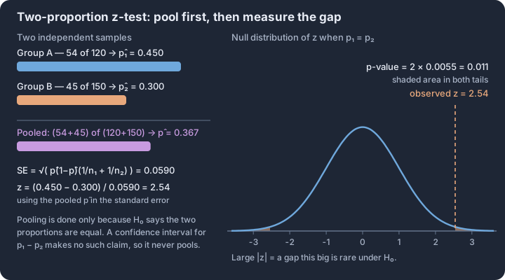
3.14 Setting Up a Chi-Square Test for Homogeneity or Independence
Key concepts: Chi-square statistic — total mismatch between observed and expected counts · Chi-square distributions — positive, right-skewed, shaped by df · Degrees of freedom = (rows − 1)(columns − 1) · Homogeneity — H₀ of identical distributions across populations · Independence — H₀ of no association between two variables · Conditions — random data, 10% rule, expected counts at least 5
The Chi-Square ($\chi^2$) test family provides the mathematical framework for analyzing the relationship between two categorical variables or comparing the distributions of a single categorical variable across multiple populations.
The Chi-Square ($\chi^2$) test family provides the mathematical framework for analyzing the relationship between two categorical variables or comparing the distributions of a single categorical variable across multiple populations. While previous methods focused on the difference between exactly two proportions, these procedures allow for "multi-way" comparisons, such as checking if four different age groups have the same distribution of preferred news sources.
The Chi-Square Distribution and Statistic
The chi-square statistic measures the cumulative "mismatch" between what we observe in a two-way table and what we would expect to see if the null hypothesis were true. It is calculated by summing the squared differences between observed and expected counts, scaled by the expected counts. This ensures that the statistic is always non-negative; a value of zero would indicate a perfect match between observed and expected data.
Chi-Square Distribution (4.C): A family of density curves that are strictly positive and skewed to the right. The specific shape of a chi-square distribution is determined by its degrees of freedom ($df$).
| Feature | Description |
|---|---|
| Skewness | Heavily skewed right at low $df$; becomes more symmetric and approaches a Normal shape as $df$ increases. |
| Domain | All values are $\ge 0$ because the statistic is based on squared differences. |
| Degrees of Freedom | For a two-way table with $r$ rows and $c$ columns, $df = (r - 1)(c - 1)$. |
Choosing the Appropriate Test (2.C)
The most critical step in setting up the inference procedure is distinguishing between a Chi-Square Test for Homogeneity and a Chi-Square Test for Independence. Although the calculation of the test statistic is identical for both, the investigative question and the data collection method dictate which test is appropriate.
Chi-Square Test for Homogeneity
This test is used when we want to determine if the distribution of a single categorical variable is the same across two or more independent populations or treatment groups.
- Data Collection: Samples are taken from multiple distinct populations (e.g., a sample of urban residents and a sample of rural residents).
- Goal: Compare "sameness" (homogeneity) of distributions.
Chi-Square Test for Independence
This test is used when we want to determine if there is an association between two categorical variables for a single population.
- Data Collection: A single random sample is taken from one population, and two different variables are recorded for each individual (e.g., one sample of students, recording both their "Major" and their "Preferred Study Time").
- Goal: Determine if the variables are "independent" (no association) or "dependent" (associated).
Identifying Hypotheses (2.E)
Hypotheses for chi-square tests are typically written in words rather than symbols to ensure the context of the populations and variables is clear.
| Test Type | Null Hypothesis ($H_0$) | Alternative Hypothesis ($H_a$) |
|---|---|---|
| Homogeneity | There is no difference in the distribution of [variable] for [populations]. | There is a difference in the distribution of [variable] for [populations]. |
| Independence | There is no association between [variable A] and [variable B] in the [population]. | There is an association between [variable A] and [variable B] in the [population]. |
Verifying Conditions for Inference (4.E)
Before proceeding with the chi-square test, three conditions must be met to ensure the sampling distribution of the test statistic approximately follows the chi-square distribution.
- Random: The data must come from independent random samples or a randomized experiment.
- 10% Condition: When sampling without replacement from a finite population, the sample size(s) should be less than 10% of the population(s). (This applies to observational studies, not experiments).
- Large Counts: All expected counts must be at least 5. It is a common error to check the observed counts; the condition specifically requires the calculated expected values to be 5 or greater in every cell of the table.
Misconception Check: Independence vs. Homogeneity
A common mistake is assuming that "multiple groups" always means homogeneity. If you take one sample of 200 people and then split them into "Male" and "Female" to look at their "Political Affiliation," you are performing a test for independence because you only took one sample. If you specifically recruited 100 Males and 100 Females as two separate groups, you are performing a test for homogeneity.
Interpretation Check
A researcher selects a single random sample of 500 electric vehicle (EV) owners and records their "Region" (North, South, East, West) and their "Primary Charging Location" (Home, Work, Public).
- Which chi-square test is appropriate?
- What are the degrees of freedom for this test?
Check your reasoning:
- Independence. There is one population (EV owners) and two variables (Region and Charging Location).
- $df = 6$. There are 4 regions (rows) and 3 locations (columns). $(4-1) \times (3-1) = 3 \times 2 = 6$.
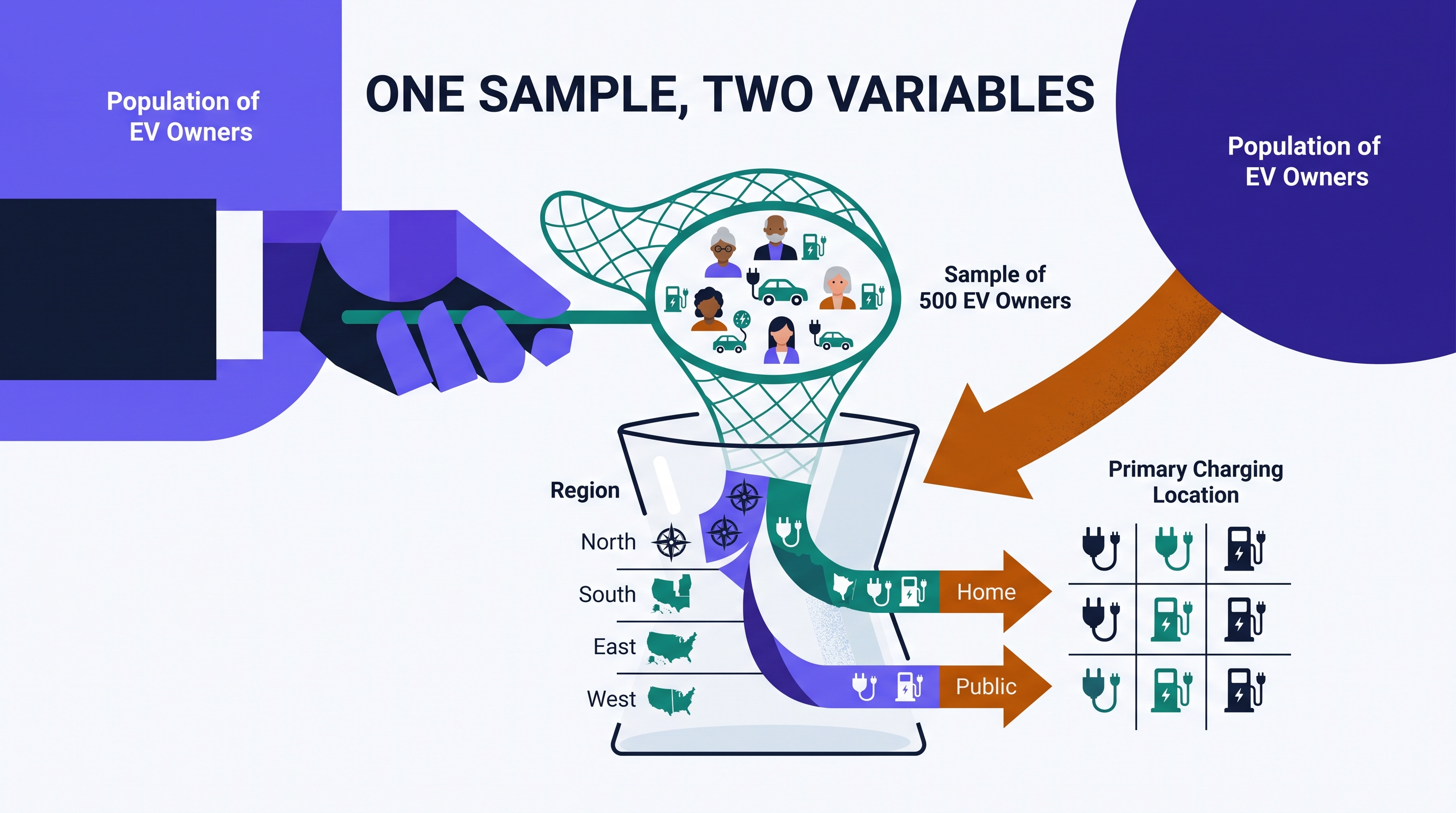
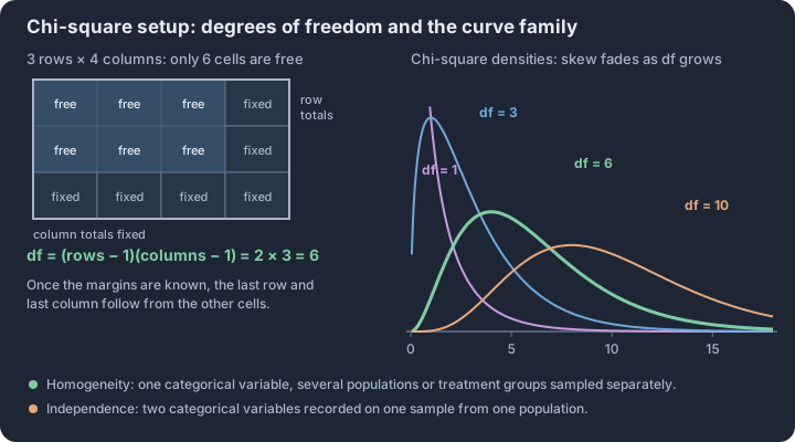
3.15 Carrying Out a Chi-Square Test for Homogeneity or Independence
Key concepts: Expected count = row total × column total ÷ table total · χ² = Σ (O − E)²/E summed over every cell · Cell contributions reveal which categories drive the statistic · p-value — upper-tail area of the χ² curve with df = (r−1)(c−1) · The p-value assumes H₀ of no difference or no association is true · Conclusion in context — evidence about the populations, not proof of cause
The chi-square test transforms a multi-cell table of raw counts into a single metric of "statistical surprise." While a simple difference in proportions compares two groups, the chi-square procedure allows us to evaluate complex relationships across multiple populations or multiple…
The chi-square test transforms a multi-cell table of raw counts into a single metric of "statistical surprise." While a simple difference in proportions compares two groups, the chi-square procedure allows us to evaluate complex relationships across multiple populations or multiple categories simultaneously. By comparing what we actually observed to what we would expect to see under a null hypothesis of no difference or no association, we can determine if the patterns in our data are likely due to chance or represent a genuine phenomenon.
Expected Counts: The Baseline of "No Effect"
LO 3.15.A [Skill 3.C]: To carry out the test, we must first establish what the data would look like if the null hypothesis ($H_0$) were true. In both the test for homogeneity and the test for independence, the null hypothesis assumes that the distribution of the categorical variable is the same across all groups or that no relationship exists between the two variables.
EK 3.15.A.1: The expected count for any specific cell in a two-way table is the average count we would see if the proportions were perfectly balanced according to the marginal totals. We calculate this using the formula: $$\text{Expected Count} = \frac{(\text{Row Total}) \times (\text{Column Total})}{\text{Table Total}}$$
Consider a study on whether a new medication affects recovery rates across three different age groups (Young, Middle-aged, Senior). If we have a total of 100 "Recovered" patients and 200 total patients, the overall recovery rate is 50%. If age has no effect (the null hypothesis), we would expect 50% of the patients in each age group to have recovered. The formula above automates this logic for every cell in the table.
Misconception Check: A common error is rounding expected counts to the nearest whole number because "you can't have half a person." However, expected counts are theoretical averages, not actual observations. Always keep at least two decimal places for expected counts to maintain the precision of the chi-square statistic.
The Chi-Square Statistic and P-Value
LO 3.15.A [Skill 3.E]: Once we have the expected counts for every cell, we measure the "distance" between our observed data ($O$) and our expected baseline ($E$). This distance is quantified by the chi-square ($\chi^2$) statistic.
EK 3.15.B.1: The chi-square statistic is the sum of the squared differences between observed and expected counts, each scaled by the expected count: $$\chi^2 = \sum \frac{(O - E)^2}{E}$$ This formula ensures that larger deviations contribute more to the statistic, and by dividing by $E$, we ensure that a difference of 5 units matters more when we expect 10 than when we expect 1,000.
The resulting $\chi^2$ value is then used to find the p-value using a chi-square distribution with degrees of freedom $df = (\text{rows} - 1)(\text{columns} - 1)$. The p-value represents the probability of observing a chi-square statistic as large as or larger than the one calculated, assuming the null hypothesis is true.
Interpreting and Justifying Conclusions
[Skill 4.F, 4.G]: The final stage of the procedure is the transition from calculation to claim. We compare the p-value to a pre-specified significance level ($\alpha$), typically 0.05.
- If p-value $\leq \alpha$: We reject $H_0$. There is convincing statistical evidence of a difference in distributions (homogeneity) or an association between variables (independence).
- If p-value $> \alpha$: We fail to reject $H_0$. There is not enough evidence to conclude that a difference or association exists.
When justifying a claim, you must state the conclusion in context. For a test of independence, a conclusion might look like: "Because the p-value (0.024) is less than $\alpha = 0.05$, we reject the null hypothesis. There is convincing evidence of an association between exercise frequency and sleep quality for adults in this city." Note the use of non-definitive language ("evidence of") rather than claiming the association is "proven."
Interpretation Check
In a $3 \times 4$ two-way table, a researcher calculates a chi-square statistic of $\chi^2 = 12.5$.
- Calculate the degrees of freedom for this test.
- If the p-value is 0.051 and $\alpha = 0.05$, what is the appropriate conclusion in terms of the null hypothesis?
Check your reasoning:
- $df = (3-1)(4-1) = 2 \times 3 = 6$.
- Since $0.051 > 0.05$, we fail to reject the null hypothesis. We do not have convincing evidence of a relationship/difference.
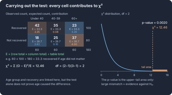
Unit 4: Inference for Quantitative Data: Means
Key concepts: Sampling distribution of x̄ — centre μ, spread σ/√n · Central Limit Theorem — x̄ becomes approximately normal for large n · t-procedures — needed because σ is unknown, df from sample size · Confidence interval for a mean: x̄ ± t* · s/√n · Paired data — one column of differences, one-sample inference · Two independent samples — inference about the difference μ₁ − μ₂
Integrate the official Unit 4 topics through the AP statistical practices and apply them to contextual problems. Follow the unit roadmap to connect every topic, practice statistical reasoning in context, and prepare for cumulative AP-style questions.
Unit 4: Inference for Quantitative Data: Means is organized around one recurring question: what evidence would justify the conclusion we want to make? This overview connects the unit's topics before you work through them one at a time.
What you will learn
Integrate the official Unit 4 topics through the AP statistical practices and apply them to contextual problems.
Topic sequence
- 4.1 Sampling Distributions for Sample Means — Calculate, verify conditions for, and interpret sampling distributions of sample means.
- 4.2 Constructing a Confidence Interval for a Population Mean or Population Mean Difference — Select, justify, and construct a confidence interval for a population mean or paired mean difference.
- 4.3 Justifying a Claim Based on a Confidence Interval for a Population Mean or Population Mean Difference — Interpret a mean confidence interval and use it to justify a contextual claim.
- 4.4 Setting Up a Test for a Population Mean or Population Mean Difference — Select and set up a valid test for a population mean or paired mean difference.
- 4.5 Carrying Out a Test for a Population Mean or Population Mean Difference — Calculate and interpret a one-sample or paired-mean test and justify its conclusion.
- 4.6 Sampling Distributions for the Difference Between Two Sample Means — Calculate, verify conditions for, and interpret sampling distributions of differences in sample means.
- 4.7 Constructing a Confidence Interval for the Difference Between Two Population Means — Select, justify, and construct a confidence interval for a difference in population means.
- 4.8 Justifying a Claim Based on a Confidence Interval for the Difference Between Two Population Means — Interpret a two-mean confidence interval and justify a contextual claim.
- 4.9 Setting Up a Test for the Difference Between Two Population Means — Select and set up a valid test for a difference in population means.
- 4.10 Carrying Out a Test for the Difference Between Two Population Means — Calculate and interpret a two-sample mean test and justify its conclusion.
The reasoning routine
- Start by naming the statistical question and the population or process in context.
- Choose a representation or procedure because its conditions match the situation.
- Show the numerical or graphical evidence clearly.
- Interpret the result using the variables, groups, and units from the original context.
Before you move on
Use the roadmap above to select the first topic. Keep a running error log with four labels—concept, procedure, calculation, and context—so the practice unit can point you back to the exact kind of repair you need.
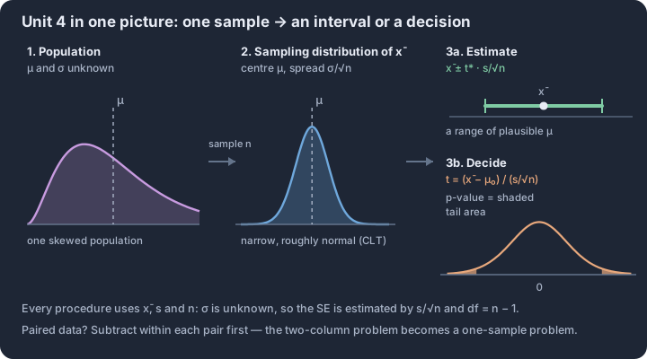
4.1 Sampling Distributions for Sample Means
Key concepts: Sampling distribution of x̄ — all possible means for a fixed n · x̄ is unbiased: the distribution centres exactly on μ · Standard deviation of x̄ = σ/√n — spread shrinks with n · 10% condition — population at least ten times the sample size · Normal population → x̄ normal for any sample size · Central Limit Theorem — n ≥ 30 makes x̄ roughly normal
Every time we pull a random sample from a population and calculate its mean ($\bar{x}$), we are essentially rolling the statistical dice.
Every time we pull a random sample from a population and calculate its mean ($\bar{x}$), we are essentially rolling the statistical dice. Because of sampling variability, different samples will yield different sample means. The sampling distribution of the sample mean is the theoretical probability distribution of all possible values of $\bar{x}$ that could be calculated from all possible samples of a fixed size $n$ from a specific population.
The Center: Unbiased Estimation
The mean of the sampling distribution of the sample mean, denoted as $\mu_{\bar{x}}$, is exactly equal to the population mean $\mu$. This property identifies the sample mean as an unbiased estimator. However, this mathematical elegance relies entirely on how the data were gathered.
Skill 3.D: Proposing Data Collection To ensure that $\bar{x}$ serves as an unbiased estimator of $\mu$, a researcher must propose a random sampling method (such as a simple random sample or a stratified random sample). Without randomization, the center of the sampling distribution may shift away from $\mu$, introducing systematic bias that invalidates subsequent inference. (T4.1-C01)
The Variability: The Square Root Rule
As the sample size $n$ increases, the variability of the sampling distribution decreases. The sample means cluster more tightly around the true population mean. This relationship is quantified by the standard deviation of the sampling distribution, often called the standard error of the mean when estimated.
| Feature | Formula | Condition for Use |
|---|---|---|
| Standard Deviation | $\sigma_{\bar{x}} = \frac{\sigma}{\sqrt{n}}$ | 10% Condition: The sample size $n$ must be no more than 10% of the population size $N$ ($n \le 0.10N$). |
When we calculate the standard deviation of the sampling distribution (Skill 4.D), we are measuring the typical distance a sample mean $\bar{x}$ will fall from the population mean $\mu$. Note that the 10% condition (T4.1-C03) is required to ensure that the observations in the sample are sufficiently independent when sampling without replacement. (T4.1-C02)
The Shape: Normal Population vs. CLT
The shape of the sampling distribution depends on the shape of the original population and the size of the sample. There are two primary pathways to achieving a Normal shape:
- Normal Population: If the parent population is Normally distributed, the sampling distribution of $\bar{x}$ will be Normal regardless of the sample size $n$. (T4.1-C04)
- Central Limit Theorem (CLT): If the parent population is not Normal (or its shape is unknown), the sampling distribution of $\bar{x}$ will become approximately Normal as the sample size $n$ increases. (T4.1-C05)
Skill 4.E: Justifying the Shape In practice, we use the Large Counts Condition for Means: if $n \ge 30$, we can justify the claim that the sampling distribution of $\bar{x}$ is approximately Normal, even if the population is heavily skewed.
Worked Example: Smartphone Battery Life
A manufacturer claims that the mean battery life of their new "Volt" smartphone is $\mu = 22$ hours with a standard deviation of $\sigma = 4.5$ hours. The distribution of battery lives for all Volt phones is known to be right-skewed. A consumer advocacy group tests a random sample of $n = 36$ phones.
- Center: $\mu_{\bar{x}} = \mu = 22$ hours. Because the group used random sampling (Skill 3.D), $\bar{x}$ is an unbiased estimator.
- Spread: Assuming there are more than 360 Volt phones produced (10% condition), we calculate the standard deviation (Skill 4.D): $$\sigma_{\bar{x}} = \frac{4.5}{\sqrt{36}} = \frac{4.5}{6} = 0.75 \text{ hours.}$$
- Shape: Although the population is right-skewed, the sample size $n = 36$ satisfies the $n \ge 30$ rule. Therefore, we justify the claim (Skill 4.E) that the sampling distribution of $\bar{x}$ is approximately Normal by the Central Limit Theorem.
Misconception Check: Distribution Confusion
It is common to confuse the distribution of a sample with the sampling distribution of a statistic.
- The Population Distribution: The values of all individuals in the population (e.g., the battery life of every phone ever made). Shape: Right-skewed.
- The Distribution of a Sample: The values of the 36 phones actually tested. Shape: Likely right-skewed, mirroring the population.
- The Sampling Distribution: The theoretical distribution of all possible $\bar{x}$ values from samples of size 36. Shape: Approximately Normal (due to CLT).
Retrieval Check: A researcher is studying the mean height of a specific tree species. The population distribution is known to be Normal. If the researcher increases the sample size from $n=10$ to $n=40$, what happens to the shape and the standard deviation of the sampling distribution of the sample mean?
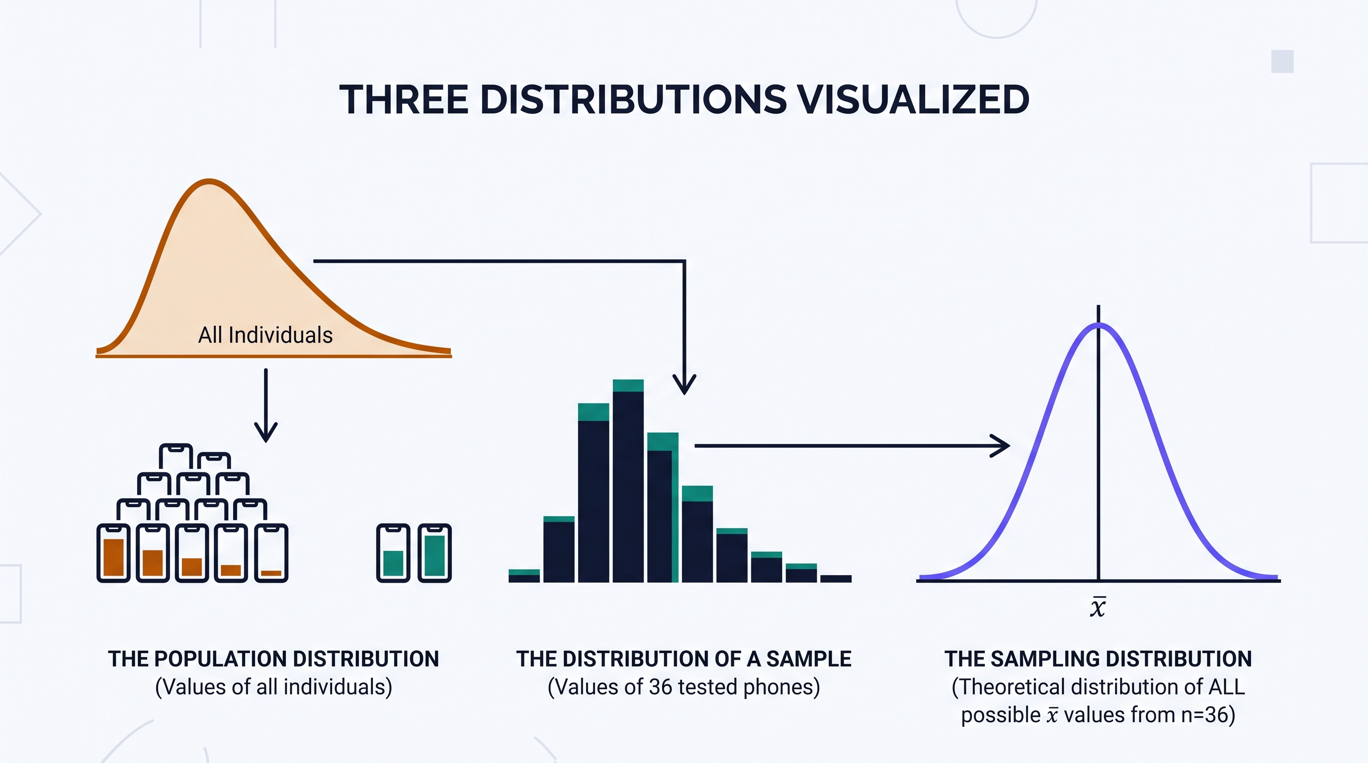
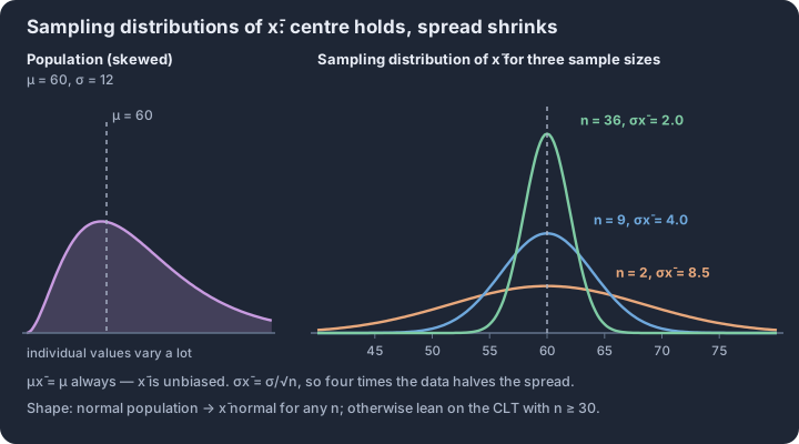
4.2 Constructing a Confidence Interval for a Population Mean or Population Mean Difference
Key concepts: t-distribution — symmetric with wider tails than the standard normal · Degrees of freedom df = n − 1 sets the curve · Standard error of the mean = s/√n · Margin of error = t* × s/√n · Matched pairs — one t-interval for the mean difference μd · Conditions — random, 10%, and near-normal sample shape
Estimating a population mean $\mu$ requires a fundamental shift in how we handle uncertainty. In the real world, we almost never know the population standard deviation $\sigma$.
Estimating a population mean $\mu$ requires a fundamental shift in how we handle uncertainty. In the real world, we almost never know the population standard deviation $\sigma$. When we substitute the sample standard deviation $s$ for $\sigma$, we introduce a new source of variability. To account for this, we move away from the Normal distribution and toward the Student’s $t$-distribution, a family of curves defined by degrees of freedom ($df = n - 1$).
The Logic of the $t$-Interval
UNC-4.A.1: The $t$-distribution is symmetric and centered at zero, but it has "heavier tails" than the standard Normal distribution. This extra area in the tails provides a wider margin of error, compensating for the fact that $s$ is only an estimate of $\sigma$. As the sample size $n$ increases, the $t$-distribution approaches the standard Normal distribution.
Selecting the correct procedure (Skill 2.C) depends on the structure of the data. If we have a single quantitative variable from one population, we use a One-Sample $t$-Interval for $\mu$. If the data consists of "before and after" measurements or matched pairs, we calculate the difference for each pair and perform a One-Sample $t$-Interval for a Population Mean Difference $\mu_d$.
Conditions for Inference (Skill 4.C)
Before constructing an interval, we must verify three critical conditions to ensure our statistical model is valid. Failing these conditions makes the resulting confidence level unreliable.
| Condition | Requirement | Purpose |
|---|---|---|
| Randomness | Data must come from a random sample or a randomized experiment. | Allows us to generalize results to the population or make causal inferences. |
| Independence | If sampling without replacement, the sample size $n$ should be less than 10% of the population $N$. | Ensures the standard error formula remains accurate. |
| Normality | The population distribution is Normal, OR the sample size is large ($n \geq 30$), OR a graph of the sample data shows no strong skew or outliers. | Ensures the sampling distribution of $\bar{x}$ is approximately Normal (via CLT). |
UNC-4.B.1: When $n < 30$ and the population shape is unknown, we must examine the sample data. A dotplot or boxplot that is roughly symmetric with no extreme outliers justifies the use of $t$-procedures (Skill 4.E).
Construction Mechanics (Skill 3.E)
The confidence interval is built using the general formula: $\text{Point Estimate} \pm \text{Margin of Error}$. For a population mean, this is expressed as: $$\bar{x} \pm t^* \left( \frac{s}{\sqrt{n}} \right)$$
The value of $t^$ is the critical value for a given confidence level and $df = n - 1$. The value of $t^$ is always larger than the corresponding $z^*$ for the same confidence level because the $t$-distribution accounts for the additional uncertainty of estimating $\sigma$ with $s$.
Contextual Example: Battery Life
A tech reviewer wants to estimate the mean battery life of a new smartphone. They test a random sample of 15 phones and find a mean life of 12.4 hours with a standard deviation of 1.2 hours. A histogram of the 15 data points shows a slightly right-skewed distribution but no outliers.
- Identify: One-sample $t$-interval for $\mu$ (Skill 2.C).
- Verify: Random sample (given); $15 < 10%$ of all smartphones; $n=15$ is small, but no outliers are present in the sample, so the Normality condition is met (Skill 4.C).
- Calculate: With $df = 14$ and 95% confidence, $t^* \approx 2.145$.
$$ 12.4 \pm 2.145 \left( \frac{1.2}{\sqrt{15}} \right) \rightarrow 12.4 \pm 0.665 \rightarrow (11.735, 13.065) $$
- Justify: The $t$-interval is appropriate here because the population standard deviation is unknown and the sample size is small, necessitating the use of the $t$-distribution to maintain the captured confidence level (Skill 4.E).
Misconception Check: The "Probability" Trap
A common error is stating there is a "95% probability that the population mean is between 11.7 and 13.1 hours." This is incorrect. The population mean $\mu$ is a fixed (though unknown) constant. A specific interval either captures it or it doesn't.
- Correct Reasoning: "In 95% of all possible samples of size 15, the resulting confidence interval will capture the true population mean battery life."
Paired Data: Mean Difference ($\mu_d$)
When data are paired, we ignore the individual values and focus entirely on the differences ($x_d = x_1 - x_2$). We calculate the mean of these differences ($\bar{x}_d$) and the standard deviation of the differences ($s_d$). The interval is then: $$\bar{x}_d \pm t^* \left( \frac{s_d}{\sqrt{n_d}} \right)$$ where $n_d$ is the number of pairs. This is still a one-sample procedure, but it is applied to the single list of differences.
Interpretation Check A researcher calculates a 90% confidence interval for the mean weight of a species of bird as $(145g, 155g)$. If the researcher wanted to increase the confidence level to 99% using the same sample data, what would happen to the width of the interval? Justify your answer using the properties of the $t$-distribution.
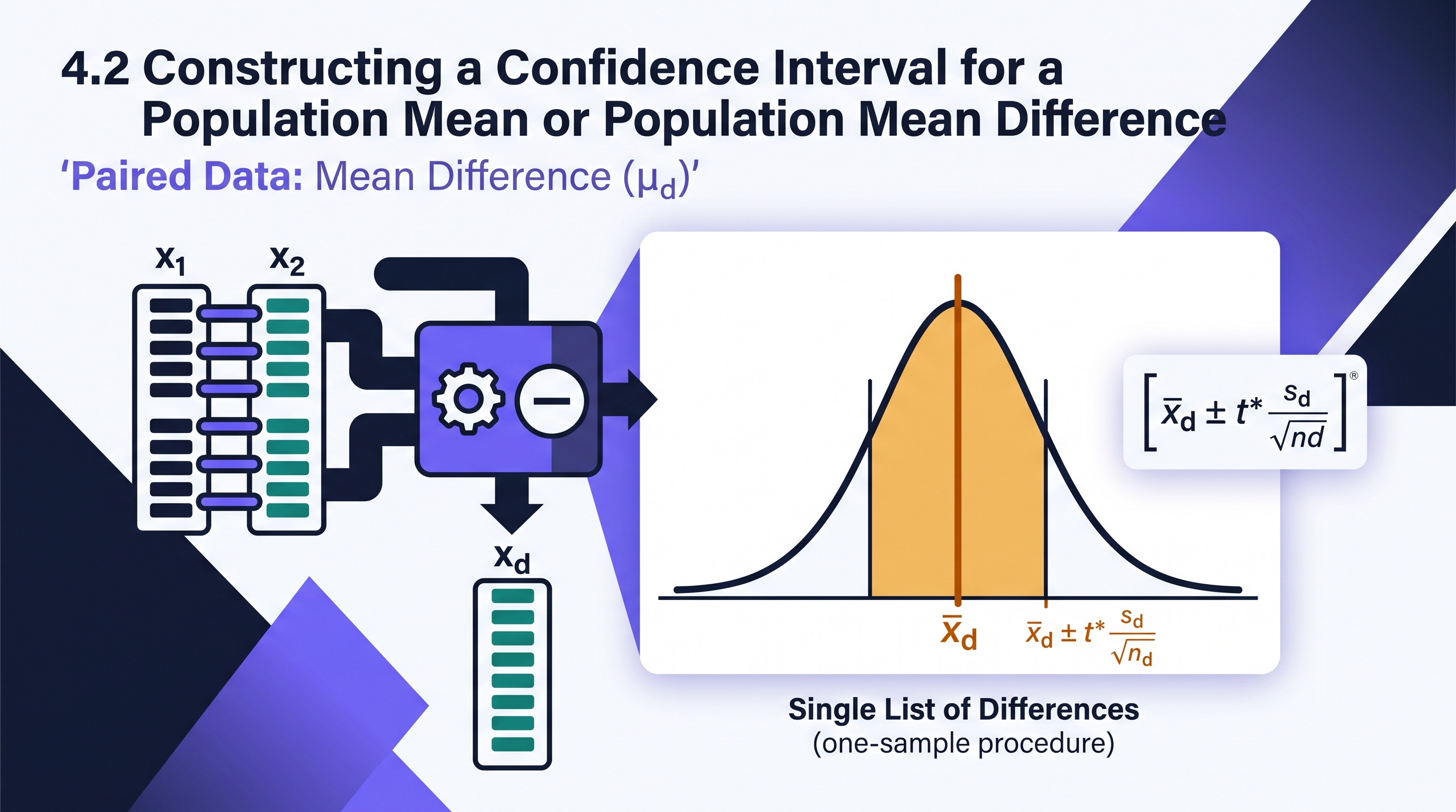
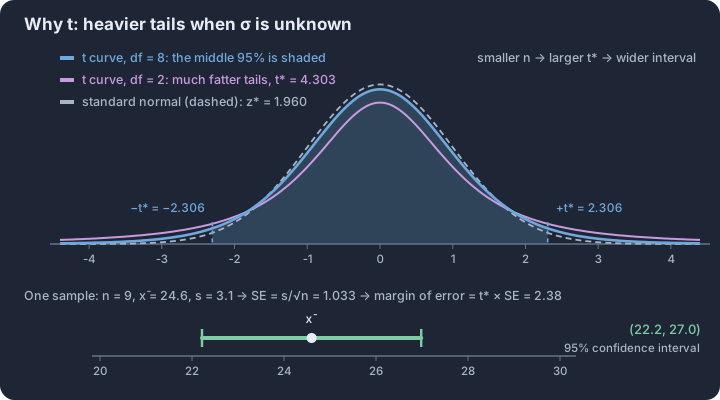
4.3 Justifying a Claim Based on a Confidence Interval for a Population Mean or Population Mean Difference
Key concepts: Confidence level — long-run share of intervals that capture μ · The interval is the set of plausible values for the parameter · A value outside the interval is evidence against that claim · Interval for μd containing 0 — no convincing difference · Higher confidence → larger t* → wider interval · Width shrinks roughly like 1/√n as n grows
A confidence interval serves as more than just an estimate; it acts as a boundary of plausibility. When a researcher or auditor makes a claim about a population mean ($\mu$) or a population mean difference ($\mu_d$), the confidence interval provides the empirical evidence needed to either…
A confidence interval serves as more than just an estimate; it acts as a boundary of plausibility. When a researcher or auditor makes a claim about a population mean ($\mu$) or a population mean difference ($\mu_d$), the confidence interval provides the empirical evidence needed to either support or refute that claim [UNC-4.S]. If a specific hypothesized value falls outside the calculated interval, we conclude that the value is not a plausible estimate for the population parameter at that level of confidence [UNC-4.S.1].
The Logic of Plausibility
The core of statistical justification (Skill 4.G) lies in the relationship between the interval and a "null" or claimed value. If a 95% confidence interval for the mean recovery time of a medical treatment is (12.4, 15.2) days, any claim that the true population mean is 10 days is statistically "implausible." Because 10 is not contained within the interval, we have convincing evidence that the true mean is likely higher than 10. Conversely, if a claim suggests the mean is 14 days, we cannot reject that claim, as 14 is a plausible value within our range.
Key Principle: A confidence interval contains all values of the population parameter that are consistent with the observed sample data at the chosen confidence level. If a claimed value is not in the interval, the data provide evidence against that claim (Skill 4.G).
Interpreting the Interval in Context
To justify a claim, one must first interpret the interval correctly (Skill 4.F). A standard interpretation follows a strict template: "We are [C]% confident that the interval from [lower bound] to [upper bound] captures the population mean [parameter in context]." This interpretation establishes the range of values we believe are "reasonable" for the population.
It is vital to distinguish between the confidence level and the confidence interval. The level (e.g., 95%) refers to the success rate of the method over many repeated samples. The interval (e.g., 4.2 to 5.8) is the specific result of one sample. When justifying a claim, we rely on the specific interval to see if the claimed value is "captured" or "missed."
Claims About Mean Differences ($\mu_d$ or $\mu_1 - \mu_2$)
In many studies, the claim involves a comparison. For paired data (mean difference $\mu_d$) or independent groups (difference of means $\mu_1 - \mu_2$), the most common claim is that there is "no difference." In statistical terms, "no difference" is represented by the value 0.
- Case 1: Interval contains 0. If a 95% confidence interval for the mean difference in test scores (After - Before) is (-2.1, 4.5), then 0 is a plausible value. We do not have convincing evidence of a mean difference.
- Case 2: Interval is entirely above 0. If the interval is (1.5, 6.8), then 0 is not plausible. We have convincing evidence that the mean difference is positive (e.g., scores increased).
- Case 3: Interval is entirely below 0. If the interval is (-10.4, -3.2), then 0 is not plausible. We have convincing evidence that the mean difference is negative (e.g., scores decreased).
Misconception Check: Probability vs. Confidence
A frequent error in justification is claiming there is a "95% probability" that the population mean is between two specific numbers. Once an interval is calculated, the population mean is either in it or it isn't; there is no longer a "probability" involved for that specific range. Instead, we use the term confidence to describe our reliance on the statistical process that produced the interval.
Connection to Error Risks
When we use an interval to reject a claim, we must acknowledge the possibility of error (Skill 2.D). If we reject a claim because it falls outside our 95% interval, there is still a 5% chance that our interval is one of the "unlucky" ones that failed to capture the true population mean. This is the foundation of a Type I Error: concluding there is a difference or an effect when, in reality, the claimed value was correct.
Interpretation Check
A fitness app developer claims that users lose a mean of 5 pounds in their first month. A consumer advocacy group takes a random sample of 50 users and constructs a 95% confidence interval for the mean weight loss: (2.1 lbs, 4.4 lbs).
Task: Does this interval provide convincing evidence that the developer's claim of a 5-pound mean weight loss is incorrect? Justify your answer based on the interval.
Drafting the justification: Yes, the interval provides convincing evidence that the mean weight loss is not 5 pounds. Because the claimed value of 5 lbs is not contained within the 95% confidence interval of (2.1, 4.4), it is not a plausible value for the population mean weight loss at this confidence level. The data suggest the true mean weight loss is actually lower than 5 pounds.
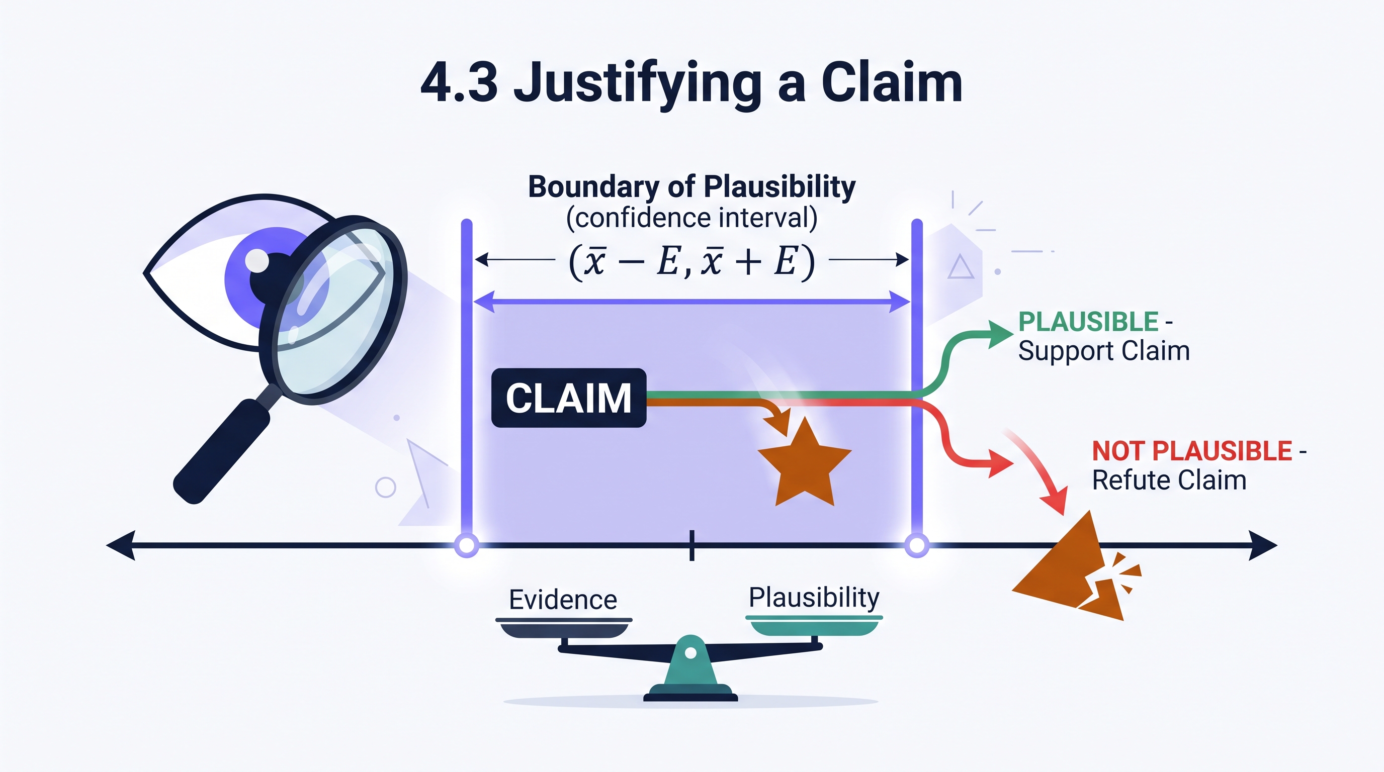
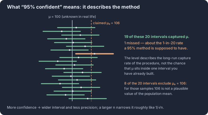
4.4 Setting Up a Test for a Population Mean or Population Mean Difference
Key concepts: One-sample t-test for μ when σ is unknown · Paired design → one-sample t-test on the differences · H₀ always states equality: μ = μ₀ or μd = 0 · Alternative one-sided or two-sided, chosen from the question · Parameter defined in context before any computation · Conditions — random, 10%, and n ≥ 30 or a clean plot
A significance test for a population mean begins with a skepticism of claims. Whether a manufacturer asserts that their batteries last 50 hours or a researcher suspects a new fertilizer increases crop yield, we start by assuming the status quo is true.
A significance test for a population mean begins with a skepticism of claims. Whether a manufacturer asserts that their batteries last 50 hours or a researcher suspects a new fertilizer increases crop yield, we start by assuming the status quo is true. Setting up this test requires a precise translation of a research question into statistical hypotheses and a rigorous verification of the mathematical environment—the conditions—that allow us to use the $t$-distribution.
Identifying the Correct Procedure (Skill 2.C)
Before writing hypotheses, you must determine if the data represent a single quantitative variable from one population or a single quantitative variable of differences from a paired design. While both use the same underlying $t$-test mechanics, the "experimental unit" differs.
| Procedure | Data Structure | Example |
|---|---|---|
| One-Sample $t$-test for $\mu$ | A single sample of $n$ individuals; one measurement per individual. | Measuring the caffeine content in 30 randomly selected cups of "Decaf" coffee. |
| Paired $t$-test for $\mu_d$ | Two measurements on the same individual OR measurements on two matched individuals. | Measuring the reaction time of 20 pilots before and after consuming an energy drink. |
Key Insight: A paired $t$-test is actually a one-sample $t$-test performed on the calculated differences ($d = x_1 - x_2$). We treat the set of differences as our primary data set.
Formulating Hypotheses (Skill 2.E)
The null hypothesis ($H_0$) is the "no effect" or "no difference" claim. It always contains an equality. The alternative hypothesis ($H_a$) represents the researcher’s suspicion—the claim we seek evidence for.
For a Single Population Mean ($\mu$):
- $H_0: \mu = \mu_0$ (where $\mu_0$ is the claimed null value)
- $H_a: \mu > \mu_0$ OR $\mu < \mu_0$ OR $\mu \neq \mu_0$
For a Population Mean Difference ($\mu_d$):
In paired designs, we are almost always testing if the "true mean difference" is zero.
- $H_0: \mu_d = 0$
- $H_a: \mu_d > 0$ OR $\mu_d < 0$ OR $\mu_d \neq 0$
Contextual Example: The Commute Challenge A city claims the average commute time on the "Express Bus" is 25 minutes. A commuter group suspects it is actually longer.
- Variable: $x =$ commute time in minutes.
- Parameter: $\mu =$ the true mean commute time for all Express Bus trips.
- $H_0: \mu = 25$
- $H_a: \mu > 25$
Verifying Conditions for Inference (Skill 4.E)
We cannot use $t$-procedures unless the sampling distribution of the sample mean ($\bar{x}$) is approximately Normal. We verify this through three specific lenses:
- Randomness: The data must come from a random sample or a randomized experiment. This justifies generalizing to the population or claiming a cause-and-effect relationship.
- Independence (10% Condition): If sampling without replacement from a finite population, the sample size $n$ must be less than 10% of the population size $N$. This ensures the observations are "close enough" to independent.
- Normality (Large Sample/Normal): We need to know the sampling distribution of $\bar{x}$ is approximately Normal. This is satisfied if:
- The population distribution is stated to be Normal.
- The sample size is large ($n \geq 30$), invoking the Central Limit Theorem.
- If $n < 30$, the sample data shows no strong skewness or outliers (checked via a dotplot or boxplot).
Misconception Check: The "Data is Normal" Trap
The Error: Students often claim a test is valid because "the sample data is Normal." The Correction: We don't need the sample to be Normal; we need the sampling distribution of the mean to be Normal. If the sample size is small, we look at the sample data only to ensure the population it came from isn't so wildly non-Normal that it breaks our $t$-model.
Summary Checklist for Setup
- Define the parameter ($\mu$ or $\mu_d$) in the specific context of the problem.
- State Hypotheses using correct symbols ($H_0, H_a$) and the null value.
- Identify the test by name (e.g., "One-sample $t$-test for a population mean").
- Verify conditions with explicit evidence from the prompt (e.g., "The problem states 40 cars were randomly selected...").
Retrieval Check: A researcher wants to see if a new "Sleep-Well" pillow changes the average hours of sleep for 15 volunteers. Each volunteer sleeps one night with their old pillow and one night with the "Sleep-Well" pillow (order randomized).
- Is this a one-sample or paired $t$-test?
- If $\mu_d = \text{Sleep}{\text{New}} - \text{Sleep}{\text{Old}}$, what is the alternative hypothesis to test if the new pillow increases sleep?
- Since $n=15$, what must the researcher check in the sample data to proceed?
(Answers: 1. Paired $t$-test; 2. $H_a: \mu_d > 0$; 3. Check a graph of the 15 differences for strong skewness or outliers.)

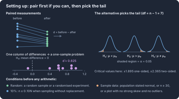
4.5 Carrying Out a Test for a Population Mean or Population Mean Difference
Key concepts: One-sample t-test — comparing x̄ to a claimed μ₀ · t = (x̄ − μ₀) ÷ (s/√n) — effect over standard error · Degrees of freedom n − 1 — because s estimates σ · p-value — chance of a statistic this extreme if H₀ were true · Decision rule: reject H₀ when p ≤ α, otherwise fail to reject · Paired data — test the mean difference x̄_d, not two separate means
Because the population standard deviation ($\sigma$) is almost never known in practice, we substitute the sample standard deviation ($s$), which introduces extra variability.
Because the population standard deviation ($\sigma$) is almost never known in practice, we substitute the sample standard deviation ($s$), which introduces extra variability. This substitution necessitates the use of the t-distribution, which has "heavier tails" than the normal distribution to account for the uncertainty in our estimate of the spread.
The Mechanics of the t-Statistic
The formula for the test statistic in a one-sample t-test (or a paired t-test for a mean difference) is: $$t = \frac{\bar{x} - \mu_0}{\frac{s}{\sqrt{n}}}$$ In this ratio, the numerator represents the observed effect—the "signal"—while the denominator represents the standard error of the mean—the "noise." This $t$-value follows a t-distribution with degrees of freedom ($df$) equal to $n - 1$. As the sample size $n$ increases, the t-distribution approaches the standard normal ($z$) distribution because the estimate of the population variability ($s$) becomes more precise.
For a matched pairs design, the calculation is identical, but the data set consists of the differences ($d$) between paired observations. In this case, $\bar{x}$ becomes $\bar{x}_d$ (the mean of the differences), $s$ becomes $s_d$ (the standard deviation of the differences), and $n$ is the number of pairs.
Determining the p-Value
The p-value is the probability of observing a test statistic at least as extreme as the one calculated, assuming the null hypothesis ($H_0$) is true. It quantifies the compatibility between the observed data and the null model. The direction of the "extreme" values depends on the alternative hypothesis ($H_a$):
- Greater than ($\mu > \mu_0$): The p-value is the area to the right of the calculated $t$ under the $t$-distribution curve.
- Less than ($\mu < \mu_0$): The p-value is the area to the left of the calculated $t$.
- Not equal to ($\mu \neq \mu_0$): The p-value is the sum of the areas in both tails (twice the area of the tail beyond the calculated $t$).
Key Insight: The p-value is a conditional probability: $P(\text{data or more extreme} \mid H_0 \text{ is true})$. It is not the probability that the null hypothesis is true, nor is it the probability that the results occurred by chance.
Justifying a Claim
To reach a statistical conclusion, the p-value is compared to a pre-defined significance level ($\alpha$). This comparison dictates whether the observed results are "statistically significant."
| P-value Comparison | Statistical Decision | Contextual Conclusion |
|---|---|---|
| p-value $\le \alpha$ | Reject $H_0$ | There is convincing evidence for $H_a$. |
| p-value $> \alpha$ | Fail to reject $H_0$ | There is not convincing evidence for $H_a$. |
A complete conclusion must be stated in context, referring to the specific population and parameter being tested. It should use non-definitive language (e.g., "the data suggest" or "there is evidence") rather than claiming the results "prove" a hypothesis.
Misconception Check: "Accepting" the Null
A common error is stating that we "accept the null hypothesis" when the p-value is large. In statistics, we never accept $H_0$. A large p-value simply means the data are consistent with the null hypothesis; it does not prove the null is true. It is like a "not guilty" verdict in a trial—it doesn't mean the defendant is innocent, only that there wasn't enough evidence to convict.
Worked Example: Battery Longevity
A manufacturer claims their new "Ultra" battery lasts for a mean of 50 hours. A consumer group suspects the mean life is actually lower. They test a random sample of 36 batteries and find a sample mean of $\bar{x} = 48.5$ hours with a sample standard deviation of $s = 4$ hours. Using $\alpha = 0.05$:
- Calculate $t$: $t = \frac{48.5 - 50}{4 / \sqrt{36}} = \frac{-1.5}{0.667} = -2.25$.
- Find p-value: With $df = 35$, the area to the left of $t = -2.25$ is approximately $0.015$.
- Conclude: Since $0.015 \le 0.05$, we reject $H_0$. There is convincing evidence that the true mean life of these batteries is less than 50 hours.
Interpretation Check: A researcher performs a paired t-test on the heart rates of 20 subjects before and after exercise. The test yields a p-value of 0.08. Using a significance level of $\alpha = 0.05$, what is the most appropriate conclusion?
- (A) Reject $H_0$; there is evidence that exercise changes heart rate.
- (B) Fail to reject $H_0$; there is evidence that exercise does not change heart rate.
- (C) Fail to reject $H_0$; there is not convincing evidence that exercise changes heart rate.
- (D) Accept $H_0$; the mean difference in heart rate is zero.
Correct Answer: (C). We do not "accept" the null or claim evidence for it; we simply state that the evidence for the change is insufficient at the 5% level.

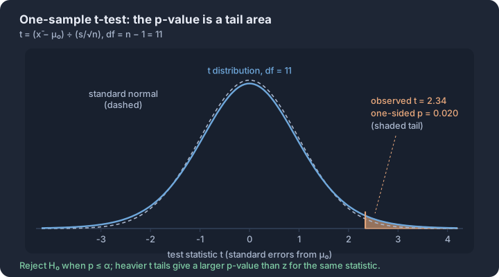
4.6 Sampling Distributions for the Difference Between Two Sample Means
Key concepts: Sampling distribution of x̄₁ − x̄₂ — every possible sample difference · Center of that distribution: μ₁ − μ₂ · Standard deviation √(σ₁²/n₁ + σ₂²/n₂) — variances add, standard deviations do not · Randomization condition — two independent random samples or random assignment · 10% condition — each sample at most a tenth of its population · Normal model when both populations are normal, or both n ≥ 30
Comparing the average performance of two independent groups—such as the mean longevity of two different battery brands or the mean growth rate of plants under two different fertilizers—requires understanding the behavior of the difference between two sample means, $\bar{x}_1 - \bar{x}_2$.
Comparing the average performance of two independent groups—such as the mean longevity of two different battery brands or the mean growth rate of plants under two different fertilizers—requires understanding the behavior of the difference between two sample means, $\bar{x}_1 - \bar{x}_2$. This difference is itself a random variable with a predictable distribution, provided we know the characteristics of the underlying populations and the sizes of the samples drawn from them.
Parameters of the Sampling Distribution (VAR-6.B)
The sampling distribution of $\bar{x}_1 - \bar{x}_2$ is the probability distribution of all possible differences between sample means of a fixed size $n_1$ and $n_2$ taken from two independent populations. To describe this distribution completely, we must identify its center (mean) and its variability (standard deviation).
The Mean of the Difference (VAR-6.B.1): The mean of the sampling distribution of the difference between two sample means is equal to the difference between the two population means. $$\mu_{\bar{x}_1 - \bar{x}_2} = \mu_1 - \mu_2$$
The Standard Deviation of the Difference (VAR-6.B.2): If the two samples are independent, the standard deviation of the sampling distribution is calculated by combining the individual variances of the sample means. $$\sigma_{\bar{x}_1 - \bar{x}_2} = \sqrt{\frac{\sigma_1^2}{n_1} + \frac{\sigma_2^2}{n_2}}$$
| Concept | Formula | Requirement |
|---|---|---|
| Center | $\mu_{\bar{x}_1 - \bar{x}_2} = \mu_1 - \mu_2$ | None (always true) |
| Spread | $\sigma_{\bar{x}_1 - \bar{x}_2} = \sqrt{\frac{\sigma_1^2}{n_1} + \frac{\sigma_2^2}{n_2}}$ | Independent Samples / 10% Condition |
The standard deviation formula relies on what is often called the "Pythagorean Theorem of Statistics" (VAR-6.B.2). When two independent random variables are added or subtracted, their variances add. Even though we are looking at the difference between means, the uncertainty (variability) of the result increases because both samples contribute their own random error to the final estimate.
Determining the Shape (UNC-3.D)
The shape of the sampling distribution for $\bar{x}_1 - \bar{x}_2$ depends on the shapes of the parent populations and the sample sizes $n_1$ and $n_2$. Under specific conditions, the distribution of the difference will be approximately Normal (UNC-3.D.1), allowing us to use the Normal model for probability calculations.
- Normal Populations: If both parent populations are normally distributed, the sampling distribution of $\bar{x}_1 - \bar{x}_2$ is exactly Normal, regardless of the sample sizes.
- Central Limit Theorem (CLT): If the parent populations are not normal (or their shapes are unknown), the sampling distribution of $\bar{x}_1 - \bar{x}_2$ will be approximately Normal if both sample sizes are sufficiently large (typically $n_1 \ge 30$ and $n_2 \ge 30$).
Misconception Check: The "Subtracting Variances" Trap
A common error is attempting to subtract the variances when calculating the standard deviation of the difference: $\sqrt{\frac{\sigma_1^2}{n_1} - \frac{\sigma_2^2}{n_2}}$. This is mathematically impossible (variances cannot be negative) and logically flawed. Subtracting one random variable from another increases the total "noise" in the system; therefore, the variability of the difference is always greater than the variability of either individual mean.
Worked Example: Commute Times
A city planner is comparing commute times between the East Side and the West Side.
- East Side: $\mu_1 = 25$ mins, $\sigma_1 = 8$ mins.
- West Side: $\mu_2 = 21$ mins, $\sigma_2 = 6$ mins. The planner takes an independent simple random sample of $n_1 = 40$ East Side commuters and $n_2 = 35$ West Side commuters.
1. Describe the sampling distribution of $\bar{x}_1 - \bar{x}_2$.
- Center: $\mu_{\bar{x}_1 - \bar{x}_2} = 25 - 21 = 4$ minutes.
- Spread (Skill 3.D): $\sigma_{\bar{x}_1 - \bar{x}_2} = \sqrt{\frac{8^2}{40} + \frac{6^2}{35}} = \sqrt{1.6 + 1.028} \approx 1.621$ minutes.
- Shape (Skill 4.E): Since $n_1 = 40 \ge 30$ and $n_2 = 35 \ge 30$, the Central Limit Theorem applies. The sampling distribution of the difference in sample means is approximately Normal.
2. Justify a Claim (Skill 4.D): If a researcher claims the West Side actually has a higher mean commute time than the East Side ($\mu_1 - \mu_2 < 0$), how likely is it to see a sample difference $\bar{x}_1 - \bar{x}_2 \le 0$? Using the Normal model $N(4, 1.621)$, a difference of 0 has a z-score of $z = \frac{0 - 4}{1.621} \approx -2.47$. The probability of seeing a difference this small or smaller is approximately $0.0068$. Because this probability is very low, the sample evidence strongly supports the city planner's parameters over the researcher's claim.
Retrieval Check: Suppose you increase the sample sizes $n_1$ and $n_2$. How will this affect the mean ($\mu_{\bar{x}_1 - \bar{x}2}$) and the standard deviation ($\sigma{\bar{x}_1 - \bar{x}_2}$) of the sampling distribution?
- Answer: The mean will remain unchanged ($\mu_1 - \mu_2$), but the standard deviation will decrease, as $n$ is in the denominator of the variance terms.
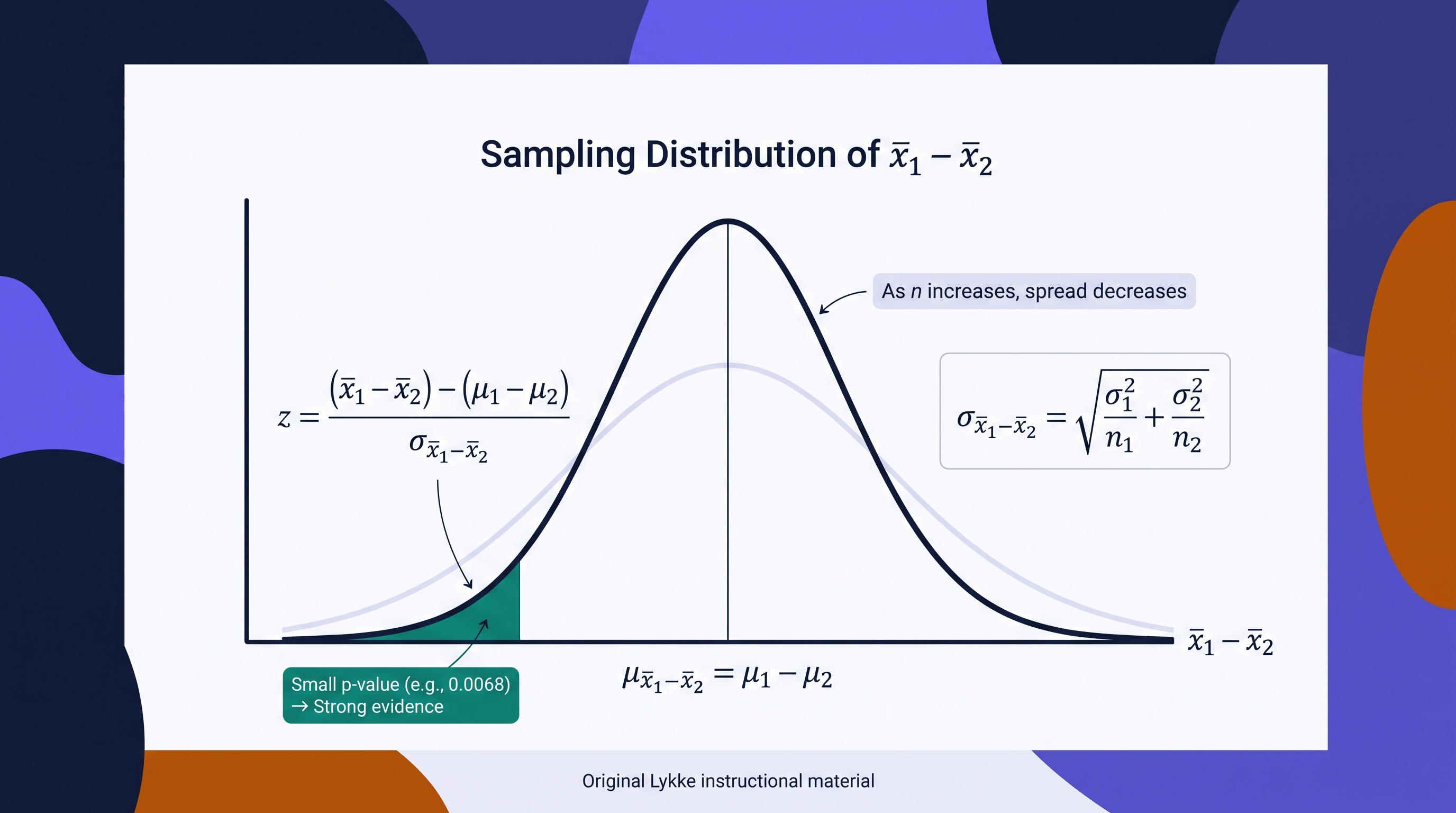
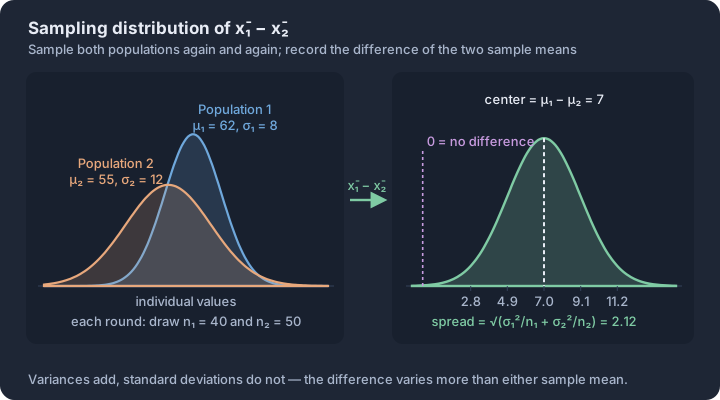
4.7 Constructing a Confidence Interval for the Difference Between Two Population Means
Key concepts: Two-sample t-interval — estimating μ₁ − μ₂ from independent samples · Point estimate x̄₁ − x̄₂, plus or minus a margin of error · Standard error √(s₁²/n₁ + s₂²/n₂) — sample SDs stand in for σ · Margin of error = t* × standard error · Degrees of freedom from technology, not n₁ + n₂ · Independent samples versus paired data — different procedures
The two-sample $t$-interval for the difference between two population means estimates the unknown difference $\mu_1 - \mu_2$ using data from two independent groups.
The two-sample $t$-interval for the difference between two population means estimates the unknown difference $\mu_1 - \mu_2$ using data from two independent groups. Unlike paired data, where observations are linked in couples, this procedure applies when the two samples are selected separately from their respective populations or when experimental units are randomly assigned to two distinct treatment groups. The point estimator for this interval is the difference in sample means, $\bar{x}_1 - \bar{x}_2$.
4.7.1 Identifying the Correct Procedure (Skill 2.C)
Before calculation, a researcher must determine if the study design supports a two-sample $t$-procedure. This requires distinguishing between independent samples and paired data. In independent samples, there is no inherent relationship between an individual in the first group and an individual in the second. For example, comparing the mean test scores of students in California to those in New York involves independent samples. If the same students were tested twice (pre-test and post-test), a paired $t$-interval (Topic 4.2) would be required instead.
Definition: Two-Sample $t$-Interval for $\mu_1 - \mu_2$ An interval used to estimate the difference between the means of two independent populations, calculated as: $$(\bar{x}_1 - \bar{x}_2) \pm t^* \sqrt{\frac{s_1^2}{n_1} + \frac{s_2^2}{n_2}}$$
4.7.2 Verifying Necessary Conditions (Skill 4.E)
The validity of the confidence interval depends on three specific conditions. If these are not met, the resulting margin of error and capture rate may be unreliable.
- Randomness: Data must come from two independent random samples or a randomized experiment with two treatment groups.
- Independence (10% Rule): When sampling without replacement from finite populations, each sample size ($n_1$ and $n_2$) must be less than 10% of its respective population size ($N_1$ and $N_2$) to ensure the standard deviation formula remains valid.
- Normality (Large Counts): For each group, the population distribution must be approximately normal, or the sample size must be large ($n \ge 30$). If the sample size is small and the population shape is unknown, the data must not show strong skewness or outliers.
4.7.3 The Mechanics of Construction (Skill 3.E)
The interval is built by adding and subtracting a margin of error from the difference in sample means. The margin of error consists of a critical value ($t^*$) multiplied by the standard error of the difference between the means.
Standard Error and Critical Values
The standard error ($SE_{\bar{x}_1 - \bar{x}2}$) accounts for the variability in both samples: $$SE{\bar{x}_1 - \bar{x}_2} = \sqrt{\frac{s_1^2}{n_1} + \frac{s_2^2}{n_2}}$$ The critical value $t^*$ is determined by the desired confidence level and the degrees of freedom ($df$). While statistical software uses the complex Satterthwaite approximation to calculate $df$, a conservative manual approach is to use the smaller of $n_1 - 1$ or $n_2 - 1$.
4.7.4 Contextual Example: Agricultural Yield
An agronomist wants to estimate the difference in mean yield (in bushels per acre) between two varieties of corn. Variety A is planted in 35 plots ($\bar{x}_A = 162, s_A = 12$), and Variety B is planted in 40 plots ($\bar{x}_B = 155, s_B = 15$).
To construct a 95% confidence interval:
- Check Conditions: Both $n_A, n_B \ge 30$, satisfying the Large Counts condition. Random assignment to plots is assumed.
- Calculate Standard Error: $\sqrt{\frac{12^2}{35} + \frac{15^2}{40}} \approx \sqrt{4.11 + 5.625} \approx 3.12$.
- Find $t^*$: Using $df = 35 - 1 = 34$, the $t^*$ for 95% confidence is approximately 2.032.
- Construct Interval: $(162 - 155) \pm 2.032(3.12) \rightarrow 7 \pm 6.34 \rightarrow (0.66, 13.34)$.
Interpretation: We are 95% confident that the interval from 0.66 to 13.34 bushels per acre captures the true difference in the mean yield between Variety A and Variety B ($\mu_A - \mu_B$).
4.7.5 Misconception Check: Standard Deviation vs. Standard Error
A common error is to use the population standard deviation ($\sigma$) or to simply average the two sample standard deviations. In practice, we rarely know $\sigma$, so we must use the sample standard deviations ($s_1$ and $s_2$) to estimate the variability. Furthermore, variances (the squares of the standard deviations) are additive when combining independent random variables, which is why we square the standard deviations and divide by $n$ before taking the square root.
Retrieval Check: A researcher calculates a 90% confidence interval for the difference in mean heights between two species of shrubs to be $(1.2, 4.5)$ centimeters. What is the correct interpretation of this interval? Answer: We are 90% confident that the interval from 1.2 cm to 4.5 cm captures the true difference in the population mean heights of these two species of shrubs, not individual observations or sample statistics.
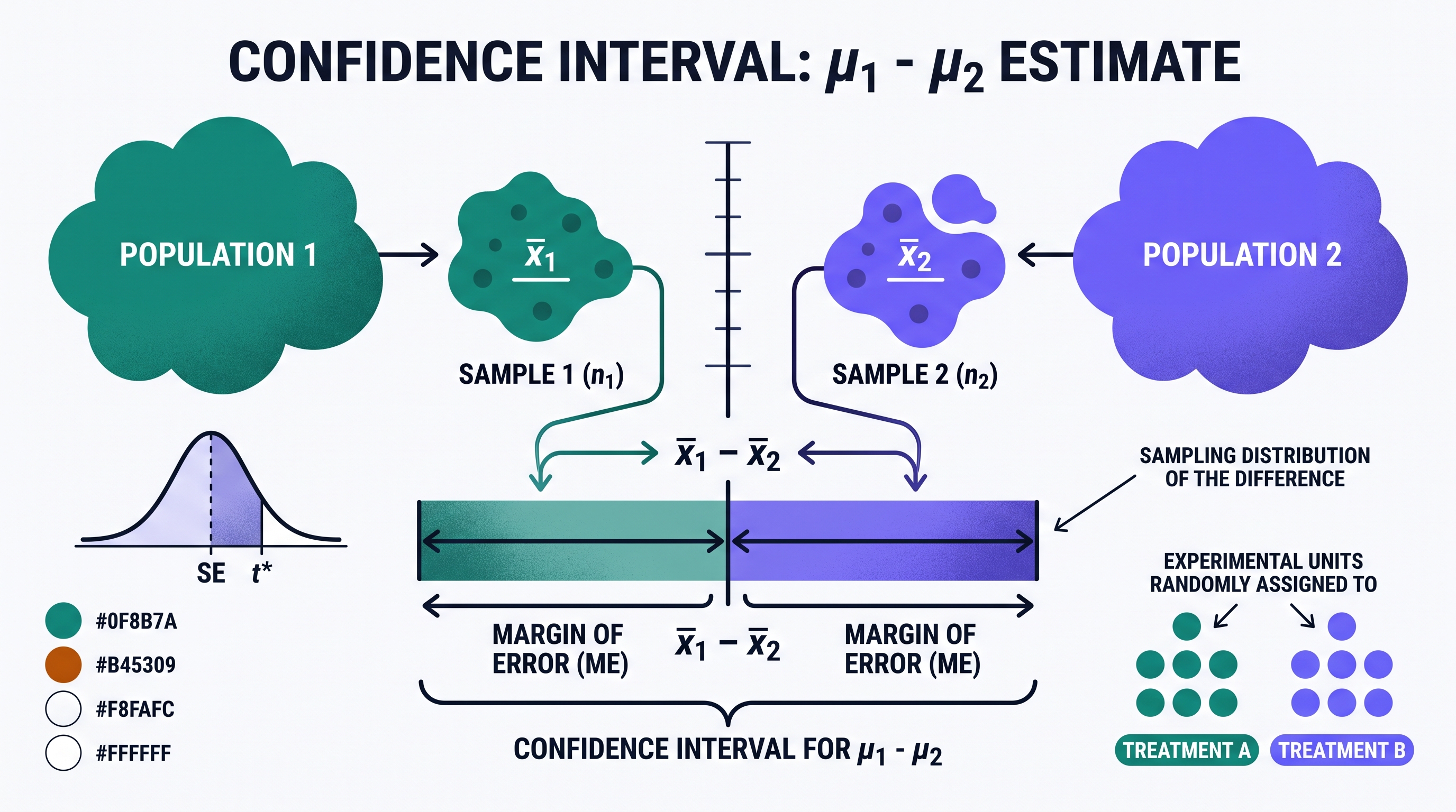
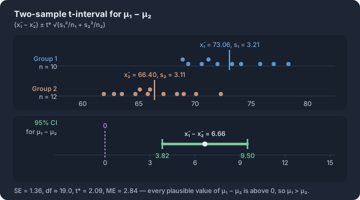
4.8 Justifying a Claim Based on a Confidence Interval for the Difference Between Two Population Means
Key concepts: Zero as the benchmark — the value that means no difference · Interval entirely above or below 0 — evidence of a difference · Interval containing 0 — insufficient evidence of a difference · Confidence level — long-run capture rate of the procedure · Interpreting (a, b) in context as plausible values of μ₁ − μ₂ · No evidence of a difference is not evidence of no difference
Statistical inference reaches its peak utility when it moves beyond mere estimation and begins to adjudicate competing claims. When we construct a confidence interval for the difference between two population means ($\mu_1 - \mu_2$), we are not just looking for a range of plausible values;…
Statistical inference reaches its peak utility when it moves beyond mere estimation and begins to adjudicate competing claims. When we construct a confidence interval for the difference between two population means ($\mu_1 - \mu_2$), we are not just looking for a range of plausible values; we are looking for the presence or absence of a specific value: zero. In the landscape of comparative statistics, zero represents the "null" state—the condition where no difference exists between the two populations.
The ability to justify a claim using this interval is governed by Learning Objective VAR-6.G: Justify a claim about the difference between two population means based on a confidence interval for the difference of two population means. This process requires a synthesis of calculation and contextual reasoning, moving from a numeric range to a definitive statement about the real world.
The Logic of the Zero Benchmark
The fundamental mechanism for justification is defined by Essential Knowledge VAR-6.G.1: If a confidence interval for the difference between two population means does not include 0, there is evidence of a difference between the two population means. If it does include 0, there is not evidence of a difference. This binary check serves as the gateway for all subsequent interpretations.
When an interval consists entirely of positive numbers, it suggests that $\mu_1$ is plausibly greater than $\mu_2$ at the chosen confidence level. Conversely, an interval of entirely negative numbers suggests $\mu_2$ is greater. If the interval straddles zero (containing both negative and positive values), we cannot rule out the possibility that the difference is exactly zero, meaning the data do not provide convincing evidence of a difference.
Skill 4.F: Explaining the Interval in Context
To satisfy Skill 4.F, a statistician must translate the numeric interval into a sentence that a non-expert can understand without losing technical precision. A standard template for this interpretation is: "We are [C]% confident that the true difference in mean [response variable] between [Population 1] and [Population 2] is between [lower bound] and [upper bound] [units]."
Consider a study comparing the mean recovery time (in days) for two different post-surgical treatments. If a 95% confidence interval for $\mu_{Treatment A} - \mu_{Treatment B}$ is $(1.2, 4.5)$, we are 95% confident that the true mean recovery time for Treatment A is between 1.2 and 4.5 days longer than the true mean recovery time for Treatment B.
Skill 4.G: Justifying the Claim
Skill 4.G moves from interpretation to argument. If a researcher claims that Treatment A is faster than Treatment B, the interval $(1.2, 4.5)$ would actually refute that claim. Because the entire interval is positive, it provides evidence that Treatment A takes longer (has a higher mean recovery time) than Treatment B.
A formal justification must explicitly mention the location of zero relative to the interval. For example: "Since the 95% confidence interval for the difference in mean recovery times (1.2, 4.5) does not contain zero and includes only positive values, we have convincing evidence that the mean recovery time for Treatment A is significantly higher than for Treatment B."
Misconception Check: "No Difference" vs. "No Evidence of Difference"
A common error is to claim that if an interval contains zero, it "proves" the two population means are equal. This is a logical fallacy. An interval like $(-2.0, 3.5)$ for the difference in mean test scores between two schools does not mean the schools are identical; it means the study's margin of error was too large, or the sample size too small, to distinguish the true difference from zero. We do not have evidence of a difference, but we have not proven equality.
The Distinction of Evidence:
- Interval excludes 0: We have evidence of a statistically significant difference.
- Interval includes 0: We lack evidence of a statistically significant difference.
Contextual Example: Agricultural Yields
An agronomist wants to know if a new organic fertilizer results in a different mean corn yield than a standard synthetic fertilizer. They calculate a 90% confidence interval for $\mu_{Organic} - \mu_{Synthetic}$ to be $(-4.2, 1.8)$ bushels per acre.
- The Claim: A salesperson for the organic company claims their fertilizer produces a higher yield.
- The Justification: Because the interval $(-4.2, 1.8)$ contains zero, the agronomist concludes that the data do not provide convincing evidence that the organic fertilizer produces a higher mean yield. The difference could plausibly be zero, or even negative (favoring the synthetic).
Interpretation Check: A researcher constructs a 99% confidence interval for the difference in mean heart rate (bpm) between a group of runners and a group of swimmers ($\mu_{Runners} - \mu_{Swimmers}$). The resulting interval is $(-8.4, -2.1)$. Based on this interval, is there evidence of a difference in the true mean heart rates of these two populations? Justify your answer by identifying which population appears to have the higher mean.
Response: Yes, there is evidence of a difference because the interval $(-8.4, -2.1)$ does not contain zero. Since all values in the interval are negative, it suggests that $\mu_{Swimmers}$ is greater than $\mu_{Runners}$, meaning swimmers have a higher true mean heart rate than runners in this context.
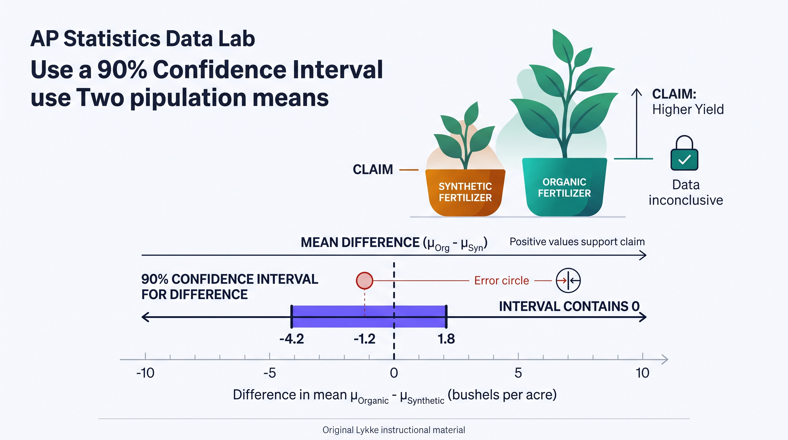
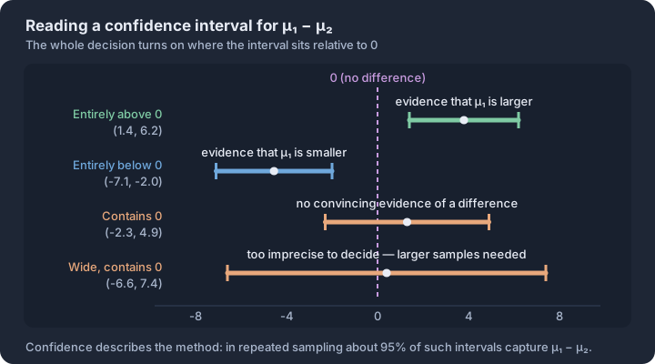
4.9 Setting Up a Test for the Difference Between Two Population Means
Key concepts: Two-sample t-test — the procedure for comparing two population means · H₀: μ₁ − μ₂ = 0 — no difference between the populations · One-sided versus two-sided Hₐ — direction chosen before seeing data · Parameters stated in context — response variable and both populations · Randomization condition — independent random samples or random assignment · Sample-size condition — n ≥ 30, or no strong skew
When we observe a difference between two sample means—say, Brand A batteries lasting 4 hours longer on average than Brand B—we face the fundamental challenge of statistical inference: is this "signal" a reflection of a true difference in the populations, or is it merely "noise" generated by the luck of the draw in…
When we observe a difference between two sample means—say, Brand A batteries lasting 4 hours longer on average than Brand B—we face the fundamental challenge of statistical inference: is this "signal" a reflection of a true difference in the populations, or is it merely "noise" generated by the luck of the draw in random sampling? Setting up a two-sample $t$-test provides the formal framework to determine if the observed difference is statistically significant.
The Investigative Question and Method Selection
The process begins by identifying the relationship between two independent groups. Unlike paired data, where observations are linked (like "before" and "after" on the same subject), independent samples involve two distinct groups where the membership in one provides no information about the membership in the other. Under Skill 2.C, we must justify the choice of a two-sample $t$-test for the difference between two population means. We use the $t$-distribution because the population standard deviations ($\sigma_1$ and $\sigma_2$) are almost always unknown, requiring us to estimate them using sample standard deviations ($s_1$ and $s_2$).
Defining the Hypotheses (Skill 2.E)
In a significance test, we start with a "skeptical" baseline. The null hypothesis ($H_0$) typically claims there is no difference between the two population means. The alternative hypothesis ($H_a$) reflects the researcher's suspicion or the investigative question.
LO VAR-6.G: Identify the null and alternative hypotheses for a difference of two population means.
- Null Hypothesis ($H_0$): $\mu_1 - \mu_2 = 0$ (or $\mu_1 = \mu_2$)
- Alternative Hypothesis ($H_a$):
- $\mu_1 - \mu_2 > 0$ (The mean of Group 1 is greater than Group 2)
- $\mu_1 - \mu_2 < 0$ (The mean of Group 1 is less than Group 2)
- $\mu_1 - \mu_2 \neq 0$ (The means are simply different; a two-sided test)
It is critical to define the parameters $\mu_1$ and $\mu_2$ in the context of the problem. For example, "$\mu_1$ is the true mean recovery time (in days) for patients using Drug A, and $\mu_2$ is the true mean recovery time for patients using a placebo."
Verifying Conditions for Inference (Skill 4.E)
Before performing calculations, we must ensure the sampling distribution of the difference in sample means ($\bar{x}_1 - \bar{x}_2$) is approximately Normal and that our data collection was valid. Under LO VAR-6.H, we verify three primary conditions:
1. The Random Condition
The data must come from two independent random samples or from an experiment with random assignment to treatments. This allows us to generalize results to the population (in the case of samples) or make causal claims (in the case of experiments).
2. The Independence (10%) Condition
When sampling without replacement from a finite population, each sample size must be less than 10% of its respective population ($n_1 < 0.10N_1$ and $n_2 < 0.10N_2$). This ensures that the probabilities remain relatively stable between selections. Note: This condition is generally not required for randomized experiments.
3. The Normal/Large Sample Condition
We must be confident that the sampling distribution of $\bar{x}_1 - \bar{x}_2$ is approximately Normal. This is met if:
- Both population distributions are known to be Normal.
- OR Both sample sizes are large ($n_1 \ge 30$ and $n_2 \ge 30$), satisfying the Central Limit Theorem.
- OR If sample sizes are small, a graph of the sample data (like a dotplot or boxplot) shows no extreme skewness or strong outliers.
Contextual Example: Agricultural Yield
A researcher wants to know if a new organic fertilizer results in a higher mean corn yield than a standard synthetic fertilizer. They randomly assign 40 plots of land to the organic fertilizer ($n_1 = 40$) and 40 plots to the synthetic fertilizer ($n_2 = 40$).
- Hypotheses: $H_0: \mu_{org} - \mu_{syn} = 0$ vs. $H_a: \mu_{org} - \mu_{syn} > 0$.
- Random: Met; plots were randomly assigned to treatments.
- Independence: Not applicable for this experiment (random assignment, not sampling).
- Normal/Large Sample: Met; both $n_1$ and $n_2$ are $\ge 30$.
Misconception Clinic: Independent vs. Paired
A common error is confusing two independent samples with paired data. If you measure the heart rates of 20 people before and after exercise, you have one sample of 20 differences (paired). If you measure the heart rates of 20 athletes and 20 non-athletes, you have two independent samples. The two-sample $t$-test is only appropriate for the latter.
Interpretation Check
A study compares the mean test scores of students who used an AI tutor ($n_1 = 25$) versus those who used a traditional textbook ($n_2 = 22$). A boxplot of the AI group's scores shows a slight left skew but no outliers. The textbook group's scores are roughly symmetric. Can the researcher proceed with a two-sample $t$-test?
Answer: Yes. Although the sample sizes are both under 30, the lack of strong outliers or extreme skewness in the sample data allows us to assume the sampling distribution of the difference in means is approximately Normal.
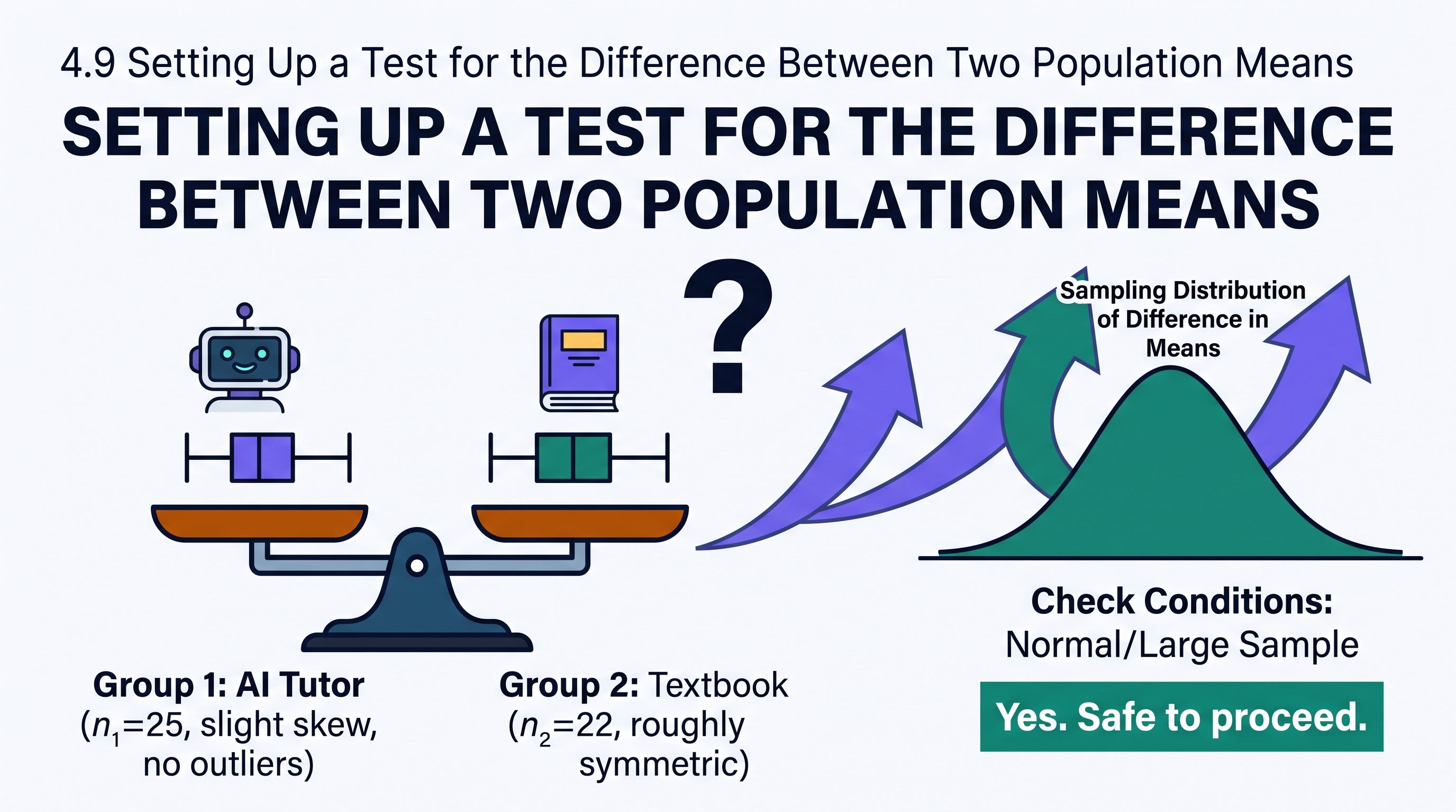
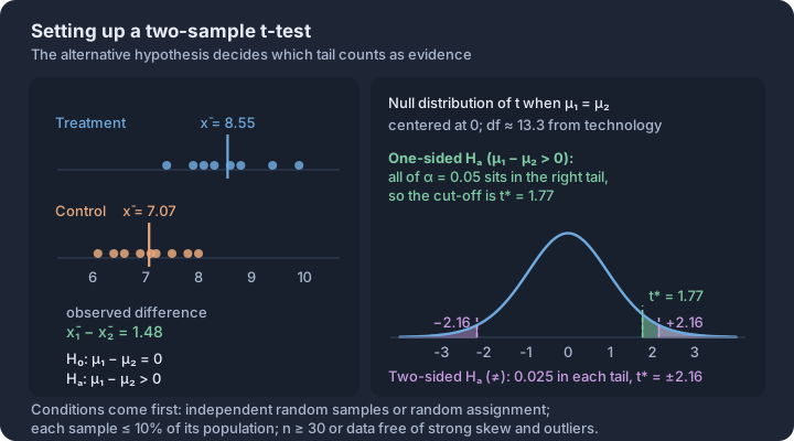
4.10 Carrying Out a Test for the Difference Between Two Population Means
Key concepts: Two-sample t-statistic = (x̄₁ − x̄₂) ÷ √(s₁²/n₁ + s₂²/n₂) · p-value — tail area beyond the observed t under H₀ · The p-value is computed assuming the two population means are equal · Compare p with α to reject or fail to reject H₀ · Conclusion in context, non-definitive, naming both populations · Statistical significance is not practical importance
When we ask if a new hybrid engine is more efficient than a traditional one, or if students using a specific app score higher than those who don't, we are investigating the difference between two population means ($\mu_1 - \mu_2$).
When we ask if a new hybrid engine is more efficient than a traditional one, or if students using a specific app score higher than those who don't, we are investigating the difference between two population means ($\mu_1 - \mu_2$). Unlike a one-sample test that compares a group to a known standard, the two-sample $t$-test evaluates the "gap" between two independent groups. We use the difference in sample means ($\bar{x}_1 - \bar{x}_2$) to determine if the observed distance is too large to be explained by random sampling variability alone.
An illustration showing two distinct bell curves (representing two populations) and a third distribution representing the possible differences between their sample means. This "difference distribution" is centered at zero under the null hypothesis.
The Two-Sample $t$-Statistic
The core of this inference procedure is the two-sample $t$-test statistic. This value measures how many standard errors the observed difference in sample means falls from the hypothesized difference (usually zero). Because we rarely know the population standard deviations ($\sigma_1, \sigma_2$), we use the sample standard deviations ($s_1, s_2$) to estimate the variability. This substitution is why we use the $t$-distribution rather than the normal distribution.
The Two-Sample $t$-Test Statistic Formula: $$t = \frac{(\bar{x}_1 - \bar{x}_2) - (\mu_1 - \mu_2)_0}{\sqrt{\frac{s_1^2}{n_1} + \frac{s_2^2}{n_2}}}$$ Where $(\mu_1 - \mu_2)_0$ is the null hypothesized difference (typically 0).
Calculating the $p$-Value and Degrees of Freedom
The $p$-value is the probability of observing a difference in sample means as extreme as, or more extreme than, the one calculated, assuming the null hypothesis is true. To find this probability, we must identify the correct degrees of freedom ($df$). In AP Statistics, there are two accepted ways to determine $df$:
- Technology Approach: Statistical software and graphing calculators use the Satterthwaite approximation, which often results in a non-integer value (e.g., $df = 34.27$). This is the most precise method.
- Conservative Approach: Use the smaller of $n_1 - 1$ or $n_2 - 1$. This method is safer because it results in a slightly larger $p$-value, making it harder to reject the null hypothesis incorrectly.
Interactive Two-Sample t-Test Walkthrough: A simulation where learners input sample stats ($\bar{x}, s, n$) for two groups. The tool calculates the $t$-statistic, displays the $t$-distribution with the shaded $p$-value area, and provides the $p$-value using both the conservative and technology $df$ methods.
Interpreting and Justifying Conclusions
Once the $p$-value is calculated, we compare it to the significance level ($\alpha$). If the $p$-value is less than $\alpha$, the results are statistically significant. This leads us to reject the null hypothesis ($H_0$) and conclude there is convincing evidence for the alternative hypothesis ($H_a$). If the $p$-value is greater than $\alpha$, we fail to reject $H_0$, meaning the observed difference could reasonably be attributed to sampling variability.
Misconception Check: Independent vs. Paired A common error is using a two-sample $t$-test for data that is actually paired (e.g., "before and after" measurements on the same people). If the two sets of data are linked or matched, you must use a paired $t$-test (Topic 4.5). The two-sample test discussed here is strictly for independent groups where the selection of individuals in Group 1 has no influence on Group 2.
Worked Example: Battery Longevity
A researcher wants to know if "Brand A" batteries last longer than "Brand B." They test 15 Brand A batteries ($\bar{x}_1 = 190$ mins, $s_1 = 12$) and 20 Brand B batteries ($\bar{x}_2 = 182$ mins, $s_2 = 15$).
- Hypotheses: $H_0: \mu_A - \mu_B = 0$ vs. $H_a: \mu_A - \mu_B > 0$.
- Calculation (Skill 3.E): $t = \frac{190 - 182}{\sqrt{\frac{12^2}{15} + \frac{15^2}{20}}} = \frac{8}{4.566} \approx 1.752$.
- $p$-Value (Skill 4.F): Using $df = 14$ (conservative), $p \approx 0.0508$.
- Conclusion (Skill 4.G): At $\alpha = 0.05$, since $0.0508 > 0.05$, we fail to reject $H_0$. We do not have convincing evidence that Brand A batteries last longer than Brand B.
Retrieval Check
- A two-sample $t$-test gives $p=0.02$ at $\alpha=0.05$. Answer: Reject $H_0$; the result provides convincing evidence for $H_a$ in context.
- Why can the conservative degrees-of-freedom method be used? Answer: Using the smaller of $n_1-1$ and $n_2-1$ generally produces a larger $p$-value, so it avoids overstating evidence against $H_0$.
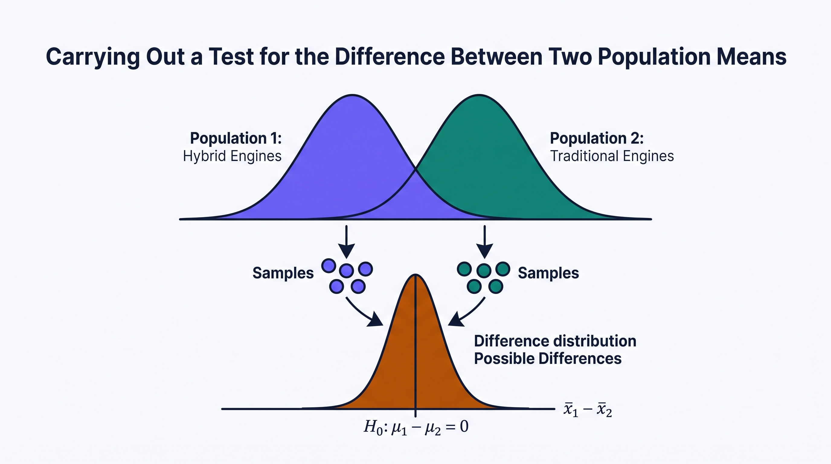
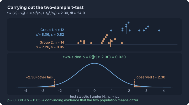
Unit 5: Regression Analysis
Key concepts: Bivariate quantitative data — paired (x, y) measurements on one individual · Scatterplot description: form, direction, strength, unusual features · Correlation r — strength and direction of a linear relationship only · Least-squares regression line — smallest possible sum of squared residuals · Residual = observed − predicted; residual plots test whether a line fits · Slope, intercept and r² interpreted in context
Integrate the official Unit 5 topics through the AP statistical practices and apply them to contextual problems. Follow the unit roadmap to connect every topic, practice statistical reasoning in context, and prepare for cumulative AP-style questions.
Unit 5: Regression Analysis is organized around one recurring question: what evidence would justify the conclusion we want to make? This overview connects the unit's topics before you work through them one at a time.
What you will learn
Integrate the official Unit 5 topics through the AP statistical practices and apply them to contextual problems.
Topic sequence
- 5.1 Graphical Representations Between Two Quantitative Variables — Construct and interpret scatterplots for relationships between two quantitative variables.
- 5.2 Correlation — Interpret correlation and evaluate claims about linear association.
- 5.3 Linear Regression Models — Calculate and interpret predictions from linear regression models.
- 5.4 Residuals — Calculate and analyze residuals to assess a linear model.
- 5.5 Least-Squares Regression — Interpret least-squares regression coefficients and related statistical results.
The reasoning routine
- Start by naming the statistical question and the population or process in context.
- Choose a representation or procedure because its conditions match the situation.
- Show the numerical or graphical evidence clearly.
- Interpret the result using the variables, groups, and units from the original context.
Before you move on
Use the roadmap above to select the first topic. Keep a running error log with four labels—concept, procedure, calculation, and context—so the practice unit can point you back to the exact kind of repair you need.
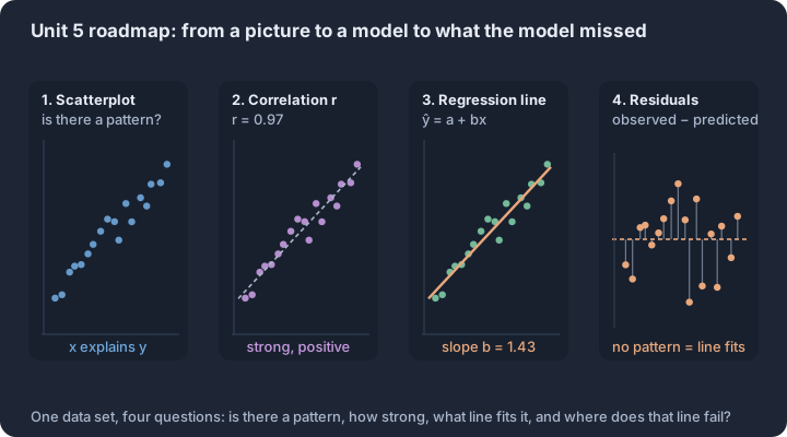
5.1 Graphical Representations Between Two Quantitative Variables
Key concepts: Bivariate quantitative data — ordered pairs from the same individual · Explanatory variable on the x-axis, response variable on the y-axis · Form — linear or non-linear pattern · Direction — positive or negative association · Strength — how closely the points follow the pattern · Unusual features — clusters and points off the pattern
When we move from analyzing a single variable to exploring the relationship between two quantitative variables, we enter the realm of bivariate data.
When we move from analyzing a single variable to exploring the relationship between two quantitative variables, we enter the realm of bivariate data. The fundamental question shifts from "What does this variable look like?" to "How does one variable change in response to another?" To answer this, we rely on the scatterplot, a two-dimensional plot that reveals patterns, trends, and deviations that numerical summaries alone might hide.
The Roles of Variables: Explanatory and Response
In many statistical investigations, we suspect that one variable may help explain or predict changes in another. We distinguish between these roles to provide structure to our analysis:
- Explanatory Variable ($x$): The variable that is manipulated or observed to determine its effect. It is always plotted on the horizontal ($x$) axis.
- Response Variable ($y$): The outcome variable that measures the result of the study. It is always plotted on the vertical ($y$) axis.
Key Distinction: While we often assign these roles based on a hypothesized causal link, a scatterplot itself does not prove causation. It merely displays association. If no clear explanatory-response relationship exists (e.g., comparing a student's SAT Math score to their SAT Reading score), the choice of axes is arbitrary, though consistency remains vital for interpretation.
Constructing the Scatterplot (Skill 3.A)
To construct a scatterplot, we plot ordered pairs $(x, y)$ representing measurements taken from the same individual or experimental unit. The process requires a consistent scale on both axes, though the scales do not need to be identical or start at zero.
| Step | Action | Requirement |
|---|---|---|
| 1 | Label Axes | Identify the explanatory variable for the $x$-axis and the response for the $y$-axis. |
| 2 | Scale Uniformly | Ensure intervals are equal (e.g., increments of 10, 50, or 100). |
| 3 | Plot Points | Place a distinct mark (dot or cross) for each individual's data pair. |
| 4 | Add Context | Include a descriptive title and units of measurement for both axes. |
Describing the Association (Skill 4.A, 4.B)
A scatterplot is only as useful as the description we provide. To fully characterize the relationship between two quantitative variables, we must address four specific components: Direction, Form, Strength, and Unusual Features.
1. Direction
- Positive Association: As $x$ increases, $y$ tends to increase. The "cloud" of points slopes upward from left to right.
- Negative Association: As $x$ increases, $y$ tends to decrease. The points slope downward from left to right.
- No Association: There is no discernible trend in $y$ as $x$ changes.
2. Form
- Linear: The points follow a roughly straight-line pattern.
- Non-linear (Curved): The points follow a clear pattern that is not a straight line (e.g., parabolic, exponential).
3. Strength
- Strength refers to how closely the points follow the identified form. We describe this qualitatively as strong, moderate, or weak. If the points fall exactly on a line or curve, the association is perfect.
4. Unusual Features
- Outliers: Individual points that fall outside the overall pattern of the relationship.
- Clusters: Distinct groups of points that suggest the data might be influenced by a third, categorical variable.
Contextual Example: Vehicle Weight vs. Fuel Efficiency
Consider a study of 15 different car models where researchers measured the curb weight (in pounds) and the highway fuel efficiency (in miles per gallon).
- Explanatory Variable ($x$): Curb weight (lbs)
- Response Variable ($y$): Fuel efficiency (mpg)
Statistical Description: The scatterplot shows a strong, negative, linear association between vehicle weight and fuel efficiency. As the weight of the vehicle increases, the fuel efficiency tends to decrease. There is one unusual feature: a high-performance sports car that is relatively light but has significantly lower fuel efficiency than the linear trend would predict, acting as an outlier.
Misconception Check: Scatterplots vs. Line Graphs
The Error: Students often want to "connect the dots" in a scatterplot with a jagged line, similar to a time-series plot or a line graph in algebra.
The Correction: In statistics, we do not connect the individual points in a scatterplot. Connecting the dots implies a sequential or functional relationship between specific adjacent observations that usually doesn't exist. Instead, we look for the "global" pattern (the trend) rather than "local" fluctuations between individual pairs.
Interpretation Check
A researcher finds that for a group of employees, the relationship between "Years of Experience" ($x$) and "Annual Salary" ($y$) shows a pattern where points are tightly clustered around a line that rises from left to right. However, one employee with 30 years of experience earns significantly less than the others with similar tenure.
Question: How should the researcher describe the direction, strength, and unusual features of this distribution?
Answer: The direction is positive, the strength is strong, and there is an outlier (the high-experience, low-salary employee).
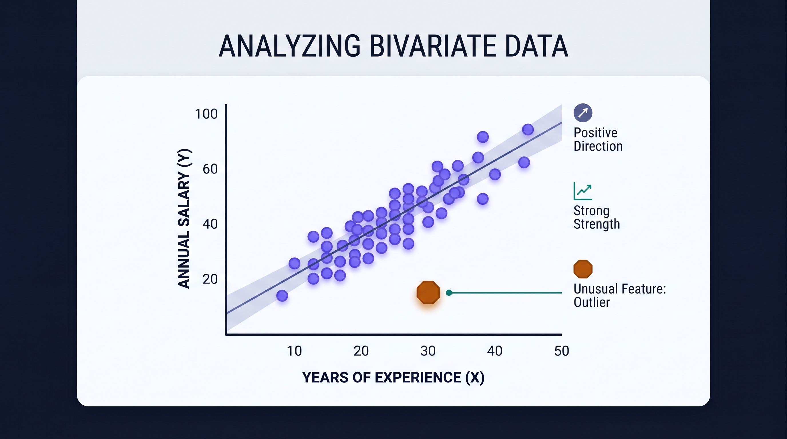
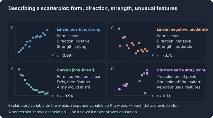
5.2 Correlation
Key concepts: Correlation coefficient r — unit-free measure of linear strength and direction · Sign of r — negative r shows a negative association, positive r a positive one · Range of r — always between −1 and 1, inclusive · Strength — |r| near 1 is a tight line, r = 0 no linear association · r built from z-scores — standardizing removes the units of x and y · Correlation is not causation, and a high r does not confirm linearity
The correlation coefficient, denoted as $r$, serves as the standardized measure for the direction and strength of a linear relationship between two quantitative variables.
The correlation coefficient, denoted as $r$, serves as the standardized measure for the direction and strength of a linear relationship between two quantitative variables. Unlike the visual "cloud" of a scatterplot, $r$ provides a single numerical value that allows for objective comparison between different datasets, regardless of the units of measurement used for the variables (LO 5.2.A, Skill 4.D).
The Mechanics of $r$
The value of $r$ is calculated using the standardized scores ($z$-scores) of the observations. By evaluating how many standard deviations an observation's $x$ and $y$ values fall from their respective means, the correlation coefficient determines how consistently the variables move together.
Definition: Correlation Coefficient ($r$) A unitless measure between $-1$ and $1$ that describes the direction and strength of the linear association between two quantitative variables (EK 5.2.A.1).
Range and Direction
The sign and magnitude of $r$ dictate the nature of the linear association (EK 5.2.A.2, EK 5.2.A.3):
- Positive Correlation ($r > 0$): As the explanatory variable increases, the response variable tends to increase.
- Negative Correlation ($r < 0$): As the explanatory variable increases, the response variable tends to decrease.
- Perfect Linearity: An $r$ of exactly $1$ or $-1$ occurs only when every data point falls perfectly on a single straight line (EK 5.2.A.4).
- No Linear Association: An $r$ near $0$ indicates a very weak linear relationship, where knowing $x$ provides little to no information about the linear trend of $y$ (EK 5.2.A.5).
Essential Properties of Correlation
To interpret $r$ accurately, several mathematical constraints must be understood. These properties prevent common errors in comparative analysis.
| Property | Statistical Implication | CED Reference |
|---|---|---|
| Unitless | $r$ does not change if you convert measurements (e.g., from inches to centimeters). | EK 5.2.A.8 |
| Symmetry | Switching the $x$ and $y$ variables does not change the value of $r$. | EK 5.2.A.1 |
| Non-Resistance | $r$ is strongly affected by outliers; a single extreme point can move $r$ from $0.9$ to $0.4$. | EK 5.2.A.6 |
| Linearity Only | $r$ only measures linear strength. A perfect parabola may have an $r$ near $0$. | EK 5.2.A.5 |
Non-Resistance to Outliers
Because $r$ is calculated using means and standard deviations—both of which are non-resistant summary statistics—correlation is highly sensitive to unusual observations. An outlier that falls far from the linear pattern of the rest of the data will decrease the magnitude of $r$. Conversely, an "influential" point that falls far in the $x$-direction but follows the linear trend can artificially inflate the strength of $r$ (EK 5.2.A.6).
Contextual Interpretation: The Wolf Study
Consider a study of gray wolves where researchers measure the length (meters) and weight (kilograms) of 25 individuals. A calculated correlation of $r = 0.85$ suggests a strong, positive, linear relationship between length and weight. In this context, longer wolves generally weigh more, and the data points cluster tightly around a linear trend. If the researchers switched to measuring length in centimeters, $r$ would remain $0.85$ because correlation is invariant under linear transformations (EK 5.2.A.8).
Critical Distinctions and Misconceptions
Misconception: $r = 0$ means "No Relationship"
A common error is assuming that a correlation of zero implies the variables are unrelated. In reality, $r = 0$ only implies the absence of a linear relationship. The variables could have a perfect quadratic or sinusoidal relationship that $r$ is mathematically unable to detect (EK 5.2.A.5).
The Causation Trap
Correlation does not imply causation (EK 5.2.A.7). A high correlation between two variables simply means they vary together; it does not prove that changes in the explanatory variable cause changes in the response variable. Often, a third "lurking" or confounding variable influences both. For example, ice cream sales and drowning incidents are highly correlated, but both are actually driven by a third variable: outdoor temperature.
Distinction from Slope
While the sign of $r$ matches the sign of the slope of the least-squares regression line, the value of $r$ is not the slope. A line with a very shallow slope can still have an $r = 1$ if the points fall exactly on that line. Slope tells you the rate of change; correlation tells you the "tightness" of the fit (EK 5.2.A.3).
Interpretation Check
A researcher finds a correlation of $r = -0.92$ between the number of hours spent on social media ($x$) and the number of hours spent sleeping ($y$) for a group of students.
- Describe the relationship: There is a strong, negative, linear relationship between social media use and sleep duration.
- Evaluate a claim: If a student claims that social media causes them to lose sleep based solely on this $r$ value, is the claim justified?
- Answer: No. While the association is strong, other factors (such as school workload or caffeine intake) might influence both variables. Correlation alone cannot establish a causal link (EK 5.2.A.7).
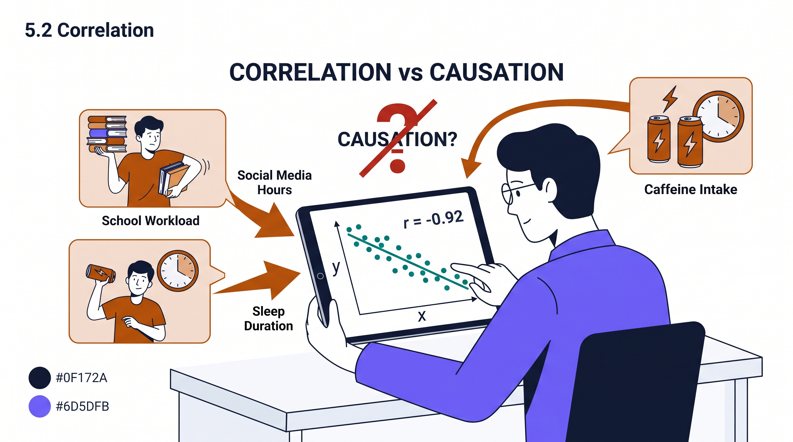
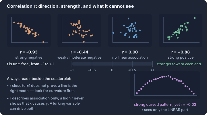
5.3 Linear Regression Models
Key concepts: Linear regression model — ŷ = a + bx predicts a response from an explanatory variable · Predicted value ŷ — a point on the line, not an observed data value · Slope b — predicted change in y for a one-unit increase in x · y-intercept a — the predicted response when x equals 0 · Interpolation — predicting at an x inside the observed range · Extrapolation — predicting beyond the data; less reliable the further out
A linear regression model serves as a mathematical bridge, allowing statisticians to estimate the value of a response variable based on the known value of an explanatory variable.
A linear regression model serves as a mathematical bridge, allowing statisticians to estimate the value of a response variable based on the known value of an explanatory variable. While correlation ($r$) measures the strength and direction of a linear relationship, the regression model provides the specific functional form—the "line of best fit"—necessary to turn that association into a predictive tool (LO 5.3.A, EK 5.3.A.1).
The Anatomy of Prediction
In algebra, a line is often written as $y = mx + b$. In statistics, we modify this notation to emphasize that the model provides an estimate rather than a deterministic certainty. The standard form for a linear regression model is:
$$\hat{y} = a + bx$$
The "Y-Hat" ($\hat{y}$): This symbol represents the predicted value of the response variable for a given value of the explanatory variable ($x$). It is the value that falls exactly on the regression line (EK 5.3.A.2).
| Component | Statistical Term | Definition |
|---|---|---|
| $\hat{y}$ | Predicted Response | The estimated value of $y$ calculated by the model. |
| $a$ | $y$-intercept | The predicted value of $y$ when $x = 0$. |
| $b$ | Slope | The amount by which $\hat{y}$ is predicted to change when $x$ increases by one unit. |
| $x$ | Explanatory Variable | The independent variable used to make the prediction. |
Worked Problem: The Backpack Weight Model
A school nurse notices that students carrying heavy backpacks often report back pain. She collects data from 30 students and develops the following linear regression model to predict backpack weight (in pounds) based on the number of books inside:
$$\widehat{\text{Weight}} = 2.2 + 1.5(\text{Books})$$
Task 1: Calculate a Prediction (Skill 3.B)
Predict the weight of a backpack for a student carrying 4 books.
- Identify the input: $x = 4$.
- Substitute into the model: $\hat{y} = 2.2 + 1.5(4)$.
- Compute: $\hat{y} = 2.2 + 6.0 = 8.2$.
- Interpret in context: For a student carrying 4 books, the model predicts the backpack will weigh 8.2 pounds.
Task 2: Interpret the Slope
The slope $b = 1.5$. This means that for each additional book added to the backpack, the predicted weight increases by 1.5 pounds.
Task 3: Interpret the Intercept
The $y$-intercept $a = 2.2$. This means that for a backpack with 0 books (an empty backpack), the predicted weight is 2.2 pounds.
The Extrapolation Trap
A regression model is only valid within the range of the data used to create it. Using a model to predict values far outside the interval of the explanatory variable $x$ is known as extrapolation (EK 5.3.A.3).
Why Extrapolation is Dangerous: We have no evidence that the linear relationship continues indefinitely. For example, if our backpack data only included students with 1 to 8 books, using the model to predict the weight for a student with 50 books would likely result in a massive error. The physical limits of the backpack or the student's ability to carry it might change the relationship entirely.
Misconception Check: Predicted vs. Observed
The Error: A student looks at the backpack data and sees that one specific student with 4 books actually had a backpack weighing 10 pounds. They claim the model is "broken" because it predicted 8.2 pounds. The Correction: The regression model predicts the average or expected response for a given $x$. Individual data points ($y$) rarely fall exactly on the line. The difference between the observed $y$ and the predicted $\hat{y}$ is the residual, which measures the model's prediction error for that specific instance.
Interpretation Check
A researcher develops a model to predict the height of a sunflower (in cm) based on the days since planting: $\widehat{\text{Height}} = 10 + 2.5(\text{Days})$. The data used to create the model ranged from Day 5 to Day 40.
- What is the predicted height of a sunflower on Day 20?
- Why would it be statistically "unapproved" to use this model to predict the height of the sunflower on Day 200?
Check your reasoning:
- $\hat{y} = 10 + 2.5(20) = 60\text{ cm}$.
- Predicting for Day 200 is extrapolation. The sunflower will eventually stop growing or die, so the linear relationship observed in the first 40 days will not hold.
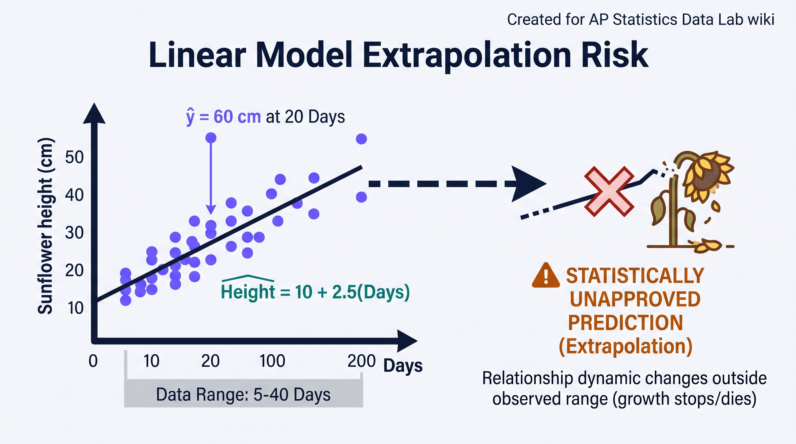
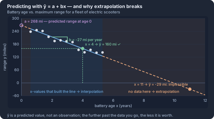
5.4 Residuals
Key concepts: Residual e = observed y − predicted ŷ, measured vertically · Positive residual — the model underpredicted that observation · Negative residual — the model overpredicted that observation · Residual plot — residuals graphed against x or against ŷ · Random scatter in the residual plot — the linear model is appropriate · Curvature in the residual plot — a line is the wrong model
Every linear model is an approximation of reality, and the "error" of that approximation is captured in the residual. A residual measures the vertical distance between an observed data point and the value predicted by the regression line.
Every linear model is an approximation of reality, and the "error" of that approximation is captured in the residual. A residual measures the vertical distance between an observed data point and the value predicted by the regression line. It represents the portion of the response variable ($y$) that the explanatory variable ($x$) fails to explain.
Definition: Residual (VAR-2.B.1) The residual ($e$) for a specific observation is the difference between the observed value ($y$) and the predicted value ($\hat{y}$). $$e = \text{Observed } y - \text{Predicted } \hat{y}$$ $$e = y - \hat{y}$$
Determining the Model and the Residual (Skill 3.B)
Before calculating a residual, we must determine the equation of the Least-Squares Regression Line (LSRL). This line is unique because it minimizes the sum of the squared residuals. To find the equation $\hat{y} = b_0 + b_1x$, we use the summary statistics of the dataset: the means ($\bar{x}, \bar{y}$), the standard deviations ($s_x, s_y$), and the correlation coefficient ($r$).
Worked Example: Electric Vehicle Range
A researcher tracks the "Age of Battery" (years) and the "Maximum Range" (miles) for five identical electric vehicle models to see how capacity degrades over time.
| Age ($x$) | Range ($y$) |
|---|---|
| 1 | 295 |
| 2 | 280 |
| 3 | 275 |
| 4 | 250 |
| 5 | 240 |
Step 1: Determine the LSRL Equation (Skill 3.B) Using technology or summary statistics ($\bar{x}=3, \bar{y}=268, s_x \approx 1.58, s_y \approx 22.25, r \approx -0.987$), we calculate the slope ($b_1$) and intercept ($b_0$):
- Slope: $b_1 = r \left( \frac{s_y}{s_x} \right) \approx -0.987 \left( \frac{22.25}{1.58} \right) \approx -13.9$
- Intercept: $b_0 = \bar{y} - b_1\bar{x} = 268 - (-13.9)(3) = 309.7$
- Equation: $\widehat{\text{Range}} = 309.7 - 13.9(\text{Age})$
Step 2: Calculate a Specific Residual (VAR-2.B.1) Let’s find the residual for the car that is 4 years old (Observed $y = 250$).
- Predict: $\hat{y} = 309.7 - 13.9(4) = 254.1$ miles.
- Subtract: $e = y - \hat{y} = 250 - 254.1 = -4.1$ miles.
- Interpret: The actual range of this 4-year-old car is 4.1 miles less than predicted by the linear model.
Analyzing Residual Plots (VAR-2.C.1, Skill 4.A)
A residual plot is a scatterplot where the $x$-axis represents the explanatory variable (or predicted values) and the $y$-axis represents the residuals. This tool is essential for visualizing how well a linear model fits the data.
| Feature | Interpretation (Skill 4.A) |
|---|---|
| Random Scatter | If residuals are scattered randomly above and below the $e=0$ line with no clear pattern, a linear model is appropriate. |
| Curved Pattern | If residuals show a "U" or "inverted U" shape, the relationship is likely nonlinear, and a linear model is not adequate. |
| Changing Spread | If the vertical spread of residuals increases or decreases as $x$ increases (fanning), the model's predictive reliability varies across the domain. |
Assessing Model Adequacy (Skill 4.D)
Statistical practice requires us to justify why we chose a specific model. A high correlation ($r$) or a high coefficient of determination ($r^2$) is not enough to prove that a linear model is appropriate. You must examine the residual plot.
The Golden Rule of Adequacy (VAR-2.C.1): A linear model is appropriate for the data if and only if the residual plot shows a random scatter of points around the horizontal line at zero, with no discernable non-linear pattern.
Misconception Check: The "Perfect" Line
Misconception: A residual of zero means the model is "wrong" for other points. Correction: A residual of zero simply means the observed value fell exactly on the regression line. Furthermore, the sum of all residuals in a least-squares regression will always be zero ($\sum e = 0$), meaning the positive and negative "errors" perfectly cancel each other out.
Misconception Check: Correlation vs. Adequacy
Misconception: "Since $r = 0.99$, the linear model is the best fit." Correction: Even with a near-perfect correlation, if the residual plot shows a curve, a linear model is technically inappropriate. A curved model (like a quadratic or exponential) would be a better representation of the underlying relationship.
Interpretation Check
A researcher calculates a residual of $+12.5$ for a data point.
- Did the linear model overpredict or underpredict the actual value?
- Is the data point located above or below the regression line?
(Answer: 1. Underpredict; 2. Above. Since $e = y - \hat{y}$, a positive value means the actual $y$ was greater than the predicted $\hat{y}$.)
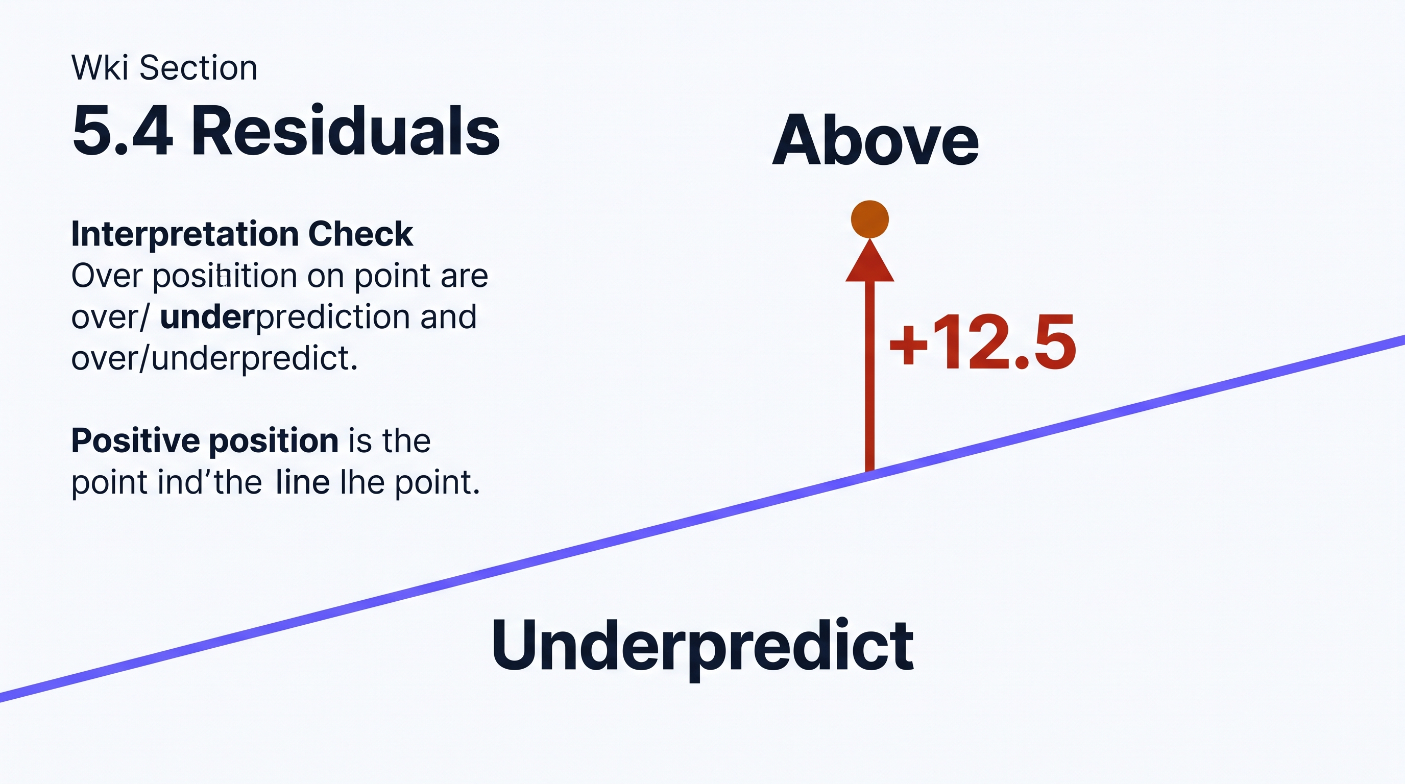
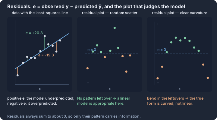
5.5 Least-Squares Regression
Key concepts: Least-squares criterion — the line minimizing the sum of squared residuals · The LSRL always passes through the point (x̄, ȳ) · Slope b = r · s_y / s_x, found with technology · Slope in context — predicted change in y per one-unit increase in x · y-intercept in context — predicted y at x = 0, sometimes not meaningful · Coefficient of determination r² — share of variation in y explained by x
The "best-fit" line in linear regression is not a subjective choice or a visual guess; it is the result of a precise mathematical optimization called the least-squares criterion.
The "best-fit" line in linear regression is not a subjective choice or a visual guess; it is the result of a precise mathematical optimization called the least-squares criterion. While many lines could potentially pass through a cloud of data points, the least-squares regression line (LSRL) is the unique line that minimizes the sum of the squared residuals ($\sum e^2$). By squaring the vertical distances between the observed data points and the predicted values, the model penalizes large deviations more heavily and ensures that positive and negative residuals do not simply cancel each other out.
The Least-Squares Criterion
To understand why we square the residuals, imagine a scatterplot where every point is connected to a candidate line by a vertical string. The length of that string is the residual ($y - \hat{y}$). If we simply minimized the sum of the residuals, any line passing through the "center" of the data would result in a sum of zero, because the positive and negative distances would offset. By squaring these lengths, we turn them into areas of physical squares. The LSRL is the specific line positioned such that the total area of all these squares is as small as possible.
The Regression Equation
The LSRL is expressed in the form $\hat{y} = a + bx$, where $\hat{y}$ (pronounced "y-hat") represents the predicted value of the response variable for a given value of the explanatory variable $x$.
- The $y$-intercept ($a$): This is the predicted value of $y$ when $x = 0$. In many contexts, such as predicting a house's price based on its square footage, the intercept may not have a meaningful physical interpretation (a house with 0 square feet is not a house), but it is mathematically necessary to anchor the line.
- The slope ($b$): This is the most critical component for interpretation. The slope describes the predicted change in the response variable for every one-unit increase in the explanatory variable.
Interpretation Template for Slope ($b$): "For every additional [unit] increase in [explanatory variable $x$], the model predicts an average [increase/decrease] of [$b$ units] in [response variable $y$]."
Calculating the LSRL from Summary Statistics
You do not always need the raw data to find the equation of the LSRL. If you know the mean and standard deviation of both variables, along with their correlation, you can calculate the slope and intercept directly using Skill 3.B:
- Calculate the slope ($b$): $b = r \left( \frac{s_y}{s_x} \right)$. This formula reveals that the slope is a product of the correlation ($r$) and the ratio of the variabilities ($s_y / s_x$). If the variables are scaled differently, the slope adjusts accordingly.
- Calculate the intercept ($a$): $a = \bar{y} - b\bar{x}$. This formula is derived from a fundamental property of the LSRL: the line always passes through the point of averages, $(\bar{x}, \bar{y})$.
Interpreting Computer Output
In professional practice and on the AP Exam, regression models are often generated by software (like Minitab or Desmos). Interpreting this output (Skill 4.D) requires identifying specific values within a "Coefficients" table.
| Predictor | Coef (Coefficient) | SE Coef | T | P |
|---|---|---|---|---|
| Constant | 12.50 ($a$) | 1.20 | 10.42 | 0.000 |
| Square Footage | 0.15 ($b$) | 0.02 | 7.50 | 0.000 |
In the table above, the "Constant" row provides the $y$-intercept ($a = 12.50$), and the row labeled with the explanatory variable name provides the slope ($b = 0.15$). The resulting equation would be $\widehat{\text{Price}} = 12.50 + 0.15(\text{SqFt})$.
Misconception Check: Slope vs. Correlation
A common error is treating the slope ($b$) and the correlation ($r$) as interchangeable. While they always share the same sign (positive or negative), they represent different concepts. Correlation measures the strength and direction of a linear relationship and is unitless. The slope measures the rate of change and is expressed in units of $y$ per unit of $x$. A very strong correlation ($r = 0.99$) can exist for a line with a very shallow slope ($b = 0.001$).
Contextual Example: Battery Life
Suppose a researcher studies the relationship between the age of a smartphone (in months, $x$) and its maximum battery capacity (in percentage, $y$). The resulting LSRL is $\hat{y} = 98 - 0.8x$.
- Intercept (98): The model predicts that a brand-new phone (0 months old) has a capacity of 98%.
- Slope (-0.8): For every 1-month increase in the age of the phone, the model predicts an average decrease of 0.8% in battery capacity.
Interpretation Check: Using the battery life model $\hat{y} = 98 - 0.8x$, what is the predicted battery capacity for a phone that is 10 months old? Does a slope of -0.8 imply that every phone loses exactly 0.8% capacity every month?
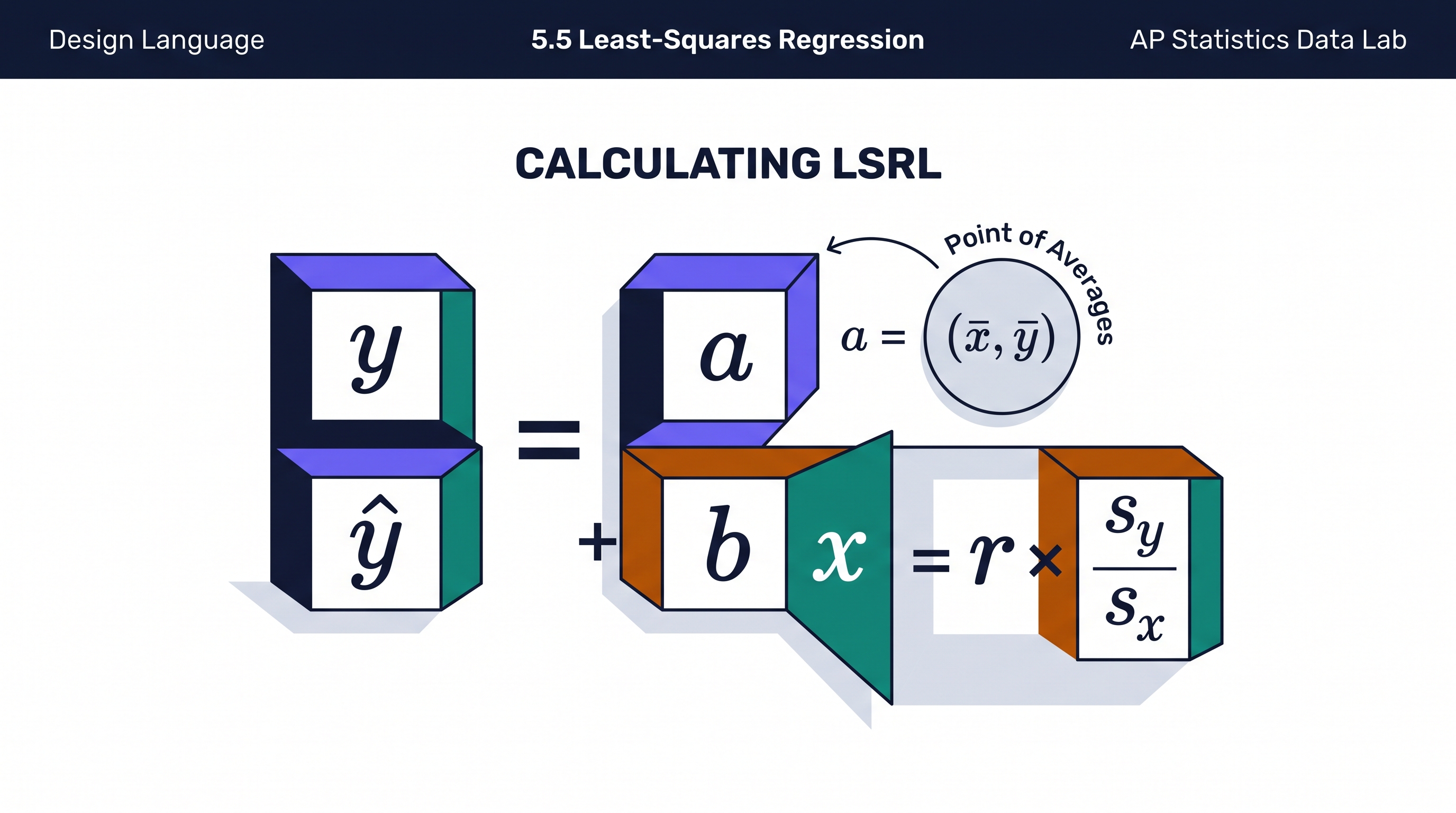
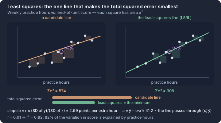
AP Practice: Multiple-Choice and Free-Response
Key concepts: Choosing a procedure — variable type, number of samples, paired or independent · Condition checks — randomness, 10% independence, large counts or near normality · Degrees of freedom — n − 1 for a mean, n − 2 for a slope, (r − 1)(c − 1) for a two-way table · Four-step inference template — state, plan, do, conclude · Conclusions in context — parameters in words, decisions tied to the scenario · Distractor analysis — naming the specific error behind each wrong choice
Apply the full course through realistic original practice that mirrors the current digital AP exam. Follow the unit roadmap to connect every topic, practice statistical reasoning in context, and prepare for cumulative AP-style questions.
This unofficial practice unit turns the five-course-unit sequence into realistic AP-style rehearsal without copying released or secure questions. You will practice both the decision-making process and the written statistical communication expected on the revised digital exam.
What you will learn
Apply the full course through realistic original practice that mirrors the current digital AP exam.
Topic sequence
- P.1 The 2027 AP Statistics Exam and Digital Workflow — Understand the current exam structure, timing, tools, digital workflow, and question groupings.
- P.2 Multiple-Choice Method: Read, Represent, Eliminate, Verify — Apply a repeatable method for solving AP-style multiple-choice questions accurately and efficiently.
- P.3 Guided Multiple-Choice Examples — Solve original AP-style MCQs with progressively revealed reasoning and complete distractor analysis.
- P.4 Timed Multiple-Choice Sets — Practice mixed MCQs under realistic pacing and diagnose errors by concept and reasoning type.
- P.5 Shared-Prompt MCQ Sets: Probability and Regression — Solve three-question sets built around shared probability or regression stimuli.
- P.6 Free-Response Method: Plan, Show, Interpret, Conclude — Write complete and efficient AP-style responses that show reasoning and answer in context.
- P.7 FRQ 1 Practice: Formulate Questions and Collect Data — Answer an original 10-point multi-focus FRQ emphasizing Practices 1 and 2.
- P.8 FRQ 2 Practice: Analyze Data and Interpret Results — Answer an original 10-point multi-focus FRQ emphasizing Practices 3 and 4.
- P.9 FRQ 3 Practice: Statistical Inference — Answer an original 10-point inference FRQ using a valid test or confidence interval.
- P.10 FRQ 4 Practice: Multi-Focus Investigation — Synthesize Practices 2, 3, and 4 across multiple content areas in an original 10-point FRQ.
- P.11 Full-Length AP-Style Practice Exam and Error Review — Complete a realistic original 42-MCQ and 4-FRQ exam and turn results into targeted revision.
The reasoning routine
- Learn the current digital workflow and build a pacing plan.
- Use Read–Represent–Eliminate–Verify for four-choice MCQs.
- Use Plan–Show–Interpret–Conclude for free responses.
- Finish with an original 42-MCQ and 4-FRQ simulation, then convert every error into a targeted revision task.
Before you move on
Use the roadmap above to select the first topic. Keep a running error log with four labels—concept, procedure, calculation, and context—so the practice unit can point you back to the exact kind of repair you need.
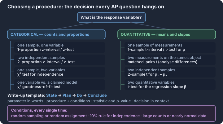
P.1 The 2027 AP Statistics Exam and Digital Workflow
Key concepts: Choosing the procedure from the question's design — one sample or two, a mean or a proportion, an interval or a test · Checking conditions before any inference — random selection or assignment, the 10% condition, Large Counts or near-normality · Interpreting every result in context — name the parameter, the population and the variable, never a bare number · Sampling variability of a score — one practice exam is a single draw from a distribution of possible scores, not a fixed ability · Reading a display before computing — shape, center, spread and unusual values decide which statistic is appropriate · Two equally weighted 90-minute sections — 42 multiple-choice items and 4 free-response questions
The 2027 AP Statistics Exam marks a definitive shift from paper-and-pencil traditions to a fully digital assessment environment hosted within the Bluebook™ application.
The 2027 AP Statistics Exam marks a definitive shift from paper-and-pencil traditions to a fully digital assessment environment hosted within the Bluebook™ application. This transition is not merely a change in medium; it aligns the assessment with modern college-level introductory statistics courses and the American Statistical Association’s GAISE II recommendations. Success on the exam now requires a dual mastery of statistical reasoning and the digital workflow used to express that reasoning.
Section I: Multiple-Choice Mechanics
Section I consists of 42 multiple-choice questions (MCQs) to be completed in 90 minutes. This section accounts for 50% of the total exam score. A significant update for the 2027 exam is the move to a four-choice format (A, B, C, D), streamlining the elimination process compared to the legacy five-choice model.
The MCQ section is divided into two distinct item types:
- Individual Questions: Standalone items targeting specific learning objectives or skills.
- Shared-Prompt Sets: Groups of two or three questions based on a single data set, research scenario, or graphical display. These sets test a student's ability to sustain reasoning across the statistical problem-solving process—from data collection to interpretation.
Section II: The Free-Response Investigation
Section II contains 4 free-response questions (FRQs) with a total time limit of 90 minutes, contributing the remaining 50% of the exam score. Unlike the legacy format which featured six questions, the 2027 format uses fewer, more integrated prompts that require deeper synthesis of the four AP Statistical Practices.
| Question | Primary Focus | Practice Alignment |
|---|---|---|
| Question 1 | Multi-Focus | Practice 1 (Formulate) & Practice 2 (Collect) |
| Question 2 | Multi-Focus | Practice 3 (Analyze) & Practice 4 (Interpret) |
| Question 3 | Inference | Hypothesis Testing or Confidence Intervals |
| Question 4 | Multi-Focus | Synthesis of Practices 2, 3, and 4 |
Key Insight: The 2027 FRQ structure emphasizes the "Multi-Focus" approach. You are rarely tested on a single skill in isolation; instead, you must demonstrate how data collection methods (Practice 2) directly impact the validity of the resulting inference (Practice 3) and the scope of the conclusion (Practice 4).
The Bluebook™ Ecosystem and Digital Notation
The exam is administered through the Bluebook™ app, which includes built-in tools to assist with the digital workflow. While students are provided with physical scratch paper for planning and manual calculations, all final responses must be entered into the digital interface.
Statistical Notation Entry
Entering complex symbols like $\bar{x}$ (x-bar) or $\hat{p}$ (p-hat) is handled through two primary methods:
- The Omega (Ω) Toolbar: A special characters menu within Bluebook that allows you to select mathematical symbols, Greek letters ($\mu, \sigma, \alpha, \beta$), and statistical operators.
- Keyboard Equivalencies: Students can type standard text representations if they prefer. For example, typing "x-bar" or "p-hat" is acceptable, as is using "sqrt" for square roots or "mu" for the population mean.
Calculator and Reference Policy
Calculators remain essential. Students may use their own approved graphing calculator (such as a TI-84 or Casio) or the built-in Desmos graphing calculator within Bluebook. Additionally, the standard AP Statistics Formula Sheet and Tables are available digitally within the app and provided as a printed reference during the exam.
Strategic Pacing and Workflow
Pacing is the "hidden" variable of the digital exam. In Section I, you have approximately 2 minutes and 8 seconds per question. In Section II, you have an average of 22.5 minutes per FRQ. Because the FRQs are multi-focus, Question 4 often requires more time than Question 1, necessitating a disciplined approach to time management.
Common Misconceptions in the Digital Shift
- The "Copy-Paste" Trap: While digital tools allow for easy editing, students often lose time trying to "perfect" the formatting of their responses. Clarity and statistical correctness are prioritized over aesthetic formatting.
- Notation Anxiety: Many students worry that using keyboard equivalents (like "p-hat") instead of the symbol ($\hat{p}$) will result in point deductions. Official guidelines confirm that standard keyboard notation is fully acceptable and will not be penalized.
- The Score Conversion Myth: There is no fixed "percentage" that guarantees a specific AP score (1–5). Scores are determined through a composite of raw points across both sections, and any unofficial "score calculators" found online are speculative and not endorsed by the College Board.
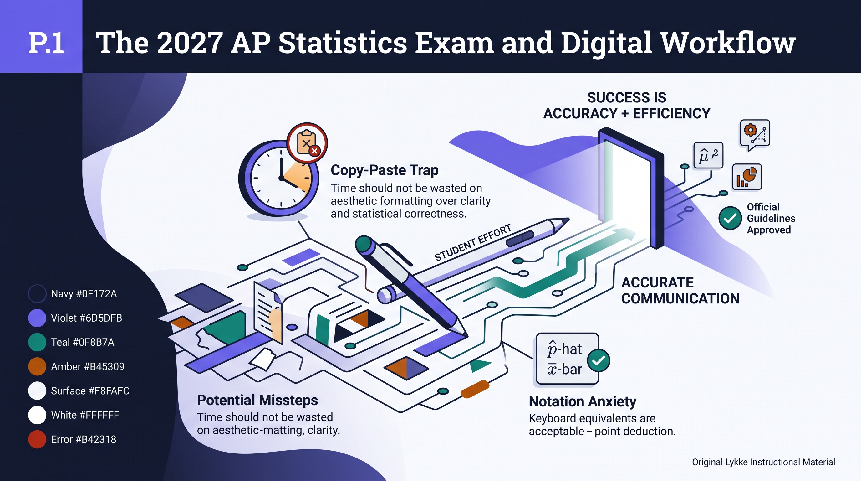
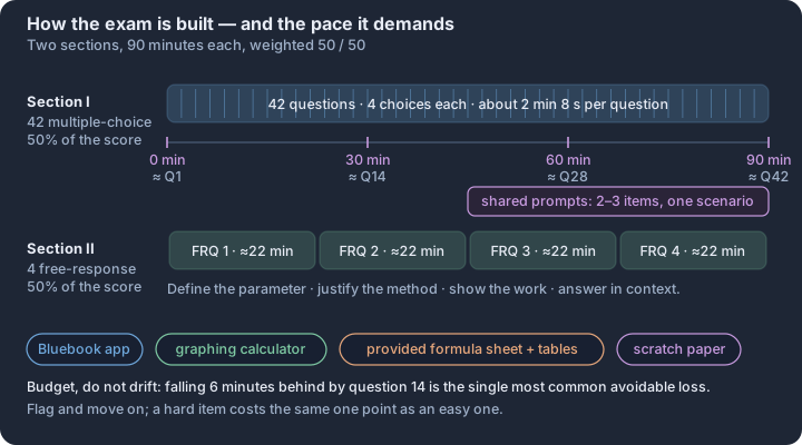
P.2 Multiple-Choice Method: Read, Represent, Eliminate, Verify
Key concepts: Read for the ask — parameter or statistic, calculation or interpretation · Represent — sketch the distribution or table before computing anything · Eliminate — reject choices that break range, units, or direction · Verify — recheck the answer against the context for reasonableness · Range checks — probabilities in [0, 1], r in [−1, 1], standard deviations ≥ 0 · Classic traps — variance for SD, wrong tail, standard error for one observation
Success on the AP Statistics multiple-choice section is less about rapid calculation and more about a disciplined protocol for navigating technical distractors.
Success on the AP Statistics multiple-choice section is less about rapid calculation and more about a disciplined protocol for navigating technical distractors. With 42 questions to answer in 90 minutes, the cognitive load is high; the Read, Represent, Eliminate, Verify (RREV) method serves as a mental circuit breaker, preventing the common "impulse pick" that leads to avoidable errors. This workflow transforms the exam from a test of memory into a systematic search for the single most defensible statistical claim.
Phase 1: Read for the Statistical Goal
The first step is to identify the specific statistical practice being tested. AP questions are rarely "just math"; they are contextual puzzles that require you to distinguish between a population parameter (like $p$ or $\mu$) and a sample statistic (like $\hat{p}$ or $\bar{x}$).
- Identify the "Ask": Is the question asking for a calculation, an interpretation of a p-value, or a critique of a sampling method?
- Highlight Constraints: Look for "trigger words" such as at least, more than, independent, or randomly assigned. These words dictate which formulas or conditions apply.
- Contextualize: Note the units (e.g., "minutes," "proportion of students"). A mathematically correct number with the wrong units is a common distractor.
Phase 2: Represent the Information
Once the goal is clear, translate the prose into a statistical model. This "bridge" phase prevents you from getting lost in the distractors before you have your own answer.
- Symbolic Translation: Write down given values using correct notation. If a problem describes a sample of 50 people with a 12% success rate, write $n = 50$ and $\hat{p} = 0.12$.
- Visual Sketching: For Normal distribution or sampling distribution problems, a 10-second sketch of a bell curve with the mean and shaded area is more reliable than mental visualization.
- Calculator Judgment: Decide immediately if the calculator is needed. If the question asks for a "Type II error definition," the calculator is a distraction; if it asks for a "probability of $X > 15$," the
normalcdforbinomcdffunction is your primary tool.
Phase 3: Eliminate the "Fatal Flaws"
AP Statistics distractors are rarely random; they are designed to mirror common student misconceptions. Instead of looking for the "right" answer, look for the "fatal flaw" in the wrong ones.
| Distractor Type | The "Fatal Flaw" | Why It Fails |
|---|---|---|
| The Parameter Swap | Uses $\mu$ when it should use $\bar{x}$. | Confuses the fixed population value with the varying sample result. |
| The Directional Error | Calculates $P(X < k)$ when the question asks for $P(X > k)$. | Fails to account for "at least" vs. "at most" logic. |
| The Condition Violation | Claims a result is valid even when $n < 30$ or $np < 10$. | Ignores the necessary requirements for using specific models (like the Normal approximation). |
| The Interpretation Trap | Describes a p-value as "the probability the null hypothesis is true." | Misrepresents the definition of a p-value as a conditional probability. |
Phase 4: Verify and Check Reasonableness
Before committing to a choice, perform a "smell test." Does the answer make sense in the real world?
The Reasonableness Check: If you are calculating the probability of an event and get a value of 1.2, or if you calculate a standard deviation and get a negative number, your representation phase likely had a calculation error. Similarly, if a confidence interval for the proportion of people who like pizza is $(0.02, 0.05)$, ask yourself: is it reasonable that only 2% to 5% of people like pizza? If the context feels "off," re-read the prompt.
Worked Example: Applying RREV
Consider this original practice scenario: A one-sample z-test for a proportion is conducted for $H_0: p = 0.50$ vs $H_a: p < 0.50$. Which of the following represents a Type II error?
- Read: Goal is to identify a Type II error. Context is a proportion test.
- Represent: Recall the definition: A Type II error is failing to reject $H_0$ when $H_a$ is actually true. In symbols: "Fail to reject $H_0$ when $p < 0.50$."
- Eliminate:
- (A) Rejecting $H_0$ when $p = 0.50$: This is a Type I error (rejecting a true null). Eliminate.
- (B) Rejecting $H_0$ when $p < 0.50$: This is a correct decision (power). Eliminate.
- (C) Failing to reject $H_0$ when $p = 0.50$: This is a correct decision. Eliminate.
- (D) Failing to reject $H_0$ when $p < 0.50$: This matches our representation. Keep.
- Verify: Does it make sense? Yes. We missed the opportunity to find evidence for the alternative even though the alternative was the reality.
The Digital Advantage
On the 2027 digital exam, use the "Eliminate Answer" tool in Bluebook to physically cross out choices as you find their fatal flaws. This reduces the "visual noise" on the screen and allows you to focus exclusively on the remaining viable options. If you are stuck between two choices, return to the Read phase—you likely missed a single word that makes one of the choices statistically indefensible.
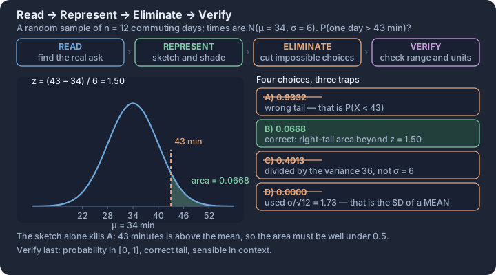
P.3 Guided Multiple-Choice Examples
Key concepts: Bias types — nonresponse, undercoverage, response, and voluntary response · Random selection versus random assignment — generalization versus causation · Scope of inference — what conclusion a given study design permits · Conditional probability and independence — random assignment makes P(workshop | motivation) equal P(workshop) · Sampling distribution of an estimate — its center exposes bias, its spread shrinks as n grows · Distractor diagnosis — naming the exact error each wrong option makes
Mastering the AP Statistics multiple-choice section requires a shift from passive recognition to active diagnosis of statistical logic. On the digital exam, questions often pivot on a single word—such as "cause," "parameter," or "proportion"—that dictates the entire solution path.
Mastering the AP Statistics multiple-choice section requires a shift from passive recognition to active diagnosis of statistical logic. On the digital exam, questions often pivot on a single word—such as "cause," "parameter," or "proportion"—that dictates the entire solution path. By dissecting these examples, we move beyond finding the "right" answer to understanding why the three distractors are mathematically or conceptually impossible.
Example 1: Sampling and Bias (Unit 1)
Scenario: A city council wants to estimate the proportion of residents who support a new tax for public parks. They mail a survey to a random sample of 1,000 households. Only 150 surveys are returned, and of those, 120 express support.
Question: Which of the following is the most significant threat to the validity of the council’s conclusion? (A) Undercoverage bias, because only households with mailing addresses were included. (B) Nonresponse bias, because the residents who returned the survey may have stronger opinions than those who did not. (C) Response bias, because the wording of the survey likely influenced the residents' answers. (D) Voluntary response bias, because the sample was not truly random.
CED Tag: Topic 1.12 (Potential Problems with Sampling) | Practice: 2.A
Hint: Distinguish between how the sample was selected and who actually provided data.
Solution: (B). The initial selection was a random sample of 1,000, but the extremely low return rate (15%) suggests that the 150 respondents are not representative of the original 1,000.
Error Diagnosis:
- (A) Incorrect: While mailing addresses exclude the unhoused, the massive nonresponse is a more immediate threat to this specific study's validity.
- (C) Incorrect: There is no evidence in the prompt that the wording was leading.
- (D) Incorrect: The council started with a random sample; voluntary response bias occurs when the sample is entirely self-selected from the start (e.g., an open internet poll).
Example 2: Probability and Binomial Distributions (Unit 2)
Scenario: A manufacturing process produces a specific electronic component with a 5% defect rate. A quality control manager selects a random sample of 20 components to inspect.
Question: Which expression represents the probability that exactly 2 of the inspected components are defective? (A) $(0.05)^2 (0.95)^{18}$ (B) $\binom{20}{2} (0.05)^2 (0.95)^{18}$ (C) $\binom{20}{2} (0.05)^{18} (0.95)^2$ (D) $1 - \binom{20}{2} (0.05)^2 (0.95)^{18}$
CED Tag: Topic 2.10 (The Binomial Distribution) | Practice: 3.C
Hint: Recall the BINS criteria (Binary, Independent, Number of trials, Same probability).
Solution: (B). The formula for a binomial probability $P(X=k)$ is $\binom{n}{k} p^k (1-p)^{n-k}$. Here, $n=20, k=2,$ and $p=0.05$.
Error Diagnosis:
- (A) Incorrect: This calculates the probability of a specific sequence (e.g., the first two are defective), forgetting that the two defects could occur in any of the $\binom{20}{2}$ combinations.
- (C) Incorrect: This swaps the exponents for success and failure.
- (D) Incorrect: This is a "complement" structure that does not represent "exactly 2."
Example 3: Inference for Proportions (Unit 3)
Scenario: A researcher conducts a significance test of $H_0: p = 0.4$ against $H_a: p > 0.4$. The resulting p-value is 0.02.
Question: Which of the following is the most appropriate interpretation of this p-value? (A) The probability that the null hypothesis is true is 0.02. (B) The probability that the alternative hypothesis is true is 0.98. (C) If the true population proportion is 0.4, the probability of obtaining a sample proportion at least as extreme as the one observed is 0.02. (D) If the true population proportion is greater than 0.4, the probability of obtaining a sample proportion of 0.4 is 0.02.
CED Tag: Topic 3.6 (p-Values) | Practice: 4.B
Hint: A p-value is a conditional probability: $P(\text{data or more extreme} \mid H_0 \text{ is true})$.
Solution: (C). This is the formal definition of a p-value in context.
Error Diagnosis:
- (A) & (B) Incorrect: These are the most common misconceptions in statistics. A p-value never tells us the probability that a hypothesis is true; it only tells us how "surprising" the data is under the assumption of the null.
- (D) Incorrect: This reverses the condition and the outcome.
Example 4: Inference for Means (Unit 4)
Scenario: A study compares the mean recovery time (in days) for two different surgical techniques. A 95% confidence interval for the difference in means ($\mu_1 - \mu_2$) is calculated to be $(-2.4, 1.1)$.
Question: Based on this interval, what conclusion can be drawn at the $\alpha = 0.05$ significance level? (A) There is a statistically significant difference because the interval includes negative values. (B) Technique 1 is significantly faster than Technique 2. (C) There is no statistically significant difference because the interval includes zero. (D) The sample sizes were too small to reach a conclusion.
CED Tag: Topic 4.3 (Justifying a Claim Based on a CI for a Mean) | Practice: 4.G
Hint: If zero is a plausible value for the difference, then "no difference" is a plausible reality.
Solution: (C). Since the interval $(-2.4, 1.1)$ contains 0, we fail to reject the null hypothesis $H_0: \mu_1 - \mu_2 = 0$.
Error Diagnosis:
- (A) Incorrect: Including negative values only suggests $\mu_2$ could be larger, but including positive values suggests $\mu_1$ could be larger.
- (B) Incorrect: This contradicts the evidence; the interval allows for the possibility that $\mu_1$ is actually larger than $\mu_2$.
- (D) Incorrect: While sample size affects interval width, we can always draw a conclusion based on the interval we have.
Example 5: Regression Analysis (Unit 5)
Scenario: A researcher finds a least-squares regression line relating $x$ (hours of study) and $y$ (exam score) to be $\hat{y} = 65 + 4.5x$. The coefficient of determination $r^2$ is 0.64.
Question: Which of the following is a correct interpretation of the value $s = 4.5$? (A) For every additional hour of study, the predicted exam score increases by 4.5 points. (B) 64% of the variation in exam scores is explained by the linear relationship with study hours. (C) The correlation between study hours and exam score is 4.5. (D) The typical distance between the observed exam scores and the scores predicted by the regression line is 4.5 points.
CED Tag: Topic 5.3 (Linear Regression Models) | Practice: 4.B
Hint: Distinguish between the slope ($b$) and the standard deviation of the residuals ($s$).
Solution: (A). In the equation $\hat{y} = a + bx$, $b$ is the slope, representing the predicted change in $y$ for each unit increase in $x$.
Error Diagnosis:
- (B) Incorrect: This is the interpretation of $r^2$.
- (C) Incorrect: Correlation ($r$) must be between -1 and 1.
- (D) Incorrect: This is the definition of the standard deviation of the residuals ($s$), not the slope.
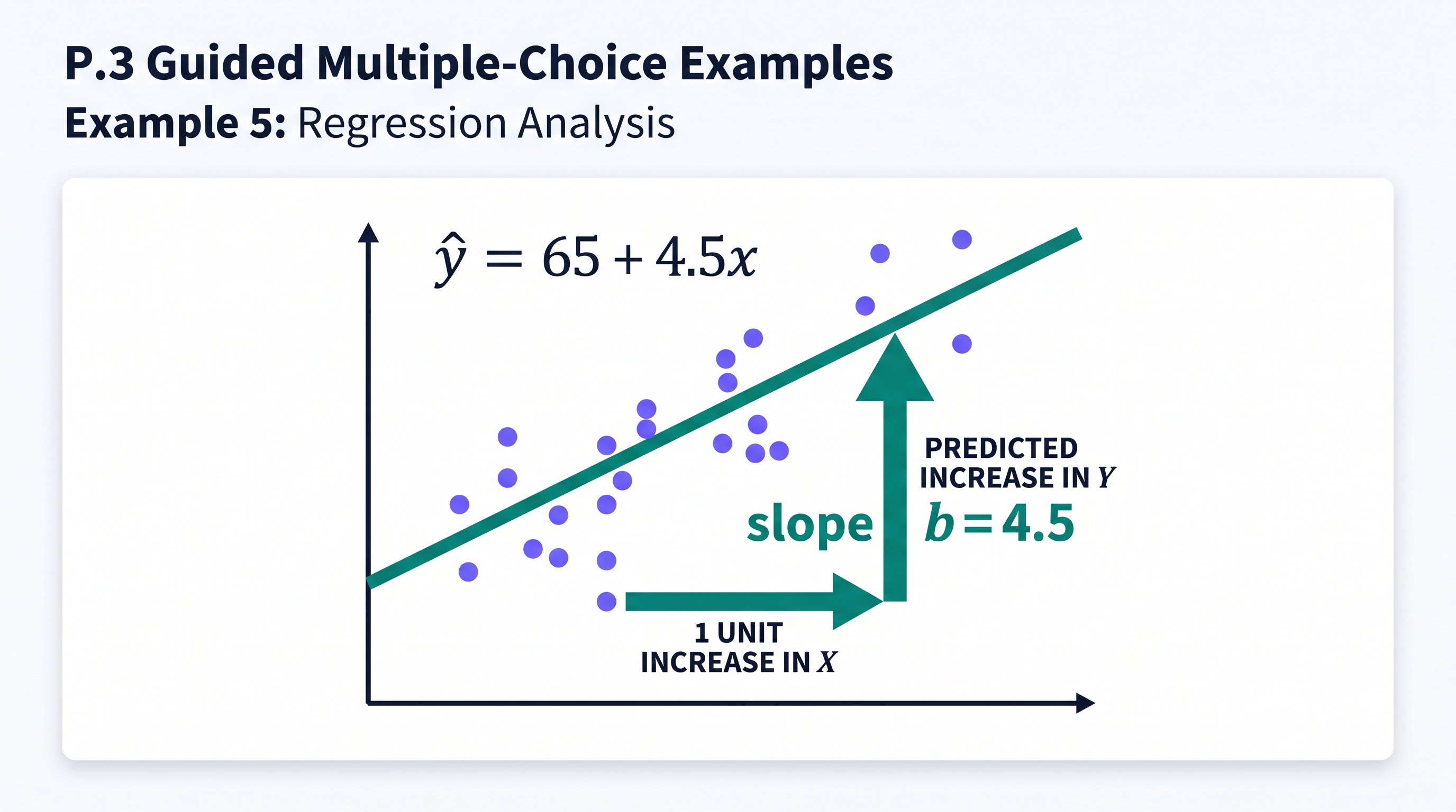
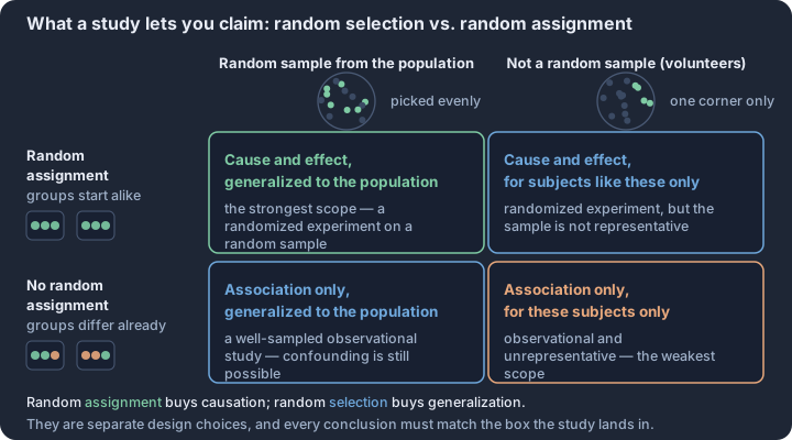
P.4 Timed Multiple-Choice Sets
Key concepts: Choosing the procedure from the prompt — one sample or two, mean or proportion, paired or independent · Checking conditions in context — random selection, independence (10% rule), Normal or large-counts · A section score is a binomial count — 42 items at success chance q have mean 42q and SD √(42q(1−q)) · Guessing probability — ruling out one of four choices lifts a blind guess from 0.25 to 0.33, two to 0.50 · Sampling variability of a score — repeated sections under identical skill still spread several points · Independence across items — a total score is a sum, so its SD grows like √n, not n
Transitioning from topic-specific practice to mixed, timed sets marks the shift from learning individual statistical tools to mastering the Statistical Problem-Solving Process.
Transitioning from topic-specific practice to mixed, timed sets marks the shift from learning individual statistical tools to mastering the Statistical Problem-Solving Process. In a single-topic quiz, the "what to do" is often implied by the chapter title. In a timed mixed set, the first and most critical hurdle is identification: recognizing whether a prompt requires a binomial calculation, a t-test for a mean difference, or a simple description of a distribution's shape.
The Cognitive Load of Interleaving
Interleaved practice—mixing different types of problems—forces the brain to constantly reload different conceptual frameworks. This mirrors the 2027 AP Statistics Exam environment, where a question on experimental design (Unit 1) may be immediately followed by a question on the power of a significance test (Unit 3).
The Interleaving Effect: While blocked practice (doing 20 regression problems in a row) creates a temporary feeling of mastery, interleaved practice builds long-term retention and the ability to distinguish between similar-looking procedures, such as a Chi-square test for independence versus a test for homogeneity.
Pacing and the "2.14-Minute Rule"
The digital AP Statistics Exam provides 90 minutes to complete 42 multiple-choice questions. This creates a baseline pacing requirement of approximately 2 minutes and 8 seconds per question, with a small buffer for review. However, not all questions are created equal. Efficient test-takers categorize questions into three "speed tiers" to manage their 90-minute block effectively:
| Tier | Question Type | Target Time | Strategy |
|---|---|---|---|
| Tier 1: Recall & ID | Vocabulary, Variable ID, Basic Shape | < 60 Seconds | Identify the key term and move on; do not overthink. |
| Tier 2: Interpretive | Reading Computer Output, Comparing Boxplots | 90–120 Seconds | Scan for context and units; eliminate distractors with "impossible" values. |
| Tier 3: Computational | Probability Trees, Inference Calculations | 150+ Seconds | Use the calculator efficiently; write down intermediate steps on scratch paper. |
Flag-and-Return Mechanics
The Bluebook digital interface allows for a flag-and-return behavior that is essential for high-stakes timing. If a question involves a complex probability simulation or a multi-step regression interpretation that threatens to consume five minutes, flagging it ensures that you reach the "low-hanging fruit" later in the set. A successful timed set is not just about accuracy; it is about maximizing points per minute.
Metacognitive Calibration: Confidence vs. Accuracy
A unique feature of advanced practice is the reporting of confidence levels alongside error categories. High-performing students often fall into two traps that timed sets are designed to expose:
- The "False Positive": Being highly confident in an answer that is incorrect, often due to a "misconception trap" (e.g., confusing the standard deviation of a sample with the standard error of the mean).
- The "Time Sink": Getting a question right but taking four minutes to do so, which "borrows" time from two other potentially correct answers.
Error Diagnosis and Feedback Loops
The value of a timed set lies in the post-submission analysis. Rather than simply checking if an answer is "B" or "C," students must categorize their errors into one of four specific statistical failure points:
- Conceptual Gap: You did not know which formula or test to apply (e.g., using a z-test when a t-test was required).
- Procedural Error: You knew the method but made a calculation or calculator-entry mistake.
- Contextual Oversight: You ignored a key word like "random assignment" or "at least," leading to an incorrect interpretation.
- Pacing Panic: You rushed the reading of the prompt because the timer was visible, missing a crucial detail in the stimulus.
Strategic Weighting in Mixed Sets
Because the AP exam weights units differently, your performance in a mixed set provides a "heat map" of where your study time is best spent. If you are consistently missing Unit 2 (Probability) questions but acing Unit 5 (Regression), your overall score is more likely to improve by shoring up probability rules, as they represent a larger portion of the total exam points.
AP Exam Unit Weighting (MCQ Section)
- Unit 1 (Exploring Data/Collection): 20%–30%
- Unit 2 (Probability/Distributions): 15%–25%
- Unit 3 (Inference for Proportions): 15%–25%
- Unit 4 (Inference for Means): 10%–20%
- Unit 5 (Regression): 10%–20%
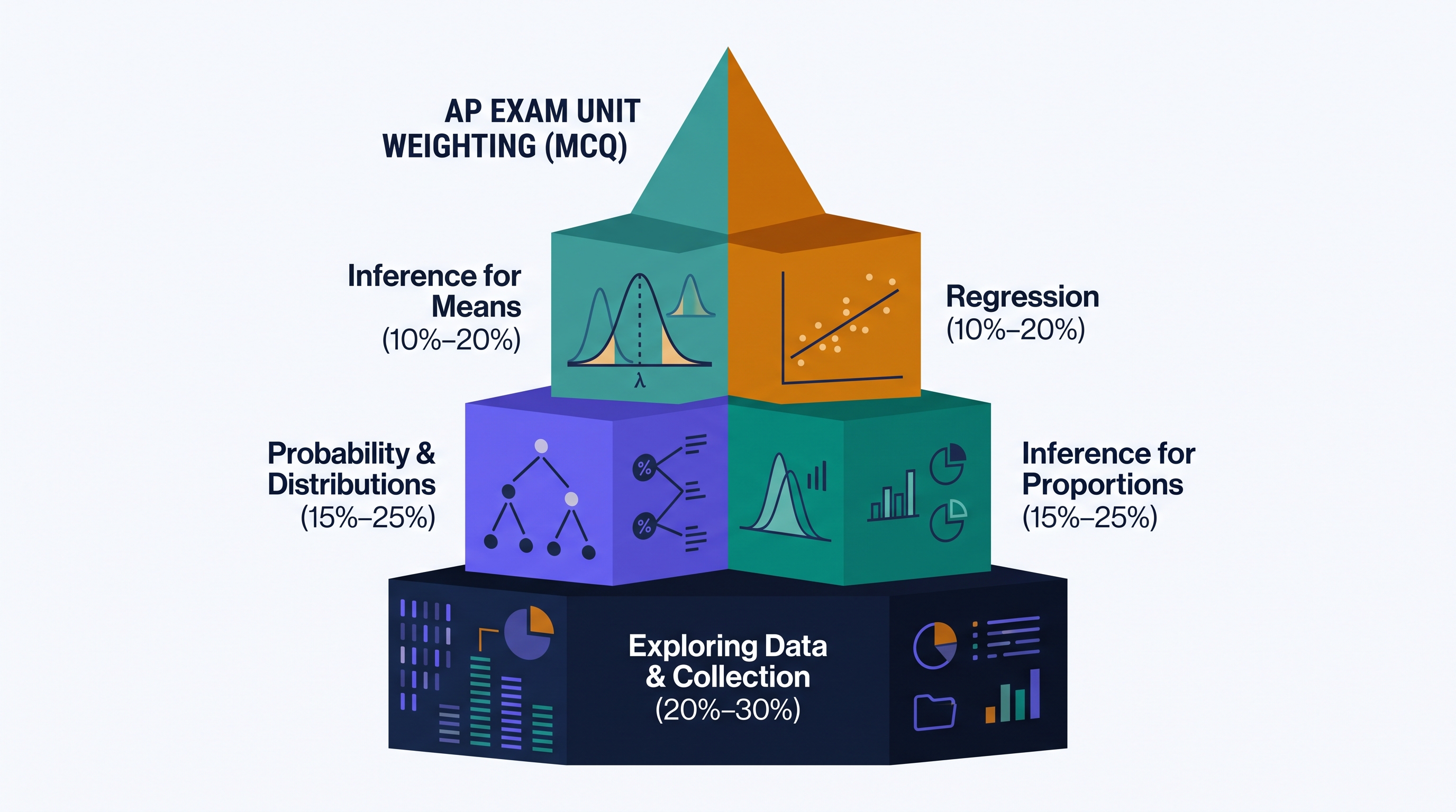
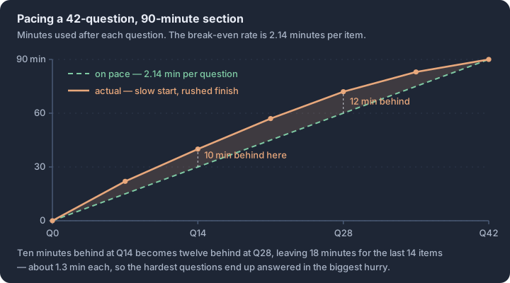
P.5 Shared-Prompt MCQ Sets: Probability and Regression
Key concepts: Marginal, joint, and conditional probability in a two-way table · Conditioning — the given event becomes the denominator · Independence check — P(A | B) equals P(A) · Slope versus correlation — units per unit change versus unitless strength · Residual — observed value minus predicted value · Shared stimulus — one context, several distinct question types
Shared-prompt sets are the "pressure cookers" of the AP Statistics exam, requiring you to pivot between different statistical practices while anchored to a single data stimulus.
Shared-prompt sets are the "pressure cookers" of the AP Statistics exam, requiring you to pivot between different statistical practices while anchored to a single data stimulus. Unlike standalone questions, these sets test your ability to maintain a consistent mental model of a scenario while applying distinct layers of reasoning—from simple calculation to high-level interpretation. Success depends on "active reading" of the stimulus: identifying whether a value represents a marginal, joint, or conditional probability, or distinguishing between an observed data point and a predicted value in a regression model.
Stimulus-Reading Guidance: The "Anchor" Strategy
Before diving into the questions, you must "anchor" the stimulus by identifying the core components. For probability sets, this means mapping out the sample space: are you looking at a two-way table of counts, or a description of independent events? For regression, it means identifying the explanatory variable ($x$) and the response variable ($y$), and noting the units for both. A common pitfall is misidentifying the "given" condition in a probability prompt or confusing the slope with the correlation coefficient in a regression output.
Probability Sets: Navigating Conditional Space
In probability sets, the most frequent point of failure is the "denominator trap." When a question asks for the probability of an event given another event, the sample space shrinks. You are no longer looking at the "Grand Total" of the population; you are looking only at the subset that meets the condition. Mathematically, $P(A | B) = \frac{P(A \cap B)}{P(B)}$. If the stimulus provides a two-way table, this means selecting a specific row or column as your new total.
Regression Sets: Beyond the Equation
Regression sets often provide a Least-Squares Regression Line (LSRL) in the form $\hat{y} = a + bx$. While calculating a prediction is a foundational skill, the AP exam pushes deeper into the interpretation of $r$ (correlation) and $r^2$ (coefficient of determination). Remember that $r^2$ measures the proportion of the variation in the response variable that is explained by the linear relationship with the explanatory variable. It does not imply causation, nor does it tell you the probability that a prediction is correct.
The Residual Reality Check
The final piece of the regression puzzle is the residual: $y - \hat{y}$. A positive residual means the model underestimated the actual value (the observed point is above the line), while a negative residual means the model overestimated it. In a shared-prompt set, you might be asked to calculate a prediction in Question 1 and then use that result to find a residual in Question 2. Accuracy in the first step is non-negotiable.
Distractor Analysis: Common Reasoning Errors
In the sets provided above, the distractors are designed to catch specific misconceptions. In the probability set, a common error is using the "Grand Total" for a conditional probability (the "Denominator Trap"). In the regression set, distractors often swap the roles of $x$ and $y$ in the slope interpretation or confuse $r$ with $r^2$. By identifying these patterns, you can move from "guessing" to "verifying," ensuring that your chosen answer is the only one that survives a rigorous statistical check.
Key Insight: In shared-prompt sets, the stimulus is your "ground truth." Every answer must be defensible based solely on the provided data, the provided formulas, and the precise definitions of statistical terms. If an interpretation feels "reasonable" but isn't supported by the $r^2$ value or the conditional probability calculation, it is a distractor.
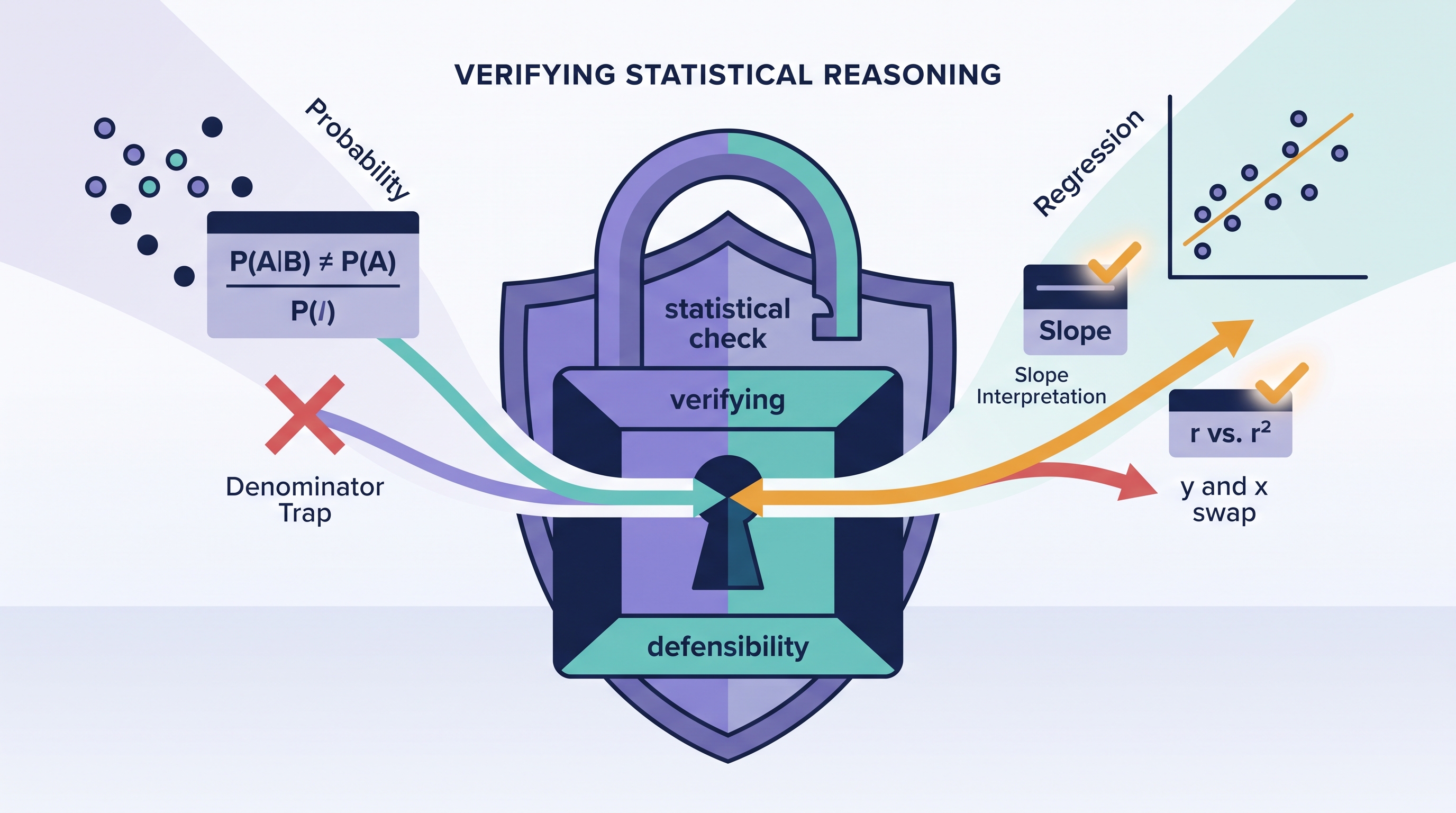
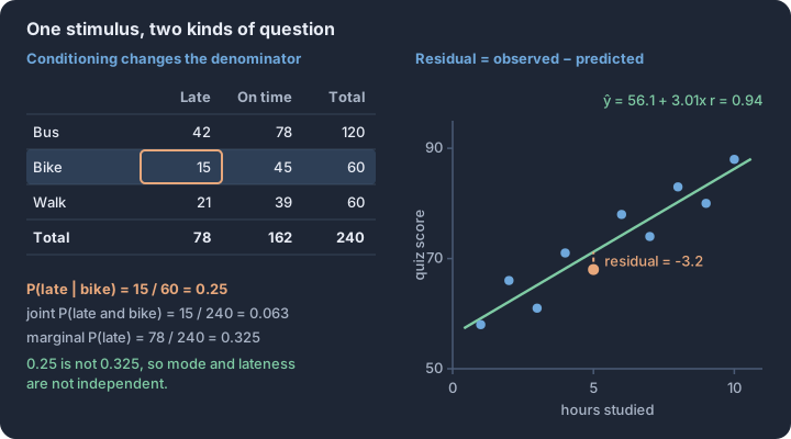
P.6 Free-Response Method: Plan, Show, Interpret, Conclude
Key concepts: Plan — the phase that names the procedure, states H₀ and Hₐ, and verifies the conditions · Show — the formula, the substituted numbers, and the resulting test statistic and p-value · Interpret — what the p-value or interval says about the population, expressed in context · Conclude — the decision at α, linked back to the claim the question actually made · Hypotheses are statements about parameters such as µ and p, never about sample statistics · Conditions for a one-proportion z-test — random sampling, the 10% condition, and np₀ ≥ 10 with n(1 − p₀) ≥ 10
Free-response questions (FRQs) on the AP Statistics Exam require a synthesis of statistical theory, precise calculation, and contextual communication. Success depends on a structured workflow that ensures every required component of a scoring rubric—from condition verification to the final…
Free-response questions (FRQs) on the AP Statistics Exam require a synthesis of statistical theory, precise calculation, and contextual communication. Success depends on a structured workflow that ensures every required component of a scoring rubric—from condition verification to the final contextual conclusion—is explicitly stated. The Plan-Show-Interpret-Conclude (PSIC) method provides a repeatable framework for organizing these responses, particularly within the digital Bluebook™ environment.
The PSIC Workflow
The PSIC method partitions a statistical problem into four distinct phases to ensure no scoring components are omitted. Each phase corresponds to specific statistical practices evaluated by exam readers.
- Plan: Identify the appropriate statistical procedure by name or formula (e.g., "One-sample $z$-test for a population proportion"). State the null and alternative hypotheses using correct parameters and define those parameters in the context of the study. Verify that all necessary conditions for the procedure—such as randomness, independence (10% rule), and normality (Large Counts or Normal/Large Sample)—are met.
- Show: Perform the mechanics of the test or interval. This includes identifying the sample statistics (like $\bar{x}$ or $\hat{p}$), calculating the test statistic (such as $z$ or $t$), and determining the $p$-value or the bounds of a confidence interval. In the digital exam, "showing work" involves typing the specific values plugged into a formula or naming the calculator function used.
- Interpret: State the immediate statistical result. For a significance test, this involves comparing the $p$-value to a significance level ($\alpha$). For a confidence interval, it involves stating the interval and the level of confidence.
- Conclude: Provide a final decision in the context of the investigative question. A conclusion must explicitly state whether there is "convincing evidence" for the alternative hypothesis, directly referencing the population and the variable being measured.
Digital Notation in Bluebook™
Starting in 2027, FRQ responses are entered into the Bluebook™ platform, which provides two primary methods for statistical notation: the built-in toolbar and standard keyboard equivalencies. Precision in notation is critical; using sample notation (like $\hat{p}$) when a population parameter (like $p$) is required can result in a lower score.
The Bluebook™ toolbar features an Omega (Ω) icon that opens a special characters menu. By filtering for "Mathematical" characters, you can access symbols such as $\leq$, $\geq$, $\neq$, $\approx$, and $\sqrt{}$. This menu also contains standard statistical symbols including x-bar ($\bar{x}$), p-hat ($\hat{p}$), and y-hat ($\hat{y}$), as well as Greek letters like $\mu$ (mu), $\sigma$ (sigma), $\alpha$ (alpha), and $\beta$ (beta).
For efficiency, the digital exam accepts standard keyboard equivalencies. These are plain-text representations of statistical symbols that readers recognize as valid notation.
| Statistical Concept | Bluebook™ Symbol | Keyboard Equivalency |
|---|---|---|
| Population Mean | $\mu$ | mu |
| Population Standard Deviation | $\sigma$ | sigma |
| Sample Mean | $\bar{x}$ | x-bar |
| Sample Proportion | $\hat{p}$ | p-hat |
| Predicted Y | $\hat{y}$ | y-hat |
| Null Hypothesis | $H_0$ | H0 |
| Alternative Hypothesis | $H_a$ | Ha |
The Anatomy of Scoring
Each FRQ is scored using a multi-level rubric that evaluates specific components of the model solution. Parts of a question are assigned a score of Essentially Correct (E), Partially Correct (P), or Incorrect (I) based on how many required components are satisfied.
- Essentially Correct (E): The response satisfies all (or nearly all) requirements for that part, including context and correct notation.
- Partially Correct (P): The response satisfies some requirements but contains a significant omission, such as a calculation without work, a missing condition check, or a conclusion that lacks context.
- Incorrect (I): The response fails to meet the minimum criteria for a partial score.
These component scores are then synthesized into a holistic score ranging from 0 to 4. For a three-part question, a "Complete" score of 4 requires three Es. A "Substantial" score of 3 typically results from two Es and one P. A "Developing" score of 2 can come from various combinations, such as one E and two Ps or two Es and one I.
Common Pitfalls and Repairs
Scoring data from previous exams highlights predictable errors that often drop a response from an E to a P. One of the most frequent is the "naked answer"—providing a correct numerical result without the supporting work or the formula used. In the digital format, ensure every calculation is preceded by the values used to reach it.
Another common error is failing to link the statistical decision to the context. A response that says "Reject $H_0$ because $0.02 < 0.05$" is incomplete. A full repair requires adding: "...therefore, we have convincing evidence that the true proportion of all students who prefer digital textbooks is greater than 0.20." Always ensure the conclusion refers back to the population, not just the sample.
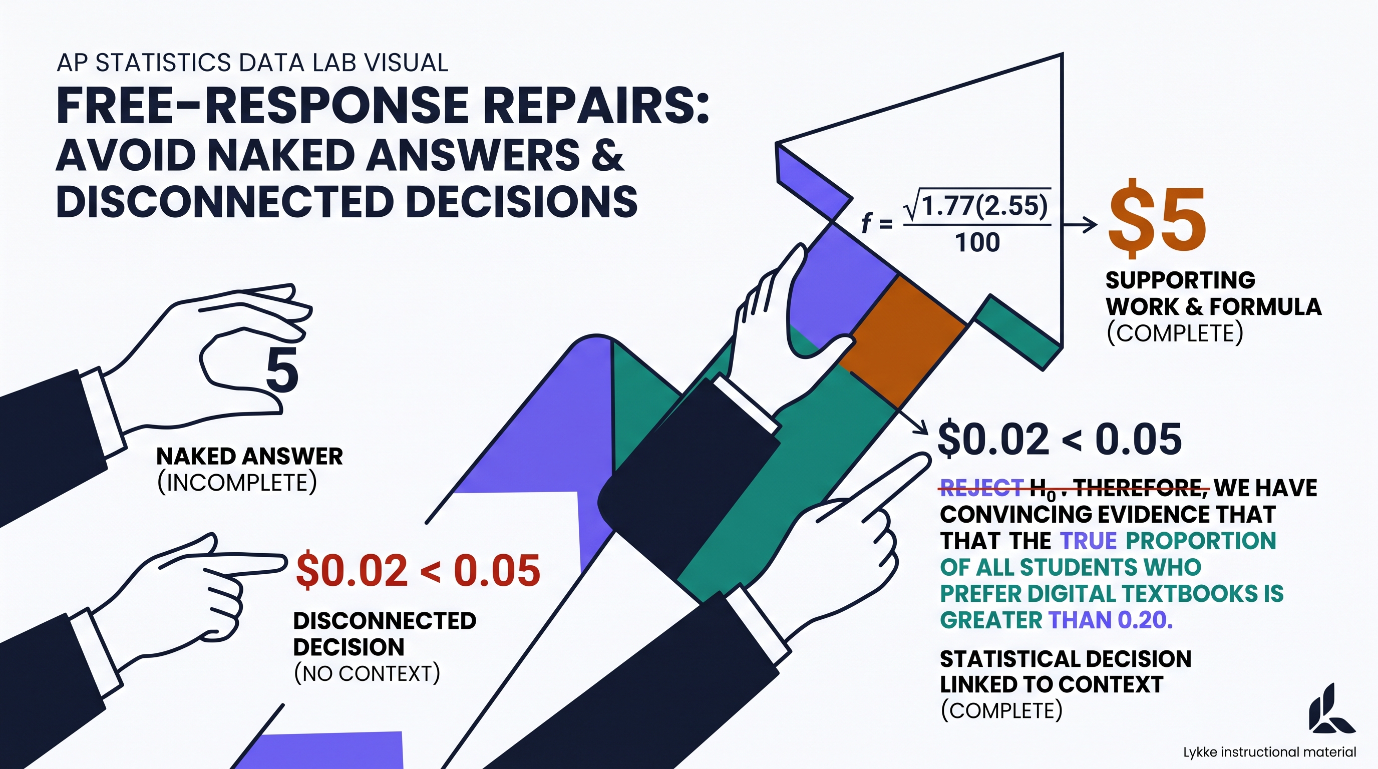
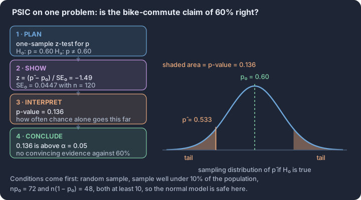
P.7 FRQ 1 Practice: Formulate Questions and Collect Data
Key concepts: Investigative question — purposeful, collectable, and analyzable · Population, sampling frame, and sample · Simple random, stratified, cluster, and systematic samples · Blocking — grouping similar units before random assignment · Random selection generalizes; random assignment establishes causation · Bias sources — undercoverage, nonresponse, and question wording
Statistical investigations begin with a precise investigative question that defines the scope of the study and the population of interest. A valid question must be purposeful, collectable, and analyzable, ensuring that the data gathered can actually address the underlying problem.
Statistical investigations begin with a precise investigative question that defines the scope of the study and the population of interest. A valid question must be purposeful, collectable, and analyzable, ensuring that the data gathered can actually address the underlying problem. Without a well-formulated question, even the most rigorous data collection methods risk producing "garbage in, garbage out" results that fail to support meaningful conclusions.
The Anatomy of FRQ 1: Practices 1 and 2
On the AP Statistics exam, the first Free-Response Question (FRQ 1) typically targets the "Plan" and "Collect" phases of the statistical problem-solving process. You are expected to demonstrate proficiency in Statistical Practice 1 (Formulate Questions) and Statistical Practice 2 (Collect Data). This requires more than just naming a sampling method; you must justify why a specific design—such as stratified random sampling or a randomized block design—is appropriate for the given context and how it minimizes potential bias.
Key Requirement: When describing a data collection plan, you must provide enough detail for another researcher to replicate your process. This includes explicitly stating how randomization will be implemented (e.g., using a random number generator) and identifying the experimental units or observational units involved.
Guided Practice: The "Library Study" Scenario
A municipal library system wants to determine if providing designated "quiet zones" increases the average time patrons spend engaged in deep work. The library director proposes a study to compare the behavior of patrons at two different branches: one with a quiet zone and one without.
- Part A (Practice 1.A): Formulate a valid investigative question for this study.
- Guided Reasoning: A strong question must include the population (library patrons), the variable of interest (time spent in deep work), and the comparison being made (quiet zones vs. no quiet zones).
- Model Answer: "Does the mean time spent engaged in deep work differ between library patrons using a branch with designated quiet zones and library patrons using a branch without designated quiet zones?"
- Part B (Practice 2.A): Identify the observational units and the variable of interest.
- Guided Reasoning: The units are the individual "things" being measured. The variable is what is being recorded for each unit.
- Model Answer: The observational units are the individual library patrons. The variable of interest is the time (in minutes) spent engaged in deep work, which is a quantitative variable.
- Part C (Practice 2.B): Explain why this study is an observational study rather than an experiment.
- Guided Reasoning: Experiments require the random assignment of treatments to units. Here, the "treatment" (quiet zone) is already a feature of the branch the patron chose to visit.
- Model Answer: This is an observational study because the researchers are not randomly assigning patrons to the quiet zone or no-quiet zone groups. Patrons choose which library branch to attend, meaning the researcher is merely observing existing conditions without imposing a treatment.
Independent Practice: The "Urban Garden" Project
A city council is considering funding for a new community garden program. They want to estimate the proportion of residents in the "Eastside" district who would actively participate in the program. The district consists of 10 distinct neighborhoods, each with a different average household income.
- Formulate (1.A): Write an investigative question that the city council should use to guide their data collection.
- Design (2.B): Describe a stratified random sampling plan to estimate the proportion of interested residents. Justify why stratification by neighborhood might be preferable to a simple random sample (SRS).
- Identify Bias (2.A): Suppose the council decides to place a sign-up sheet at the local luxury fitness center to collect data. Identify the type of bias this would likely introduce and explain how it might affect the estimate of the population proportion.
Annotated Response Levels
To succeed on FRQ 1, your writing must be precise, contextual, and complete. The following levels illustrate how the 10-point rubric (detailed in the studio above) is applied to student work.
- Strong (9–10 points): The response provides a clear, comparative investigative question. The sampling plan is described with "reproducible" detail (e.g., "Assign each resident a unique number from 1 to N, then use a random number generator to select n numbers..."). It correctly identifies that stratification reduces variability by accounting for the known differences between neighborhoods (income levels). All answers are grounded in the Eastside district context.
- Partial (5–8 points): The response identifies the correct concepts but lacks specificity. For example, it might suggest "taking a random sample from each neighborhood" without explaining how the random selection occurs. It might identify selection bias (specifically undercoverage) in the fitness center scenario but fail to explain the direction of the bias (e.g., "Residents at a luxury fitness center may have more disposable time/income and thus be more likely to participate than the general Eastside population, leading to an overestimation").
- Weak (0–4 points): The response uses vague language (e.g., "Ask people what they think") or fails to include a randomization component. It may confuse the population (all Eastside residents) with the sample (those who answer the survey). In the bias section, it might simply state the data is "unfair" without using statistical terminology like non-representative or identifying a specific mechanism of bias.
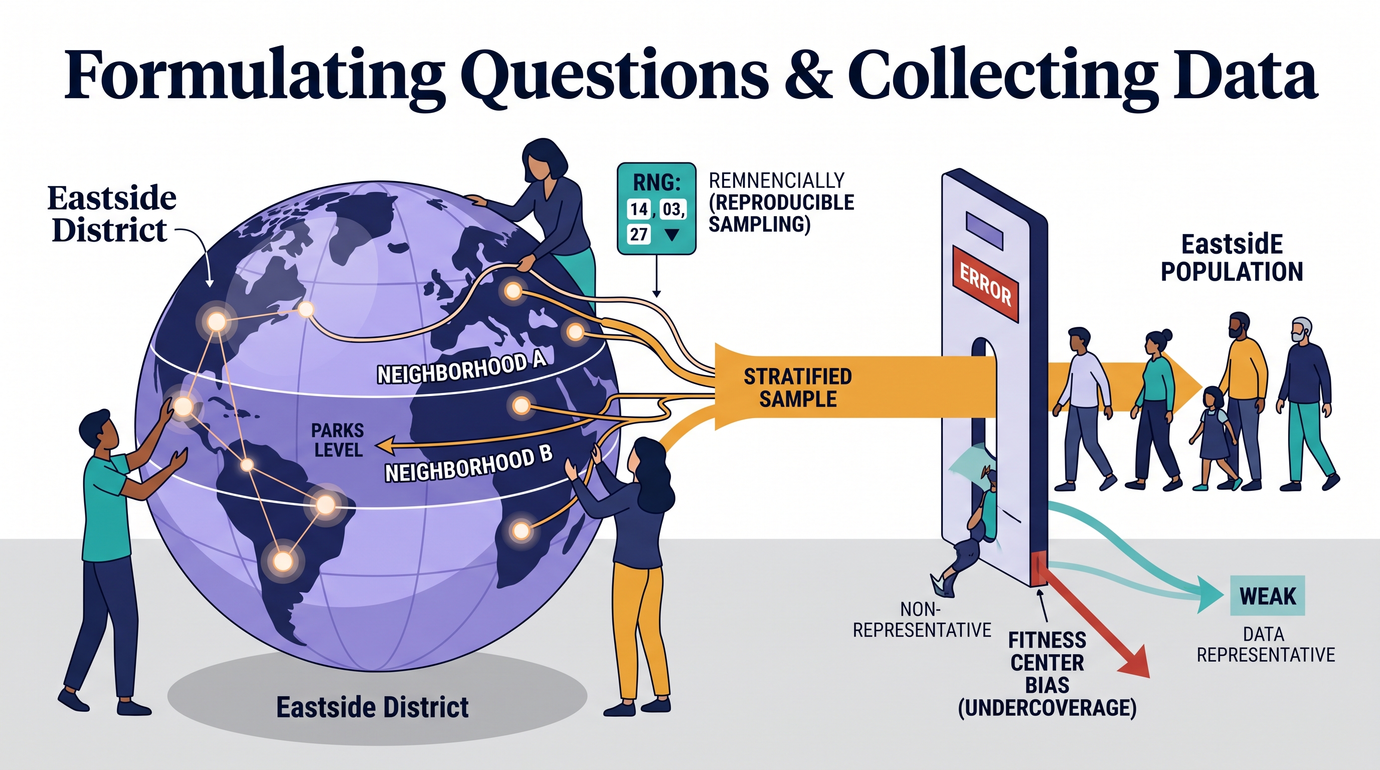
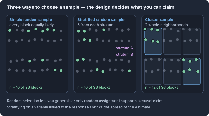
P.8 FRQ 2 Practice: Analyze Data and Interpret Results
Key concepts: Shape, center, spread, and unusual features — the description checklist · Skew decides between mean with SD and median with IQR · Resistance — outliers move the mean, not the median · The 1.5 × IQR rule for flagging outliers · Standard deviation as a typical distance from the mean · Interpretation in context, with units
Statistical analysis transforms raw measurements into evidence-based narratives by identifying patterns that are invisible to the naked eye. In the AP Statistics workflow, this transition relies on the synergy between Statistical Practice 3 (Analyze Data) and Statistical Practice 4…
Statistical analysis transforms raw measurements into evidence-based narratives by identifying patterns that are invisible to the naked eye. In the AP Statistics workflow, this transition relies on the synergy between Statistical Practice 3 (Analyze Data) and Statistical Practice 4 (Interpret Results). While analysis focuses on the mechanics of construction and calculation—building the boxplot or finding the interquartile range—interpretation breathes meaning into those numbers, answering the "so what?" of a statistical inquiry.
The Anatomy of Data Analysis and Interpretation
Effective free-response answers for "Data Analysis" questions must bridge the gap between numerical output and contextual conclusions. A calculation of a standard deviation is incomplete without an explanation of what that value implies about the consistency of the data. Similarly, a description of a distribution's shape (e.g., "skewed right") is only useful if it informs a choice between the mean and the median as the most representative measure of center.
Key Distinction: Practice 3 asks "What is the value?" or "What does the graph look like?" Practice 4 asks "What does this value tell us about the population?" or "Which group performed better based on this evidence?"
Guided FRQ: The Solar Efficiency Case
Scenario: A renewable energy firm is testing two types of solar panels, Alpha and Beta, to determine which provides a more consistent daily kilowatt-hour (kWh) output. The following summary statistics were generated from 30 days of testing for each panel type.
| Statistic | Alpha Panel (kWh) | Beta Panel (kWh) |
|---|---|---|
| Mean | 42.5 | 41.8 |
| Median | 42.1 | 41.9 |
| Std. Deviation | 8.4 | 2.1 |
| Min | 25.0 | 38.0 |
| Q1 | 36.5 | 40.5 |
| Q3 | 48.5 | 43.1 |
| Max | 65.0 | 46.2 |
Task 1 (Practice 3): Calculate the Interquartile Range (IQR) for both panel types and determine if the maximum value for the Alpha panel (65.0) is a statistical outlier using the 1.5xIQR rule.
- Alpha IQR: $48.5 - 36.5 = 12.0$.
- Outlier Check: $Upper\ Fence = Q3 + 1.5(IQR) = 48.5 + 1.5(12.0) = 48.5 + 18 = 66.5$.
- Conclusion: Since $65.0 < 66.5$, the maximum value is not an outlier.
Task 2 (Practice 4): Based on the summary statistics, which panel should the firm recommend for a client who prioritizes reliability over maximum potential output? Justify your answer.
- Interpretation: While the Alpha panel has a slightly higher mean (42.5 vs. 41.8), its variability is significantly higher (Std. Dev of 8.4 vs 2.1; IQR of 12.0 vs 2.6). The Beta panel is much more consistent, with a tighter range of values.
- Conclusion: The firm should recommend the Beta panel. Although its average output is marginally lower, its significantly smaller standard deviation and IQR indicate much higher reliability and predictability in daily energy production.
Independent FRQ: The "Delivery Speed" Challenge
Scenario: A local pharmacy is choosing between two courier services, Swift-Drop and Reliable-Route, for delivering prescriptions. The pharmacy collected data on the delivery times (in minutes) for 8 random deliveries from each service.
- Swift-Drop Times: 12, 15, 16, 17, 18, 20, 22, 45
- Reliable-Route Times: 18, 19, 20, 21, 22, 23, 24, 25
Prompt: (a) Calculate the median and IQR for Swift-Drop. (b) Use the 1.5xIQR rule to identify any outliers in the Swift-Drop data. Show your work. (c) The pharmacy wants to choose the service that is most likely to deliver a prescription in under 30 minutes every time. Which service should they choose? Justify your answer by comparing the distributions of delivery times.
Unofficial 10-Point Scoring Rubric: Delivery Speed Challenge
This rubric is designed to mirror the scoring patterns used in the current AP Statistics digital exam format, emphasizing both the precision of the calculation and the depth of the contextual interpretation.
| Points | Component | Scoring Criteria |
|---|---|---|
| 1 pt | Median (Swift) | Correctly identifies the median for Swift-Drop as 17.5 minutes (average of 17 and 18). |
| 1 pt | IQR (Swift) | Correctly calculates $Q3 (21) - Q1 (15.5) = 5.5$ minutes. |
| 1 pt | Fence Formula | Correctly states or applies the outlier formula: $Q3 + 1.5(IQR)$. |
| 1 pt | Fence Value | Calculates the upper fence as $21 + 1.5(5.5) = 29.25$. |
| 1 pt | Outlier ID | Correctly identifies 45 as an outlier because $45 > 29.25$. |
| 1 pt | Center Comp. | Compares the centers (Medians: 17.5 vs 21.5) and notes Swift-Drop is generally faster on average. |
| 1 pt | Spread Comp. | Compares the variability (IQR or Range) and notes Reliable-Route is more consistent. |
| 1 pt | Shape/Unusual | Mentions the outlier in Swift-Drop or the potential skewness created by the 45-minute delivery. |
| 1 pt | Contextual Choice | Selects Reliable-Route based on the specific criteria (under 30 minutes). |
| 1 pt | Justification | Explains that while Swift is faster on average, its outlier (45) exceeds the 30-min limit, whereas Reliable's max (25) is well within the limit. |
Annotated Response Levels
- Strong (9–10 pts): The response provides all calculations with units (minutes), clearly shows the outlier test with the calculated fence, and makes a comparative argument that directly addresses the "under 30 minutes" requirement using the maximum values of both sets.
- Partial (5–8 pts): The response may calculate the statistics correctly but fail to use the 1.5xIQR rule formally, or it may choose the correct courier but provide a generic justification (e.g., "it's more consistent") without citing the specific data points that prove it stays under 30 minutes.
- Weak (1–4 pts): The response makes calculation errors in the IQR or median and fails to identify the outlier. The justification is often based on personal opinion rather than the provided data distributions.
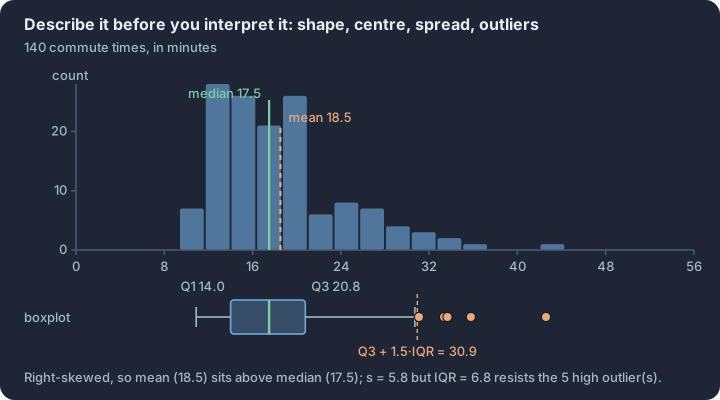
P.9 FRQ 3 Practice: Statistical Inference
Key concepts: Hypotheses stated in parameters and defined in context · Conditions: random, 10% independence, Large Counts · Test statistic — standard errors from estimate to null value · p-value — chance of evidence this extreme if H₀ were true · Decision rule — compare the p-value with α; never accept H₀ · Type I error, Type II error, and power
Statistical inference is the process of using sample data to make "claims with confidence" about an entire population. While descriptive statistics tell us what happened in our specific sample, inference allows us to quantify the uncertainty of generalizing those results.
Statistical inference is the process of using sample data to make "claims with confidence" about an entire population. While descriptive statistics tell us what happened in our specific sample, inference allows us to quantify the uncertainty of generalizing those results. On the AP Statistics Exam, FRQ 3 specifically targets your ability to navigate the formal "Inference Engine"—a rigorous five-step workflow that transforms raw data into a defensible scientific conclusion.
The Five Pillars of a Complete Inference Response
To earn full credit, a response must demonstrate mastery of five distinct phases. Omitting even one—such as failing to interpret the p-value before stating a conclusion—can drop a response from "Substantial" to "Developing."
| Phase | Requirement | Key Precision Point |
|---|---|---|
| Selection | Identify the correct procedure and state hypotheses ($H_0$ and $H_a$). | Use population parameters ($\mu$ or $p$), never sample statistics ($\bar{x}$ or $\hat{p}$). |
| Conditions | Verify Randomness, Independence (10% rule), and Normality. | Do not just list them; show the specific calculation (e.g., $np \geq 10$). |
| Calculation | Compute the test statistic and the p-value. | Always include the degrees of freedom ($df$) for $t$-procedures. |
| Interpretation | Explain the p-value in the context of the null hypothesis. | Define it as the probability of observing these results if $H_0$ is true. |
| Conclusion | Compare the p-value to $\alpha$ and link to the context. | Never say you "proved" the null or "accepted" it; only "fail to reject." |
Guided FRQ: The "Sleep-Study" Scenario
The Prompt: A researcher claims that a new herbal tea reduces the time it takes to fall asleep. In a random sample of 40 adults, the mean reduction in "time-to-sleep" was 8.4 minutes with a standard deviation of 12.2 minutes. Does this provide convincing evidence at the $\alpha = 0.05$ level that the tea reduces sleep-onset time for the population of adults?
Step-by-Step Reasoning
- Selection: This is a One-Sample t-test for a Population Mean ($\mu$).
- $H_0: \mu = 0$ (The tea has no effect on sleep-onset time).
- $H_a: \mu > 0$ (The tea reduces sleep-onset time; note that "reduction" implies a positive value if we define $\mu$ as "minutes saved").
- Conditions:
- Random: The prompt states a "random sample of 40 adults."
- 10% Rule: 40 is likely less than 10% of all adults.
- Normality: Since $n = 40 \geq 30$, the Central Limit Theorem ensures the sampling distribution of $\bar{x}$ is approximately normal.
- Calculation:
- $t = \frac{\bar{x} - \mu_0}{s / \sqrt{n}} = \frac{8.4 - 0}{12.2 / \sqrt{40}} \approx 4.35$
- $df = 39$. Using a calculator: $p\text{-value} \approx 0.00005$.
- Interpretation: If the tea actually has no effect ($\mu = 0$), there is a 0.005% probability of seeing a sample mean reduction of 8.4 minutes or greater purely by chance.
- Conclusion: Since the $p\text{-value} (0.00005) < \alpha (0.05)$, we reject $H_0$. There is convincing evidence that the herbal tea reduces the time it takes for adults to fall asleep.
Independent FRQ: The "Digital Ad" Experiment
The Prompt: A marketing firm wants to know if a new interactive ad leads to a higher "click-through rate" (CTR) than a static ad. They randomly assign 500 users to view the interactive ad and 500 users to view the static ad.
- Interactive Group: 65 clicks.
- Static Group: 42 clicks. Perform a significance test at the $\alpha = 0.01$ level to determine if the interactive ad is more effective.
Original 10-Point Rubric
Use this unofficial rubric to self-score your response to the "Digital Ad" prompt.
| Points | Criteria |
|---|---|
| 2 pts | Hypotheses: Correctly states $H_0: p_1 = p_2$ and $H_a: p_1 > p_2$ with parameters defined in context. |
| 2 pts | Conditions: Correctly checks Random Assignment and Large Counts ($n\hat{p} \geq 10$ and $n(1-\hat{p}) \geq 10$ for both groups). |
| 2 pts | Calculation: Correctly calculates the pooled proportion $\hat{p}_c$, the $z$-test statistic, and the $p$-value. |
| 2 pts | Interpretation: Provides a correct conditional interpretation of the $p$-value (probability of the observed difference given $H_0$ is true). |
| 2 pts | Conclusion: Correctly compares $p$ to $\alpha$, makes a "reject/fail to reject" decision, and writes the final conclusion in context. |
Common-Error Analysis: The Inference "Pitfalls"
Even students who understand the math often lose points on "Statistical Practice 4: Interpret Results" by using imprecise language.
- The "Probability of $H_0$" Fallacy: A $p$-value is not the probability that the null hypothesis is true. It is the probability of the data given that the null is true. Avoid saying "There is a 5% chance the tea doesn't work."
- Parameter vs. Statistic Confusion: Using $\hat{p}$ or $\bar{x}$ in your hypotheses is a major error. Hypotheses are always about the unknown population parameters ($p$ or $\mu$).
- The "Acceptance" Trap: Never write "We accept the null hypothesis." In statistics, we only "fail to find enough evidence to reject it." It’s like a "Not Guilty" verdict in court—it doesn't mean the defendant is innocent, just that the evidence wasn't strong enough to convict.
- Condition Neglect: Calculating a $p$-value without first verifying the Large Counts condition ($np \geq 10$) or the Central Limit Theorem ($n \geq 30$) invalidates the entire mathematical procedure, as the normal approximation may not be appropriate.
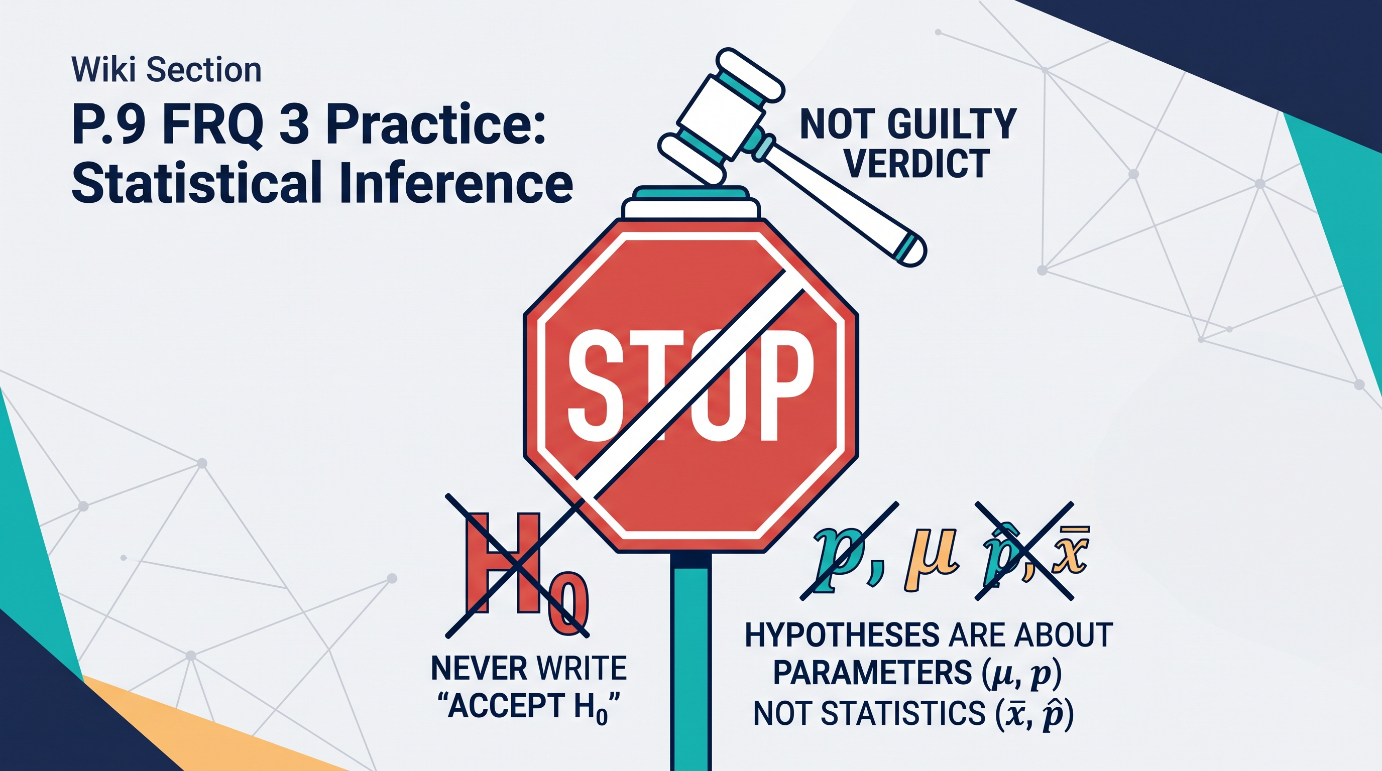
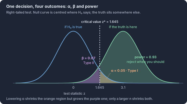
P.10 FRQ 4 Practice: Multi-Focus Investigation
Key concepts: Through-line — the design constrains every later claim · Explanatory versus response variable in an observational study · Association is not causation without random assignment · Confounding and lurking variables · Slope in context — predicted change per unit of x · Scope of inference — who the conclusion covers
The multi-focus investigation represents the pinnacle of the AP Statistics Free-Response section, requiring a synthesis of the entire statistical problem-solving process. Unlike specialized questions that isolate a single skill, this task demands that you move fluidly from formulating a…
The multi-focus investigation represents the pinnacle of the AP Statistics Free-Response section, requiring a synthesis of the entire statistical problem-solving process. Unlike specialized questions that isolate a single skill, this task demands that you move fluidly from formulating a question and designing a data collection plan to analyzing distributions and justifying a final conclusion. It mirrors the work of professional statisticians who must ensure that every step of an inquiry—from the first random sample to the final p-value—is logically connected and contextually grounded.
Success on this question type depends on your ability to maintain a "through-line" of reasoning. A flaw in the sampling design can invalidate the subsequent analysis, and a failure to account for distribution shape can lead to an inappropriate choice of inference. To master this, you must treat the prompt not as a series of disconnected math problems, but as a single narrative of discovery where data serves as the evidence for a claim.
The Urban Canopy Study: A Multi-Focus Case
Consider an investigation into the "Urban Heat Island" effect. A city planning committee wants to determine if neighborhoods with high tree-canopy coverage experience significantly lower ground-surface temperatures during summer months compared to neighborhoods with low canopy coverage. This single context allows for the exploration of sampling bias, comparative data analysis, and the interpretation of statistical significance.
The 10-Point Multi-Focus Rubric
On the AP Exam, FRQs are typically scored on a 0–4 scale using the EPI (Essentially Correct, Partially Correct, Incorrect) framework. For this practice investigation, we utilize an original 10-point scale to provide more granular feedback on the specific components of a multi-focus task.
| Category | Points | Criteria for Success |
|---|---|---|
| Data Collection | 3 | Identifies a valid sampling method; justifies why the method reduces bias; explains the implementation (e.g., random number generator use). |
| Data Analysis | 3 | Constructs or interprets a comparative display; uses comparative language (e.g., "greater than") for center and variability; identifies unusual features. |
| Inference & Conclusion | 4 | States appropriate hypotheses or interprets a p-value; links the p-value to a decision about the null; provides a conclusion in the context of the study. |
Annotated Response Analysis
The difference between a "Substantial" response and a "Complete" response often lies in the precision of the language and the consistent use of context. In a multi-focus investigation, "naked numbers"—statistics without units or labels—are the most common cause of point deductions.
The "Strong" Response (9–10 Points)
Student Writing: "The median surface temperature for high-canopy neighborhoods (88°F) is lower than the median for low-canopy neighborhoods (96°F). Additionally, the temperatures in high-canopy areas are more consistent, with an IQR of only 4°F compared to 9°F in low-canopy areas. Because the p-value (0.02) is less than alpha (0.05), we reject the null hypothesis. We have convincing evidence that the true mean ground temperature is lower in neighborhoods with high tree canopy."
- Why it works: It uses direct comparative language ("lower than," "more consistent"). It includes units (°F). It links the p-value directly to a decision and a contextual conclusion.
The "Partial" Response (5–6 Points)
Student Writing: "High canopy has a median of 88 and low has 96. The boxplot for low canopy is wider. The p-value is 0.02, so it is significant. This means trees make it cooler."
- Critique: This response lacks explicit comparison (it lists medians but doesn't say one is lower). "Wider" is a vague term for variability; "IQR" or "Range" is preferred. The conclusion is too broad; it implies a causal "make it cooler" claim that may not be supported if the study was observational rather than a randomized experiment.
Strategic Scaffolding: The "Plan-Show-Interpret" Workflow
When approaching a multi-focus prompt, use a mental or physical scaffold to ensure no component is missed. Start by identifying the Experimental Units (e.g., city blocks) and the Response Variable (e.g., temperature). When analyzing the data, use the "CUSS" acronym (Center, Unusual features, Shape, Spread) but ensure every observation is a comparison between the groups. Finally, when concluding, always return to the original investigative question to ensure your statistical answer actually addresses the city's real-world problem.

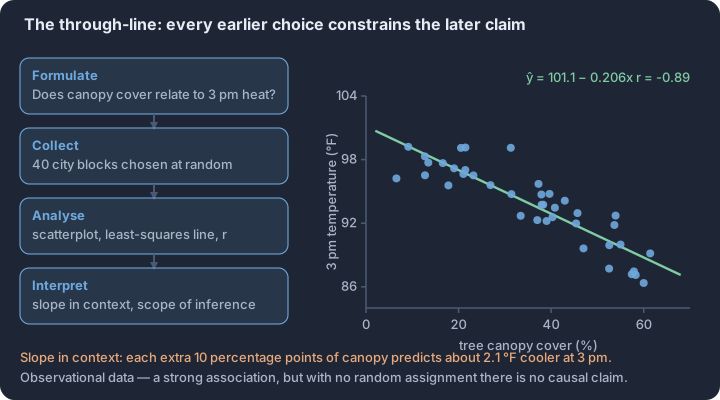
P.11 Full-Length AP-Style Practice Exam and Error Review
Key concepts: Sampling variability of a score — one practice result is a single draw from the distribution of scores the same student could have earned · The multiple-choice total is Binomial(n = 42, p): mean 42p and SD √(42p(1−p)), so luck alone moves the raw count by several items · Linear rescaling — multiplying a score by a constant a multiplies its mean and SD by |a| and its variance by a² · Independent parts add variances, not standard deviations: SD of the composite = √(SD² of the MCQ half + SD² of the FRQ half) · Averaging repeated measurements — the SD of the mean of k independent practice scores is the single-score SD divided by √k · Interpreting a result in context — a gain smaller than the run-to-run swing is evidence of luck, not of learning
The transition from unit-level mastery to a full-length, 180-minute AP Statistics exam requires a shift from recognizing patterns to synthesizing the entire statistical problem-solving process.
The transition from unit-level mastery to a full-length, 180-minute AP Statistics exam requires a shift from recognizing patterns to synthesizing the entire statistical problem-solving process. This final simulation mirrors the digital workflow of the 2027 exam, emphasizing the 42-question Multiple-Choice Section and the 4-question Free-Response Section. Unlike standard homework, this exam tests your ability to pivot between probability, inference, and data collection under strict time constraints.
The 2027 Exam Blueprint
The exam is divided into two equal-weight sections. Section I consists of 42 four-choice multiple-choice questions (MCQs) to be completed in 90 minutes. A significant feature of the revised format is the shared-prompt set, where a single data stimulus—such as a complex scatterplot or a multi-stage probability scenario—serves as the basis for two or three consecutive questions. Section II consists of four 10-point free-response questions (FRQs), also timed at 90 minutes, requiring a mix of calculation, representation, and contextual justification.
| Exam Component | Number of Items | Timing | Weighting | Focus Areas |
|---|---|---|---|---|
| Section I: MCQ | 42 Questions | 90 Minutes | 50% | All 5 Units; includes shared-prompt sets. |
| Section II: FRQ | 4 Questions | 90 Minutes | 50% | Formulate/Collect, Analyze/Interpret, Inference, Multi-focus. |
Unofficial Practice Notice: This exam is an original Lykke instructional resource. It is not an official College Board exam, and the questions provided here have not been released or scored by the AP Program. No official score conversion or "5-point scale" prediction is provided; use this set exclusively for diagnostic error review and pacing practice.
Navigating Shared-Prompt Sets
In Section I, you will encounter clusters of questions linked to one "stimulus." These sets are designed to test depth rather than breadth. For example, a shared prompt might present a residual plot for a linear model. Question 1 might ask for the interpretation of a specific residual, while Question 2 asks for an evaluation of the model's adequacy based on the overall pattern.
Strategies for Shared Prompts:
- Anchor the Stimulus: Read the shared data carefully before looking at the questions. Annotate the units, variable types (categorical vs. quantitative), and any unusual features.
- Independence of Logic: While the data is shared, the logic for Question A usually does not depend on your answer to Question B. If you get stuck on one, the next is still solvable.
- Contextual Consistency: Ensure your interpretations remain consistent across the set. If you identify a distribution as right-skewed in the first question, that shape should inform your choice of center (median) in the next.
Common Misconception: The "FRQ 4 is just FRQ 1" Trap Many learners treat FRQ 4 (the Multi-focus Investigation) as a standard descriptive statistics problem because it often begins with a graph. However, FRQ 4 is designed to bridge multiple units—such as using a Unit 1 data display to justify a Unit 3 inference procedure or a Unit 2 probability simulation. Unlike FRQ 1, which focuses on specific skills, FRQ 4 requires you to synthesize "The Investigative Question" from start to finish.
The Full-Length Practice Exam
This assessment contains 42 original MCQs and 4 original 10-point FRQs. Solutions are delayed until you submit the entire exam to simulate the testing environment. Ensure you have your approved graphing calculator and the official AP Statistics Formula Sheet and Probability Tables ready.
The Post-Exam Error Review Log
The value of a practice exam lies not in the "score," but in the diagnosis of your reasoning gaps. Use the following log structure to categorize every missed question.
Error Category Definitions:
- Context Gap: You performed the correct calculation but failed to link it back to the specific subjects or units of the problem.
- Statistical Notation: You confused symbols (e.g., using $\mu$ instead of $\bar{x}$ or $p$ instead of $\hat{p}$).
- Condition Failure: You performed an inference procedure without verifying the necessary requirements (e.g., $n\hat{p} \ge 10$).
- Distractor Trap: You chose an answer that was a "partial truth" or a common calculation error (like dividing by $n$ instead of $n-1$).
- Pacing/Timing: You rushed the reading or left the question blank due to time.
| Question # | Correct Answer | Your Answer | Error Category | Repair Strategy (What will I do differently?) |
|---|---|---|---|---|
| MCQ 12 | B | C | Distractor Trap | Re-read the axis labels; I confused frequency with relative frequency. |
| FRQ 2b | 7/10 | 4/10 | Context Gap | I calculated the p-value but didn't say "at the $\alpha=0.05$ level." |
| MCQ 35 | D | A | Condition Failure | I forgot to check if the sample size was less than 10% of the population. |
Solutions and Explanations
The following solutions correspond to the practice exam provided in the interactive quiz above. Review these only after completing the full simulation.
Section I: MCQ Highlights
- Questions 1–3 (Shared Prompt: Regression): The stimulus provided a scatterplot of tree age vs. height.
- Q1 (D): The slope $b_1 = 1.45$ means for each additional year of age, the predicted height increases by 1.45 meters. Distractors A and B failed by omitting the word "predicted."
- Q2 (A): The residual of -2.1 indicates the actual tree was 2.1 meters shorter than the model predicted.
- Q3 (C): High leverage points are identified by their horizontal distance from the mean $x$, not their vertical residual.
- Question 40–42 (Shared Prompt: Probability):
- Q40 (B): Uses the Addition Rule for non-mutually exclusive events: $P(A \cup B) = P(A) + P(B) - P(A \cap B)$.
- Q41 (D): Tests independence. $P(A|B) = P(A)$ must hold.
- Q42 (C): Binomial calculation for $P(X \ge 1) = 1 - P(X=0)$.
Section II: FRQ Rubric Summaries
- FRQ 1 (Formulate/Collect): Full credit (10 points) requires identifying the population (all residents), the sample (the 250 surveyed), and justifying why the voluntary response leads to overestimation of the proportion in favor of the new park.
- FRQ 2 (Analyze/Interpret): Requires a back-to-back stemplot. Scoring focuses on the inclusion of a key, uniform spacing, and a comparative description of centers (medians) and variability (ranges) in context.
- FRQ 3 (Inference): A one-sample z-test for a proportion. Must state $H_0: p = 0.5$ and $H_a: p > 0.5$. The "Show" component must include the test statistic ($z \approx 2.12$) and $p$-value ($\approx 0.017$).
- FRQ 4 (Multi-focus): Integrates Unit 1 (Boxplots) with Unit 4 (Inference). Learners must use the boxplot to check the Normality/Large Sample condition for a t-test. If the boxplot shows extreme skewness or outliers with a small $n$, the procedure is not advisable.
Full-Length Unofficial Assessment
Original and unofficial: These questions were created for this wiki. They are not released College Board questions and do not produce an official AP score conversion.
Complete the 42 multiple-choice questions in 90 minutes and the four free-response questions in a separate 90-minute session. Submit the quiz before reading its feedback. For FRQs, write your response first; then open the model solution and 10-point rubric.
Free-Response Section: Four Original 10-Point Questions
FRQ 1: Smart Traffic Light Experiment
A city council is considering installing a new 'smart' traffic light system at 40 major intersections to reduce the average commute time for drivers. The smart system uses real-time traffic data to adjust signal timing, whereas the current system uses fixed-time intervals. The council decides to conduct an experiment to evaluate the effectiveness of the smart system before committing to a city-wide upgrade. They have a budget to install the smart system at 20 of the 40 intersections for a one-month trial period.
(a) Identify the explanatory variable and the response variable in this experiment.
(b) Describe a completely randomized design that the city council could use to assign the 40 intersections to the two treatments.
(c) The 40 intersections are located in two distinct areas: 20 are in the dense downtown commercial district, and 20 are in the suburban residential outskirts. Explain why a randomized block design might be preferable to a completely randomized design in this context, and identify the blocking variable.
(d) Instead of an experiment, a council member suggests just installing the smart lights at the 5 intersections closest to the city hall and surveying drivers who pass through those specific intersections about their commute times. Identify a potential sampling problem (bias) with this approach and explain how it could affect the estimate of the smart system's effectiveness.
Model solution
- (a) The explanatory variable is the type of traffic light system used (smart system vs. current fixed-time system). The response variable is the average commute time for drivers passing through the intersections.
- (b) To implement a completely randomized design, number the 40 intersections from 1 to 40. Use a random number generator to select 20 unique integers between 1 and 40. The 20 intersections corresponding to these selected numbers will be assigned to the treatment group and receive the new smart traffic light system. The remaining 20 intersections will serve as the control group and keep the current fixed-time system. After the one-month trial, compare the average commute times between the two groups of intersections.
- (c) A randomized block design would be preferable because traffic patterns, volumes, and baseline commute times likely differ significantly between the dense downtown commercial district and the suburban residential outskirts. By using the location type (downtown vs. suburban) as a blocking variable, we can ensure that exactly 10 downtown and 10 suburban intersections receive the smart system. This accounts for the variability in commute times caused by the location, reducing the margin of error and making it easier to detect a true difference in commute times caused specifically by the traffic light systems.
- (d) This approach uses convenience sampling, which introduces selection bias. The 5 intersections closest to city hall may not be representative of all intersections in the city (e.g., they might have heavier government traffic, different road maintenance, or unique peak hours). Because these intersections are not randomly selected, the commute times recorded may systematically overestimate or underestimate the true effectiveness of the smart system for the entire city.
Original 10-point rubric
- 2 points: Part (a): 1 point for correctly identifying the explanatory variable AND 1 point for correctly identifying the response variable.
- 3 points: Part (b): 1 point for a valid method of random assignment, 1 point for clearly stating the two treatment groups, AND 1 point for stating that the response variable will be compared between the groups.
- 3 points: Part (c): 1 point for correctly identifying the blocking variable (location/district type), 1 point for explaining that baseline commute times vary by location, AND 1 point for explaining that blocking reduces this variation to better isolate the effect of the traffic lights.
- 2 points: Part (d): 1 point for identifying the sampling method as convenience sampling or identifying selection bias, AND 1 point for explaining the direction or nature of the bias in context (how it affects the estimate).
FRQ 2: Artisanal Sourdough Loaves
A local bakery produces artisanal sourdough loaves. The baking process is highly controlled, but there is still some natural variation in the final weight of the bread. The weights of the sourdough loaves are normally distributed with a mean of 850 grams and a standard deviation of 25 grams.
(a) Calculate the probability that a randomly selected sourdough loaf weighs less than 800 grams.
(b) The bakery sells these loaves to a local restaurant in boxes of 4. Assuming the weights of the loaves are independent, what is the probability that exactly 1 out of the 4 loaves in a randomly selected box weighs less than 800 grams?
(c) Let the random variable X represent the total weight of 4 randomly selected loaves. Calculate the mean and standard deviation of X.
(d) The bakery wants to print a label claiming that 95% of their loaves fall within a specific symmetric weight range around the mean. Determine the lower and upper bounds of this weight range.
Model solution
- (a) To find the probability that a loaf weighs less than 800 grams, we first calculate the z-score: z = (800 - 850) / 25 = -50 / 25 = -2.00. Using the standard normal distribution, the probability of a z-score being less than -2.00 is approximately 0.0228. Therefore, P(Weight < 800) = 0.0228.
- (b) This is a binomial probability scenario where n = 4 trials (loaves), the probability of success (weighing less than 800g) is p = 0.0228, and we want exactly k = 1 success. P(Y = 1) = (4 choose 1) * (0.0228)^1 * (1 - 0.0228)^3 = 4 * 0.0228 * (0.9772)^3 = 4 * 0.0228 * 0.9331 ≈ 0.0851. The probability is approximately 0.0851.
- (c) The mean of the total weight X is the sum of the individual means: Mean(X) = 850 + 850 + 850 + 850 = 4 * 850 = 3400 grams. Because the loaves are independent, the variance of the total weight is the sum of the individual variances: Var(X) = 25^2 + 25^2 + 25^2 + 25^2 = 625 * 4 = 2500. The standard deviation of X is the square root of the variance: SD(X) = sqrt(2500) = 50 grams.
- (d) For a normal distribution, the middle 95% of the data falls between z-scores of approximately -1.96 and 1.96. Lower bound = Mean - 1.96 * SD = 850 - 1.96(25) = 850 - 49 = 801 grams. Upper bound = Mean + 1.96 * SD = 850 + 1.96(25) = 850 + 49 = 899 grams. The symmetric weight range is 801 grams to 899 grams.
Original 10-point rubric
- 2 points: Part (a): 1 point for the correct z-score setup AND 1 point for the correct probability.
- 3 points: Part (b): 1 point for recognizing the binomial distribution, 1 point for the correct formula setup using the probability from part (a), AND 1 point for the correct final probability.
- 3 points: Part (c): 1 point for the correct mean, 1 point for recognizing that variances (not standard deviations) must be added, AND 1 point for the correct standard deviation.
- 2 points: Part (d): 1 point for identifying the correct z-scores (+/- 1.96 or +/- 2 by Empirical Rule), AND 1 point for correctly calculating the lower and upper bounds.
FRQ 3: River Pollutant Concentration
An environmental scientist is studying the concentration of a specific industrial pollutant (measured in parts per million, ppm) in two different rivers, River A and River B. The scientist takes random samples of water from various locations along both rivers.
For River A, a sample of 15 locations yields a mean pollutant concentration of 4.2 ppm with a standard deviation of 0.8 ppm. For River B, a sample of 18 locations yields a mean pollutant concentration of 3.5 ppm with a standard deviation of 0.6 ppm.
Dotplots of the sample data reveal no strong skewness or outliers in either sample.
The sampling frame for each river contains at least 200 eligible sampling locations.
The sampling frame for each river contains at least 200 eligible sampling locations.
(a) State the null and alternative hypotheses the scientist should use to test if the mean pollutant concentration in River A is greater than the mean pollutant concentration in River B. Define any parameters you use.
(b) Identify the appropriate statistical test for these hypotheses and state the conditions required for this test to be valid. Based on the information provided, are the conditions met?
(c) Assuming the conditions are met, calculate the test statistic and the corresponding p-value for this test.
(d) Based on the p-value calculated in part (c), what conclusion should the scientist make at the alpha = 0.05 significance level? Provide your conclusion in the context of the study.
Model solution
- (a) Let mu_A = the true mean pollutant concentration in River A (in ppm) and mu_B = the true mean pollutant concentration in River B (in ppm). Null Hypothesis (H0): mu_A - mu_B = 0 (or mu_A = mu_B). The mean pollutant concentration is the same in both rivers. Alternative Hypothesis (Ha): mu_A - mu_B > 0 (or mu_A > mu_B). The mean pollutant concentration in River A is greater than in River B.
- (b) The appropriate test is a two-sample t-test for a difference in population means. The conditions are:
- Random: The data must come from independent random samples. This is met because the problem states random samples of water were taken from both rivers.
- Normal/Large Sample: The sampling distribution of the difference in sample means must be approximately normal. Since the sample sizes are small (n_A = 15, n_B = 18, both < 30), we must check the sample data. The problem states that dotplots reveal no strong skewness or outliers, so this condition is met.
- Independence: The samples must be independent of each other, and the 10% condition must be met (the number of possible locations in each river is safely assumed to be greater than 150 and 180, respectively). This is met.
- (c) The test statistic is calculated as: t = (x-bar_A - x-bar_B) / sqrt((s_A^2 / n_A) + (s_B^2 / n_B)) t = (4.2 - 3.5) / sqrt((0.8^2 / 15) + (0.6^2 / 18)) t = 0.7 / sqrt(0.04267 + 0.02) t = 0.7 / sqrt(0.06267) t = 0.7 / 0.2503 ≈ 2.796. Using a t-distribution with conservative degrees of freedom df = 15 - 1 = 14 (or using technology df ≈ 26.7), the p-value for t = 2.796 is approximately 0.007 (with df=14) or 0.0047 (with df=26.7).
- (d) Because the p-value (approx 0.005) is less than the significance level of alpha = 0.05, we reject the null hypothesis. There is convincing statistical evidence to conclude that the true mean pollutant concentration in River A is greater than the true mean pollutant concentration in River B.
Original 10-point rubric
- 2 points: Part (a): 1 point for correctly defining the population parameters in context AND 1 point for stating the correct null and alternative hypotheses.
- 3 points: Part (b): 1 point for identifying the two-sample t-test, 1 point for stating and verifying the Random condition, AND 1 point for stating and verifying the Normal/Large Sample condition based on the provided dotplot information.
- 3 points: Part (c): 1 point for the correct formula/setup for the test statistic, 1 point for the correct calculated t-value, AND 1 point for a correct p-value consistent with the calculated test statistic.
- 2 points: Part (d): 1 point for explicitly comparing the p-value to alpha to make a decision (reject H0), AND 1 point for stating the conclusion in the context of the study.
FRQ 4: Study Locations and Academic Standing
A university researcher wants to investigate whether there is an association between a student's primary study location and their academic standing. The researcher stands at the entrance of the student union on a Monday morning and surveys the first 250 students who enter. Each student is asked for their primary study location (Library, Dorm, or Coffee Shop) and whether they are currently on the Dean's List.
The results are as follows:
- Library: 45 on Dean's List, 55 Not on Dean's List
- Dorm: 20 on Dean's List, 80 Not on Dean's List
- Coffee Shop: 15 on Dean's List, 35 Not on Dean's List
(a) Identify the sampling method used by the researcher and explain one potential source of bias this method introduces in the context of this study.
(b) Using the data provided, calculate the conditional probability that a randomly selected student from this sample is on the Dean's List, given that their primary study location is the Library.
(c) The researcher decides to perform a hypothesis test to determine if there is an association between primary study location and academic standing. State the appropriate null and alternative hypotheses for this test.
(d) Show the calculation for the expected count of students who primarily study in the Library AND are on the Dean's List, assuming the null hypothesis is true.
(e) The researcher calculates a test statistic of chi-square = 12.45, which yields a p-value of 0.002. Interpret the meaning of this p-value in the context of the study, and state your conclusion at the alpha = 0.05 level.
Model solution
- (a) The researcher used convenience sampling. A potential source of bias is that students entering the student union on a Monday morning might not be representative of the entire student body. For example, highly motivated students who are more likely to be on the Dean's List might be in early morning classes or studying in the library, rather than entering the student union. This could lead to an underestimation of the proportion of students on the Dean's List.
- (b) The total number of students who primarily study in the Library is 45 + 55 = 100. The number of students who study in the Library and are on the Dean's List is 45. P(Dean's List | Library) = 45 / 100 = 0.45.
- (c) For a target population of university students, the formal hypotheses would be H0: primary study location and Dean's List status are independent, and Ha: they are associated. However, the convenience sample violates the random-sampling condition, so a chi-square test result from these data cannot support a generalization to all university students.
- (d) To find the expected count, we use the formula: (Row Total * Column Total) / Grand Total. The total number of students on the Dean's List (Row Total) = 45 + 20 + 15 = 80. The total number of students who study in the Library (Column Total) = 45 + 55 = 100. The Grand Total is 250. Expected count = (80 * 100) / 250 = 8000 / 250 = 32.
- (e) Assuming the null model of no association for the sampled table, a chi-square statistic at least as large as 12.45 would occur with probability 0.002. Because 0.002 < 0.05, reject the no-association model for these sampled students. The convenience sample prevents extending that conclusion to all students at the university.
Original 10-point rubric
- 2 points: Part (a): 1 point for identifying convenience sampling AND 1 point for explaining a valid source of bias in context.
- 2 points: Part (b): 1 point for the correct setup (identifying the correct denominator of 100) AND 1 point for the correct probability (0.45).
- 2 points: Part (c): 1 point for stating the formal independence/association hypotheses AND 1 point for noting that convenience sampling invalidates population-level inference.
- 2 points: Part (d): 1 point for showing the correct expected count formula/values AND 1 point for the correct expected count of 32.
- 2 points: Part (e): 1 point for a correct conditional p-value interpretation and reject decision AND 1 point for limiting the conclusion to the sampled students because the sample was not random.
Error Review
For each missed item, record the unit/topic tag, whether the error was conceptual, procedural, computational, or contextual, and one specific action you will take. Reattempt the item without notes before marking it resolved. Do not translate the raw result into an unofficial AP score.
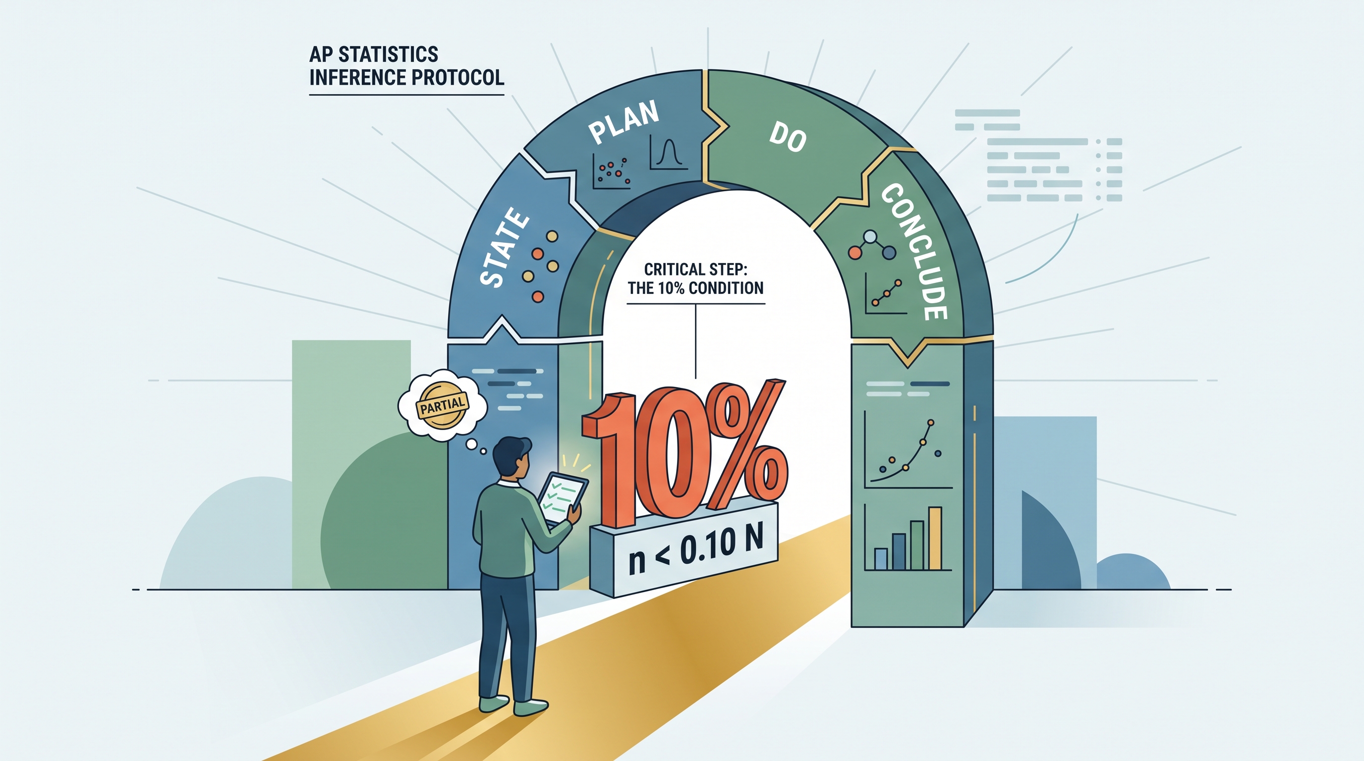
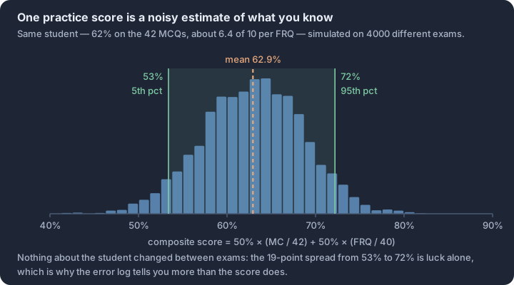
Source Materials
- AP Statistics — Course and Exam Description (CED)
- AP Statistics Course — AP Central (College Board)
- AP Statistics Past Exam Questions — AP Central
- Khan Academy — AP Statistics
- Guide to the AP Statistics Exam — Princeton Review
- AP Statistics Units — Save My Exams
- AP Statistics Study Guide — EBSCO
- Classic AP Stats Lessons — Skew The Script
- r/APStudents — “So…what is AP Statistics?”
- YouTube — Michael Porinchak — AP Statistics & AP Precalculus
- YouTube — Math Medic (Stats Medic) — Luke Wilcox
- YouTube — Advanced Placement — official College Board channel
Study AP Statistics with AI — Free on Lykke
Sign up for free to generate personalized flashcards, quizzes, and study guides from this course. Chat with an AI tutor that knows the material.
Get Started FreeView this course wiki on Lykke · Browse all public course wikis