Interactive Demo
The Distribution Sculptor
The Distribution Sculptor is a free, interactive learning demo from the AP Statistics course on Lykke. It helps you build intuition for Categorical vs. Quantitative Data, Frequency and Relative Frequency, Histograms and Boxplots, Measures of Center (Mean and Median). Play with it directly in your browser — it features 4 buttons, direct drag interaction and a live visual canvas. This demo lives in the “Unit 1: Exploring One-Variable Data” section of the course.
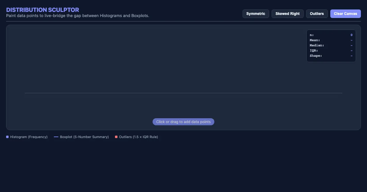
How to use this demo
- Click and drag directly on the canvas to manipulate the scene.
- Use the “Symmetric”, “Skewed Right”, “Outliers”, “Clear Canvas” buttons to trigger actions or reset the demo.
- Experiment freely — there's nothing to break, and every change is reversible.
What you'll explore
- Categorical vs. Quantitative Data
- Frequency and Relative Frequency
- Histograms and Boxplots
- Measures of Center (Mean and Median)
- Measures of Spread (Standard Deviation and IQR)
- The Normal Distribution
- Z-scores and Percentiles
Frequently asked questions
What does the The Distribution Sculptor demo do?
The Distribution Sculptor Distribution Sculptor Paint data points to live-bridge the gap between Histograms and Boxplots. The Distribution Sculptor lets you explore this hands-on instead of only reading about it.
What AP Statistics concept does The Distribution Sculptor teach?
Learn how to represent and analyze data from a single variable using graphical displays and numerical summaries. It focuses on Categorical vs. Quantitative Data, Frequency and Relative Frequency, Histograms and Boxplots, Measures of Center (Mean and Median), Measures of Spread (Standard Deviation and IQR), The Normal Distribution from the “Unit 1: Exploring One-Variable Data” section.
What can I control in The Distribution Sculptor?
You can drag elements directly on the canvas; the “Symmetric”, “Skewed Right”, “Outliers”, “Clear Canvas” buttons run actions or reset the demo. Every change updates the visualization in real time, so you can see exactly how each variable affects the outcome.
How does The Distribution Sculptor fit into the AP Statistics course?
AP Statistics introduces students to the major concepts and tools for collecting, analyzing, and drawing conclusions from data. The course is equivalent to a one-semester introductory college statistics course and focus… This demo is the interactive piece for the “Unit 1: Exploring One-Variable Data” section. Open the full AP Statistics course wiki at https://www.getlykke.com/explore/public/ap-statistics-70553ac9-70f9-422d-b8b6-c328240d85c1 for notes, flashcards, quizzes and the other demos.
What will I understand better after using The Distribution Sculptor?
You'll build intuition for Categorical vs. Quantitative Data, Frequency and Relative Frequency, Histograms and Boxplots, Measures of Center (Mean and Median), Measures of Spread (Standard Deviation and IQR), The Normal Distribution — and, crucially, see how they behave when you change the inputs, which is hard to get from a textbook or lecture on AP Statistics alone.
From the AP Statistics course
This interactive demo is part of the Unit 1: Exploring One-Variable Data section. Explore the full AP Statistics course wiki on Lykke — with notes, flashcards, quizzes and more interactive demos.
Open the AP Statistics course →